A CTA on a landing page is the element that encourages visitors to take the next step. Most commonly, it appears as a button paired with short, action-oriented messaging that guides users toward a specific conversion goal – such as signing up, booking a demo, downloading a guide, or making a purchase.
That’s why CTA buttons are often the most important element of the entire conversion path. They reduce hesitation, clarify what happens next, and help users move through the decision-making process faster. A high-converting CTA is rarely just about color or wording alone – it’s about timing, visibility, relevance, user intent, and context.
In 2026, creating and optimizing CTAs has also become much more data-driven. Modern landing page workflows rely heavily on behavioral insights, A/B testing, heatmaps, click tracking, and AI-supported optimization. Platforms like Landingi help teams generate landing pages faster with AI tools like Lunar, test different CTA copy and layouts, and analyze CTA performance using EventTracker and Solis.
Below, you’ll find some of the best landing page CTA examples across industries like healthcare, ecommerce, SaaS, education, and finance – along with practical insights into what makes CTA design and messaging actually convert.
Key facts
- A CTA on a landing page guides visitors toward the main conversion goal.
- High-converting CTA buttons reduce friction and clarify the next step.
- CTA performance depends on messaging, placement, visibility, and timing.
- Behavioral analytics and AI optimization tools help improve CTA performance continuously.

Lunar is almost here!

What Is a CTA on a Landing Page?
A CTA on a landing page is the element that encourages visitors to take the next step. Most often, it appears as a button with short, action-oriented copy encouraging users to take the next step – book a demo, start a trial, download a guide, or make a purchase.
At the same time, a high-converting CTA is rarely “just a button.” It shapes the entire conversion flow. A good CTA reduces hesitation, clarifies what happens next, and keeps users moving naturally through the page.
That’s why effective CTA design depends on more than wording alone. Placement, visibility, timing, mobile usability, and user intent all influence whether people click or leave.
In 2026, CTA optimization is far more behavioral and data-driven than before. Teams continuously test CTA variants, analyze click behavior and heatmaps, and refine conversion paths based on how users actually interact with the page – especially on mobile devices, where small friction points can impact conversions quickly.
How Do You Write a Call to Action?
Strong CTA copy works because it’s clear, specific, and easy to process instantly.
The best landing page CTA examples usually follow a few simple rules:
- Start with action verbs – “Start,” “Book,” “Get,” “Try,” or “Download” create immediate momentum.
- Clarify the outcome – “Get My Free Audit” feels stronger and more concrete than “Submit.”
- Reduce hesitation – Small additions like “No credit card required” or “Takes 30 seconds” can noticeably improve conversions.
- Match user intent – Visitors comparing options respond differently than users ready to buy immediately.
- Keep CTAs mobile-friendly – Buttons should stay visible, thumb-friendly, and easy to tap.
- Test continuously – Even small CTA changes can significantly impact clicks and conversion rates.
Modern AI workflows also make CTA experimentation much faster. Instead of rewriting dozens of CTA buttons manually, teams can generate variations quickly and optimize them continuously based on behavioral insights and conversion data.
Let Solis detect low-engagement CTA sections, missed clicks, and friction points before they hurt conversions
20 Best CTA Examples on Landing Pages
The best landing page CTA examples guide attention, reduce hesitation, and match the visitor’s intent at a specific moment in the conversion journey.
Some CTAs work because they feel frictionless. Others succeed through clarity, timing, emotional appeal, or smart positioning. In many cases, the difference between a weak CTA and a high-converting CTA comes down to small details – the wording, placement, visual hierarchy, or the context surrounding the button itself.
Below, you’ll find landing page CTA examples from industries like SaaS, ecommerce, healthcare, finance, education, and events, along with practical insights into what makes each call to action effective – and where some of them could still improve.
#1 Healthcare CTA example: Kentfield Hospital
Healthcare CTAs work best when they reduce uncertainty – and Kentfield Hospital understands that well.
What stands out here is the dual CTA structure placed directly in the hero section:
- one CTA encourages visitors to explore the offer,
- the second invites them to schedule a tour.
That second action is especially smart for healthcare marketing. “Schedule a Tour” feels low-pressure and trust-oriented instead of overly sales-driven. It reassures visitors with a simple message: see the place for yourself before making a decision.
The page could still improve the visual hierarchy slightly. When two CTA buttons carry equal visual weight, some users may pause longer before choosing a direction.

#2 Real Estate CTA example: Focus
In real estate landing pages, trust often decides whether users click the CTA or leave the page. Focus builds that credibility largely through visual consistency.
The dark palette, combined with deep blues and blacks, creates a premium, professional feel that matches the expectations associated with high-value property purchases. This matters more than many brands realize – CTA design is never isolated from the surrounding visual context.
A few things work particularly well here:
- strong contrast between the CTA and the background,
- clean visual hierarchy,
- premium-looking color palette associated with trust and stability,
- minimal distractions around the primary action.
The page proves an important point: high-converting CTA buttons don’t always need aggressive colors. Sometimes clarity and contextual trust perform better than visual intensity alone.

#3 E-Commerce CTA example: COS
COS proves that effective CTA design does not always require complex tricks or aggressive messaging. Sometimes, contrast alone does the job.
The landing page uses a simple black CTA button against a bright, minimal background, making the action immediately visible without overwhelming the user.
What works especially well here:
- strong white-black contrast,
- minimal visual noise around the CTA,
- clean luxury aesthetic matching the brand,
- immediate visibility without excessive animations or effects.

The CTA feels natural within the page instead of artificially forced into attention. That balance is often what separates premium ecommerce experiences from overly aggressive conversion design.
#4 Education CTA example: Glasgow Caledonian University
Glasgow Caledonian University uses CTA messaging to reduce one of the biggest barriers in education marketing: perceived complexity.
The “Apply Today” CTA works because it suggests immediacy in an industry usually associated with long processes, paperwork, and slow decision-making. Instead of overwhelming visitors with institutional language, the page encourages quick action from the very beginning.

A few elements strengthen the CTA here:
- direct, action-oriented wording,
- clear next step,
- low-friction feel,
- strong visibility in the hero section.
This example shows how effective CTA copy often reframes the experience itself. In this case, the CTA does not simply promote enrollment – it makes the process feel faster and more approachable.
Don’t just admire great CTAs – build your own landing page masterpiece with Landingi.
#5 Non-Profit CTA example: United Nations Population Fund
This CTA works less through design perfection and more through emotional immediacy.
The donation button is visually simple, but the subtle pulsing heart animation adds movement and emotional weight without overwhelming the page. For nonprofit landing pages, that kind of emotional reinforcement often matters more than polished visuals alone.
A few things make the CTA effective here:
- emotionally charged context,
- clear donation-focused action,
- animated element drawing attention naturally,
- minimal friction between message and action.
The page also proves an important CRO principle: high-converting CTAs do not always need complex design systems. Sometimes emotional clarity and urgency are enough to drive action.

#6 Travel & Tourism CTA example: Liverpool Tour Company
Liverpool Tour Company uses multiple CTAs to address visitors at different stages of the decision-making process.
The page separates users with high purchase intent from those still exploring options:
- “Book Now” targets visitors ready to convert,
- while “View Our Tours” works better for users still comparing experiences.
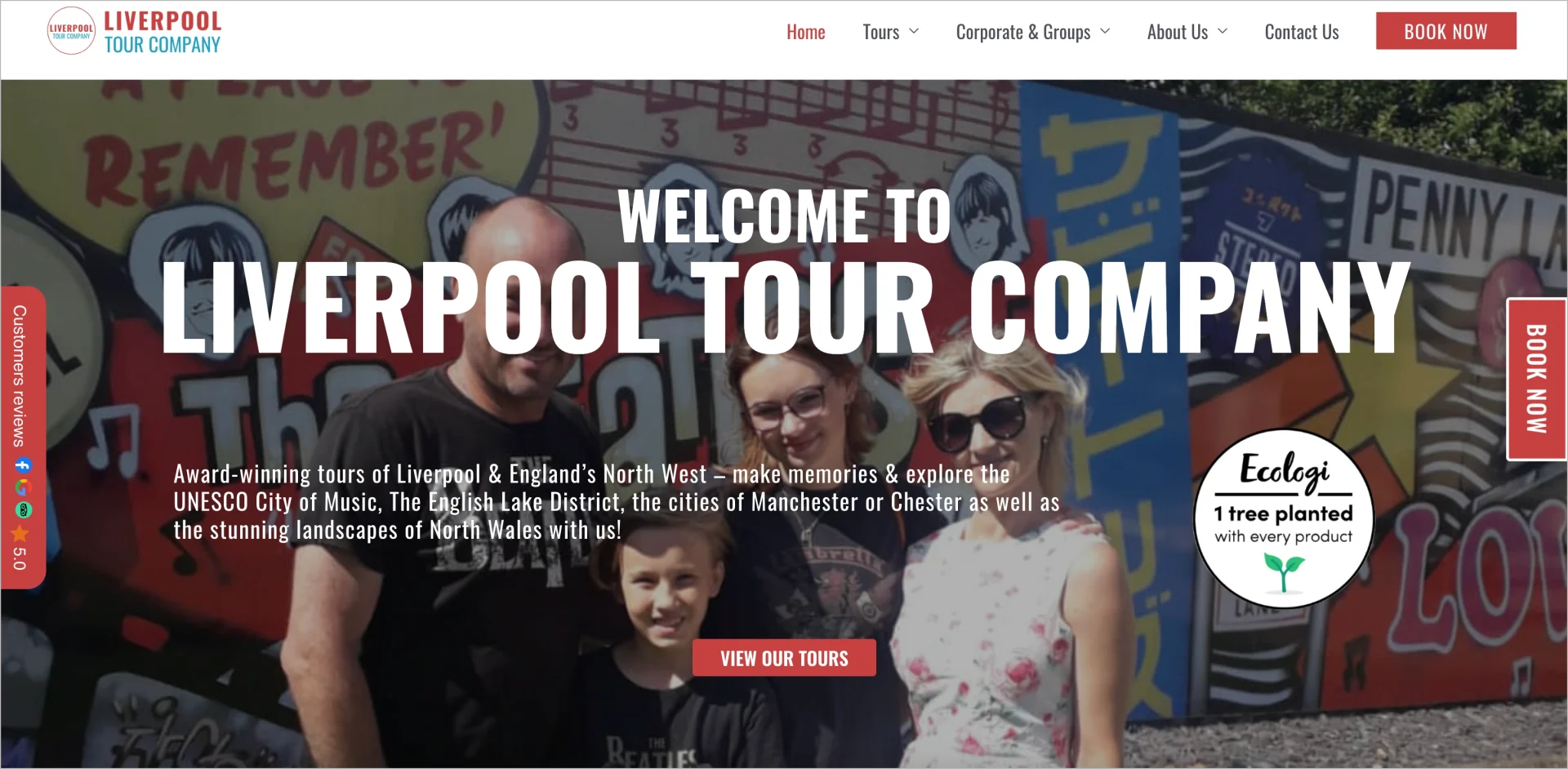
That distinction matters because not every visitor arrives with the same level of intent. Strong landing pages often use CTA copy to match different moments in the customer journey instead of forcing every user toward the same action immediately.
The bold red CTA buttons also help attract attention quickly against the lighter page background. At the same time, using multiple CTAs always introduces a tradeoff: more flexibility can sometimes reduce focus. This is exactly the kind of scenario where A/B testing different CTA hierarchies becomes especially valuable.
#7 Technology & Software CTA example: SoftProdigy
SoftProdigy shows how visually strong CTA design can still underperform when the messaging lacks clarity.
The landing page immediately catches attention with vivid colors and high visual energy. The problem appears later: users still struggle to understand what the company actually offers and why they should click.
A few friction points weaken the CTA performance here:
- vague messaging,
- unclear value proposition,
- lack of specific user outcomes,
- generic CTA communication.
High-converting CTA copy usually answers two questions instantly:
- What is this?
- Why should I care?
Without those answers, even well-positioned CTA buttons can lose effectiveness. Strong CTA design attracts attention, but strong CTA copy is what gives users a reason to act.

#8 Food Delivery CTA example: Sweetgreen
Sweetgreen keeps its CTA strategy simple, clear, and highly aligned with user intent.
The primary CTA – “Order Catering” – appears immediately below the hero message, making the next step feel obvious instead of forced. The wording also works well because it’s direct and action-oriented. Users instantly understand what will happen after clicking.
Another smart detail is CTA repetition further down the page. Instead of relying on a single hero button, Sweetgreen places the CTA again near the “why us” section, catching visitors who need a bit more context before deciding.
A few things strengthen the CTA performance here:
- clear visual hierarchy,
- direct action-focused wording,
- repeated CTA placement,
- strong alignment between the offer and user expectations.
The page shows that high-converting CTAs often work best when they feel like a natural continuation of the browsing experience rather than a sudden sales push.

#9 Wellness CTA example: Headspace
Headspace uses one of the most effective CTA patterns for wellness products: low-friction commitment.
The “Start Free Trial” CTA lowers psychological resistance immediately. Users can explore the product without feeling locked into a purchase decision, which fits perfectly with the emotional context of sleep and mental wellness services.
The CTA placement also works well:
- highly visible in the hero section,
- repeated later near pricing information,
- surrounded by generous whitespace,
- reinforced by calming visuals and minimal distractions.
What makes this landing page especially effective is consistency. The CTA design, tone, colors, and messaging all support the same feeling: simplicity, calmness, and ease.
A small improvement could come from adding more emotional specificity to the CTA copy itself. Subtle additions tied to outcomes or immediacy can sometimes increase engagement even further.

#10 Automotive CTA example: Mobile Mechanic Bristol
This landing page proves that urgency often performs best with simplicity.
The “Call Now!” CTA is direct, highly visible, and perfectly aligned with the visitor’s situation. Someone searching for a mobile mechanic usually wants immediate help, not a long browsing experience or detailed sales funnel.

A few things make this CTA effective:
- clear action-oriented wording,
- minimal friction,
- strong visibility on mobile,
- immediate alignment with user intent.
For service-based landing pages, especially emergency-related ones, speed and clarity often convert better than creativity.
Build landing pages with clear, conversion-focused CTAs designed to turn clicks into real inquiries.
#11 B2B Services CTA Example: HubSpot
HubSpot uses one of the strongest CTA formulas in SaaS and B2B marketing: low-risk commitment.
The “Get Started Free” CTA removes pressure immediately while keeping the value proposition clear and action-oriented. Just below the button, the “No credit card required” microcopy reduces hesitation even further by answering a common objection before users even ask it.
Several elements strengthen the CTA performance here:
- low-friction entry point,
- highly visible button contrast,
- reassuring supporting microcopy,
- simple, expectation-focused wording.
This example highlights an important principle: high-converting CTAs often work because they reduce anxiety, not because they sound aggressive or overly persuasive.
The bright button stands out visually, drawing the eye, while the supporting line “No credit card required” reduces hesitation and builds trust. It’s a smart, user-first design choice that aligns perfectly with HubSpot’s goal of encouraging quick sign-ups.

#12 Agency CTA example: Vireo Video
Agency landing pages usually depend on one thing: turning curiosity into conversation. Vireo Video handles that transition well with the CTA “Book a Discovery Call.”
The wording feels low-pressure while still moving users toward a meaningful next step. Instead of pushing an immediate purchase or commitment, the CTA invites visitors into a conversation – which fits the decision-making process typical in agency services.
A few details strengthen the CTA here:
- approachable wording,
- clear next action,
- strong placement in the hero section,
- visual reinforcement through icon usage.
The CTA could become even stronger with more outcome-focused language tied directly to business value or growth. For agencies especially, users often respond best when the CTA hints at the result, not just the meeting itself.

#13 Events & Leisure CTA example: SaaStr Annual
SaaStr Annual shows that CTA context can sometimes replace traditional CTA structure.
The “2025 Tickets” CTA works despite lacking an action verb because the surrounding context already creates urgency and intent. Visitors immediately understand what’s being offered and why it matters.
At the same time, the page also highlights how clarity impacts CTA performance. The secondary hero element focused on event dates feels visually important, but not clearly actionable. Users may notice it without understanding whether it’s clickable or simply informational.
What works well:
- concise CTA wording,
- strong event-driven urgency,
- immediate clarity around availability,
- high relevance to visitor intent.
What could improve:
- stronger visual distinction for primary CTA hierarchy,
- more explicit action-focused language for secondary CTA elements,
- clearer interaction cues for clickable sections.

#14 Fitness & Nutrition CTA example: The Fort NYC
The Fort NYC uses a less aggressive CTA strategy built around momentum instead of instant conversion.
Rather than pushing users to act immediately in the hero section, the page encourages exploration first. As visitors scroll, a sticky “Book a Call” CTA remains visible the entire time, creating a persistent but non-intrusive conversion path.
This approach works particularly well for high-commitment services like fitness coaching or personal training because users often need more context and emotional buy-in before taking action.
A few things strengthen the CTA here:
- sticky CTA visibility during scrolling,
- low-pressure consultation wording,
- gradual intent-building,
- clean separation between content and conversion moments.
The page is a strong example of how modern CTA design increasingly adapts to browsing behavior instead of forcing immediate action.

#15 Insurance CTA example: SoFi
SoFi uses dual CTAs strategically to match different levels of purchase readiness.
The first CTA – “Get My Quote” – targets visitors already prepared to move forward. The second – “Calculate My Needs” – creates a softer entry point for users still researching or comparing options.
That distinction is especially effective in industries like insurance or finance, where decision-making often takes longer and involves more hesitation.

What works well here:
- intent-based CTA segmentation,
- reduced pressure for undecided users,
- clear differentiation between actions,
- personalized-feeling conversion paths.
Instead of forcing every visitor into the same funnel immediately, the page adapts the CTA experience to different stages of consideration.
Turn inspiration into action! Start crafting irresistible CTAs with Landingi now.
#16 Legal CTA example: ER Law
ER Law shows how secondary CTAs can support conversions by addressing specific audience needs directly.
The “Hablamos Español” CTA is not the primary conversion action, but it plays an important trust-building role. For Spanish-speaking visitors, it immediately communicates accessibility, inclusivity, and cultural awareness – all critical factors in legal services, where trust strongly influences conversion behavior.
What makes this CTA effective:
- audience-specific messaging,
- immediate reassurance,
- strong contextual relevance,
- reduced communication barriers.
This example highlights an important principle of modern CTA strategy: sometimes the most effective CTA is the one that makes users feel understood first.

#17 Media & Entertainment CTA example: Netflix
Netflix proves how powerful simplicity can be in CTA design.
The CTA itself is minimal, familiar, and easy to process instantly. Combined with reassuring microcopy like “Cancel anytime” and a single-field signup flow, the page removes friction almost entirely.
Several elements strengthen the CTA performance here:
- low-commitment messaging,
- minimal form complexity,
- immediate clarity around the next step,
- strong alignment between value proposition and action.
Netflix also demonstrates a broader CRO lesson: when the offer is clear and highly recognizable, the CTA does not need to overcomplicate persuasion. Sometimes reducing resistance works better than increasing pressure.

#18 Home & Garden CTA example: K STUDIO
K STUDIO shows how CTA performance often depends more on surrounding context than on the button itself.
The button label – “Contact” – is fairly generic. What makes the CTA work is the messaging placed directly above it: “Start your green journey with a click.” That line creates emotional framing and speaks clearly to the audience interested in eco-conscious architecture and design.
A few elements strengthen the CTA here:
- emotionally aligned messaging,
- clear audience targeting,
- soft, low-pressure transition into contact,
- strong brand consistency.
The biggest limitation is placement. The strongest CTA-message combination appears only near the bottom of the page, meaning many users may never reach it. While the sticky navigation includes another CTA button, it lacks the same persuasive context and emotional framing.

#19 Medical Practitioners CTA example: Smileboston
Smileboston uses CTA personalization well by offering visitors more than one logical next step.
The page immediately identifies the target audience with the headline “New Patients: Prepare for Your First Visit,” creating a welcoming and reassuring tone from the start. The CTA structure then supports different patient preferences:
- “Request an Appointment” for traditional consultations,
- “Request Virtual Consult” for lower-friction remote contact.
This dual-path approach works particularly well in healthcare because it reduces pressure and increases flexibility. Instead of forcing every visitor into the same conversion path, the page adapts to different comfort levels and decision styles.
What strengthens the CTA performance here:
- reduced friction through virtual options.
- patient-focused messaging,
- clear audience targeting,
- flexible conversion paths,
- trust-oriented tone,
- reduced friction through virtual options.

#20 Finance CTA example: Emerald Credit Union
Not every landing page CTA example is worth copying – and this one highlights several common conversion mistakes.
Several other elements also weaken the conversion flow:
- generic CTA wording,
- weak visual hierarchy,
- outdated button styling,
- excessive navigation links distracting from the main action,
- broken or unclear secondary CTA behavior.

The biggest issue starts with the primary CTA itself. “Learn More” feels vague and low-intent, especially in finance, where users usually expect clarity, reassurance, and immediate value. Without stronger supporting benefits nearby, the CTA gives visitors little reason to click.
This example shows an important CRO principle: CTA performance depends on the entire surrounding experience, not only on the button label itself. Even small friction points can quickly reduce trust and engagement – especially in industries like finance, where credibility strongly affects conversion behavior.
Discover which CTAs users ignore, where friction appears, and what actually drives conversions with behavioral insights from Solis
How to Create a High-Converting CTA for a Landing Page?
A high-converting CTA makes the next step feel obvious and easy to take and that usually starts with matching the visitor’s mindset. Someone comparing options needs a different CTA than someone ready to buy immediately. That’s why “See Pricing,” “Book a Demo,” and “Start Free Trial” all work differently depending on where users are in the decision-making process.
A few things consistently make CTA buttons perform better:
- Clarity over cleverness – Users should instantly understand what happens after clicking.
- Specific wording – “Get My Custom Plan” usually feels stronger than generic CTA copy like “Submit.”
- Low friction – Short forms, reassuring microcopy, and simple next steps reduce hesitation quickly.
- Strong visibility – CTAs should feel easy to notice naturally, especially on mobile devices.
- Contextual placement – Sometimes the best-performing CTA is not the first one on the page, but the one appearing exactly when the visitor feels ready to act.
High-converting landing pages also treat CTA optimization as an ongoing process, not a one-time decision. Small changes in wording, placement, hierarchy, or surrounding copy can noticeably impact conversions.
That’s why modern teams increasingly test CTA variations continuously, analyze click behavior and heatmaps, and refine CTA flows based on how users actually interact with the page.
Run A/B tests on CTA copy, placement, and design to discover which version actually drives more clicks and conversions.
FAQ for CTA on Landing Pages
CTAs may look simple, but small details can significantly influence conversions. Button wording, placement, timing, mobile visibility, and surrounding context all affect whether users click or leave the page.
Below, you’ll find short answers to some of the most common questions about landing page CTAs, CTA copy, CTA design, and conversion-focused optimization.
Is CTA color important for conversion rates?
Yes – but usually less than clarity, placement, and messaging. CTA color helps attract attention and create contrast against the rest of the page, especially on mobile devices. However, button color alone rarely determines conversion success. A weak offer or unclear CTA copy will still underperform even with a highly visible button.
The most effective CTA colors are typically the ones that create strong visual distinction while remaining consistent with the overall landing page design.
What is meant by “Above the Fold” in web design?
“Above the fold” refers to the part of a landing page visible immediately after loading the page, before users start scrolling.
This area is important because it shapes the first impression and usually receives the most attention. That’s why many landing pages place their primary CTA above the fold to make the next step visible instantly.

At the same time, a CTA does not always need to appear above the fold to convert well. Longer landing pages often perform better with repeated or context-based CTAs placed throughout the scrolling experience, especially on mobile devices where user behavior differs significantly from desktop browsing.
Analyze user behavior and interactions on your page to find the best CTA placement!
Can a landing page have multiple CTAs and still be effective?
Yes – as long as the CTAs support different user intentions instead of competing with each other.
High-converting landing pages often use multiple CTAs to match different stages of the customer journey. For example, visitors still exploring the offer may click “Learn More,” while high-intent users are more likely to choose “Start Free Trial” or “Book a Demo.”
The key is maintaining a clear hierarchy. Users should always understand which CTA is primary and what action matters most on the page.
HubSpot is a good example of this approach. Their landing pages often combine lower-friction CTAs with stronger conversion-focused actions, allowing users to move forward at their own pace instead of forcing everyone into the same path immediately.

What types of CTAs work best on landing pages?
Different landing pages require different CTA strategies depending on the user’s intent and stage of decision-making.
The most common CTA types include:
- lead generation CTAs – “Download the Guide,” “Get the Audit,”
- signup CTAs – “Start Free Trial,” “Create Account,”
- purchase CTAs – “Buy Now,” “Add to Cart,”
- demo or consultation CTAs – “Book a Demo,” “Schedule a Call,”
- exploration CTAs – “See Pricing,” “Learn More,”
- video engagement CTAs – “Watch Demo,” “See How It Works.”
Many high-converting landing pages combine multiple CTA types to support different levels of intent. For example, one CTA may target users ready to convert immediately, while another helps less-decided visitors explore the offer first.

The best CTA strategy depends less on trends and more on matching the visitor’s mindset at a specific moment in the conversion journey.
Build landing pages with CTA flows designed for every stage of the customer journey.
Which design elements matter most for an effective CTA?
Good CTA design helps users notice the next step instantly without disrupting the overall experience.
The most important CTA design elements usually include:
- strong contrast between the button and the background,
- clear visual hierarchy so the CTA stands out naturally,
- enough whitespace around the button,
- mobile-friendly sizing for easy tapping,
- readable typography and concise CTA copy,
- consistent styling across the landing page.
Small interaction details can also improve engagement. Subtle hover effects, sticky mobile CTAs, or directional visual cues often help guide attention more naturally.
At the same time, effective CTA design is rarely about one isolated element like color alone. High-converting CTAs usually perform well because the entire page – layout, copy, visuals, hierarchy, and timing – supports the action cohesively.
Which works better: urgency or value-based CTA copy?
Both can work well – but they influence users differently.
Urgency-focused CTAs encourage faster decisions with messaging like “Limited Spots” or “Offer Ends Today.” They usually perform best for events, promotions, or time-sensitive campaigns.
Value-based CTAs focus more on what users gain. Examples like “Get My Free Audit” or “Start Saving Time” often work better for SaaS, B2B, lead generation, and higher-consideration offers.
In practice, the strongest CTAs often combine both approaches subtly – offering clear value while giving users a reason to act sooner rather than later.
How do CTAs differ between B2B and B2C landing pages?
B2B CTAs usually focus on trust, logic, and long-term value. They often encourage lower-friction actions like “Book a Demo,” “Get the Report,” or “Schedule a Consultation” because the decision-making process tends to be longer and more complex.
B2C CTAs are typically faster, simpler, and more emotionally driven. Actions like “Buy Now,” “Start Free Trial,” or “Claim Your Discount” aim to reduce hesitation and encourage immediate action.

The difference is not just in wording. B2B landing page CTAs usually rely more on proof, clarity, and ROI, while B2C CTAs often prioritize speed, emotion, and visual impact.
What psychological principles make CTAs more effective?
High-converting CTAs often work because they align with basic psychological triggers influencing decision-making.
The most common ones include:
- scarcity – “Only a few spots left,”
- social proof – reviews, ratings, testimonials, or customer numbers,
- reciprocity – offering something valuable first, like a free trial or guide,
- emotional appeal – creating excitement, reassurance, curiosity, or relief,
- cognitive ease – making the next step feel simple and low-effort.
The strongest CTA strategies usually combine several of these principles naturally instead of relying on aggressive persuasion alone.
Social proof is essential in B2C as well, but it may manifest differently. Reviews, ratings, and user-generated content can play a significant role in B2C CTAs.
How do you A/B test Different CTAs to find the best-performing one?
Effective CTA A/B testing starts with changing one important element at a time – for example:
- CTA copy,
- button color,
- placement,
- size,
- or surrounding microcopy.
The goal is simple: understand which variation drives more clicks and conversions based on real user behavior instead of assumptions.
A few best practices matter most:
- test one major change per variation,
- define a clear conversion goal,
- run the test long enough for reliable results,
- analyze both clicks and downstream conversions,
- keep testing continuously instead of treating optimization as a one-time task.
Modern landing page workflows also make CTA testing much faster than before. Teams can generate multiple CTA variants quickly, launch tests across pages, and analyze behavioral data like clicks, scroll depth, or form abandonment patterns in real time.
Compare CTA copy, placement, and design variations to discover what actually drives more conversions
What happens when a landing page CTA is poorly designed?
A weak CTA can quietly destroy conversions – even when the offer itself is strong. If users don’t notice the CTA, don’t understand it, or hesitate before clicking, the entire conversion path starts breaking down. Poor CTA copy, weak contrast, unclear hierarchy, overwhelming layouts, or mobile usability issues can all increase drop-offs quickly.
This matters more than many brands realize. Research consistently shows that users judge websites within seconds, and poor UX or confusing design strongly impacts trust, engagement, and conversion rates.
That’s why effective CTA optimization is rarely just about the button itself. High-converting landing pages treat CTA performance as part of the entire user experience – from messaging and layout to mobile behavior and page clarity.
Build Landing Pages with High-Converting CTAs in Landingi
High-converting CTAs rarely happen by accident. They come from continuous testing, clear messaging, strong UX, and understanding how users actually behave on the page.
That’s why modern teams increasingly rely on landing page operation systems that combine creation, optimization, analytics, and experimentation in one workflow. With Landingi, you can generate landing pages faster, test CTA variants, analyze user behavior, and refine conversion paths without juggling multiple disconnected tools.
Lunar helps teams create conversion-focused landing pages from prompts, while Solis analyzes behavioral data and highlights optimization opportunities based on real interactions. Combined with A/B testing, EventTracker insights and Smart Sections, this creates a much faster workflow for improving CTA performance over time.
Most high-converting CTAs are optimized, not guessed. Start building and testing yours with Landingi.