You can add a button to your landing page in the Landingi platform and specify what will happen when you click on it.
In this guide, you will learn how to add a button to your landing page, edit, and configure it.
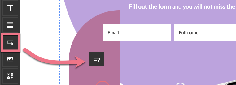
Add button
On the left side of the editor, find the Button widget, then drag and drop it into the active area of your landing page.
Edit button
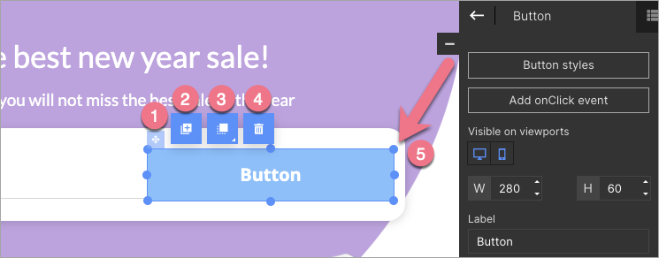
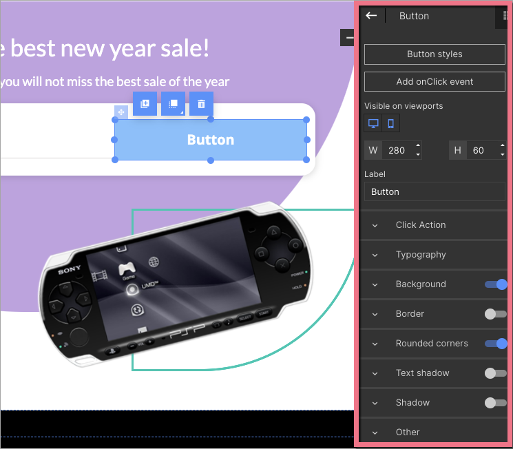
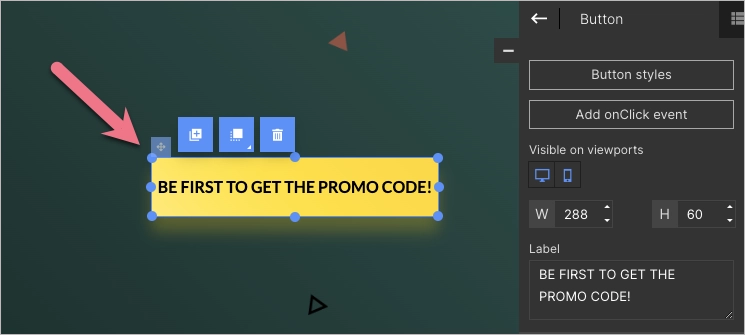
Click on the button to start editing. You will see its context menu (1) and toolbar on the right side of the editor (2).
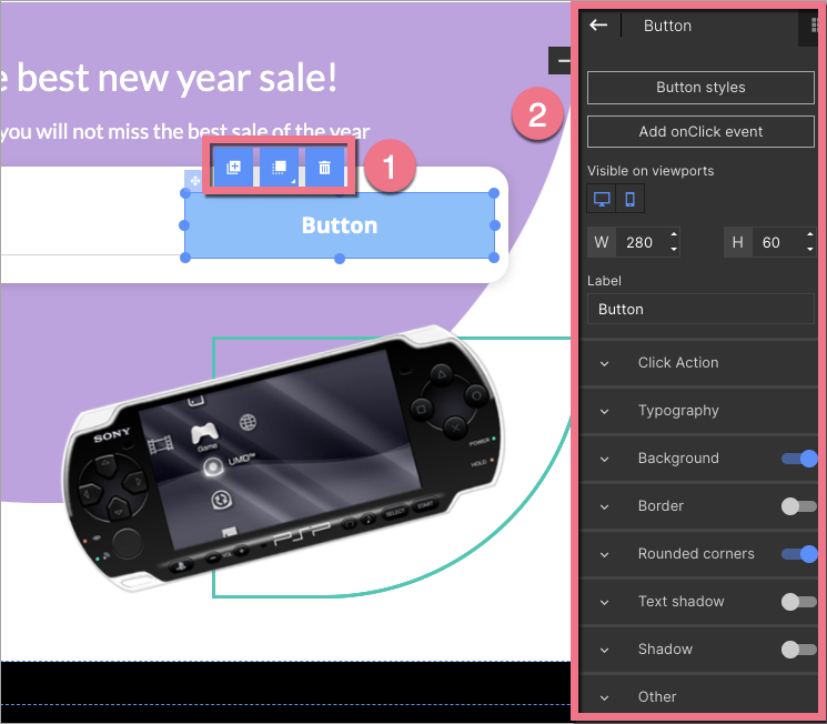
Context menu
You can change the size of the button by clicking on the dots on the frame (5). The remaining icons let you change its position (1), duplicate it (2), move it to the top/bottom (3), and delete the button (4).
Widget toolbar
In the widget toolbar, you can select the style of the button or add an onClick event, turn on/off mobile or desktop view (by default, the button is visible in both views), change the button size, and edit the text displayed on the button (label).
Underneath, you will find tabs with some additional options. You can turn some of them on or off using the slider located in the right-hand corner of each tab.
- Click Action – decide what happens when the user clicks the button.
- Scroll to section – select a section to which your landing page will be scrolled smoothly after clicking on the button.
- Show lightbox – choose a lightbox to be displayed after clicking on the button.
- Download file – insert a link to your file or upload a file to share a file with a user.
- Redirect – enter the URL to which the user will be redirected after clicking on the button. Remember that the redirection URL should start with the https:// prefix. NOTE: You can’t create a callto or mailto link simultaneously and check the option Track click as conversion – the link will not work correctly. You can read more about alternative links here.
- Redirect to landing page – select a target landing page to which the user will be redirected after clicking the button.
- Typography – change the font and its size and color, adjust the text line’s height, select styles, and alignment. You can also add Google fonts or your own ones.
- Background – choose the style of the background: full color, gradient, or image.
- Border – adjust the parameters of the frame: thickness, line style, and color.
- Rounded corners – set specific values to round corners (the value can be the same for all corners or different for each).
- Text shadow – control the text shadow settings.
- Shadow – set values for the shadow of the button.
- Other – adjust button position, copy the button ID or add a class.
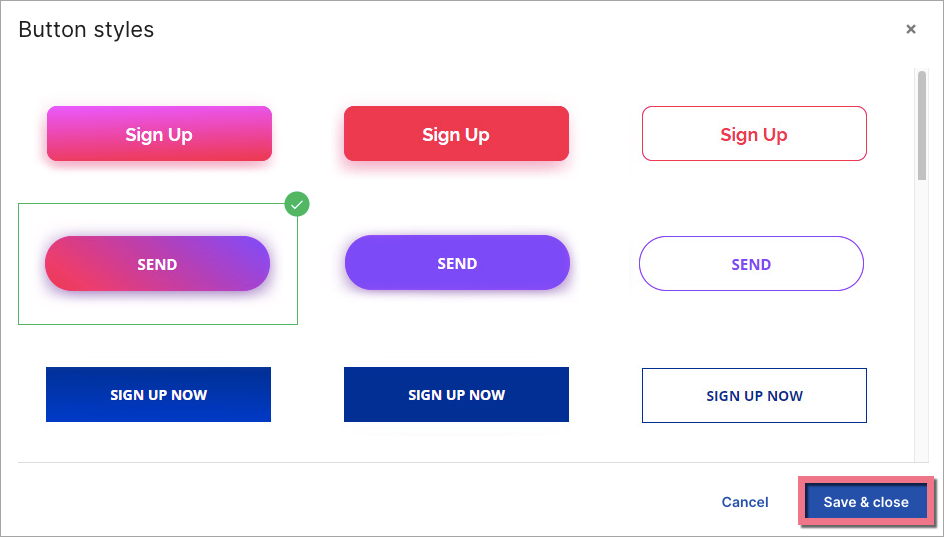
Button styles
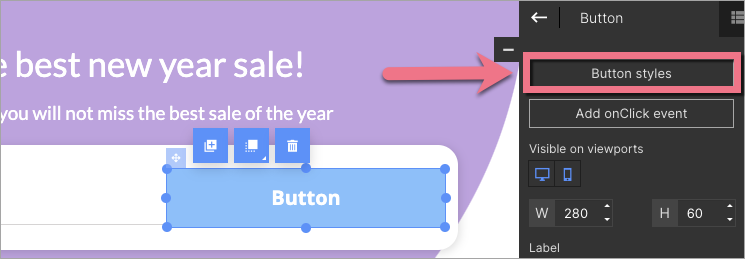
You can use one of the ready-made button styles. Feel free to manage the design of your button using the tools in the right-side toolbar.
Click Button styles in the toolbar to choose a ready-made design. Double-click on it or select and click Save & close.
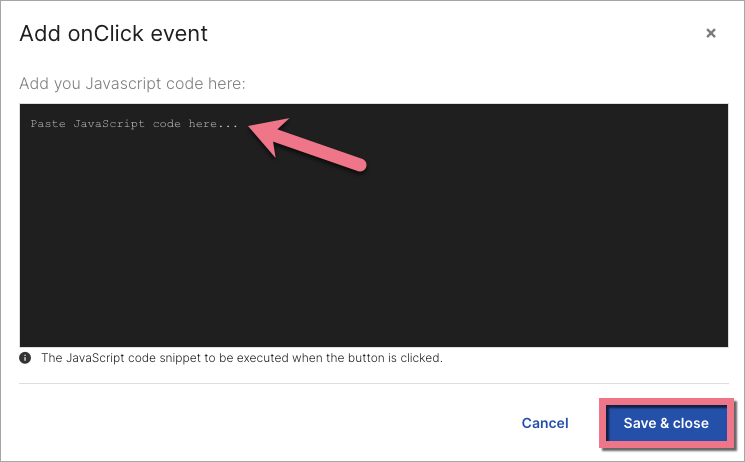
OnClick event
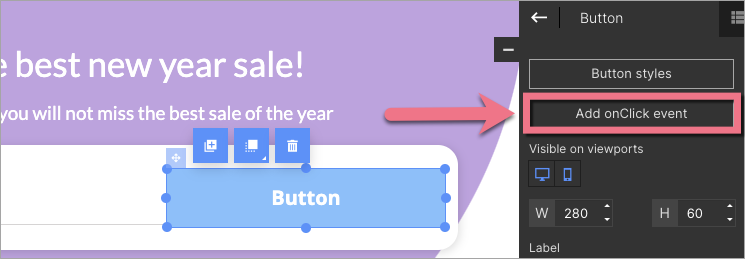
You can add a JavaScript code to activate the onClick event when you click on the button.
Click Add onClick event in the toolbar and paste your JavaScript code. Then Save & close.
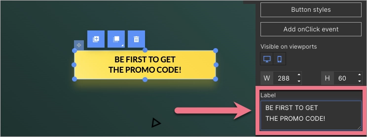
Multi-line text on a button
You can add another line of text on a button by pressing the Enter key to divide one line from the other.
1. Select your button.
2. In the right-side toolbar, adjust the button text, separating lines with the Enter key.
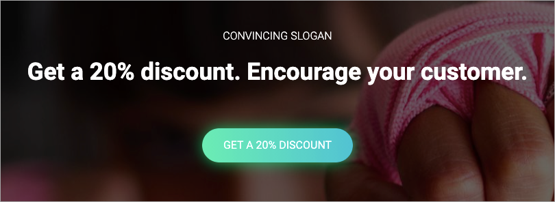
To learn more about effective Call to Action for your buttons, read our What Is Call To Action, Actually? article.

