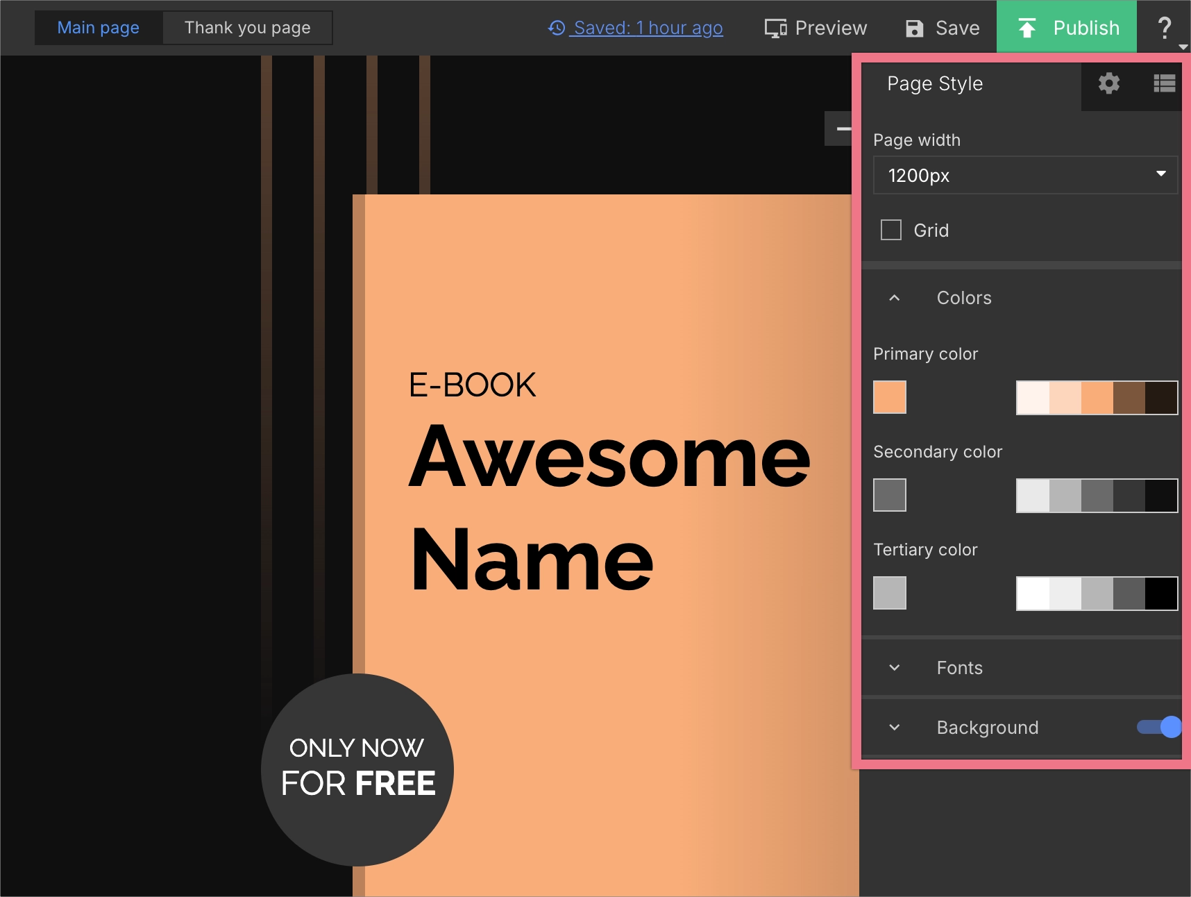
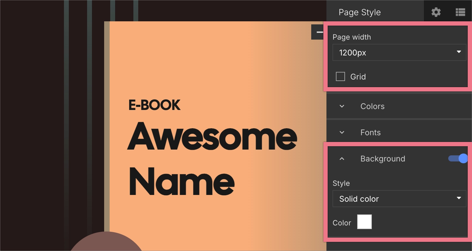
The Page Style panel lets you manage the overall appearance of your landing page in one place. You can set your global colors and global fonts, as well as adjust the page width, grid visibility, and background.
Using global settings ensures visual consistency across all page elements and makes it easier to apply stylistic updates without editing each widget separately.
You can also use global settings on popups and lightboxes – the available options are the same as in the Page Style. Learn more about Popup Style and Lightbox Style.
Access Page Style
In the Page Style tab, you’ll find landing page global settings for colors, fonts, page width, grid visibility, and background.
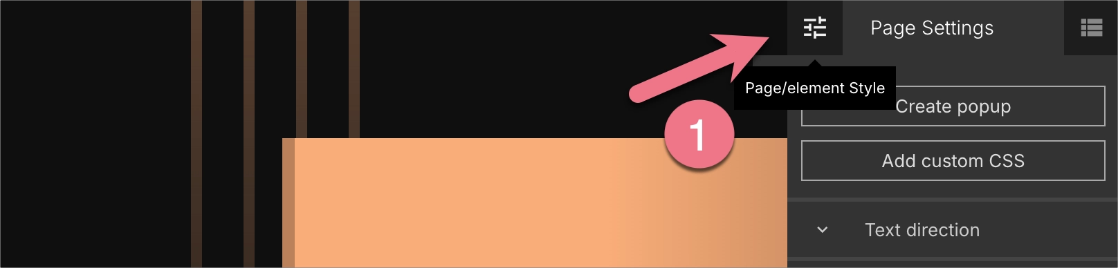
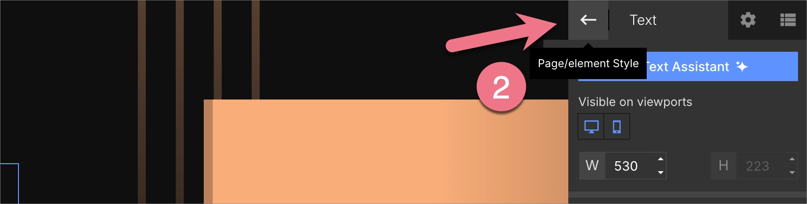
1. Log in to your Landingi account and open your landing page in the editor.
2. The Page Style panel opens by default when you start editing a landing page.
3. If you’ve navigated away, click the sliders icon (1) or use the back arrow (2) at the top of the right-side panel to return to Page Style or Element Style.
IMPORTANT: Smart Sections do not inherit a page’s global settings.
Set global colors
In Page Style, you can define up to three brand colors:
- Primary color
- Secondary color
- Tertiary color
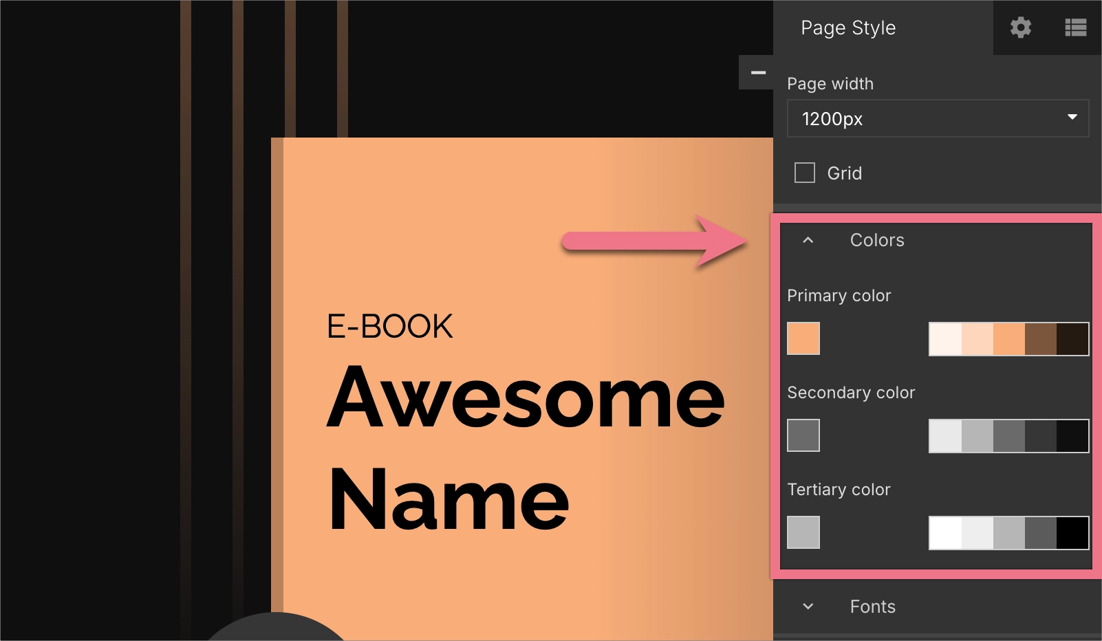
Next to each selected color, you’ll see its shades, which you can use to apply lighter or darker variations of the same tone to individual elements. These shades make it easy to stay within your brand’s color range without repeating the exact same hue everywhere.
To change a global color, click on a color box and choose a color from a color picker.
All widgets that have Primary, Secondary, or Tertiary color selected in their settings will automatically update if you change these values in Page Style. This applies to text, buttons, shapes, backgrounds, borders, forms, counters, accordions, etc.
Set global fonts
In the same Page Style panel, you can set global fonts for:
- Headlines
- Paragraphs
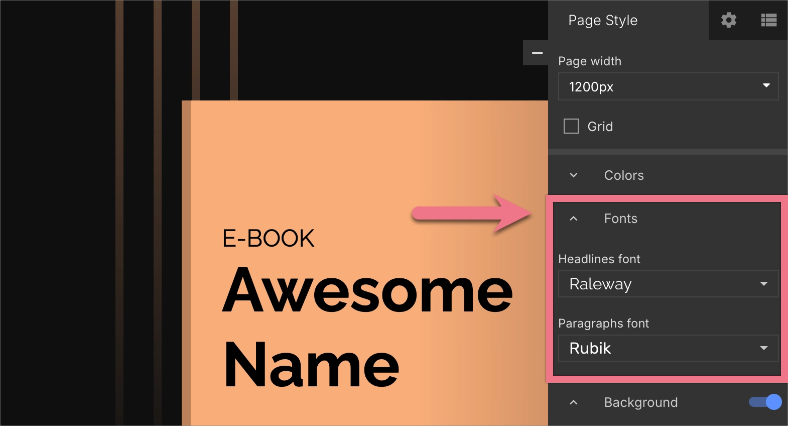
To change global fonts, expand the drop-down menu and choose a font from the list.
Once set, any text widget assigned as a headline or paragraph will automatically update to the chosen font family, whenever you change the settings in Page Style.
If you select a custom font for a specific text element instead of a global one, that element will no longer respond to global font changes.
Every new widget you add to the landing page automatically adopts your global color scheme and fonts, which helps you maintain a cohesive look right from the start.
Other Page Style settings
Besides global colors and fonts, the Page Style tab includes additional appearance settings:
- Page width – adjust the overall width of your landing page layout.
- Grid visibility – turn the editor grid on or off to help align elements.
- Page background – set a solid color, gradient, or image as your page background.
Applying global styles to elements
When you select an element on the page, you can apply either global or custom colors and fonts.
Colors
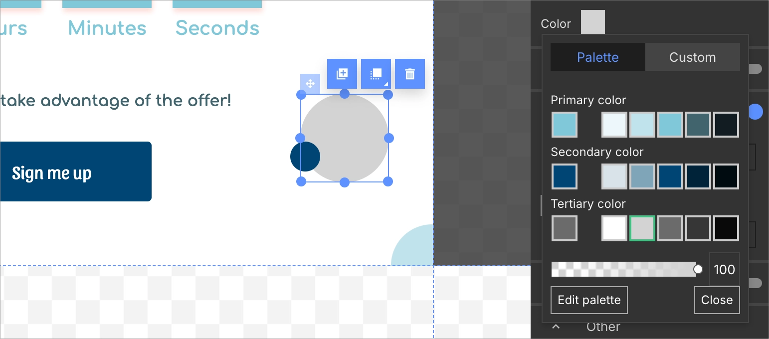
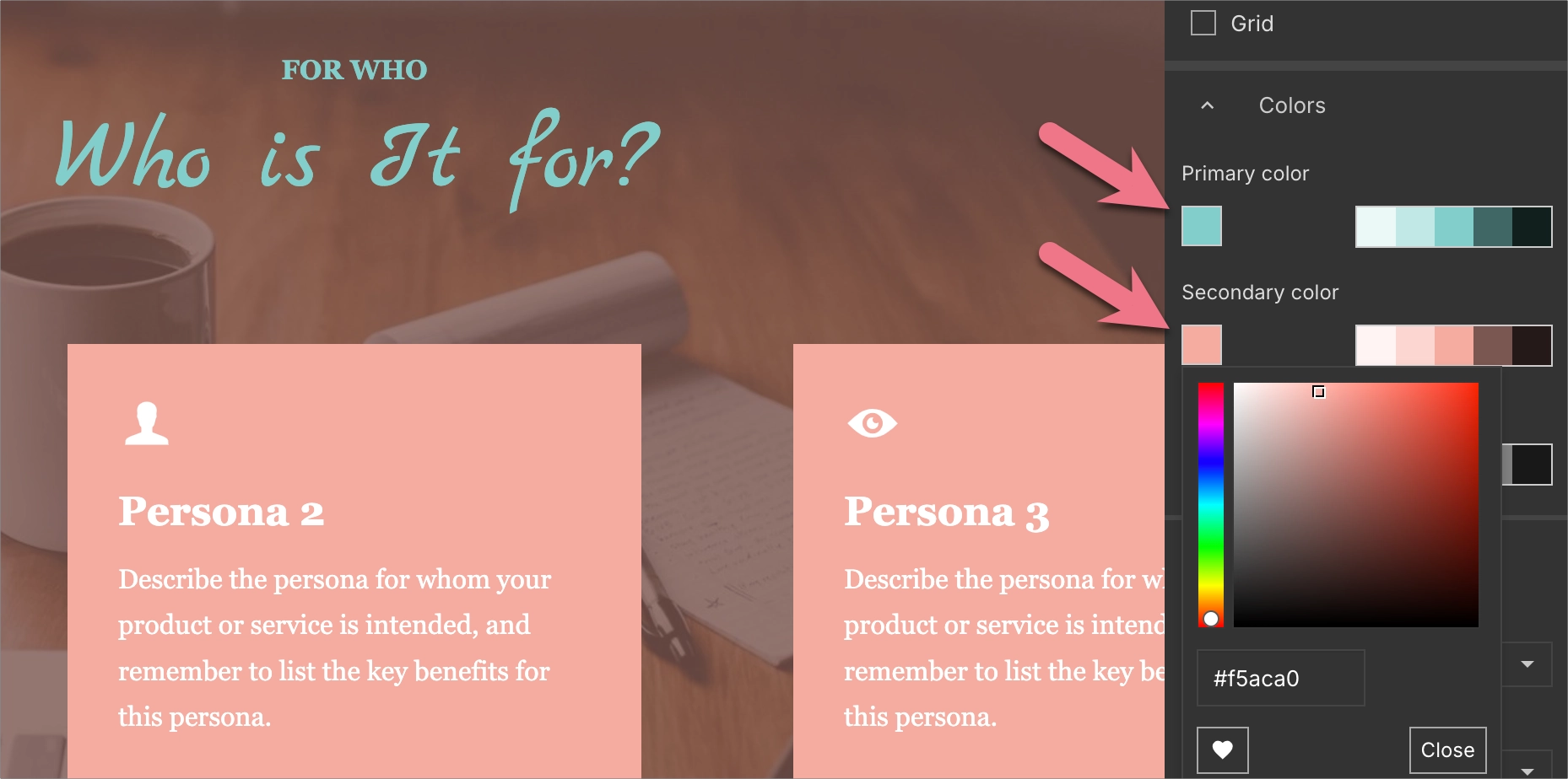
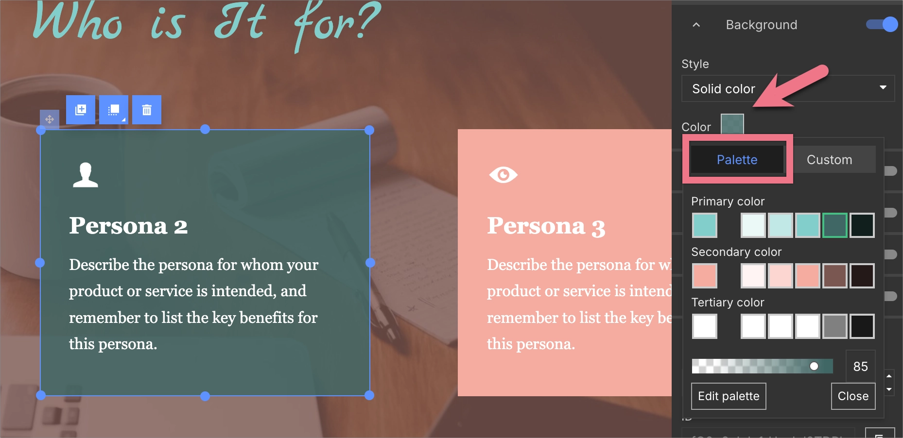
1. Select an element and, in the right-side panel, click the color box.
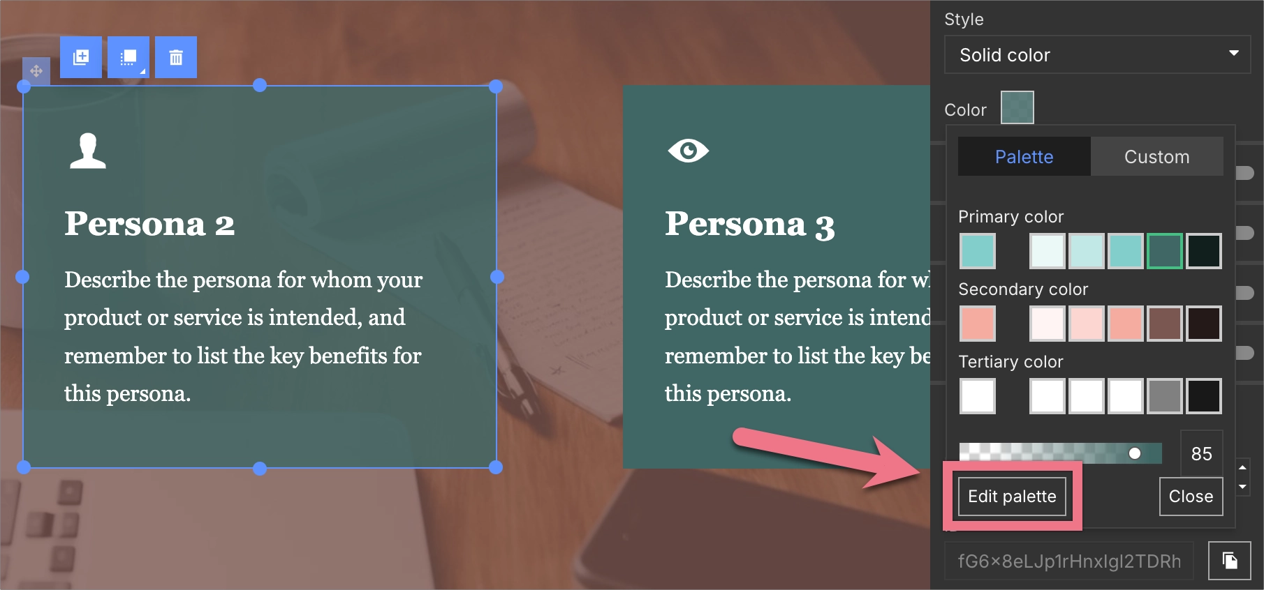
2. In the popup window, go to the Palette tab to pick one of your global colors (Primary, Secondary, or Tertiary) or one of their shades.
You can also adjust transparency.
3. To choose a custom color, switch to the Custom tab and use the color picker.
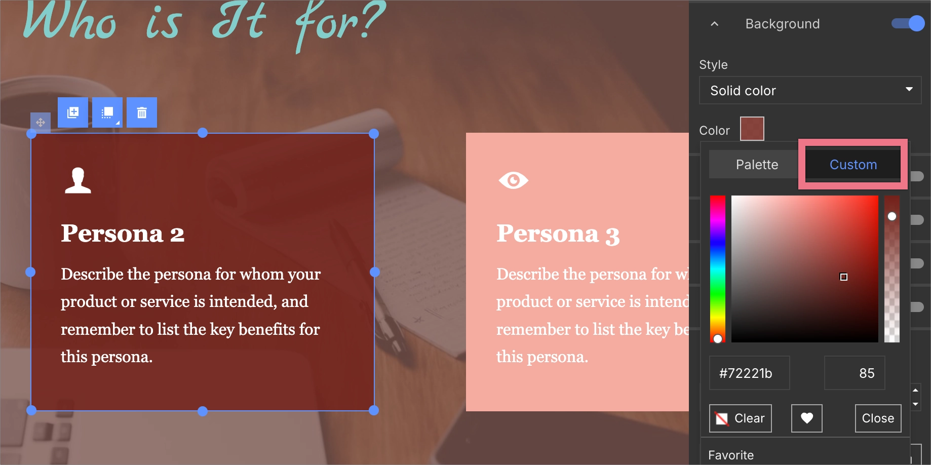
NOTE: Elements using global colors automatically update when you change them in Page Style. Elements using custom colors remain unchanged, even if you modify the global color palette later.
4. When you click Edit palette, you’ll be redirected to Page Style settings, where you can adjust your global colors directly.
Fonts
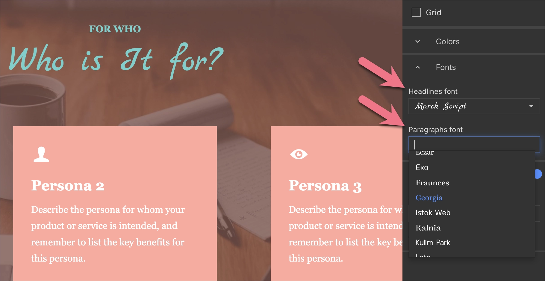
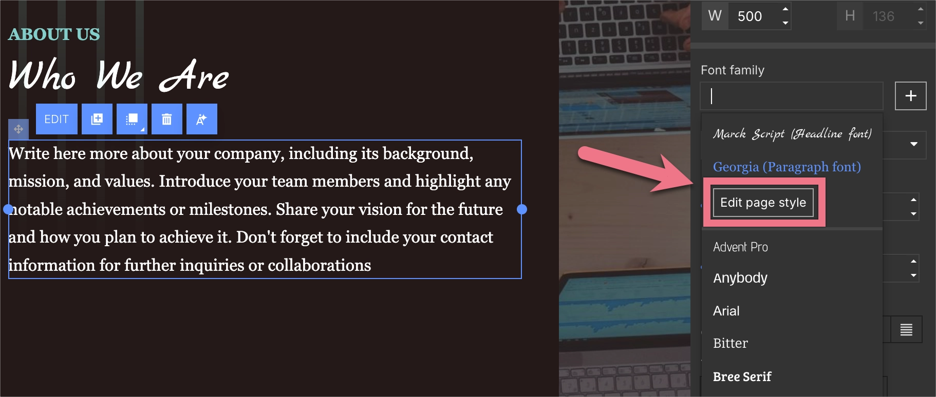
1. Click a text widget and expand the Font family menu in the right-side panel.
2. Choose a global font (1) (Headline or Paragraph) or select a custom font (2).
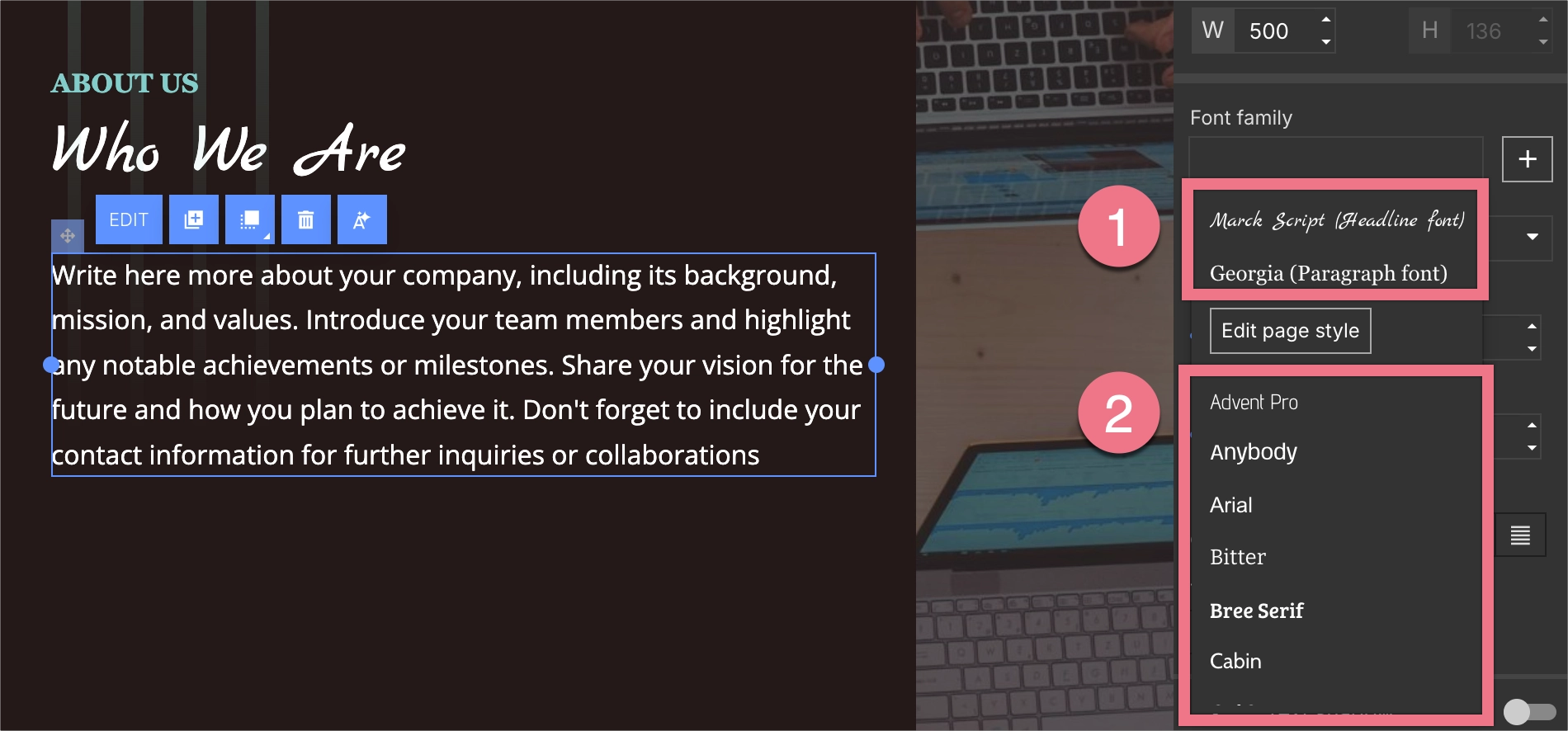
NOTE: Text elements using global fonts automatically update with any changes made in the Page Style tab. Custom fonts remain static.
3. When you click Edit page styles, you’ll be redirected to Page Style settings, where you can adjust your global fonts directly.
Good practices and tips
- Define your brand’s main colors before you start editing individual widgets.
- Use global colors and fonts for all essential elements to simplify future updates.
- Keep custom fonts or colors for exceptions only – such as callouts or creative highlights.
- Use color shades to maintain tone consistency while introducing visual depth.
- Revisit your global settings when you rebrand or update campaign visuals.
Examples of usage
Example 1: Updating seasonal campaigns
When you launch a new campaign, you can change your global colors to match its theme. All matching elements update instantly – no need to edit them individually.
Example 2: Consistency across subpages
If you duplicate or reuse a landing page template, your global styles ensure that all new elements match your existing design.
Example 3: Quick stylistic A/B tests
When running an A/B test, try adjusting your global colors or fonts in one variant. You can easily test which design converts better without redoing the layout.
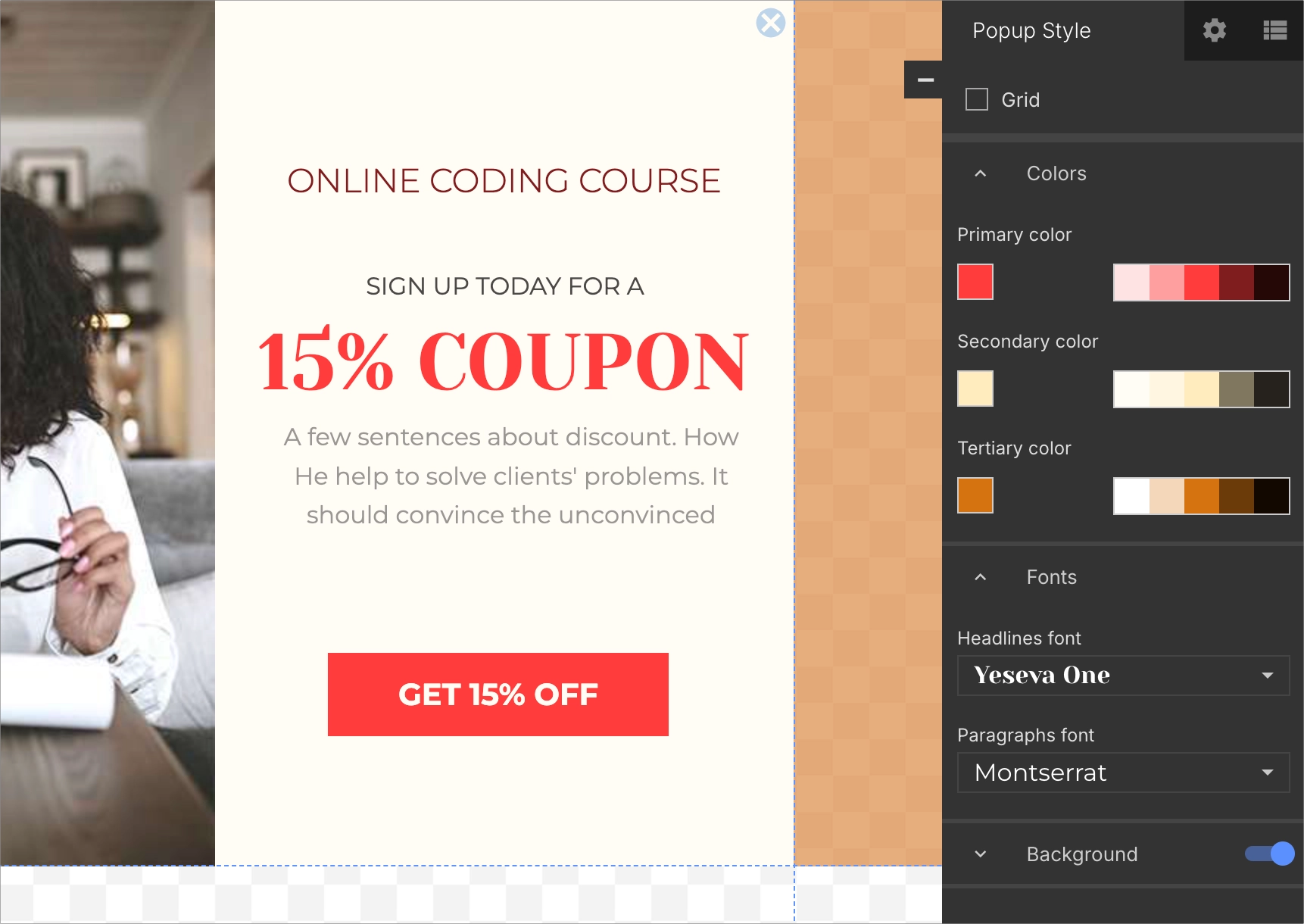
Popup Style and Lightbox Style
The settings for Popup Style and Lightbox Style are similar to those for Page Style.
While editing a lightbox (1) or a popup (2), you can define global colors and fonts for that specific project.
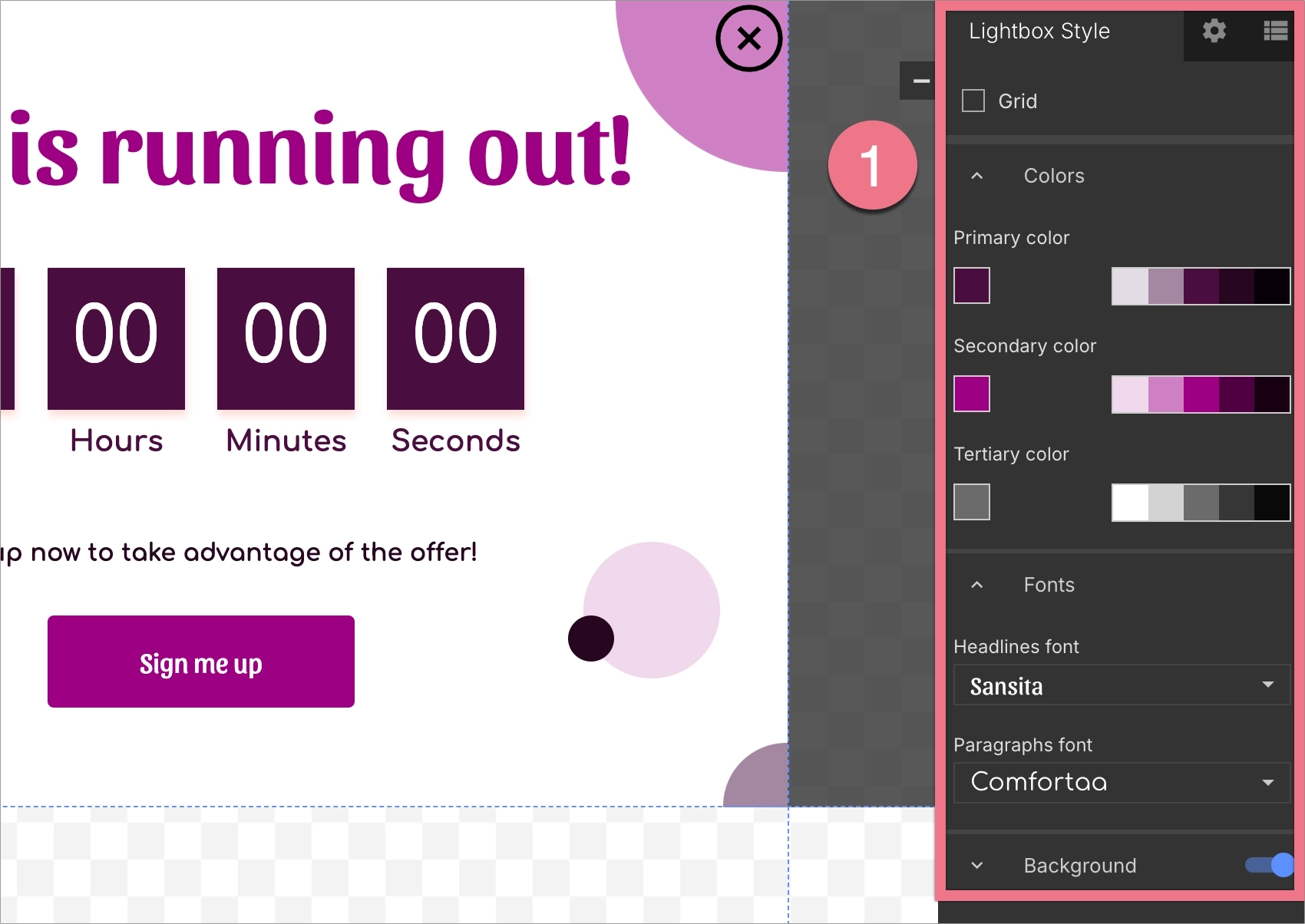

Editing their global settings works the same way as editing the Page Style settings.
Example of editing global colors and fonts for a popup:
Example of changing the color of an element in a lightbox: