Shapes are simple graphic elements that allow you to add visual interest to your page, divide your landing page into parts, create backgrounds for images to enhance their display, highlight a product with an attractive border, and more. They can also be used to create tables, serving as backgrounds or borders to organize information and improve readability while enhancing the overall aesthetics of the layout. Squares, ellipses, vertical lines, and horizontal lines are basic shapes, yet they offer limitless design possibilities.
This guide explains how to use the Shapes widget and provides some examples of its usage.
Add the Shapes widget
On the left side of the editor, find the Shapes widget, click it, select a shape, and then drag and drop it into the active area of your landing page.
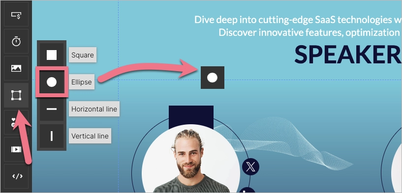
There are four shapes to choose from:
- square
- ellipse
- horizontal line
- vertical line
Each of them is fully editable.
Edit the Shape
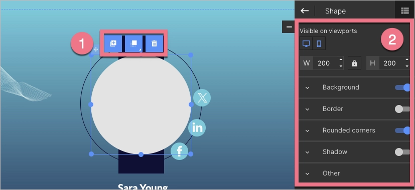
Click on the Shape to start editing. You will see its context menu (1) and toolbar on the right side of the editor (2).
- In the context menu, you can change the size of the Shape by clicking on the dots on the frame. The remaining icons let you duplicate the Shape, move it to the top or bottom, and delete it.
- In the right-side toolbar, you can turn on/off the mobile or desktop view (the Shape is visible in both views by default) and change the Shape size. Underneath, you will find tabs with additional options. The slider located in the right-hand corner of each tab (except the Other tab, where you can adjust the Shape position, copy the Shape ID, or add a class) allows you to turn them on or off.
Background
The Shape widget can be filled with solid color, gradient, or image.
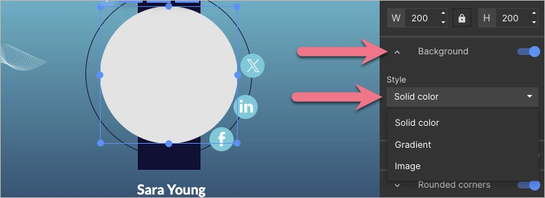
To customize solid color and gradient options, you can adjust the transparency, including full transparency, and set an angle for the gradient.
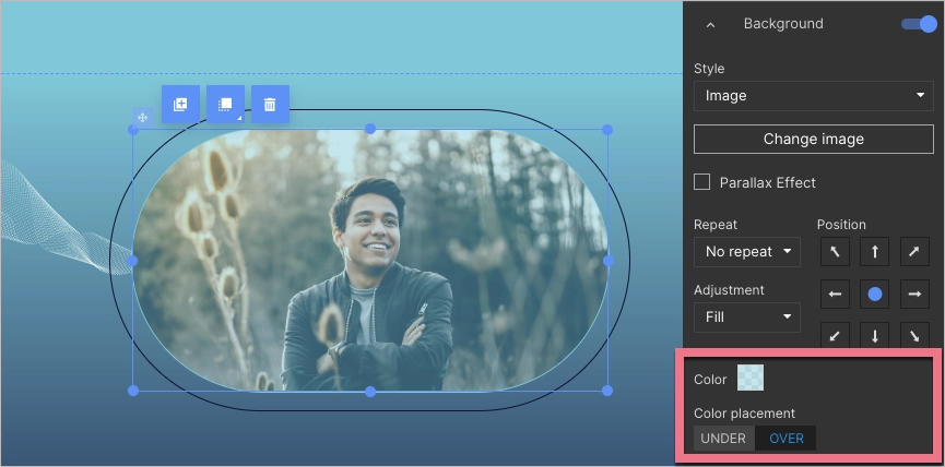
When selecting an image, you can choose one from your gallery or browse the Unsplash library. If you use a Shape background with an image, you can apply a parallax effect. Additionally, you can add a layer of color to the image in the Shape background. To do this, click Under or Over, select the color, and then adjust the transparency level.
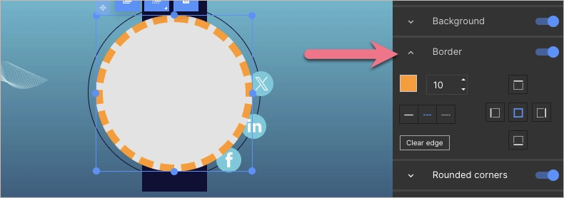
Border
The Border option for the Shape widget allows you to set the thickness, color, style (solid, dashed, or dotted), and placement of a border.
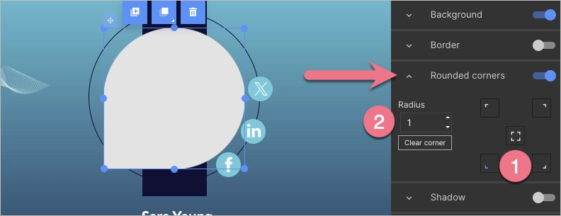
Rounder corners
The Rounded corners option allows you to set specific values to round corners. To do this, select a corner or choose all (1), then specify the radius (2).
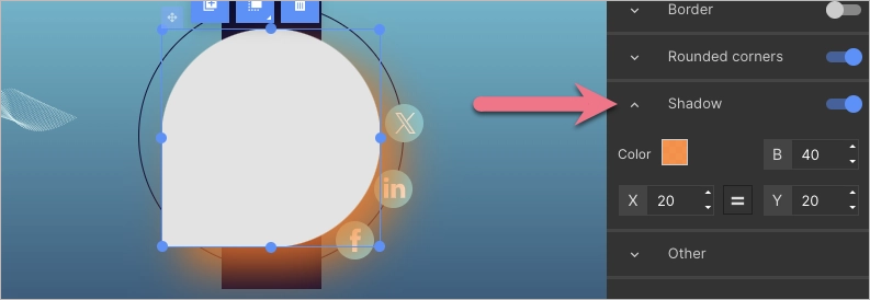
Shadow
The Shadow option allows you to set values for the shadow of the Shape. You can specify the color, blur, horizontal distance, and vertical distance of the shadow.
Examples of the use of Shapes
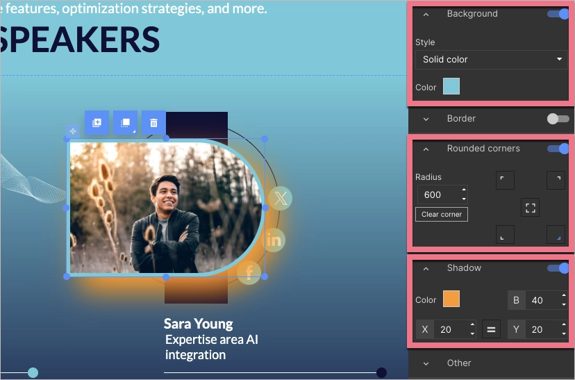
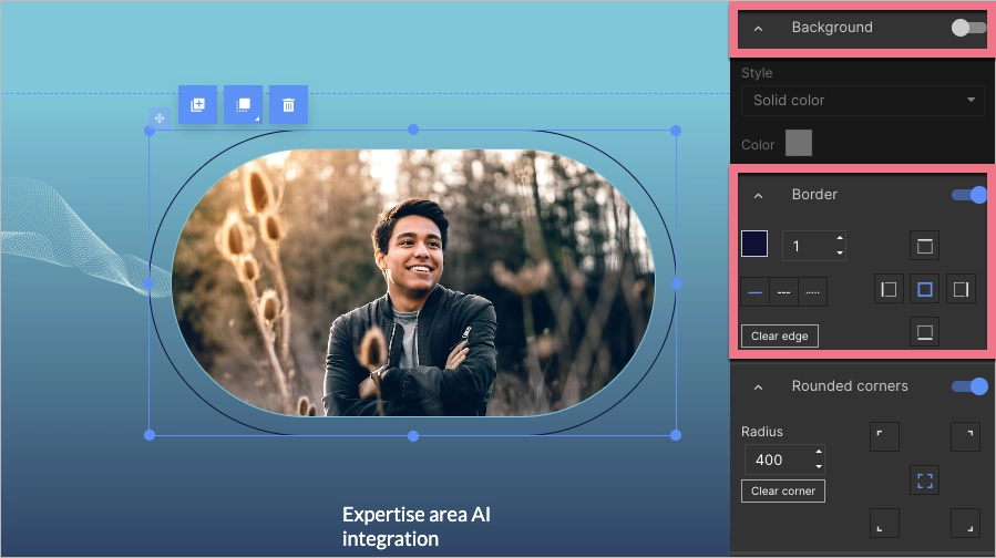
You can round one, two, or three corners, creating new shapes. To completely round a corner, set its radius to 600. You can apply similar settings to an Image widget and position it over the Shape. Take a look at the following settings:
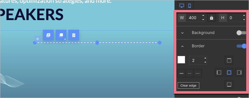
With Shapes, you can also create just a border. To do this, turn off the Background option and turn on the Border option. Take a look at the following settings:
To create a dotted or dashed line, turn off the Background, set the height to 0, turn on the Border option, set the thickness (e.g., to 2), and choose the style of the line. Take a look at the following settings:
Shapes and parallax effect
Combining shapes and the parallax effect can create visually interesting elements that effectively grab the attention of your landing page visitors.
Take a look at the following examples of the application of the Shapes widget and parallax effect.
Click to see the effect with a single Shape:
Click to see the effect with multiple Shapes and the same image:

