

A lead generation landing page is a standalone page built to collect user data—usually an email address—in exchange for something valuable, like a free trial, newsletter, or resource. Its purpose is to convert visitors into leads by focusing attention on a single action.
Top-performing pages use clear layouts, persuasive copy, and frictionless forms. According to WPForms (2023), the average form converts at 21.5%, but strong design and messaging can significantly outperform this.
Tools like Landingi simplify the process by letting you build optimized pages specifically for paid campaigns in Google Ads. Unlike CMS platforms, Landingi offers faster load times, A/B testing, and ad-focused templates—crucial for performance marketing.
In this article, you’ll learn what makes a lead gen page effective—from layout and copy to visuals and calls to action. You’ll also see real examples that show how different brands use landing pages to grow their email lists, attract leads, and promote their tools or services.

15 Best Examples of Lead Generation Landing Pages
These 15 lead generation landing page examples show how top brands turn clicks into conversions. Each one illustrates key success factors—clean layout, strong messaging, focused CTAs, and high perceived value.
Use these examples to guide your own page setup. Whether you’re optimizing an existing page or starting from scratch, they highlight what works in real-world campaigns.
1. Learn UI Design – Newsletter
The “Design Hacks” page by Learn UI Design is a high-converting lead generation landing page built to grow their email list. The headline is short, benefit-driven, and immediately communicates value. It leads with clarity and urgency, which boosts attention and clicks.
The layout is clean and visually appealing, using consistent colors and quality graphics to build trust. A short, frictionless sign-up form is placed high on the page, requiring only minimal user input—ideal for increasing conversion rates.
This page is used to capture leads from content-driven ads and organic traffic. It offers a free newsletter in exchange for an email, creating a low-barrier, high-value offer. Testimonials and logos from brands like Apple, Google, and Amazon provide social proof, reinforcing authority and increasing credibility.

What works:
- Clear, benefit-first headline
- Clean visual design
- Frictionless form placement
- Social proof via logos and testimonials
- Strong CTA that highlights the value
What could improve:
- Adding adaptive content (e.g. based on user behavior) could further personalize the experience and boost engagement.
Choose the Simple Monthly Newsletter template from Landingi to attract qualified leads effectively – its clean design, simple form, and minimal copy make the sign-up process easier and increase conversions.

Discover best practices for lead generation—design your page with Landingi!
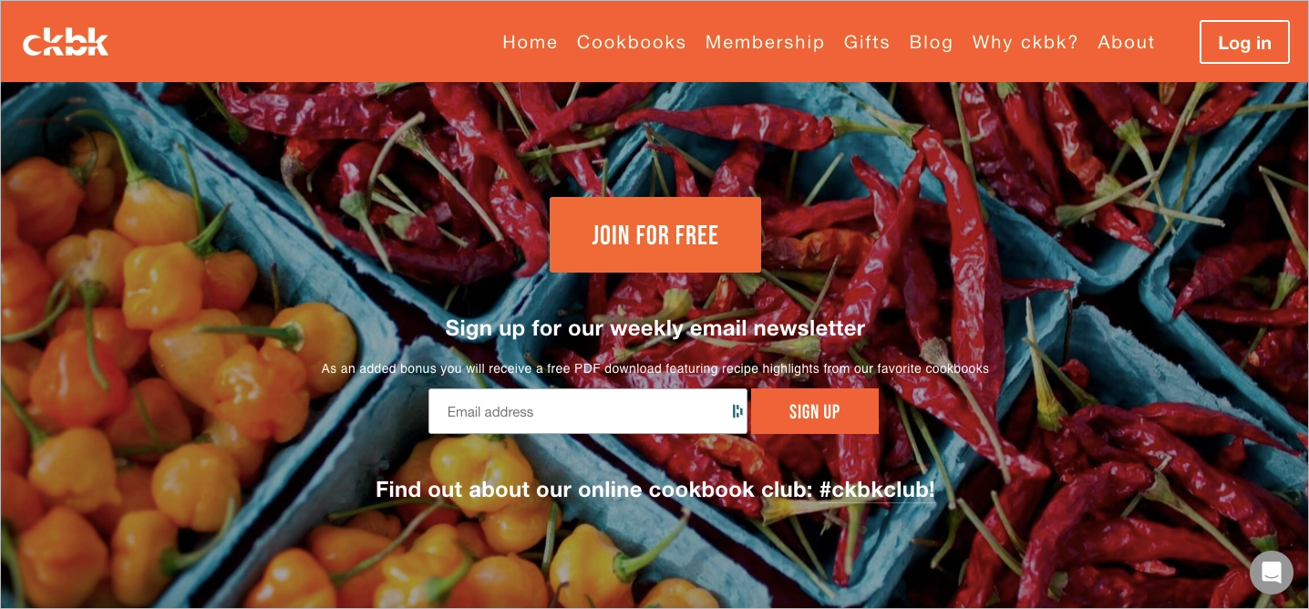
2. CKBK
CKBK uses its lead generation landing page to drive free trial sign-ups for its cookbook subscription platform. The offer is simple and enticing: access hundreds of premium cookbooks online with a free trial code—no hard sell, just immediate value.
The page combines strong visual storytelling with product immersion. A short video demo, high-quality food imagery, and feature highlights (like personalized collections and recipe filters) show users what they’re getting before they commit.
This page supports performance campaigns targeting food lovers and home cooks via paid channels and email retargeting. Social proof—chef endorsements, press mentions, and a clear cancellation policy—reinforces trust and reduces hesitation.
What works:
- Clear trial incentive upfront
- Immersive visual content (video + imagery)
- Product-driven layout with feature previews
- Multiple trust elements (quotes, media, policies)
What could improve:
- Stronger CTA focus above the fold could further lift sign-ups from first-time visitors.
3. Intercom
Intercom’s lead generation landing page for Fin, their AI-powered support tool, keeps things crisp and compelling from the first glance. The headline, “Deliver exceptional customer service with Intercom,” hits with a clear, benefit-driven message. Just below, the supporting copy positions Fin as a smart, scalable solution capable of handling full frontline support—human-like service, without the human wait time.
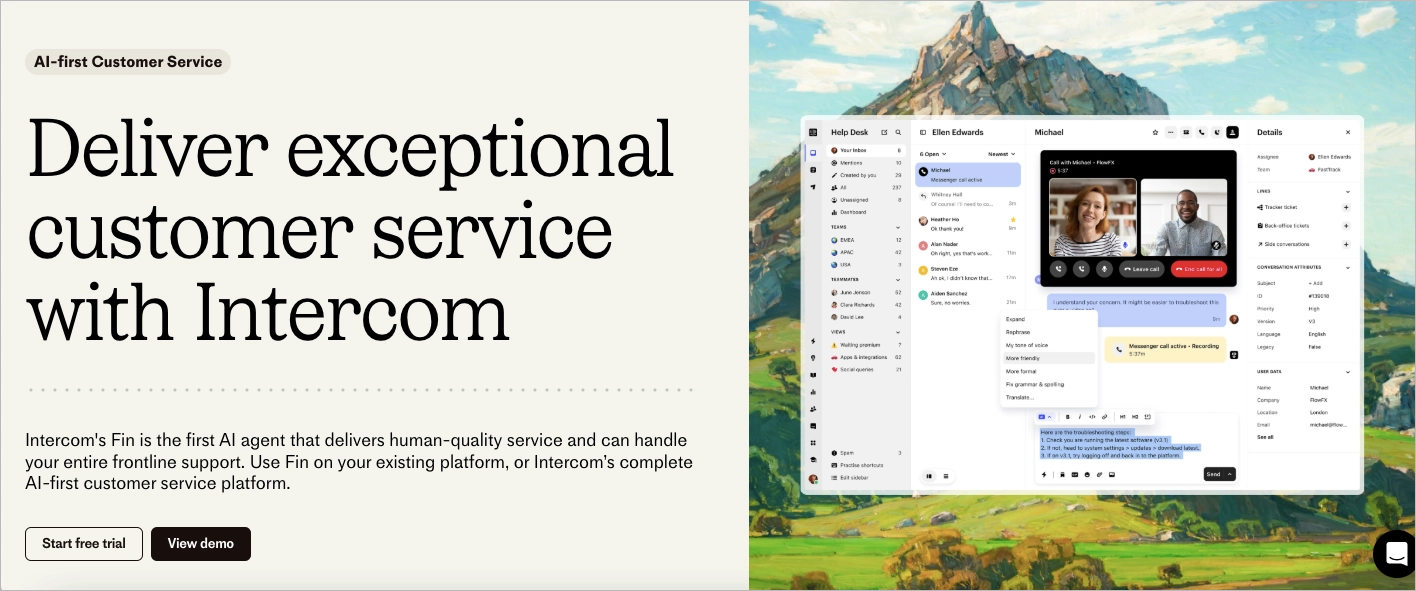
What works:
- Direct, benefit-focused messaging
- Dual CTA strategy (trial + demo)
- Real product visuals for credibility
- Lightweight, high-scan layout
What could improve:
- Adding industry-specific use cases could increase relevance for segmented audiences.
4. Akuto Studio – Wishlist
Akuto Studio uses this lead generation landing page to capture early interest in the Chord Machine AKT-0.1. Designed for music tech enthusiasts, the page combines bold visuals with minimal copy to highlight product appeal without clutter.
The layout is clean and editorial, with strong imagery, scannable spec tables, and a single-field wishlist form. This low-friction setup turns casual curiosity into leads, especially from product drops and teaser campaigns on social.
This page supports email list building ahead of product launch. Subtle trust signals—like mailing list size—reinforce credibility, while the design speaks directly to a niche, style-conscious audience.

What works:
- Striking product visuals
- Simple, focused copy
- Low-barrier wishlist form
- Social proof without distraction
What could improve:
- Adding a short video demo or sound preview could further boost engagement for audio-first users.
The App Pre Launch template from Landingi is perfectly designed for lead-generation purposes. Its layout with strategic white space directs visitors’ attention to the focused content, and a clear form with an outstanding CTA encourages them to take the desired action.

Optimize your landing page for lead generation—build with Landingi today!
5. Trello
Trello’s lead generation landing page takes a minimalistic, high-conversion approach. The soft visuals, friendly illustrations, and clean layout create a distraction-free space focused entirely on the sign-up form.
With just one email field, the form is optimized for quick conversions. The copy emphasizes collaboration and productivity, appealing to a broad audience without overwhelming users with features.
This page supports top-of-funnel campaigns aimed at professionals looking for team tools. Trust is reinforced through app store badges and light mentions of team use cases across industries.
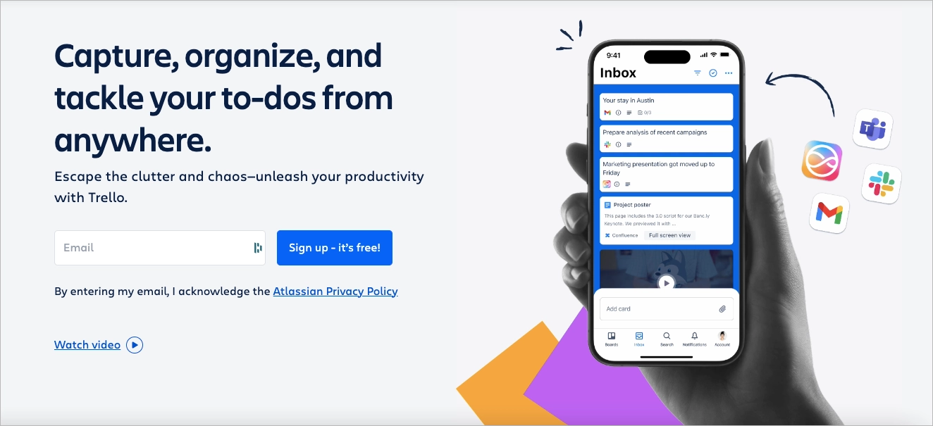
What works:
- Low-friction form with clear CTA
- Clean, welcoming design
- Messaging focused on outcomes, not specs
- Broad appeal with subtle credibility cues
What could improve:
- Adding personalized CTAs based on user role or team size could lift relevance and conversions.
6. Backlinko
Backlinko’s newsletter landing page is a masterclass in minimal, high-conversion design. The headline—“Proven SEO Tips Straight to Your Inbox”—delivers immediate value. A single email field and a soft CTA (“Try it”) make sign-up fast and frictionless.
Social proof appears right away: logos from Apple, Amazon, and Forbes, along with a bold subscriber count of 180,000+, establish instant credibility. The layout is stripped down and conversion-focused, using whitespace and visual hierarchy to keep attention locked on the form.
This page is used to capture leads from blog readers, podcast listeners, and YouTube viewers. It works as a scalable, always-on asset—embedded in blog posts, video descriptions, and exit-intent pop-ups. The simplicity, trust signals, and ultra-clear offer make it ideal for top-of-funnel acquisition.
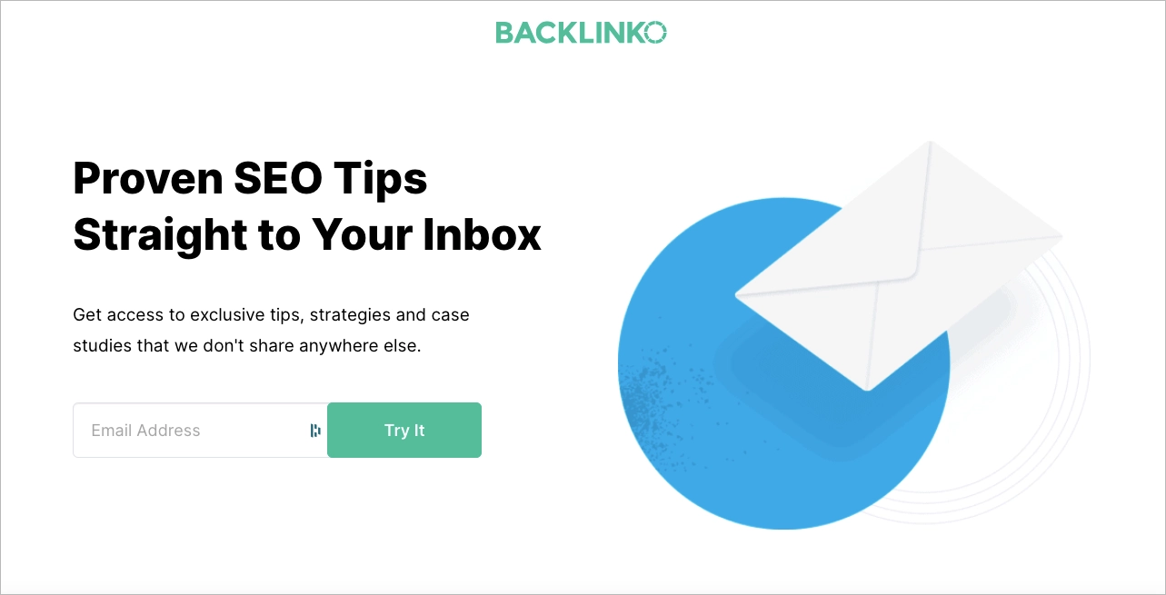
What works:
- Benefit-first headline and one-field form
- Immediate social proof with trusted brand logos
- Clean layout focused on the form
- Strong alignment with organic and content-driven traffic
What could improve:
- Previewing a sample tip or newsletter issue could boost perceived value and post-signup retention.
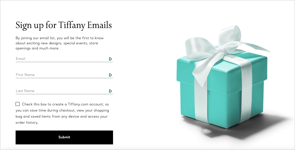
7. Tiffany.co
Tiffany’s lead generation landing page reflects the brand’s luxury positioning: refined, minimal, and quietly persuasive. The offer is clear—early access to new collections, events, and store openings—delivered through a clean form with just two fields: name and email.
The design relies entirely on visual identity. Signature Tiffany Blue, precise typography, and total absence of distractions create a feeling of exclusivity. There are no outbound links, no clutter—just a single, elegant path to sign-up.
This page is used in lifestyle and brand awareness campaigns, especially on social media and high-end editorial placements. It converts aspirational traffic into leads by offering insider access, rather than promotional discounts. The luxury tone is maintained throughout, turning sign-up into part of the brand experience.
What works:
- Elegant, trust-based design
- Minimal form for quick conversion
- Focused messaging around exclusivity
- Seamless alignment with brand identity
What could improve:
- Adding a subtle confirmation of what users will receive (e.g. email frequency) could improve post-signup clarity.
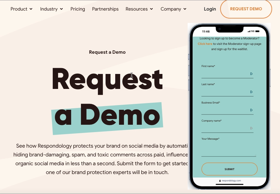
8. Respondology
Respondology’s lead generation landing page is built for a single goal: drive demo requests. The headline is direct, the layout is minimal, and the form is placed for immediate action.
Messaging targets a B2B audience, especially social media and community managers looking to moderate toxic comments and protect brand conversations. The CTA (“Request a Demo”) aligns perfectly with their pain point and stage in the decision process.
This page is used in bottom-of-funnel paid campaigns, especially LinkedIn ads and retargeting flows. Its simplicity supports high-intent visitors who already know the problem and want a fast path to a solution. The friction is low, but conversion could improve with a live scheduler or product screenshots for added clarity.
What works:
- Clear, single-purpose structure
- Strong alignment with audience need
- Low-distraction layout
- CTA matched to user intent
What could improve:
- Adding a product preview or embedded demo calendar could boost trust and reduce hesitation.
9. Laurie Wang – Starter Kit
Laurie Wang’s lead generation landing page promotes her Ultimate Online Business Resources and Starter Kit—a free download aimed at aspiring entrepreneurs and digital creators. The headline is benefit-focused and immediately speaks to the target audience: people launching or growing an online business.
The layout is clean and mobile-friendly, with high-quality visuals and a short form that lowers friction. Benefits are listed clearly and are easy to scan, while CTAs are placed exactly where conversion intent peaks.
This page is used primarily in content-driven campaigns, including organic blog traffic, Instagram Stories, and newsletter sign-up incentives. It functions as a key asset in her funnel—offering value upfront, nurturing trust, and segmenting users for future email marketing.

What works:
- Clear headline and audience alignment
- Short, responsive sign-up form
- Clean layout with visual support
- Strong funnel integration via content and email
What could improve:
- Adding previews of included resources (e.g. screenshots or checklists) could boost perceived value.
Generate leads with the Best Recipe template – use its potential, clearly set up the value proposition, and use persuasive headlines and benefit-oriented copy. Keep the form above the fold to boost conversions.

Turn visitors into leads—create a lead generation landing page with Landingi!
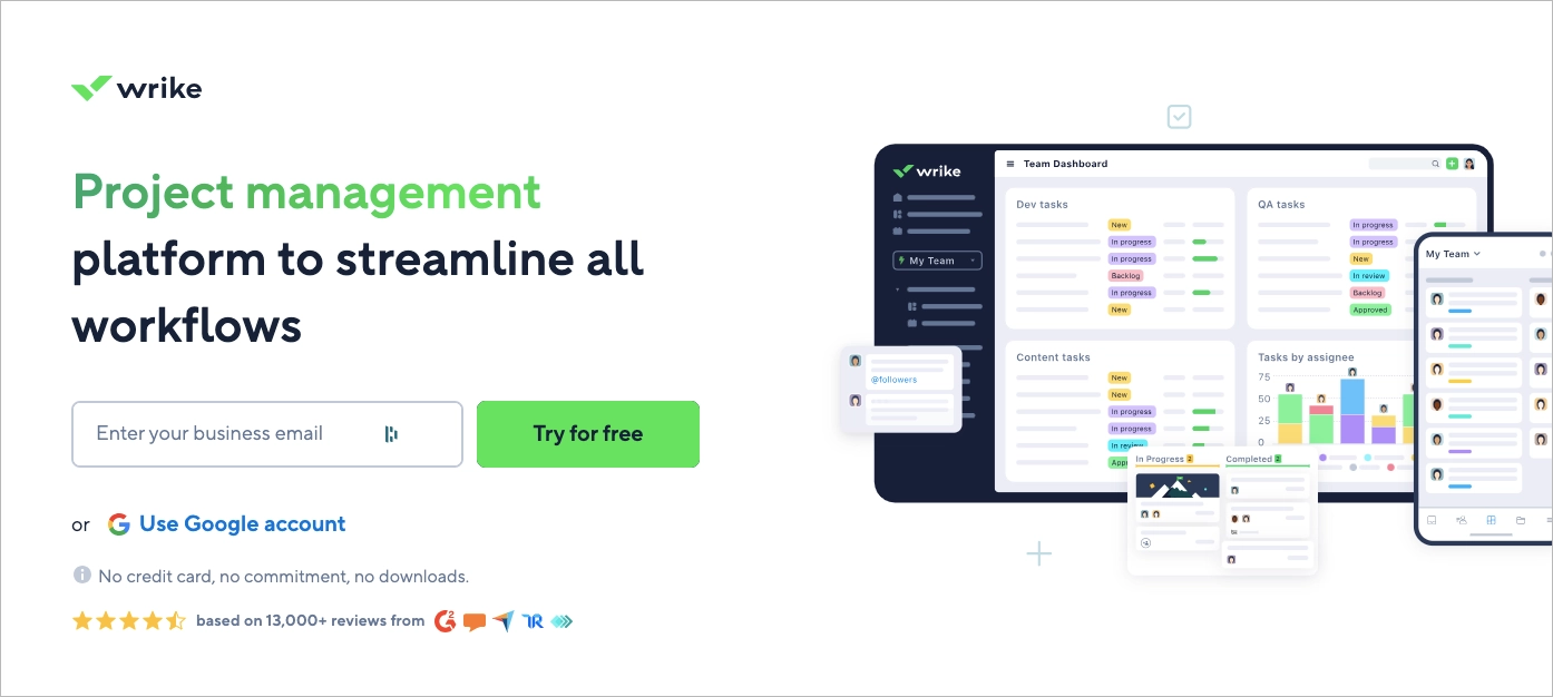
10. Wrike
Wrike’s lead generation landing page is built for fast, high-intent SaaS sign-ups. The headline—“Project management platform to streamline all workflows”—sets a clear expectation. A single email field and bold “Try for free” CTA minimize friction and encourage immediate action.
The layout is purposefully split: the left side drives sign-up via email or Google, while the right side displays a product screenshot showing Wrike’s clean dashboard and collaboration features. Trust signals below—like “No credit card required” and user ratings—reinforce safety and confidence.
This page is used in performance marketing campaigns across paid search and LinkedIn, targeting project managers and teams. It captures leads at the bottom of the funnel with high clarity, fast loading, and strong alignment to purchase intent.
What works:
- Clear headline with outcome-focused messaging
- One-step sign-up flow (email or Google)
- Live product preview to set expectations
- Built-in trust indicators (no credit card, ratings)
What could improve:
- Adding segmented CTAs for teams vs. individuals could personalize the offer and improve lead quality.
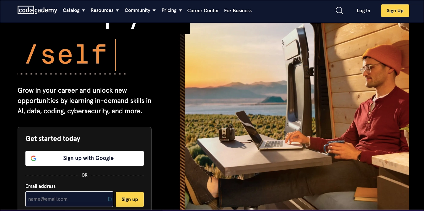
11. Codeacademy
Codecademy uses its homepage as a lead generation landing page designed for speed and simplicity. The headline—“Learn job-ready technical skills”—delivers clear value. The CTA, “Sign up — it’s free,” removes hesitation and invites immediate action.
Visitors can start with a quick email form or sign up instantly using Google, GitHub, or LinkedIn. A guided quiz helps users identify their learning path, adding personalization early in the funnel. Social proof is present but subtle—“Join over 50 million learners” and student testimonials build trust without crowding the interface.
This page supports freemium acquisition campaigns, SEO traffic, and referrals from influencers and tech blogs. Its hybrid role as homepage + lead magnet makes it effective across multiple traffic sources and intent levels.
What works:
- Fast, frictionless signup options
- Clear value proposition from the first second
- Built-in personalization (learning path quiz)
- Scalable for organic and paid traffic
What could improve:
- Highlighting specific course categories could help users self-identify faster and improve segmentation.
12. Landbot – Free Trial
Landbot’s landing page for its AI Chatbot Generator targets marketing, sales, and support teams with a clear value proposition: automate conversations without coding. The headline is direct, and the visuals support the product’s interactive nature without overwhelming the user.
The layout is modern and conversion-focused. A short form and prominent CTA guide users into the free trial quickly. Scrolling reveals social proof—client logos and brief testimonials—that reinforce trust and demonstrate the product’s real-world utility.
This page is used in performance-based SaaS campaigns, especially paid search and social, where speed and clarity are key. It also supports retargeting flows for users who interacted with blog content or product tours. The structure is built for high-intent leads with minimal onboarding friction.

What works:
- Clear, benefit-led headline
- Short form for low signup resistance
- Effective use of social proof (logos + testimonials)
- Design that reflects product use (chat-style interaction)
What could improve:
- Page speed optimization across mobile could improve UX and reduce drop-offs.
Create a free trial offer with Your Music App template from Landingi – it’s designed to immediately attract visitors and direct them through powerful content to complete the form.

Learn from top lead generation examples—design your page with Landingi!
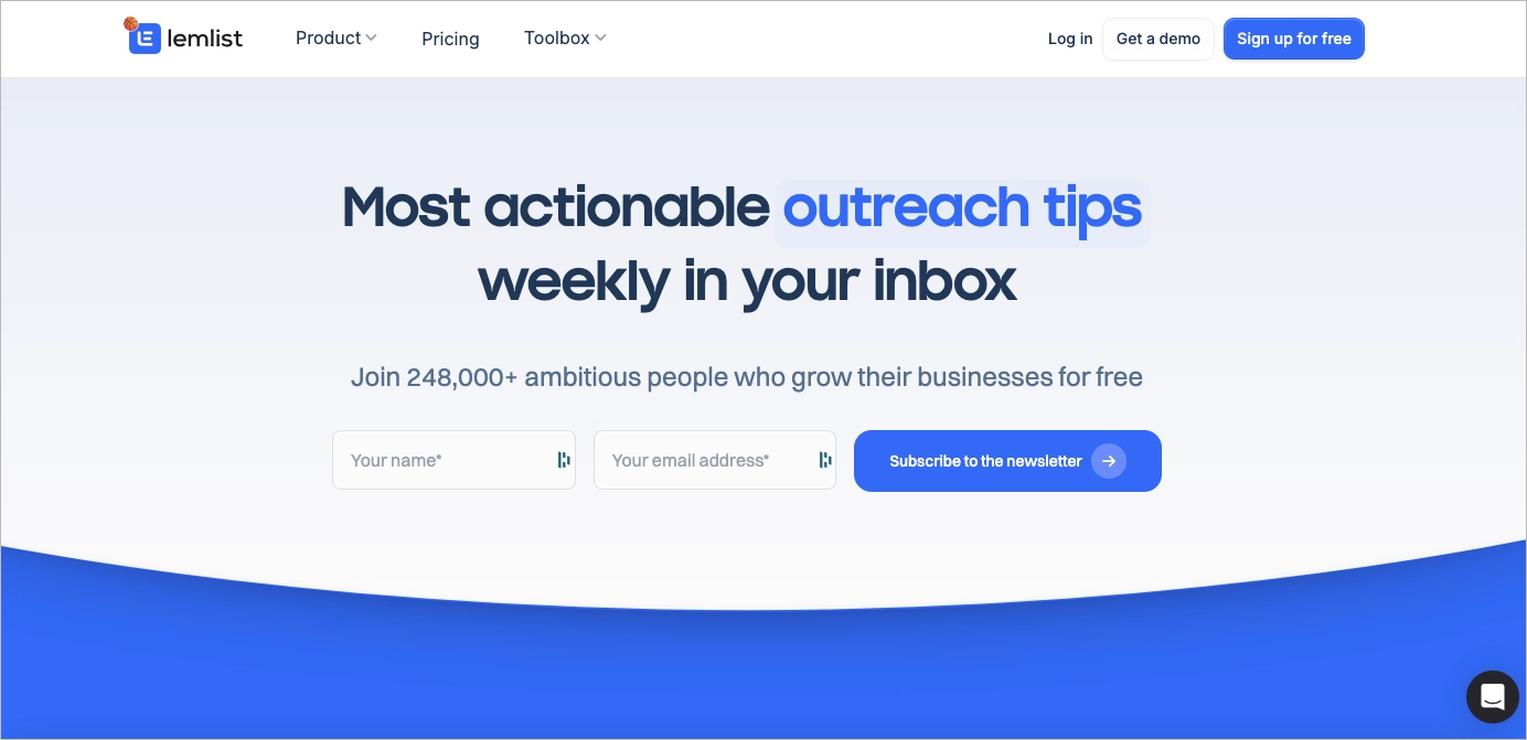
13. Lemlist
Lemlist’s lead generation landing page is a textbook squeeze page—minimal, fast, and focused on one goal: collect emails. The headline, “Most actionable outreach tips weekly in your inbox,” tells users exactly what they’ll get. Below it, a single email field and a strong CTA drive conversions with zero distractions.
Social proof is immediate: “Join 248,000+ ambitious people” builds instant trust and creates FOMO. The design is stripped down—no extra content, no secondary links—so attention stays locked on the value and the action.
This page is used in email list growth campaigns across blog posts, LinkedIn content, and SaaS onboarding flows. It works particularly well for retargeting visitors already familiar with Lemlist’s tools or content.
What works:
- Clear, benefit-focused headline
- One-field signup form
- Strong social proof above the fold
- No competing elements or distractions
What could improve:
- Adding a preview of past content or bonus perks (e.g. templates) could increase perceived value and signup motivation.
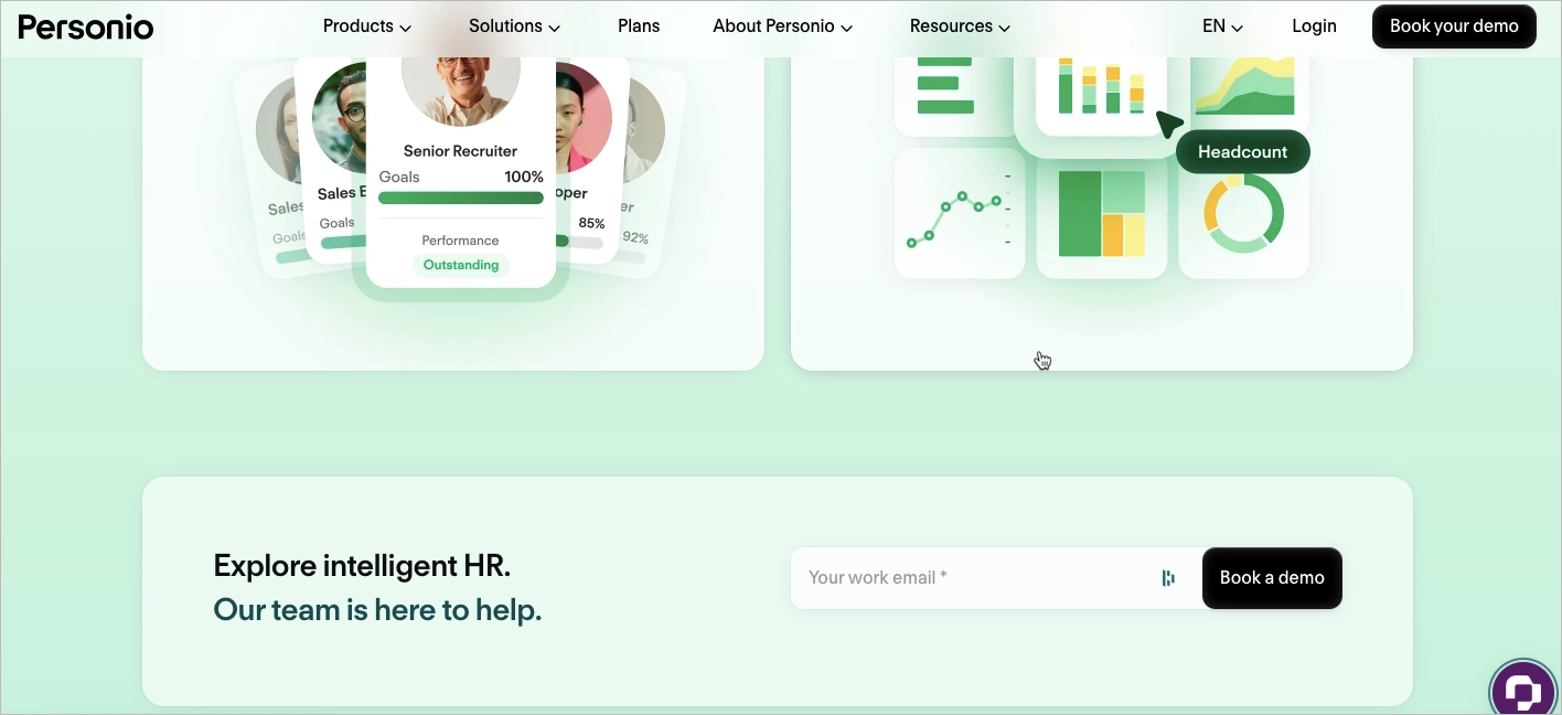
14. Personio
Personio’s lead generation landing page targets HR leaders with a clear offer and a premium feel. The headline—“The intelligent HR platform”—is direct, while the primary CTA, “Book your free demo,” sets the intent from the first screen.
The copy is sharp and minimal. Phrases like “Automated. Adaptable. Insightful.” speak to decision-makers who want efficiency without buzzwords. Trust is reinforced early with logos from well-known enterprise clients.
This page is used in B2B demo campaigns, especially through paid LinkedIn ads, intent-based retargeting, and HR-focused content sponsorships. A secondary mid-page form offers another conversion point for engaged scrollers, reducing drop-off.
What works:
- Direct CTA and clear audience targeting
- Punchy, benefit-driven messaging
- Two-step lead capture strategy (top and mid-scroll)
- Visual contrast on CTAs to guide action
What could improve:
- Adding a short product explainer video could speed up understanding for new leads.
15. Imperative Concierge – Consultation
The Imperative Concierge landing page is a focused lead generation tool designed to convert time-strapped professionals into qualified leads. The headline addresses a real pain point—overload—and immediately positions the solution: a free consultation to explore how a virtual assistant can help.
A short, benefit-focused video follows, showing how offloading tasks can improve productivity. The signup form is simple, paired with a bold CTA and a pop-up scheduler that streamlines the next step. Client testimonials help build trust with first-time visitors.
This page is used in targeted lead gen campaigns via Google Ads, niche business podcasts, and email automation. It converts well in service-based funnels where personal connection and time savings are key decision drivers.

What works:
- Problem-first headline with clear offer
- Embedded video for emotional and practical appeal
- Scheduling tool for immediate lead qualification
- Strong use of testimonials for trust
What could improve:
- Adding an FAQ section could help reduce objections around pricing and onboarding for new users.
Offer a free consultation and gather leads with a Business Coaching template from Landingi – craft targeted content, use the power of well-structured forms, and complete your conversion funnel with a perfect lead generation landing page.

Follow lead generation best practices—start building your landing page with Landingi!
What Is a Lead Generation Landing Page?
A lead generation landing page is a standalone page with one purpose: capture contact information, like an email or phone number, in exchange for something valuable. The offer might be a free guide, newsletter, or webinar—what matters is that it’s clear, relevant, and easy to claim.
What makes these pages work is the value exchange. Visitors must instantly understand what they’re getting and why it’s worth sharing their details. A strong headline, persuasive subcopy, and short form work together to drive action.
Effective pages eliminate distractions. They use simple layouts, bold CTAs, and frictionless forms to guide users toward a single action. This is where curiosity turns into connection—and where real growth starts.
Create a high-converting lead generation landing page—start with Landingi!
How to Create a Lead Generation Landing Page?
To build a high-converting lead generation landing page, start with a clear objective. Are you aiming for newsletter sign-ups, demo requests, or resource downloads? Your goal defines the structure, tone, and offer.
Next, align the message with your audience. What pain point are they trying to solve? What would motivate them to take action? Use that insight to shape the offer and call to action.
Use a tool like Landingi to design and launch pages without coding. These platforms help you move fast while testing layouts, forms, and copy variations.
Focus on clarity. Write a benefit-first headline, support it with visuals, and keep the copy concise. Add trust elements like testimonials or partner logos, and guide users with a bold, well-placed CTA. Always use a short, mobile-optimized form.
Follow the 7-step guide below to create a landing page that captures leads—and converts attention into action.
Step 1. Define Your Goal and Audience
Start by identifying the specific goal of your landing page. Do you want to capture email sign-ups, promote a free trial, or drive downloads? Your objective will directly influence the layout, CTA, and messaging.
Then, define your target audience. What motivates them? What pain points are they trying to solve? Tailor the offer to their intent—someone considering a trial may need social proof, while a newsletter subscriber looks for quick, practical value.
Clear goals and audience insights ensure your page speaks to the right person with the right message.
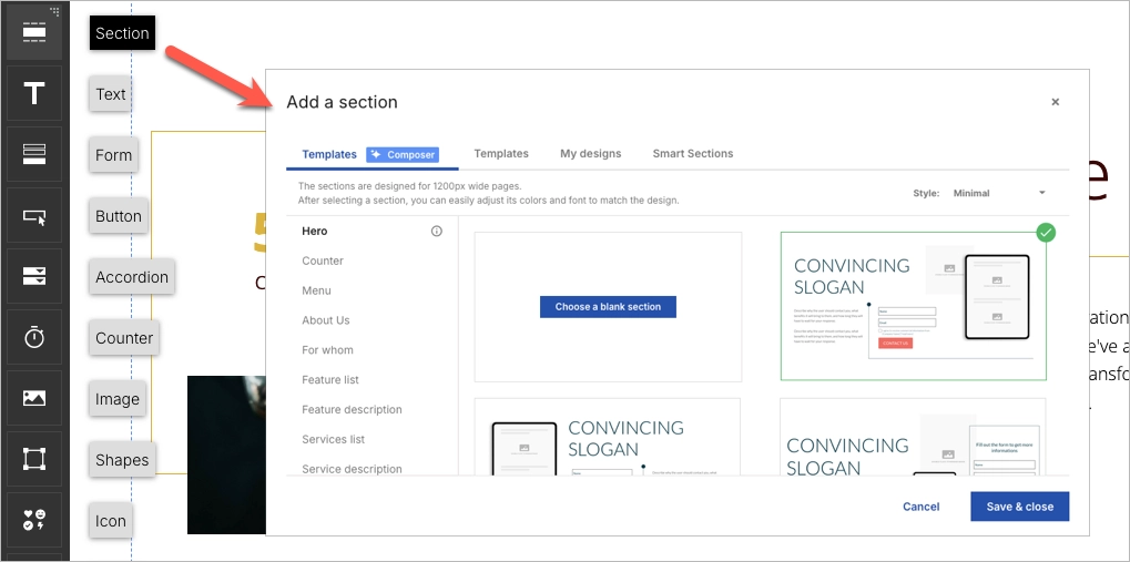
Step 2. Choose a High-Converting Template
Start with a proven foundation. Landingi offers over 400 lead generation templates, each designed to convert. Click Create new landing page, then browse the library by goal or industry to find a layout that fits your offer.

You can also start from scratch or use Composer, Landingi’s AI tool that generates ready-to-edit landing page content. Once selected, use the drag-and-drop editor to customize headlines, forms, and sections—no coding required.
Use Smart Sections to apply consistent branding across pages. This makes it easy to launch and scale campaigns faster.
Step 3. Craft a Compelling Headline and Engaging Copy
Your headline is the first thing visitors see. It should grab attention fast and clearly explain what the visitor gets out of the page. Think benefit-first: instead of “Sign Up for Our Newsletter,” go with “Get Weekly Marketing Tips That Grow Your List.”
Use persuasive, conversational copy that focuses on value. What’s in it for the visitor? Keep the tone friendly and straightforward, and use subheadings or short paragraphs to make the content easy to scan.

Tools like Landingi’s AI Assistant can help generate copy that aligns with your offer and nudges visitors toward conversion.
Step 4. Enhance Visual Appeal with High-Quality Images and Videos
Visuals play a huge role in lead generation—especially when you’re asking someone to take action fast. They can build trust and keep visitors engaged. Use clean, high-resolution images that support your offer and help tell the story.
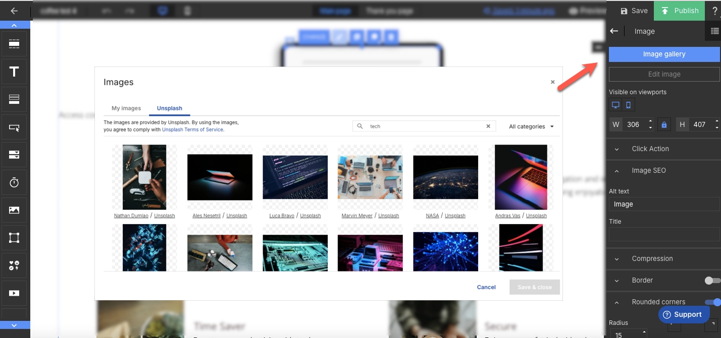
With Landingi, you can easily upload and edit images directly in the editor. Use the built-in background remover to keep visuals focused and distraction-free. Want to go further? Add short videos or animated elements to explain your offer in motion—but keep it light. Fast load times matter, so always optimize for performance.
Step 5. Implement a Lead Capture Form with a Strong CTA
Your form is where interest turns into action—so it needs to be easy, quick, and clearly worth it. With Landingi’s form builder, you can create clean, user-friendly forms that ask only for what you really need (think: name, email, maybe one more field). The shorter the form, the higher the chance someone actually fills it out.
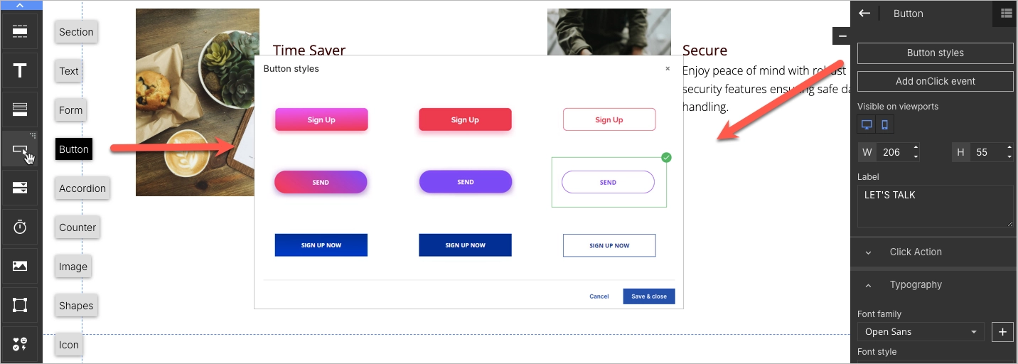
Right next to the form, add a CTA that’s direct and benefit-focused. Instead of something vague like “Submit,” go for “Get Your Free Guide” or “Send Me the Checklist.” Use button colors that stand out from the rest of the page and place your CTA where it’s easy to find—above the fold, after key sections, and right where people are ready to say yes.
Step 6. Add Interactive and Trust-Building Elements
To keep visitors engaged and build trust, add elements that make your page feel dynamic and credible. Interactive features—like countdown timers or exit-intent pop-ups—can create a sense of urgency and highlight time-sensitive offers. Just make sure they’re helpful, not distracting.
Trust signals are just as important. Add testimonials, partner logos, or user reviews to show social proof. If you’ve been featured somewhere, say so. You can also link to your social media profiles to give visitors a quick way to check you out and build confidence in your brand before they hit “submit.”
Step 7. Optimize for Mobile and Publish with a Custom Domain
Most users will visit your landing page on their phone—so mobile optimization isn’t optional. With Landingi’s mobile view editor, you can fine-tune layouts, resize text, and adjust button placement to make sure everything looks clean and works smoothly on smaller screens.

Before you hit publish, connect your custom domain to keep your branding consistent and give your page a more professional feel.
Once your page is live, use Landingi’s built-in analytics and A/B testing tools to see what’s working and where there’s room to improve. A few small tweaks can make a big difference in conversions.
Ready to generate more leads? Build your landing page with Landingi now!
3 Lead Generation Landing Page Best Practices
The right structure can turn your landing page from a passive touchpoint into an active conversion tool. Below are three best practices that consistently improve performance, especially for lead generation.
These tactics help you increase engagement, reduce bounce rates, and turn visitors into qualified leads. Whether you’re running paid ads or driving organic traffic, applying these principles will make your page more effective—and more valuable in your broader marketing strategy.
#1 Focus on a single objective
Every lead generation landing page should have one clear goal. Whether it’s collecting email sign-ups, offering a free trial, or booking a consultation, your entire page should guide visitors toward that one action.
Keep the layout simple and distraction-free. Avoid multiple CTAs or navigation links that lead users away from the conversion point. A single focus improves clarity and increases the chance of completion.

Tailor your content around that goal. Use a direct headline, concise messaging, and a CTA that highlights urgency or value—like “Get My Free Trial” or “Start in 30 Seconds.” Every element should reinforce the one thing you want the visitor to do.
Maximize your lead generation—create an optimized landing page with Landingi!
#2 Use simple forms
Simple forms convert better—period. The fewer fields a visitor has to complete, the more likely they are to do it. For lead generation, that can be the difference between a bounce and a qualified lead.
Stick to essential fields only. In most cases, name and email are enough. You can add one campaign-specific field if needed, but avoid asking for sensitive or non-critical data early on.
If your offer requires collecting sensitive data, include a privacy assurance message near the form. This builds trust and can mitigate friction.
Make sure your form is mobile-friendly. Use large, tap-friendly fields, clear labels, and spacing that works well on smaller screens. Enable autofill and predictive text to speed up completion.

Use a bold, clear CTA button with action-driven copy like “Get Your Free Guide” or “Start My Free Trial.” Choose a contrasting color to make the button stand out and signal the next step.
Get more qualified leads—design your landing page with Landingi today!
#3 Create an irresistible offer
Your offer is the main reason someone will submit their info—so make it count. A relevant, high-value offer can dramatically increase conversions and turn passive visitors into qualified leads.
Start by understanding what truly matters to your audience. What are their pain points or goals? Build your offer around solving that. It could be a free ebook, discount code, checklist, consultation, or exclusive access—just make sure the perceived value outweighs the cost of sharing personal data.

Be honest and specific. Clearly explain what users will receive, and ensure the landing page reflects the offer accurately. Overpromising can damage trust and increase churn.
To push conversions further, add urgency or scarcity. Use tactics like “Offer ends in 24 hours,” “Only 100 spots available,” or “Download expires soon” to encourage fast action. These small changes can have a big impact on decision-making.
Unlock the power of lead generation—create a landing page with Landingi now!
FAQ – Lead Generation Landing Page
Have questions about building high-converting landing pages? This FAQ covers the most common challenges marketers face—from design and forms to tools and conversion best practices.
How Can I Optimize My Lead Generation Landing Page for Higher Conversion Rates?
To increase conversions, focus on clarity, speed, and simplicity. A well-optimized landing page removes friction and guides visitors toward one specific action. Use the checklist below to fine-tune your page:
- Streamline the design
Keep it clean and focused. Remove distractions that pull attention away from the CTA. - Craft compelling copy
Speak to the user’s pain points and show how your offer solves them. Keep it short and benefit-driven. - Minimize form fields
Only ask for essential info. Fewer fields = higher completion rates. - Use high-quality visuals
Add relevant images or videos that reinforce the offer’s value and attract attention. - Leverage social proof
Include testimonials or client logos to build trust and validate your offer. - Optimize for mobile
Ensure fast load times, large tap areas, and responsive design on all devices. - Run A/B tests
Test variations of headlines, buttons, forms, and images to see what drives the most conversions. - Add a lead magnet
Offer a free resource (e.g., ebook, trial, checklist) to increase sign-up motivation. - Set a clear CTA
Use direct, action-oriented text like “Start Free Trial” or “Download the Guide.”
By applying these practices, you’ll build a lead generation page that performs better across devices and traffic sources—turning more visitors into qualified leads.
What Are the Key Elements of an Effective Lead Generation Landing Page?
The key elements of an effective lead generation landing page include concise but well–written copy, persuasive headlines indicating the valuable offer, attractive visuals, clear layout, outstanding CTAs, and forms strategically crafted to convert visitors into leads. The best lead generation landing pages perfectly balance their informative and visual sides with functional elements that, mixed together, efficiently convert visitors into leads.
Each well-performing lead generation landing page should include the following key components:
- Compelling headline – powerful enough to engage visitors immediately upon landing on the page.
- Persuasive subheadings – providing additional details about the benefits and features of the offer.
- High-quality images or videos – relating directly to your offer and illustrating the benefits in a clear and attractive manner.
- Concise and persuasive copy – easy to read and crafted to persuade your audience to take action.
- Lead capture form – placed above the fold so it’s visible without needing to scroll.
- Clear CTA – outstanding with vibrant colors and positioned strategically to draw the eye, inciting urgency or excitement, prompting immediate clicks.
- Social proof – elements like reviews or well-known brand logos, showcasing that others have benefited from what you’re offering.
- Trust signals – security seals, associations, awards, or media mentions, reassuring visitors that they are dealing with a reputable and secure entity.
These elements work together to create a landing page that not only attracts visitors but also effectively converts them into leads by addressing their needs and offering a clear, valuable solution.
What Is the Best Lead Generation Landing Page Builder?
The best lead generation landing page builder is Landingi, a multifunctional platform designed to maximize lead conversions with its user-friendly interface and comprehensive suite of digital marketing tools. Suitable for both beginners and experienced marketers, Landingi offers an effective solution for achieving conversion goals.
Starting with a selection of professionally designed templates, you can easily customize your landing pages to meet specific lead generation objectives. Landingi’s editor allows you to quickly integrate custom images, engaging content, and key conversion elements.
Beyond basic page creation, Landingi’s advanced optimization tools – including A/B testing, EventTracker for user behavior analysis, and AI Assistant – transform a simple landing page into a dynamic marketing tool. These features facilitate continuous optimization, providing insights for enhancements and supporting effective lead-collection strategies.
Landingi is not only budget-friendly but also equipped with advanced capabilities to support individual marketers and agencies alike, making it the perfect platform for building high-performing lead-generation landing pages.
Why do I Need a Lead Generation Landing Page?
A lead generation landing page helps you turn website visitors into qualified leads by focusing their attention on a single, valuable action—like signing up, booking a demo, or downloading a resource. It gives you full control over messaging, layout, and call to action—making it easier to convert interest into contact information.
Whether you’re running ads, promoting content, or growing your email list, a dedicated lead gen page increases your chances of capturing leads—and improves ROI across your marketing efforts.
Create a Lead Generation Landing Page with Landingi
A high-performing lead generation landing page combines persuasive content, strong visuals, and a clear goal. But building the page is only the beginning—ongoing optimization is what turns it into a consistent source of qualified leads. By following best practices and using smart tools, you can create a page that not only looks great but also converts effectively. That’s where Landingi comes in.
With Landingi, you can launch and test professional landing pages—without coding. Use A/B testing, behavior tracking, and AI-powered content tools to continuously improve performance. Start building with Landingi today and turn your traffic into real business results!


