Landing page best practices are essential guidelines that can dramatically improve your digital marketing outcomes. When implemented strategically, these practices can boost conversion rates by up to 300%.
A thoughtfully designed landing page does more than simplify lead generation – it actively shapes visitor behavior through intentional aesthetics and functionality. Adobe’s research shows that 59% of people prefer beautifully designed content over plain text when given 15 minutes to consume content.
In this guide, we’ll walk through 12 real-world examples of high-performing landing pages and demonstrate how Landingi can help you optimize your landing pages to maximize both your lead generation and landing page conversion rates.
What Makes a Landing Page Effective?
Effective landing pages strategically combine clean layouts, targeted content, strong CTAs, trust signals, and responsive design to guide visitors toward specific actions like purchases or sign-ups.
Here are essential elements to optimize:
- Uncluttered design. Create a clean layout with intuitive navigation and compelling visuals that immediately capture attention and guide visitors.
- Concise content. Keep messaging focused and aligned with visitor expectations, providing just enough information for quick decision-making.
- Straightforward headline. Use clear, keyword-rich headlines that directly communicate value – straightforward headlines consistently outperform creative ones.
- Prominent CTA. Position strong, visible call-to-action buttons in strategic locations (hero section, sticky bar, and key content areas).
- Trust signals. Include testimonials, client logos, and guarantees to build credibility and significantly improve conversion rates.
- Simple forms. Design short forms requiring only essential information, with clear data security statements to reduce abandonment.
- Fast loading speed. Optimize for quick loading to reduce bounce rates and keep visitors engaged with your offer.
- Mobile optimization. Ensure seamless performance across all devices for a consistent user experience, regardless of how visitors access your page.

Lunar is almost here!

Landing Page Best Practices
These proven strategies are designed to fine-tune every element on your landing page to meet visitor needs and encourage action. By incorporating these practices, you can ensure your landing pages perform at their best, driving both immediate results and long-term success.
1. Craft the perfect CTA
The primary function of the call-to-action (CTA) is to guide visitors clearly and persuasively toward the action you want them to take. It is perhaps the most critical element of any landing page, and a pivotal component of the conversion process.
The clarity, visibility, and appeal of your CTA can directly influence visitors’ decision-making process, encouraging them to complete a desired action; that’s why perfectly designed and strategically placed buttons matter. The CTA should be bold and clear, visually standing out from everything else on the page. Your messaging should tell visitors exactly what to expect.
- Use action-oriented, persuasive language.
- Choose colors within your brand’s palette that contrast with the background and other page elements – use these contrasting colors to make your CTA pop.
- Place the CTA above the fold so visitors see it immediately without needing to scroll.
- Use personalization techniques based on your data – for example, customize the CTA based on the specific actions that brought visitors to this landing page.
Following these practices creates a more intuitive, user-centric experience that leads to higher conversion rates and stronger customer relationships.
Example: Gavin Oattes
The CTA button on Gavin Oattes’ landing page uses straightforward, action-oriented language that clearly states what the visitor will do: contact Gavin. Such clarity removes any ambiguity about the action expected from the visitor and directly invites engagement, which is crucial for increasing conversion rates.
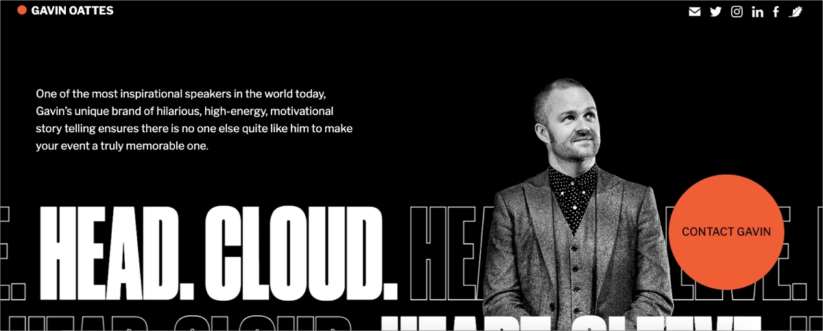
It’s also strategically placed in the hero section of the landing page, ensuring that it captures the visitor’s attention immediately upon arrival – increasing the likelihood that visitors will notice and act on the CTA early in their visit.
2. Create relevant, scannable content
Your page should answer your target audience’s needs – content must be concise and informative, matching visitors’ expectations and creating deep engagement.
- Keep landing page content focused and relevant to what visitors are searching for.
- Use clear headlines and subheadings to guide visitors, making text scannable.
- Emphasize benefits over features – show how you solve specific problems.
- Break information into bullet points and short sections to improve readability.
Sign up and build high-converting landing pages with Landingi
3. Optimize layout and user experience
A cluttered page overwhelms visitors and dilutes your message. Your landing page should focus on a single goal – with an intuitive layout that’s inviting and action-oriented.
- Keep the design simple and the layout clean.
- Avoid clutter to reduce distraction.
- Design with clear information hierarchy.
- Use whitespace strategically to highlight important content.
- Make navigation intuitive – only include links or buttons beyond the main CTA if they’re absolutely necessary and support your conversion goals.
- Ensure your page works well on all devices.
Example: Facetune
The Facetune landing page exemplifies an intuitive layout that is perfectly designed to meet the expectations and needs of its users, making it an excellent example of user-centered design.
The page employs a clear visual hierarchy that guides the visitor’s eye through the content in a logical order, from the hero image and headline down to detailed features and testimonials. This layout is maintained across different device sizes, ensuring consistency in user experience.
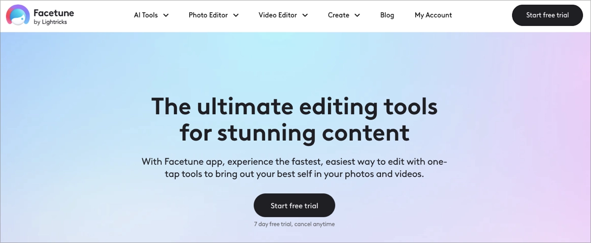
What also matters is the content, organized in a flow that naturally leads visitors from introduction to conversion. Each section builds upon the last, with CTAs strategically placed to catch the user at the peak of their interest, enhancing the chances of conversion.
4. Incorporate relevant visuals
Visuals significantly impact engagement and conversions when used carefully. With short human attention spans, infographics, animations, and videos are most effective, providing better conversion results than text alone.
In fact, visuals are processed 60,000 times faster in the brain than text, which means they can quickly grab attention and make a lasting impression. Additionally, combining written content with relevant visuals can increase conversion rates by up to 86%, according to HubSpot.
- Use visuals that align with your message and help reinforce page copy
- Use high-quality, relevant images
- Choose a style that resonates with your audience
- Implement short videos: testimonials, explainers, or product demonstrations
- Compress images and videos to avoid negatively impacting the page load time.
5. Leverage social proof
A well-performing landing page should include trust signals and testimonials, as social proof can greatly influence decision-making. These elements help build brand credibility and strengthen your overall brand position.
- Include authentic testimonials and customer reviews from satisfied clients.
- Describe meaningful case studies with specific results and outcomes.
- Show logos of well-known clients or partners to establish industry connections.
- Incorporate case studies when possible.
- Display user reviews and ratings.
- Use industry awards or endorsements.
- Showcase media mentions.
Example: Caboodle
The use of social proof on the Caboodle landing page exemplifies best practices in leveraging customer feedback and recognition to build trust and credibility. Displaying logos of well-known clients or partners immediately communicates the level of trust and professionalism new clients can expect.
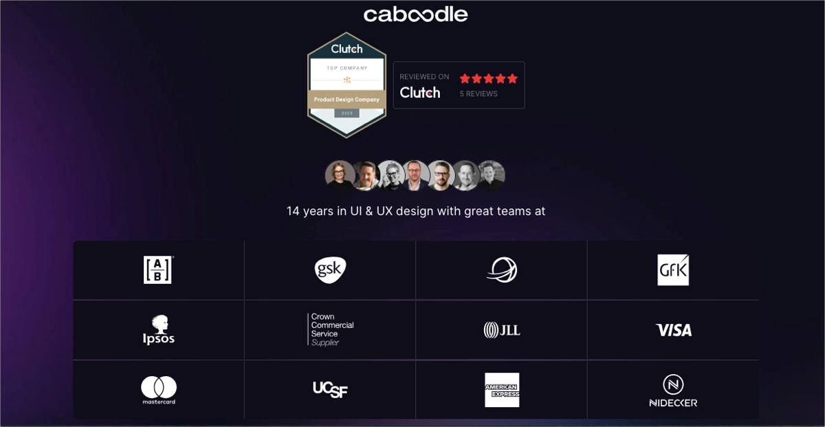
Integrating a Clutch customer reviews widget directly on the landing page allows visitors to see real-time feedback from previous clients, which enhances the credibility of the testimonials presented.
Mentioning specific, quantifiable outcomes from past projects (e.g., increased user engagement and improved customer satisfaction) helps to substantiate the studio’s claims about their effectiveness. This approach provides social proof and sets measurable expectations for what new clients might achieve.
6. Create irresistible offers
Depending on your landing page objective and industry, offering something valuable in exchange for visitor contact details can significantly boost conversions at various sales stages.
- Select compelling lead magnets tailored to your audience, such as free trials, discount codes, exclusive ebooks, or webinar access.
- Create genuine urgency with time-limited offers that influence immediate action.
- Clearly communicate the value and specific benefits visitors will receive from your offer.
The perceived value of what you’re offering often becomes the critical factor that transforms hesitant visitors into qualified leads or paying customers.
Example: Sundae Body
The popup on the Sundae Body landing page serves as a compelling example of an irresistible offer. It employs vibrant colors and engaging visuals that, combined with a pop-up, immediately capture visitors’ attention. This makes it hard to miss and encourages interaction, increasing the likelihood of the visitor engaging with the offer.
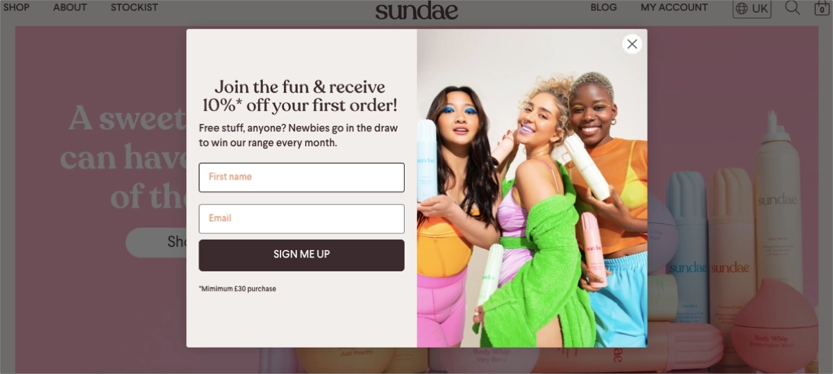
The message within the pop-up is clear and straightforward, quickly informing visitors about the benefits of an exclusive offer. It also involves a simple form with an outstanding CTA button, supported with a colorful, engaging picture.
7. Optimize your forms
If the conversion goal involves filling out a form (e.g., newsletter signup, demo request, or white paper download), the form should be easy to find, simple, and require only essential information.
- Place the form above the fold.
- Keep it concise.
- Minimize the number of fields.
- Use dropdowns, checkboxes, and radio buttons.
- Enable autofill.
- Include inline validation.
- Consider progressive profiling to gather information incrementally.
- Add privacy protection notes.
Example: Learn UI Design
A perfect example of a simple newsletter page from Learn UI Design showcases best practices in form design. The page form uses a clean, uncluttered design that avoids unnecessary fields or complex navigational elements. Minimalism helps reduce cognitive load for users, making the form visually appealing and easy to interact with.
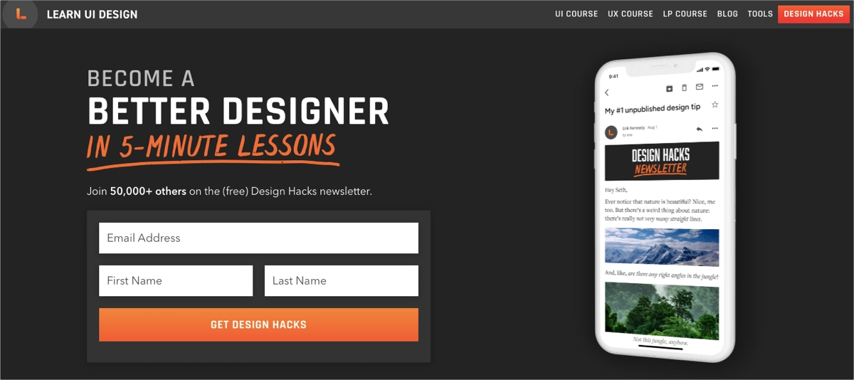
Positioned prominently on the page, the form is easily accessible, not requiring users to search or scroll extensively. This strategic placement ensures that the form is one of the first elements that visitors see and interact with. Moreover, the form is supported by encouraging copy, social proof, and visuals.
8. Improve page loading speed
Page load time is crucial for maintaining visitor interest and reducing bounce rates. Visitors stay longer and interact more with a page that responds quickly to their actions. Even a one-second delay in page response can result in a 7% reduction in conversions, as showcased in KissMetrics study.
- Optimize image sizes.
- Streamline code (HTML, CSS, JavaScript).
- Consider using a CDN.
- Prioritize above-the-fold content (lazy loading)
A fast-loading page provides a better user experience. A well-optimized page that loads quickly always performs better in search visibility than one that does not.
Use Landingi now and optimize your landing page for higher conversion rates!
9. Ensure accessible page design
When designing highly effective landing pages, ensure that everyone, including people with disabilities, can use them effectively.
- Use proper HTML structure.
- Ensure keyboard navigability.
- Provide alt text for images.
- Use sufficient color contrast.
Improving accessibility can broaden your audience, improve the overall user experience, and ultimately, increase conversions.
10. Address potential objections proactively
Successful landing pages precisely address common objections potential customers might have about your offer.
- Identify common objections or questions your target audience has.
- Include clear details about pricing, usage instructions, compatibility with other products, or success stories from satisfied customers.
- Maintain transparency throughout your messaging to build trust.
- Use benefit-oriented language that focuses on how your solution solves their problems.
Doubts naturally accompany any decision-making process, but proactively addressing common objections helps alleviate concerns and guides visitors toward conversion.
11. Use directional cues strategically
Landing page performance depends on how well it directs users toward the desired conversion, which involves several techniques, from cleverly designed layout through persuasive visual elements to strategic content structure.
- Guide visitors towards important elements such as the CTA using visual cues.
- Optionally, use arrows or images where the subjects approach the CTA.
- Incorporate more explicit pathways created through the page layout and design elements.
- Keep strategic elements above the fold.
12. Localize content for global audiences
Pages that target a global audience must localize the content to cater to different regions. This involves tailoring a landing page’s content, design, and functionality to meet the cultural, linguistic, and regional preferences of different audiences worldwide.
- Translate the content.
- Using region-specific examples and testimonials.
- Adapt offers to local markets.
- Ensure your landing page complies with local regulations.
- Don’t forget about technical aspects: cater the page to regional differences in technology use (e.g., consider mobile-first browsing habits).
13. Optimize for SEO
Landing pages must be SEO optimized to achieve high search engine results and reach your target audience. Without effective keyword optimization, organic search visibility is nearly impossible, yet many landing pages fail to prioritize this crucial element.
- Research specific terms your target audience uses in their search queries.
- Select keywords that directly relate to your landing page’s content and offer.
- Strategically incorporate these keywords throughout your content, including titles, headers, and body text, without keyword stuffing.
- Craft compelling page titles and meta descriptions that include your target keywords.
- Build a fully responsive landing page – search engines significantly favor mobile-friendly websites in their rankings.
- Create high-quality, informative content that genuinely addresses your audience’s needs and questions.
- Structure your URLs to be clean, concise, and SEO-friendly.
- Optimize the page URL
- Use plain language and avoid complex jargon or long ID numbers.
- Include relevant keywords in your URL to improve your search engine rankings.
- Short URLs are easier to share, especially on social media platforms where space is limited.
14. Place key elements above the fold
Place key elements above the fold to capture visitor interest immediately. Visitors decide within seconds whether to stay or leave. Including your headline, subheadline, CTA, and engaging visuals above the fold is crucial in our short-attention-span digital landscape.
Studies show elements above the fold get significantly more attention. Nielsen Norman Group found content above the fold attracted 84% more attention than below.
- Craft a headline that is clear, engaging, and reflective of the core benefit of your offer.
- Choose a striking image or a short video that complements your message and attracts attention.
- Place a strong CTA in the hero section.
- Include an image, graphic, or short video that complements your headline and CTA.
- Avoid overloading the hero section with too many elements.
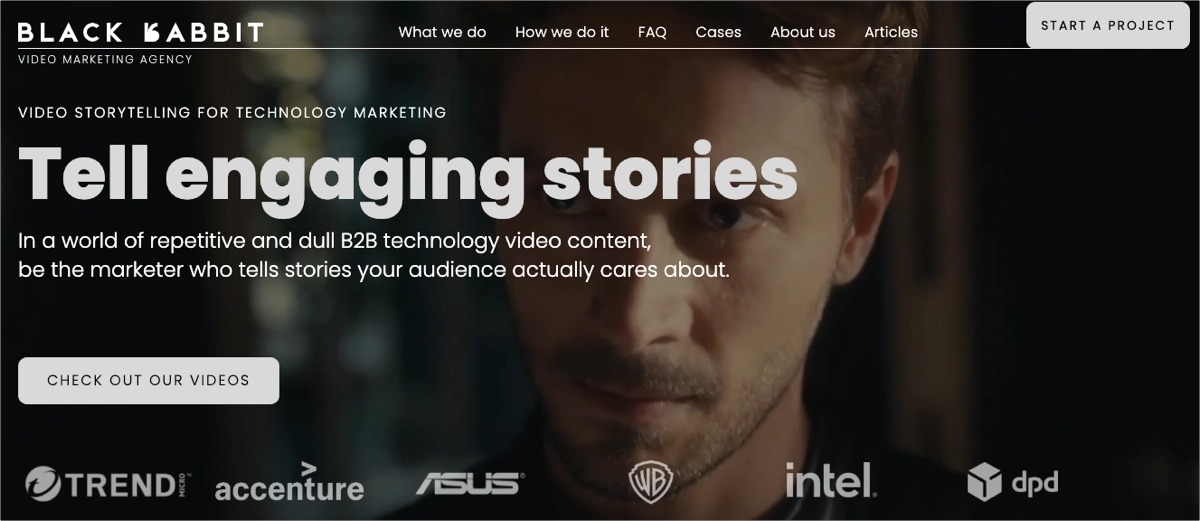
Example: Black Rabbit
Black Rabbit’s hero section uses headlines that directly address its audience’s core needs and desires. These headlines answer potential customers’ most pressing questions or concerns and highlight desires that the service can fulfill.
The headline directly addresses the company’s core service: video storytelling in marketing. The straightforward nature of this headline makes it instantly understandable, ensuring that visitors grasp the essence of Black Rabbit’s offerings without any confusion.
The subheadline sets the context by highlighting a common issue in the industry (repetitive and dull content). This positions Black Rabbit as a solution, offering a more captivating alternative that will resonate with the target audience.
15. Match landing page content to your ads
Ensure your page content matches your ads. This “message match” creates a seamless transition between the ad a customer clicks and the landing page they reach.
When your landing page mirrors your ad’s messaging, it reinforces what initially attracted the visitor. This consistency builds trust and sets clear expectations, which can reduce confusion and bounce rates. Familiar headlines, phrases, and images reassure visitors they’re in the right place.
- Align your landing page headline with your ad’s main message.
- Use similar colors, fonts, and layout styles across ads and landing pages.
- Prominently display the advertised offer, discount, or deal on the landing page.
- Maintain tone and style.
- Match the ad’s imagery.
- Tailor calls to action.
16. Highlight benefits, not features
This approach shifts focus from what your product does to how it positively impacts customers’ lives. Benefits directly address “what’s in it for me?” By explaining how your product solves problems, you make your offer more relevant.
Benefits can differentiate your product from competitors with similar features. They translate technical features into easy-to-understand advantages, simplifying decisions.
- Identify your product’s most impactful benefits
- Focus on solving common problems for your audience
- Use language that resonates with your audience
- Avoid jargon or complex explanations
- Use bullet points
- Support benefits with visuals
- Align CTAs with benefits
Example: Dropset
The Dropset landing page effectively highlights the app’s benefits, making it an excellent example of how to use benefits-driven content to engage and convert users. The page features prominently placed, clear statements about the app’s benefits, directly addressing the needs and interests of the target audience.
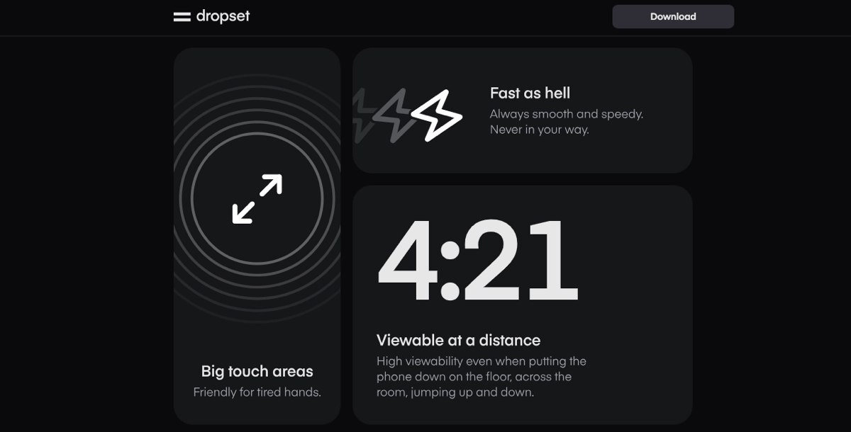
Each app feature is presented not just as a functional element but as a direct benefit to the user. The landing page uses visuals strategically to reinforce the benefits.
For instance, screenshots and icons that illustrate the app in use show what it looks like and highlight how easy and efficient it is to use, aligning with the user’s desires for simplicity and effectiveness.
17. Ensure consistent branding
Consistent branding helps to confirm the page’s authenticity, reassuring visitors that they interact with a brand they trust. This can also significantly affect their decision to engage with your content and ultimately convert. Additionally, maintaining a consistent visual style and tone deepens the brand’s impact and enhances recall.
Consistent branding across all marketing materials, including landing pages, social media, and traditional advertising, creates a cohesive marketing campaign, ensuring the brand message is clear and impactful, no matter how or where a customer encounters it.
- Apply your brand’s color scheme, logo, font styles, and imagery consistently on the landing page.
- Maintain language and tone consistency.
- Standardize layouts across campaigns.
- Ensure that the branding is consistent across different platforms and devices.
Ensuring consistent branding on your landing page enhances the user’s familiarity and comfort with your brand, effectively turning it into a higher conversion rate.
18. Implement systematic A/B testing
Continuous optimization through systematic testing is essential for maximizing landing page performance. A/B testing allows you to make data-driven decisions rather than relying on assumptions about what works best for your audience.
The key is testing one element at a time and ensuring statistical significance before making changes.
- Test one element at a time (headlines, CTAs, images, form fields) to isolate what drives improvements.
- Ensure adequate sample size and statistical significance before concluding tests.
- Run tests for full business cycles to account for weekly patterns and seasonal variations.
- Create a testing roadmap prioritizing high-impact elements first.
- Document all test results and learnings to build institutional knowledge.
- Use proper A/B testing tools that can handle traffic splitting and statistical analysis.
Sign up and use Landingi to create multi-language landing pages with ease!
19. Personalize content dynamically
Personalized landing pages that adapt to visitor characteristics can significantly increase conversions. Dynamic content shows visitors exactly what they want to see based on their source, behavior, or demographics.
Modern visitors expect relevant, tailored experiences. Generic one-size-fits-all pages perform significantly worse than personalized alternatives that speak directly to specific visitor segments.
- Customize headlines and offers based on traffic source (Google Ads, Facebook, email campaigns, etc.).
- Show different content for first-time visitors versus returning visitors.
- Adapt messaging based on geographic location, device type, or time of day.
- Use dynamic keyword insertion to match search terms visitors used.
- Display relevant testimonials or case studies based on visitor industry or company size.
- Implement progressive profiling to show more personalized content over time.
Example: Amazon
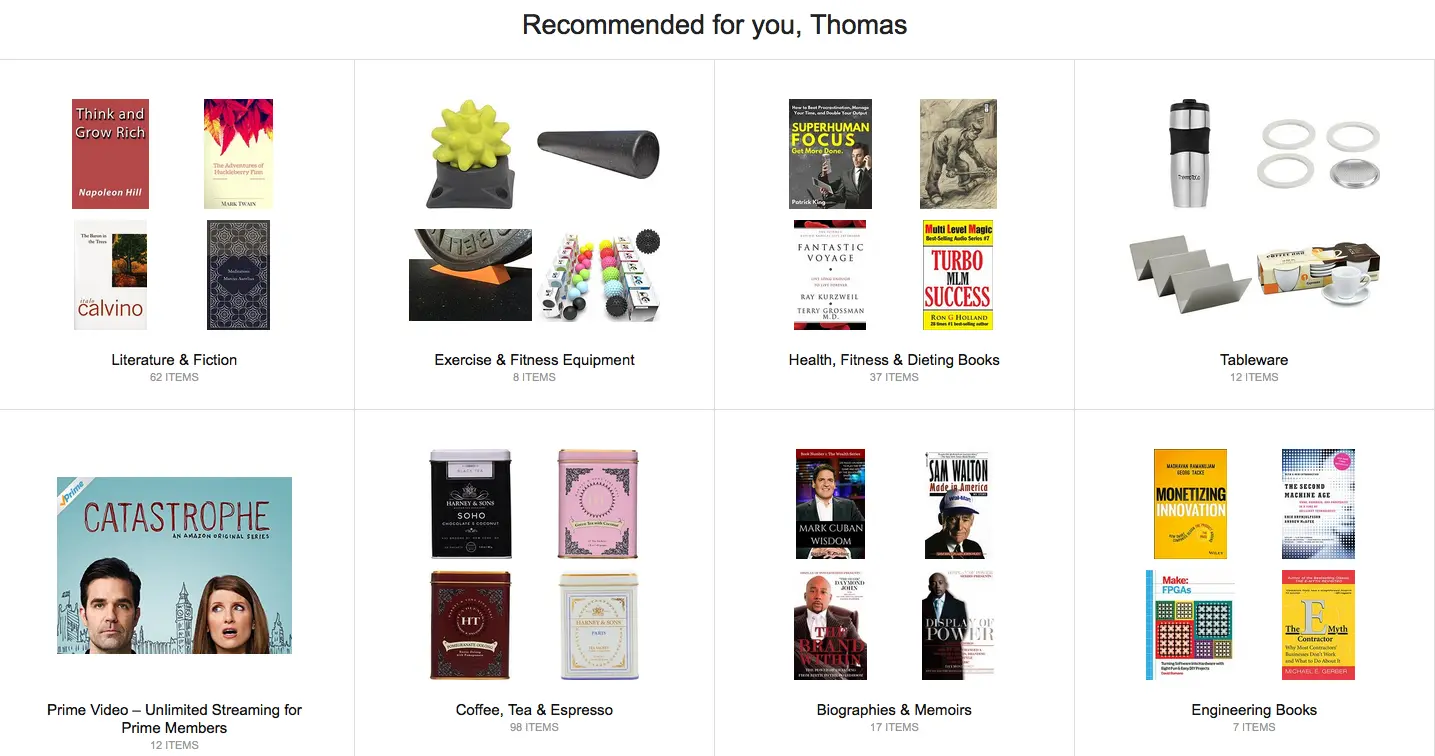
Amazon’s product pages dynamically change based on browsing history, purchase behavior, and similar customer patterns. Their “Customers who bought this item also bought” sections and personalized recommendations demonstrate the power of dynamic content.
20. Deploy exit-intent technology
Exit-intent technology can recover 10-15% of abandoned visitors by detecting when someone is about to leave and presenting a final conversion opportunity. This last-chance engagement often converts visitors who might otherwise be lost forever.
Exit-intent popups have higher conversion rates than standard popups because they only appear when someone is already leaving, making them less intrusive while maximizing the opportunity to convert.
- Use exit-intent detection to trigger popups just as visitors move to close the tab.
- Offer special discounts, bonus content, or exclusive access as final incentives.
- Keep exit-intent offers simple with minimal form fields.
- A/B test different exit-intent messages and offers.
- Ensure exit-intent popups are mobile-optimized and don’t frustrate mobile users.
- Set frequency caps so visitors don’t see exit-intent popups on every visit.
21. Leverage advanced analytics and behavior tracking
Understanding exactly how visitors interact with your landing page reveals optimization opportunities that traditional analytics miss. Heat maps, scroll tracking, and session recordings provide insights into user behavior that can dramatically improve conversion rates.
Advanced analytics help identify friction points, confusion areas, and opportunities to guide visitors more effectively toward conversion. This behavioral data often reveals surprising insights about what actually works versus what you think works.
- Implement heat mapping to see where visitors click, hover, and spend time.
- Use scroll maps to understand how far down the page visitors read.
- Record user sessions to watch real visitor behavior and identify pain points.
- Track micro-conversions like video plays, section views, and form interactions.
- Analyze conversion funnels to identify where visitors drop off.
- Set up event tracking for all important page interactions.
22. Optimize the post-conversion experience
The conversion doesn’t end when someone submits a form or makes a purchase. The immediate post-conversion experience can significantly impact customer satisfaction, reduce buyer’s remorse, and set the stage for long-term customer relationships.
A well-designed post-conversion sequence can improve customer lifetime value and reduce support burden by providing clear next steps and setting proper expectations.
- Create compelling thank you pages that confirm the conversion and provide immediate value.
- Send instant confirmation emails with clear next steps and timeline expectations.
- Provide immediate access to promised resources or download links.
- Use thank you pages to cross-sell related products or services.
- Include social sharing buttons to leverage word-of-mouth marketing.
- Set clear expectations about what happens next and when.
- Offer immediate customer support options for questions.
23. Implement progressive disclosure and micro-conversions
Breaking complex conversions into smaller, manageable steps can increase completion rates. Progressive disclosure reduces the psychological barrier of commitment while gathering valuable information incrementally.
Multi-step approaches work because they leverage the commitment and consistency principle – once someone starts a process, they’re more likely to complete it. Each small step builds momentum toward the final conversion.
- Break long forms into multiple steps with progress indicators.
- Start with easy, low-commitment questions before asking for sensitive information.
- Use micro-conversions like email signup before asking for phone numbers.
- Implement progressive profiling to gather more data over time.
- Show progress bars and completion percentages to encourage continuation.
- Allow users to save progress and return later for complex forms.
- Optimize each step individually based on drop-off rates.
Example: TurboTax
TurboTax breaks tax preparation into dozens of small steps, each feeling manageable. Their progress indicators and “you’re almost done” messaging keep users engaged through what could otherwise feel like an overwhelming process.
24. Set up comprehensive retargeting and attribution
Proper tracking pixel implementation and retargeting strategies can help recover non-converting visitors. Most visitors don’t convert on their first visit, making retargeting essential for maximizing return on marketing investment.
Effective retargeting keeps your brand top-of-mind while providing multiple touchpoints to nurture prospects toward conversion. Combined with proper attribution, you can understand the full customer journey and optimize accordingly.
- Install tracking pixels for all major advertising platforms (Facebook, Google, LinkedIn).
- Create retargeting audiences based on specific page visits and behaviors.
- Develop sequential retargeting campaigns that tell a story over time.
- Use dynamic retargeting to show specific products or content visitors viewed.
- Implement cross-device tracking to follow users across multiple devices.
- Set up proper attribution models to understand multi-touch conversion paths.
- Create lookalike audiences based on your best converting visitors.
25. Ensure privacy compliance and build trust
Modern privacy regulations and increasing consumer awareness make privacy compliance essential for maintaining trust and avoiding legal issues. Proper privacy implementation can actually improve conversions by demonstrating trustworthiness.
Transparent privacy practices build consumer confidence, while poor privacy implementation can result in legal penalties and lost conversions. The key is making compliance feel helpful rather than burdensome.
- Implement GDPR, CCPA, and other relevant privacy regulation compliance.
- Use clear, user-friendly cookie consent mechanisms that don’t hurt user experience.
- Provide transparent privacy policies in plain language.
- Offer granular consent options for different types of data collection.
- Display security badges and certifications prominently.
- Explain exactly how visitor data will be used and protected.
- Make it easy for users to update their privacy preferences or withdraw consent.
- Regularly audit and update privacy practices as regulations evolve.
Example: Apple

Apple’s privacy-first approach has become a major selling point. Their clear explanations of data protection and user control over privacy settings build trust while maintaining compliance with global privacy regulations.
Implement Effective Landing Page Practices for Optimal Conversion Rates
Mastering landing page optimization is crucial for any digital marketing strategy that aims to turn visitors into customers. When you integrate best practices across conversion optimization, design, lead generation, user experience, and URL optimization, you’ll create a landing page that attracts, engages, and converts visitors effectively.
When you combine these elements into a unified strategy, your landing page becomes a powerful tool for achieving business objectives – turning every visit into a potential gateway to new customer relationships. While this might seem complex, Landingi makes it easy to achieve the best results. Try it now and start crafting impressive landing pages!