

A service landing page is a dedicated space built to present a specific service in a clear, focused way. It’s where potential clients learn what you ofcomfer, why it matters, and how to take the next step – whether that’s booking a call, signing up for a session, or requesting more details. Every element on the page serves that one goal: getting someone closer to choosing your service.
In this article, you’ll find real-life design examples of high-performing service landing pages, along with practical takeaways on what makes them work. From strong messaging and design to trust signals and smart calls to action, we break down the strategies that help turn visits into conversions.
If you’re creating a new landing page (or improving an existing one), this guide will provide the structure, ideas, and inspiration you need to achieve success.

What Is a Service Landing Page?
A service landing page is a specialized web page designed with a single focus or goal, which is typically to promote a specific service offered by a company or an individual. This type of landing page is crafted to convert visitors into leads or customers by providing them with all the necessary information about the service concisely and compellingly. The primary aim is to encourage the visitor to take a specific action, such as filling out a contact form, signing up for a trial, or purchasing.
The effectiveness of a service landing page lies in its ability to communicate the value proposition of the service clearly and persuasively. It is optimized for conversions, which means it employs design and content strategies to guide the visitor towards the desired action.
Elements like persuasive copy, engaging visuals, user testimonials, and trust signals are crucial in building credibility and encouraging conversion. A well-designed service landing page not only provides detailed information about the service but also addresses potential questions or concerns the visitor might have, making it an essential tool for businesses looking to increase their online conversion rates.
Create a high-converting service landing page – start with Landingi today!
How Do I Create a Service Landing Page?
Creating a service landing page that promotes your offering and turns visitors into leads or clients is simple with Landingi. The platform gives you all the tools you need to build, launch, and improve high-converting landing pages – without relying on external apps or developers. Here’s how to do it step by step, using Landingi’s features:
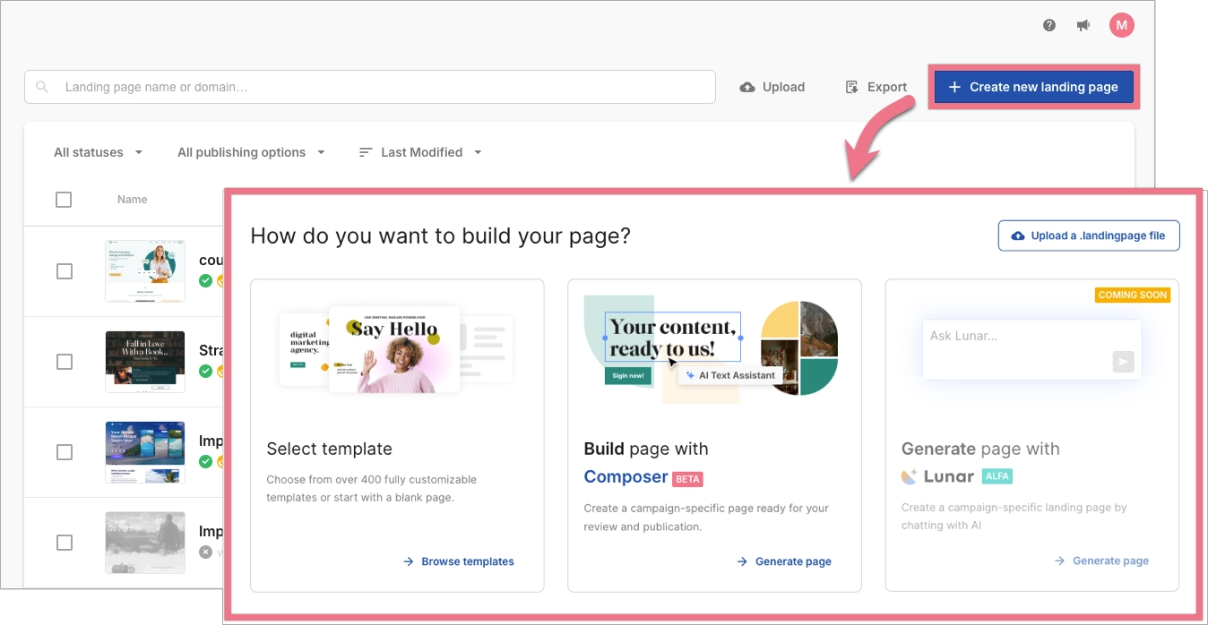
Step 1. Define your objective
Start by creating a new landing page in Landingi. You can choose from ready-made templates, start with a blank page, or generate a layout using AI landing page generator Lunar. When choosing the starting point, think about your goal (whether it’s lead generation, booking consultations, or selling a service) and select a layout that aligns with that purpose.
Step 2. Understand your audience
Before working in the editor, clarify who you’re building the page for. What are their challenges? What would make them choose your service? Use this insight to plan your structure and messaging. You can outline your customer journey offline or in your campaign documentation, then reflect that journey in how you place content and calls to action on the page.
Step 3. Craft compelling copy
Use AI Assistance directly in the Landingi editor to create headlines, subheadings, and paragraphs that speak directly to your audience. You can prompt the AI to write from scratch or to improve existing text based on your service type, tone, and desired conversion goal.
Create high-converting copy effortlessly with AI Assistance, built right into Landingi.
Step 4. Incorporate social proof
Show that others trust your service by adding client testimonials, reviews, or awards. You can use the Text widget to display quotes, and the Image widget to upload customer photos or star ratings. If you want to design custom testimonial blocks, use the Shape widget to build clean sections and organize content visually.
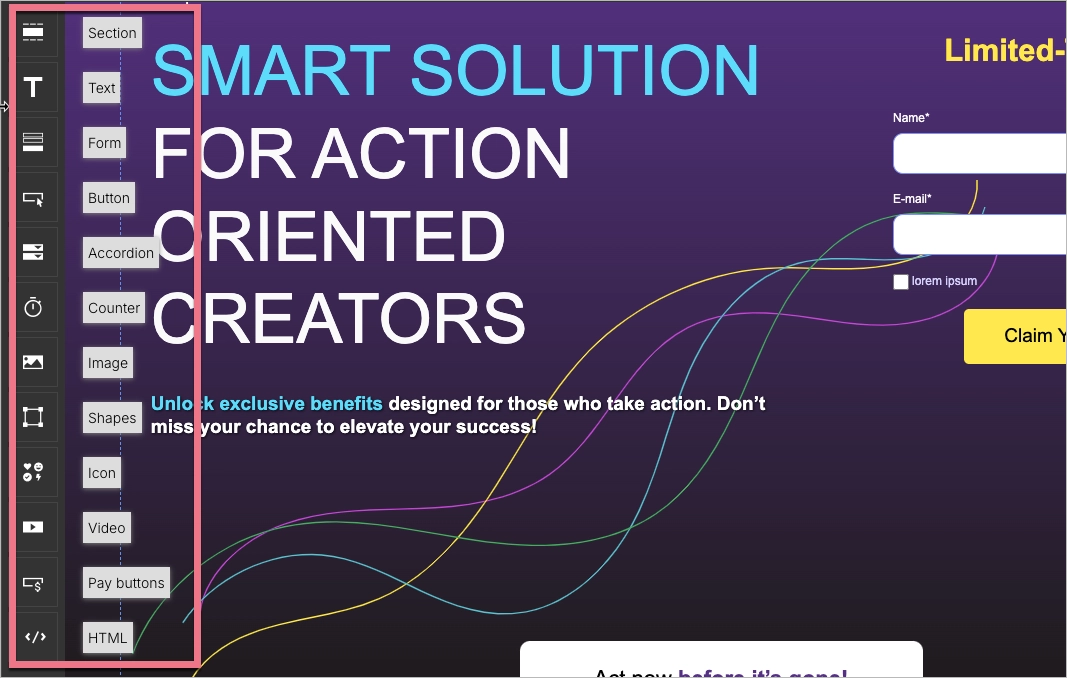
Step 5. Design for usability
Use Landingi’s drag-and-drop editor to lay out your content clearly. Make your call-to-action buttons stand out by using contrast colors and placing them in high-visibility areas like the hero section and near the page’s end. You can upload your own fonts and save brand colors to your favorites, so they’re easy to reuse consistently across the page. The editor gives you full control over design without writing any code.
Learn how to build an effective service landing page—design yours with Landingi!
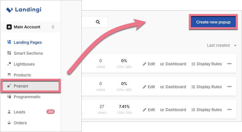
Step 6. Optimize for conversion
Make the next step obvious and easy. Add lead capture forms, show trust elements near CTAs, and limit any distractions by removing unnecessary links or navigation. If you want to show a special offer, a lead magnet, or a reminder before someone leaves the page, you can create a pop-up separately in Landingi and connect it to your landing page. You can trigger it based on user behavior, such as time spent on the page or exit intent.
Step 7. Test and refine
Use A/B testing – available from your landing page dashboard – to compare two versions of a page. You can clone a landing page design, make changes to elements like copy, images, or CTAs, and split traffic between both versions. The platform automatically collects performance data, helping you decide which version converts better.
Track visitor behavior and conversions, then refine your landing page based on data to boost performance.
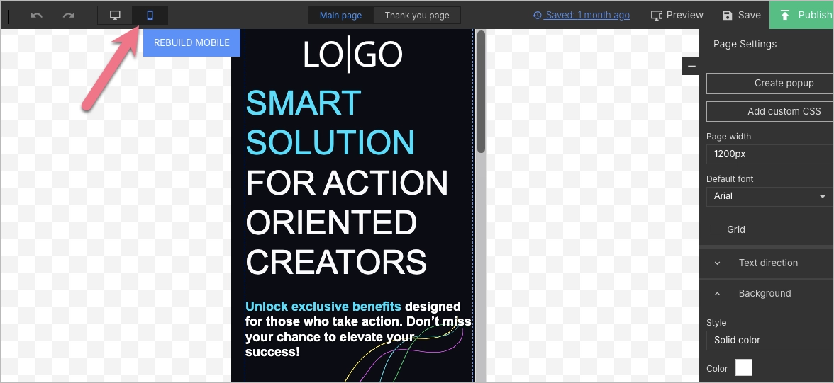
Step 8. Ensure mobile responsiveness
Switch to Mobile View in the editor to fine-tune how your page looks on smartphones and tablets. While Landingi automatically generates a mobile version of your page, you can adjust each element manually for the best experience on any device.
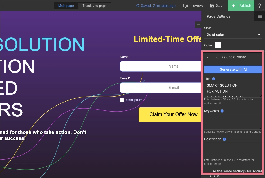
Step 9. Implement SEO optimization
In the SEO settings of your landing page, use AI Assistance to suggest relevant keywords, generate optimized titles and meta descriptions, and strengthen your on-page structure. This helps your page rank better in search results and brings in more traffic over time.
20 Best Examples of Service Landing Pages
Knowing the theory behind service landing pages is important, but seeing effective landing page examples in action is even more valuable. Let’s explore 20 great service landing page examples from various industries, showcasing how they have nailed best practices and driven successful conversions.
See the best service landing page examples—start building yours with Landingi!
1. Interflora
Interflora’s service landing page is a visual treat, highlighting their flower delivery service. It likely includes attractive images of stunning flower arrangements, which is vital for a florist’s online presence. The page also employs a user-friendly interface, facilitating easy navigation and selection of flower arrangements for different occasions.

Alternative CTAs allow visitors to choose the type of flower service they need. The page’s layout is user-friendly and easy to navigate, making the page effective, also on mobile devices. An extra offer for loyal customers that encourages visitors to take action and fill out a member form is a great lead generation tool. The page includes concise written content, which is supplemented with stunning pictures, saying more than words in this case. Clear pricing and an informative attitude also enhance conversions.
Key takeaways to learn from this example:
- Intuitive layout with a sticky navigation bar,
- High-quality visuals,
- Short but informative text sections,
- Clear, alternative CTAs,
- Valuable offer encouraging to fill out member form.
Improvement areas:
- Social proof – adding user reviews would enhance the conversion rate.
Find the best flower service landing page template and customize it easily with Landingi’s drag-and-drop builder to drive high conversions!

2. Vinty
Vinty’s service landing page showcases the classic car rental service with attractive visuals and a simple booking process. The page offers a user experience that is simple and efficient, with a booking process that can be completed in as little as 20 seconds – the search bar is designed in a user-friendly way, supplemented with an outstanding CTA button.

Features like instant quotes for events enhance the decision-making process for customers. The page includes user reviews, which helps convince visitors to take action. A single opt-in newsletter subscription form is strategically placed, designed for a seamless user experience.
Key takeaways to learn from this example:
- Highly intuitive layout with simple navigation,
- Catchy headlines,
- Concise text sections,
- Stunning visuals,
- “How it works” section,
- User testimonials.
Improvement areas:
- Videos – adding short films, like video testimonials highlighting excellent service experiences from previous customers, would not only enhance conversion rate but also engage visitors into the brand and its car services.
Promote your services effectively – create a service landing page with Landingi!
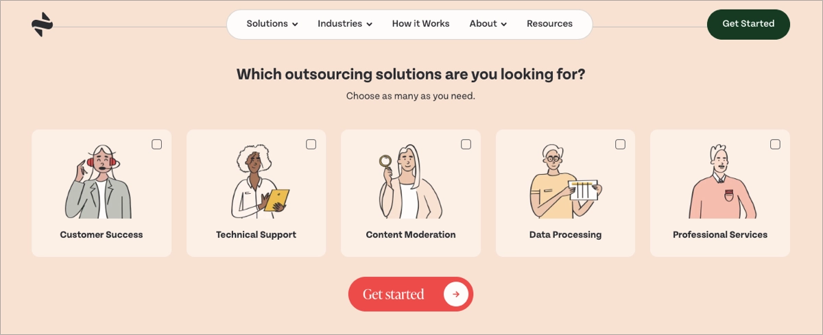
3. Supportninja
Supportninja’s service landing page emphasizes outsourcing services with a clean design and strong CTAs. The page likely features a clear explanation of their outsourcing solutions, showcasing services such as customer support, back office support, and content moderation.

The page is designed in a user-friendly way, with strategic white space. Well-matched colors and fonts make the landing page consistent. The landing page includes trust elements, such as a list of their business customers and previous clients’ testimonials. The implementation of a sticky navigation bar boosts mobile user’s experience. A single goal is presented by the “Get Started” CTA button, placed in strategic sections.
Key takeaways to learn from this example:
- Clear layout and highly intuitive navigation,
- Consistent design,
- Informative content answering user’s needs,
- Strong, outstanding CTA buttons with straightforward messaging,
- Client testimonials,
- “How it works” section.
Improvement areas:
- Interactive elements and videos – adding more interactive elements and videos would boost user engagement and improve conversions.
Build trust among potential customers – use a perfect Landingi template and add client testimonials to boost credibility and drive higher conversion rates.

4. Caboodle
Caboodle’s landing page shines with its web design and development services. The page likely showcases their portfolio of projects, demonstrating their expertise and previous successes. It also includes client testimonials and case studies, providing social proof of their quality service and customer satisfaction.

The page’s design is visually attractive and well done in terms of user experience. The informative content highlights the unique selling proposition with all the features and benefits. The important element of their landing page, boosting trust among visitors, is the implementation of user testimonials and concise but rich in data case studies.
Key takeaways to learn from this example:
- Intuitive layout,
- Trust signals – logos of renowned clients, case studies, reviews,
- Cleverly presented USP,
- Benefits section,
- High-quality visuals,
- Outstanding CTAs,
- Pricing.
Improvement areas:
- Sliders – the better option is to change sliders into an animation or short video, which boosts user engagement and delivers rich content within seconds.
5. California Dental
California Dental’s service landing page uses trust signals and clear messaging to promote their dental services. The page features a clear and concise headline immediately communicating their leading service or value proposition and detailed service descriptions important in the health industry.

The landing page also includes patient testimonials, which serve as trust elements increasing conversion rate. These elements inform and reassure potential patients while encouraging them to book an appointment. The main CTA button placed in the hero section leads to the booking appointment form. Clear contact information with a “Call Now” button and location button makes the page useful for potential patients.
Key takeaways to learn from this example:
- Intuitive navigation,
- Outstanding CTA buttons,
- Contact information,
- “Call Now” and location buttons,
- Informative, detailed service descriptions and compelling headlines,
- Map plugin,
- Patient testimonials.
Improvement areas:
- Page loading time – the page should be optimized for better loading speed.
Choose this perfectly designed Landingi template to facilitate your customers’ path – use clear forms and encourage visitors to schedule appointments.

6. Factor
Factor’s landing page focuses on their meal delivery service with enticing images and clear benefits. The page employs high-quality images of their meal offerings, highlighting the freshness and quality of their ingredients to engage the target audience. It also includes subscription options, making it easy for customers to understand what they are signing up for.

The navigation bar is intuitive, including all information users could seek, including pricing. The CTA button is well-designed, with a green color suggesting health and nature. Visitors can read customer testimonials, which are trust-building elements.
Key takeaways to learn from this example:
- Immersive visuals,
- Catchy headlines and concise but informative content,
- “How it works” section,
- Benefits section,
- Customer reviews,
- Strong CTAs,
- Pricing,
- Survey form.
Improvement areas:
- Videos – they could drive higher conversions by incorporating videos, for instance, about meal preparation or ingredient choice, to boost user engagement and encourage visitors to take action.
Boost your brand with a professionally designed landing page tailored to your needs.
7. Safewatch
Safewatch’s landing page promotes their home security services, offering a comprehensive solution for homeowners looking to enhance their property’s safety, but they also promote their services for different life elements. The page stands out with its clean design, intuitive navigation, and strong CTAs. It includes concise, well-written service descriptions with a benefits section, clear pricing, and a special offer – a free 7-day trial, encouraging visitors to try out the service.

The page hits visitors with catchy, animated headlines, answering potential customer’s needs. The main CTA button is outstanding with its shape, color, and lack of messaging – they have used a recognizable, blinking icon, leading visitors to take action.
Key takeaways to learn from this example:
- Minimal landing page design,
- Highly intuitive navigation,
- Catchy headlines,
- Outstanding CTA buttons,
- Concise descriptions,
- Clear pricing.
Improvement areas:
- User testimonials – adding customer reviews and testimonials would increase trust among visitors, leading to higher conversions.
8. Nourish
The landing page for “Prediabetes Nutritionists and Dietitians | Nourish” is a strong example of how to guide visitors toward action with clarity and focus. It uses a clean layout that highlights the main message – getting help from a dietitian covered by insurance – without distractions. The primary call to action, “Am I covered?”, is not only visible but emphasized by a subtle arrow that naturally draws attention and encourages clicks. Trust is reinforced by familiar insurance logos, which reassure users they’re in the right place.
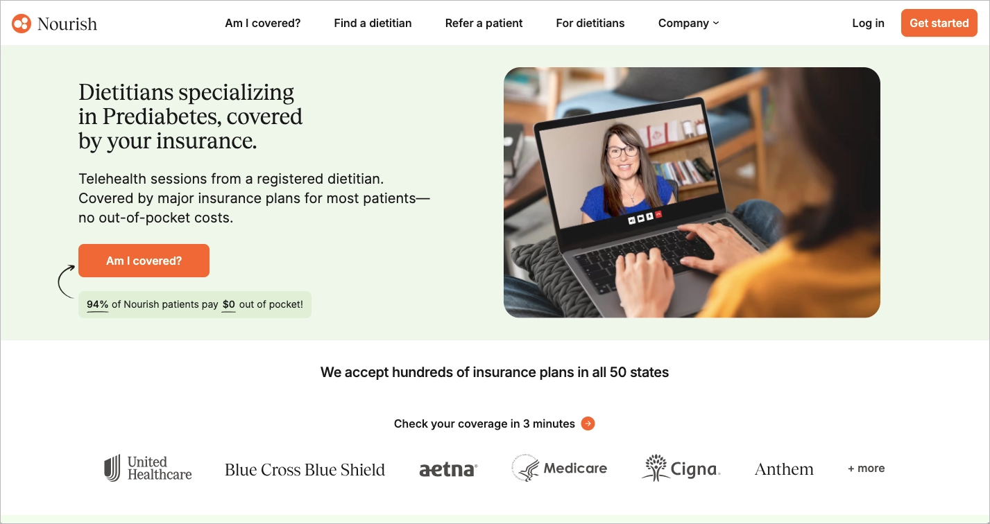
A clear “How it Works” section breaks the process into three easy steps, helping users quickly understand the value and how to get started. With direct messaging and helpful visuals, the page makes the decision process confidence-driven and straightforward.
Key takeaways to learn from this example:
- Clear layout,
- Strong CTA,
- Insurance logos,
- Step-by-step process.
Improvement areas:
- Too many external links in the menu – they pull attention away from the CTA. Reducing these links would help keep users focused on signing up.
9. Evergreen Beauty College
The Evergreen Beauty College service landing page offers a clean and visually inviting experience right from the start. The use of a bright, fresh color palette helps give the site an energetic and approachable feel, which works well for its target audience – people interested in the beauty industry. The prominent headline, “Get a Career in the Beauty Industry,” instantly communicates the main value of the service. Strong imagery and consistent branding create a sense of professionalism, and the design draws the eye naturally down to the form and call to action.
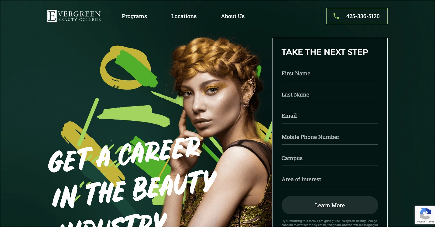
One strength of the page is the inclusion of reCAPTCHA, which helps prevent spam submissions and shows that the business values data security. Another highlight is the design itself—the layout is easy to follow, and the visuals support the message well. The phone number is always accessible, which can help reduce friction for users who want to contact the school directly.
Key takeaways from this example:
- Eye-catching color scheme,
- Smooth layout,
- Use of reCAPTCHA,
- Strong main message.
Improvement areas:
- The form is a bit too long – simplifying it could lead to more completions.
10. Welcome Pickups
The service landing page for “Book your Mallorca Airport Transfer – Welcome Pickups” is a clean, well-structured example of how to win trust and drive bookings quickly. The top section includes a strong value proposition and a short, straightforward form that makes it easy for users to book a ride. It’s clear what you’re getting: a trusted local driver at a taxi price. Right under the booking button, the site adds credibility with the line “15,182 travelers in 358 destinations booked a ride today.” This kind of real-time social proof can make users feel confident they’re choosing a popular and reliable service.
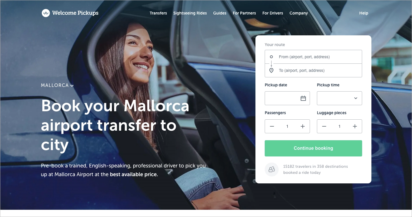
Just below the fold, the second section immediately shows star ratings and testimonials. These reviews help remove doubt early on, before someone has to scroll far. Combined with good design and mobile responsiveness, the page keeps things light and focused – users can act without feeling overwhelmed.
Key takeaways from this landing page:
- Short, user-friendly booking form,
- Strong social proof,
- Testimonials appear early,
- Clear messaging,
- Clean layout.
Improvement areas:
- A secondary CTA – while the main action is obvious, having a secondary CTA (like “Learn More” or “See Prices”) could help users who need more info before booking.
11. Stitch Fix
The Stitch Fix personal stylist landing page is a strong example of how to create a service-focused experience that balances design, functionality, and persuasion. The message is clear from the start: users are invited to “Take your style quiz” with a central call-to-action (CTA) that stands out visually and is repeated in the top menu. This menu remains visible as users scroll, which helps keep the main goal – signing up – always within reach. The copy for the CTA is simple and welcoming, reducing friction and encouraging users to give it a try.
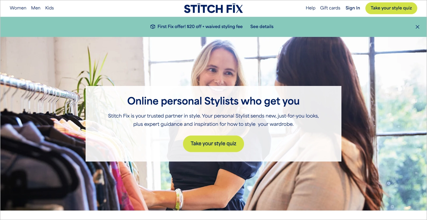
What also works well here is the visible social proof. Throughout the page, Stitch Fix shares impressive stats like “100+ million Fixes sent” and “150+ million looks styled,” along with App Store ratings and user stories. This builds trust without overloading the user. Testimonials, client highlights, and stylist profiles offer credibility and show the human side of the service, which makes the concept of online styling feel more approachable and real.
Key takeaways to learn from this example:
- Strong central CTA,
- Follow-along navigation,
- Clear social proof,
- Low-barrier CTA copy.
Improvement areas:
- Streamline the navigation – the menu includes many links, which might distract or confuse new visitors. Fewer, more focused choices would help users stay on the path to conversion.
12. LeverX
The “MVP Development Services” landing page from LeverX is built to guide potential clients through the value of starting with a minimum viable product. The page opens with a clear, straightforward headline that immediately communicates the service offered. This section also includes well-placed trust badges, which help build credibility from the start. The layout is clean, with enough white space and visual breaks to make content easy to scan. One highlight is the use of a timeline feature, which helps explain the development process in a simple, step-by-step manner.
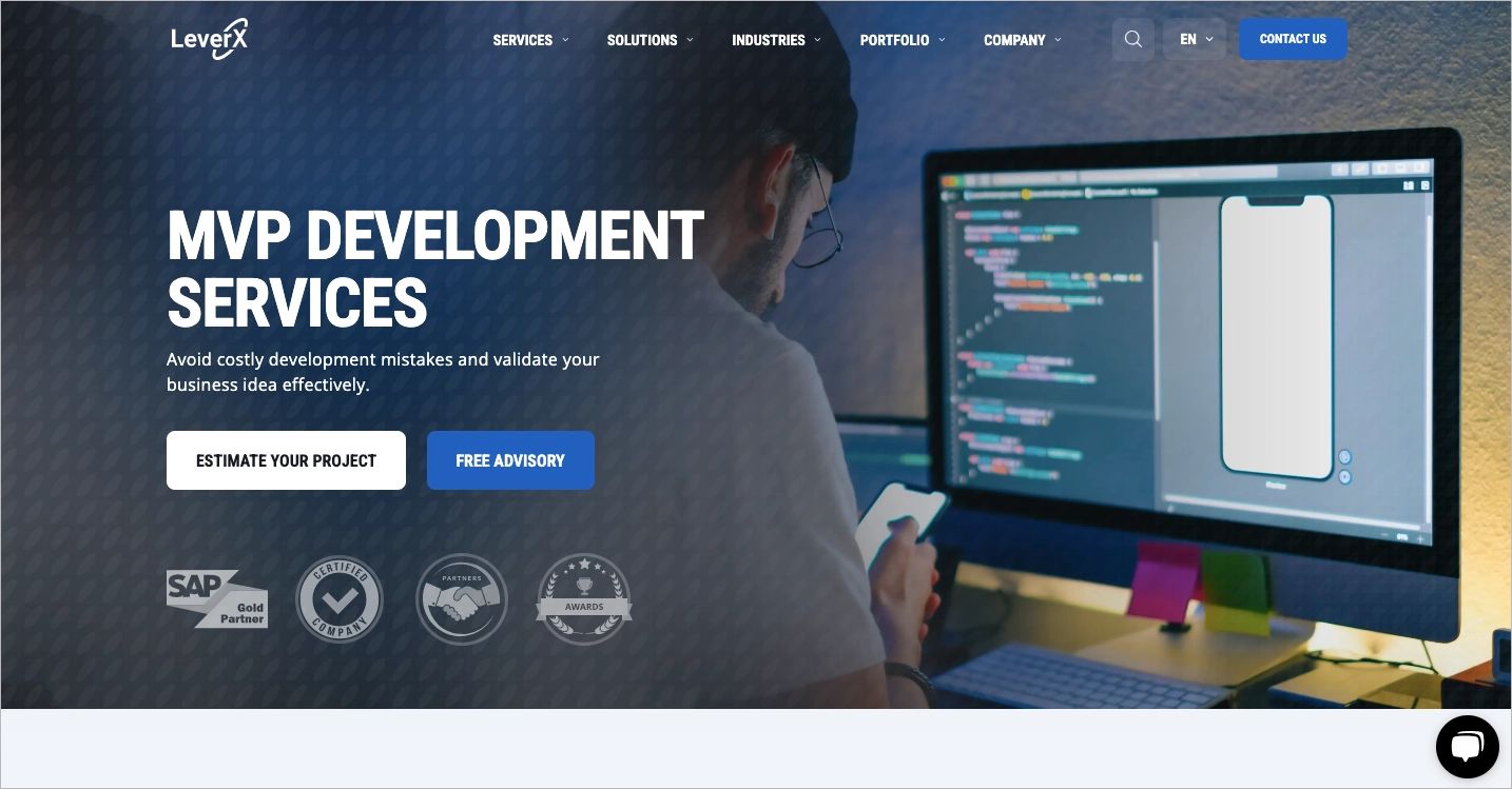
What stands out is how the information is grouped into digestible sections. The visitor can learn what MVP means, why it matters, and how LeverX supports businesses through the MVP stage – all without needing to dig. This flow encourages users to stay longer on the page. The design supports a clear structure, and visuals align with the message, adding to the clarity without overwhelming the viewer.
Key takeaways to learn from this example:
- Clear headline,
- Trust badges,
- Timeline,
- Clean layout.
Improvement areas:
- CTA focus – it’s not obvious which call-to-action is the main one, making the next step less clear for users.
Introduce your company and encourage visitors to book a call with a perfectly tailored layout – this Landingi’s technology template is designed to convert.

13. Atlantic Relocation Systems
The service landing page titled “Seattle Movers For Cheap: Get Your Free Atlantic and Atlas Van Lines Quote Today” delivers a focused and clean experience for visitors looking for affordable moving services. The page starts with a strong, clear headline that communicates a unique value – low-cost, professional moving in Seattle. This message instantly tells the user what to expect, setting a clear direction. One of the page’s standout features is its well-placed CTA buttons like “GET YOUR FREE QUOTE,” which are repeated in key locations. These buttons are bold and visible, making it easy for users to take action at any point.
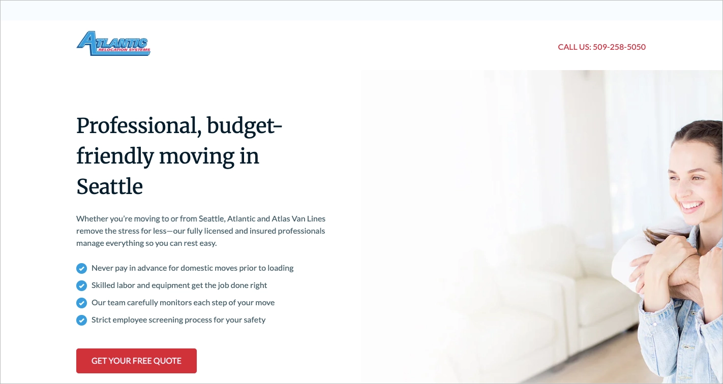
The structure flows logically: starting with service highlights, followed by trust signals like logos and testimonials, and ending in a three-step quote form. The transition from interest to engagement is smooth, and the inclusion of an FAQ near the end helps reduce hesitations by answering common concerns. This approach helps users feel informed and supported throughout the visit, reinforcing credibility and reducing friction before the quote form.
Key takeaways to learn from this example:
- Clear value proposition in the headline,
- Strong and repeated CTA buttons,
- Well-organized content flow,
- Helpful FAQ section.
Improvement areas:
- The landing page design could benefit from a tighter layout up top to make better use of the screen’s upper part, especially on smaller devices. A smaller header could create a better sense of proportion and visual balance.
14. Globant
The service landing page from Globant for its software development solutions stands out as a strong example of modern digital presentation. Right from the start, it features a catchy headline that sets the tone and draws attention, quickly telling visitors what the page is about. Every call-to-action (CTA) button, regardless of its wording (like “Contact us today”, “Drop us a line”, or “Let’s connect”) all funnel visitors to the same lead capture form. This consistency helps streamline the user flow and reduces friction. Subtle animations throughout the page help create a smooth, dynamic experience without overwhelming the content.
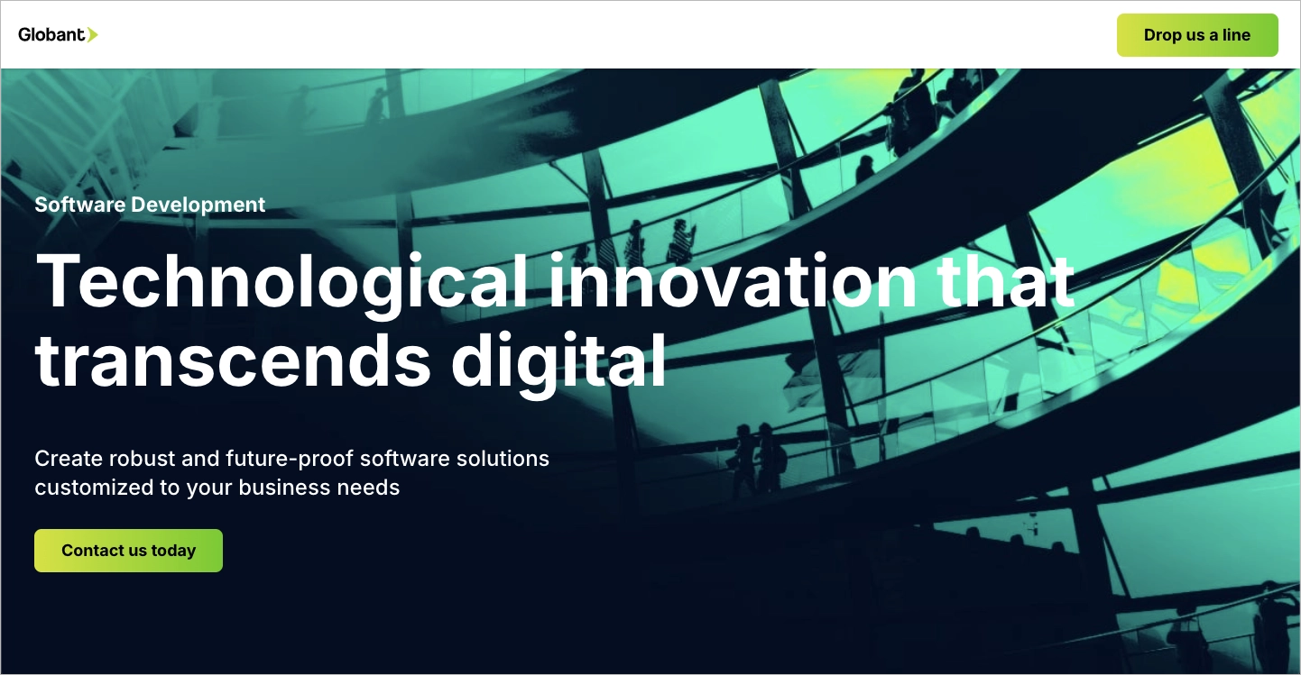
One of the most effective aspects is how visually clear the CTA buttons are. Their design and placement ensure they’re hard to miss, encouraging users to engage. Similar to many other landing pages mentioned in this article, the layout is organized to allow the message to breathe, with well-spaced content blocks that naturally guide the reader’s eye. While the visual appeal is strong, it complements the messaging, which is clear, focused on benefits, and solution-oriented.
Key takeaways to learn from this example:
- Bold, engaging headline,
- Visually distinct CTAs,
- Smooth transitions and light animation effects,
- Consistent form-driven conversion strategy.
Improvement areas:
- The CTA labeled “Meet our experts” may create confusion. It suggests access to expert profiles or booking time with specialists, yet it leads to a standard contact form like the others.
15. Yelp
The service landing page from Yelp, focused on connecting users with home cleaners, is a great example of a clear and functional design built for quick action. It centers its message right at the top with a strong headline: “Get pricing from Home Cleaners in Tukwila.” This grabs attention immediately and sets the right expectation for visitors. Supporting this is a simple form asking only for a ZIP code, which lowers the barrier for user interaction and encourages form completion.
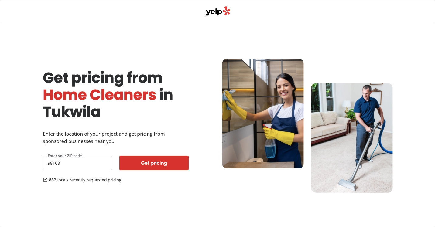
One of the most effective trust signals is the note below the call-to-action button: “862 locals recently requested pricing.” It acts as both social proof and a subtle nudge that this service is actively used. Visual support comes from relatable imagery showing home cleaning scenes, which helps users feel they’re in the right place. The page avoids overloading users with options and stays focused on its goal: to get visitors to request pricing.
Key takeaways to learn from this example:
- Clear, specific headline,
- Short, focused form,
- Social proof,
- Clean layout.
Improvement areas:
- A few testimonials or ratings from past users could further build trust.
Showcase your offer in a visually appealing way with easily customizable Landingi template and encourage visitors to take action – with the Landingi platform, it’s effortless.

16. Translated.com
The “Immediate translation quote” landing page from Translated.com is a strong example of a service-focused page built to drive user action quickly. Right away, the user sees what the page is for: getting a translation quote. The header makes it clear with a direct headline and supporting stats about translators and clients. The form is placed above the fold, encouraging users to interact immediately. Each section below reinforces the service offer with more details, showing the types of documents supported and adding credibility through visual cues like recognizable client logos.
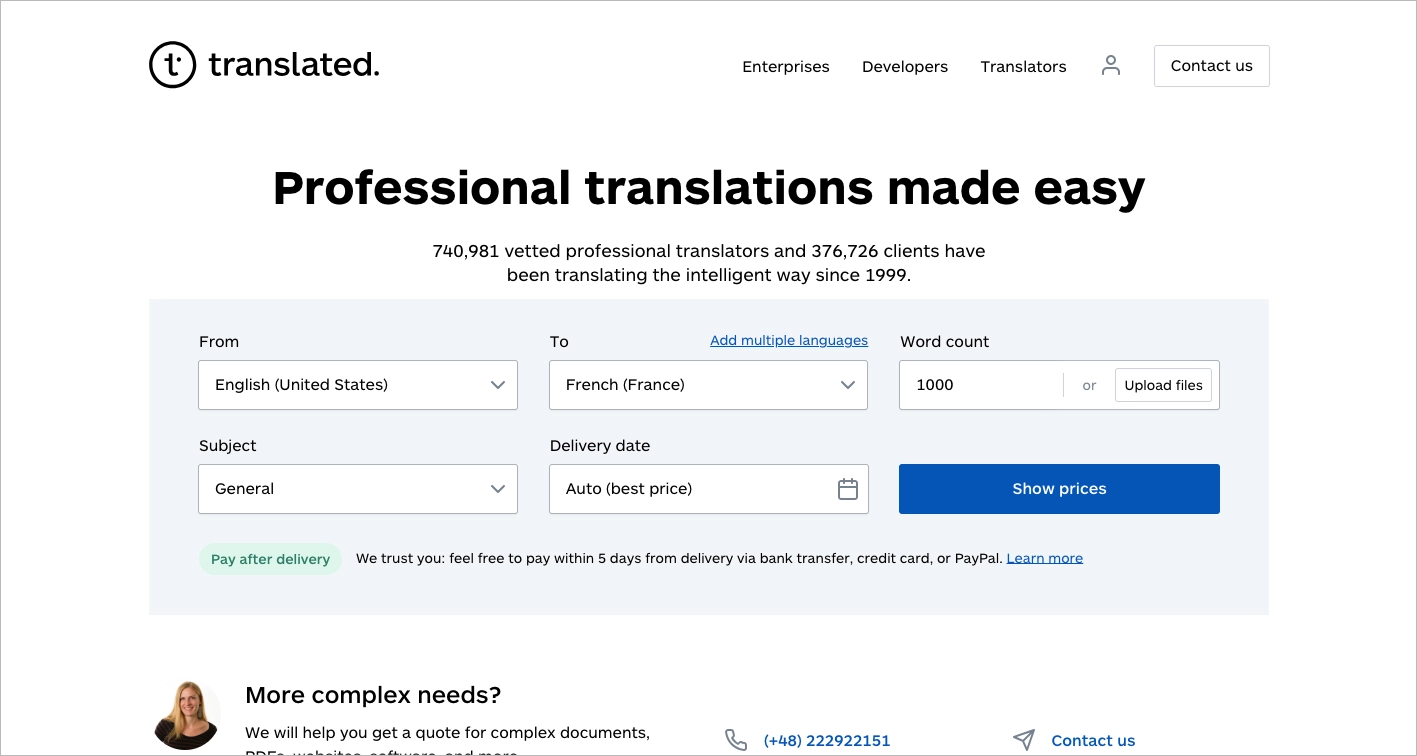
The overall layout is clean and easy to follow. Content blocks are broken into logical parts with plenty of white space. The presence of big-name case studies builds trust without needing lengthy explanations. The form also offers flexibility, covering various languages and subject areas. These elements make the user journey intuitive, especially for someone seeking a quick price without much reading.
Key takeaways to learn from this example:
- Clear purpose above the fold,
- Organized content,
- Strong credibility,
- Professional design.
Improvement areas:
- The first screen is a bit packed – so much text and form elements can feel slightly overwhelming.
- Too many form fields upfront – this may discourage some users from filling it out completely. A two-step form might help.
17. Deel
The Deel contractor landing page stands out as a strong example of how to present a global service in a clear and compelling way. The first section is especially well done – it starts with a bold headline, crisp visual design, and an immediate opt-in form that includes a short, confident call to action. The page quickly builds trust with badges from G2 and well-known client logos shown right below the hero section. This combination of authority indicators and visual hierarchy does a great job of capturing and holding attention right from the top.
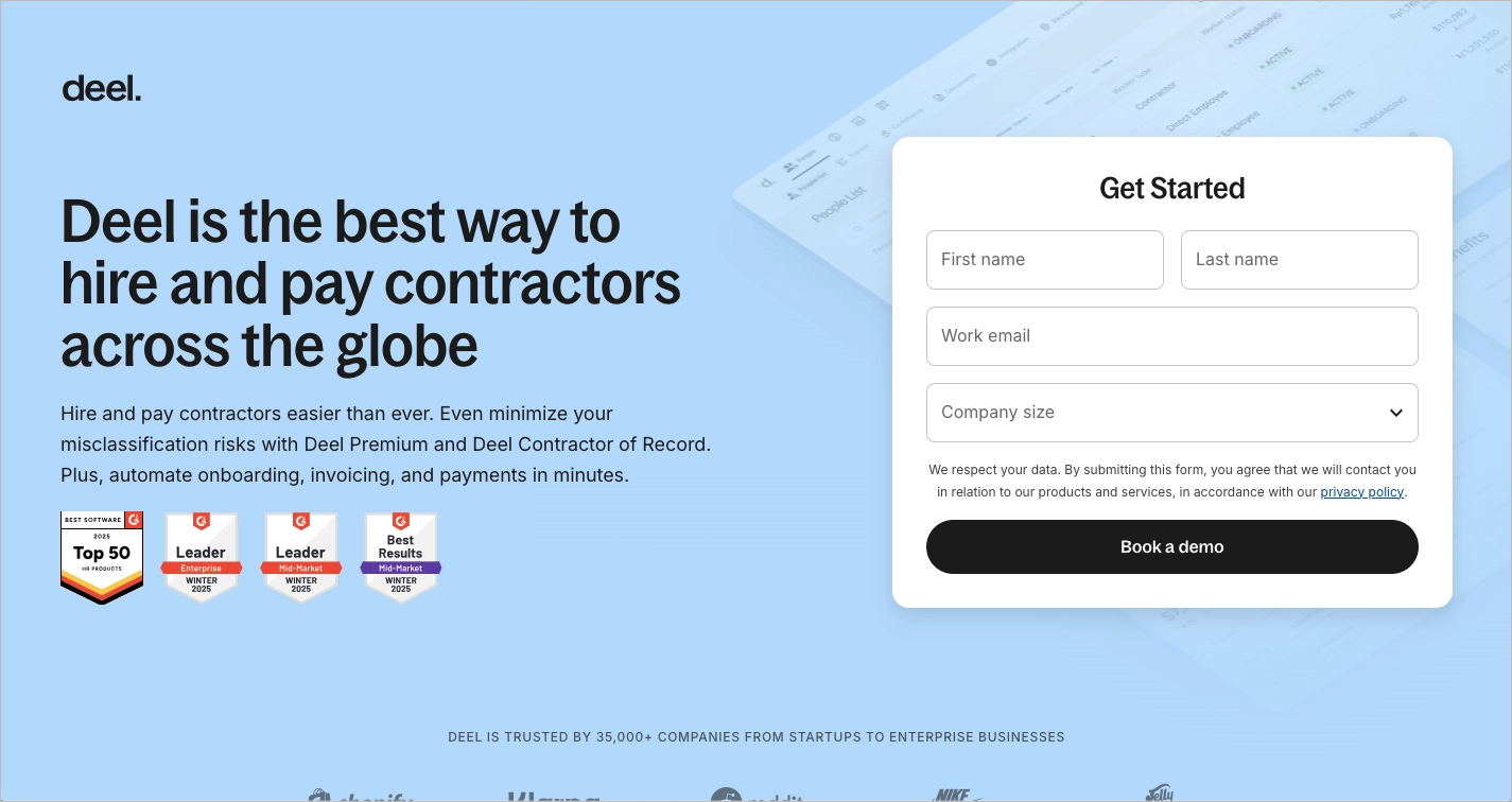
What adds even more power to this page is its use of repeated calls to action throughout the scroll, keeping conversion top of mind for the visitor. The page also includes an interactive demo, giving potential users a hands-on preview of how the platform works. Social proof is integrated smartly, helping reinforce credibility with user testimonials and recognizable brands. The design feels professional, consistent, and well-aligned with its purpose – offering services to companies looking to hire independent contractors globally.
Key takeaways to learn from this example:
- Strong visual hierarchy in the hero section,
- Use of G2 badges and client logos,
- Simple and clear call to action,
- Social proof and CTA repetition,
- The interactive demo.
Improvement areas:
- The page could potentially benefit from being shortened – trimming some content might improve scanability and help keep focus on the most important actions.
18. Consumer Fusion
The service landing page for “Remove Negative Reviews | Consumer Fusion” presents a clear value: helping businesses protect their reputation by removing false or damaging reviews. It opens with a strong, benefit-focused headline posed as a question, which is effective at sparking curiosity: “Are Illegitimate Reviews Hurting Your Business?” This type of headline works well to get attention and invites the user to imagine a better outcome.
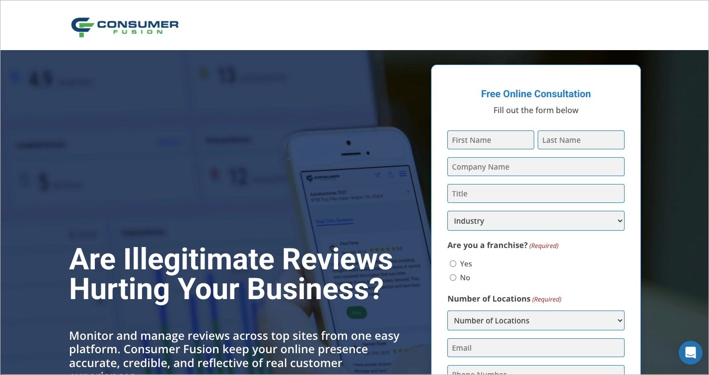
Another strength is the value proposition. The copy directly promises results that matter to local businesses – improving trust and visibility by managing online reviews. The page also includes social proof and brand credibility indicators, which add to its persuasiveness. The design is clean and straightforward, and the use of whitespace makes the message easy to digest.
Key takeaways to learn from this example:
- Question-style headline,
- Clear value proposition,
- Clean layout,
- Trust elements.
Improvement areas:
- The form is too long – it asks for more information than needed upfront, which could discourage potential leads.
- The headline sits too low on the page – moving it higher would give it the attention it deserves and improve first impressions.
19. Get A Copywriter
The service landing page for Get A Copywriter does a great job of blending friendly visuals with a clear offer. The design is cheerful, using rounded fonts, smooth icons, and soft color schemes that make the page feel approachable. Key benefits are called out clearly near the top, like fast turnaround and expert copywriters, helping users understand what they’ll gain without having to dig. The page includes a solid structure with CTAs spread throughout, making it easy for visitors to engage at different moments.
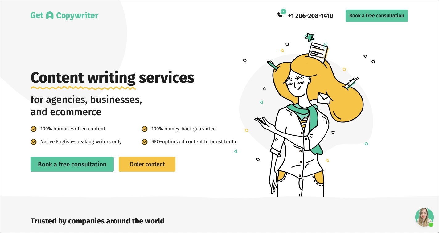
Additional strengths include strong social proof, such as recognizable client logos and positive testimonials that build trust. There’s also a handy step-by-step breakdown of how the process works, which helps set expectations and reduce doubts. Reviews are well-placed and feel authentic, and the consistent tone of the site builds credibility across sections.
Key takeaways to learn from this example:
- Cute and inviting design,
- Clearly marked benefits,
- Well-placed CTA buttons,
- Strong client logo section,
- Process is broken down into easy-to-understand steps,
- Reviews and testimonials.
Improvement areas:
- The CTA button in the top-right corner could stay visible as users scroll. Making this button “sticky” could lead to more clicks, as it would always be within reach no matter where users are on the page.
Check out Landingi’s template gallery to find a perfect pattern for your service landing page. Customize it with a user-friendly editor, run the A/B test to find the most effective elements, and be ready for success!
20. Arrows Up
The Arrows Up service landing page is a strong example of how to combine clear messaging, visual appeal, and smart layout to build trust and drive action. Right at the top, it makes a great first impression with a “Rated 5 Stars” badge from Google – this instantly lends credibility. The headline is direct: “Smarter Marketing Starts with Data.” It’s not trying too hard, but it gets the point across. The hero section uses a warm, professional image of the team that gives the page a personal touch. Alongside that, key performance stats are visible right away, giving potential customers quick insight into the benefits they can expect.
The “Book a Call” button is used strategically – it’s placed above the fold and repeated as visitors scroll, making it easy to act on interest. The layout keeps attention on what’s important: clear service descriptions, proof of performance, and a smooth path to booking a call. The clean font and color scheme give the page a polished, trustworthy feel without being overdone.
Key takeaways to learn from this example:
- Trust-building with Google star rating,
- Strong hero image featuring real people,
- Focused, conversion-driven layout with repeated CTA button
- Clear message about results and services.
Improvement areas:
- The top menu includes links to the homepage, which could lead users away from the primary goal of the page. Removing or simplifying this could help keep attention focused on the call-to-action.
5 Service Landing Page Best Practices
Now that you’ve seen some examples of successful landing pages let’s delve into some best practices that can take your landing page from good to great. Take a look at the 5 tried-and-true tactics below –those can significantly improve your own landing page performance and effectiveness.
Follow the best practices for service landing pages and start building with Landingi!
1. Use a catchy headline
Your headline is the first thing people read – so it needs to grab their attention right away. A strong headline speaks directly to the visitor’s needs, offering a clear benefit or solution. It’s short, easy to understand, and gets straight to the point. The best ones often spark curiosity, challenge assumptions, or ask a question that’s already on the visitor’s mind.
Take a look at the example below:

Reflective of the brand’s voice and tone, this headline ensures consistency across all marketing materials. It engages visitors immediately by animation highlighting the main part, consistent with the offer.
Another great idea is to engage visitors by asking a compelling question in the headline, directly involving them or addressing their specific concerns.
Highlight your services effectively—create a compelling landing page with Landingi!
2. Set strong CTAs
Strong CTAs are critical to guiding your visitors toward the desired action. Effective CTAs should use action-oriented language, it can also include shapes that signify action, like arrows. The CTA button should stand out from the rest of the page, making it clear where the user is meant to click next.
Take a look at the example below:
The placement of the CTA is crucial; it should be above the fold for immediate visibility and repeated strategically throughout the page to capture visitors at different stages of engagement.
Personalizing CTAs based on visitor data or the traffic source can significantly increase the likelihood of conversion.
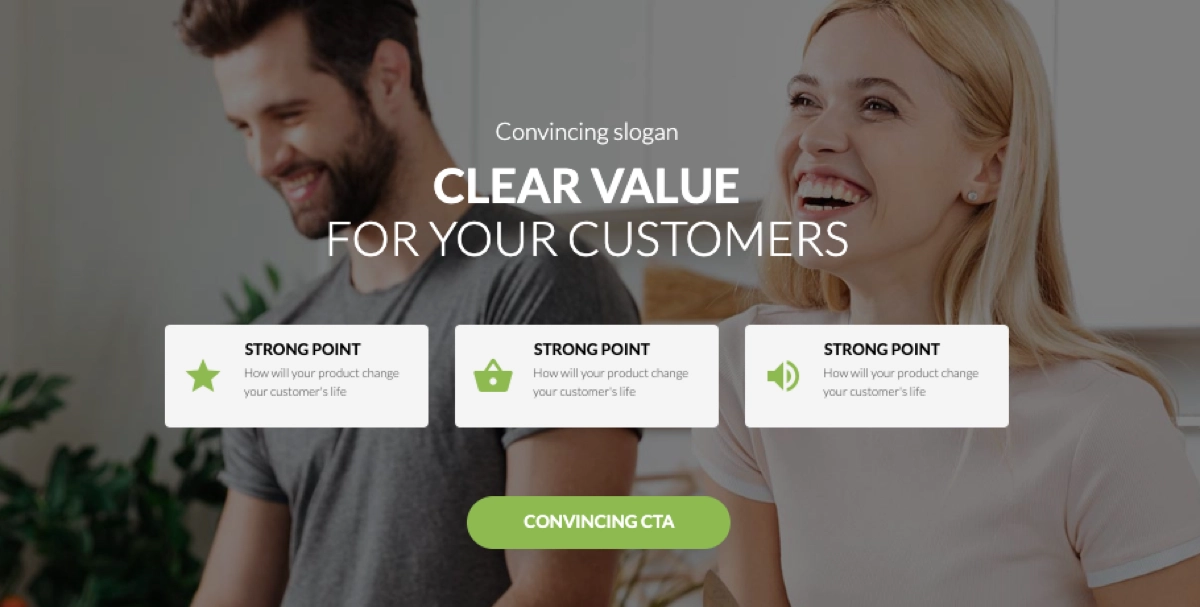
3. Implement benefit-oriented content
Benefit-oriented content can boost the effectiveness of your service landing page. This means your content should emphasize the benefits of the service rather than just its features, explaining how it solves problems or improves the user’s situation. Use persuasive language to describe the benefits and advantages of the service. It’s a good practice to implement “How it works” section, showcasing simplicity of using your service.
Take a look at the example below:

Simple icons and concise descriptions are the best method, alternatively, you can set a bullet list showcasing all phases of your service.
By focusing on the benefits, you can create compelling content that convinces users to choose your service. Remember that content on your landing page should be organized logically, leading with the most significant benefits first to engage the visitor’s interest immediately.
Convert more visitors into customers—design a service landing page with Landingi!
4. Remember about trust signals
Trust signals help visitors feel confident about choosing your service. These can take many forms, like customer reviews, certifications, awards, or even simple security badges. When placed thoughtfully on a landing page, they reassure potential clients that they’re making a safe and smart decision.
Showing real customer reviews gives your satisfied clients a voice and adds authenticity to your message. Awards and certifications show that your service meets high standards and is recognized by others in your field. Even a small icon showing secure payment can quietly reduce hesitation.
The goal is simple: make it easier for someone to say yes. Trust signals do just that.
Take a look at the example below:

Displaying logos of well-known clients or partners can enhance trust by showing that the service is recognized and used by reputable companies.
Additionally, you can include a privacy statement or link to a privacy policy near forms. It can reassure visitors that their personal information will be protected.
5. Keep forms simple
Last but not least, keep your forms simple. Request only essential information to minimize friction and encourage completion. The design of your form should be straightforward, with clear labels for each field and a prominent submission button that indicates the action to take.
Take a look at the example below:

It’s a good practice to keep the form’s design consistent with your landing page and brand visual identity. It ensures a seamless experience and helps to build your brand strength.
Putting all these landing page best practices into action can be time-consuming, especially when you’re building a page from scratch. Tools like Lunar – Landingi’s AI landing page generator – can simplify this process by creating complete, launch-ready pages that already include all the essential conversion-focused elements, so you can focus on refining your offer instead of structuring the page.
How Can I Optimize My Service Landing Page for Higher Conversion Rates?
To boost conversions on your service landing page, focus on simplifying the design, writing clear CTAs, streamlining your form, ensuring mobile responsiveness, improving load speed, and running regular A/B tests to fine-tune what works. Using these proven strategies, you can enhance user experience, clarify your value proposition, and ultimately, increase the likelihood of converting visitors into customers.
Simplify the design
Aim for clarity. A clean layout with enough breathing room helps people focus on what matters: your offer and what they should do next. Avoid clutter. Use whitespace to guide the eye, and make sure your call-to-action buttons are easy to spot.
Use clear, action-driven CTA
Your call to action should tell people exactly what will happen when they click. Use direct, benefit-oriented language like “Book your free session” or “Get pricing details.” Make the buttons visually stand out and place them where users expect to see them – especially near headlines and at the end of sections.
Make your form easy to complete
The shorter the form, the better. Only ask for what you really need. Every extra field adds friction. If you plan to collect more details later, consider using progressive profiling.
Make sure it works on mobile
A large share of your visitors will land on your page via phone. If your layout breaks or feels hard to use on a small screen, many of them will leave. Test on different devices and fix anything that slows people down or causes confusion.
Keep testing and improving
What works now might stop working later. Run A/B tests regularly to compare variations of headlines, images, copy, or CTA buttons. Even small changes can lead to better results when backed by data.
To make optimization even more effective, you can also use Solis – Landingi’s AI-powered landing page optimization tool. It helps you uncover performance insights and identify smarter ways to improve conversions based on how your page performs.
Speed it up
People are impatient. If your page loads slowly, many visitors won’t wait. Compress large images, limit scripts, and use caching tools to make sure your landing page loads fast.
What are the Key Elements of an Effective Service Landing Page?
An effective service landing page includes nine essential elements that work together to capture attention and guide visitors toward a specific action: a clear headline, informative subheadings and copy, persuasive call-to-action buttons, visual content, testimonials, a features-and-benefits section, responsive design, and SEO-friendly content.
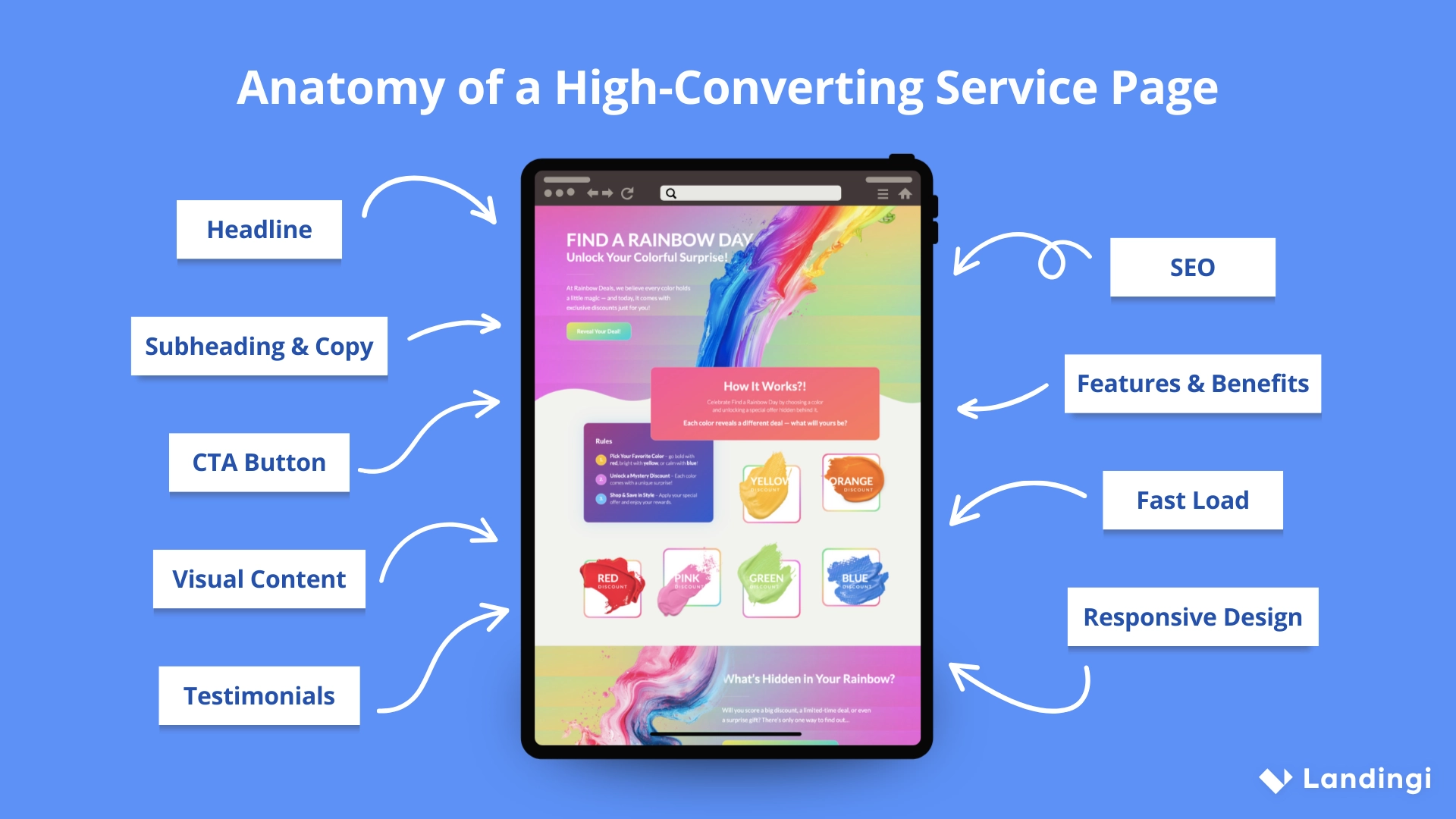
A strong headline instantly communicates the core value of the service, encouraging visitors to stay and read more. Subheadings and copy should be written in a way that highlights the benefits of the service and explains how it addresses the visitor’s needs.
Clear, action-oriented call-to-action buttons invite users to take the next step, whether that’s booking a call or requesting a quote. Supporting visuals (such as photos or short videos) help people quickly understand what the service looks like in practice.
Adding testimonials, client logos, or reviews builds trust and credibility, especially when visitors are encountering your business for the first time. A well-structured section on features and benefits helps users see not just what your service does, but how it solves their problems or improves their lives.
The entire page should load quickly and look great on any screen, ensuring a smooth experience across all devices. And finally, smart use of relevant keywords helps the page rank in search results, putting your offer in front of the right people at the right time.
What Is the Best Service Landing Page Builder?
The best service landing page builder is Landingi. It’s a platform built to make creating and optimizing service landing pages simple, efficient, and effective – even if you don’t have a technical background.
What makes Landingi a standout choice is how much you can do with it in one place. The editor is intuitive, so you can design pages quickly without relying on developers. But beyond that, Landingi includes tools that support your entire landing page workflow. You can write and improve content with the help of AI, generate complete, launch-ready pages with Lunar, track user actions and page performance using EventTracker, experiment with different versions of your page through A/B testing, and collect leads using customizable forms and popups.
It’s a complete solution that works well for solo marketers, small businesses, and agencies. And because it’s both affordable and packed with functionality, it’s a smart pick whether you’re just starting out or managing multiple campaigns.
Build Service Landing Pages and Get Leads
Service landing pages are an essential part of your digital marketing strategy. They act as a dedicated space for your campaigns, offering a focused experience without the distractions that often come with a homepage or broader website. These pages are built with a single goal in mind: to turn visitors into leads or customers by clearly communicating the value of your service.
Now that you’ve explored what makes a service landing page high-converting, understood the theory, and reviewed real examples, you’re ready to build your own. By applying the key elements and proven practices highlighted throughout this article, you’ll be well-positioned to achieve strong conversion results.
The success of a service landing page depends on how well it captures attention, builds trust, and guides users toward taking action. Whether you’re creating your first page or improving an existing one, try the best landing page builder – Landingi, and optimize your page to convert more visitors into clients.


