

A tech landing page is a one-mission webpage built to drive a specific action — like starting a free trial, booking a demo, or downloading an app. It’s where innovation meets intention. Whether you’re launching a SaaS tool, promoting a virtual event, or introducing a cutting-edge product, this page is your conversion engine.
And here’s a number that speaks tech fluently: companies that optimize their landing pages with the right tools see a 30% average conversion boost (Unbounce). That’s not just a lift — it’s the difference between product-market fit and product-market flop.
In this article, we’re unpacking what makes a tech landing page click. You’ll get the anatomy of high-performing examples, best practices pulled straight from top-performing campaigns, and easy-to-apply tips that help turn curious visitors into loyal users.
Keep reading to explore real examples from the tech space and see what makes these pages stand out — not just in design, but in performance.

What Is a Tech Landing Page?
A tech landing page is a digital space designed to promote a single technology product, service, or related event. Its primary goal is to guide visitors toward a specific action, such as subscribing to a service, downloading software, requesting a demo, etc. Unlike regular web pages, which might offer various information and navigational options, a tech landing page is focused and targeted to keep the user’s attention on the call-to-action.
This type of landing page is essential in the tech industry for launching new products, offering free trials, or capturing leads for software and tech services. It highlights the product’s features, benefits, and unique selling propositions, leveraging testimonials, demos, and technical specifications to persuade visitors.
Effective tech landing pages are streamlined for conversion, using clear and compelling copy, engaging visuals, and a straightforward layout that makes taking the next step irresistible for the audience. They play a crucial role in a tech company’s digital marketing strategy by optimizing the user’s journey from interest to decision-making.
How Do I Create a Tech Landing Page?
To create a landing page for a tech industry, start by defining your goal and getting to know your target users. Then pick a platform that makes things easy—like Landingi—so you can focus more on content and less on coding. Build your page with a bold, clear headline, eye-catching visuals (think product screenshots or quick demo clips), and crisp, benefit-driven copy.
You’ll also want to add credibility boosters like customer logos, testimonials, or security badges, and finish strong with a clear CTA that pushes people to sign up, request a demo, or download your tool. Don’t forget a lead capture form to collect the info you need—and make sure your page looks sharp on every screen, from laptop to mobile.
Follow the detailed 7-step guide below to build a high-converting tech landing page that’s optimized for action.
Design a high-performing tech landing page with ease using Landingi.
Step 1. Define Your Goal and Audience
First things first—what’s the one thing you want people to do on this page? Sign up for a free trial? Book a demo? Download your app? The clearer the goal, the easier it is to build a landing page that actually works.
Then, dial in on your audience. Are you targeting developers, IT managers, startup founders? Each group looks for different things—some want technical specs, others need fast value and social proof. Knowing what matters to them helps you shape the message, tone, and layout so the page feels like it was made just for them.
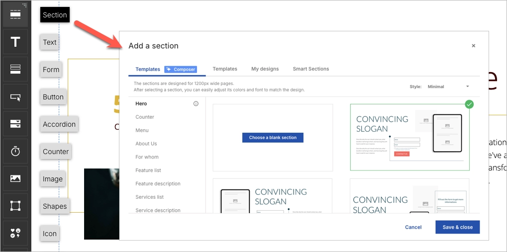
Step 2. Choose a High-Converting Template
You don’t have to build your tech landing page from zero. Landingi gives you over 400 templates designed to convert—just click “Create new landing page” and pick one that fits your product or campaign type.

Once you’ve got your base, make it yours with the drag-and-drop editor. Add your product visuals, tweak the copy, swap out sections—no coding needed. Want consistent branding across multiple landing pages? Use Smart Sections to keep your logo, colors, and CTAs aligned in every version.
Step 3. Craft a Compelling Headline and Engaging Copy
Your headline needs to stop the scroll and make people think, “I need this.” Whether it’s “Boost Dev Productivity by 60%” or “Your AI Co-Pilot Is Here,” the goal is to instantly show the value.

Once you’ve nailed the headline, write copy that walks users through your product’s benefits in a natural, helpful way. Use Landingi’s AI Assistant if you want a smart jumpstart. Focus on real outcomes, not just features. Instead of saying “Advanced analytics dashboard,” say “Track user behavior in real time, no extra setup.”
Break your content into scannable chunks using subheadings or bold statements. Every line should lead the visitor toward your CTA—whether that’s “Start Free Trial,” “See It in Action,” or “Get Early Access.” And if you’re running paid ads, sprinkle in relevant keywords that match what your ideal user is searching for.
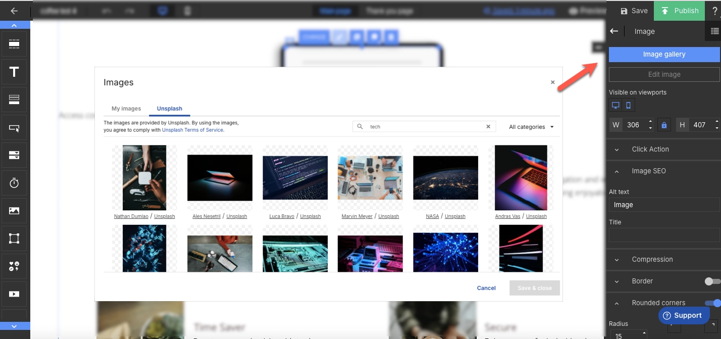
Step 4. Enhance Visual Appeal with High-Quality Images and Videos
People don’t just want to read about your product—they want to see it in action. Upload crisp screenshots, short demo clips, or even looping UI gifs to give your landing page real visual punch. Tools like Landingi’s background remover make your visuals cleaner and sharper with zero hassle.
A quick product walkthrough or explainer video can also do wonders. It gives visitors a taste of how your tool works without asking them to commit. Just keep everything lightweight—optimize your files so they load fast. No one’s waiting more than two seconds to see what you’ve built.
Step 5. Implement a Lead Capture Form with a Strong CTA
A solid lead form is your conversion engine—so make it count. With Landingi’s form builder, you can whip up a clean, quick form that only asks for what you actually need (think: name, email, maybe company or role). The shorter the form, the more likely people are to fill it out.
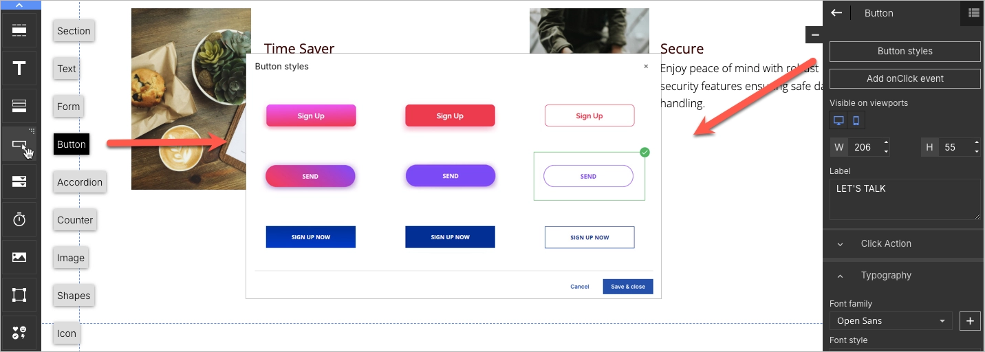
Now for the CTA—make it loud, clear, and action-driven. Instead of “Submit,” go with something like “Start Free Trial,” “Get the Beta Invite,” or “Book My Demo.” Use contrasting colors so the button pops and place it strategically—above the fold, after benefits, and near key visuals.
Step 6. Add Interactive and Trust-Building Elements
Want more clicks and trust? Add some movement and social proof. Countdown timers are perfect for limited beta spots or ending launch deals. Smart pop-ups can nudge visitors who’ve been hanging around but haven’t acted yet.
Build trust with real testimonials—quotes from current users, logos of companies using your product, or even short video clips from happy customers. Bonus points if you’ve got press mentions or third-party reviews. Also, link out to your socials to show there’s a real team behind the tech.
Step 7. Optimize for Mobile and Publish with a Custom Domain
A huge chunk of users will hit your page from their phone—so don’t leave mobile as an afterthought. Use Landingi’s mobile view to tweak your layout, tighten up text, and make sure buttons are easy to tap. Everything should load fast and feel seamless.

Before you go live, connect your own domain so your page looks polished and professional. Then track what’s working (and what’s not) with Landingi’s built-in analytics and A/B testing tools. Tweak headlines, try new CTAs, and keep optimizing until your tech landing page runs like a well-oiled conversion machine.
5 Best Examples of Tech Landing Pages
The 12 best examples of tech landing pages with various main objectives below showcase how theoretical fundamentals cover real-life cases. Learn how to design your tech landing page and gather ready-to-use key takeaways to create your own page.
1. Starlink
The Starlink landing page showcases a great design inspiration for creating a high-converting technology landing page for services. The hero section includes catchy headlines, a background picture showcasing new technology in real-life use, and an outstanding CTA indicating urgency. Next to the CTA button, visitors can type the localization to check the availability of Starlink technology.

The page includes high-quality visuals, immersive video, and captivating descriptions, which are introduced by catchy headlines. This combination of content, tailored for the target audience, directs visitors straight to the primary CTA, repeated at the bottom of a landing page. The page cleverly showcases the value of a new technology, attracting users with a special offer.
Key takeaways to learn from this example:
- Stunning design,
- High-quality visuals and videos,
- Concise, informative descriptions, including storytelling elements,
- Outstanding CTA button,
- Availability map,
- Clear pricing.
Improvement areas:
- Social proof – the page could include ratings and reviews from previous and current users, which build trust and credibility among visitors, ultimately leading to higher conversion.
Pick a template for your tech landing page and customize it easily with Landingi – show your technology potential and engage visitors to give it a trial!

#2 Disqus
Disqus goes ultra-minimal — flat colors, clean visuals, and barely-there text. The goal? No distractions, just clarity. One bold call-to-action tells visitors exactly what to do next, and that’s the beauty of it.
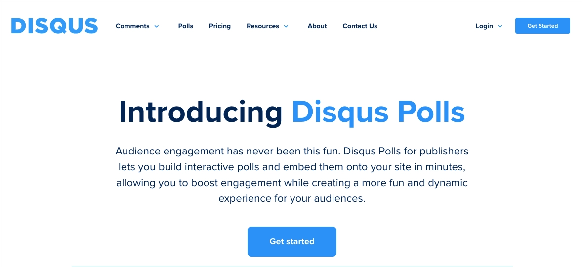
Pro tip: Stick to one CTA — and make it count. When you give visitors too many choices (“Try Free,” “See Pricing,” “Book Demo,” “Read Docs”), decision fatigue kicks in. Confused users don’t convert. A great landing page has tunnel vision: one goal, one button, one path forward. Keep it focused, and your conversion rates will thank you.
#3 Apple TV+
The Apple TV+ landing page feels like a trailer in itself — cinematic, sleek, and built to pull you in. With high-res visuals, background video, and crisp Apple Originals on full display, it grabs the attention of movie lovers right away. But beyond the eye candy, the layout stays clean and easy to follow, thanks to smart white space and a clear content structure.

What really works? The CTA. It’s bold, perfectly placed, and says exactly what users need to hear. The messaging is simple, the design pops, and it’s impossible to miss. Apple also strikes a great balance between dynamic visuals and still, informative content — animated banners up top, then static sections below to explain the tech without overwhelm.
The built-in FAQ section is a smart touch too, answering common questions about supported devices, features, and pricing without sending users off-page.
To promote your technology, choose the perfect template from Landingi’s gallery and customize it effortlessly with its drag-and-drop editor – it takes minutes and brings awesome results!

#4 Google Docs
Google keeps things minimal — and it works. The landing page for Google Docs is clean, calm, and clear. A peaceful background image sets the scene, while the copy gets straight to the point: “Create persuasive documents.” No fluff, no clutter, just one simple message.
What makes it pop? That animated headline. It cycles through different use cases, catching your eye without overdoing it. A small touch, but super effective for grabbing attention and keeping things dynamic. The CTA — “Go to Google Docs” — is front and center, styled in bold blue so there’s zero confusion about the next step. Just one button, one goal. Classic Google.
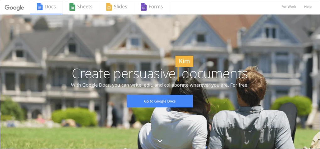
Why this page works:
- Minimal layout with max clarity
- Smart use of animated headlines to boost engagement
- One strong CTA that’s easy to find and follow
- Background image adds warmth without distracting from the message
#5 Potis
Potis doesn’t waste a second — the landing page kicks off with animated questions that instantly spark curiosity and explain what the product is all about. It’s a smart move that pulls visitors in before they’ve even scrolled. Just below, bold headlines take over, spelling out the value clearly and confidently.

The main CTA lives in the top right corner but scroll a bit and you’ll spot more sign-up buttons sprinkled exactly where they need to be — after feature highlights, pricing details, and testimonials. Every click feels natural, not forced.
Each section is compact and focused, mixing sleek visuals with quick-hit copy that’s easy to scan. Animations keep things lively without being distracting, and the pricing layout stands out for being both unconventional and super easy to digest.
Why the Potis landing page works:
- It starts with animated questions that quickly show what the product does.
- Signup buttons are placed exactly where users expect them.
- The design is clean and easy to scroll, with visuals that keep things interesting.
- Headlines, features, and testimonials all work together to build trust fast.
This is what happens when you blend smart UX with clear messaging — Potis proves that even B2B landing pages can look great and convert like a champ.
#6 TSMC
The TSMC technology symposium landing page is a perfect example of promoting an event in the technology industry. Its layout is clear, including well-selected headlines and written content. Adequate, high-quality animation in the hero section builds interest among the target audience. The CTA button is outstanding with its design and includes straightforward messaging, indicating urgency.

This technology landing page, created for event promotion, includes the agenda and benefits section that informs the audience about the subject of the symposium at the same time. Social media buttons allow visitors to find more information and dive into the brand’s world within their SM channels.
Key takeaways to learn from this example:
- Clear and intuitive layout,
- Attention-grabbing animation,
- Minimized descriptions,
- Agenda,
- Benefits section,
- Outstanding CTA button.
Improvement areas:
- Speakers section – adding a speakers section with widely-known industry specialists would boost engagement and improve the informative side of an event landing page.
Promote your tech event with a SaaS Webinar template – use your brand’s colors, create an irresistible offer, and boost engagement with a countdown widget.

#7 Xiaomi
Xiaomi’s landing page for the Mi Motion-Activated Night Light 2 is proof that tech doesn’t have to feel complicated. True to the brand’s style, the layout is simple, sleek, and laser-focused — no clutter, just everything you need to know in one scroll.
From the start, high-quality visuals do most of the talking. Each section flows naturally, breaking down features, use cases, and specs without drowning you in jargon. There’s even a step-by-step guide and full tech breakdown — perfect for smart home fans who like to know exactly what they’re buying.

The purchase CTA sticks with you thanks to a sticky nav bar — a smart move for mobile shoppers who scroll fast but buy faster. And down in the footer? Social buttons and a clean opt-in form make it easy to stay connected with the Xiaomi crowd.
What Xiaomi gets right:
- To-the-point visuals that show the product in action
- A sticky CTA that’s always just a tap away
- Clear specs and simple setup instructions for the detail-oriented
- Easy newsletter signup and social links that invite users to join the brand’s ecosystem
This page is a masterclass in how to present a tech product: look good, say just enough, and make buying feel effortless.
#8 Supabase
“Build in a weekend. Scale to millions.” That headline alone is enough to hook any dev team chasing speed and scale. Supabase doesn’t tiptoe — it dives straight into what matters to its audience: launching fast and growing big.
The layout is clean and dark-themed, letting the bold green CTA and headline pop hard. Right below, logos from GitHub, Mozilla, and 1Password lend serious credibility — a quiet flex that says, you’re in good company.
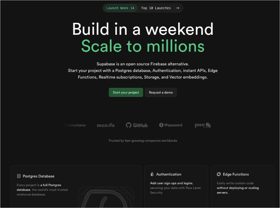
There’s also a smart move here: a live documentation link right on the homepage. It works like a silent product demo — no fluff, just straight into the tech. Perfect for engineers who want proof before promises.
What Supabase nails:
- Big, bold headline that speaks directly to developer priorities
- Trust-building logos from well-known enterprise users
- Clear CTAs with zero guesswork (“Start your project” or “Request a demo”)
- Live docs link that shows the product in action from the jump
It’s a fast-loading, no-nonsense landing page that knows exactly who it’s talking to — and how to get them to click.
#9 Sentry
Sentry hits different in the dev tools crowd. Their headline — “Code breaks, fix it faster” — doesn’t just acknowledge the pain of debugging, it makes you smirk while doing it. It’s real, it’s relatable, and it cuts through the dry noise of typical IT messaging.
Below that? A casual flex: “Considered ‘not bad’ by 4 million developers.” It’s tongue-in-cheek, but still builds trust. Add sticky dual CTAs — “Try Sentry for free” and “Explore the sandbox” — and visitors always know their next move, no matter where they are on the page.
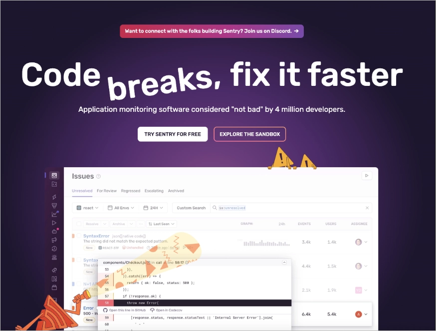
The interface preview adds context, and those little warning icons, they make the page feel alive without being chaotic.
Why Sentry sticks:
- A headline with actual personality (and a sense of humor)
- Persistent CTAs that keep conversion paths open
- Subtle but smart visuals that reinforce product value
- Usage stats that show credibility without bragging
It’s a great reminder that even serious tools can show up with a little wit — and still win devs over.
#10 AMD
The AMD technology landing page created to promote the Ryzen™ Threadripper™ processors is another example that can be your design inspiration. Its clear layout leads visitors toward informative sections supplemented with high-quality visuals and immersive videos. This click-through landing page has one goal – direct users to complete the CTA and gather leads.

This page, although it seems lengthy, provides a professional overview of a product. It includes comparison tables, technical specification tables, and visual charts showcasing technical performance data. These technical, informative sections are supplemented with attractive, persuasive content. The page also includes testimonials from industry-related customers, boosting visitors’ engagement.
Key takeaways to learn from this example:
- Long landing page design,
- Attractive visuals and video,
- Informative sections with technical specification tables,
- Persuasive, well-written content,
- Testimonials,
- Outstanding CTA.
Improvement areas:
- Intuitiveness – although the page is both informative and engaging, it should highlight the main CTA button more, making it an intuitive step for visitors.
Pick the Revolution Product template from Landingi’s gallery and customize it with its editor to promote your solution.

#11 Linear
Linear keeps things sharp, clean, and all about the product. The headline is straightforward — “Linear is a purpose-built tool for planning and building products” — and the rest of the page follows suit with zero fluff.
What really stands out is how they show the product in motion without overwhelming you. Subtle animations and dark-mode visuals give dev teams a real feel for the tool, without turning it into a full-blown demo.
The copy? It’s smart but human. Linear speaks developer without drowning in dev-speak, striking that sweet spot between technical and approachable. And the CTAs are clear, consistent, and right where you’d expect them — no second-guessing, just action.
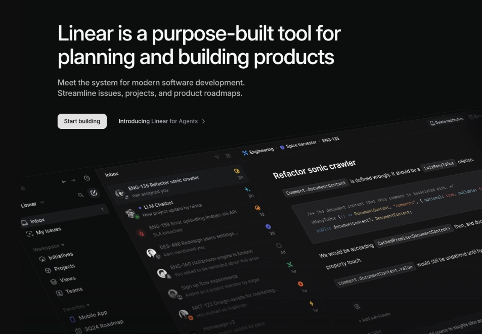
Why Linear nails it:
- Conversational copy that clicks with product and dev teams
- Slick, in-product visuals that tell the story without shouting
- Minimal design that keeps the focus on usability
- Repeated CTAs that make next steps obvious
This is how you build trust fast: clear message, clean design, and just enough movement to keep things interesting.
#12 IBM
The IBM creative page created to promote Quantum Summit attracts visitors thanks to its clear layout and monochromatic theme in the hero section, changing into a modern color palette in further parts of the page. Chosen purples in color psychology refer to the future and innovation, which perfectly fits the technology page.

The CTA button is well-placed, with an outstanding design and straightforward messaging. The concise but informative descriptions captivate users’ attention while carefully selected visuals, presenting a modern, minimalistic approach, perfectly supplement the page’s design.
Key takeaways to learn from this example:
- Clear layout,
- Compelling headlines,
- Immersive visuals and animations,
- Well-matched colors,
- Outstanding CTA button,
- Informative content.
Improvement areas:
- Mobile responsiveness – the page should be better optimized for mobile devices, and page load speed should be improved to ensure a seamless experience across all devices and minimize bounce rates.
Choose the Virtual Summit template from Landingi’s template gallery, show your innovative approach, and attract users to complete your CTA – high-converting landing pages are within your reach.

4 Tech Landing Page Best Practices
To create a perfect tech landing page, implement the 4 best practices that allow you to gather leads, engage visitors in your technology world, and drive high conversions. These practices are designed to optimize your landing page for maximum performance, transforming casual browsers into committed leads or customers.
#1 Incorporate testimonials or social proof
The first best practice for a tech landing page is to implement testimonials or other social proof elements. Showcasing success stories, testimonials, or endorsements from reputable sources or satisfied customers, efficiently builds trust and brand credibility.
Take a look at the example below:

Even a simple section with reviews from satisfied customers can enhance visitors’ trust in your product or service. If possible, show award badges on the landing page – this way, you will build the value of your brand among potential customers and, ultimately, increase conversions.
Build a sleek and modern tech landing page that converts with Landingi.
#2 Make your CTA outstanding
The second best practice for a tech landing page is to make your CTA outstanding. Ensure the button contrasts well with the entire page’s color theme and is consistent with your brand visual identity as well. However, its design can’t be flashy and overwhelming – you have to find a good balance to achieve the best results.
Take a look at the example below:

Messaging also matters, so keep it short, engaging, and straightforward. If possible, indicate urgency within your button message. Alternatively, you can use just shape, for instance, an arrow or a “play” icon, without wording the intention – it gathers attention and encourages action.
Launch a professional tech landing page that drives results with Landingi.
#3 Include video content
The third best practice for a tech landing page is to include video content. It can be an immersive background video, a use case video, or the one with testimonials. Enabling autoplay can be a great decision, as users, especially from mobile traffic, are used to short video content from SM giants – an autoplay video quickly grabs their attention, promising something interesting or valuable.
Take a look at the example below:

A video is one of the most important elements of each high-converting landing page. Including videos is the best option to boost conversions, as internet users prefer watching short films instead of reading lengthy written content. Videos allow you to tell more in a matter of seconds – remember that most effective videos last no longer than 2 minutes, and the optimal video duration is 45 sec.
#4 Use popups
The fourth best practice for a tech landing page is to use a popup encouraging to subscribe to a newsletter. In a technology world, nothing is more important than being up-to-date with innovations, so the best option for lead-generation purposes is to use a simple popup with a short form.
Take a look at the example below:

Give visitors a simple path to join your newsletter community – you can choose a pop-up display scenario, implementing an exit intent pop-up or a scroll depth pop-up. Conduct A/B testing to discover which scenario works best and use the insights to optimize your page further. One thing is sure – a popup with a short form is one of the most effective lead-gathering tools in digital marketing.
Easily design a landing page for your tech business with Landingi’s intuitive tools.
How Can I Optimize My Tech Landing Page for Higher Conversion Rates?
To optimize your tech landing page for higher conversion rates, focus on refining your value proposition to be as clear and compelling as possible, enhance your CTA button visibility and attractiveness, utilize A/B testing to experiment with different page elements, and ensure your page design is responsive across devices. Learn the following 6 optimization tips to achieve the best results:
1. Keep it clean
A great tech landing page isn’t cluttered. Go for a simple layout, readable fonts, and colors that feel on-brand. It should look sharp on any screen and make clicking your CTA feel like the natural next step.
2. Make your CTA pop
Your CTA button shouldn’t play hide and seek. Use clear, punchy text (think: “Start Free Trial,” not “Submit”) and make it stand out with contrast. Test placement and wording until it feels just right.
3. Speed things up
Nobody’s waiting for your page to load. Compress images, clean up code, and check your speed with tools like PageSpeed Insights. Faster = more conversions. Always.
4. Test everything
Don’t guess. A/B test headlines, CTAs, images — even button colors. Let real data tell you what works instead of relying on gut instinct.
5. Think SEO from the start
Use keywords your audience actually searches for, write helpful copy, and optimize your meta tags. A little SEO love can bring in high-intent traffic you didn’t pay for.
6. Track what matters
Watch how users behave. With tools like Landingi’s EventTracker, you can spot drop-offs, top clicks, and missed opportunities — and fix them fast.
Craft a cutting-edge tech landing page that captures attention with Landingi.
What Are the Key Elements of an Effective Tech Landing Page?
The key elements of an effective tech landing page are: eye–catching visual elements, compelling headlines with creative but informative content, and a well–designed layout, all showcasing unique selling propositions in an engaging way to complete the CTA. Familiarize yourself with the basic components that make up a successful tech landing page, shown below:
A good tech landing page feels less like a pitch and more like a guided tour — short, smooth, and designed to make every scroll count. It all starts with the headline. Think of it as your opening line — it needs to hook people fast. A strong subheadline keeps the momentum going, adding just enough detail to make visitors think, “Okay, I’m listening.” From there, visuals take over. A clean screenshot, a snappy product demo, maybe a quick looped animation — they all help users see the value without digging for it.
But a good first impression isn’t enough. You need to show people why this product matters to them. That’s where a clear value proposition steps in, followed by real proof: customer logos, reviews, maybe even a quote or two from happy users. These little details go a long way in building trust. A standout CTA, placed exactly where it makes sense, does the rest.
And as visitors explore, everything should feel intuitive. A features section that’s easy to skim. A short FAQ that answers the “what ifs.” A mobile layout that doesn’t feel like a second thought. When done right, a landing page becomes less of a webpage and more of a conversation — one that makes it easy for people to say yes.
Design a high-performing tech landing page with ease using Landingi.
What Is the Best Tech Landing Page Builder?
The best tech landing page builder is Landingi, a platform that allows you to build landing pages, experiment with various landing page versions, track user behavior, and optimize your page in each aspect. Landingi is well-known for its user-friendly builder and perfectly prepared digital marketing toolkit, providing the best solution for both inexperienced individuals and professional marketers.
Landingi is the best tool to start your journey of crafting your own landing page. You can start the process by choosing a pattern in the template library. Each template you find is designed to maximize conversions, so it’s enough to customize its visual side and complete the content to get closer to your conversion goals.
The page creation process is just the beginning. Still, thanks to A/B testing features, an EventTracker tool, and AI Assistance, you can turn a good landing page into a powerful digital marketing tool. As regular optimization is a must, the Landingi platform delivers all the necessary tools to help you achieve the best results with minimal effort.
With an A/B testing tool, you can experiment with various versions of your tech landing page and measure its effectiveness. EventTracker feature allows you to track user behavior and gather essential data in a built-in dashboard to implement further optimization. Side features, like AI Assistance, forms, popups, and widgets, allow you to optimize your tech landing page for higher search engine visibility, cover user expectations, and generate more leads for further campaigns.
The Landingi platform is well-equipped, budget-friendly, and definitely the best option for individuals. Still, its advanced features, invented to support marketers and agencies in their digital marketing campaigns, make it the best choice among professional landing page builders.
Build High-Impact Tech Landing Pages Using Landingi
A standout tech landing page is your product’s best first impression. It speaks in headlines, sells in seconds, and quietly does the hard work of converting traffic into traction. But here’s the kicker: the secret isn’t in one perfect layout — it’s in testing, tweaking, and always staying one step ahead.
Whether you’re launching the next big app or a niche B2B platform, the formula stays the same: clarity, creativity, and conversion-first thinking. And with the right builder like Landingi, it’s easier than ever to turn your ideas into pages that perform.
Don’t settle for average. Build a landing page that actually converts — start with Landingi and turn your tech into results.


