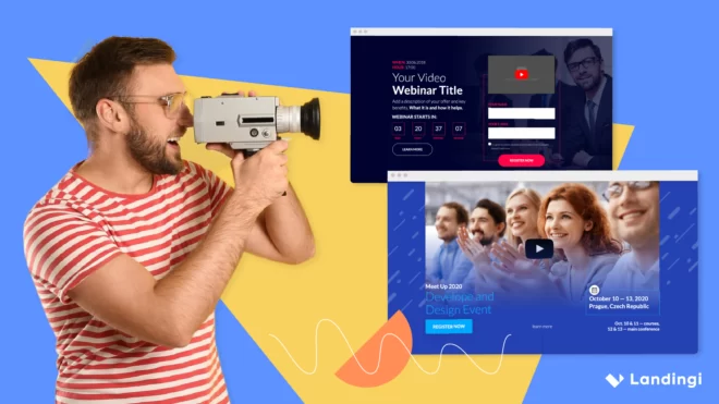

A video landing page is a focused space where your audience can quickly understand what you offer, through video, not just words. If you’re promoting a service, showcasing a portfolio, or trying to win over new clients, a strong video landing page helps you make that first connection fast.
Did you know that 55% of users spend less than 15 seconds on a landing page? That stat alone shows how important it is to capture attention right away. A video gives you the chance to do that – by showing your message, tone, and creative style in the first few seconds.
This article breaks down what makes video landing pages work. You’ll find design examples, clear takeaways, and practical advice on how to turn casual visits into real engagement.

What Is a Video Landing Page?
A video landing page is a webpage built around a video that serves as the main content. The video is placed front and center to grab attention right away and deliver your key message in a more engaging way than text or images alone. It helps visitors quickly understand your product, service, or brand – making it easier to turn interest into action.
These pages use visual storytelling to leave a stronger impression, often leading to better engagement and higher conversions compared to pages without video. The video itself can be:
- a product demo,
- a testimonial,
- a company intro,
- an explainer video,
- or even a background video that sets the mood.
Engage visitors with a video landing page—create yours with Landingi today!
Alongside the video, a good video landing page includes a clear headline, a strong call to action, and, if needed, a bit of supporting content that reinforces the video’s message. The goal is to guide visitors toward a specific action, like signing up, making a purchase, or requesting more details.
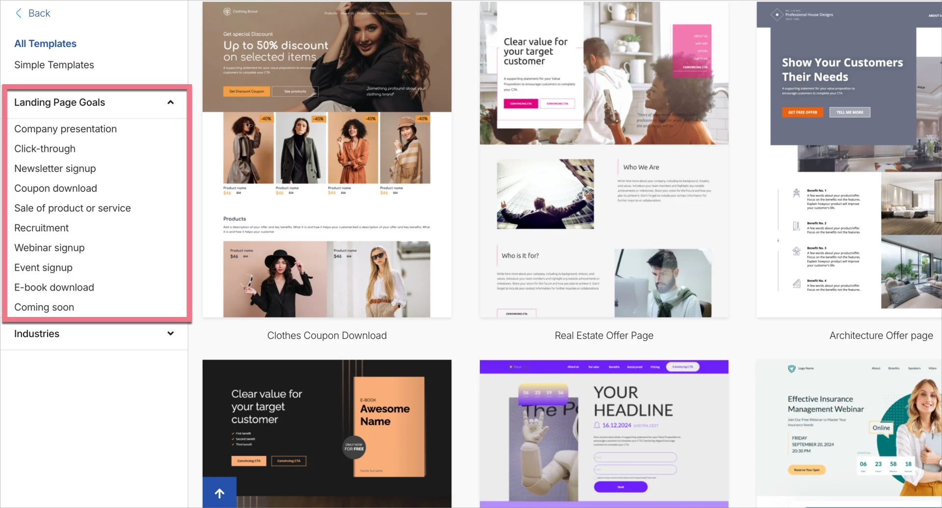
How Do I Create a Video Landing Page?
To create a video landing page, use Landingi – a platform that gives you all the tools to build, launch, and optimize a page where your video takes center stage. You can start with a ready-made template, a blank page, or generate a layout using AI-powered Composer. Whatever option you choose, make sure your video has space to stand out.
Turn your video into a conversion machine! Launch a landing page that sells.
Here’s a step-by-step guide to help you build a landing page effectively:
1. Define the goal of your page
Before adding any content, think about what you want the page to achieve. Do you want visitors to sign up, request a quote, book a call, or buy something? Your goal will shape the entire page, from the tone of your video to where you place your call to action. Define it clearly before you begin editing.
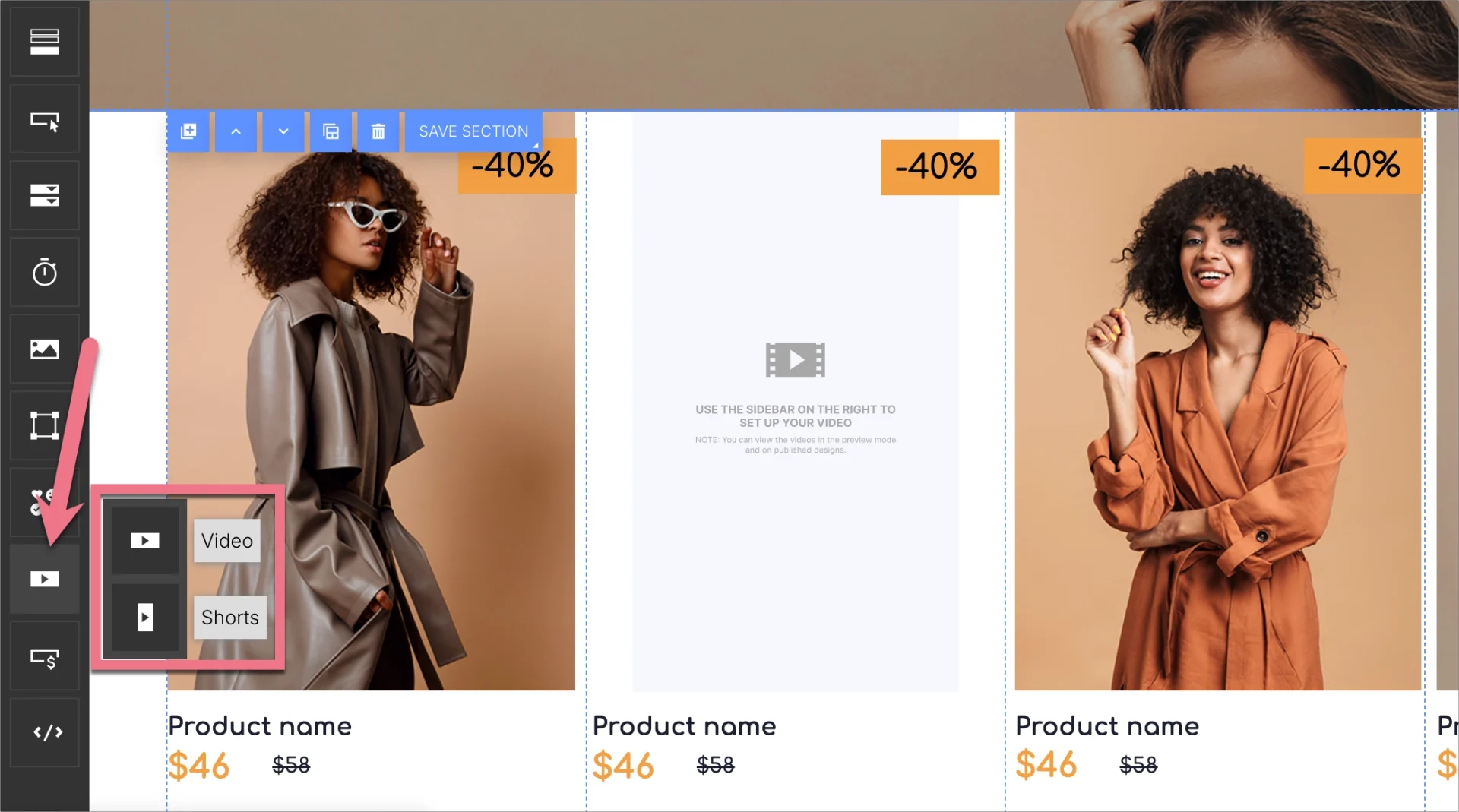
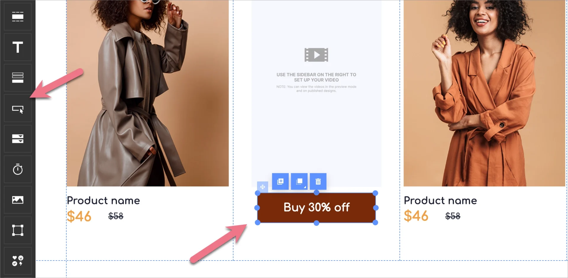
2. Add a compelling video using the Video widget
In the Landingi editor, drag the Video widget onto your page. You can use it to embed either a classic horizontal video or a shorts-style vertical one, depending on what suits your message. Keep your video short (ideally under two minutes) and make sure it clearly communicates your value in the first few seconds. This is your moment to hook the viewer and give them a reason to stay.
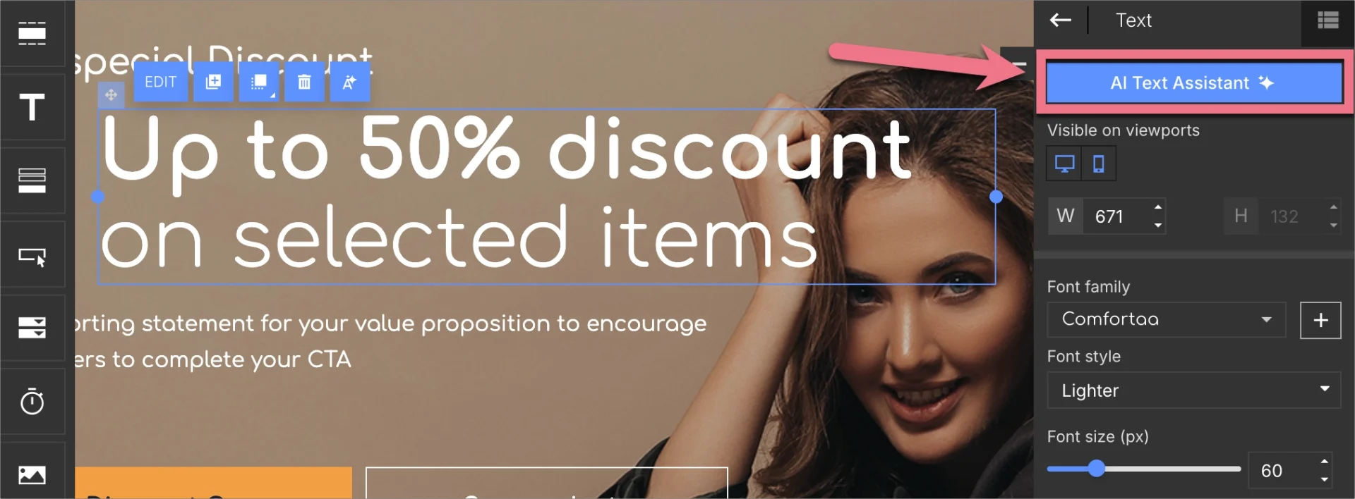
3. Write a strong, simple headline
Add a headline above or next to your video. It should be clear, relevant, and give people a reason to watch. Use the Text widget to add copy that complements the video and reinforces the value of what you’re offering. If you’re unsure how to phrase it, try AI Assistance to generate headline variations based on your video topic.
4. Design the layout around your video
Make sure the video is visible right away when the page loads – no scrolling needed. In Landingi’s drag-and-drop editor, place the video in the first section and use whitespace to draw attention to it. Avoid adding too many elements around it; the more focused the layout, the stronger the impact.
5. Add a clear CTA button near the video
Your call-to-action should be visible during or immediately after watching the video. Use the Button widget to add a simple, action-driven message like “Book a Call,” “Get Access,” or “Try It Now.” Place it right below or next to the video, and consider repeating it later on the page for those who scroll.
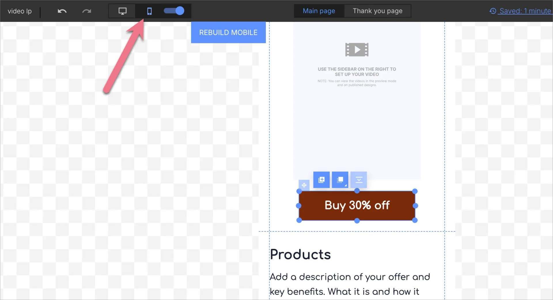
6. Optimize for speed and mobile
Landingi pages are responsive by default, but it’s worth checking the mobile view in the editor to adjust layout, spacing, and font sizes for smaller screens. You can also upload compressed video files and optimize visuals to keep your page loading quickly, especially important if you’re sharing the page via ads or social media.
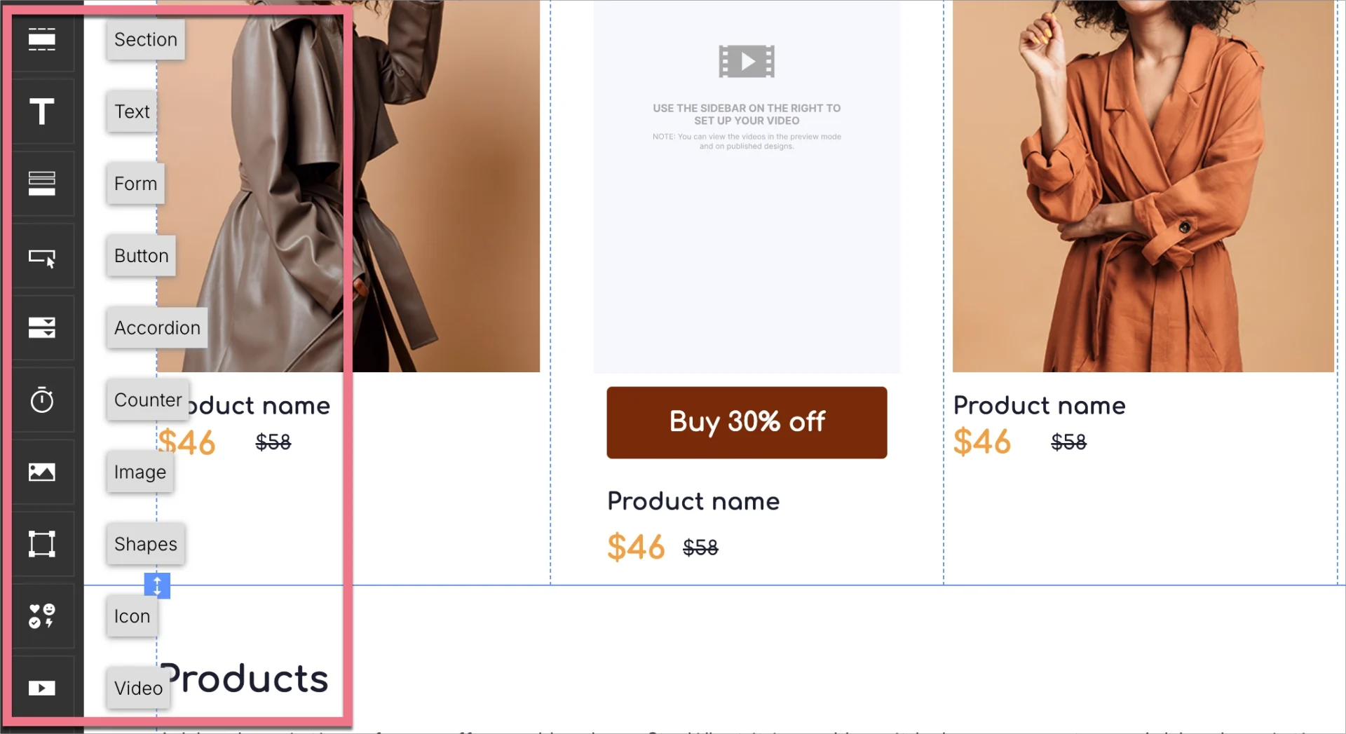
7. Add extra supporting content if needed
If your video leaves room for more detail, you can add short text sections, testimonials, or trust badges below the video. Use the Image, Text, and Shape widgets to build clean, readable blocks that reinforce your message without distracting from the main content.
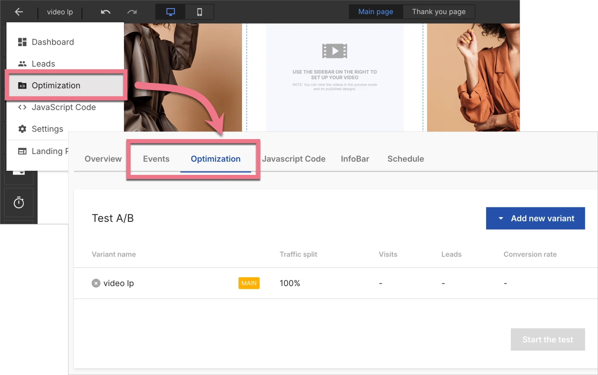
8. Test and refine your page
Once your page is live, use A/B testing to experiment with different versions – change the headline, swap in a new thumbnail, or adjust your CTA wording. You can set this up directly in your Landingi dashboard. Then, use EventTracker to see how people interact with your video and what they do next. Are they watching the whole thing? Clicking the CTA? That data helps you improve performance over time.
Ready to showcase your video content? Design your landing page with Landingi!
11 Best Examples of Video Landing Pages
The 11 best examples of video landing pages showcased below serve as both inspiration and instructive guides. Learn how to apply theoretical principles to craft a video landing page that drives conversions. Analyze key insights, identify the strengths and areas for enhancement in these examples, discover the ideal video landing page template, and begin designing your page to captivate and convert new customers.
1. Rivery
The video landing page from Rivery is a strong example of how to effectively showcase a technical product through engaging design and UX. The hero section features an autoplay video that subtly demonstrates product functionality without overwhelming the visitor. This visual cue immediately communicates value. Accompanying it is a bold, benefit-driven headline (“Build end-to-end data pipelines in minutes. Not weeks.”) and a high-contrast yellow CTA button that draws attention instantly. A sticky top bar with another “Start for free” CTA ensures conversions remain accessible throughout the visit.
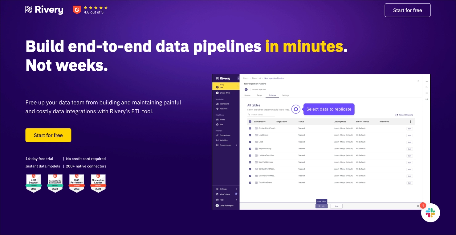
Credibility is established with a G2 rating badge (4.8 stars) and visual trust signals like industry awards. The second fold highlights large numerical proof points (like “33% reduction in data-related costs”), which are designed to grab attention and add social proof. Testimonials further support the page’s credibility by showcasing customer satisfaction, reinforcing trust in the product and the brand.
Key takeaways to learn from this example:
- Autoplay demo video,
- Strong, outcome-oriented headline,
- Eye-catching CTA buttons,
- G2 badges and awards,
- Visual metrics,
- Testimonials.
Improvement areas:
- Mobile responsiveness of graphics – some visual elements do not scale well on smaller screens, affecting readability and polish.
See the best video landing page examples—build yours with Landingi now!
2. Fotografiska
The landing page of Fotografiska Museum welcomes visitors with an immersive background video involving exhibitions in real-life shots with real people experiences. This marketing video works as the best advertisement, engaging page visitors into art. This click-through landing page directs visitors to alternative pages dedicated to each museum localization.
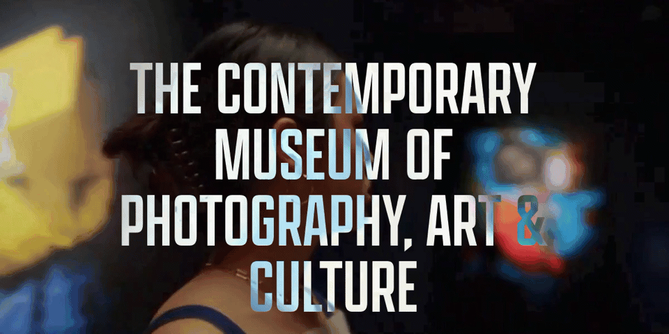
A clear layout with strategic white space and bold headlines make the page highly intuitive and easy to navigate, delivering visitors a seamless experience regardless of the device they use. Minimal written content combined with attractive, high-quality pictures impact the page’s efficiency, providing high conversion rates.
Key takeaways to learn from this example:
- Immersive background video,
- Bold headlines,
- High-quality static images,
- Minimal written content,
- Social media buttons.
Improvement areas:
- CTA – the page should include an outstanding CTA button with straightforward messaging, like “Book Tickets”, to boost conversion rates.
Promote your events with the effective Concert template from Landingi – add background video, implement strong CTAs, and engage potential customers in your offer.

3. Link AI
The landing page for Link AI is a strong example of a well-executed video landing page. It opens with a bold headline, immediately telling visitors the tool is designed for AI-powered lead generation on LinkedIn. The embedded video is front and center, explaining the product in just under three minutes. A human presenter in the video demonstrates the tool in action, which helps build trust and relatability. The short form and concise layout keep the user experience simple and conversion-focused. Additionally, the claim of helping 2,000+ business owners and professionals acts as strong social proof, reinforcing the product’s credibility.
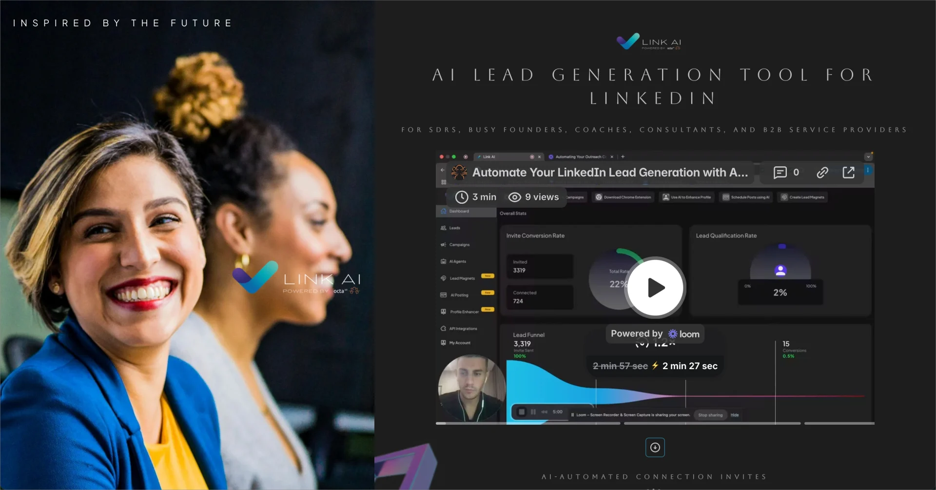
The layout smartly mixes visuals with minimal text, allowing the video to do the heavy lifting in explaining the offer. This approach is particularly useful for busy professionals who prefer a quick overview rather than reading through paragraphs of copy.
Key takeaways to learn from this example:
- Short and focused layout,
- Product demo video,
- Human element,
- Social proof.
Improvement areas:
- Font readability – the fancy serif font is visually elegant, but a bit hard to read.
- Video contrast – the video area blends into the dark background, making it less eye-catching than it could be.
Boost engagement with video—create a compelling landing page with Landingi!
4. GK3 Capital
The video landing page for GK3 Capital is a professional example tailored for financial service providers looking to grow their business with social media marketing. The headline immediately communicates a clear value proposition and promise – “Grow Your Business Presence with Social Media Marketing for Financial Services.” This direct benefit-led message sets expectations from the start. In the second section, the use of performance metrics like “129% Increase in AUM raised in one year” provides credibility and tangible proof of success. Additionally, the inclusion of a dedicated team section helps humanize the brand and builds trust by showcasing the experts behind the service.
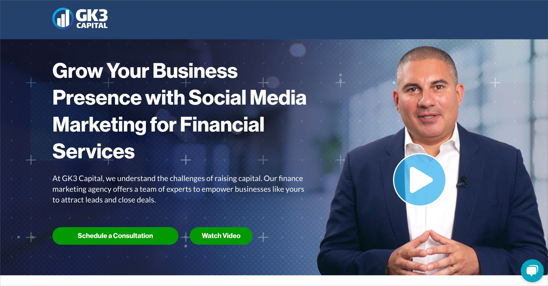
A major strength of this page is how the video is integrated. It’s hidden behind a “Watch Video” button, appearing as a pop-up. This keeps the user focused on reading and navigating the content without distraction, while still offering an engaging media option. The primary call-to-action – “Schedule a Consultation” – is prominently displayed in bright green, encouraging direct engagement.
Key takeaways to learn from this example:
- Strong, benefit-focused headline,
- Credibility through performance stats,
- Effective video integration,
- Personal connection,
- Testimonials.
Improvement areas:
- CTA button hierarchy – secondary CTA (watch video) shares the same style as the primary CTA, which may dilute focus.
- Testimonial section typography – the font size is quite small, making it hard to read and reducing its impact.
5. Triibe
The Triibe application landing page captures the audience’s attention with relevant video content describing product features. The video appears in an uncommon shape that aligns with the overall web design. Its strategic placement and use of white space ensure nothing distracts visitors from the main video content.

The overall page design is engaging but not overwhelming, showcasing app features and benefits in concise sections. Below the video, visitors can find the FAQ section that delivers additional information and answers possible doubts. The CTA button appears in the hero section and at the bottom of the page, which is a great method to enhance the likelihood of conversion.
Key takeaways to learn from this example:
- Stunning yet clear layout,
- Video content,
- Concise written content,
- FAQ section,
- Outstanding CTA.
Improvement areas:
- Video duration – the perfect video should take no more than 90 seconds to keep the visitor’s attention and effectively impact the decision-making process.
Choose the Sign up template to promote your app effectively – add the video explaining complex concepts to engage visitors in your offer
6. Michaela Elyse
The Michaela Elyse Events landing page is a great example of an elegant video-based homepage. It features a refined visual aesthetic with soft, romantic imagery that aligns perfectly with the wedding planning niche. The video section is positioned mid-scroll, and although not immediately visible on load, it spans the entire width of the screen, making it impossible to miss when reached. This immersive layout naturally draws the visitor’s attention and enhances engagement with behind-the-scenes footage that builds trust.
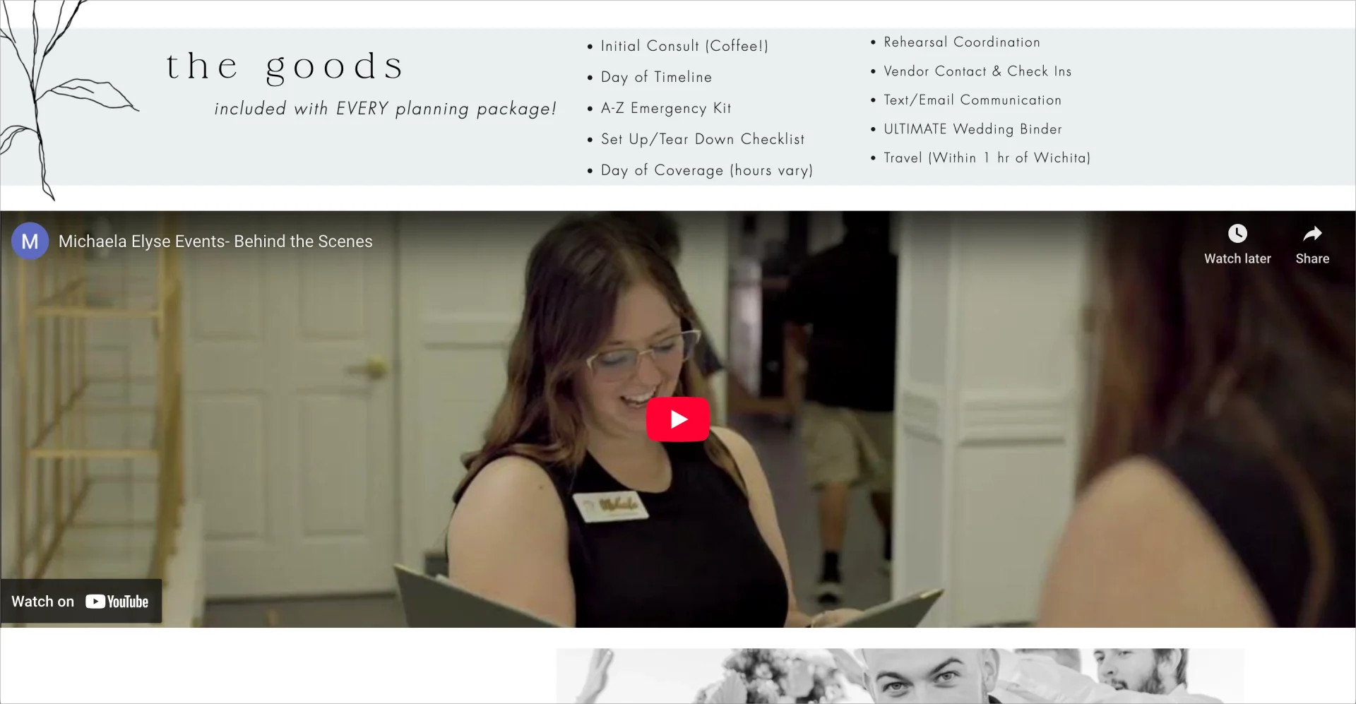
A key strength of this landing page is its single-page navigation. The header menu options like “home,” “services,” “inquire,” etc., do not redirect users to separate pages, but instead scroll smoothly to different sections on the same page. This streamlined navigation enhances user experience by keeping everything centralized and intuitive. The clean layout, elegant font choices, and natural imagery help convey the brand’s sense of quality and sophistication.
Key takeaways to learn from this example:
- Beautiful, themed visuals,
- Full-width embedded video,
- One-page design,
- Soft, cohesive color palette.
Improvement areas:
- Limited CTA buttons – adding more actionable prompts (e.g., “Book a Consult”, “Watch Our Process”) could drive conversions.
- Page title improvement – currently displayed as “Home” in the browser tab, it should be replaced with a brand-relevant title like “Michaela Elyse Events | Wedding Planning” to boost SEO and performance in search engines.
Convert visitors with a powerful video landing page—start with Landingi!
7. Scorpion
The Scorpion landing page promoting law firms’ marketing services is a great example of how to use testimonial videos, a powerful tool in building trust and credibility with potential clients. By incorporating these videos, Scorpion showcases a real-life success story of a law firm that has benefited from its marketing services.

The page is well-structured, including a compelling headline with a short description placed near the testimonial video. The video itself is prominently placed in an unusual way – it’s a tile with a quote and caption, including a play button. The outstanding CTA button with straightforward messaging appears near the video and in a strategic top-right corner on a sticky bar, giving visitors easy access to action regardless of scrolling depth.
Key takeaways to learn from this example:
- Simple layout with strategic white space,
- Testimonial video,
- Clear headline with a short description,
- Well-designed CTA button,
- Written testimonials with professional pictures,
- Benefits section,
- Case studies.
Improvement areas:
- Play button – the shape of a play button should be more intuitive to encourage watching video, ultimately leading to higher engagement.
To easily draw inspiration and convert visitors into customers, choose the Business Consultant template, add relevant videos, and use the Landingi platform to test key elements after launching your landing page.

8. Classic Journeys
The video landing page for the “Morocco Cultural Walking Tour” by Classic Journeys is an engaging and visually rich example of how immersive content can elevate travel marketing. One of the biggest strengths is the full-width background video that auto-plays stunning visuals from Morocco, immediately transporting the viewer into the vibrant culture and architecture of the destination. This cinematic experience creates an emotional connection and sets a strong tone for the luxury adventure being offered. Additionally, the page contains a generous amount of information, clearly presenting the length of the tour, price, and itinerary options, which are key for conversion.
The layout also includes intuitive navigation tabs like “Overview,” “Highlights,” and “Dates & Prices,” enabling users to quickly find the details they need. Action-oriented buttons such as “Book Now” and “Download Itinerary” are strategically placed and visually distinct, supporting immediate user action.
Key takeaways to learn from this example:
- Full-width auto-play video background,
- Informative structure,
- Clear CTAs,
- Image gallery.
Improvement areas:
- Distraction from main menu – the persistent top navigation bar from the homepage is somewhat distracting and unnecessary for a focused landing experience.
9. Industrious
The Industrious video landing page is a strong example of modern design and personalization. It features a full-width, auto-playing background video showcasing the interior design and atmosphere of their coworking spaces, effectively giving users a visual experience of what they’re signing up for. The value proposition is clear: “Join us for a great week, on us”, supported by a limited-time promo code that encourages quick action. Personalized elements like “Locations nearest you” and an explainer section titled “How it works” help users feel guided and informed throughout their journey. The testimonials included add further trust and credibility by sharing real user experiences.
The signup form is clean and professionally placed above the fold, prompting users to take immediate action. However, it does have a few drawbacks. The number of required fields could be trimmed down to reduce friction – eight inputs may feel overwhelming for casual users. Additionally, the “Continue” button is visually understated and doesn’t stand out, which could reduce click-through rates and hinder conversions.
Key takeaways to learn from this example:
- Full-width background video,
- Strong headline and subheadline,
- Testimonials,
- Personalized location suggestions,
- “How it works” explanations.
Improvement areas:
- Reduce the number of form fields to make the signup process faster and more inviting.
- Redesign the “Continue” button to make it more prominent and action-driving.
10. Esse
Esse’s landing page promoting sunscreen effectively engages visitors with a video about the product, showing how to use it and what results can be expected. The page is well-designed with clarity, ensuring a seamless experience across various devices. Short product details description with numbers saying more than words and quality indicating badges is supplemented with a short video miniature.

The purchasing CTA button is outstanding, with clear messaging indicating the action visitors should take. All the benefits are organized with bulleted lists, which are the best for human eyes. The page also includes customer testimonials, boosting visitors’ trust and influencing their decision-making process.
Key takeaways to learn from this example:
- Clear layout,
- Short product video,
- High-quality static images,
- Customer reviews,
- Oustanding CTA button,
- Quality indicating badges,
- Concise written content.
Improvement areas:
- CTA – to boost conversions, the CTA button should also appear near the video.
Pick the Perfumes template from Landingi’s gallery and easily customize it with a user-friendly editor – add immersive product video, create an outstanding CTA button, and engage visitors to buy your product.

11. Mode Mobile
The video landing page for Mode Mobile is a striking example of high-impact digital marketing, especially tailored to attract retail investors. The opening section immediately features a dynamic video that plays automatically, paired with a bold headline claiming “The Biggest Disruption to $martphones Since iPhone.”This sets a strong tone for urgency and innovation. Complementing this is a vibrant color scheme, sleek futuristic gradients, and a pinned, persistent CTA bar (“Invest Now at $0.30/Share”) that ensures the investment action is always within reach.
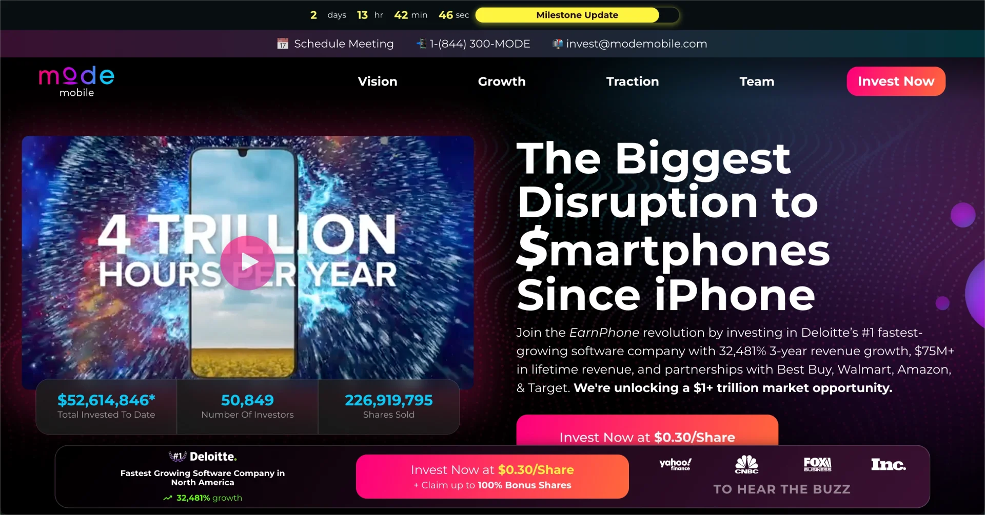
This page is especially strong in how it speaks to its audience: it uses tech-forward design, real-time metrics (e.g., total investors, shares sold), and performance validation (e.g., Deloitte’s #1 ranking). The embedded Investment Calculator lets users easily visualize their returns, while the “Top Reasons to Invest” section backs up the offer with large, digestible stats like “$75M+ in revenue” or “$1T+ market opportunity.”
Key takeaways to learn from this example:
- Video hero section,
- Bold headline,
- Persistent CTA bar,
- Eye-catching, Gen-Z-appropriate color palette,
- Investment calculator,
- Metrics-based “Top Reasons”.
Improvement areas:
- Slightly overwhelming first view – too many focal points (video, headline, stats, CTA, timer) competing for attention may cause cognitive overload.
- Could simplify the mobile layout – to enhance speed and clarity, especially for on-the-go investors.
3 Video Landing Page Best Practices
To craft a stunning video landing page, start with three core practices: use high-quality, relevant video content, keep your message concise and focused, and place your call to action near the video. These simple but powerful choices help keep visitors engaged and ready to act, whether you’re aiming for sign-ups, purchases, or inquiries. Done right, they turn passive viewers into active clients or supporters by guiding attention and eliminating friction.
#1 Prioritize video quality and relevance
The first best practice for a video landing page is to prioritize video quality and relevance. Ensuring your video is in high-definition and closely aligns with your core message or offer is crucial for capturing and retaining viewer attention on your landing page. High-definition video quality is imperative not just for aesthetic reasons but also for maintaining professionalism and credibility. It reflects your brand’s commitment to quality and detail, which can significantly influence viewers’ perceptions and engagement levels.
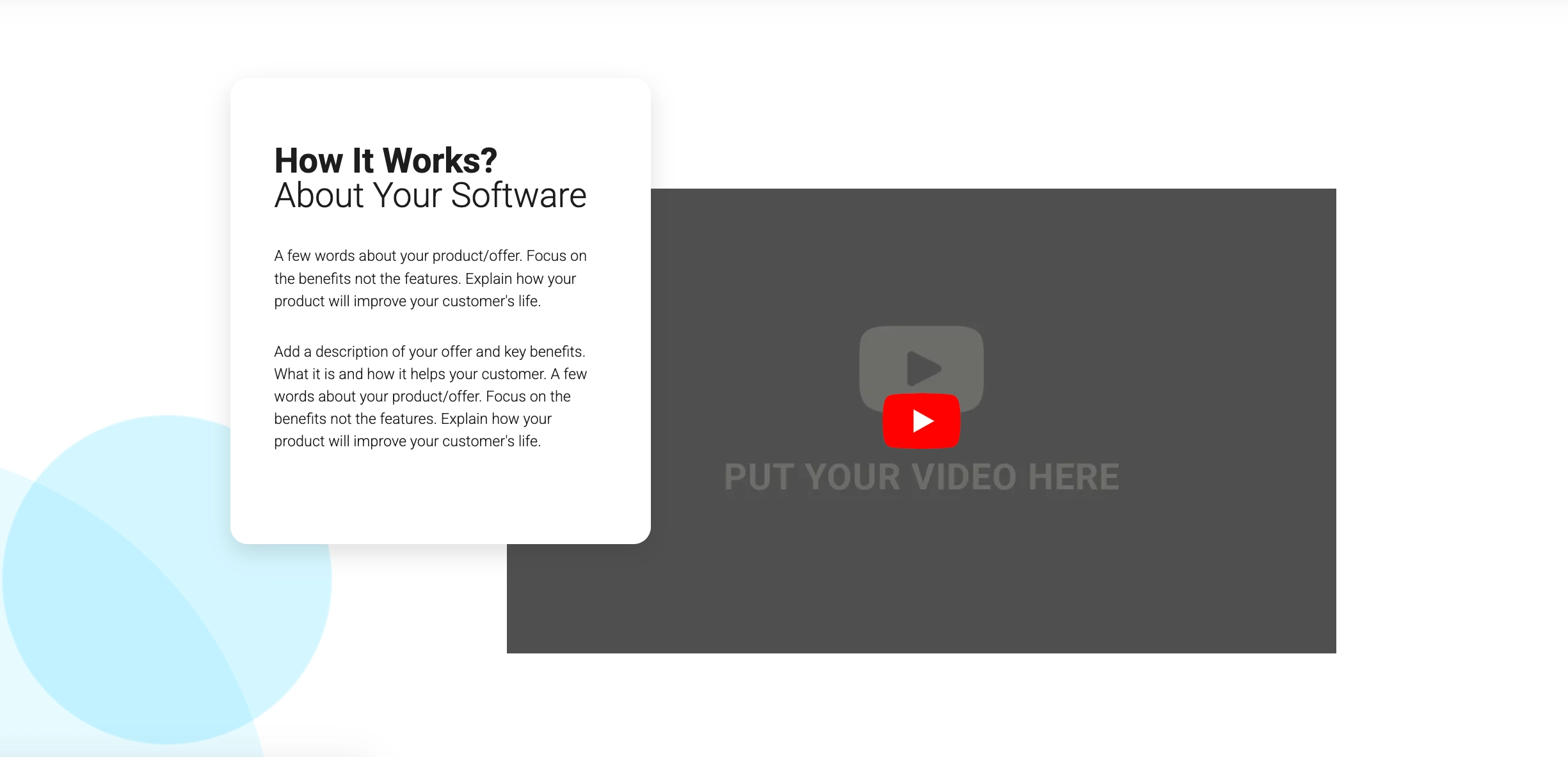
Take a look at the example below:
Moreover, the content of the video must be directly relevant to the product, service, or idea you are promoting. This relevance is key to immediately grabbing the viewer’s interest and keeping them engaged. By closely aligning the video content with your message or offer, you ensure that the viewer understands your value proposition right from the start.
Turn video viewers into leads—design a video landing page with Landingi!
#2 Keep it concise and focused
The second best practice for a video landing page is to keep it concise and focused. In today’s fast-paced digital environment, viewers often prefer content that can be quickly consumed, making the brevity of your video a critical factor in maintaining interest. A concise video ensures that your audience remains engaged from start to finish without the risk of them losing interest or clicking away.
Take a look at the example below:

An engaging video also relies on a dynamic presentation style, using visuals, animations, or storytelling techniques that enhance the narrative without diluting the message. The goal is to create a seamless flow of information that is both informative and entertaining, ensuring that each second of the video adds value and builds towards your call to action (CTA).
Follow the best practices for video landing pages and build yours with Landingi!
#3 Place CTA strategically
The third best practice for a video landing page is to strategically place the CTA button near the video. After investing time in watching your video, viewers are at a heightened state of receptivity; a well-positioned CTA can capitalize on this moment, converting interest into action.
Take a look at the example below:

The physical placement of the CTA plays a crucial role in conversion rates. Ideally, it should be in close proximity to the video player, where it can draw the viewer’s eye immediately after or even during video playback. Consider placing the CTA both above and below the video to accommodate different viewer preferences and browsing behaviors. Additionally, making the CTA button visually distinctive through contrasting colors or animation can further attract attention and encourage clicks.
Maximize video conversions—create an optimized landing page with Landingi!
How Can I Optimize My Video Landing Page for Higher Conversion Rates?
To optimize your video landing page for higher conversion rates, focus on video quality and optimize its placement, craft catchy headlines, streamline overall page design, remember about SEO and mobile optimization, and optimize the CTA button for higher efficiency. Meet the 11 key strategies and incorporate them to enhance the effectiveness of your portfolio landing page:
#1 Focus on video quality
Firstly, focus on video quality. Ensure your video is perfect, both in terms of production and content. A professional-looking video that clearly communicates your message can significantly increase viewer engagement and trust.
#2 Optimize video placement
Secondly, optimize video placement. It should be the centerpiece of the landing page, placed prominently where visitors can easily view it without scrolling, to encourage more views and engagement.
#3 Streamline the design
Thirdly, streamline the design. Keep the page layout clean and focused, minimizing distractions that could draw attention away from the video and CTA. Use a simple color scheme and layout that highlights the video.
#4 Use a clear and strong CTA
Fourthly, use a clear and strong CTA. Position an action-oriented CTA near the video, encouraging viewers to take the next step, whether signing up, purchasing, or another desired action. Make sure the CTA stands out visually.
Ready to create a video landing page? Build yours with Landingi today!
#5 Enable autoplay for the video (with caution)
Fifthly, enable autoplay for the video. It will engage visitors instantly. However, ensure the video starts without sound – it could annoy or drive away visitors. Users should have the option to enable sound easily.
#6 Consider adding subtitles
Sixthly, consider adding subtitles. It’s the best way to engage users who watch your video without sound and make your message understandable for those who are not fluent in your language.
#7 Optimize for loading speed
Seventhly, optimize your page for loading speed. Video can significantly impact page load times, so optimize it for the web by compressing it without losing quality. Use a reliable hosting solution to ensure the video loads quickly for all users.
#8 Ensure mobile responsiveness
Eighthly, ensure mobile responsiveness to provide a seamless experience across various devices. Most traffic comes from mobile devices, so your video landing page must be responsive. Test the page on various devices to ensure the video plays correctly and the page is easy to navigate.
#9 Test and refine
Ninthly, regularly test and refine your landing page. Use A/B testing to try different versions of your video, headlines, CTAs, and page layouts. Analyze performance data to identify what works best and continuously refine your page for optimal results.
#10 Optimize for SEO
Tenthly, optimize your landing page for SEO. Include relevant keywords in your page title, meta description, and video transcript to help improve your page’s visibility in search engine results.
#11 Track user engagement
Lastly, track user engagement. Utilize analytics tools to track how visitors interact with your video and landing page. Look at metrics like video view count, play rate, and how long people stay on the page to gain insights into what’s working and what isn’t.
Make your landing page unforgettable with video—start building with Landingi!
What Are the Key Elements of an Effective Video Landing Page?
An effective video landing page includes a few essential elements: a strong video front and center, attention-grabbing headlines, a clear call to action, social proof, and basic SEO setup. All of this should be placed in a simple, easy-to-follow layout. A good video landing page looks great but also works well – it helps you showcase your work, skills, and achievements in a way that’s clear and convincing. Below, you’ll find a breakdown of the most important parts to include.
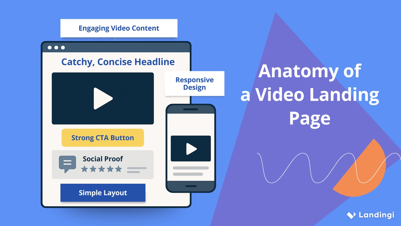
#1 Engaging video content
The first key element of an effective video landing page is engaging video content, serving as its core. It should be high-quality, concise, and compelling, providing viewers with a clear understanding of your offer or message. The video should be relevant to your target audience, addressing their needs or interests directly.
#2 Catchy, concise headline
The second key element of an effective video landing page is a catchy headline. It should immediately capture attention and concisely convey your offer’s main value proposition or benefit. It sets the expectation for what the viewer will learn or gain by watching the video.
#3 Strong CTA button
The third key element of an effective video landing page is a strong CTA button. It guides viewers on what to do next – whether it’s signing up, making a purchase, or taking another action. The CTA should be visible and placed strategically near the video to catch the viewer’s attention immediately after they’ve engaged with your content.
#4 Responsive design
The fourth key element of an effective video landing page is a responsive design. It ensures that the page and video are easily viewable on desktops, tablets, and smartphones. Your video landing page must perform flawlessly across all devices, as significant traffic comes from mobile.
#5 Social proof
The fifth key element of an effective video landing page is social proof. Incorporating testimonials, reviews, or endorsements enhances credibility and trust. Including social proof near the video can reassure viewers of your product’s or service’s value and effectiveness.
#6 Simple layout
The sixth key element of an effective video landing page is a simple layout. Keep the design and content of the page simple and focused. Minimize distractions to ensure that the video and CTA are the main focuses. A clean, intuitive layout helps maintain viewer attention on the message and action you want them to take.
What Is the Best Video Landing Page Builder?
The best video landing page builder is Landingi. It’s a platform built to help marketers and creatives showcase video content in a way that captures attention and drives action. With Landingi, you can build pages that are visually impressive and focused on results, without needing coding skills or external tools.
The platform includes a wide range of templates designed to highlight video content and guide visitors toward a clear next step. Each layout is created to support user engagement and make your message easy to follow.

Landingi’s Video widget lets you add videos in two formats: classic, for longer horizontal content, and shorts, for quick, vertical clips. You can choose the best fit for your message and place the video exactly where it makes the most impact on the page.
You can test different layouts and content using A/B testing, and track how visitors interact with your video using EventTracker. With built-in AI Assistance, it’s easy to generate or improve your page copy. You can also add forms and popups to collect leads – all without leaving the platform.
Landingi brings together an intuitive editor and a full set of optimization tools, making it a smart choice for anyone who wants to turn video content into real engagement and conversions.
Create a Perfect Video Landing Page with Landingi
A well-crafted video landing page can be a game-changer in your digital marketing strategy, delivering unparalleled engagement levels, boosting conversion rates, and significantly enhancing the overall effectiveness of your online presence.
Creating an engaging page is the first step, as the best conversion results come with ongoing optimization. By applying targeted CRO techniques, you can develop a landing page that not only aligns with your creative vision but also actively captivates and converts visitors into leads, loyal customers, or partners.
Equipped with the appropriate tools and insights drawn from standout examples of video landing pages, now is the time to craft your ideal video landing page. Discover Landingi today and initiate the evolution of a standard page into a vibrant, high-converting digital marketing tool that resonates with viewers and marks your presence in the digital market.


