Branże
Edukacja Doradztwo i coaching Reklama i marketing Hotel i restauracja Podróże Rozrywka i gry Oprogramowanie i technologia Zdrowie i uroda Ecommerce Architektura i design Nieruchomości Finanse Farmaceutyka Motoryzacja Dom i ogródCele landing page'a
Sprzedaż usługi lub produktu Przedstawienie firmy Pobranie kuponu Pobranie ebooka Zapis na Webinar Zapis do newslettera Rejestracja na wydarzenie Przekierowanie na inną stronę Uruchomienie wkrótce RekrutacjaKolory
World Art Day
International Women's Day
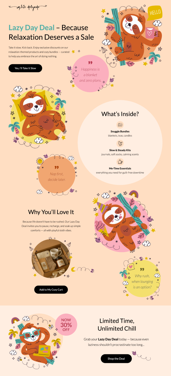
Sloth Day
Nowość
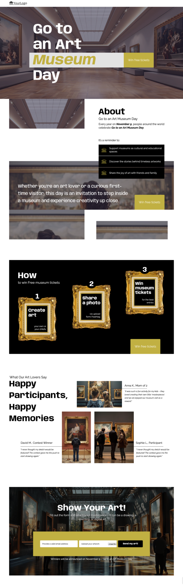
Go To An Art Museum Day
Nowość
Christmas Card Day
International Podcast Day
International Cat Day

Meet the Team

Show Your Startup

Dark E-Book

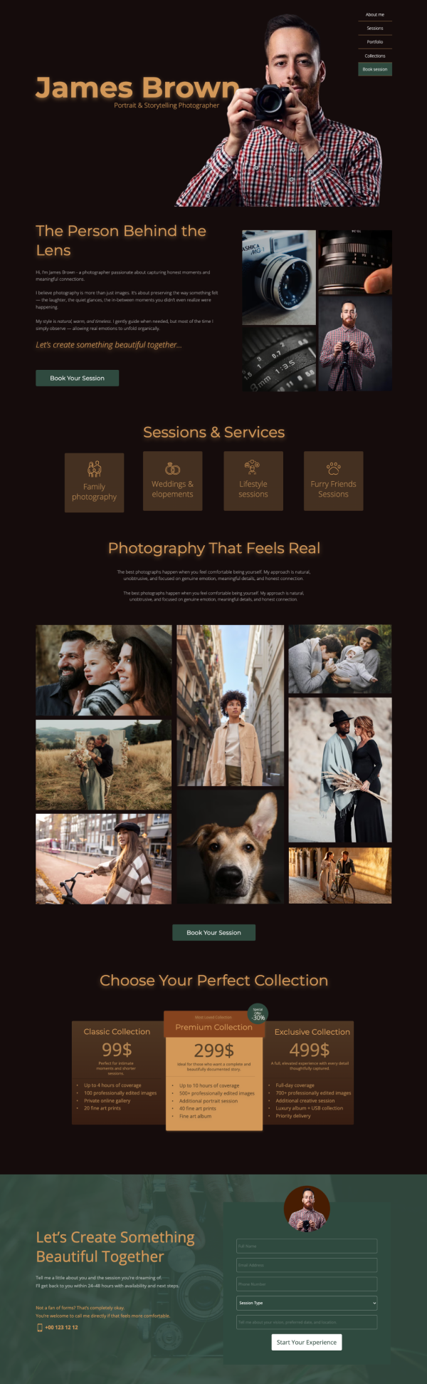
Photographer – Company presentation

Digital Marketing Agency

Book an artist for your event

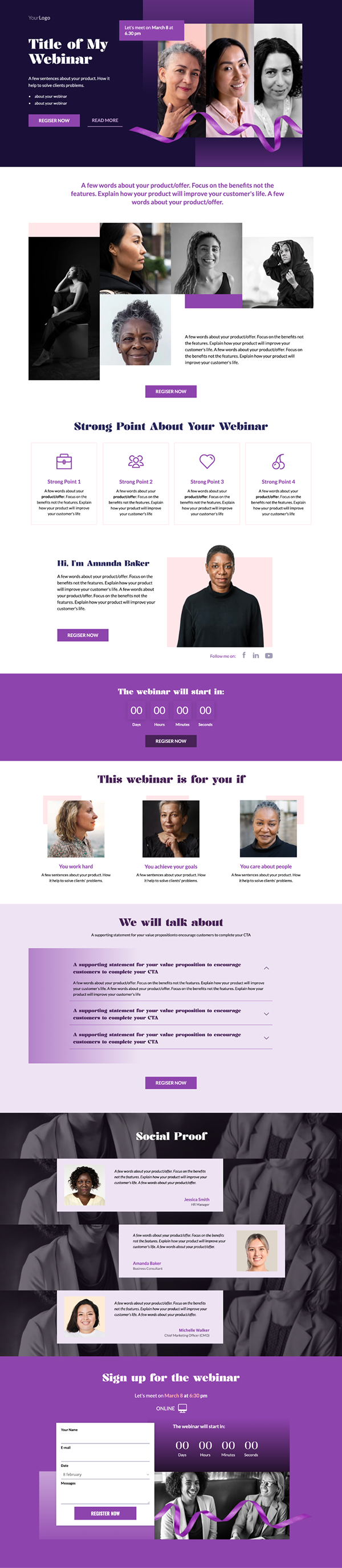
Webinar 2

Video course for influencers

Christmas Gift – Squeeze page

E-book 2 – squeeze page

Digital Marketing Consultant

Simple Discount Form

Mobile Lead Generation

Simple Form

Almost there

Looking for an Employee

Marketing Software

Advertising/Marketing

Buy book

E-book Marketing

Selling a Product
Course Sign Up

Lead Generation Webinar

Let's meet

We Are Innovation

Buy Course

Video Story

Printing Company

Evently

Buy an Event Ticket
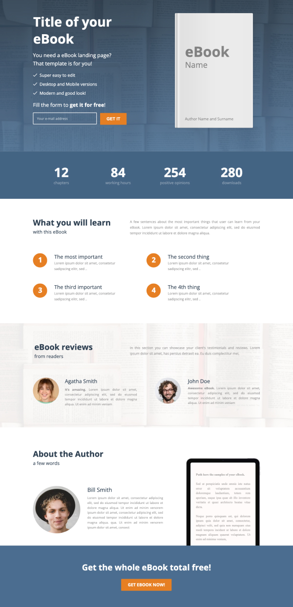
Get E-book

Hotel Offer