Your logo is more than just a pretty symbol. It’s the face of your brand’s values, personality, and customer promise. If you want to discover how logo redesign makes sure that your brand’s visual identity stays relevant and competitive, keep reading.
Your brand’s visual identity is like its unique fingerprint in the business world. It sets you apart from your competitors and helps customers recognize and connect with your brand faster. At the core of your visual identity is your logo.
In a highly competitive marketplace, you need to regularly assess and update your logo to meet the ever-evolving market trends and consumer preferences. If you have no idea where to start, this article is right for you. We provide practical ideas, examples, and expert advice on redesigning your logo.
At the end of this article, you will learn how to approach the redesign process strategically. But first, let’s find out when the best time to consider a logo redesign is.
Make your sections smartable and let go of mundane manual tasks with Smart Sections! An easy way to manage bulk changes.
3 Critical Signs That It’s Time For A Logo Redesign
Determining the right time to change your brand’s logo design will help you save time, effort, and resources. Here are key indicators that suggest it’s time to consider refreshing your logo:
1. Poor Brand Differentiation
When a logo looks too similar to your competitors, it can confuse consumers. Remember, 75% of consumers recognize a brand through the logo so if it looks generic, you won’t be noteworthy.
Brand differentiation establishes a distinctive and memorable identity. It’s a strategic approach that highlights your brand’s unique attributes, strengths, and qualities. This includes factors like service offers, customer experience, or innovative approaches. Take Gap as an example, specifically its attempt to change its logo in 2010.
Gap decided to introduce a new logo after 24 years. Their previous design was a white wordmark in uppercase letters on a blue box.
The new logo featured a combination of uppercase and lowercase black and bolded, modern font. Unfortunately, this logo redesign received significant backlash from customers and the design community.
Many felt that the new logo lacked the distinctive qualities that made Gap’s brand recognizable. It failed to distinguish Gap from other clothing brands and appeared generic and uninspiring. The negative response was so overwhelming that Gap reverted to its original logo within one week of introducing the new design.
This incident shows the impact of a logo redesign that didn’t align with the brand’s identity and didn’t resonate with its target audience. So carefully consider how to set your brand apart and be consistent when planning for a logo redesign.
2. Outdated Logo Design & Brand Evolution
An outdated logo may no longer accurately represent the brand’s identity or align with its current direction. It could be because of the shift in its values, mission, target audience, or product offers as time passes. It simply evolves in response to factors like market trends and internal strategic decisions.
This is the right time to freshen up the logo design to stay consistent with the brand’s values and positioning. Logo redesign also helps fix the following issues:
- Unappealing color palette
- Old-fashioned typography
- Incompatibility with digital platforms
You can take Levi’s logo evolution as an inspiration. Back in 1853, the company didn’t have a logo. They only invest in their name to build and strengthen brand recognition. Not until the 1880s did Levi Strauss & Co. introduce their first logo.
The logo featured the iconic Two Horse brand patch depicting two horses pulling apart a pair of Levi’s jeans, implying its strength and durability. This logo became synonymous with the brand and remains an integral part of Levi’s visual identity.
As time went on, Levi’s consistently updated their logo to reflect the brand’s ability to adapt to changing times while staying true to its core values. Today, their logo includes modern minimalistic variations to stay relevant and appeal to new generations.
3. Form Strategic Alliances
Companies engage in mergers, acquisitions, or partnerships for several reasons. But the most common is for global expansion, allowing them to enter new markets and reach a broader customer base.
When companies join forces, they often integrate their operations and products/services. This is when a redesign is needed to symbolize unity. It helps create a fresh perception of the company, reinforcing the narrative of growth and transformation.
One excellent example is the partnership between Target (retail chain) and designer brands. When Target collaborates with designers, they often create a unique logo that combines elements of both brands. This logo redesign helps communicate the exclusivity and high-fashion appeal of the collection.
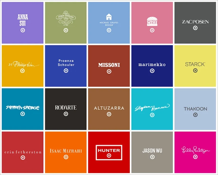
Each collaboration has its distinct logo blending the iconic Target “bullseye” logo and the designer’s logo. These strategic alliances not only benefit Target. It also offers designer brands a chance to make their designs more accessible to the masses.
Forming strategic alliances and implementing logo redesigns enhances a brand’s perception, creates buzz, and drives sales by leveraging the strengths and appeal of partner brands.
While updating a logo can have its benefits, approach logo redesign with caution and consideration. Frequent changes or unnecessary modifications can make the brand inconsistent and confusing. Strike a balance between maintaining a contemporary image and preserving the brand’s recognition and equity.
Thoughtful planning, execution, and communication make a logo update successful. Let’s now explore the essential steps and best practices to successfully execute the redesign process.
Get 111 Landing Page Examples—The Ultimate Guide for FREE
A Step-By-Step Logo Redesign Guide To Create A Lasting Impression
Whether your goal is to enhance your brand’s image or adapt to changing trends, a logo redesign will be an effective solution. We will take you through each crucial stage of logo redesign and provide you with expert advice, best practices, and the right tools.
Step 1. Evaluate Your Current Logo
When you finally decide to update your logo’s design, start by evaluating your current design. Take time to assess every aspect of the design and determine its strengths and weaknesses. It’s a simple way to identify which elements you should keep and what requires improvement. Determine whether you need a simple logo redesign or a complete overhaul.
The evaluation process starts by gathering all versions of your logo, including different color variations and file formats. Make sure your design team has access to the original design files too because they may contain important details.
The next step is breaking down the logo into its design elements. Assess each element separately to understand its impact on the overall logo. Here’s a list of elements to cover:
- Text
- Shapes
- Layouts
- Typography
- Color scheme
- Symbols/icons
When assessing each element, consider trends. For example, recently, most brands use sans serif font because it’s what appeals to the current masses. This should tell you what kind of font to use.
You also need to check the elements’ adaptability to different sizes and formats. A versatile logo should be easily adjustable. It shouldn’t lose visual appeal or legibility so it can be effectively used across different mediums – on a giant billboard and digital applications/platforms.
Step 2: Establish Clear Goals & Objectives
Goals and objectives provide your team with a roadmap for the design process. It ensures that the new logo aligns with your brand’s vision and purpose. Here’s what you need to do:
METHOD I. Revisit Your Brand Strategy
This step helps you gain a deep understanding of your brand’s identity. Reflect on your brand’s core values, mission, and vision. Understand it well so you can:
- Stay consistent with the overall brand experience
- Communicate your brand’s essence to your audience
- Establish an emotional connection with your target audience
- Identify the unique attributes and qualities that set your brand apart from competitors
METHOD II: Respond To Feedback
Since a logo should resonate with your target audience, collect customers’ feedback. It tells you how your customers perceive and interpret your logo.
Positive feedback highlights elements of your logo that appeal the most to your audience. Conversely, negative feedback points out areas where your logo may fall short. Here are some effective methods to gather customers’ input:
- Conduct individual interviews
- Create a survey or questionnaire
- Place a feedback form on your website or within your customer portal
- Organize focus group sessions with a select group of your loyal customers
- Leverage existing customer feedback channels like online review platforms
- Monitor social media platforms to identify customer discussions and comments
For online stores, you’ll be much more efficient if you use eCommerce AI tools for this.
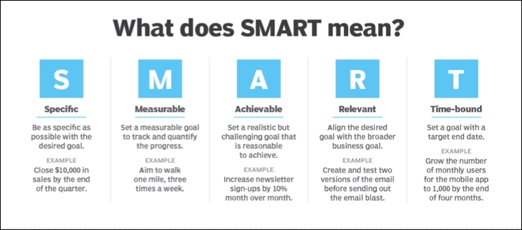
METHOD III: Use The SMART Goal-Setting Technique
Step 3: Research & Gather Inspiration
Researching and gathering inspiration allows your design team to explore various sources to help ignite creativity and innovative thinking. You can start by learning other brands’ success stories of logo redesigning.
Going, a go-to source for cheap flights rebranded from Scott’s Cheap Flights to its new name. The former brand name has a stiff and serious logo.
But as years passed, the website saw the need to reflect a more modern and playful aesthetic. Changing names, they also felt the need to jump from one color scheme to another and green was chosen to signify their rebirth.
They also decided to use a more playful font that incorporated movement and an arrow on the letter “G”, elements that described what traveling is. They went for the modern minimalistic approach, making their logo design recognizable and memorable. It also made it more versatile so it’s easy to apply across various platforms and sizes.
If you’re looking for more inspiration, here are some of the key sources:
- Art and design books
- Social media and design communities
- Logos of your competitors or brands in a similar industry
- Design websites and portfolios (Behance, Dribbble, and Adobe Portfolio)
- Branding and design awards (Red Dot Award and the Communication Arts Design Annual)
Step 4: Conceptualize & Sketch
This part of concept development is where your professional team generates many design concepts. It starts with brainstorming to determine what design styles to use and visual elements that will go well with it. Here are a few examples of design styles your team can consider when redesigning your brand’s logos.
A. Wordmark Logo
Wordmark, also known as a logotype, is a style that focuses on typography. Choose this style if you want to use your company name as the central visual element of the logo. It typically uses a combination of sleek and modern fonts like what Styiens used to convey professionalism and creativity. An excellent example of a wordmark is Catena’s logo, an executive assistant sourcing platform.
It uses a sans serif font with a stylish first letter. It conveys the authority and professionalism needed for an executive hiring platform. It also used a neutral navy blue color because it pairs well with a wide range of other colors. Other iconic logos that use wordmarks are Coca-Cola and Google.
B. Lettermark Logo
It’s similar to the wordmark that uses typography as the primary visual element. Their only difference is a lettermark logo only incorporates the initials or acronyms of the company name. Choose this if your brand has long or complex names like the brand The California Business Journal.
The logo focuses on the initials “CBJ” as the central visual element, allowing for a clean and minimalistic design. Unlike the previous design, the brand uses custom lettering to convey its personality, values, and style.
It features bold and elegant lettering to establish a strong industry presence. It also evokes a sense of professionalism and credibility because the brand is a trusted source of business news and success stories. Other well-known lettermark logos that exist today are IBM, CNN, and P&G.
C. Combination Mark Logo
The combination mark logo is the most flexible of all design styles. It integrates both text and a symbol/icon to create a comprehensive visual representation of a brand. The best part of it is you can use the text and symbol/icon as a unified logo and separately to maximize your brand recognition.
ShopSolar illustrates how effective this logo design style is. It crafts a bold and clean typography. Though the brand name is combined as one word, it highlights each word with a different color – white and orange. The icon they use is a mechanical sun, which represents the brand’s focus on providing quality solar products and services.
The brand also uses orange for the icon – a vibrant and energetic color to evoke feelings of enthusiasm, excitement, and warmth. Orange can also help convey the idea of renewable energy being a lively and sustainable source of power. Make it more creative by adding the image element as a silhouette on the letters like what this dog bootcamp website did.
You can also do what Reliablesoft, a digital certifications guide website did. Instead of an object for the icon, they used the first letter of their brand name.
You can leverage plenty of shapes, symbols, and typography. Explore them all to find the one that aligns with your brand’s personality and objectives. Sketch out your initial ideas and continue to brainstorm with your team.
Step 5: Refine & Iterate
This is where you and the design team choose the most promising logo concepts from your initial brainstorming. After doing so, you can start improving the chosen concepts. Experimenting with different elements is a must-do to see what works best for your brand logo.
Other than your team, you can ask for feedback from trusted stakeholders (company executives, marketing teams, and intended audience). Get feedback from different groups to uncover blind spots and highlight potential improvements. Make the necessary adjustments and refinements to your logo designs based on the feedback.
Let’s say you need a logo redesign for your online review platform that provides unbiased medical alert gadget reviews. The current version of the logo uses a wordmark logo design for a clear and concise representation of the brand.
Through the refinement process, the design team can experiment with different color schemes, typography styles, and layout arrangements. You can add a shade of blue to represent trust or green for health and safety. Your team can also use a combination mark design style instead and include elements like a medical symbol.
After multiple rounds of refinement and iteration, your final logo is ready to launch. It should represent a balanced blend of aesthetics, meaning, and relevance to the platform’s purpose. Your new logo design should now be versatile and impactful across digital platforms, including marketing materials.
Step 6: Test Logo Design In Different Contexts
After refining your logo design, test the overall design (including each visual element) in various contexts to make sure it’s effective. Check how it appears on different platforms, like websites, social media, print materials, or signs. Lastly, try out the logo in different sizes and formats to see how it adapts across various applications.
After completing the new logo design, you can conduct another set of feedback collections to get real-world insights. Fresh perspectives from your audience help confirm the effectiveness of your logo design. Make any necessary adjustments and complete your logo design.
To check your logo’s real impact on users and customers, you can perform A/B tests. If your company has a website or landing pages, just prepare some variants for your logo and present each of them to a part of your audience. This way, you will determine which one converts more and make an unbiased design decision.
Check out how to easily perform A/B tests using Landingi platform.
Step 7: Review & Implement
Managers hold many responsibilities in the company. One of them is ensuring the quality of the final logo design. As the team leader, you should review the design concepts and evaluate them against your brand goals.
Once you’re satisfied with the design, you can create comprehensive brand guidelines outlining the proper usage of your logo. These guidelines should include:
- Sizing
- Clear space
- Color variations
- Specifications for logo placement
- Any additional rules for maintaining visual consistency
Don’t forget to provide clear instructions to ensure that your logo is displayed consistently across all channels. Ask your team to prepare a set of logo assets in different file formats (PNG, JPEG, etc.) to accommodate different platforms and applications.
Once everything is ready, your team can start updating your website and social media profiles with the new logo. You can also create a formal announcement or press release to explain the reasons behind the logo redesign. This can generate excitement and reinforce your brand’s commitment to growth and evolution.
Conclusion
As design trends continuously evolve, what was once considered trendy can quickly become outdated. A logo redesign lets you embrace and incorporate the latest design elements. It can also help you keep your brand’s visual identity, relevance, and competitiveness.
Make sure to recognize the signs that your logo needs to update. Remember to think strategically, be creative, and listen to feedback. Not to mention, you need to have a clear understanding of your brand identity. A well-executed logo redesign can breathe new life into your brand and create a stronger bond with your customers.
But logo design is just one aspect of encouraging more traffic and loyal customers. Need to know more traffic strategies? Visit Landingi so we can help you generate more leads for your website. Visit Landingi so we can help you generate more leads for your business with landing pages, pop-ups, in-depth analytics, and a set of AI-powered tools.