
If you want to increase the mobile conversion rate of your page, we come up with a few essential strategies aimed at converting visitors into customers. Consider this as becoming fluent in your customers’ language. When you understand and speak this language well, you can communicate effectively, persuading them to take action. Remember that the aim is not to trick your customers but to craft a seamless and enjoyable experience that naturally leads to conversion.
Data shows that websites with a loading time of two seconds or less experience a 15% increase in conversion rates on mobile devices, and consumers are 37% more inclined to buy from a website that is responsive to mobile devices, as it’s said in Convertica reports. It’s up to you to face the mobile users’ expectations and succeed in conversions.
Before you dive into the article, take a look at the 7 tips to increase conversion rates:
- Optimize loading speed
- Implement responsive design
- Simplify navigation
- Streamline checkout process
- Use high-quality images and content
- Set solid, outstanding CTAs
- Test and analyze user behavior
The high mobile conversion rate clearly indicates that your mobile user experience is on point. You’ve hit a common roadblock if you’re seeing mobile traffic but not conversions. It’s like having a party where everyone shows up, but nobody dances. It’s time to change the tune and get the conversion party started – read on to learn how to increase conversions.

Lunar is almost here!

How Can I Increase My Mobile Conversion Rate?
To increase your mobile conversion rate, recognize the significant influence of mobile users, focus on optimizing your webpages for mobile, and conduct A/B testing to determine the most effective optimization strategies for the best outcomes. A substantial part of web traffic now comes from mobile devices, but the real challenge is converting these visitors into actual customers. Enhancing mobile conversion rates is vital to achieving higher sales and improving user experience on mobile platforms.
Various strategies can be employed to boost mobile conversion rates, including the following practices:
- Simplifying the navigation and checkout process,
- Incorporating high-quality, mobile-optimized images and product videos,
- Utilizing mobile-friendly popups,
- Creating an environment that encourages mobile visitors to take actions, such as making a purchase, signing up for a newsletter, or filling out a form,
- Optimizing mobile site within A/B tests.
7 Tips to Boost Mobile Conversion Rates
To optimize your mobile site to boost conversion rates, check out a shortlist of 7 proven methods that can help enhance the mobile user experience and improve conversions:
- Optimize loading speed
- Implement responsive design
- Simplify navigation
- Streamline checkout process
- Use high-quality images and content
- Set clear Calls-to-Action (CTAs)
- Test and analyze user behavior
By following these strategies for mobile conversion optimization, you can improve your mobile site and achieve the main goal – increase mobile conversions.
To understand each of these strategies better, read the detailed examination below.
1. Optimize loading speed
The first step in optimizing your mobile site for conversions is to optimize the loading speed using some of the proven methods, including the following:
- Assessing the site speed
- Reducing web page weight
- Removing automatic image carousels
- Optimizing the search functionality
- Expediting the checkout process
- Implementing caching
- Optimizing code and resource handling
- Cleaning up database files
Using the proper tools, like Google PageSpeed Insights, can help you evaluate the loading speed on mobile devices and identify areas for improvement.
Think with Google reports show that 53% of mobile users will navigate away from a site if it takes more than 3 seconds to load. Bidnamic’s report demonstrates that a 17% increase in conversion rate is achieved for each second of improved site loading speed.
2. Implement responsive design
The second tip, crucial for boosting conversion of a mobile website, is implementing a responsive design. A responsive design adjusts the page components and content to suit the screen size of the device, ensuring usability as the screen size decreases. Preserving a positive user experience is vital, as it can boost conversion rates.
You can choose adequate tools that can help you create a responsive design for your mobile site, such as Bootstrap, but the best choice will be a mobile web page builder that delivers built-in solutions for mobile optimization, such as Landingi. While creating a landing page within its editor, you can be sure its mobile version will be perfectly prepared to boost the user experience factor. Of course, you can customize the layout, but the tool ensures all elements always fit the limited screen space.
Notably, after Time Magazine revamped its website with a mobile-responsive design, it saw a 25% increase in traffic, according to Snap Agency research. Similarly, Walmart.ca experienced a 20% boost in conversions following their transition to responsive design, as described in the Blue Stout case study.
3. Simplify navigation
The third tip is about simplifying the navigation of your mobile website, which can also have a significant impact on your conversion rates. A user-friendly navigation menu that is easy to use can significantly improve the customer’s ability to find what they’re looking for and complete their actions, thus leading to a boost in conversion rates.
For a mobile navigation menu that’s a hit with users, consider implementing the following steps:
- Make sure the navigation is easily found and accessible,
- Utilize a hamburger menu to save precious screen space,
- Keep the number of signposts to a minimum,
- Present one action at a time to avoid overwhelming the user,
- Consider using the billboard pattern as a design alternative.
Take a look at the example of a mobile website with well-implemented simplified navigation below:

4. Streamline checkout process
The fourth advice is to streamline the checkout process, which can significantly contribute to an increase in mobile conversions. To simplify mobile checkout, it’s crucial to avoid a complex process that can deter users and lead to a higher bounce rate, which in turn leads to lower conversion rates. Conversely, a streamlined checkout process, with minimal steps and multiple payment options, can increase trust and diminish cart abandonment on mobile sites.
The steps you can take to streamline the checkout process on mobile devices are the following:
- Minimize the number of steps – keep the checkout process as short as possible, and remember that each additional step can be a potential exit point for customers.
- Offer a guest checkout – not everyone wants to create an account, and forcing them to do so can lead to cart abandonment or site exits.
- Provide multiple payment options – the more options you offer, the more likely customers will find a method they’re comfortable with.
- Implement auto-fill functionality – this can save users time and effort, making the checkout process smoother.
- Provide secure checkout – highlight the security measures you have in place to protect customer data. This can help build trust and encourage customers to complete their purchase.
- Set clear and concise CTAs – users should know exactly what to do at each step of the checkout process.
- Provide error handling – if there’s an error during checkout, clearly communicate what the error is and how to fix it. This can prevent users from abandoning their cart out of frustration.
When customers come across options they are familiar with, they are more likely to take action, easing any worries about transaction safety. Therefore, it’s wise to implement all UX rules and maximally fit your mobile site version to users’ expectations in order to increase mobile conversions.
5. Use high-quality images and content
The fifth tip says to use high-quality images and content. It can also significantly boost mobile conversion rates.
In fact, studies have shown that high-quality images can increase conversions by up to 60%, according to the Spyne research.
The mobile-friendly content plays a crucial role in mobile optimization and can significantly influence conversion rates. The use of high-quality, relevant, and accessible content enhances user experience, boosts engagement, and contributes to improved business outcomes, such as driving traffic for e-commerce businesses.
Take a look at the instructions below to create high-quality content for mobile users, and make use of the following pieces of advice:
- Consider how users consume content on mobile devices.
- Break content into short paragraphs.
- Offer a summary or highlights of your content.
- Start with a responsive design for various screens.
By following these tips, you can create content that is optimized for mobile screens and provides a great user experience.
Instead of relying heavily on text, consider incorporating video content. Given the rise of short-form video content on platforms like YouTube and TikTok, mobile users have become accustomed to this format. Every social media platform now heavily features short videos. This shift has significantly influenced user behavior patterns.
As per data from HypeAuditor, over 70% of users would prefer to watch a video related to a product rather than read text-based posts about it. Further research shows, according to Eyeview reports, that including a video on a landing page can increase conversions by over 86%.
6. Set clear Calls-to-Action (CTAs)
The sixth tip is to set clear and direct CTAs, that constitute another effective strategy for enhancing mobile conversion rates. An effective CTA guides non-interactive browsing towards actionable behaviors, thereby converting visitors into customers.
The Optinmonster research has shown that a well-designed CTA with sufficient white space can significantly boost conversions by up to 232% by capturing users’ attention and directing them toward the desired action.
To optimize CTAs for mobile users, ensure that buttons are sufficiently large for easy tapping on a touchscreen, text is easily readable, and CTAs are strategically positioned within the thumb zone for natural interaction.

CTAs should be attention-grabbing and concise to communicate the intended action to users effectively. Examples of powerful Calls-to-Action in mobile marketing encompass phrases such as the following:
- Get your copy
- Sign up for free
- Limited time offer
- Get started today
- Shop now
- Subscribe for updates
7. Test and analyze user behavior
Lastly, as the seventh tip, use proper tools to test and analyze user behavior, which, as an integral part of mobile conversion rate optimization, include:
- Understanding how users interact with your site,
- Testing and analyzing user behavior,
- Identifying areas for improvement,
- Implementing data-driven changes to enhance conversion rates effectively.
Using tools like Landingi allows you to run A/B testing, which can help you determine which design or content changes lead to higher conversion rates.
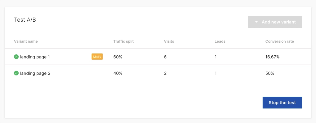
Split testing involves:
- Creating two versions of a page,
- Testing them with different segments of your audience,
- Analyzing user behavior,
- Making more informed decisions,
- Continuously improving your mobile conversion rate optimization strategy.
What Is Mobile Conversion Rate?
Mobile Conversion Rate refers to the percentage of mobile users who successfully carry out a desired action on a website or app. This could be anything from making a purchase to filling out a form or subscribing to a newsletter.
Four key factors that impact the mobile conversion rate include:
- Key page load speed
- Mobile-friendly navigation
- Responsive design
- Overall website performance
Creating an environment that encourages website visitors to take desired actions can be achieved by optimizing these aspects of your mobile site.
How Do You Calculate Mobile Conversion Rate?
The mobile conversion rate is determined by dividing the number of mobile conversions by the number of mobile visitors. The result is the percentage of your mobile audience that takes the desired action on your site.
To put it into context, let’s say your mobile site had 100 visitors in a day, and 10 of them took action and signed up for a newsletter. Your mobile conversion rate for that day would be 10%. By regularly calculating your mobile conversion rate, you can measure the effectiveness of your mobile marketing efforts and identify areas for improvement.
What Is a Good Conversion Rate for Mobile?
A general benchmark for a “good” mobile conversion rate falls around 2-3%, according to The Mobile E-Commerce Conversion Report by Littledata, which analyzed thousands of e-commerce sites. Mobile conversion rates, a crucial metric for assessing the effectiveness of e-commerce strategies, notably vary across different industries and products.
According to the Ruler Analytics, data shows differences in average conversion rates by industry, as you can see below:
- Professional services – 4.6%
- Industrial – 4.0%
- Auto – 3.7%
- Legal – 3.4%
- Health – 3.0%
- Travel – 2.4%
The disparity in these rates can be attributed to several factors, including website design, user experience, and market segmentation. Also, market-specific behaviors play a significant role; luxury goods retailers often see higher conversion rates than general retailers due to a more targeted consumer base.
What Is a Good Conversion Rate for Ecommerce on Mobile?
Top-performing e-commerce businesses often exceed this average, achieving mobile conversion rates of up to 5%, as highlighted in a study by Smart Insights.
When it comes to e-commerce specifically, a good conversion rate on mobile can vary depending on the product and industry.
Factors such as:
- product-audience fit,
- order and payment forms design,
- supported payment methods,
- site speed,
- mobile optimization
can all impact the average conversion rate for a mobile ecommerce store, especially when considering mobile traffic.
What Is The Difference Between Mobile Conversion Rate And Desktop Conversion Rate?
Generally, mobile conversion rates tend to be slightly lower than desktop site conversion rates. This can be attributed to a number of factors, including the smaller screen size of mobile devices, slower loading times, and different user behavior on mobile devices.
In fact, the behavior of users on mobile devices varies from that on desktops. For instance, mobile users are often on the go and may not have the same level of engagement or time to spend on a site compared to desktop users.
Mobile and desktop conversion rates are metrics used to measure the effectiveness of converting visitors into customers on different devices. The differences between these rates stem from the varying user behaviors and experiences on mobile devices versus desktops.
Key differences include the following:
- Screen size and navigation – mobile users navigate on smaller screens, which can affect the visibility and accessibility of certain website elements. In comparison, desktop users have the advantage of larger screens, allowing for more detailed and expansive displays of products and information.
- User intent and engagement – mobile users often exhibit higher intent but lower engagement, as they are more likely to be browsing on the go and making quick decisions. Desktop users typically show deeper engagement, spending more time per visit, which can lead to more informed purchasing decisions.
- Conversion process – mobile conversion processes must be streamlined and simple due to the smaller interface, requiring fewer steps and a more intuitive design. However, desktop platforms can afford more complex conversion processes, with users more likely to tolerate multiple steps.
- Loading speed and performance – mobile sites require faster loading times as mobile users expect quick access, often using less stable internet connections.
- Shopping context and environment – mobile shopping is often done in a more casual, impulsive context, such as during commutes or in short breaks. In contrast, desktop shopping is usually more planned and considered, often done in a home or office environment.
- Checkout process – mobile checkouts must be optimized for touch input, with larger buttons and simplified form filling.
Understanding these differences is crucial for businesses to optimize online presence and improve conversion rates across all platforms. With the right strategies in place, it’s possible to overcome these challenges and boost your mobile conversion rates.
What To Avoid in Mobile Conversion Rate Optimization?
While many strategies can help boost mobile conversion rates, there are also common pitfalls to avoid, including the 9 following:
- Stuffing too much content
- Overlooking the importance of page load speed
- Ignoring the principles of mobile design
- Complex checkout procedures
- Inappropriate touch targets
- Inefficient use of forms
- Absence of distinct CTAs
- Undervaluing the significance of testing
- Neglecting user feedback
By avoiding these common mistakes, businesses can significantly improve their mobile conversion rates and provide a better overall experience for their users.
Conclusion
To conclude, the key to increasing your mobile conversion rate lies in focusing on the user experience. The tips for increasing mobile conversions described in this article show optimization path for your mobile pages, including the following:
- Enhancing site loading speed
- Incorporating a responsive design
- Making navigation more user-friendly
- Making the checkout process more efficient
- Conducting tests and evaluating user behavior
By making it as easy and enjoyable as possible for users to interact with your site on a mobile device, you can improve your conversion rate. Then, testing and analyzing user behavior can provide valuable insights that can help you identify areas for improvement and make data-driven decisions that boost your mobile conversion rate.
In this digital era, optimizing mobile conversion rates has become crucial. Begin your journey with Landingi and its EventTracker solution, an ideal tool for crafting, testing, and enhancing mobile pages – transform your mobile page traffic into successful conversions.


