
An app landing page gives people a compelling reason to install, sign up, or start using your product. For many apps, it’s the first place where potential users decide whether your solution is worth their time.
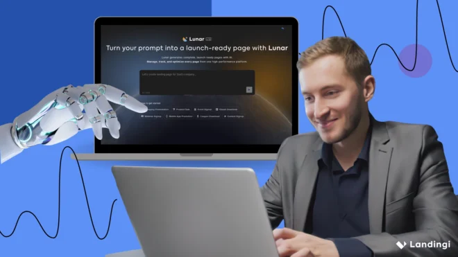
In 2026, successful app growth strategies rarely rely on app stores alone. Dedicated landing pages help teams tailor messaging for specific audiences, campaigns, and use cases while capturing traffic from search, paid ads, social media, and creator partnerships. With Landingi, marketers can generate app landing pages in minutes using Lunar, launch campaigns faster, and continuously optimize performance with insights from EventTracker and Solis.
Below, you’ll find 20 app landing page examples that turn attention into action – and practical ideas you can borrow for your own app install campaigns.

20 Examples of Best App Landing Pages
The best app landing pages make people want to download it. Strong messaging, compelling visuals, clear app store CTAs, and a frictionless user experience all play a role in turning interest into installs.
The 20 app landing page examples below showcase different approaches to app promotion, user acquisition, and conversion optimization. From productivity and finance apps to fitness, travel, and AI-powered tools, each example offers practical lessons you can apply to your own app landing page.
#1 Planta – plant care app landing page
Planta helps plant owners keep their greenery healthy with smart care reminders, plant identification, light measurements, and personalized recommendations. Its landing page reflects that mission perfectly, making plant care feel simple and approachable from the very first screen.
Strong visuals, a nature-inspired design, and clear app screenshots quickly explain how the app works. Download buttons are easy to find, while ratings and customer reviews add credibility without cluttering the page.

Key takeaways to learn from this example:
- Strong visual branding aligned with the product,
- App screenshots that clearly demonstrate functionality,
- Prominent download buttons,
- Social proof through ratings and reviews,
- Simple, focused messaging.
Improvement areas:
- A short product demo could help visitors experience the app before installing.
Create high-converting app landing pages faster with Lunar, Landingi’s AI-native landing page generator.
2. Aura Health – mental wellness app landing page
Aura Health combines meditation, sleep support, mindfulness exercises, life coaching, and therapeutic content in a single platform. Its landing page mirrors that breadth, showcasing the app as a personalized companion for mental well-being rather than a single-purpose meditation tool.
The page does an excellent job presenting the app’s extensive content library without feeling overwhelming. Personalization takes center stage, helping Aura differentiate itself in a crowded wellness market. User reviews, industry recognition, and awards such as “Best of Apps by Apple” further strengthen credibility.
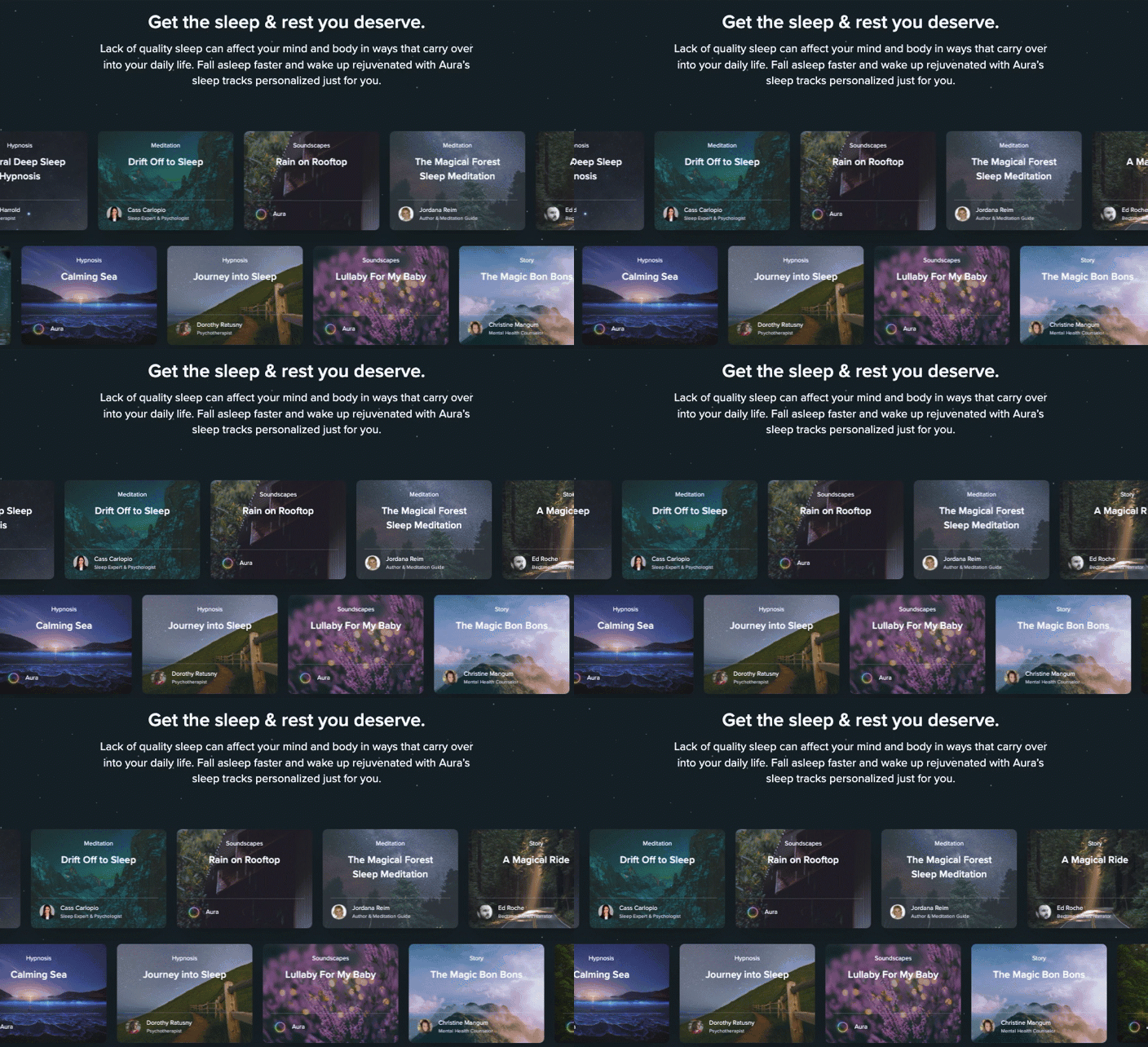
Another strength of Aura’s app landing page is its aesthetic design. The page employs attractive visuals and a neat layout, making it engaging and simple to navigate. Interactive sections make the page enjoyable for users and encourage them to take action.
As for improvement, the landing page could consist of more detailed descriptions of how each feature works and its benefits. They could also improve CTAs to be more prominent.
3. FitnessAI – AI fitness app landing page
FitnessAI uses artificial intelligence and data from millions of logged workouts to create personalized training plans. Its landing page leans heavily into that data-driven positioning, making AI-backed fitness recommendations the app’s main selling point.
The page quickly communicates the core benefit: smarter workouts without the guesswork. Statistics, App Store reviews, and clean visuals help build trust, while the simple layout makes the product easy to understand for first-time visitors.

Key takeaways to learn from this example:
- Strong data-backed value proposition,
- Clear explanation of the app’s benefits,
- App Store reviews that build credibility,
- Clean design with engaging visuals,
- Focused, easy-to-scan messaging.
Improvement areas:
- CTA buttons could be more prominent and repeated throughout the page.
Grow your app’s user base – build a high-converting landing page with Landingi!
4. Oggl by Hipstamatic – photography app landing page
Oggl by Hipstamatic is a photography app built around creative image capture, photo effects, and a community of photography enthusiasts. Its landing page reflects that creative spirit, putting visuals front and center from the very first scroll.
The page does a great job showcasing the app’s filters, features, and unique aesthetic through striking imagery. Clear feature descriptions and a strong emphasis on the creator community help differentiate the app from standard photo editors. Membership benefits and pricing are also presented clearly, reducing friction during the decision-making process.

Key takeaways to learn from this example:
- Visual-first design that showcases the product,
- Clear feature and pricing communication,
- Strong community-focused positioning,
- Interactive and mobile-friendly experience.
Improvement areas:
- User reviews or creator stories could strengthen social proof and credibility.
5. Pocket Casts – podcast app landing page
Pocket Casts is a podcast app built for listeners who want more control over their experience, offering features like customizable playback speeds, silence trimming, cross-device syncing, and premium upgrades for power users.
Its landing page keeps things simple and effective. Clean visuals, concise copy, and app screenshots quickly communicate what makes the app different. Download buttons for iOS and Android are impossible to miss, while the emphasis on free access lowers the barrier to entry for new users.

Key takeaways to learn from this example:
- Clear path from landing page to app download,
- Well-presented features and benefits,
- Strong cross-platform messaging,
- Clean, user-friendly design,
- Free plan highlighted early in the user journey.
Improvement areas:
- User ratings and reviews would add extra credibility.
- Demo videos could showcase the listening experience more effectively,
Create app landing pages that make downloading your app the obvious next step.
6. Forest – productivity app landing page
Forest turns productivity into a game. Users stay focused by growing virtual trees, and over time can even contribute to planting real ones through the app’s environmental partnerships. It’s a simple idea with a memorable twist – and the landing page makes the most of it.
The design mirrors the app’s mission: clean, distraction-free, and easy to follow. Illustrations and animations quickly explain how Forest works, while the sustainability angle gives the product a purpose beyond productivity.

Key takeaways to learn from this example:
- Unique value proposition presented immediately,
- Strong visual storytelling,
- Clean, focused design,
- Emotional connection through environmental impact.
Improvement areas:
- Download buttons could be more prominent above the fold to drive more installs.
Get inspired by app landing page ideas and build yours with Landingi today!
7. Artisse – AI photo generation app landing page
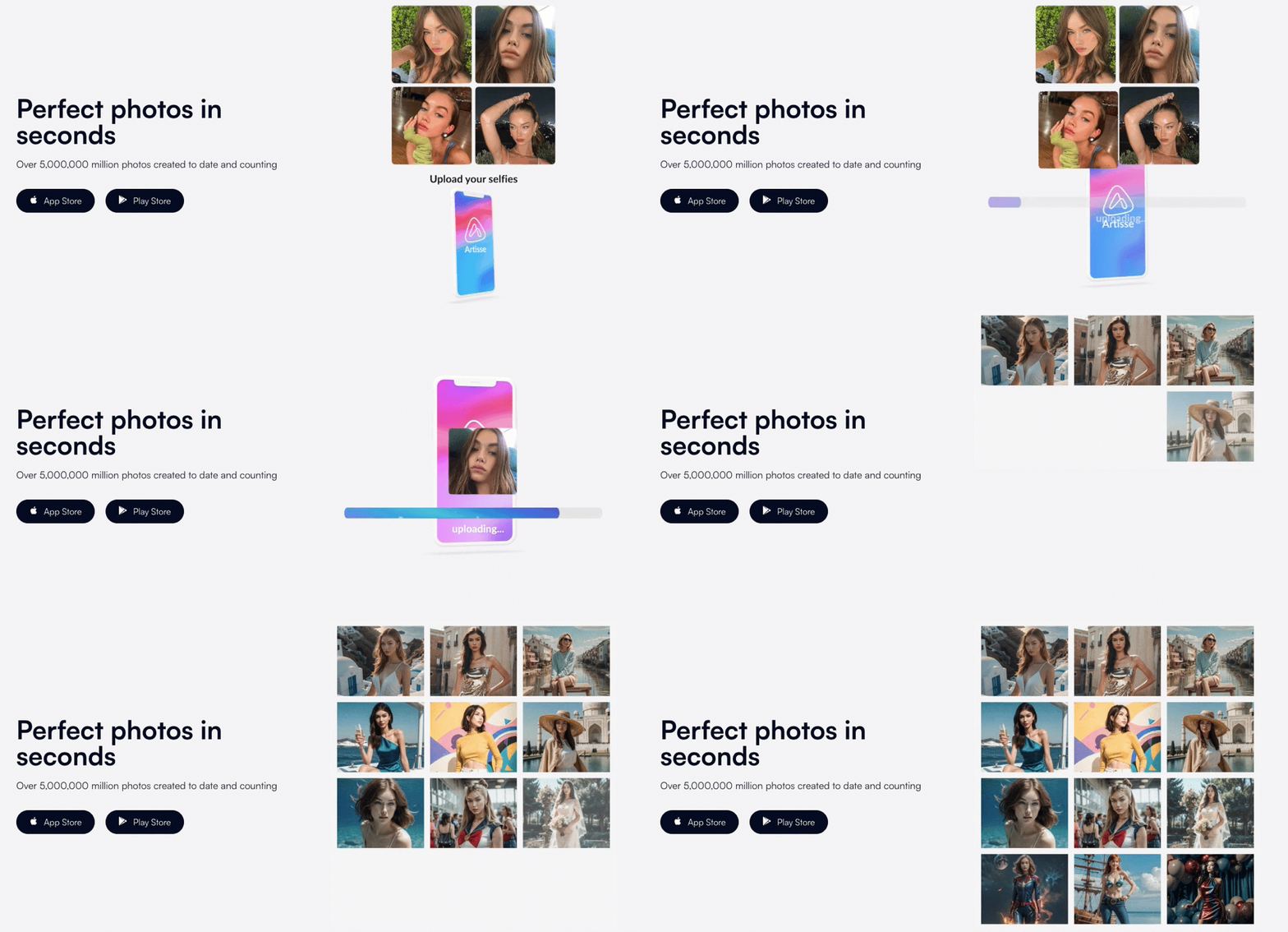
Artisse uses AI to create personalized, high-quality images, helping users generate professional-looking photos without a traditional photoshoot. Its landing page embraces that promise with a sleek, modern design that immediately feels aligned with an AI-powered creative product.
The page relies on strong visuals, product demos, and concise copy to explain the app’s value in seconds. Testimonials and credibility signals help build trust, while a prominent CTA encourages visitors to try the app right away.
Key takeaways to learn from this example:
- Strong visual-first presentation,
- Clear and concise messaging,
- Effective use of screenshots and videos,
- Visible CTA above the fold,
- Trust-building testimonials.
Improvement areas:
- Some visitors may want deeper explanations of how the technology works.
- Benefits could be tied more directly to user outcomes,

#8 D-ID – AI avatar app landing page
D-ID uses AI to create photorealistic digital avatars and animated content for marketing, education, and entertainment. Its landing page immediately leans into the “wow factor,” showing the technology in action rather than simply describing it.
Interactive demos, polished visuals, and a futuristic design help visitors grasp the product’s capabilities within seconds. The free trial is especially well-positioned, giving users a chance to experience the technology firsthand before committing. Case studies, testimonials, and recognizable client logos add credibility throughout the page.

Key takeaways to learn from this example:
- Interactive product demonstrations,
- Strong free-trial offer,
- Futuristic design aligned with the product,
- Clear, jargon-free messaging,
- Effective use of social proof.
Improvement areas:
- Some features and use cases could be explained in greater detail for users researching before buying.
9. Kittysplit – expense-sharing app landing page
Kittysplit helps friends, roommates, and travel groups split expenses without complicated setup or account creation. Its landing page follows the same philosophy: simple, fast, and refreshingly frictionless.
The page gets straight to the point with a clear headline, a prominent CTA, and screenshots that show exactly how the app works. There are no distractions, lengthy explanations, or unnecessary steps. Instead, the entire experience focuses on helping visitors understand the value and start using the app within seconds.

Key takeaways to learn from this example:
- Extremely clear value proposition,
- Friction-free user journey,
- Simple, conversational copy,
- Effective use of screenshots,
- Strong focus on a single action.
Improvement areas:
- Trust signals such as user reviews or usage statistics could strengthen credibility for first-time visitors.

10. TIDAL – music streaming app landing page
TIDAL positions itself as a premium music streaming platform, and its landing page makes that clear from the very first scroll. Dark visuals, bold typography, and high-quality imagery create an experience that feels more like a luxury brand than a typical streaming service.
The page combines strong branding with smart conversion tactics. Content flows naturally from one section to the next, highlighting audio quality, exclusive content, and artist-focused values. Meanwhile, the “Start Free Trial” CTA remains visible without dominating the experience.

Key takeaways to learn from this example:
- Premium visual identity,
- Strong brand positioning,
- Smooth content flow,
- Well-placed free trial CTA,
- Consistent messaging throughout the page.
Improvement areas:
- More product screenshots could help users better understand the app interface before signing up.
Let visitors experience your product before they download it with demos, trials, and interactive content.
11. Klarna – fintech app landing page
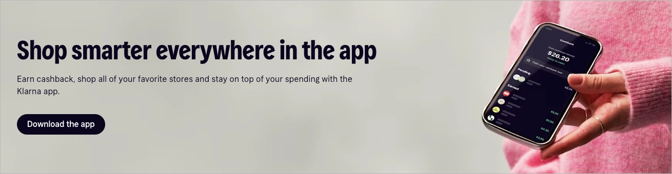
Klarna transforms a financial service into a lifestyle product, and its landing page follows the same playbook. The message is instantly clear: shop now, pay later. Large headlines, soft colors, and fashion-inspired visuals make the experience feel approachable rather than transactional.

The page is built for quick scanning. Short sections explain the app’s core benefits, while featured retailers and visual cues reinforce trust and familiarity. Every element gently guides visitors toward downloading the app without making the experience feel overly sales-driven.
Key takeaways to learn from this example:
- Instantly understandable value proposition,
- Strong lifestyle-oriented branding,
- Highly scannable layout,
- Effective use of retailer logos and social proof,
- Clear path to app installation.
Improvement areas:
- Adding more app interface screenshots could help users better understand the in-app experience before downloading.
12. Too Good To Go – food waste reduction app landing page
Too Good To Go helps users save money while reducing food waste by rescuing unsold meals from local restaurants, bakeries, and stores. Its landing page turns that mission into a compelling reason to join.
The page leads with a clear value proposition and then walks visitors through the process step by step. Real food photography, a warm color palette, and impressive impact statistics make the concept feel both practical and meaningful. Instead of focusing on features, the page focuses on outcomes – saving food, saving money, and making a difference.

Key takeaways to learn from this example:
- Mission-driven value proposition,
- Simple step-by-step user journey,
- Strong use of statistics and social proof,
- Authentic, engaging visuals,
- Friendly and approachable tone.
Improvement areas:
- More app screenshots could help visitors better visualize the in-app experience.
13. Slack – app download page
Slack’s Mac download page is a great example of an app download page stripped down to its essentials. The goal is obvious from the first second: help users install Slack as quickly as possible.
The page revolves around a single CTA, supported by just enough information to answer practical questions about compatibility, platforms, and system requirements. There’s no unnecessary storytelling, no feature overload, and no distractions competing for attention.

Key takeaways to learn from this example:
- Single, highly focused conversion goal,
- Prominent download CTA,
- Minimalist design,
- Essential information presented upfront,
- Friction-free user journey.
Improvement areas:
- A brief reminder of Slack’s core benefits could reinforce motivation for first-time visitors arriving from search.
14. Farfetch – fashion shopping app landing page
Farfetch’s app landing page feels less like a retail page and more like a luxury fashion magazine. The focus is clear from the start: download the app to access a more exclusive shopping experience.
Premium photography, elegant typography, and generous white space reinforce the brand’s high-end positioning. Rather than listing features, the page highlights benefits such as early access, app-exclusive collections, and a smoother checkout experience. Every section subtly pushes visitors toward installing the app while strengthening the brand’s aspirational appeal.

Key takeaways to learn from this example:
- Strong lifestyle-focused positioning,
- Premium visual design,
- Benefit-driven messaging,
- Well-placed download CTAs,
- Consistent brand experience.
Improvement areas:
- Additional app screenshots could help visitors better understand the mobile shopping experience before downloading.
Turn features into compelling stories with a dedicated app landing page built in Landingi.
15. Barclays – mobile banking app landing page
Barclays uses its app landing page to do something every financial product needs to do: build trust. From the first section, the focus is on convenience, security, and staying in control of your finances wherever you are.
The page breaks down key features such as balance checks, card management, and secure messaging into easy-to-digest sections supported by icons and visuals. The design feels professional without becoming overly corporate, while the CTAs guide visitors naturally toward downloading the app or learning more.

Key takeaways to learn from this example:
- Trust-focused messaging,
- Clear feature explanations,
- Effective use of icons and visuals,
- Strong information hierarchy,
- Seamless path to app download.
Improvement areas:
- More real app interface screenshots could make the mobile experience feel more tangible before installation.
16. Tropical Smoothie Cafe – restaurant app landing page
Tropical Smoothie Cafe uses its app landing page to make one thing clear: ordering should be as enjoyable as the food itself. Bright colors, mouthwatering product photos, and energetic copy immediately create a sense of fun and convenience.
The page focuses on practical benefits such as earning rewards, skipping the line, and accessing exclusive offers. Everything is presented in short, easy-to-scan sections, while download CTAs remain highly visible throughout the experience.

Key takeaways to learn from this example:
- Strong visual consistency with the brand,
- Benefit-focused messaging,
- Highly visible download CTAs,
- Effective use of food photography,
- Clear rewards and loyalty program positioning.
Improvement areas:
- Customer ratings or app store reviews could add another layer of trust and encourage more downloads.
17. Greene King – restaurant ordering app landing page
Greene King’s app is built around a simple promise: order food and drinks directly from your table without waiting at the bar. The landing page reflects that practicality from the very first section.
Clear headlines, warm pub imagery, and step-by-step explanations quickly show how the app works. Rather than focusing on features, the page emphasizes outcomes – shorter waits, easier payments, and a more relaxed experience. Download buttons are easy to find, and the entire journey feels straightforward and intuitive.

Key takeaways to learn from this example:
- Problem-solving value proposition,
- Clear explanation of the user journey,
- Benefit-focused messaging,
- Consistent visual branding,
- Friction-free path to app download.
Improvement areas:
- Real customer reviews could further reinforce trust and encourage first-time users to install the app.
18. The People’s Pension – pension management app landing page
The People’s Pension app helps users manage their retirement savings, track contributions, and update account details from their phones. Its landing page takes the same approach as the product itself: clear, practical, and reassuring.
The design relies on clean layouts, generous white space, and straightforward explanations rather than flashy visuals. Visitors quickly understand what they can do in the app, while direct download links and onboarding instructions make getting started easy. A FAQ section near the bottom helps remove uncertainty and answers common questions before they become objections.

Key takeaways to learn from this example:
- Clear, trust-focused messaging,
- Straightforward feature presentation,
- Easy access to app store downloads,
- Helpful onboarding information,
- FAQ-driven reassurance.
Improvement areas:
- More app screenshots could make the mobile experience feel more tangible and engaging.
19. Ticketmaster – event ticketing app landing page
Ticketmaster’s app landing page sells more than a ticketing app – it sells access to experiences. Concert photography, event-focused visuals, and confident messaging immediately tap into the excitement of live entertainment.
The page keeps things simple, highlighting benefits such as easier ticket access, event discovery, and mobile ticket management. The user journey feels natural, with download prompts woven into the experience rather than aggressively pushed at every turn.

Key takeaways to learn from this example:
- Emotion-driven visuals,
- Clear app benefits,
- Strong connection to the brand experience,
- Smooth, intuitive user flow,
- Well-balanced CTA placement.
Improvement areas:
- Interactive previews or personalized event recommendations could make the experience even more engaging.
20. Meliá – travel app landing page
Meliá’s app landing page makes travel feel effortless before you’ve even booked a trip. The focus is clear from the start: manage reservations, access exclusive perks, and enjoy a smoother hotel experience from your phone.
Soft colors, inviting destination imagery, and a clean layout create a relaxed, vacation-ready atmosphere. Instead of overwhelming visitors with features, the page highlights practical benefits such as digital check-ins, mobile room access, and loyalty rewards, making the value of the app easy to understand.

Key takeaways to learn from this example:
- Benefit-driven messaging,
- Strong travel-focused visuals,
- Calm, user-friendly design,
- Clear explanation of app advantages,
- Consistent download journey.
Improvement areas:
- More motion elements or real user-generated content could make the experience feel even more immersive.
Learn from top app landing page examples – create yours with Landingi!
How Do I Create an App Landing Page?
To create an app landing page faster, use Landingi and generate the first version with Lunar, Landingi’s AI-native landing page generator. Start with a clear campaign brief: what the app does, who it’s for, what action you want users to take, and which channels will drive traffic to the page.
A high-converting app landing page should answer three questions within seconds:
- What does the app do?
- Why should I care?
- What should I do next?
The most effective pages combine a clear value proposition, app screenshots, demo visuals, social proof, and frictionless download paths that guide visitors toward installation, registration, or trial activation.
For example, you could use a prompt like:
Create a high-converting app landing page for BudgetBee, a personal finance mobile app for young professionals aged 25–35 who want to manage spending, reduce impulse purchases, and build better saving habits.
The main goal of the page is to increase app installs and free-trial sign-ups from Google Ads, TikTok campaigns, and organic search.
Use a clear, modern, trustworthy tone. The design should feel friendly, mobile-first, and visually clean, with app screenshots, soft financial colors, simple icons, and short sections that are easy to scan on smartphones.
Include: a hero section with a strong headline and CTA, App Store and Google Play download buttons, a short explanation of how the app works, key features such as AI-powered budgeting, spending insights, savings goals, bill reminders, and bank account integrations, app screenshots showing the dashboard, budget categories, and progress tracking, testimonials or app store ratings, a comparison section showing why BudgetBee is easier than spreadsheets, FAQ addressing privacy, pricing, bank security, subscriptions, and cancellation, and a final CTA focused on starting a free trial.
Highlight these benefits: understand spending in minutes, set realistic savings goals, get personalized AI insights, track money without manual spreadsheets, and build better financial habits.
Make the page mobile-first, fast to scan, conversion-focused, and optimized for app installs and free-trial sign-ups.
After few minutes, you get high-converting and fully editable landing page:
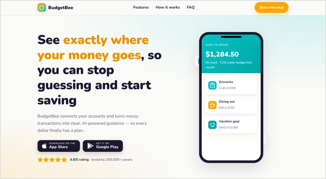
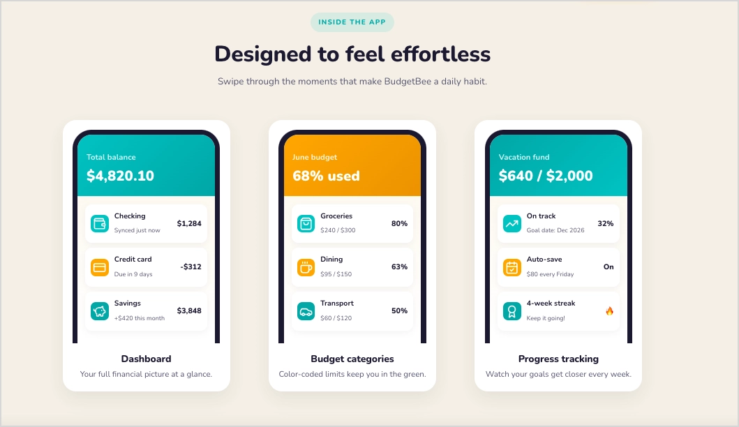
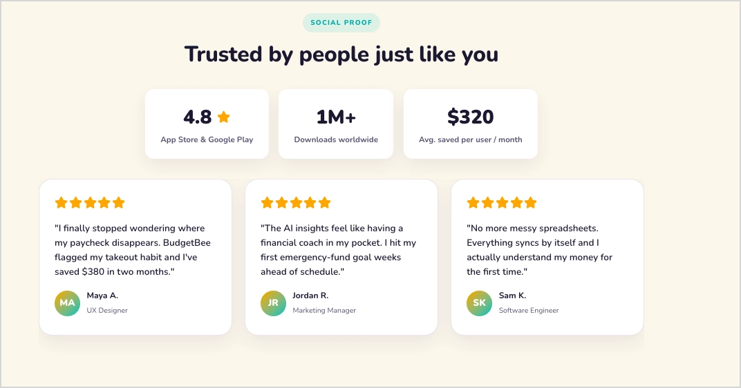
After publishing, use EventTracker to understand how visitors interact with the page through scroll maps and event maps. Solis can then analyze that behavioral data and recommend optimizations that help increase app installs, sign-ups, and trial activations.
What to avoid while creating an app landing page?
Common mistakes include overcrowding the page with features, hiding download buttons, using generic messaging, neglecting mobile optimization, or asking visitors to make too many decisions at once.
Avoid treating your app landing page like a product manual. Focus on outcomes rather than feature lists, keep the primary CTA visible throughout the page, and make it easy for visitors to understand the value of your app within a few seconds. The faster people grasp the benefit, the more likely they are to install.
Analyze scroll patterns, interactions, and conversion bottlenecks with Solis.
4 App Landing Page Best Practices
The best app landing pages don’t succeed because of beautiful design alone. They convert because every element – from the headline to the download button – helps visitors understand the value of the app and take action with minimal friction.
The four best practices below consistently appear across the highest-performing app landing page examples and can have a measurable impact on installs, registrations, and user acquisition campaigns.
1. Mobile-first design
Most visitors will discover your app on a smartphone, so your app landing page should be designed for mobile first, not desktop first.
Fast loading times, thumb-friendly navigation, prominent download buttons, and layouts that adapt seamlessly to smaller screens all contribute to higher conversion rates. A poor mobile experience can quickly undermine even the most compelling app promotion landing page.

Key elements include:
- Fast page speed,
- Clear visual hierarchy,
- Large tap targets,
- Mobile-optimized forms,
- Prominent App Store and Google Play buttons.
2. Consistent branding
The transition from landing page to app should feel seamless. When visitors install your app, they should immediately recognize the same visual identity, messaging, and tone they saw on the page.
Consistent colors, typography, imagery, and copy help build trust and reduce uncertainty during the decision-making process. This is especially important for fintech, health, productivity, and subscription-based apps where credibility directly influences conversion rates.

Key elements include:
- Consistent visual identity,
- Matching screenshots and app interface,
- Unified messaging,
- Clear brand recognition across channels.
3. Continuous optimization
Launching an app landing page is only the beginning. The strongest app install landing pages improve over time because teams track how visitors actually behave, not just how they were expected to behave.
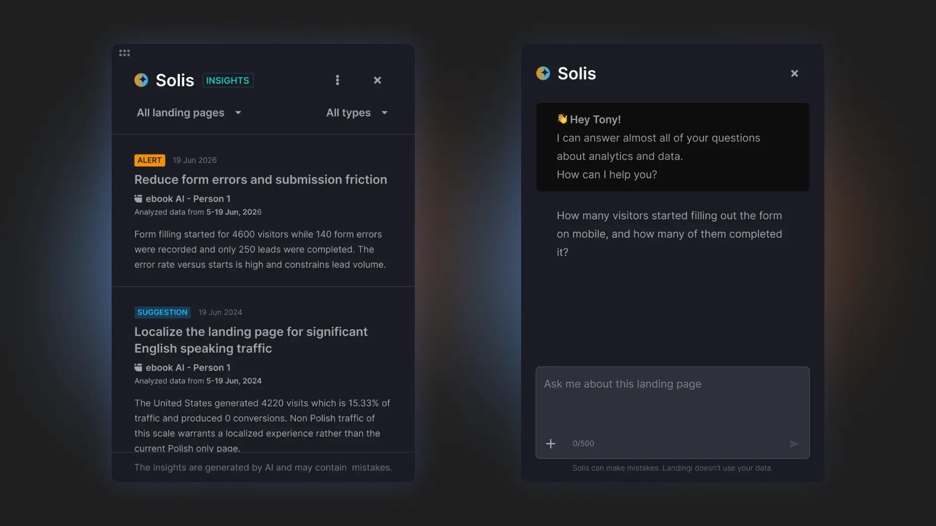
Test headlines, screenshots, CTA copy, app store buttons, social proof, page length, and pricing sections. Then look beyond surface-level metrics. EventTracker can show scroll depth, clicks, form interactions, conversion events, and other behavioral signals, while Solis analyzes that data in the context of the page and campaign to surface alerts, discoveries, and practical optimization suggestions.
This matters especially for app promotion campaigns, where small friction points can quietly cost installs. If users stop scrolling before the app screenshots, ignore the download buttons, or abandon a free-trial form, Solis can help identify where the page needs attention.
Key elements include:
- A/B testing,
- Behavioral analytics,
- Scroll maps and event maps,
- CTA and app store button optimization,
- AI-powered optimization recommendations.
4. User-centric messaging
Visitors don’t care about features first – they care about outcomes.
The strongest app landing pages focus on the problems users want to solve and the results they can achieve. Instead of listing technical capabilities, explain how the app saves time, reduces effort, improves productivity, increases revenue, or simplifies daily tasks.
Keep the copy concise, remove unnecessary distractions, and make the primary action obvious throughout the page.
Key elements include:
- Strong conversion path.
- Benefit-focused copy,
- Clear value proposition,
- Simple navigation,
- Minimal distractions,
- Strong conversion path.
FAQ About App Landing Pages
A great app landing page helps visitors understand the value of your app, builds trust, and turns interest into installs, sign-ups, or subscriptions. Here are answers to the most common questions about app landing pages.
What is an app landing page?
An app landing page is a dedicated webpage designed to promote a mobile or web application and encourage visitors to install, download, or sign up for it. Unlike a homepage, it focuses on a single conversion goal and highlights the app’s value through benefits, screenshots, social proof, and clear calls to action.

Why do I need an app landing page?
An app landing page gives you more control over how potential users discover and evaluate your product. It allows you to tailor messaging for specific audiences, campaigns, and acquisition channels while driving app installs, registrations, or free-trial sign-ups. It can also improve SEO visibility and support paid advertising campaigns more effectively than relying on app store listings alone.
How do you optimize an app landing page for conversions?
Start with a clear value proposition, compelling app screenshots, visible download buttons, and strong social proof. Then continuously test headlines, CTAs, page structure, and visual elements. Behavioral analytics tools such as EventTracker can reveal how visitors interact with the page, while Solis can analyze that data and recommend optimization opportunities based on actual user behavior.
What industries benefit most from app landing pages?
App landing pages work especially well for SaaS platforms, productivity tools, fintech apps, health and fitness applications, e-commerce brands, travel services, education platforms, gaming companies, and subscription-based products. Any business that relies on app installs, user acquisition, or mobile engagement can benefit from a dedicated app promotion landing page.
What is the best app landing page builder?
Landingi is one of the best platforms for creating app landing pages because it combines page generation, publishing, optimization, and campaign management in a single landing page operation system. With Lunar, teams can generate complete app landing pages from a prompt, while EventTracker and Solis help analyze user behavior and uncover opportunities to improve conversion rates after launch.
Generate, publish, and optimize app landing pages in one workflow.
Create High-Converting App Landing Pages with Landingi
App store listings alone rarely provide enough space to tailor messaging for different audiences, campaigns, and acquisition channels. Dedicated app landing pages help bridge that gap by giving marketers full control over positioning, user journeys, and conversion paths.
With Landingi, you can generate app landing pages in minutes using Lunar, publish them quickly, and improve performance with behavioral insights from EventTracker and optimization recommendations from Solis.
Whether you’re promoting a productivity app, fintech platform, fitness app, AI tool, or mobile game, Landingi helps you create, test, and optimize app landing pages from a single workflow. Start creating landing pages with Landingi and turn more campaign traffic into installs, sign-ups, and active users.