

A competitor comparison landing page is a standalone page that helps potential customers understand how your product or service stacks up against others. It’s a direct, side-by-side comparison that highlights your strengths and shows why your offer is the better choice. These pages are especially effective in saturated markets, where buyers need clarity to make confident decisions.
Creating competitor comparison pages is a smart way to guide visitors toward choosing your product by answering the exact question they’re asking: “How does this compare to the others?” The best examples are clear, honest, and backed by useful information. They don’t just list features – they explain why your solution delivers more value, using visuals and focused copy to build trust.
In this article, we’ll explore practical landing page examples to show how competitor comparisons work in action. You’ll learn how to structure these pages, what to include, and how to write in a way that’s convincing without sounding aggressive or biased. Whether you’re looking to increase conversions or build a stronger case for your product, you’ll find specific strategies to apply right away.

What Is a Competitor Comparison Landing Page?
A competitor comparison landing page is a web page designed to directly compare your product or service with those of your competitors. This type of landing page highlights the strengths and advantages of your offerings while clearly demonstrating how they outperform other options in the market. The goal is to provide potential customers with the information they need to make an informed decision, guiding them toward choosing your product or service over others.
Competitor comparison landing pages are particularly effective in industries where multiple companies offer similar products or services. SaaS companies, for example, often use these pages to address both existing customer doubts and active search demand from users researching alternatives. By offering a side-by-side comparison, you can build trust, showcase transparency, and drive conversions by helping prospects see the unique value your brand provides.
Build a competitor comparison page that highlights your strengths using Landingi.
How to Create a Competitor Comparison Landing Page?
Creating a competitor comparison landing page in Landingi is straightforward when you know how to use its visual tools effectively. Follow the detailed advice below to create a landing page that is both engaging and informative.
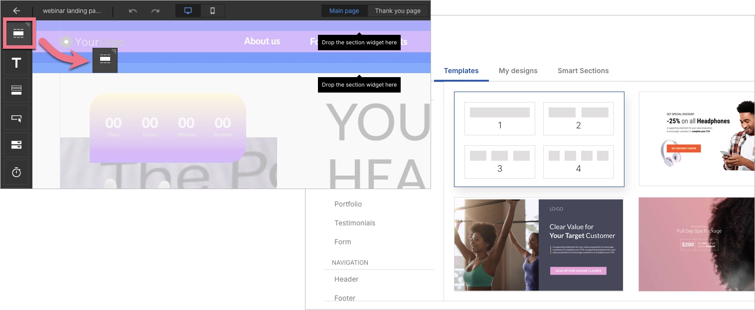
1. Set Up Your Layout with Sections and Columns
Start in the Landingi dashboard by choosing Create new landing page. You can select a blank template or a pre-built one, depending on your needs. Once you’re in the editor, use the Section widget to build the basic layout of your page. You’ll want dedicated sections for your hero, comparison table, pricing breakdown, testimonials, and call-to-action.
Within each section, apply columns to organize content into clear side-by-side formats. This is especially helpful when you need to compare features directly with your competitors, giving users a fast and easy way to see differences.
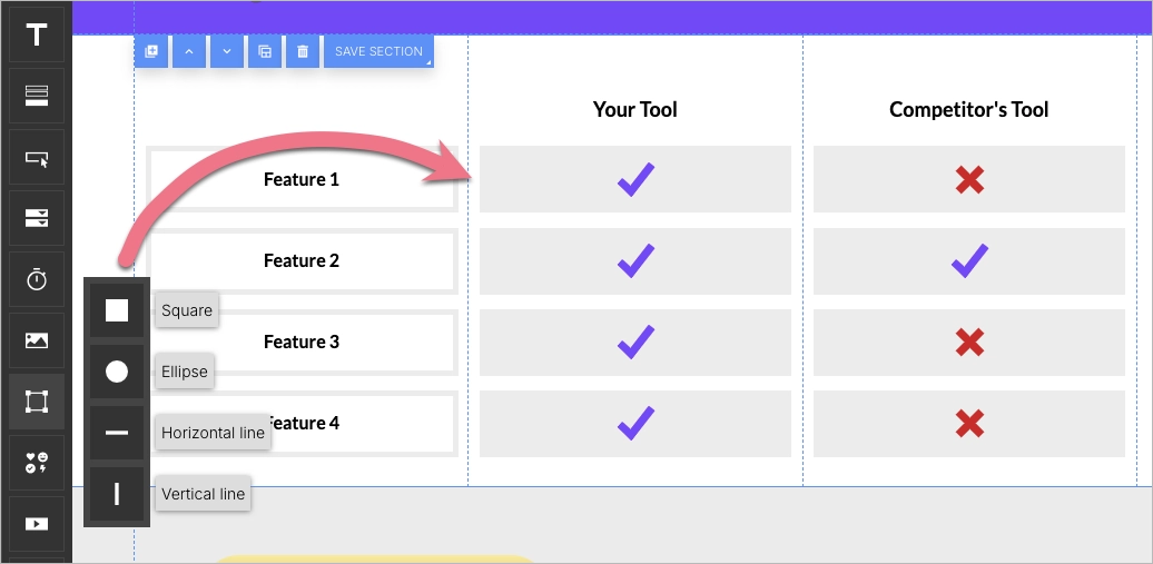
2. Build a Comparison Table Using Shapes and Text
In Landingi, you can create a table using a combination of Shapes and Text. Start by placing rectangles to serve as the background of each row. Then layer Text widgets on top to list feature names and corresponding values under each brand.
If you want to show whether a feature is included, upload icons like checkmarks and crosses, and place them directly into the appropriate columns.
You can highlight your unique selling points using bold text or accent colors, making it easy for users to recognize your advantage at a glance.
As you build the content, keep in mind the actual search demand and include competitor keywords that match what your audience is searching for. Use phrases, such as “[Your Product] vs [Competitor]” or “best CRM alternative,” to align your page with real user intent. This not only helps with conversions but also supports discoverability if you’re driving traffic from search.
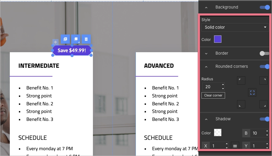
3. Display Clear Pricing with Visual Blocks
Use the same Shape and Text widgets to create pricing boxes that present each plan’s details clearly. Place each plan in its own column, and display the monthly cost, included user count, and any pricing advantages your offer provides.
If your product is cheaper, this is where to emphasize savings – add small banners or colored text labels that call out how much a customer could save.
These pricing sections should be clean and easy to scan, helping users see the value of your product without extra clicks.
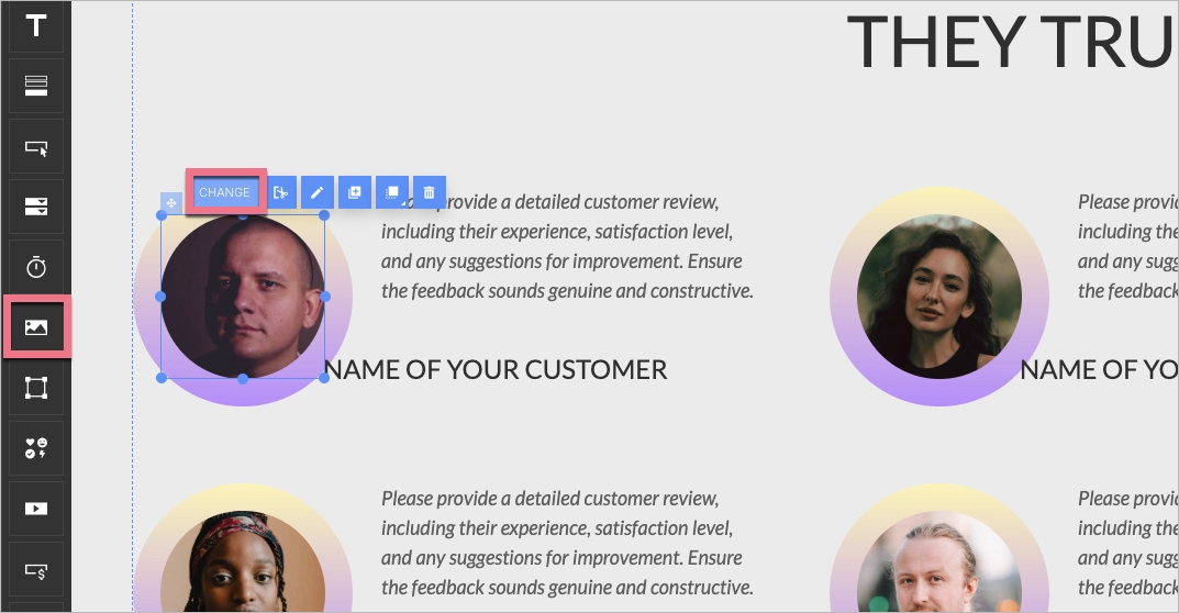
4. Add Visual Aids and Testimonials
To support your claims and provide social proof, include screenshots of your product interface and visuals that demonstrate functionality. Upload these using the Image widget and place them alongside concise, benefit-focused text.
Testimonials can be built using a combination of text and image widgets – include the quote, customer name, photo, and role. To differentiate this section, apply a colored background or use a shape as a frame. This adds credibility and reinforces how your product performs in real scenarios.
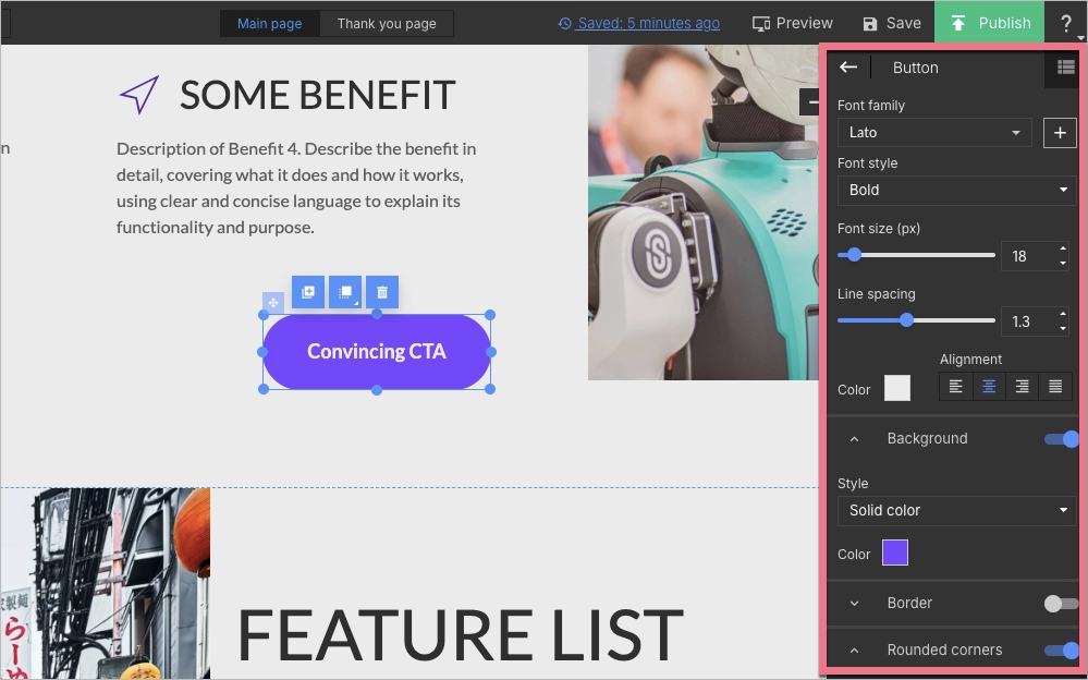
5. Add and Style a Clear Call-to-Action (CTA)
The Button widget allows you to insert strong calls to action, like “Start Free Trial” or “See Full Comparison.” Style the button by adjusting color, font, and size using the editor panel on the right.
Place CTAs at multiple touchpoints on the page – after your comparison table, at the end of testimonials, and in the final section. Make sure each one leads to your desired action, whether that’s a sign-up form or a scheduling tool.
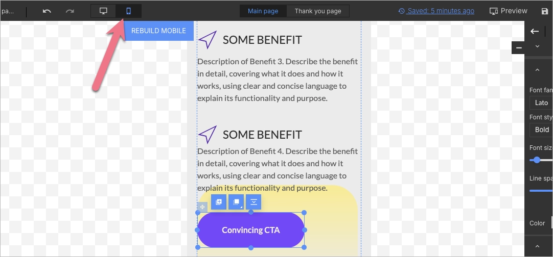
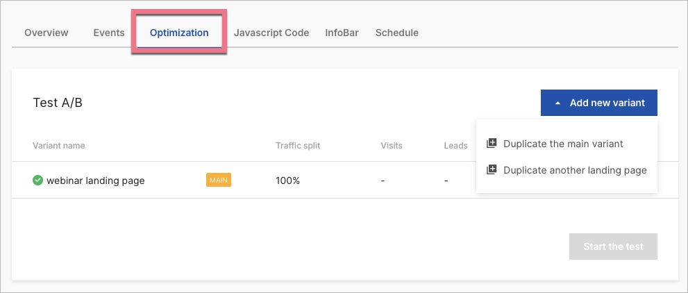
6. Optimize for Mobile and Test Variants
Switch to mobile view using the toggle at the top of the editor. Adjust element sizes, spacing, and layout so that everything remains readable and functional on smaller screens.
Landingi also offers A/B testing features. Duplicate your page and change one key element (like the main headline or CTA text) then publish both versions to see which one performs better. Review results in the dashboard and keep optimizing based on what converts best.
20 Best Examples of Competitor Comparison Landing Page
Crafting an effective competitor comparison landing page is crucial for businesses looking to differentiate their products and convert potential customers. This section highlights the top 20 examples of high-converting landing pages, showcasing how companies like Asana, Typeform, and Hostinger successfully leverage design, clear messaging, and strategic calls-to-action to highlight their advantages over competitors.
From using comparison tables that make feature differences easy to digest, to employing customer testimonials that build credibility, these examples provide valuable insights into creating persuasive and user-friendly landing pages that drive engagement and conversions. Whether you’re aiming to improve mobile optimization or enhance social proof, these case studies offer actionable takeaways to elevate your own landing pages.
1. Asana vs. Wrike
The Asana vs. Wrike comparison landing page is an excellent example of a well-structured competitor comparison page. It is designed to clearly articulate the differences between Asana and Wrike, guiding potential customers through key decision-making factors. The page uses a clean and modern layout with high-quality visuals and well-organized content sections, making it easy for visitors to navigate and understand the key benefits and features of Asana compared to Wrike.

This page’s strengths include its strategic use of persuasive copy and a comparison table, which allow users to quickly see how the two platforms stack up against each other. Additionally, the page highlights customer testimonials and case studies, providing social proof to reinforce Asana’s advantages. The strong call-to-action (CTA) buttons encourage users to try for free or learn more, driving engagement and conversions.
Key takeaways to learn from this example:
- Clear comparison table,
- Social proof,
- Strong CTAs,
- FAQ section.
Improvement areas:
- Mobile optimization – while the desktop experience is smooth, ensuring the mobile layout is equally engaging could enhance usability across all devices.
Create a compelling competitor comparison landing page with Landingi.
2. Keap vs. ActiveCampaign
The competitor comparison landing page on Keap’s website, which contrasts its features with ActiveCampaign, is a strategic tool designed to highlight the advantages of Keap over its competitor. The page emphasizes Keap’s comprehensive business automation and CRM solutions specifically tailored for small businesses, contrasting this with ActiveCampaign’s need for additional tools to match the full suite that Keap offers. The page layout is clean and direct, using a comparison table, bullet points, social proof, and visuals to make the differences clear and accessible.

This page’s strengths lie in its straightforward design and clear messaging. The use of a comparison table allows users to quickly grasp the differences between the two platforms, while the strategic placement of call-to-action buttons encourages conversions. The page also benefits from a strong emphasis on Keap’s all-in-one solution, a compelling argument for small businesses looking to streamline their operations.
Key takeaways to learn from this example:
- Showcasing the product in action,
- Clear and persuasive messaging,
- Strategic CTA placement.
Improvement areas:
- Surface-level comparison table – the table could have delved deeper so that users can easily find the desired features to make better buying decisions
3. Duda vs. Wix
The competitor comparison landing page on Duda’s website offers a detailed comparison between Duda and Wix, aiming to highlight Duda’s advantages over its competitor. The page is well-structured, beginning with a clear, bold headline and attractive hero shot that immediately sets the context of the comparison. The layout is straightforward, with a side-by-side comparison table that lists key features and benefits of both platforms. This table is followed by sections that delve deeper into specific aspects such as ease of use, performance, and customer support, further solidifying Duda’s positioning.

Key strengths of the page include its use of concise, detailed information, which makes it easy for readers to understand and absorb the material. The design is clean and visually appealing, with a consistent color scheme that maintains the focus on the content.
Key takeaways to learn from this example:
- Clear headline and value proposition,
- Detailed feature comparison table,
- Visual hierarchy.
Improvement areas:
- Trust signals – showcasing testimonials, case studies, or industry awards would enhance credibility.
Create a landing page that compares your competitors and wins more clients.
4. Typeform vs. Jotform
The landing page on Typeform’s website, titled “The best Jotform alternative,” is an excellent example of a competitor comparison landing page. It strategically compares Typeform to Jotform, aiming to position Typeform as the superior choice for users seeking a form-building tool. The page is designed to attract Jotform users who might be considering a switch by highlighting the unique benefits and features of Typeform over Jotform.

The page is structured with clear headings, concise copy, and direct comparisons that emphasize Typeform’s strengths. Visuals like side-by-side feature comparisons and customer testimonials add credibility and engage visitors. The call-to-action (CTA) buttons are prominently displayed, encouraging users to try Typeform for free, making it easy for potential customers to take the next step.
Key takeaways to learn from this example:
- Engaging visuals,
- Trust signals,
- Pricing table.
Improvement areas:
- Deeper feature analysis – providing a more in-depth feature comparison might help persuade more technically inclined users.
5. Sketch vs. Adobe XD
The “Adobe XD to Sketch — Why people are choosing Sketch” page serves as an excellent example of a competitor comparison landing page. The page effectively positions Sketch against Adobe XD by emphasizing the unique features and advantages of Sketch. It uses a structured approach, beginning with a compelling hero section that contrasts the two products, followed by detailed sections that highlight the superior attributes of Sketch, such as design system control, offline functionality, and an extensive library of plugins.

Key takeaways to learn from this example:
- Effective visual design,
- Focused messaging,
- Visible CTA.
Improvement areas:
- More testimonials – while the page includes testimonials, incorporating more user stories and case studies could provide additional social proof and further convince potential customers.
Make your brand shine by creating a competitor comparison landing page.
6. Lemon Squeezy vs Gumroad
The “Lemon Squeezy vs. Gumroad” page is a strong example of a competitor comparison landing page designed to encourage users to switch from Gumroad to Lemon Squeezy. The page effectively highlights the pain points associated with Gumroad, such as increased fees, and contrasts them with the benefits of Lemon Squeezy, such as lower fees and additional features. The headline and subheadline immediately address users’ frustrations, creating an emotional connection by acknowledging their dissatisfaction with Gumroad.

Key takeaways from this page include a clear value proposition, a compelling call-to-action (“Get started with 0% fees”), and testimonials that reinforce the effectiveness of Lemon Squeezy. Additionally, the page uses contrasting colors, making it visually appealing and easy to navigate. The use of statistics and numbers helps to build credibility.
Key takeaways to learn from this example:
- Clear value proposition,
- Strong social proof,
- Compelling CTAs.
Improvement areas:
- Enhanced feature comparison – the page could benefit from a more detailed feature-by-feature comparison chart that clearly outlines Lemon Squeezy’s specific advantages over Gumroad.
7. Buy Me a Coffee vs. Patreon
The Buy Me a Coffee competitor comparison site is a great example of how to effectively position a product against an industry leader like Patreon. The page is designed to highlight the advantages of using Buy Me a Coffee as an alternative to Patreon, emphasizing features such as low fees, instant payouts, and a user-friendly experience. It starts with a clear, bold headline that immediately communicates the core value proposition, drawing in visitors with the promise of better terms for creators. The use of a comparison table effectively breaks down the differences, making it easy for potential users to see the benefits at a glance.

One of the strengths of this landing page is its focus on transparency and ease of use. By clearly outlining the key features and benefits it simplifies the decision-making process for visitors. The design is also visually appealing and straightforward, likely utilizing a clean layout that emphasizes the most critical information without overwhelming the user. Additionally, the inclusion of testimonials and an FAQ section builds trust and credibility.
Key takeaways to learn from this example:
- Clear, direct headline,
- Comparison focus,
- User-friendly design.
Improvement areas:
- Mobile optimization – ensuring the page is fully optimized for mobile devices could enhance user experience across all platforms.
Create a comparison page that highlights why you’re the best choice.
8. Slite vs. Confluence
The Slite vs. Confluence landing page is an example of a competitor comparison page, specifically designed to highlight Slite as a superior alternative to Confluence. The page immediately sets the stage by positioning Slite as a “modern Confluence alternative,” which is reinforced by the page’s title and description meta tags. This landing page is aimed at users who are familiar with Confluence but are exploring other options that could better meet their needs.

The page is structured to emphasize Slite’s features in direct comparison with Confluence, making it easy for potential customers to evaluate the benefits of switching. Visuals, such as images, videos, and diagrams, play a key role in reinforcing Slite’s strengths over Confluence. The text is likely well-organized, with clear headings and concise descriptions that draw attention to Slite’s advantages, such as its AI-powered capabilities, ease of use, and scalability for fast-growing teams.
Key takeaways to learn from this example:
- Focused messaging,
- Direct comparison,
- Social proof.
Improvement areas:
- CTA buttons – the landing page would be more effective with additional call-to-action buttons.
9. FreshBooks vs. Harvest
The landing page “FreshBooks vs Harvest: Which Software Fits Your Business Needs?” is designed to help potential customers compare the features, benefits, and pricing of two software products specifically in the context of accounting and time-tracking tools. The page begins with a clear and concise headline, immediately informing the visitor of the comparison focus. It uses a structured layout, including sections that highlight key features, benefits, and use cases of each software, enabling users to make an informed decision.

Call-to-action buttons encourage visitors to start a free trial, aiming to convert them into leads or customers. Additionally, the page includes a comparison table, which visually contrasts the features of both software options, making it easier for users to digest the information.
Key takeaways to learn from this example:
- Comparison table,
- Strong CTAs,
- FAQ section.
Improvement areas:
- Busy layout – the above-the-fold area is cluttered with a navigation bar, headline, description, CTA button, rating, and comparison table, potentially distracting visitors from the landing page’s main goal.
Outperform your competitors with a strategic comparison page using Landingi.
10. Bitdefender vs. Norton
The Bitdefender vs. Norton landing page is a strong example of a SaaS comparison done right. It opens with a clear headline (“Trying to decide between using Bitdefender versus Norton?”) and follows up with a persuasive subhead: “There’s a reason so many IT experts tell their friends to use Bitdefender.” This immediately builds trust and relevance. The call-to-action “Get Hassle-Free Protection Now” is particularly effective – it’s simple, benefit-driven, and emotionally appealing. Another great feature is the clear savings message (“Saving $49.99”), which adds urgency and value. Midway through the page, Bitdefender takes things a step further by guiding users through how to switch from Norton, removing potential friction from the decision-making process.
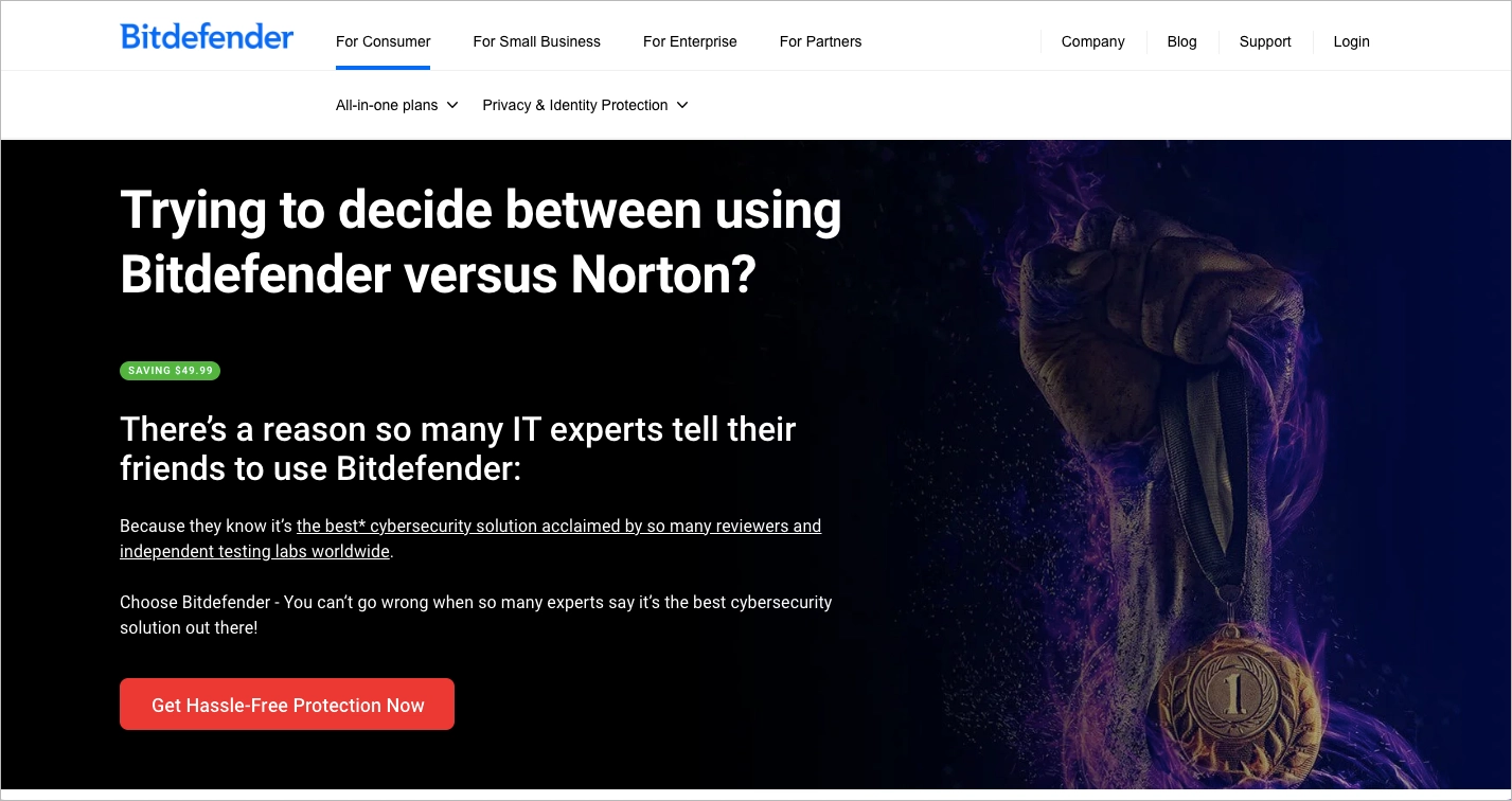
Overall, the comparison is structured to show Bitdefender in the best light without coming across as aggressive. It’s informative, visual, and easy to skim, making it well-suited for users in the consideration stage. The page reinforces trust with mentions of industry awards and customer satisfaction, supported by recognizable logos and visual badges. This adds credibility while keeping things straightforward.
Key takeaways to learn from this example:
- Hero copy that builds trust quickly,
- Emotional and action-oriented CTA,
- Clear mention of savings,
- The explanation section on switching from Norton.
Improvement areas:
- The hero section, while strong, contains a bit too much text, which could overwhelm users scanning quickly.
- The full-site menu remains visible, which distracts from the page’s primary conversion goal. Removing it or replacing it with a stripped-down version would reduce exit points.
11. Surfshark vs. Cyberghost
The Surfshark vs CyberGhost landing page presents a strong example of how to handle a competitor comparison in a clean and user-friendly way. Right from the start, the hero section is clear and visually strong. It communicates the key proposition with a short headline, complemented by a visible CTA button that repeats across the page to keep users focused on taking action. The comparison table sits below the hero and is supported by a clear headline. This layout helps readers quickly understand how Surfshark claims to outperform its competitor. The white space gives the page a light, uncluttered look, making the information easy to digest. Additionally, the use of user reviews near the bottom adds trust and reinforces the claims made throughout.
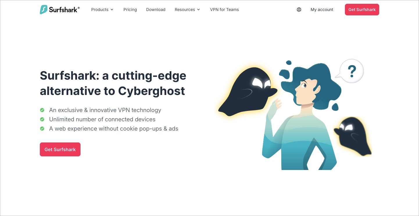
The page keeps visual consistency with brand colors and icons, and the repeated call-to-action buttons guide users at every scroll stage. However, the opening section could do a better job explaining what the actual value is. While the page says Surfshark is a “cutting-edge alternative”, it doesn’t clearly outline what users gain by switching. This could be improved by rewriting the first few lines to show specific benefits like speed, security, or price savings. That would help potential customers connect faster and feel more confident about clicking through.
Key takeaways to learn from this example:
- Clear hero section,
- Repeated CTA buttons,
- Well-structured comparison table with a strong heading,
- User reviews,
- Smart use of white space.
Improvement areas:
- The main copy in the first section could highlight more value upfront.
Easily compare your competitors with a high-converting landing page.
12. Zoho CRM vs. HubSpot Sales Hub
The Zoho CRM landing page titled “The best alternative to HubSpot Sales Hub” is a standout example of a competitor comparison page that blends clarity with persuasion. Right from the start, the hero section captures attention with a clean layout and elegant animation, presenting a strong opening statement that sets the tone for the entire comparison. The message is confident, yet respectful of HubSpot’s role in the market, which helps establish credibility.
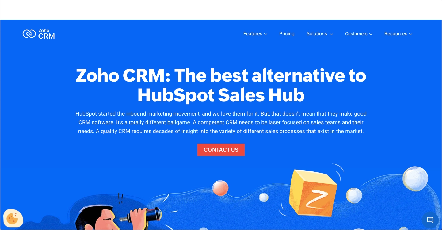
One of the strongest parts of the page is the follow-up section with the heading “Wait, isn’t HubSpot CRM free?” It cleverly flips a common assumption into an opportunity to highlight pricing and feature limitations. The bullet points that follow pack a punch: “HubSpot CRM is free. HubSpot Sales Hub is not. Zoho CRM is better, and less expensive. Our 250,000 customers say so.” It’s a short, high-impact message that sticks. The layout continues with badges, user awards, and testimonials that further support the product’s credibility. Answers to questions about switching – clearly aligned with user search intent – remove friction and give prospects exactly the reassurance they’re looking for.
Key takeaways to learn from this example:
- Visually appealing hero section with smooth animation,
- Smart framing of value in the “Wait, isn’t HubSpot CRM free?” section,
- Effective use of social proof through awards, badges, and user reviews,
- Helpful pricing table,
- Thoughtful answers to switching doubts that preemptively address friction points.
Improvement areas:
- The sticky bar that follows the user is blank in the first viewport. This can feel unfinished or confusing at first glance. Hiding it until the user scrolls would likely improve the visual experience.
13. Scalenut vs. Surfer SEO
The landing page titled “Unveiling the Differences between Surfer SEO and Scalenut” is a solid example of how to build an effective competitor comparison page. It starts strong by featuring a real user review right at the top. This isn’t just a testimonial – it directly mentions Surfer SEO and clearly positions Scalenut as the preferred alternative. That kind of immediate social proof grabs attention and builds trust fast.
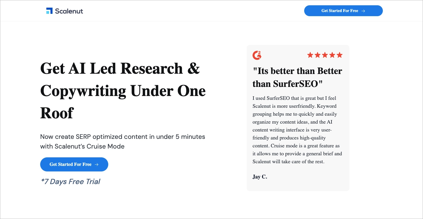
The page follows up with consistent and noticeable calls-to-action like “Get Started For Free” placed throughout the layout. It makes sure users always know what step to take next. The comparison table between the tools is another highlight – clear, scannable, and focused on benefits. G2 badges and rating icons are prominently placed, offering visual proof that reinforces the platform’s credibility. On top of that, there are engaging animations and step-by-step visuals that help keep the reader involved without overwhelming them.
Key takeaways to learn from this example:
- Strong user opinion comparing it directly to Surfer SEO,
- Clear and repeated call-to-action buttons,
- Visual social proof: G2 badges, rating stats, and brand logos,
- Appealing animations and content flow that support product features.
Improvement areas:
- The font consistency needs attention. In some sections, it looks like fonts haven’t loaded properly, which disrupts the first impression and can make the page feel slightly unfinished.
Stand out from the competition with an effective comparison page built on Landingi.
14. Local Dominator vs. Search Atlas
The page “Local Dominator vs Search Atlas – Best Google Maps Rank Tracker Alternative” is a strong example of how to run a competitor landing page. It opens with a headline that directly addresses the user’s intent: finding an alternative to Search Atlas. The landing page copy in the headings is clear and benefit-focused, helping readers understand what they gain by switching. The standout offer of “Get 95% OFF” in the main call-to-action (CTA) immediately draws attention and adds urgency to take action. The layout is simple, with a logical flow from comparison, to features, to testimonials, making it easy to scan and absorb.
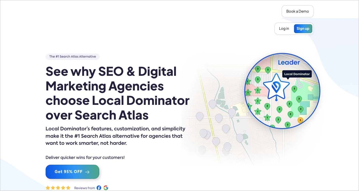
The page also does a good job integrating a discount code in a prominent format that users can copy easily. This small detail improves usability and can directly impact conversion. The color choices, spacing, and visual cues all support a friendly and professional appearance that builds trust with potential buyers. The comparison tables and feature lists also reinforce the value proposition of Local Dominator over its competitor without overloading the page.
Key takeaways to learn from this example:
- Headline and subheadings,
- 95% off promo in the CTA,
- Clean, user-friendly layout,
- Natural flow,
- Discount code.
Improvement areas:
- Too many CTAs can be distracting. “Book a Demo,” “Sign up,” and “Log in” dilute the main goal of getting users to convert via the discount offer
15. Taia AI Translator vs. DeepL
The comparison landing page titled “Taia AI Translator Vs. DeepL” is a strong example of how to structure a competitor-focused page with clarity and purpose. It opens with a clean value proposition, letting users know right away why they should consider Taia as an alternative. The first section smartly outlines key advantages of Taia in bullet points, making the comparison instantly understandable without requiring visitors to scroll. This quick-hitting format builds confidence fast.
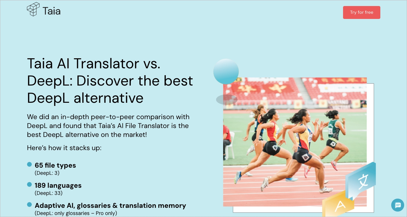
One standout feature is the persistent call-to-action (CTA) in the sticky bar that follows the user during scrolling. This improves accessibility to conversion points no matter where someone is on the page. The page also includes a helpful FAQ section toward the end, which addresses common concerns and helps users make a decision with more certainty. These answers are practical and framed in a direct way.
Key takeaways to learn from this example:
- Strong and consistent CTA placement,
- Clear comparison points between Taia and DeepL introduced right at the start,
- Benefit-focused headlines,
- Helpful FAQ section.
Improvement areas:
- The hero image in the first section features athletes racing on a track, which feels off-topic for a translation tool. A more relevant visual (e.g., a side-by-side dashboard or text translation UI) could help reinforce the message.
- While the structure is strong, some sections later in the page could be broken up with more visual variety or subheaders to improve readability for users skimming for information.
Discover how to build a high-converting competitor comparison page with Landingi.
16. Funnel vs. Adverity
The comparison landing page for Funnel vs Adverity is a strong example of how to clearly differentiate between two competing platforms. It starts off with a compelling hero section that includes a video, which is a smart move to keep visitors engaged right from the beginning. This section also features primary and secondary call-to-action buttons (“Book a demo” and “Sign up”) that stand out visually and encourage users to take the next step.
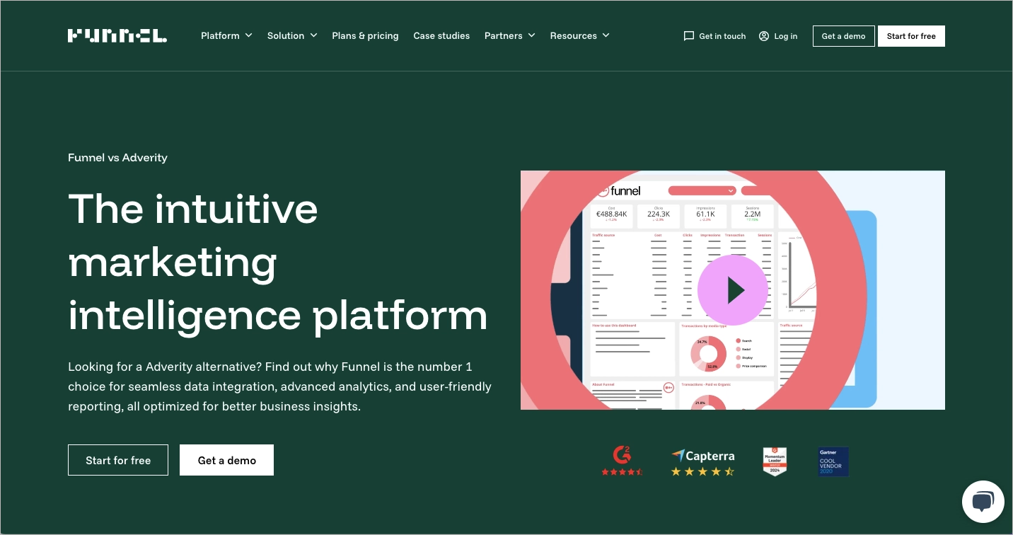
The page includes trustworthy user reviews and third-party ratings from platforms like Capterra and G2. These elements help build credibility early on. It also includes a handy widget showing available connectors, giving users a quick look into the integration capabilities. The copy throughout the page does a good job explaining the differences between the two tools, supported by user quotes and use-case insights. Altogether, the content is informative without overwhelming the visitor.
Key takeaways to learn from this example:
- Effective use of CTA buttons,
- Engaging video in hero section,
- Trusted ratings and reviews,
- Strong user testimonials,
- Useful integration widget,
- Well-written content.
Improvement areas:
- Comparison table placement – the feature comparison chart appears too far down the page. Moving it higher could help visitors access the most relevant content sooner.
17. Hostinger vs. Shopify
The competitor comparison landing page for “Hostinger vs Shopify” is a strong example of how to communicate product differences clearly and effectively. The page starts with a direct headline that tells visitors exactly what they’ll get – a side-by-side look at how these two platforms measure up. The layout is clean, and it doesn’t take long to find key information. What stands out right away is the clear call-to-action button that reads “See comparison.” This phrase lowers the barrier for interaction – it doesn’t ask the user to commit to anything big, just to take a look.
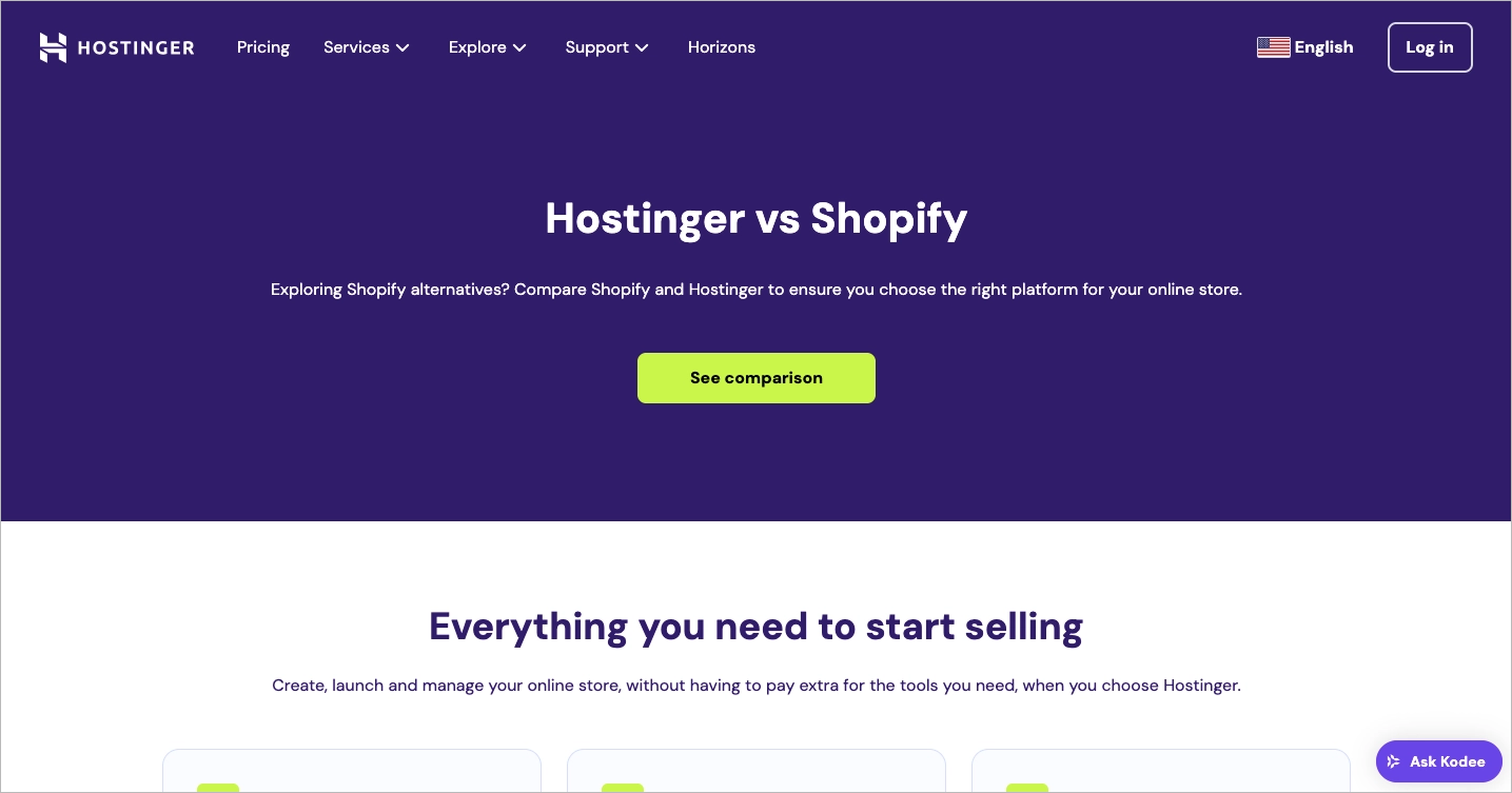
The highlight of the page is its comparison table. It’s structured in a way that makes it very easy to digest – rows cover specific features like pricing, ease of use, and customer support, while columns compare Hostinger and Shopify side by side. This format works especially well for visitors who are trying to make a quick, informed decision. Each section is backed up with short, easy-to-skim explanations, which helps users stay engaged without feeling overwhelmed.
Key takeaways to learn from this example:
- Clear headline and CTA,
- Well-organized table,
- Focused content,
- Testimonials.
Improvement areas:
- Visual simplicity – while easy to read, the page may feel a bit too plain for users who expect more dynamic or interactive content.
18. TextCortex vs. QuillBot
The landing page titled “Best QuillBot Alternative To Paraphrase Text for Free” by TextCortex presents a strong example of a competitor comparison page. Right from the headline, the value proposition is made clear – TextCortex wants to position itself as a better, more flexible alternative to QuillBot. The visual layout is clean, using a structured side-by-side comparison chart that highlights differences in pricing, features, and limitations. This format helps users quickly grasp the benefits of choosing TextCortex.
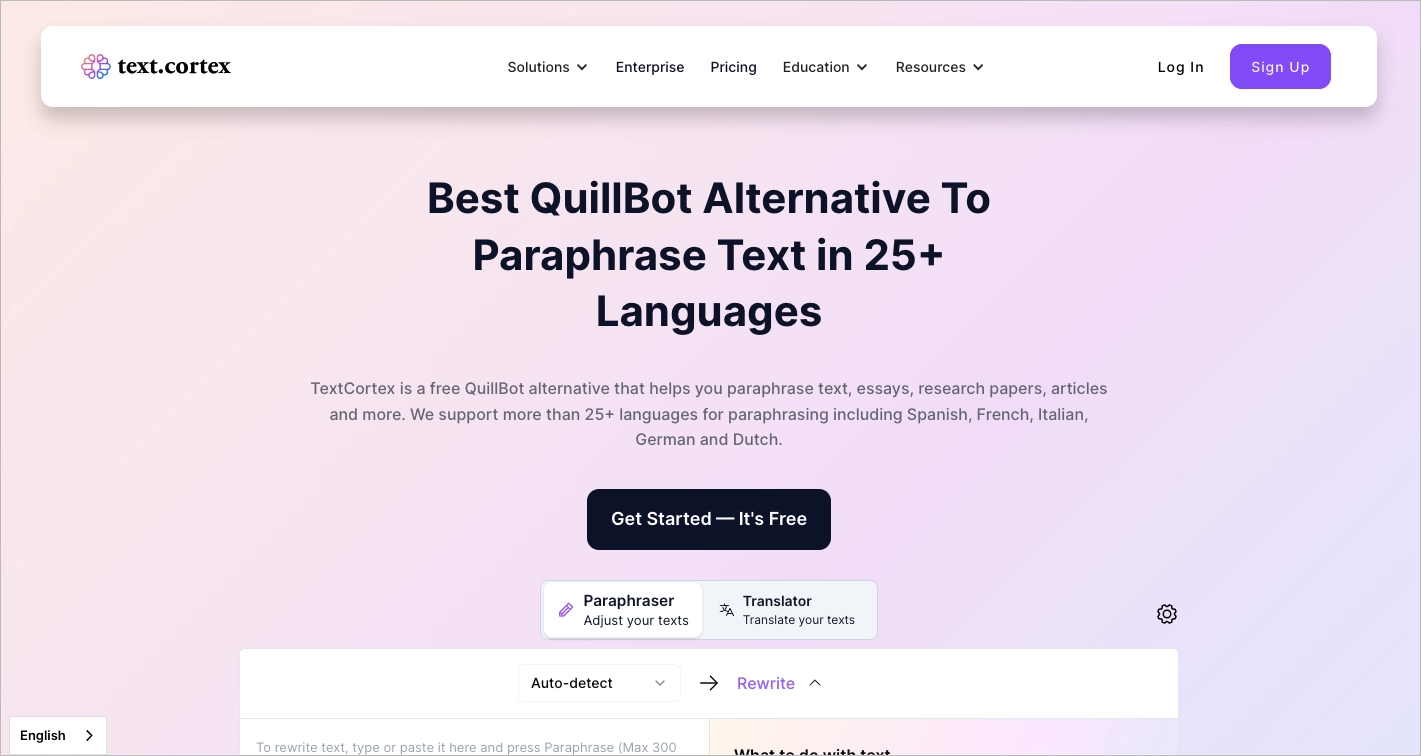
The interactive demo widget placed early on encourages hands-on experience, which is a smart way to increase engagement. Animated testimonials follow later, adding credibility by showcasing real user reviews. Logos from well-known companies using the product serve as social proof, making the offer feel more trustworthy. The page also includes a helpful FAQ section, which is good for addressing last-minute doubts and increasing conversion chances.
Key takeaways to learn from this example:
- Clean layout,
- Interactive demo,
- Animated testimonials,
- Enterprise logos,
- FAQ section.
Improvement areas:
- The sticky menu distracts from the landing focus and uses CTAs that don’t match the main page.
Showcase your advantages with a competitor comparison page built in Landingi.
19. ChowNow vs. Restolabs
The “Best ChowNow Alternative” landing page from Restolabs serves as a strong example of a competitor comparison landing page that aims to highlight cost savings and functional advantages in a clear, visual, and persuasive way. The headline sets the tone immediately with a strong value proposition: “Get Everything ChowNow Offers at Less than Half the Price.” This message directly addresses a pain point (high costs) and frames Restolabs as the better-value option right from the start. Just below the form, a standout detail reinforces this with real financial impact: “You can increase your revenue by $36,000 *With a 25% commission, apps take a big cut – save annually by driving direct orders.” That kind of tangible benefit sticks.
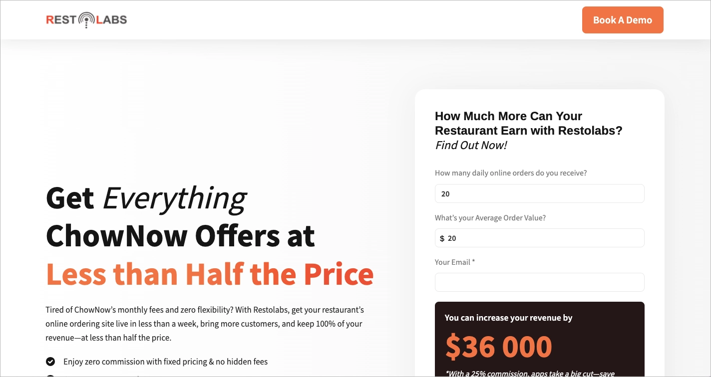
Supporting this messaging is a mix of trust signals and visual aids. The use of well-known restaurant logos builds credibility, showing that established businesses are already using the platform. There’s also a detailed comparison table that breaks down how Restolabs stacks up against ChowNow, making it easier for prospects to understand exactly what they’re gaining or saving by switching. These elements work together to present a confident, easy-to-understand case.
Key takeaways to learn from this example:
- Bold, benefit-driven headline with a clear value proposition,
- Savings calculator with a specific revenue example,
- Recognizable client logos that add social proof,
- Straightforward comparison table.
Improvement areas:
- The headline and supporting text could be moved slightly higher in the viewport to grab attention faster without the user needing to scroll.
20. Soda PDF vs. Adobe Acrobat
The competitor comparison landing page for Soda PDF is a clean, focused example of how to capture user attention without distraction. Right from the top, the headline clearly positions the product as an “Adobe Acrobat® Alternative”, helping visitors immediately understand the value proposition. The subheadline reinforces this with a quick list of features (“Over 50 easy-to-use PDF tools”), while the bullet points that follow support the claim with practical benefits, like e-signing, editing, and speed.
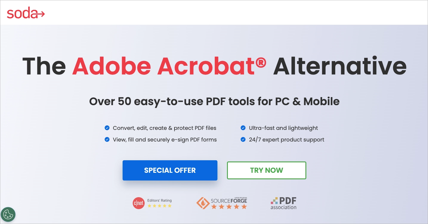
One of the biggest strengths of this landing page is its strong visual hierarchy. The key features are laid out above the fold, and the user is presented with two prominent call-to-action buttons: “Special Offer” and “Try Now.” These CTAs stand out thanks to their size, spacing, and clear messaging. Another smart move is the lack of any menu or extra navigation links – this keeps the user’s attention on the message and makes them more likely to act. Importantly, social proof is also present, with trusted media logos like CNET and PDF Association featured prominently, visible without scrolling.
Key takeaways to learn from this example:
- Clear, benefit-driven headline,
- Visible, well-placed CTA buttons,
- No navigation menu,
- Social proof above the fold,
- Intuitive layout.
Improvement areas:
- All CTAs lead to external pages – at least one button could scroll to more content below to keep the user engaged within the same flow.
Create a competitor comparison page that convinces customers to choose you.
4 Competitor Comparison Landing Page Template Examples
Choosing the right competitor comparison template can significantly impact how effectively you convey your product’s benefits. Let’s explore four versatile landing page template examples, each designed to showcase key aspects that can differentiate your offering. Each of these landing page designs is customizable and available for free across all Landingi plans, making them accessible to businesses at any stage.
1. Benefits list – Demo Request template
Highlighting benefits is essential when you want to stand out in a crowded market. Showcasing the unique features and advantages of your offer can significantly improve your conversion rates by making it clear to potential users why your solution is superior to others. It’s easy to achieve with the Demo Request landing page template, as this customizable design allows you to effectively communicate your key messages, showcase your products or services, and engage your audience in a way that drives action.
Adjust the template’s colors, insert your content, and craft a compelling headline to instantly demonstrate your advantage over competitors. This template is available for free in all Landingi plans, including the Free plan and a free trial.
2. Side-by-side comparison – Software Functionality template
Comparison landing pages cannot exist without… a comparison. Describe your product or service, then describe your competitor’s product or service and arrange the information side by side on a Software Functionality template to highlight the differences. This will help the reader make an informed decision based on a direct comparison of features, benefits, and pricing.

You can fully unleash the potential of this template by customizing its colors, images, and text. You have the freedom to tailor the sections by adding or removing content to perfectly match your vision.
3. Persuasive copy – Sign Up For Test template
The effectiveness of the Sign Up For Test template lies in the excellent placement of headings and descriptions. Strategic arrangement of sections not only enhances the user experience on pages created with this template but also increases the likelihood of successful sign-ups.

Modify the template’s call-to-action and copy to highlight the advantages of your solution compared to the competition. Then, incorporate the landing page into your marketing activities. This template is available to all Landingi users, including those on the Free plan and during the trial period, at no cost.
4. Social proof – Mobile App template
One effective way to persuade people to try the advertised offer is by showcasing feedback from current users. You can achieve this by creating a competitor comparison landing page with the Mobile App template. This way, you can ensure that the reviews are prominently displayed and will attract the attention of new visitors.

Incorporate collected reviews, your visuals, and messaging into this template to emphasize the benefits for potential customers. You can utilize this template for free across all Landingi plans, including the Free plan and free trial.
What Is The Best Landing Page Builder For Competitor Comparison Landing Pages?
The best landing page builder for competitor comparison pages is Landingi. With Landingi, you can create visually appealing and highly functional competitor comparison landing pages without any coding skills. The platform offers a wide range of templates, drag-and-drop editing, and customizable features that allow you to build professional-grade landing pages quickly and efficiently.
Landingi also provides robust analytics and A/B testing tools, making it easier to optimize your comparison pages for higher conversion rates. Additionally, with seamless integrations to various CRM and marketing tools, Landingi ensures that your landing pages are connected to the rest of your marketing stack, enhancing your overall campaign effectiveness.
Competitor comparison helps in decision-making, and Landingi’s wide range of templates caters specifically to this need, enabling the creation of effective and engaging competitor analysis sites without requiring any coding skills.
Side-by-side never looked so good! Start with Landingi and create stunning comparison pages today.
How Can I Optimize My Competitor Comparison Landing Page For Higher Conversion Rates?
To optimize a competitor comparison landing page for higher conversion rates, focus on simplifying the design, using persuasive copy, leveraging visuals, incorporating social proof, ensuring mobile optimization, and regularly testing different elements.
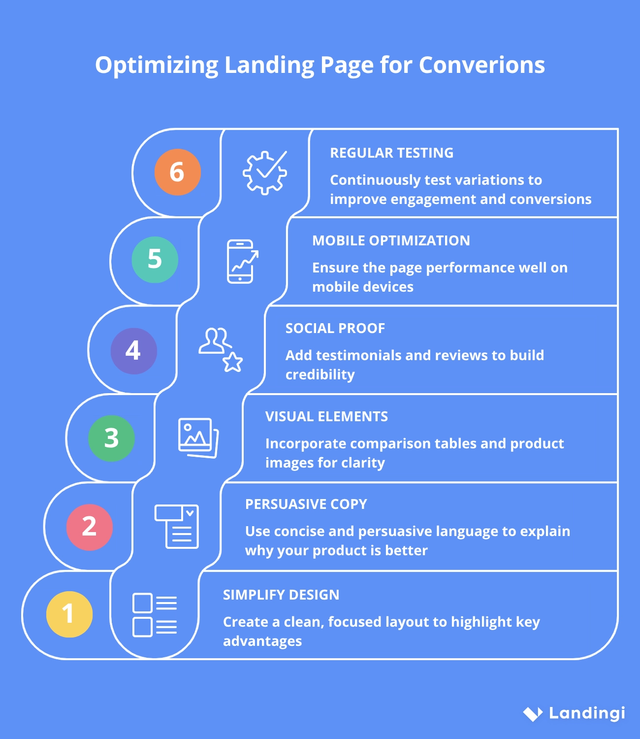
Start by simplifying the design so that visitors can find the information they need without distractions. A clean, focused layout helps highlight your key advantages without overwhelming the user.
Your copy should be concise and persuasive, clearly explaining why your product is the better choice. Address common questions or concerns your audience may have and speak directly to their priorities.
Visual elements like comparison tables, product images, and icons make complex information easier to understand at a glance and help guide the reader through the page. Adding social proof (such as customer testimonials, review snippets, or case study highlights) can increase credibility and reinforce your claims.
Make sure your page performs well on mobile devices, since many users will be comparing options on the go.
Finally, test different variations of headlines, calls to action, layouts, and visuals regularly to see what drives the most engagement and conversions. Small changes can lead to meaningful improvements when backed by data.
What Are The Key Elements of an Effective Competitor Comparison Landing Page?
The key elements of an effective competitor comparison landing page include a clear headline, comparison table, benefits, strong CTA, social proof, and visual appeal.
Your headline should quickly explain what the page is about and catch the reader’s attention. It needs to be specific, relevant to the comparison you’re making, and aligned with the user’s intent. A well-structured comparison table helps visitors see how your product stacks up against others at a glance. Keep it focused on the features and benefits that matter most to your audience.
In addition to the table, make sure to highlight what gives your product an edge. Instead of listing features, explain the value behind them. Use persuasive copy to reinforce why someone should choose you. A clear call-to-action should appear more than once on the page, offering a logical next step without overwhelming the reader. Add credibility with short customer testimonials, quotes, or reviews that support your claims.
What Are The Competitor Comparison Landing Page Best Practices?
Best practices for creating a competitor comparison landing page include honesty and transparency, focusing on what matters most to your audience, keeping the design simple, supporting claims with data, regularly updating the content, and incorporating SEO strategies.
Honesty and transparency are fundamental in building trust; it’s crucial to present accurate and fair comparisons rather than exaggerating claims, as misleading information can harm your credibility. Focusing on what matters most means highlighting the key features and benefits that resonate with your target audience, ensuring the content is relevant and engaging. Keeping the design simple helps visitors easily navigate the page, avoiding clutter that could detract from the main message.
Supporting your claims with data, such as statistics or third-party validations, adds a layer of credibility, making your comparisons more convincing. Regular updates are essential to ensure the information remains current, reflecting any changes in your offerings or those of your competitors. Finally, incorporating SEO strategies, like using relevant keywords and optimizing meta tags, helps increase your page’s visibility, driving more targeted traffic and improving overall performance.
What is The Average Competitor Comparison Landing Page Conversion Rate?
Competitor comparison landing pages typically convert between 3% and 10%, depending on the industry, audience, and how well the page is built. Pages that clearly communicate value, focus on what the customer cares about, and include a strong call to action tend to perform at the higher end of that range – and sometimes even exceed it. Clarity, relevance, and trust play a big role in whether visitors take action. If the comparison is easy to understand, feels honest, and answers the user’s key questions, you’re much more likely to see solid conversion rates.
Build Landing Pages For Your Competitor Comparisons With Landingi
Looking to create high-converting competitor comparison landing pages? Look no further than Landingi. Our platform gives you the tools to design, customize, and optimize landing pages that effectively present your product’s advantages over the competition. With features like page duplication, A/B testing, and Smart Sections, as well as comprehensive support, you can swiftly create pages that drive conversions and improve your marketing ROI.
What’s more, Landingi offers an innovative feature: Programmatic Landing Pages. When integrated into your competitor comparison strategy, this tool can transform the way you create, manage, and optimize landing pages. By automating the generation of personalized pages based on dynamic data, it enables you to efficiently scale your efforts, ensuring each comparison accurately highlights your product’s strengths against specific competitors. This not only saves time but also enhances the relevance and effectiveness of your pages, leading to higher engagement and conversions.
Get started with Landingi today, activate Programmatic Landing Pages, and witness the impact on your competitor comparison landing pages!


