

Competitor comparison landing pages are among the highest-converting formats in SaaS and B2B marketing. They target users with strong purchase intent who are actively searching for terms like “X vs Y”, “alternative to X”, or “best replacement for X” – often just moments before making a decision.
Unlike broader product or feature pages, comparison pages answer a specific question prospects already have: how does one solution compare to another? That’s why they perform exceptionally well at the bottom of the funnel, helping brands capture high-intent traffic from both SEO and PPC campaigns while shortening the evaluation process.
The best examples don’t rely on aggressive sales tactics. They combine transparent comparisons, clear positioning, and relevant proof points to help visitors make informed decisions. Whether comparing two competing products or presenting an alternative to an established market leader, the goal is the same: demonstrate why your solution is the better fit for a particular audience or use case.
As comparison strategies continue to scale in 2026, many teams are moving beyond one-off pages and creating dynamic competitor comparison pages for entire market segments. With Landingi, marketers can generate competitor comparison pages, alternative pages, and programmatic comparison landing pages at scale using Lunar, then optimize them with behavioral insights from EventTracker and Solis.
In this guide, you’ll discover some of the best comparison landing page examples, learn what makes them effective, and see how to turn competitor research traffic into customers.

Lunar is almost here!

20 Best Examples of Competitor Comparison Landing Page
When prospects start comparing options, they’re often close to making a decision. That’s what makes competitor comparison pages so powerful. Rather than introducing a product from scratch, they help buyers evaluate alternatives and understand why one solution may be a better fit than another.
The examples below showcase different approaches to comparison marketing – from feature-focused versus pages to alternative pages designed to capture competitor traffic. Together, they reveal the strategies that turn product research into conversions.
1. Asana vs. Wrike
Asana’s comparison page is a strong example of a SaaS comparison landing page built around a high-intent query. Instead of presenting Asana in isolation, the page directly addresses prospects evaluating Wrike and helps them understand the differences between the two platforms.

The structure is simple and effective. Feature comparisons, customer stories, and product benefits are organized in a way that makes evaluation easier without overwhelming the visitor. Rather than relying on aggressive messaging, Asana focuses on demonstrating value through clear explanations and proof points.
What works:
- Easy-to-scan comparison table
- Strong product positioning
- Customer testimonials and case studies
- Clear CTAs throughout the page
- FAQ section that addresses common objections
What could improve:
- Interactive comparisons tailored to different team sizes or use cases could make the page even more relevant for specific audiences.
2. Keap vs. ActiveCampaign
Keap takes a slightly different approach from many comparison pages by focusing less on individual features and more on overall product philosophy. The page positions Keap as an all-in-one CRM and automation platform for small businesses, contrasting it with ActiveCampaign’s more modular approach.

What makes this page effective is its emphasis on simplicity. Instead of overwhelming visitors with dozens of feature comparisons, it focuses on the practical benefits of having CRM, sales, marketing automation, and customer management in a single platform. For prospects looking to reduce tool sprawl, that positioning can be more persuasive than a lengthy feature checklist.
What works:
- Clear differentiation strategy
- Benefit-focused messaging
- Product visuals that support the narrative
- Strong CTAs throughout the page
- Messaging tailored to small business owners
What could improve:
- The comparison remains relatively high-level. More detailed use-case comparisons or interactive feature breakdowns could help prospects validate their decision faster.
3. Duda vs. Wix
Duda’s comparison page follows a classic head-to-head format. Rather than broadly promoting the platform, it targets prospects actively evaluating Wix and provides a structured framework for comparison.

The page relies heavily on side-by-side feature analysis, helping visitors assess differences in areas such as performance, customization, and usability. This approach works particularly well for users who are already familiar with both products and simply need help making a final decision.
What works:
- Clear value proposition
- Detailed comparison table
- Strong information hierarchy
- Focused messaging around key differentiators
- Easy-to-scan structure
What could improve:
- More customer stories, migration case studies, or third-party validation could strengthen credibility and help reduce switching concerns.
4. Typeform vs. Jotform
Typeform takes a slightly different route by positioning the page as an alternative to Jotform rather than a direct feature battle. The focus is less on technical comparisons and more on the user experience, design quality, and conversational approach that have become central to Typeform’s brand.

This strategy allows the page to appeal not only to users comparing feature sets, but also to those looking for a different way to create forms and surveys. The result feels more persuasive than confrontational, which often works well for alternative pages targeting competitor traffic.
What works:
- Strong alternative-page positioning
- Clear differentiation beyond features
- Effective use of customer proof
- Visual product comparisons
- Prominent CTAs
What could improve:
- More scenario-based comparisons could help visitors understand which platform is better suited for specific workflows or team requirements.
5. Sketch vs. Adobe XD
Sketch’s comparison page is a great example of competitor-focused positioning built around product differentiation. Rather than comparing every feature, it concentrates on the areas where Sketch believes it has a meaningful advantage, including workflow flexibility, offline functionality, and design system management.

The page works because it stays focused. Instead of overwhelming visitors with information, it reinforces a handful of core differentiators and supports them with product visuals and concise explanations.
What works:
- Clear product positioning
- Strong visual presentation
- Focused messaging around key differentiators
- Simple user journey with visible CTAs
- Easy-to-consume content structure
What could improve:
- More customer migration stories could strengthen the case for teams considering a switch from Adobe XD.
6. Lemon Squeezy vs Gumroad
Lemon Squeezy’s page is a textbook example of an alternative page built around a competitor’s weakness. Instead of starting with features, it starts with a pain point many Gumroad users already recognize – pricing and fees.

This approach works particularly well because it aligns with existing user frustration. The page acknowledges a problem, presents a clear alternative, and backs up its claims with numbers, proof points, and a straightforward value proposition. Rather than asking visitors to evaluate dozens of features, it focuses on the business outcome that matters most.
What works:
- Strong alternative-page positioning
- Clear value proposition
- Effective use of pricing comparisons
- Customer proof and credibility signals
- Conversion-focused CTAs
What could improve:
- A more comprehensive side-by-side comparison could help prospects evaluate additional factors beyond pricing when considering a migration.
7. Buy Me a Coffee vs. Patreon
Buy Me a Coffee uses a familiar but effective strategy: position itself against the category leader and simplify the switching decision. Rather than competing on every possible feature, the page focuses on the benefits creators care about most, including fees, payouts, and ease of use.

What makes this page work is its clarity. Visitors immediately understand who the page is for, what problem it solves, and why Buy Me a Coffee believes it’s a better alternative. The comparison feels practical rather than promotional, helping creators evaluate their options without excessive friction.
What works:
- Clear alternative-page positioning
- Simple and transparent comparison structure
- Strong value proposition
- FAQ section that addresses common concerns
- Trust-building testimonials
What could improve:
- More creator case studies or migration stories could help prospects better understand the long-term benefits of switching from Patreon.
8. Slite vs. Confluence
Slite’s comparison page demonstrates how a challenger brand can compete with an established market leader. Rather than trying to match Confluence feature for feature, Slite positions itself around simplicity, speed, and a more modern user experience.

The page combines product explanations, visuals, and direct comparisons to create a compelling argument for teams frustrated with complexity. This approach works particularly well because it focuses on the outcomes users want rather than simply listing capabilities.
What works:
- Strong alternative-page positioning
- Clear differentiation strategy
- Effective use of product visuals
- Benefit-driven messaging
- Focus on user outcomes rather than features alone
What could improve:
- More interactive comparisons or customer migration examples could strengthen the page for visitors evaluating multiple knowledge-management platforms.
9. FreshBooks vs. Harvest
FreshBooks takes a practical approach to comparison marketing by helping visitors evaluate two solutions side by side. Rather than focusing exclusively on its own strengths, the page walks users through key differences in functionality, pricing, and business use cases, making it easier to determine which platform best fits their needs.

This approach works particularly well for visitors who are still evaluating options and haven’t committed to a preferred solution. The page functions as both a comparison asset and an educational resource, helping prospects move closer to a purchasing decision.
What works:
- Well-structured comparison framework
- Clear feature and pricing comparisons
- Strong CTAs throughout the page
- FAQ section that supports decision-making
- Educational content for evaluation-stage buyers
What could improve:
- The above-the-fold section contains several competing elements. A more focused hierarchy could help visitors identify the primary message and next step more quickly.
10. Bitdefender vs. Norton
Bitdefender’s page goes beyond a traditional versus comparison and moves into migration-focused territory. Instead of simply explaining why Bitdefender is different, it actively addresses the concerns users may have about switching from Norton.
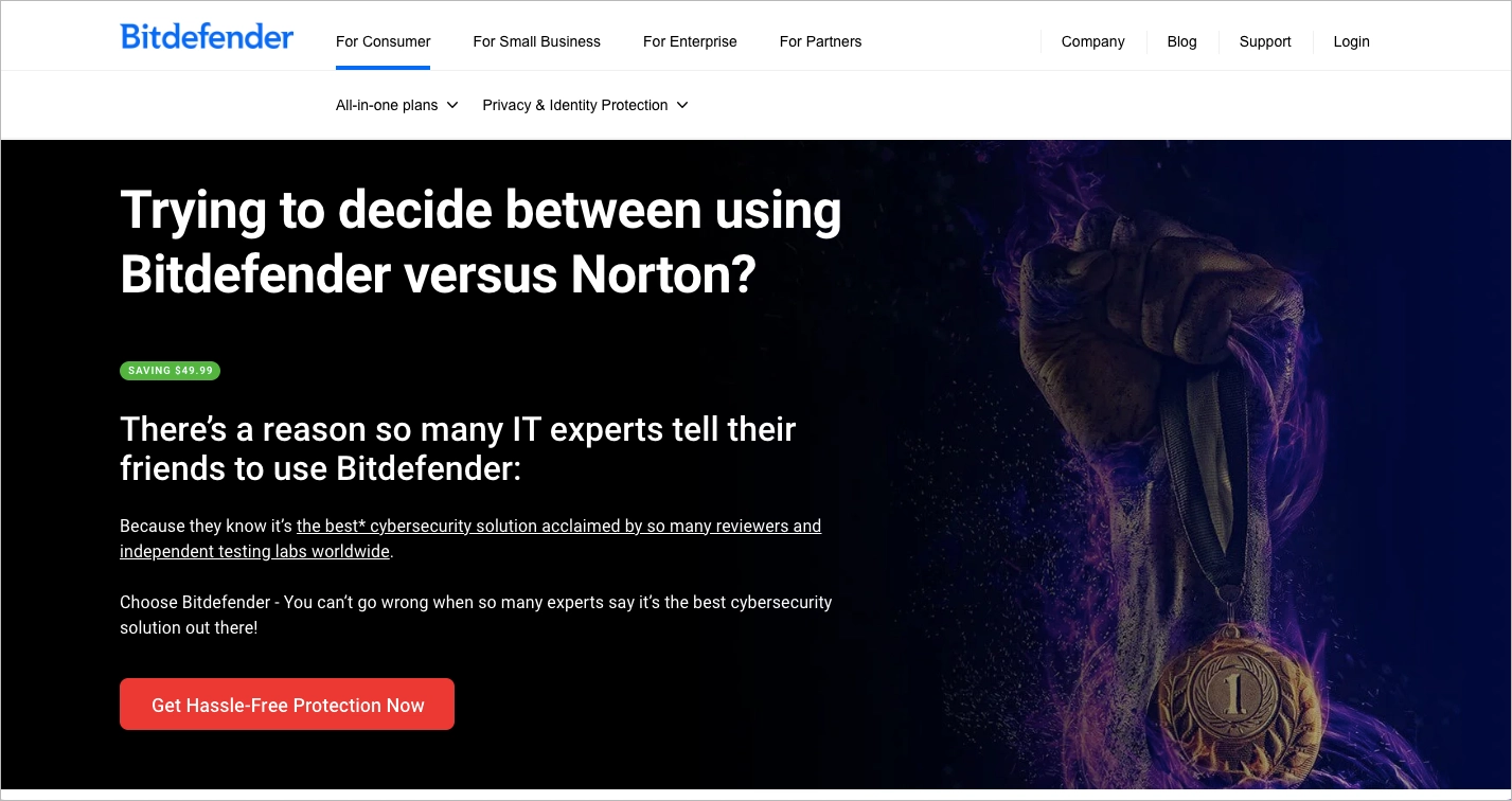
This is a smart strategy because it reduces friction at a critical stage of the buying journey. The page combines product comparisons, trust signals, pricing incentives, and migration guidance to make the transition feel easier and lower risk. For prospects already considering a change, that reassurance can be more persuasive than feature comparisons alone.
What works:
- Strong trust-building hero messaging
- Benefit-focused CTAs
- Clear pricing and savings communication
- Dedicated migration guidance
- Industry awards and credibility signals
What could improve:
- A shorter hero section and simplified navigation could create a more focused path to conversion, particularly for visitors arriving from paid campaigns.
Launch your first competitor comparison page and start capturing high-intent traffic today.
11. Surfshark vs. Cyberghost
Surfshark’s comparison page is a strong example of a competitor-focused landing page built around simplicity. The layout avoids unnecessary complexity, allowing visitors to quickly understand how Surfshark positions itself against CyberGhost.
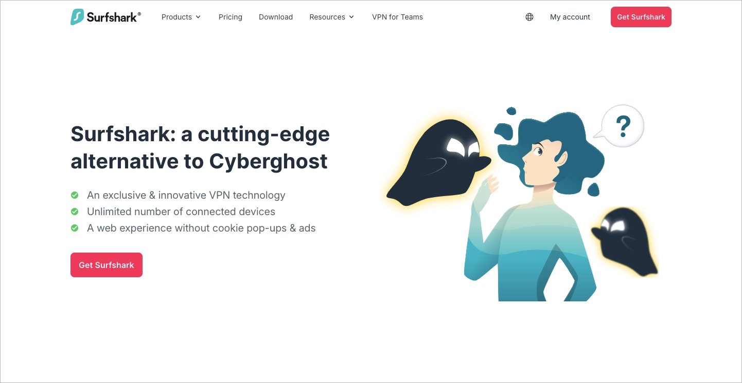
A well-structured comparison table, consistent CTAs, and customer reviews work together to support the decision-making process without overwhelming the reader. The generous use of white space also helps maintain clarity, making the page easy to scan even when presenting detailed information.
What works:
- Clear hero section
- Well-structured comparison table
- Consistent CTA placement
- Customer reviews that reinforce credibility
- Clean, easy-to-scan layout
What could improve:
- The opening section could communicate Surfshark’s key differentiators more explicitly by highlighting benefits such as pricing, speed, or security earlier in the user journey.
12. Zoho CRM vs. HubSpot Sales Hub
Zoho’s comparison page demonstrates one of the most effective strategies in competitor marketing: addressing the competitor’s strongest selling point directly. Instead of avoiding HubSpot’s reputation or free CRM offering, Zoho confronts it head-on and uses it as an opportunity to reframe the conversation around pricing, scalability, and overall value.
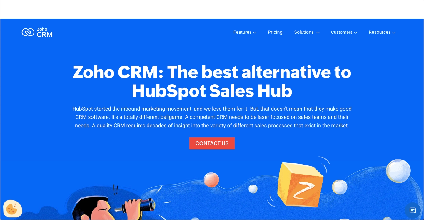
This approach feels confident without becoming confrontational. The page combines product comparisons, customer proof, awards, and migration-focused messaging to address the questions prospects are already asking. As a result, it aligns exceptionally well with bottom-of-funnel search intent.
What works:
- Strong strategic positioning
- Effective handling of common objections
- Pricing-focused differentiation
- Awards, badges, and customer proof
- Messaging that reduces switching friction
What could improve:
- The sticky navigation element could be introduced later in the browsing experience to create a cleaner first impression and reduce visual noise above the fold.
13. Scalenut vs. Surfer SEO
Scalenut’s comparison page demonstrates how social proof can become the centerpiece of a competitor strategy. Instead of leading with feature comparisons, the page immediately introduces a customer perspective that directly references Surfer SEO, creating credibility before the comparison even begins.
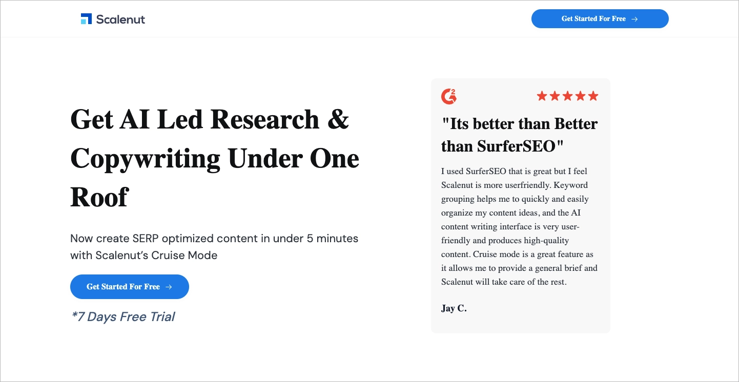
The page maintains momentum through repeated CTAs, visual proof points, and a comparison framework that remains easy to follow. Ratings, review badges, and product visuals reinforce the positioning without making the experience feel overly promotional.
What works:
- Strong customer-led positioning
- Prominent social proof throughout the page
- Clear comparison structure
- Consistent CTA placement
- Visual elements that support engagement
What could improve:
- Greater visual consistency would strengthen the overall experience. Small design details, such as inconsistent typography, can affect perceived product quality and trust.
14. Local Dominator vs. Search Atlas
Local Dominator combines competitor comparison with a highly conversion-focused promotional offer. The page immediately addresses a common search intent – finding an alternative to Search Atlas – while reinforcing its positioning through pricing incentives, product comparisons, and customer-focused messaging.
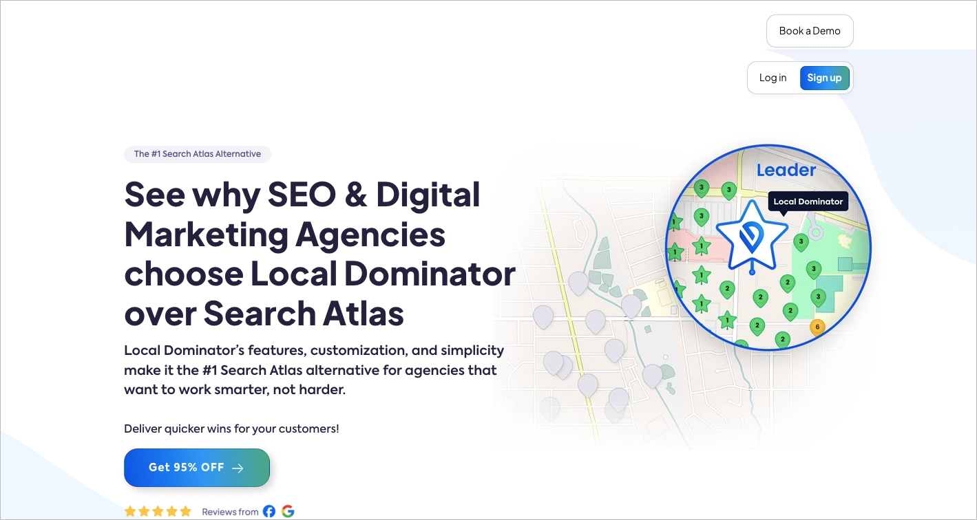
What makes this page effective is its balance between education and conversion. Visitors can evaluate the product through feature comparisons while also receiving a compelling incentive to act immediately. This combination works particularly well for high-intent traffic already considering alternatives.
What works:
- Intent-driven headline
- Strong promotional offer
- Clear comparison sections
- Logical page flow
- User-friendly presentation of discounts and offers
What could improve:
- The page introduces multiple conversion paths. Reducing competing CTAs could create a clearer user journey and strengthen the primary conversion goal.
15. Taia AI Translator vs. DeepL
Taia’s comparison page is a strong example of how to position an emerging AI product against a category leader. Rather than trying to compete on every feature, the page quickly communicates where Taia believes it offers a stronger value proposition and presents those differentiators upfront.
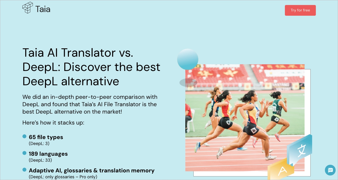
The structure supports fast decision-making. Key benefits appear early, CTAs remain accessible throughout the experience, and the FAQ section helps address common objections before they become conversion barriers. This creates a smooth journey for visitors already evaluating alternatives.
What works:
- Clear value proposition above the fold
- Strong and consistent CTA visibility
- Benefit-focused messaging
- Well-structured FAQ section
- Easy-to-scan comparison format
What could improve:
- More product-centric visuals could strengthen the page. Screenshots, workflows, or interface examples would reinforce the comparison more effectively than generic imagery.
16. Funnel vs. Adverity
Funnel’s comparison page is a good example of a competitor page aimed at a more sophisticated buyer. Rather than focusing primarily on pricing or individual features, it combines product education, social proof, integrations, and use-case content to support a longer evaluation process.
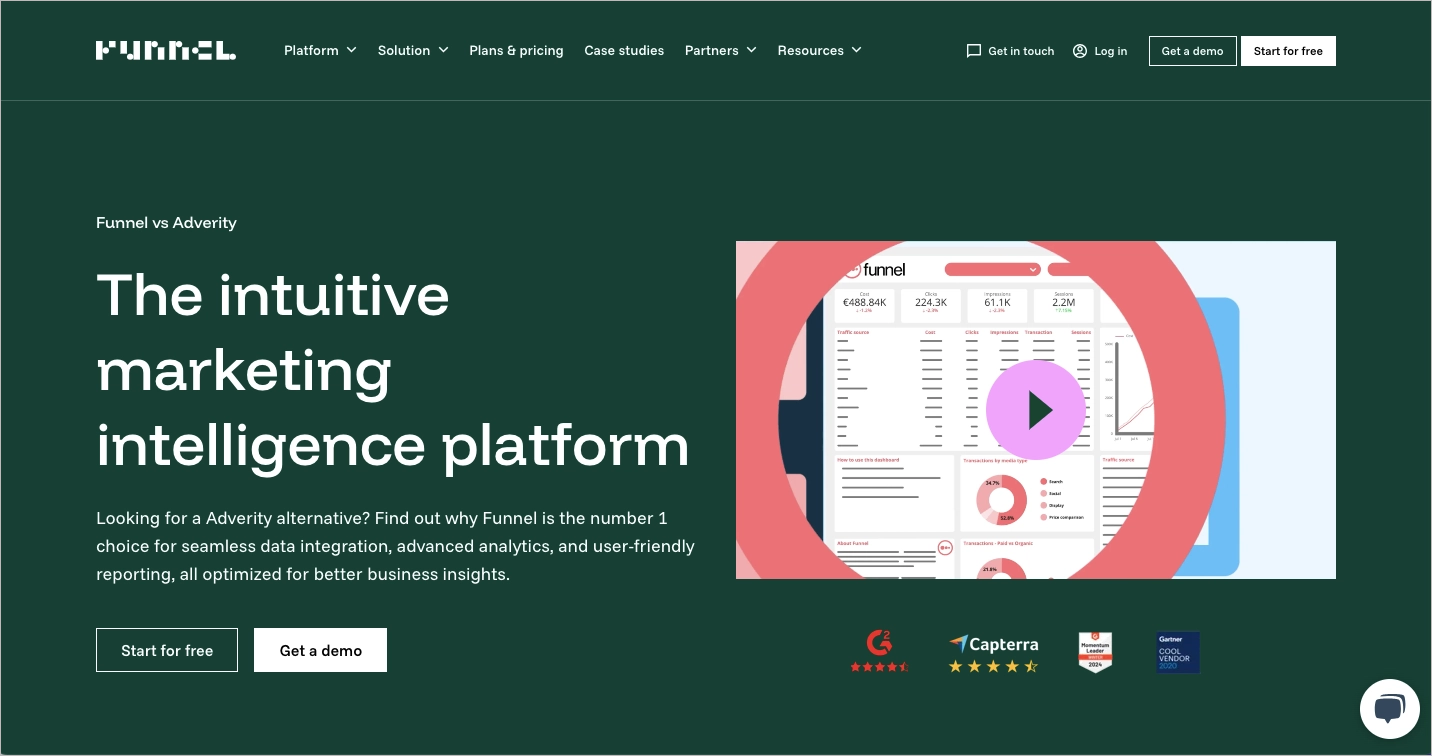
The page does a particularly good job building trust through customer reviews, third-party ratings, and real product demonstrations. Combined with the integration directory and explanatory content, this creates a strong resource for buyers comparing enterprise data and reporting platforms.
What works:
- Engaging video content
- Strong trust signals
- Third-party ratings and reviews
- Useful integration-focused content
- Educational, decision-supporting copy
What could improve:
- Surfacing the comparison framework earlier could help visitors validate key differences before diving into more detailed product information.
17. Hostinger vs. Shopify
Hostinger’s comparison page succeeds because it prioritizes clarity. The page immediately communicates its purpose, presents a straightforward comparison framework, and allows visitors to evaluate both platforms without unnecessary distractions.
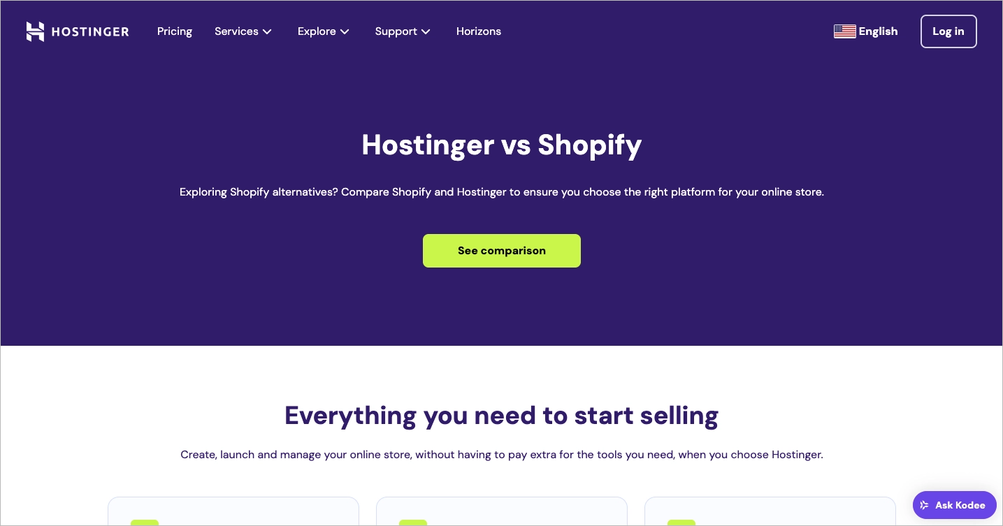
The comparison table is the centerpiece of the experience. Instead of overwhelming users with excessive detail, it focuses on the criteria most likely to influence a purchasing decision, including pricing, usability, and support. This makes the page particularly effective for visitors who want to reach a conclusion quickly.
What works:
- Clear headline and low-friction CTA
- Easy-to-scan comparison table
- Well-organized content structure
- Customer testimonials
- Strong focus on decision-making criteria
What could improve:
- Interactive elements, calculators, or personalized recommendations could make the comparison feel more engaging and tailored to different ecommerce needs.
18. TextCortex vs. QuillBot
TextCortex demonstrates how comparison pages can become product experiences rather than static comparisons. Instead of relying solely on tables and feature lists, the page encourages visitors to interact with the product through an embedded demo, helping prospects evaluate the platform firsthand.
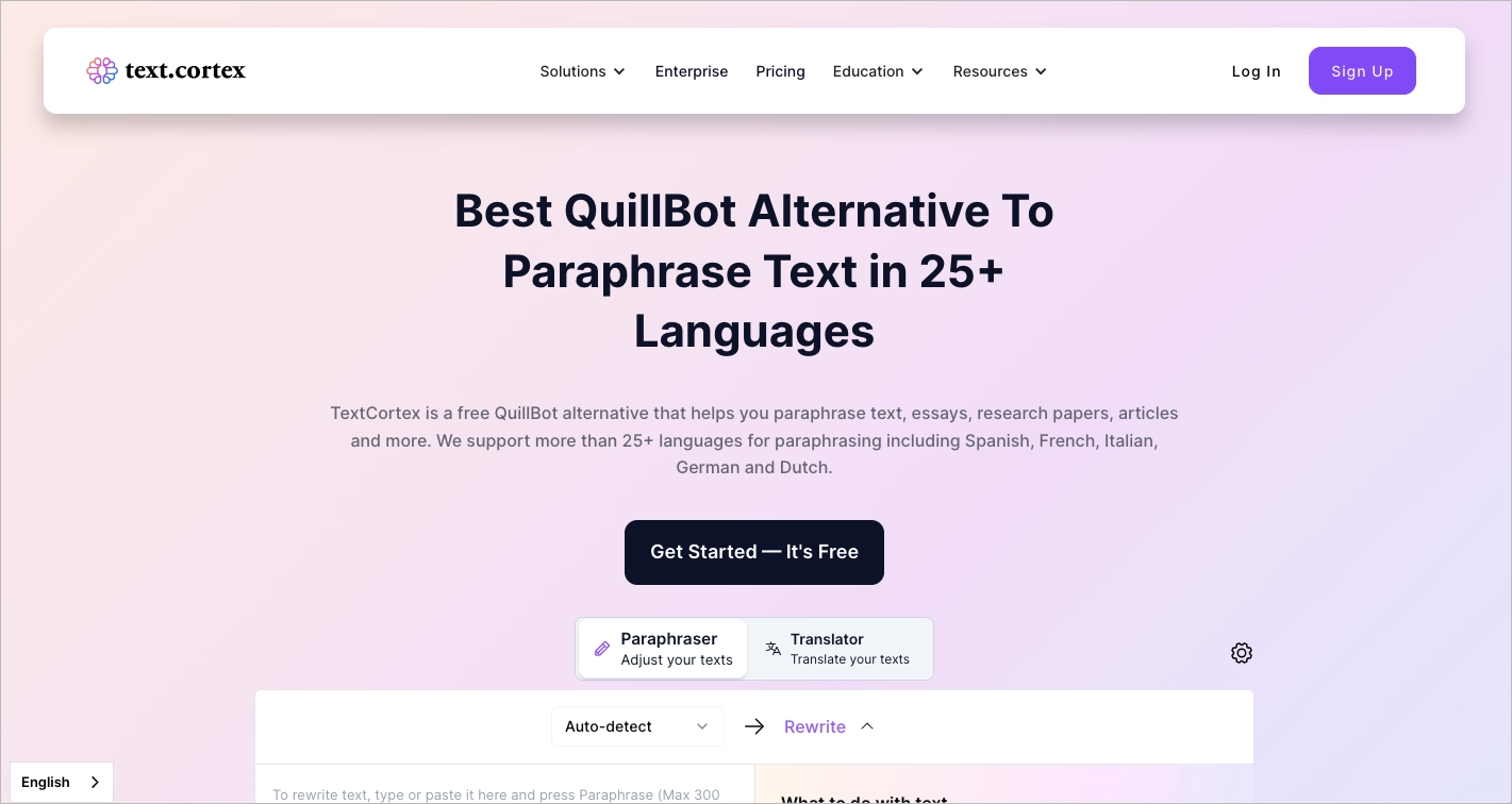
This approach is particularly effective in AI software categories, where experiencing the product often communicates value better than reading about it. Combined with customer reviews, company logos, and direct comparisons, the page creates a compelling argument for users considering alternatives to QuillBot.
What works:
- Interactive product demo
- Clear alternative-page positioning
- Strong social proof
- Customer testimonials
- FAQ section that addresses common objections
What could improve:
- Simplifying the sticky navigation and aligning all CTAs with the page’s primary conversion goal would create a more focused user journey.
19. ChowNow vs. Restolabs
Restolabs builds its comparison page around a simple but powerful argument: similar functionality at a significantly lower cost. Instead of leading with product features, the page focuses on financial outcomes, helping restaurant owners quickly understand the business impact of switching.
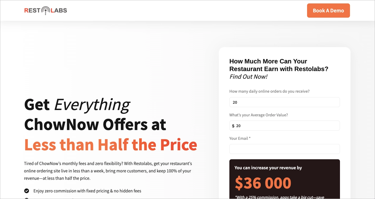
The messaging is particularly effective because it translates platform differences into revenue implications. Combined with recognizable customer logos and a clear comparison framework, the page creates a compelling case for change without requiring visitors to dig through technical details.
What works:
- Strong value-driven positioning
- Revenue-focused messaging
- Recognizable customer logos
- Clear comparison table
- Easy-to-understand business benefits
What could improve:
- Surfacing the primary value proposition higher in the viewport would make the page’s core argument immediately visible to new visitors.
20. Soda PDF vs. Adobe Acrobat
Soda PDF demonstrates how to position a product against one of the most recognizable brands in a category. The page immediately establishes context by presenting itself as an Adobe Acrobat alternative and then reinforces that positioning through concise benefit-driven messaging.
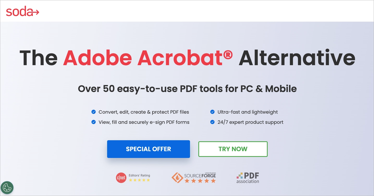
One of the page’s biggest strengths is its focus. By removing unnecessary navigation and keeping attention on the offer, it creates a streamlined path toward conversion. Strong CTAs, visible proof points, and a clear feature overview make it easy for visitors to evaluate the product without distractions.
What works:
- Clear alternative-page positioning
- Strong visual hierarchy
- Focused conversion path
- Well-placed CTAs
- Trust signals visible above the fold
What could improve:
- Introducing an internal scroll-based CTA or interactive comparison section could encourage deeper engagement before directing visitors to external destinations.
How to Create a Competitor Comparison Landing Page?
To create a competitor comparison landing page, start with AI-assisted generation rather than a blank page. Using Lunar, Landingi’s AI-native landing page generator, you can create a complete comparison page, alternative page, or versus page from a single prompt, then refine the messaging and optimize performance based on real visitor behavior.
The process starts with defining three things: the competitor you’re targeting, the audience you’re speaking to, and the differentiators that make your solution a better fit. Once you have those inputs, use Lunar to generate the first version of your page.
Try a prompt like:
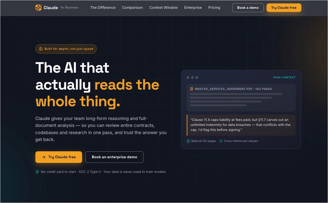
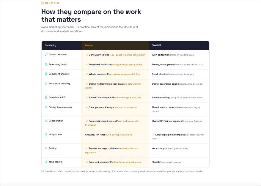
Create a competitor comparison landing page comparing Claude against ChatGPT for business users and knowledge workers. Highlight differences in reasoning, context window, collaboration features, integrations, pricing, and enterprise capabilities. Include a hero section, comparison table, use-case comparisons, customer proof, FAQ, and conversion-focused CTAs. Position Claude as the preferred solution for long-form analysis and document-based workflows.The strongest comparison pages rarely try to win every category. Instead, they focus on a few meaningful differentiators – pricing, ease of use, AI capabilities, integrations, customer support, performance, or migration simplicity – and build a clear narrative around them. The goal isn’t to prove that a competitor is worse. It’s to show why your solution is a better fit for a specific audience or use case.
After publishing, use EventTracker to analyze visitor behavior through scroll maps, click tracking, and event data. Then use Solis, Landingi’s AI landing page optimization tool, to identify opportunities for improving messaging, page structure, and conversion paths based on actual user interactions. Together, these tools make it possible to generate, launch, and continuously optimize competitor comparison pages without relying on lengthy design and development cycles.
Create competitor comparison pages, alternative pages, and versus pages from a single prompt with Lunar.
FAQ About Competitor Comparison Landing Pages
Below are answers to the most common questions about competitor comparison pages, including their purpose, key elements, conversion potential, and the industries that benefit most from this strategy.
What is a competitor comparison landing page?
A competitor comparison landing page is a page that helps prospects evaluate your product against a competing solution. By comparing features, pricing, benefits, or use cases side by side, it helps potential customers make informed decisions and understand why your product may be the better fit for their needs. These pages are especially effective for capturing high-intent traffic from users actively researching alternatives or comparing options before purchasing.
What is the best landing page builder for competitor comparison landing pages?
The best solution for creating competitor comparison landing pages is Landingi because it combines AI-powered page generation, publishing, optimization, and performance analysis in a single landing page operation system.
With Lunar, marketers can generate comparison pages, alternative pages, and versus pages from a prompt. EventTracker reveals how visitors interact with those pages through click tracking, event maps, and scroll maps, while Solis analyzes user behavior and recommends optimization opportunities. This makes it easier to create, launch, and improve competitor-focused campaigns without relying on lengthy design and development workflows.
Track clicks, scroll depth, and engagement patterns with EventTracker to understand how visitors evaluate your comparisons.
What are the key elements of an effective competitor comparison landing page?
The most effective competitor comparison landing pages combine clear positioning with credible proof. Key elements include a strong headline, an easy-to-scan comparison table, benefit-focused messaging, customer testimonials, review scores, and conversion-focused CTAs.
Rather than listing every feature, focus on the differences that matter most to your audience and explain why they create value. Visual elements such as product screenshots, ratings, or comparison charts can help visitors evaluate options more quickly and confidently.
How can I optimize my competitor comparison landing page for higher conversion rates?
To increase conversions, focus on clarity, differentiation, and proof. The most effective comparison pages make it easy for visitors to understand how your solution differs from competitors and why those differences matter.
Use a clear comparison framework, benefit-driven messaging, customer testimonials, review scores, case studies, and visual elements such as comparison tables or product screenshots. Keep the page focused on a single conversion goal and ensure the experience works seamlessly across devices.
Once the page is live, use EventTracker to understand how visitors interact with your comparison page. Scroll maps, event maps, and behavioral data can reveal where users engage, hesitate, or drop off. Then use Solis, Landingi’s AI landing page optimization tool, to analyze that behavior and identify opportunities to improve headlines, comparison sections, CTAs, and conversion paths. Continuous optimization based on real user data often delivers bigger gains than redesigning an entire page from scratch.
Turn visitor behavior into actionable recommendations with Solis and continuously improve conversion rates.
What are the best practices for competitor comparison landing pages?
The best comparison pages are transparent, customer-focused, and easy to navigate. Present comparisons fairly, support claims with data or third-party validation, and focus on the differentiators that matter most to potential buyers.
Keep the page updated as products evolve, align the content with search intent, and optimize for both SEO and conversions. Most importantly, don’t try to win every category – the strongest competitor pages focus on a few meaningful advantages and build a compelling case around them.
What is the average competitor comparison landing page conversion rate?
Competitor comparison landing pages typically convert between 3% and 10%, depending on the industry, traffic source, and purchase intent. Because they target users already evaluating alternatives, they often outperform broader product or feature pages.
The highest-converting pages clearly communicate differentiation, address common objections, and support their claims with proof points such as testimonials, ratings, case studies, or pricing comparisons. When visitors quickly understand why a solution is a better fit for their needs, conversion rates tend to increase significantly.
What industries benefit most from comparison pages?
Comparison pages work best in industries where buyers actively evaluate multiple options before making a decision. They’re particularly effective in SaaS, AI software, cybersecurity, CRM platforms, marketing technology, ecommerce tools, fintech, HR software, and other competitive B2B categories.
These industries often generate high-intent searches such as “X vs Y”, “alternative to X”, or “best replacement for X”, making comparison pages a powerful way to capture bottom-of-funnel traffic. Many companies also scale this strategy through programmatic comparison pages targeting multiple competitors, products, or customer segments.
Create, publish, and optimize competitor comparison pages from a single platform.
Build Competitor Comparison Landing Pages at Scale with Landingi
The best competitor comparison pages don’t exist in isolation. Top-performing SaaS and B2B brands build entire ecosystems of comparison content – from “X vs Y” pages and competitor alternatives to highly targeted pages designed for specific audiences, use cases, and search intents. Managing that manually doesn’t scale.
Landingi helps marketing teams turn competitor comparisons into a repeatable acquisition engine. With Lunar, you can generate comparison pages, alternative pages, and dynamic competitor-focused landing pages from a single prompt, dramatically reducing the time required to launch new campaigns and enter new market segments.
As your strategy expands, you can create and manage pages for multiple competitors, products, industries, or customer profiles without rebuilding every page from scratch. This makes it easier to capture high-intent traffic across dozens – or even hundreds – of comparison keywords while maintaining relevant messaging for each audience.
Launching the page is only the beginning. EventTracker shows how visitors interact with your comparison pages through scroll maps, event maps, and behavioral analytics. Solis then analyzes that data to uncover optimization opportunities, helping you refine messaging, CTAs, layouts, and conversion paths based on actual user behavior.
Whether you’re targeting a single competitor or building a scalable comparison-page strategy, Landingi provides the tools to generate, publish, optimize, and grow your campaigns from one place. Ready to turn competitor research traffic into customers? Try Landingi today.


