

A creative landing page is a high-converting page designed to grab attention, communicate a clear message, and drive action. It stands out with strong visuals, compelling copy, and a user-friendly layout that keeps visitors engaged.
Creativity makes a landing page more than functional—it makes it effective. A smart, well-crafted page builds trust, keeps visitors engaged, and nudges them toward conversion instead of letting them bounce. With so much competing for attention online, creativity is what turns visitors into buyers.
Curious how creativity boosts conversions? Take a look at these 17 high-converting landing page examples and see how brands use bold ideas, smart layouts, and irresistible messaging to turn clicks into customers.

What is a Creative Landing Page?
A creative landing page is a visually appealing, conversion-driven page designed to capture attention and drive action. It combines bold visuals, compelling copy, and strategic web design to guide visitors toward a specific goal, whether that’s making a purchase, signing up for a service, or downloading a resource.
A good landing page keeps things simple, making sure visitors stay focused on the goal. The call to action should be impossible to miss, and every design choice should guide, not distract. A page that feels easy to navigate keeps visitors engaged and moving in the right direction.
No matter the purpose—financial landing pages, product showcases, or lead generation forms—a creative approach helps your page stand out and drive results.
What is the Role of Creativity in Creating Landing Pages?
Creativity is what makes a landing page grab attention and drive results. A great design keeps visitors engaged and makes taking action effortless. From eye-catching visuals to a clear, compelling call to action, every element should guide users naturally toward conversion.
But it’s not just about aesthetics—it’s about creating a smooth and intuitive experience. The right mix of colors, fonts, and images makes a page memorable and engaging, while interactive elements encourage visitors to stay longer. A well-placed video can also make a difference—HubSpot reports that adding a relevant video can increase conversions by up to 86%.
That stat proves just how much creativity matters. A basic, text-heavy page won’t hold attention for long. Visitors expect something visually appealing, easy to navigate, and worth their time. Whether it’s through great design, interactive features, or a quick video that explains your offer, creativity isn’t just nice to have—it’s what turns visitors into customers.
Build creative, high-converting landing pages in minutes with Landingi’s 400+ templates. Align with your ads, improve performance, and save time!

How Do I Create a Creative Landing Page?
To create a creative landing page, start by defining your goal and getting inside your audience’s mindset—what catches their eye, what sparks curiosity, what makes them click. Then choose the right platform, like Landingi, to streamline the process and give your ideas room to breathe.
Craft your page with a bold, attention-grabbing headline, use imaginative visuals that tell a story, and write copy that feels like a conversation, not a sales pitch. Sprinkle in creative trust elements (think quirky testimonials, fun micro-interactions, or behind-the-scenes peeks) to build authenticity.
Make your CTA impossible to ignore—it should feel like the natural next step, not a hard sell. And don’t forget a playful, smartly designed form that feels like part of the experience. Finally, ensure everything looks and works perfectly on mobile, because creativity loses its magic if the layout breaks on a small screen.
Follow the detailed 7-step guide below to build a creative landing page that’s not just beautiful, but built to convert.
Sign up and build high-converting landing pages with Landingi!
Step 1. Define Your Goal and Understand What Sparks Curiosity
Start by setting a crystal-clear goal for your creative landing page. Are you promoting a new product, capturing leads for a campaign, or teasing a bold new idea? The more specific your goal, the sharper your message—and the better your design decisions will be.
Just as important is knowing your audience inside and out. What inspires them? What frustrates them? What kinds of visuals, phrases, or experiences make them pause and click? A Gen Z creator might gravitate toward playful design and quirky copy, while a SaaS marketer could prefer sleek visuals and clear-cut benefits. Shape your messaging to resonate, and you won’t just catch attention—you’ll keep it.
Step 2. Choose a Template That Gives Your Creativity Room to Shine
Landingi gives you access to 400+ high-converting templates, and while they’re optimized for performance, they’re also a blank canvas for your creative vision. Whether you’re building a campaign around a bold visual concept, a clever product hook, or a storytelling-driven narrative, there’s a starting point for every idea.
You can also start from scratch using Landingi’s drag-and-drop editor. The best part? No code. You can tweak layouts, layer in visual flair, and add your signature style on the fly.

Use Smart Sections to keep your branding consistent across all your landing pages—even when each page pushes a different creative angle.
Step 3. Write a Copy That Stops the Scroll
Your headline is your creative hook. It’s the first thing visitors see, and it needs to do more than inform—it needs to intrigue. Whether you go bold, clever, mysterious, or ultra-clear depends on your audience, but one rule always stands: make it impossible to ignore. Think “Steal-Worthy Ideas for Your Next Campaign” or “Your Brand’s New Secret Weapon (That Converts Like Crazy).” The goal is to spark curiosity and hint at immediate value.

Once you’ve pulled them in, your copy should keep the momentum going. Use Landingi’s AI Assistant to help shape engaging, benefit-driven sections that sound human and sharp. Focus on your offer’s unique angle—what makes it interesting, different, or irresistible. Forget long-winded explanations; aim for bite-sized, conversational chunks. Subheadings guide the reader, and short paragraphs with rhythm (and the occasional bold thought) keep the energy up.
Step 4. Boost Visual Appeal with Bold Images and Scroll-Stopping Videos
Creative landing pages live and die by their visuals. Use sharp, high-quality graphics and videos that instantly communicate mood, style, or value.
Upload optimized files to keep your page fast and friction-free. And don’t skip video—HubSpot reports that nearly 40% of marketers say it’s the top-performing element for conversions. It’s your chance to show, not tell.
Step 5. Capture Leads with a Sleek Form and a CTA That Pops
A creative landing page needs a form that feels like part of the experience. Use Landingi’s form builder to ask only for what matters (think name and email, max). The shorter, the better—nobody wants to fill out a survey.
Now for the CTA: make it shine. Swap boring buttons for action-driven lines like “Steal This Idea” or “Get the Free Kit.” Use contrast, bold placement, and one clear goal. According to Unbounce, landing pages with a single CTA convert 13.5% better on average—so keep it focused, and keep it fun.
Step 6. Make It Pop with Interactivity and Creative Social Proof
Creative landing pages thrive on engagement. Add interactive elements like countdown timers, subtle animations, or surprise pop-ups to build urgency and curiosity. Layer in trust boosters—think playful testimonials, recognizable brand logos, or user-generated content that feels authentic. Even a quirky customer quote can go a long way. Link to your social profiles to show you’re active, real, and worth following.
Step 7. Nail the Mobile Experience and Launch with Style
Creativity flops if your page breaks on mobile. Use Landingi’s mobile view editor to fine-tune spacing, font sizes, and buttons so everything looks sharp and scrolls smooth.

Before hitting publish, connect your custom domain to keep things polished and on-brand. Then track the magic—Landingi’s built-in analytics and A/B testing tools let you see what’s working and tweak what’s not.
Bring your creativity to life—design a stunning landing page with Landingi!
8 Creative Landing Page Best Practices
A landing page works best when it’s built with proven practices that capture attention and keep visitors engaged. Even small changes can impact how users respond, influencing whether they stay or leave.
So, what separates a high-converting landing page from one that gets ignored? The right mix of clarity, creativity, and strategy. Let’s explore 8 key practices that will help your page stand out, keep visitors engaged, and drive real results.
Uncluttered and Focused Design
A landing page should be clear, distraction-free, and goal-oriented. A clean layout helps convert visitors by guiding them toward the CTA without unnecessary clutter. Whitespace is your friend—it naturally draws attention to key content and makes the page feel organized. Also, removing navigation menus reduces distractions, keeping visitors focused on the CTA instead of wandering off to other pages.
Compelling Visual Elements
First impressions matter, and visual appeal plays a huge role. A hero image can immediately capture attention and set the right tone. A catchy headline that aligns with your audience’s needs reassures them they’re in the right place. Engaging visuals—like images, videos, or infographics—reinforce your message and boost conversions. When used correctly, design inspiration from top brands can help make your creative landing page stand out.
Strong Call-to-Action (CTA)
Your CTA should be impossible to miss. Whether it’s “Get Started,” “Claim Your Free Landing Page,” or “Download Now,” the message should be short, clear, and action-driven. Make sure it’s placed above the fold so visitors see it immediately. Using contrasting colors helps the button stand out, while personalized messaging (like “Get My Free Trial”) can make the CTA more engaging and relevant for potential customers.
Mobile Optimization
With more than half of web traffic coming from mobile, a mobile-friendly landing page is a must. Prioritize a mobile-first design by using responsive layouts, a clean user interface, and touch-friendly elements. Hero images and CTA buttons should be easy to tap, and forms should be simple enough to complete on a phone. A landing page that isn’t optimized for mobile will lose visitors fast.
Conversational Tone and Concise Content
Nobody has time to read a wall of text. A great example of a high-converting page is one that keeps content lean, to the point, and easy to skim. Break information into short paragraphs, multiple links, bullet points, or bold highlights. A conversational tone makes the content feel natural, helping to build trust and connect emotionally with potential customers.
Remember, your landing page isn’t an essay—it’s a direct pitch with a clear goal.
Social Proof and Trust Indicators
People trust other people. Adding testimonials, social media posts, or case studies gives potential customers the confidence to take action. Trust badges—like security seals, payment verification logos, or media mentions—help visitors feel safe sharing their information. If others have succeeded with your product or service, show it off—this is one of the easiest ways to increase conversions.
Design landing pages that match your ads, boost engagement, and lower costs—no coding needed!
Page Speed and SEO Optimization
A slow page is a dead page. Fast loading times improve user experience and help with SEO rankings. Optimizing images, reducing unnecessary scripts, and using caching techniques can keep your page running smoothly. At the same time, SEO-friendly elements—like clear headings, relevant keywords, and meta descriptions—help increase visibility and drive organic traffic.
Continuous Testing and Optimization
No creative landing page is perfect from the start—the best ones are constantly tested and improved. A/B testing different headlines, images, and CTA placements helps you understand what works best. Gather visitor feedback, track conversion rates, and refine the page to maximize performance. What worked yesterday might not work tomorrow, so optimization should be an ongoing process.
17 Examples of Best Creative Landing Pages
The best creative landing pages blend eye-catching design with smart usability, making sure every color, CTA, and content block guides users toward action.
Here are seventeen standout landing page examples that prove creativity and conversions go hand in hand. Let’s take a look.
#1 Feel the flow – TOEFL iBT x ATHLETIC EXCELLENCE GRANT
A landing page that moves? TOEFL iBT® made it happen with their Athletic Excellence Grant page. Built with the Landingi Design Team, it captures the energy of sports with fluid shapes, interactive visuals, and background videos that bring the experience to life.

Winning elements:
- Interactive elements keep users engaged
- Background GIFs and videos add motion
- Smooth transitions create a natural flow
- Fewer colors keep the focus on key info
- Well-structured layout for better readability
Despite its high-quality visuals and animations, the page is fully optimized for mobile and loads quickly, ensuring a smooth user experience.
#2 Show the potential – deBijenkorf
deBijenkorf proves that a fashion-forward landing page can be an experience in itself. This high-end department store ditched the typical e-commerce design and turned its landing page into a visual playground where visitors explore fashion in an unexpected way.

Winning elements:
- Unique product visualizations
- High-quality background graphics
- Horizontal navigation for a fresh experience
- Content that invites exploration
It’s all about bold visuals and interactive elements. Usability? That’s secondary. The goal is to immerse visitors in the world of high fashion. The only downside is loading time—a slow page can cost potential visitors.
Want to bring originality to your landing page? Landingi’s intuitive editor and AI tools help you create unique, high-converting pages. Need a tailor-made solution? The Landingi Design Team can take care of it for you!
#3 Inspire your audience – MGS Frigomat
When selling professional ice cream shop equipment, you could go with a standard product page—or you could do what MGS Frigomat did and make it engaging, informative, and action-driven.

Winning elements:
- Eye-catching product presentation
- Content that answers key questions upfront
- Strong but subtle CTAs
- Embedded video for more engagement
This Landingi-powered page combines a creative layout, well-placed CTAs, and a mix of content formats that keep visitors interested. The colors are bold, the navigation is clear, and the visuals make the product shine without overwhelming the user.
#4 Dive into a story – Arts & Culture by Google
Google’s Arts & Culture landing page is a masterclass in immersive design. It’s not just a landing page—it’s a guided journey through history, art, and culture, where every element feels like part of the story.

Winning elements:
- Minimal text keeps the page clean
- Visuals are part of the content, not just decoration
- Smooth transitions for seamless navigation
- Video elements boost engagement
Instead of walls of text, this page relies on high-quality visuals, videos, and simple icons that make navigation easy. It’s clean, engaging, and distraction-free. The only thing missing is a stronger CTA to drive more conversions.
Unleash your creativity—build a unique landing page with Landingi!
#5 Focus on the product – Billie Eilish Fragrances
A product landing page doesn’t have to be overloaded with information to be effective. Billie Eilish Fragrances proves that less is more with a clean, highly interactive design.

Winning elements:
- Limited color palette for a clean, premium feel
- Elegant typography that matches the brand
- High-quality product visualization
- Strong but non-intrusive CTA
The design puts the product front and center. Visitors first see a high-quality bottle visualization, followed by simple on-screen instructions that invite them to interact. No unnecessary clutter, just a clear and engaging user experience.
#6 Give answers – Lindywell
Lindywell’s page for Pilates training is a strong landing page example of how to structure content effectively while keeping it visually appealing. Instead of overwhelming visitors with text, the information is broken into small, easy-to-digest sections using creative layouts and colors that naturally draw attention to key details.

Winning elements:
- Smart use of graphics and shapes to highlight key info
- Concise content presented in small, scannable blocks
- High-quality visuals that enhance credibility and engagement
- Clear, easy-to-spot CTAs that simplify the decision-making process
This landing page inspiration proves that a clear structure and well-placed visuals can make a difference. The design flows naturally, leading visitors through the benefits of Pilates training, while the CTAs guide them seamlessly toward downloading the app.
#7 Use Proper CTAs – Huttopia
A well-structured CTA can make or break a landing page. Huttopia’s page for summer camp job applications is a great landing page example of how to make CTAs stand out without disrupting the user experience. The page sticks to a nature-inspired aesthetic, while CTAs remain bold, clear, and action-driven.

Winning elements:
- Strong, well-placed CTA that grab attention
- A creative background that reinforces the theme
- Step-by-step instructions that make applying simple
- A layout that ensures visitors stay focused on the next action
This design keeps it simple unlike other landing pages that clutter the layout with excessive buttons. The background and colors align with the brand’s outdoor identity, while step-by-step instructions help users quickly understand the application process.

To achieve such effects, you can use the template Fitness Camp or find the best pattern from the Landingi template library and start the process of crafting your perfect landing page.
8. Analogue aF1
This landing page nails the retro vibe with bold visuals, big typography, and strong ’90s energy. It creates a full-on brand world that feels more like a lifestyle than a shop. The creative concept is clear and immersive—and it works.
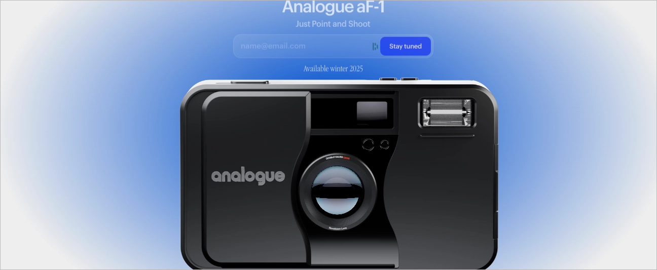
Winning Elements
- Distinct style – The retro direction is clear, consistent, and sets the tone from the first second.
- Brand world – Instead of selling products, the site sells a vibe—and it does it well.
- Cohesive storytelling – Every element, from visuals to copy, supports the same creative concept.
Some animations and transitions feel a bit clunky, especially on slower devices, which can interrupt the flow. Overall, the idea is strong and memorable—it just needs a bit more technical polish to feel fully smooth.
9. reboot
What really sets Reboot Studio’s landing page apart is how it moves. The design isn’t just visually clean—it’s alive. One of the most distinctive touches? A rotating carousel of animated effects that sweep across specific words like “Design,” “Branding,” “3D,” and “Interaction.” Each term briefly transforms with its own visual treatment—glitch, gloss, distortion, or rainbow gradients—giving every discipline its own moment to shine.
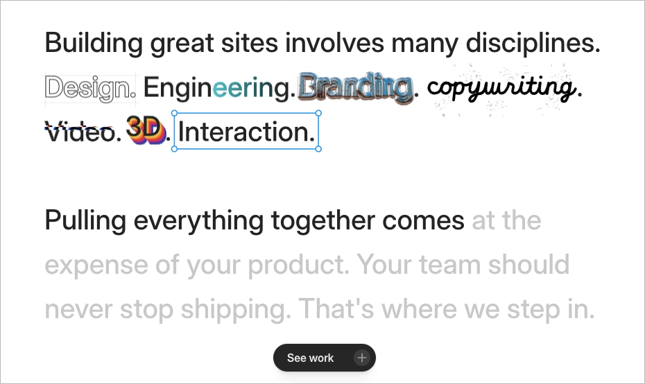
Winning elements:
- Animated service showcase – each word gets its own style moment, signaling creative range and attention to detail.
- Copy-meets-motion design – messaging and visual effects work together to build trust and keep you reading.
- Clarity through creativity – even with all the flair, the core message stays sharp: they make top-tier marketing sites for tech teams who care about good design.
This kind of interaction-driven design does more than just impress—it subtly reassures visitors that if Reboot can make this page feel memorable, imagine what they could do for your brand. It’s smart, stylish, and functional—all at once.
10. Lovi
The lovi.care website instantly sets a futuristic tone with fluid animations and a clean, tech-forward design. From the moment the animated face scan appears—with its rotating ring hovering around the user’s face—you’re pulled into an experience that feels both advanced and personal. Each element transitions with purpose: text labels like “Pigmentation” or “Wrinkles” glide into view as overlays, syncing motion with meaning in a way that subtly showcases the AI-powered engine behind the interface.
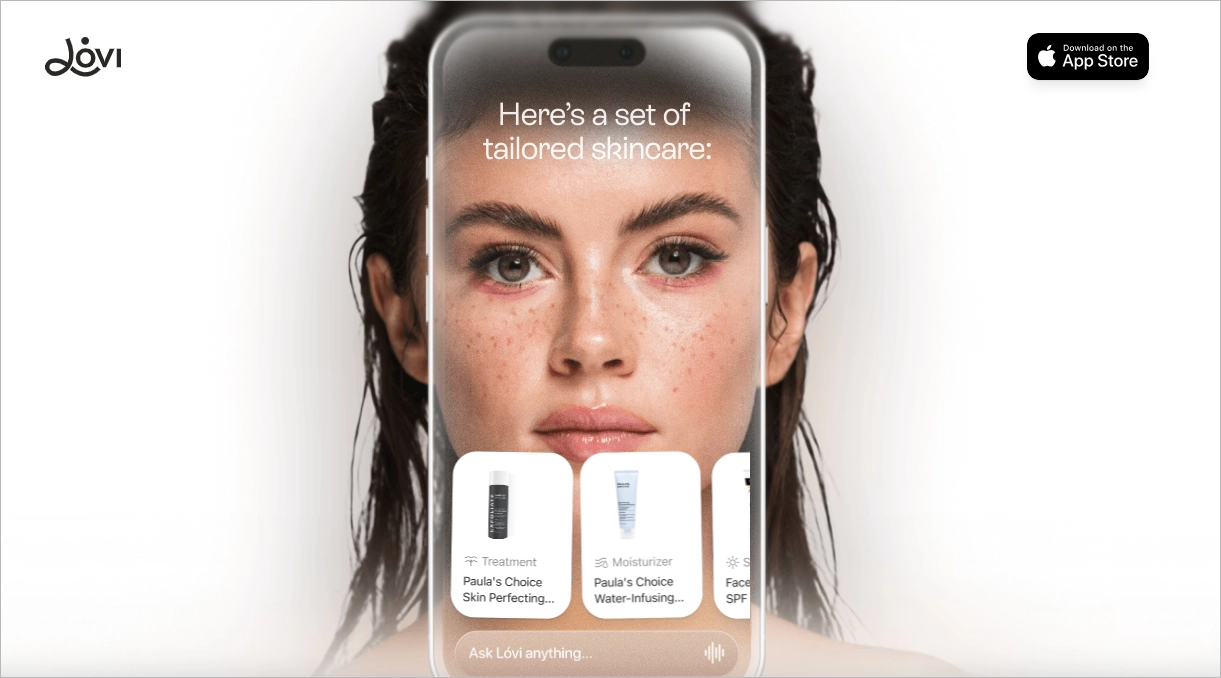
Scroll-triggered effects bring the site to life, with sections like “Superpower #1/2/3” gently fading and zooming into focus, keeping the user engaged without overwhelming them. Even the animated footer—stylized with slanted, scrolling text—feels intentional, adding a final brushstroke of personality as you reach the bottom. It’s polished, immersive, and visually confident.
11. AWSMD
One of the coolest software landing pages out there is the Awsmd site. It’s a spot-on example of how a software agency can show off what it does best—without overcomplicating things. With a sharp, modern look, the page instantly gives off a vibe of confidence and creativity. It smoothly walks you through their work, making it super clear they’ve got the skills and the projects to back it all up.
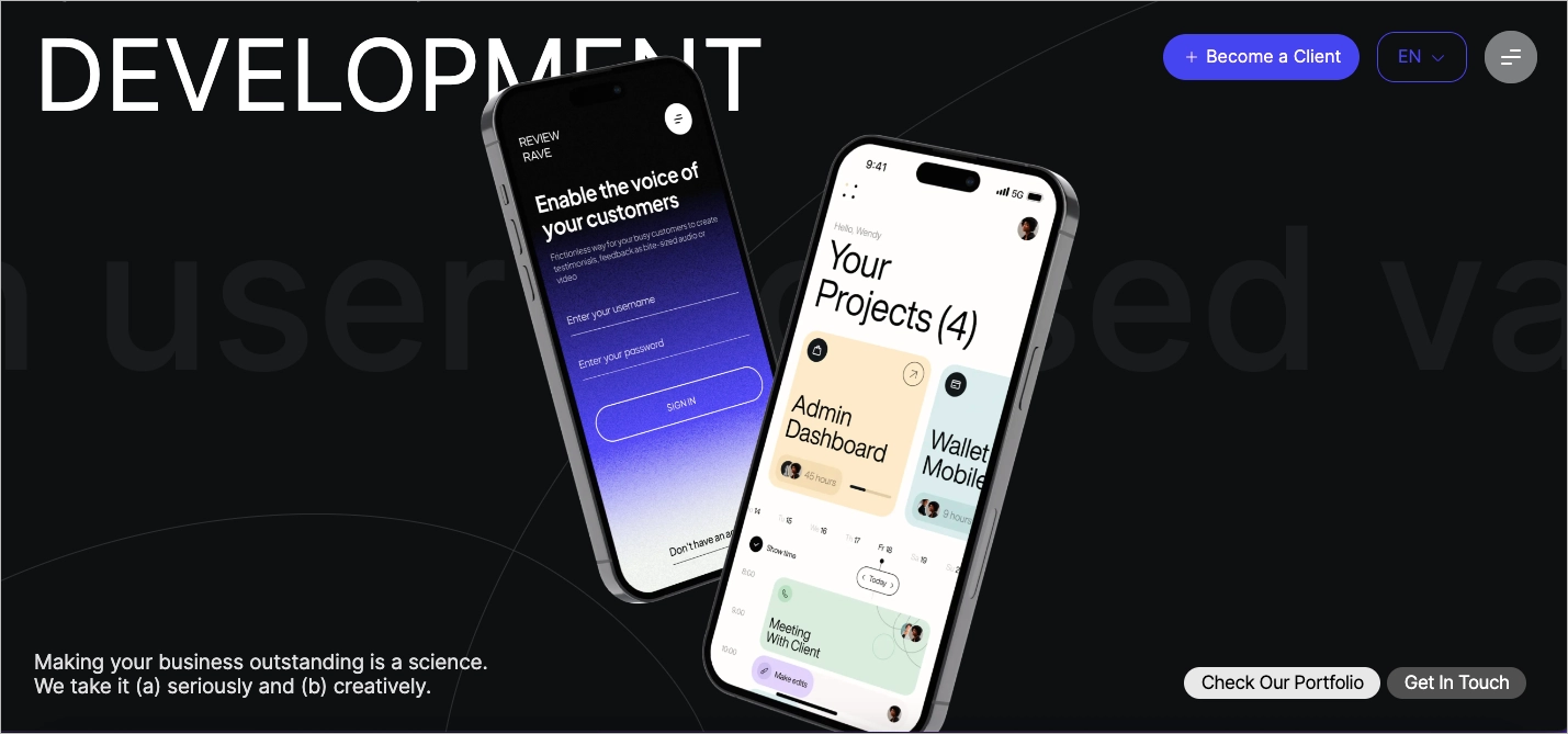
Winning points:
- Scroll-triggered animations
- Strong team presence
- The minimal copy paired with dynamic motion lets the visuals do the heavy lifting.
Their work section is super digestible, letting the projects speak for themselves without overwhelming visitors. Combined with smooth animations and minimalist copy, it’s an experience that feels more like a creative pitch deck than a traditional website. The storytelling, design, and interaction elements are all in sync, which reflects their branding precision and tech-savvy finesse.
12. UX & Product Design Week
The moment you land on the UX Week page by Future London Academy, one thing’s clear: creativity is everywhere. From the bold colors to the playful animations and unexpected layouts, it’s a visual treat that grabs your attention right away. The design screams innovation and feels like a perfect fit for a conference all about UX and forward-thinking design.
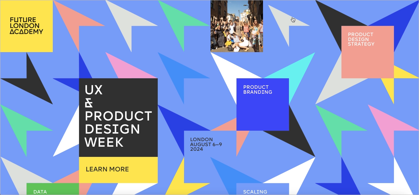
That said, it’s a bit of a wild ride. With so much happening on the screen, it’s not always obvious where to click or what to explore next. The lack of clear navigation and calls-to-action can leave visitors feeling a little lost.
Winning points:
- Eye-catching creative design – makes a strong first impression
- Trendy visuals – appeal to a design-savvy crowd
- Strong brand alignment – on-brand for Future London Academy
Where it could improve:
- Clearer navigation – more obvious buttons would help
- Less visual clutter – a cleaner layout could improve the flow
13. Colibri
The restaurantcolibri.ca site feels less like a typical restaurant website and more like a purpose-driven landing page—clean, clear, and conversion-ready. From the very first scroll, it communicates exactly what matters: local, sustainable, and inclusive cuisine.
The flat, minimalist design keeps the experience distraction-free, guiding the user through smooth navigation and intuitive sections: menu, location, hours, and online ordering. It’s fully responsive, meaning it looks great on both mobile and desktop, which is key for on-the-go diners checking in from Quebec City streets.
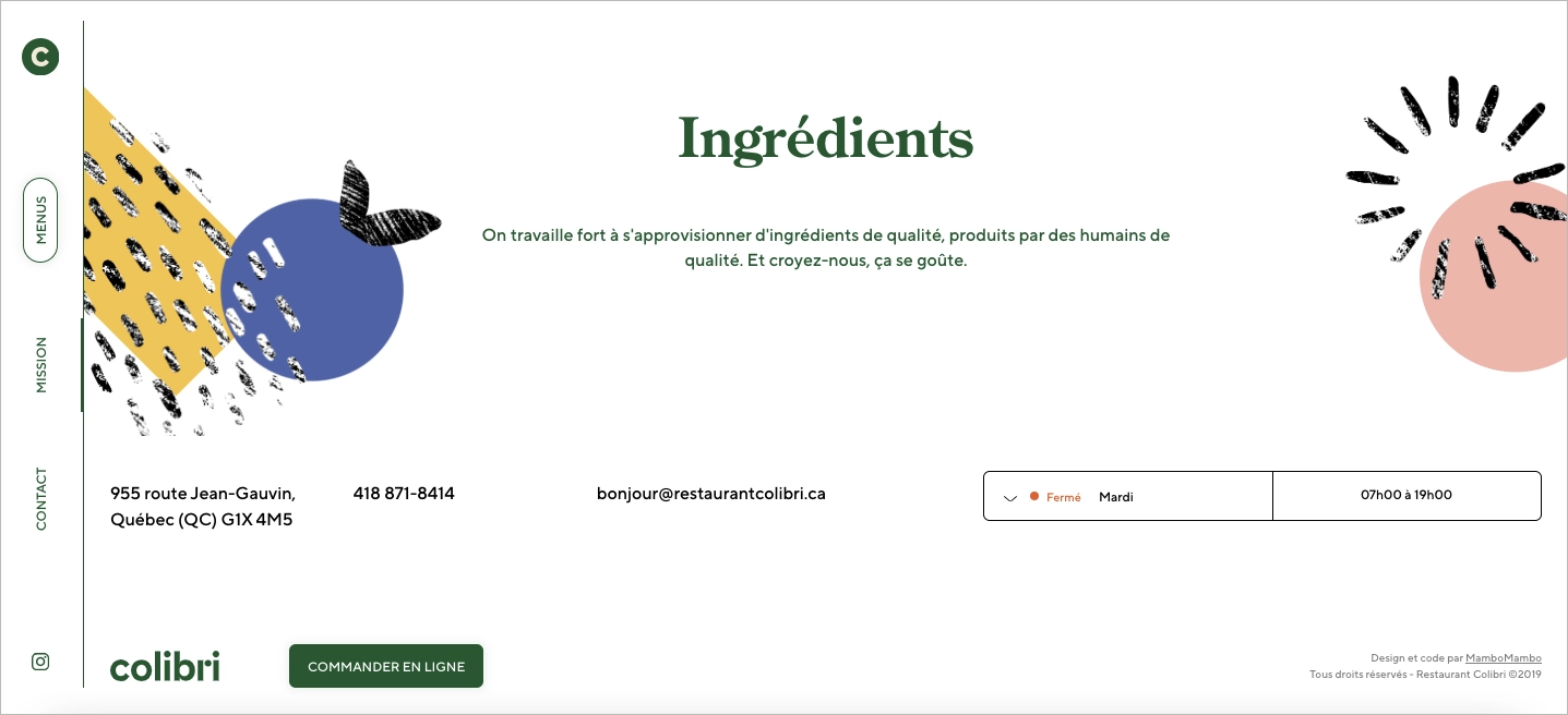
Winning elements:
- Seamless scroll and section transitions
- Mission-driven hero section
- Mobile-first navigation
While the page design is lean and clean, a few dish previews or behind-the-scenes kitchen shots could add flavor—helping users fall in love with the food before the first bite. And a sprinkle of visible social proof—like a quick quote, review, or testimonial block—would help seal the deal for first-time visitors.
14. Debtfindr
The Debtfindr landing page makes a serious topic feel a whole lot more approachable. Right away, it hits you with a clear, confident message: “Smart debt resolution powered by AI.” There’s no fluff—just a quick explanation of how it works and a simple CTA inviting users to join the waitlist. Scroll a bit, and you’re walked through a clean 4-step process: scan your records, match debts, negotiate automatically, and track it all. It’s smart, simple, and doesn’t make you feel overwhelmed.
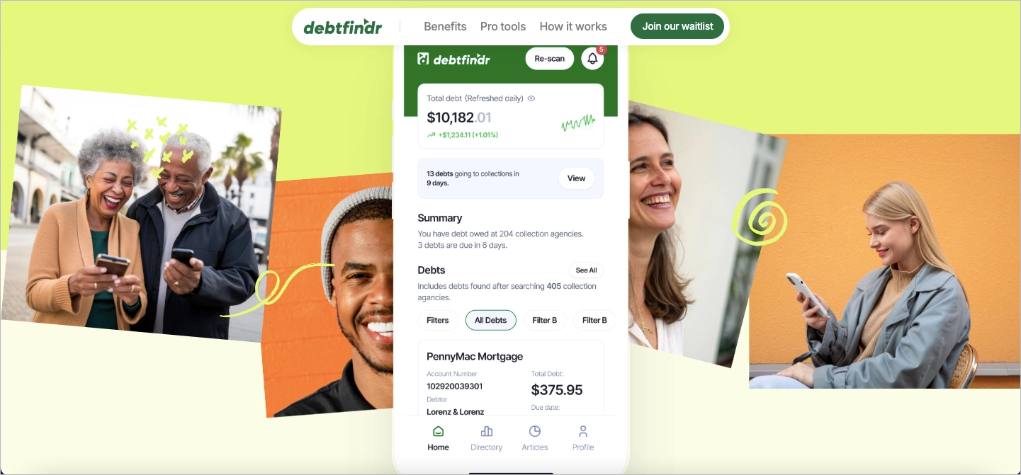
Visually, the site leans into modern clarity: soft colors, friendly icons, and just the right amount of white space. Every section flows into the next—problem, solution, how it works, and real people sharing how it helped them. Trust signals like encryption and “no hard credit checks” are placed right where you need them. Even the FAQ feels direct and digestible, especially if you’re anxious about handing over personal data.
Winning elements:
- A digestible 4-step explainer that simplifies a complex process.
- Honest testimonials that make the product feel credible (and human).
- Clear reassurance around data safety—huge in the financial space.
- Smooth structure and CTA flow that gently guide the user toward action.
15. Folk App
Folk’s landing page hits all the right notes from the first scroll. The minimalist layout paired with bold copy (“Finally, an intelligent CRM”) immediately sets the tone: clean, confident, and user-focused. The CTA buttons—“Try for free” and “Get a demo”—are clear, repetitive, and smartly placed throughout the page.
The narrative structure flows smoothly: intro headline, feature blocks, UI visuals, and user quotes. Each section feels intentional. The design relies on ample white space, a muted palette, and clean typography to keep the focus on the content. Feature highlights like “Absurdly simple to setup” or “Capture contacts fast as lightning” make it easy to grasp value at a glance.
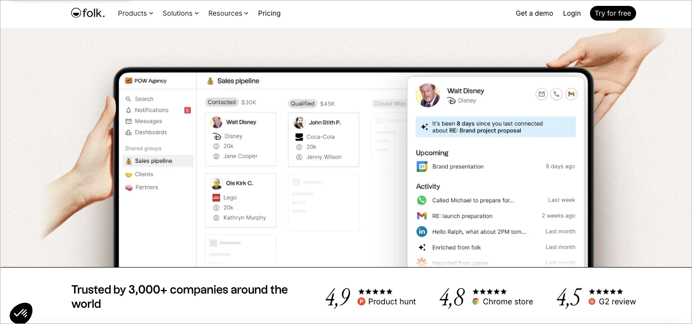
Winning points:
- Bold, minimalist aesthetic that feels premium and modern
- Clear, benefit-focused copy that keeps things simple
- Smart CTA placement—no friction, no guesswork
- Real user quotes used naturally as trust builders
The one thing missing? A bit of interactivity. Adding hover states or micro-animations would elevate engagement. A short demo video could also help visitors instantly see the tool in action—especially for CRM newcomers. Still, it’s a standout page that proves simplicity can sell.
16. Joi Planner
Joi’s landing page doesn’t scream for attention — it calmly invites you in. With a muted palette, elegant typography, and loads of intentional whitespace, this is creative minimalism done right. The headline “The daily planner to keep distracted minds on track” sits on a soft dark background like a quiet promise. It’s part digital product, part aesthetic experience.
Every scroll feels deliberate. Sections are perfectly aligned, visuals are subtle yet precise, and mockups float into view without stealing the show. Instead of overwhelming you with flashy graphics or animations, Joi’s page builds mood. It creates a kind of visual exhale — a calm you don’t usually associate with productivity tools.
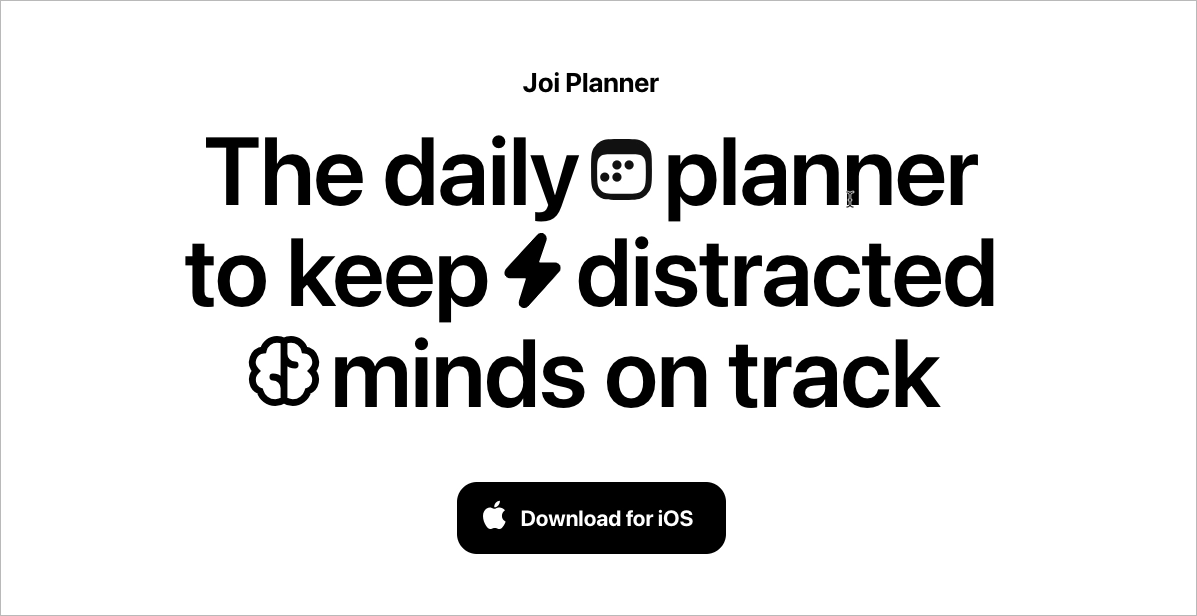
Winning points:
- Confident minimalism — the design says more by showing less
- Emotion-driven messaging — speaks directly to a scattered, modern mind
- High-end UI mockups — soft, sleek, and placed with intention
- No distractions — the entire page mirrors what the app promises: focus
If there’s anything to add, maybe a subtle motion or interactive scroll effect could help punctuate key points without disturbing the calm. But overall? Joi nails the quiet confidence that so many creative brands strive for.
17. Travelwise
The Travelwise landing page feels less like a tech promo and more like a page from your family travel scrapbook. Right from the top, the mood is warm and nostalgic. The headline “Rediscover the joy of the journey” does the heavy lifting — it’s not just about planning a trip, it’s about reliving that sense of wonder and connection.
The phone mockup at center stage anchors the layout, giving a glimpse into the app’s clean UI while letting real photos tell the emotional story. Soft gradients and gentle, curved shapes echo the winding paths of travel, leading your eye through the layout like a road trip map. Everything breathes — the spacing, the flow, the copy. No clutter, just calm guidance.
Winning points:
- Visual storytelling that taps into memory and emotion
- UI mockups that feel intimate, not staged
- Clean layout with room to breathe
- Warm, consistent tone of voice
To make it even more immersive? Light animation — like a glowing travel path or gently looping user stories — could elevate the narrative even further, drawing users deeper into the journey before they even click “start.”
Create high-converting landing pages with Landingi’s intuitive tools!
FAQ About Creative Landing Pages
A creative landing page should be eye-catching, engaging, and conversion-focused—but getting the balance right isn’t always easy. Below, you’ll find answers to the most common questions about what makes a creative landing page effective and how to avoid common mistakes.
What to Avoid While Creating Creative Landing Pages?
When creating a creative landing page, avoid overloading visitors with too many design elements, animations, or confusing navigation. A page that’s too chaotic can overwhelm visitors instead of converting them. Also, avoid unclear CTAs—your visitors should never have to guess what to do next.
Keep it visually appealing, but ensure that clarity and usability come first.
Can a Landing Page Design Be Too Creative?
No, a landing page can never be too creative—as long as creativity enhances usability, not overshadows it. A bold, artistic layout can make a strong impression, but conversions will drop if it distracts from your value proposition or confuses visitors. A dark background with neon text might seem cool, but if it reduces readability, it reduces conversions.
What Constitutes a ‘Creative’ Landing Page?
A creative landing page is the one that uses bold visuals, unique layouts, and compelling copy to stand out while still keeping conversion in mind. It’s about balancing aesthetics with strategy—an engaging hero image, eye-catching color palettes, and persuasive copy that guides visitors seamlessly toward the CTA.
Does a Creative Landing Page Significantly Increase Conversion Rates?
A well-executed creative landing page can boost conversion rates by grabbing attention and making a lasting impression. However, creativity alone isn’t enough—it must align with clear messaging, strategic CTAs, and a seamless user experience.
What Are the Key Elements of Effective Landing Page Design?
A good landing page includes:
- A hero image and visuals that draw attention.
- A clear, persuasive value proposition.
- Easy-to-scan short paragraphs and a clean layout.
- A single, strong CTA that encourages visitors to take action.
- Minimalistic design that avoids distractions.
What Are Some Common Themes in Successful Creative Landing Pages?
Some of the most effective creative landing pages follow these themes:
- Bold colors & fonts that align with branding.
- Minimalist design for easy navigation.
- Video testimonials to build trust.
- Interactive elements (scroll effects, animations).
- Clever copywriting that makes the message memorable.
Turn your creative ideas into high-converting landing pages with Landingi’s flexible design options!
Which Industries Benefit the Most From Creative Landing Page Designs?
Job training programs see the highest conversion rates, hitting 6.1%, followed by travel (5%), business consulting (5%), legal services (3.3%), home improvement (3.3%), and healthcare (2.9%), according to Unbounce.
Industries that rely on strong branding and emotional appeal also get big wins from creative landing pages. E-commerce brands (fashion, beauty, tech) use bold visuals to grab attention and drive sales. Entertainment and media (music, streaming, gaming) need engaging layouts to hook audiences and increase sign-ups. Startups—especially those with innovative products—depend on creative landing pages to stand out in a crowded market. And in food delivery, a well-placed mouthwatering image can turn visitors into paying customers in seconds.
Regardless of the industry, a landing page that balances creativity, UX, and clear messaging will always have a better chance of converting visitors into customers.
Which is More Important for a Landing Page: Visual Creativity or Clear Messaging?
Clear messaging is always the priority. A well-designed page supports the message, but if users don’t understand the offer, they won’t convert.
How Does the Choice of Color Scheme Impact the Effectiveness of a Creative Landing Page?
Colors affect how users perceive a brand and can influence conversions. A bright color palette can create excitement, while a dark background can feel premium or exclusive. The key is to match the color scheme with the brand personality and target audience.
Example: Blue is often used for financial landing pages because it conveys trust, while red can create urgency for e-commerce offers.
What Role Does Copywriting Play in the Success of a Creative Landing Page?
Copywriting is what drives action – a landing page needs clear, persuasive messaging that immediately tells visitors why they should care, what’s in it for them, and what to do next. Strong copy removes doubts, builds trust, and keeps users engaged long enough to convert. Without it, even the most visually appealing landing page won’t perform.
Create High-Converting Creative Landing Pages with Landingi
Most landing pages don’t fail because they look bad—they fail because they don’t engage, convert, or stand out. Visitors bounce when your page doesn’t grab attention in seconds. They leave when your CTA isn’t clear and get frustrated when your layout is clunky. If your landing page isn’t driving clicks, it’s wasting space.
With Landingi, you don’t need coding skills or design experience to build a high-converting, visually appealing landing page. Our free landing page builder allows you to customize layouts, add bold visuals, and optimize every element for conversions.
Why marketers choose Landingi:
- Drag-and-drop simplicity—no coding, no stress, just easy customization.
- Proven-to-convert templates—built for engagement and sales.
- A/B testing & analytics—optimize and improve with real data.
- Seamless integrations—connect with your favorite digital marketing tools.
Don’t settle for an average page—build landing pages that drive real results. Try Landingi today and create a great landing page that actually converts.


