

What if a single FAQ landing page could answer your customers’ burning questions, cut your support tickets in half, and boost conversions – all at the same time? That’s exactly what happens when you get it right. Unlike buried help articles or generic support pages, a well-crafted FAQ page design puts clarity front and center. It answers the “what ifs” and “how does this work” questions before they become deal-breakers. The result? Faster decisions, fewer abandoned carts, and happier users who actually find what they need.
Beyond helping customers, a strategic FAQ section cuts your support workload. Landingi makes building these pages refreshingly simple – no plugins, no headaches. Just drag, drop, and deploy. You can experiment with different FAQ page design ideas, optimize what works, and watch your conversion rates climb.
Ready to build one yourself? This guide covers everything you need to know. We’ll show you what makes an FAQ landing page effective, how to write answers that feel helpful (not robotic), and how to weave in strategic calls to action. You’ll also explore real landing page examples from brands that nailed the balance between information and persuasion.

12 Best Examples of FAQ Landing Pages
Explore 12 standout examples of FAQ landing pages, well-designed FAQ sections, and effective help center pages. Each example shows how to answer frequently asked questions using clear language, structured layouts, and intuitive design. Reviewing these FAQ pages can give you actionable ideas for your own FAQ landing page, from layout choices to content flow and user experience best practices.
1. GoCompare
The GoCompare FAQ landing page is an excellent example of how to use design and content structure to guide users through complex decisions, such as life insurance. Its layout is entirely focused on addressing user questions. Instead of limiting the content to a single FAQ section, the entire page is built around multiple informational blocks such as “What is life insurance?” and “Do I need life insurance?”
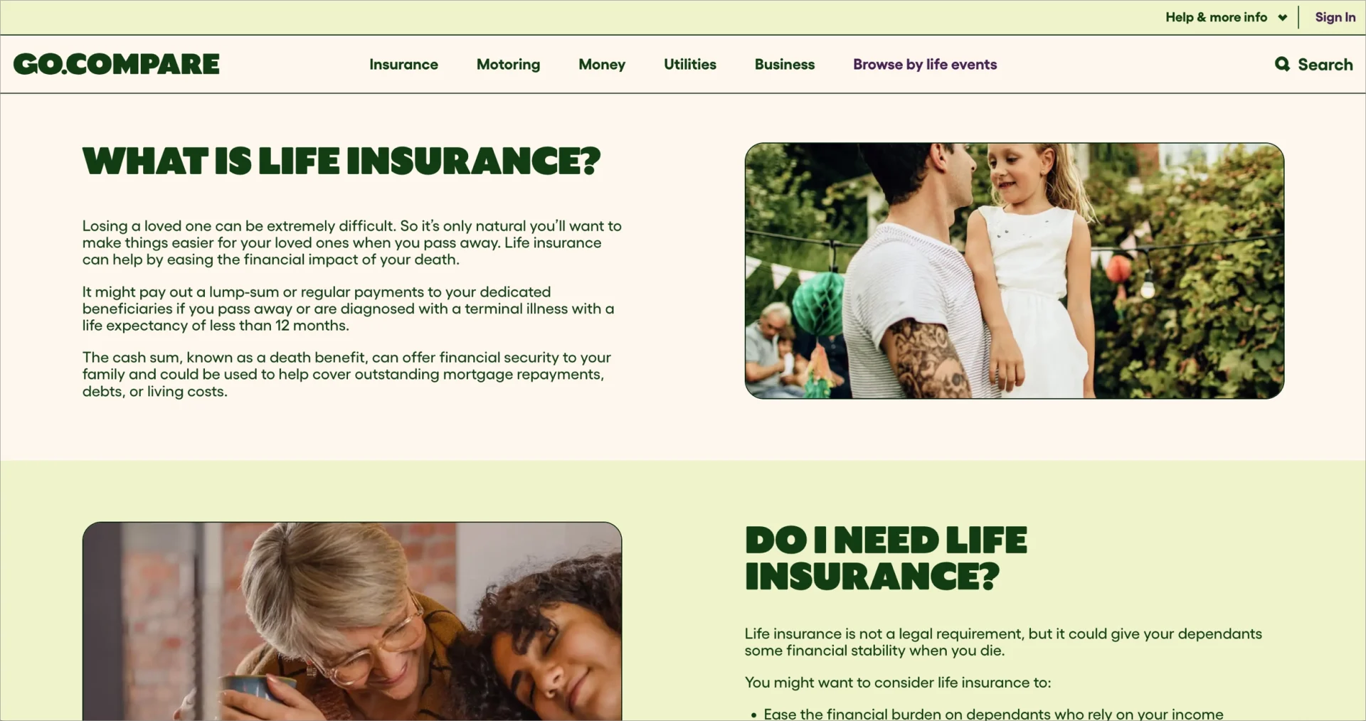
Each block of GoCompare’s FAQ page tackles a specific concern using plain, accessible language that builds user understanding and trust. Consistent font choices, unified tone, and a clean layout improve readability. The inclusion of footnotes provides additional context and reinforces the credibility of the answers.
Key takeaways from GoCompare’s FAQ page:
- Visually clean and well-structured design
- Multiple FAQ sections organized by topic
- Strong visual branding and consistent layout
- Clear and visible call to action
- Additional trust elements, including footnotes for clarity
Improvement opportunity:
- Adding customer testimonials could create a stronger emotional connection and support decision-making by showing real-world relevance.
2. Trivazo
The FAQ landing page by Trivazo offers a well-structured experience focused on clarity and ease of use. Each frequently asked question is housed in a foldable section, allowing users to expand content only when needed. This layout reduces visual clutter, improves scannability, and encourages interaction. The clean, minimalist design creates a professional look that aligns with Trivazo’s brand, while the strategic use of whitespace guides the user’s attention to the content itself.

Moreover, Tivazo’s FAQ page is optimized for performance, with fast load times that enhance the user experience. Branding elements – including Trivazo’s fonts and color palette – are applied consistently across the page to reinforce brand recognition. A clearly visible call-to-action button drives conversions by encouraging users to request more details. In addition, a live chat icon lets users get immediate support if their questions aren’t fully answered by the FAQ.
Key takeaways from Trivazo’s FAQ page example:
- Clean, user-friendly layout
- Minimalist design approach
- Foldable FAQ sections for better organization
- Concise, focused answers
- Consistent use of brand colors and fonts
- Responsive design for mobile accessibility
- Prominent and effective call-to-action button
Improvement opportunity:
- Adding a search bar could improve navigation by helping users find specific questions faster.
3. Sage Intacct
The Sage Intacct landing page is designed to convert business visitors by focusing on clarity, engagement, and product promotion. The layout removes distractions by excluding a top navigation bar, keeping attention on key content and the primary call to action. The page encourages users to either take a product tour or request pricing. The FAQ section uses an accordion layout to organize detailed pre-sales questions, covering implementation, features, and pricing.
The Sage Intacct landing page uses a modern dark theme with subtle animations and microinteractions that guide attention without overwhelming the user. At the top of the page, a clean two-step form invites users to begin a product tour, collecting only essential details. Visual enhancements such as animated trust badges, preview snippets of testimonials, and interactive elements make the experience engaging while maintaining a professional tone. The messaging throughout the page reinforces Sage Intacct’s positioning as a forward-looking, AI-supported financial solution.
Key takeaways from Sage Intacct’s page example:
- No top navigation to reduce distractions
- Strong, action-oriented calls to action
- Well-organized accordion FAQ layout
- Interactive and visually engaging user interface
- Subtle animations and microinteractions to guide flow
- Messaging aligned with AI-powered product positioning
Improvement opportunity:
- Enhancing mobile performance – particularly scroll behavior and form usability – could improve conversion rates for mobile users.
Turn doubts into decisions! Create conversion-focused FAQ landing pages with Landingi.
4. Virtually Healthcare
The FAQ landing page for Virtually Healthcare’s online dermatology clinic combines clean design with structured, user-focused content. The layout uses a soft pastel color scheme that conveys professionalism and calm, supporting the clinic’s approachable digital presence. A visual 3-step process explains the full consultation journey – from uploading skin photos, through an online GP consultation, to receiving personalized recommendations and prescriptions. This clear explanation of service flow helps users understand what to expect and builds trust through transparency.
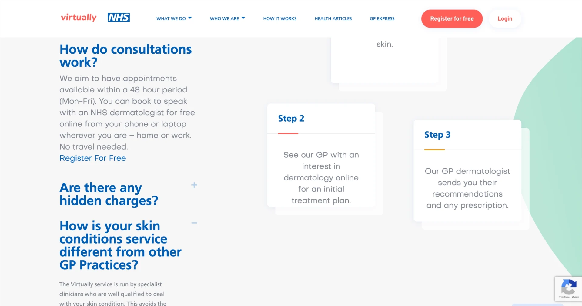
The collapsible FAQ section on Virtually Healthcare’s page addresses common user concerns in a concise, organized format. Questions cover topics such as pricing clarity, hidden charges, and comparisons to traditional GP practices – directly reflecting real user doubts. By presenting answers in a straightforward tone, the FAQ section reinforces the clinic’s credibility. A map with clinic contact information at the bottom of the page links the virtual service to a physical presence, offering reassurance to prospective patients.
Key takeaways from Virtually Healthcare’s page example:
- Clean layout with a calm, professional color palette
- Step-by-step visual explanation of the service process
- Clear, collapsible FAQ format for easy navigation
- Focused content that addresses real user concerns
- Location map and contact details to support trust
Improvement opportunity:
- The opening section could include social proof, such as patient testimonials or ratings, to create a stronger emotional connection and increase engagement early in the user journey.
5. Oyster
The Oyster help center page demonstrates a user-focused approach to support content. The page uses a clean, modern layout that emphasizes simplicity and ease of access. FAQs are organized into clearly labeled categories, each represented by a clickable box. This design allows users to quickly scan the page and explore only the topics relevant to their needs, keeping the overall appearance uncluttered while providing in-depth answers.
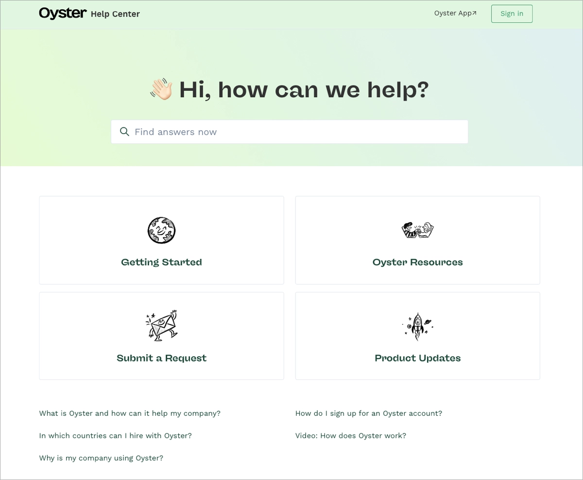
A built-in search bar at the top of the Oyster help center page helps users locate specific topics instantly. At the bottom, related article links extend support without forcing users to navigate away from the FAQ landing page. This seamless structure is especially important for a global HR platform like Oyster, where users often seek fast answers on complex subjects such as compliance, onboarding, or international employee benefits
Key takeaways from Oyster’s help center page example:
- User-centric layout designed for self-service
- Clear category-based organization of FAQs
- Prominent search functionality for faster navigation
- Contextual links to related content for extended support
Improvement opportunity:
- Adding interactive elements, such as chatbots, could enhance real-time assistance and boost engagement for more complex inquiries.
6. Fora Travel
The Fora Travel FAQ landing page combines premium design with functional clarity, creating an aspirational yet informative experience. A full-screen background video immediately transports visitors to a tranquil travel setting, setting the tone for a high-end, lifestyle-driven brand. Overlaid on the video, a clear call to action – “Join the next generation of travel advisors” – is paired with a prominent “Apply” button, encouraging immediate engagement. The page’s elegant typography and muted color palette reinforce a sense of sophistication and position Fora as a modern alternative to traditional travel agencies.
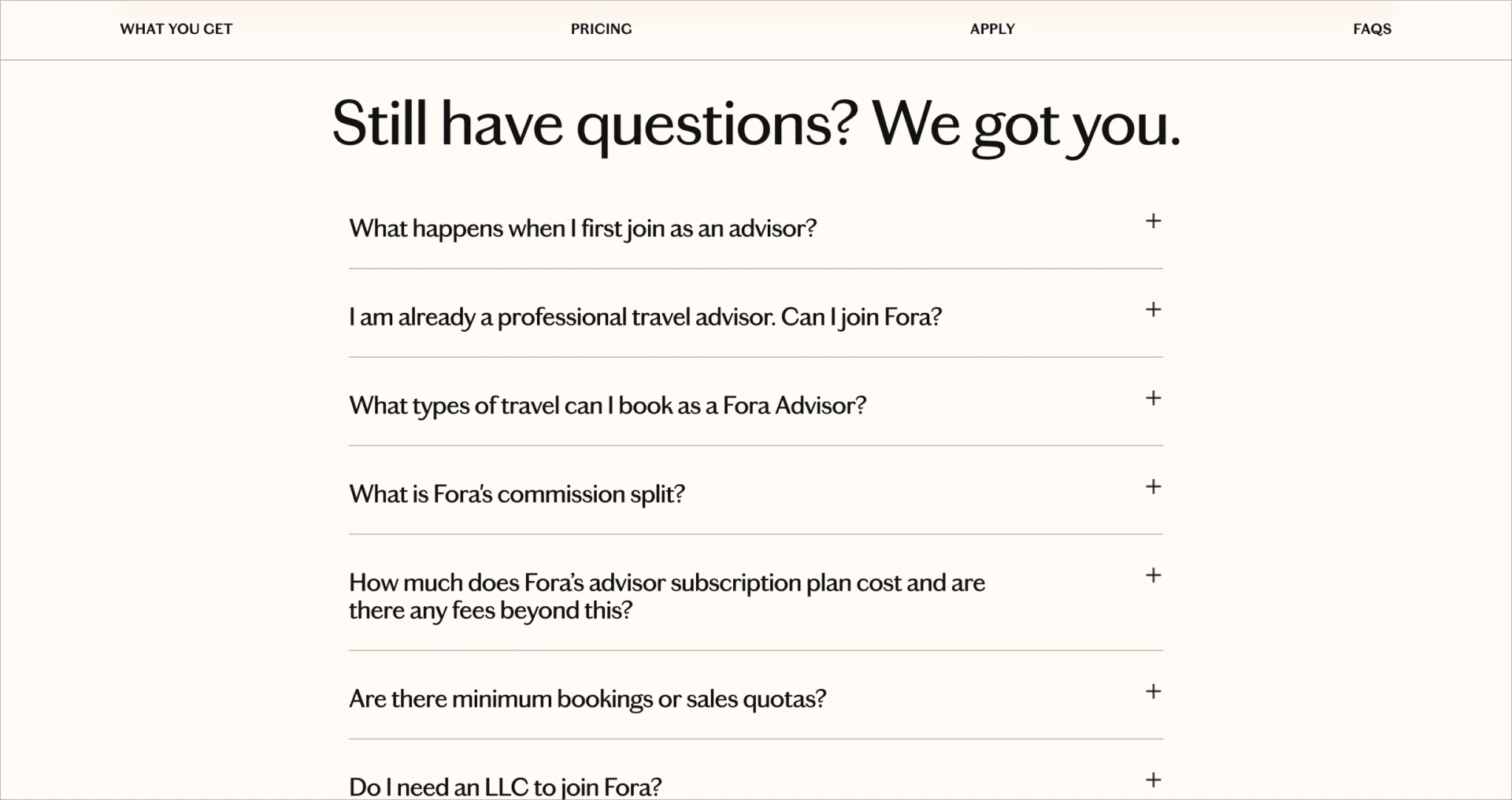
What makes the Fora Travel landing page especially effective is how it communicates detailed information without overwhelming the user. The FAQ section itself is content-rich yet streamlined, using collapsible questions to maintain visual clarity. Topics range from advisor commission structures to LLC formation requirements, making the page useful for both beginners and experienced travel professionals. By answering common concerns directly, the FAQ content reduces uncertainty and supports confident decision-making.
Key takeaways from the Fora Travel page example:
- Immersive background video that sets emotional tone
- Sophisticated font and soft color palette
- Detailed, collapsible FAQ content for multiple user types
- Animated media mentions to build credibility
- Clear positioning against traditional travel agencies
Improvement opportunity:
- Adding an interactive feature – such as a chatbot or quiz – could help undecided visitors determine if the advisor program fits their goals, increasing engagement and personalization.
Your visitors have questions – Landingi helps you turn answers into action. Start building now!
7. Codelita
The Codelita FAQ landing page is a strong example of effective FAQ design for an educational platform focused on coding and technology. The layout is built for usability, with accordion sections that organize questions by topic. This structure keeps the page clean while allowing users to explore relevant content at their own pace. Each answer is concise and informative, helping users resolve common questions without leaving the page.

Visually, the Codelita page uses modern design elements and consistent branding to create a polished and professional appearance. The FAQ section is enhanced with embedded links to tutorials and related resources that guide users toward deeper learning. A “More Help” section provides direct access to customer support, enabling users to get assistance with questions not covered in the FAQ. This combination of structured design, educational depth, and accessible support reinforces Codelita’s value as a learning platform.
Key takeaways from the Codelita FAQ page example:
- Clear, topic-based FAQ structure
- Consistent use of branding across layout and typography
- Integrated links to educational resources and tutorials
- Direct support access through a “More Help” contact section
Improvement opportunity:
- Improving mobile responsiveness could enhance accessibility for users on smartphones and tablets.
8. Pendo
The Pendo FAQ page demonstrates how to build a high-performing, user-focused experience that drives both engagement and conversions. The hero section opens with a value-driven headline and a streamlined lead capture form, designed to encourage immediate action. Visual simplicity supports clarity, while the form – labeled “See how Pendo works” – reinforces trust by referencing its adoption by over 10,000 organizations.
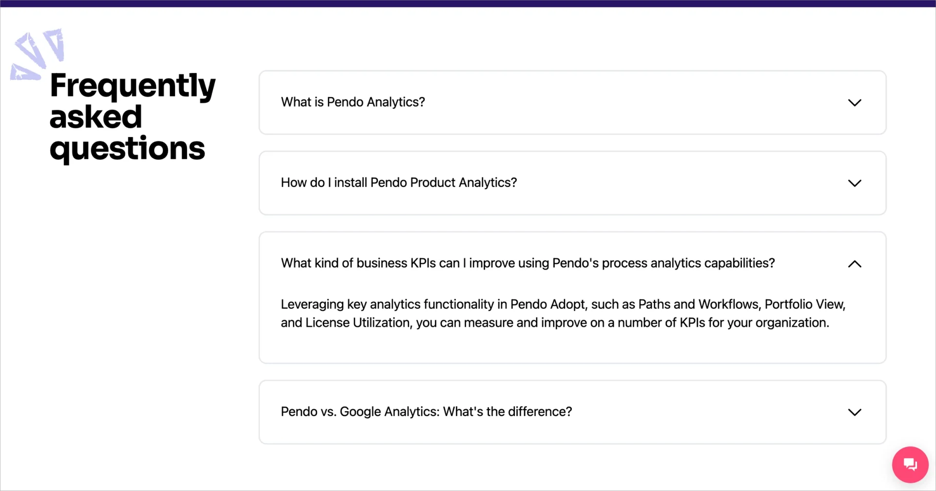
In the next FAQ page section, Pendo presents its key features through tabbed content that clearly segments the information. Each tab uses benefit-driven language and branded icons to explain what users can expect. Supporting data points provide strong social proof. Animated testimonials break up the text and add credibility while keeping users engaged through visual movement. The FAQ section at the bottom is compact but strategic, addressing common concerns and highlighting unique differentiators, including a direct comparison between Pendo and Google Analytics.
Key takeaways from Pendo’s FAQ page example:
- Strong headline and CTA pairing in the hero section
- Tabbed feature presentation with benefit-focused content
- Trust-building elements including stats, testimonials, and brand logos
- Focused FAQ content that covers practical and comparative questions
Improvement opportunities:
- Ensuring that client logos are immediately visible on all screen sizes would strengthen credibility.
- Enhancing the testimonial slider with clearer navigation cues or auto-scroll functionality could improve engagement across devices.
9. Adaptify
The Adaptify SEO FAQ landing page demonstrates a conversion-focused design tailored for agencies interested in automated SEO solutions. The hero section uses clean whitespace and a bold headline, paired with a simple interactive demo form to drive engagement. Directly below, a featured client testimonial establishes early trust and reinforces Adaptify’s credibility. A dynamic G2 badge slider adds visual momentum and supports social proof through third-party validation.
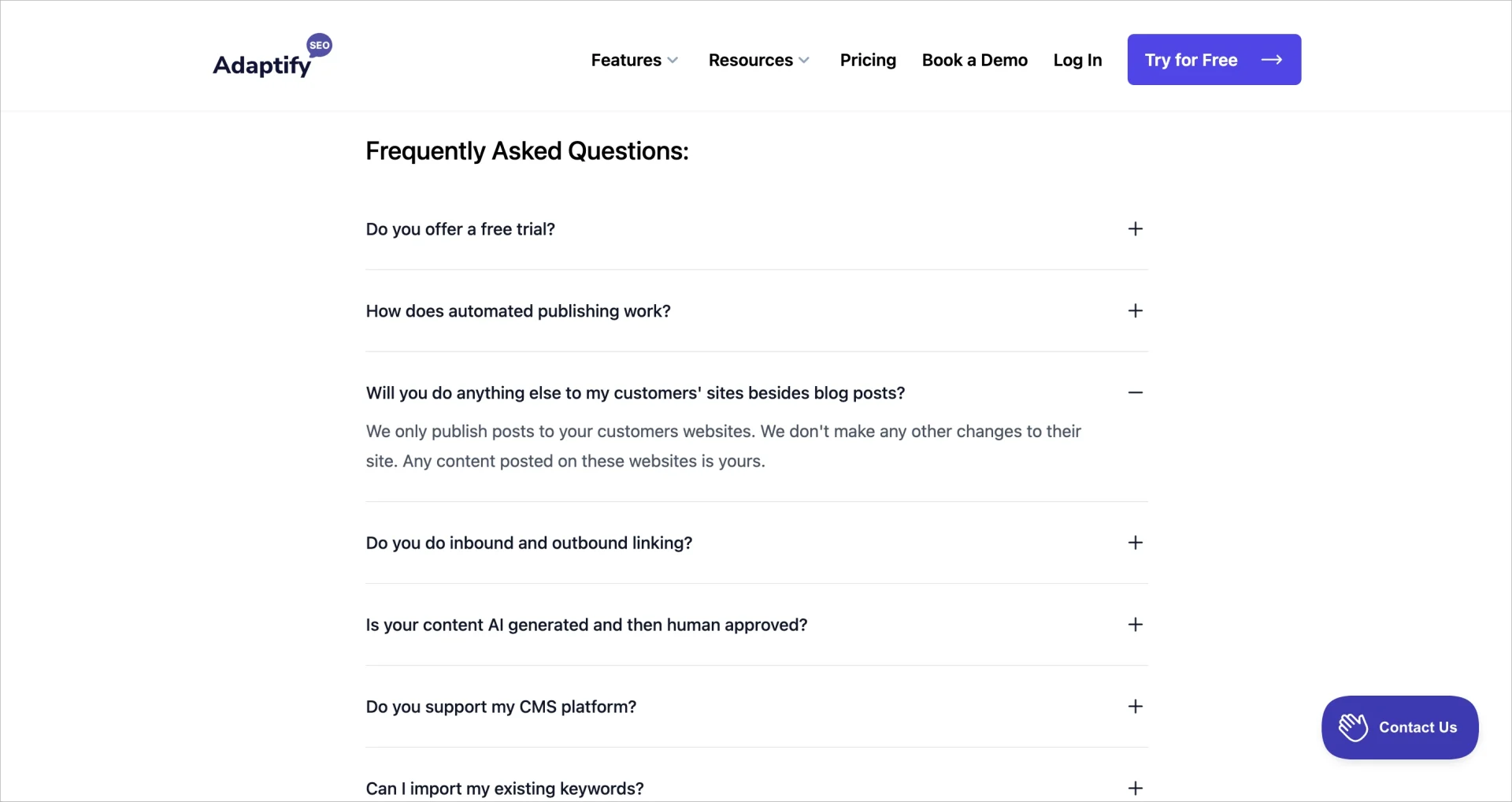
The FAQ section on Adaptify’s page is extensive, collapsible, and well-organized – addressing both general and technical topics. Answers are detailed and supported by performance metrics. A competitor comparison table clearly illustrates how Adaptify differs from other providers. A standout feature of Adaptify’s FAQ page is the frequent use of embedded video explainers within FAQ answers. These videos simplify complex topics and make content more engaging for different learning styles, enhancing both clarity and retention.
Key takeaways from Adaptify’s FAQ page example:
- Detailed, well-structured FAQ content
- Embedded video explainers for visual learning
- Integration with a broader Help Center
- Performance stats and competitor comparison
Improvement opportunity:
- Adding real-time support tools like a chatbot or live messaging feature could enhance user engagement and provide immediate answers for high-intent visitors.
Turn objections into opportunities! Launch a high-converting FAQ landing page with Landingi.
10. Arrived
The Arrived FAQ landing page serves as a dedicated extension of the platform’s Help Center and is designed to support users seeking information on real estate investing. The layout organizes frequently asked questions into clear, accessible sections, making it easy for users to browse by topic. Each answer is detailed and written in well-structured paragraphs, providing thorough explanations. This level of depth helps clarify complex financial topics and builds trust with prospective investors.

A key feature of Arrived’s FAQ page is the use of embedded video explainers within several answers. These videos simplify intricate investment concepts and offer an alternative to reading long-form text. By combining written content with multimedia elements, the page accommodates various learning styles and increases content retention. This blended approach makes the FAQ section not only informative but also highly user-friendly for a wide audience.
Key takeaways from Arrived’s FAQ page example:
- In-depth, well-written answers to common investor questions
- Integrated video explainers to support visual learning
- Organized by section for easy navigation
- Part of a broader Help Center for extended support
Improvement opportunity:
- Adding real-time interactive features, such as a chatbot or instant messaging tool, could provide immediate assistance and elevate the overall user support experience.
11. Zoom
The FAQ landing page for Zoom Webinars combines high-impact design with content tailored for conversion. A bold hero headline immediately communicates value, while an above-the-fold explainer video clarifies the product offering, and two prominent calls to action guide visitors toward their next step. The layout makes strong use of whitespace to reduce cognitive load and enhance clarity.
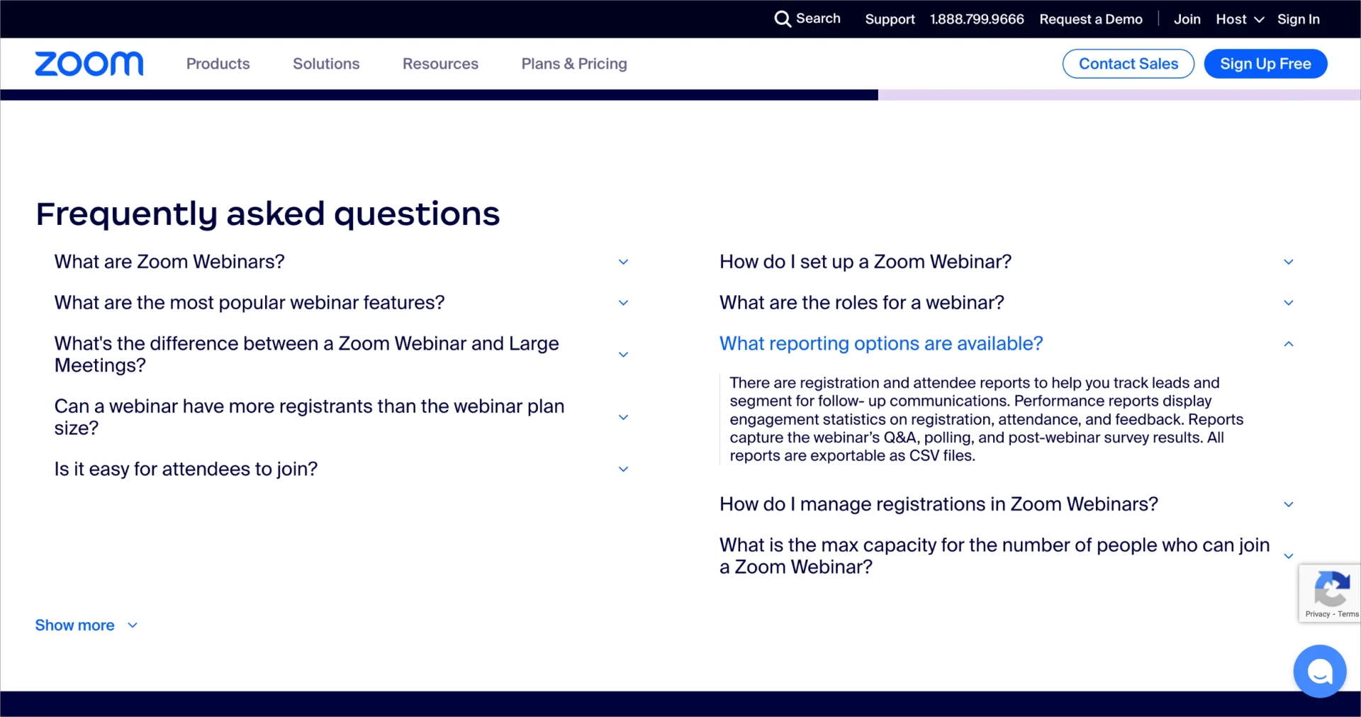
Supporting sections on the Zoom FAQ page include webinar use cases, product descriptions, and a teaser for a customer success story that boosts credibility. The FAQ area is organized in a clean two-column format that minimizes scrolling and improves readability. Collapsible answers address a range of questions – from basic functionality to reporting features and registration limits – helping reduce friction during the decision-making process.
Key takeaways from Zoom’s FAQ page example:
- Engaging explainer video in the hero section
- Dual CTAs that clarify user pathways
- Trust elements like early testimonials and client stories
- Well-structured, scroll-efficient FAQ section
- Animated G2 review slider for social proof
Improvement opportunities:
- Adding FAQ filtering or topic-based categorization would help users find relevant answers faster.
- Reducing on-page distractions – such as the persistent global navigation bar and floating widgets– could further streamline the user experience.
12. ChainGPT
The FAQ section on the ChainGPT website, part of the ChainBots product page, is tailored to blockchain and AI users seeking clear technical guidance. This section is divided into topic-based categories, each presented in a collapsible accordion format. Answers are informative yet concise, offering practical explanations that simplify complex subjects. Each entry is crafted to ensure users receive clear direction on how ChainGPT’s solutions function within a broader blockchain ecosystem.

The FAQ section of ChainGPT’s page includes visual enhancements that increase user engagement without overwhelming the interface. Where relevant, answers contain direct links to additional resources, allowing users to dive deeper into specific subjects. At the top of the section, a dedicated support link allows users to contact the customer service team for further questions.
Key takeaways from ChainGPT’s FAQ page example:
- Well-structured accordion layout with topic categories
- Concise answers tailored to technical users
- Links to deeper content and documentation
- Direct support access through the contact link
- Visual design that supports engagement
Improvement opportunity:
- Improving mobile responsiveness for the accordion structure and embedded links would make the FAQ more accessible to on-the-go users.
FAQs that convert? Yes! Build optimized, user-friendly FAQ pages with Landingi.
How to Create an FAQ Landing Page?
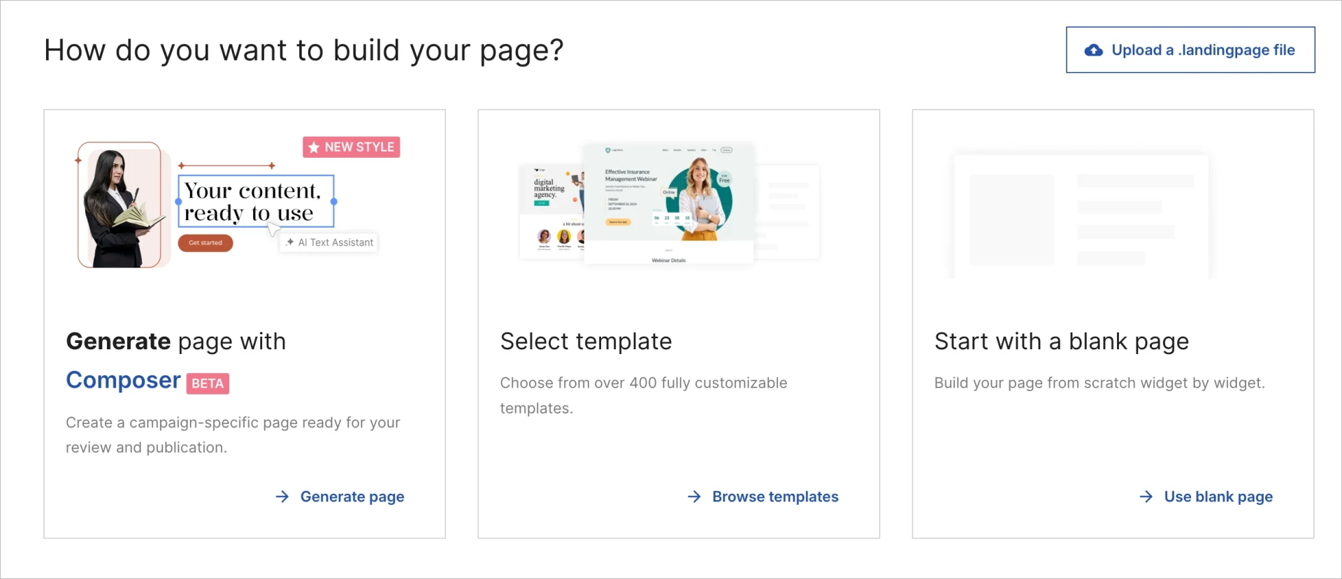
To create a landing page for FAQs, begin by choosing the right tool. Landingi offers a fast, flexible way to build FAQ pages or embed FAQ sections into existing landing pages – without writing a single line of code. Whether you’re starting from a template or a blank canvas, the process is designed for simplicity and control.
After selecting your platform, the next steps include collecting your most frequently asked questions, organizing them into categories, writing clear answers, and structuring the layout for ease of use. Once the content is complete, you can design, publish, and optimize your FAQ landing page for mobile users, search engines, and conversions.
Here’s a step-by-step guide to help you plan, build, and optimize a page that answers your visitors’ questions and supports conversions.
1. Collect and group your questions
Begin by identifying the most common questions your users ask. Pull real data from support tickets, live chat logs, sales calls, customer feedback, or product reviews. Once you have a solid list, group the questions into categories such as “Pricing,” “Features,” or “Account Setup.” This organization helps visitors find answers quickly on the FAQ landing page.
Got questions from users? Transform them into a smart, searchable landing page in minutes.
2. Start with a template or blank canvas
In Landingi, you can create a new FAQ landing page using one of over 400 pre-built templates, starting from a blank canvas, or using the AI-powered Composer. If you decide to use a template, select a layout that supports multi-section formatting to make organizing your FAQ content easier later.
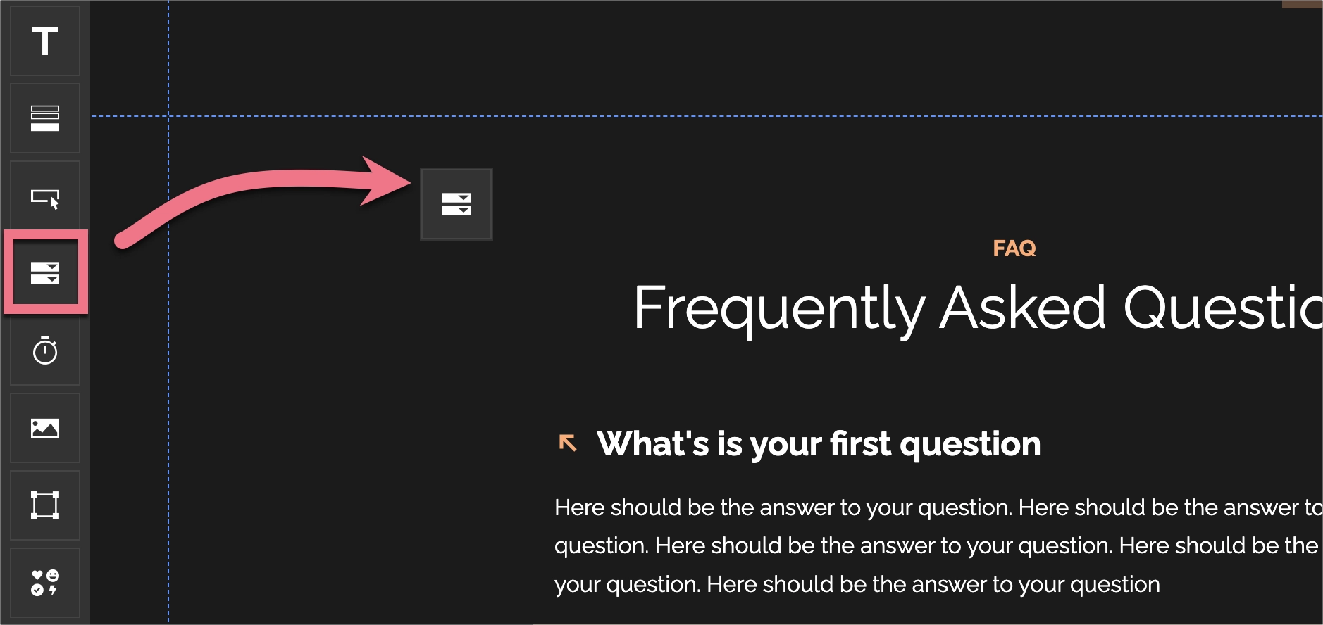
3. Use the Accordion widget for better readability
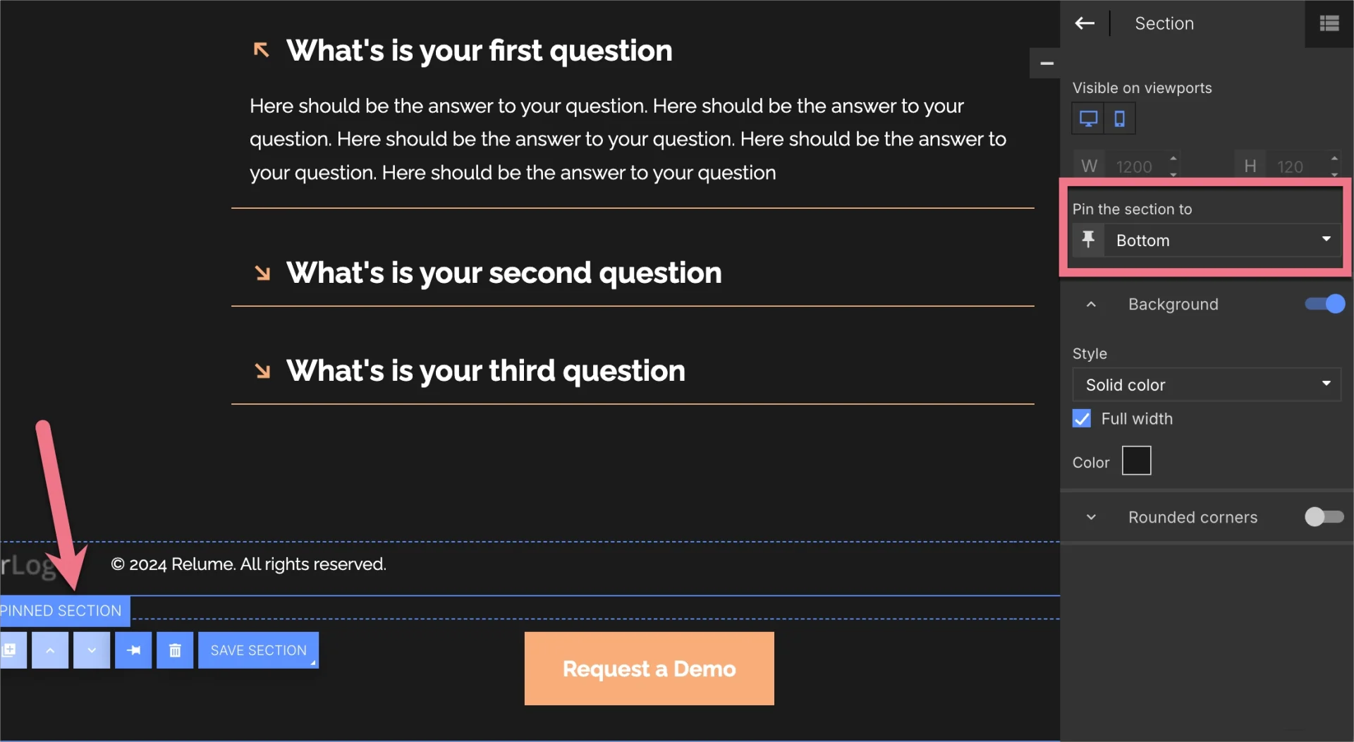
Display each FAQ using the Accordion widget in Landingi to avoid clutter. Collapsible sections keep the page clean while allowing users to expand only the answers they care about. You can create multiple accordions within each category and style them to match your brand’s look.
4. Write short, clear answers
Keep every answer direct and easy to understand. Use plain language and avoid technical jargon unless it’s explained. Each response should answer the question fully without unnecessary detail. Short paragraphs improve readability – especially on mobile devices.
Let AI craft your landing page text—clear, sharp, and ready to convert.
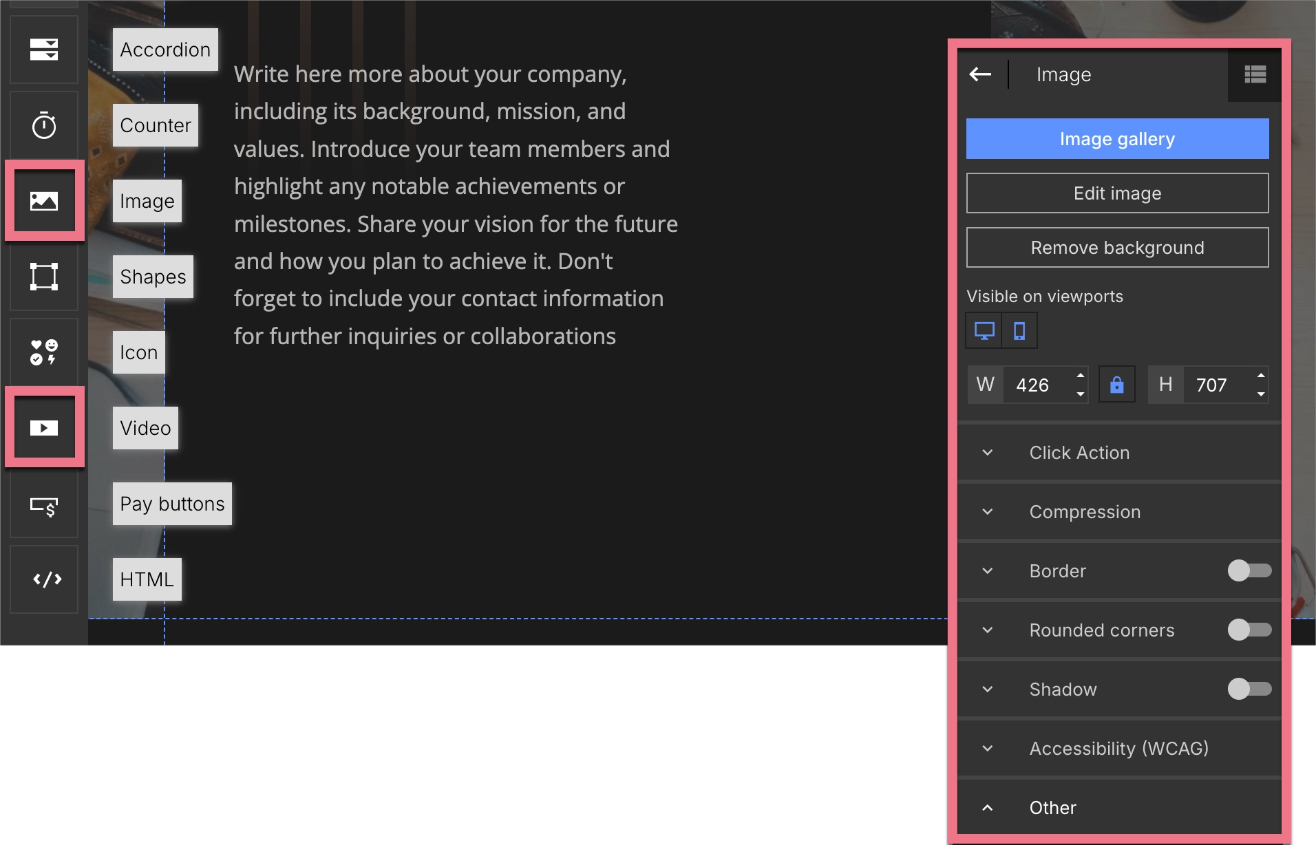
5. Add helpful visuals and links
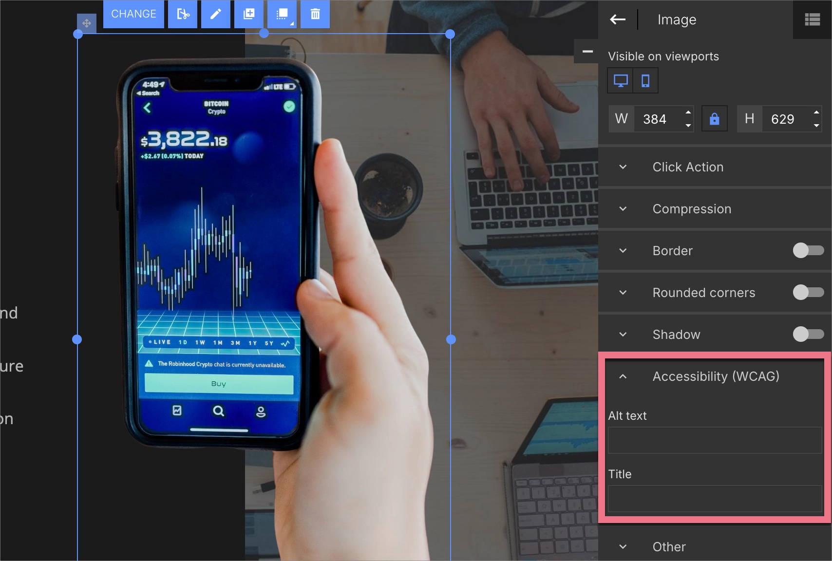
Make your FAQ answers more helpful by embedding videos, screenshots, or diagrams. Use the Image and Video widgets in Landingi to add multimedia that clarifies complex topics. Link to product pages, tutorials, or support articles to help users explore further.
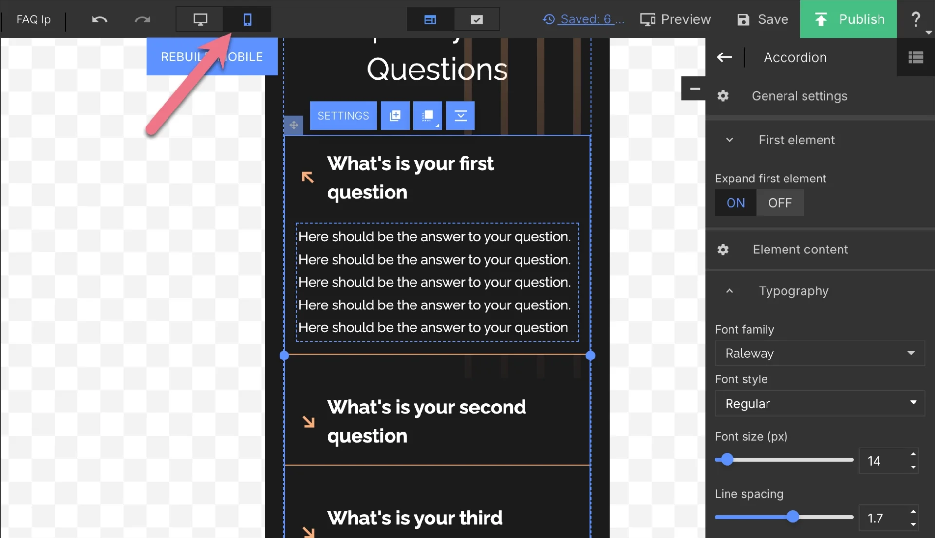
6. Set up mobile-friendly formatting
Use Landingi’s Mobile View to fine-tune how your FAQ landing page appears on smaller screens. Check that fonts are legible, buttons are easy to tap, and accordion elements function smoothly. A mobile-optimized FAQ page improves user experience and reduces bounce rates.
7. Add strategic CTAs
Use your FAQ landing page to drive conversions by placing CTA buttons where users may need to take the next step. Add buttons after answers, at the end of each section, or in a sticky footer. Link to pricing pages, sign-up forms, or contact pages, and style your CTAs consistently using Landingi’s Button widget.
8. Optimize for SEO
Incorporate relevant keywords naturally into your FAQ questions and answers. Use Landingi’s built-in SEO tools to set custom titles, meta descriptions, image alt text, and structured content. SEO optimization helps your FAQ landing page rank in search results and attract organic traffic.
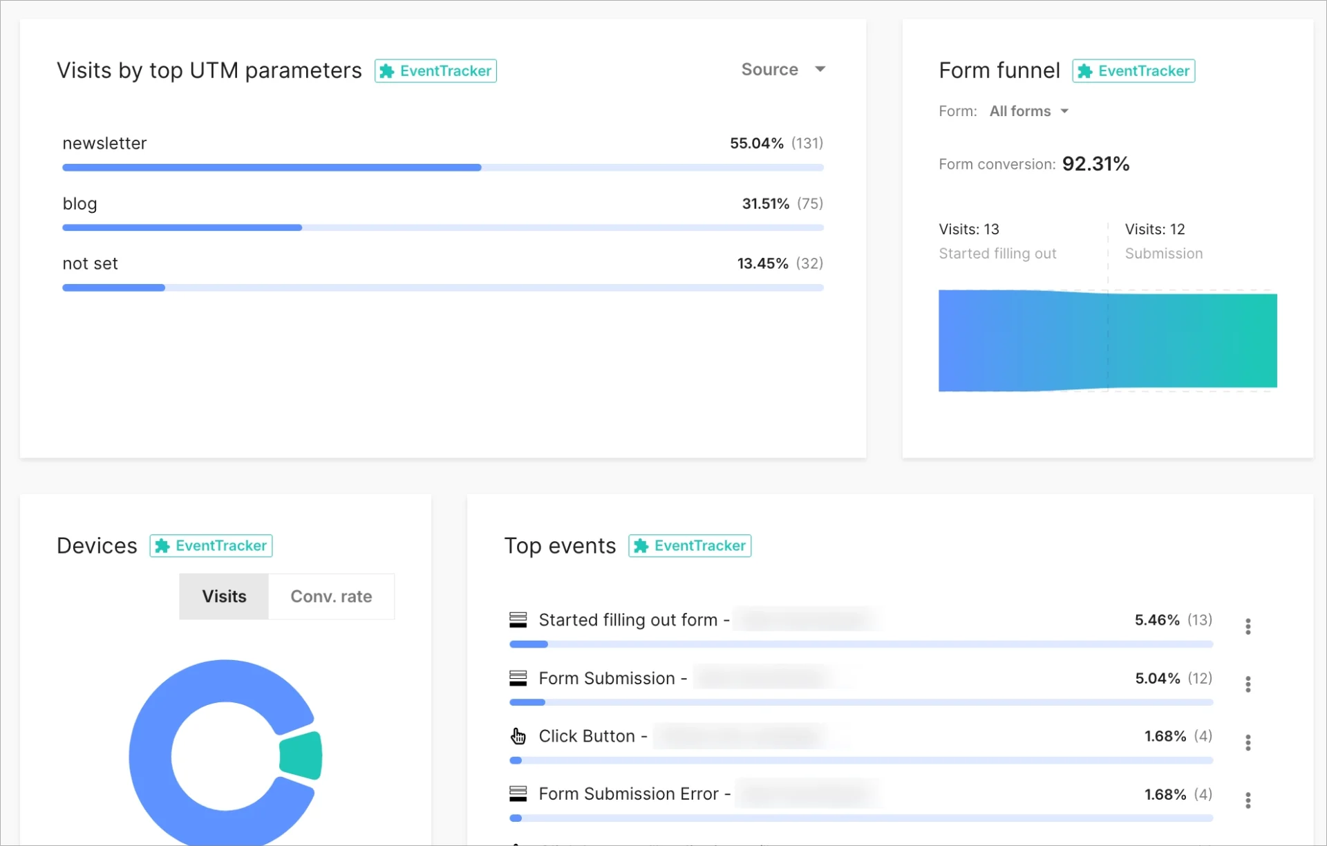
9. Track performance and keep improving
After publishing your FAQ landing page, use Landingi’s EventTracker to see which questions get the most engagement. Combine these insights with form data and feedback to identify gaps. Run A/B tests on different FAQ layouts or headings to learn what converts best, and update your page based on results.
What Is a FAQ Landing Page?
A FAQ landing page is a dedicated webpage that answers frequently asked questions about a product, service, or organization. This type of landing page is designed to provide clear, concise answers to help users quickly find the information they need. FAQ landing pages are typically structured in an organized way, often using categories or collapsible sections, to reduce friction during browsing.
A well-structured FAQ landing page addresses common concerns before they become barriers to conversion.
FAQ landing pages are also valuable from an SEO perspective. When the questions and answers include relevant keywords and are properly structured, the page becomes easier for search engines to index. This increases the likelihood that the FAQ landing page appears in organic search results and attracts high-intent traffic to the site.
Turn questions into conversions with a high-impact FAQ landing page.
What Is the Best Landing Page Builder for FAQ Landing Pages?
The best landing page builder for creating FAQ landing pages is Landingi – a no-code platform that lets you build standalone FAQ pages or add FAQ sections to existing landing pages with a simple drag-and-drop editor. With over 400 free templates, you can start from a design that fits your brand and customize it quickly – without needing a developer.
Landingi helps organize FAQ content with its built-in Accordion widget, which displays questions in collapsible sections. This format keeps the FAQ landing page clean and easy to scan, allowing users to click and expand only the answers they care about. You can also divide questions into categories and enhance your answers with visuals such as images, diagrams, or videos.

Landingi offers an A/B testing tool that lets you test different FAQ layouts or wording to see what converts better. With EventTracker, you can monitor visitor behavior – such as which questions are viewed most often or where users drop off – and update your FAQ content based on real data.
For added support, Landingi’s form builder lets you place contact forms anywhere on the page. Visitors who don’t find their answer in the FAQ can easily reach out, improving customer service and lead generation. Landingi also includes a suite of AI-powered tools to speed up the creation of FAQ landing pages. You can generate or rewrite content, create SEO metadata, remove image backgrounds, translate pages automatically, or build entire FAQ pages using the AI-powered Composer.
With its flexible design features, integrated analytics, and automation tools, Landingi provides everything you need to create a clean, fast, conversion-focused FAQ landing page.
No code, no hassle—just smart, stunning FAQ pages that do the talking for you.
How Can I Optimize My FAQ Landing Page for Higher Conversion Rates?
To boost conversions on your FAQ landing page, focus on clarity, usability, and strategic engagement. Use a clean, organized layout with grouped questions, accordion sections, and a search bar to help users find answers quickly. A simple design reduces friction and keeps the content easy to scan.
Place strong, relevant CTAs near key answers – such as directing users to pricing pages, sign-up forms, or support. Treat your FAQ page as a conversion path, not a dead end. Track user behavior with tools like Landingi’s EventTracker to see which questions get clicks. Use A/B testing to refine wording, layout, or CTA placement based on what performs best.
Use EventTracker to discover which questions get clicks—and which get ignored.
Build trust by adding customer quotes, reviews, or links to case studies – especially near answers that address objections. These elements help reassure visitors and support decision-making. Additionally, ensure mobile responsiveness by optimizing font sizes, spacing, and touch-friendly buttons. Most visitors expect seamless navigation on phones.
For better search visibility, include relevant keywords in your questions and answers, and optimize SEO titles, meta descriptions, alt tags, and structured data. Well-written FAQs can attract organic traffic and bring in high-intent users.
What Are the Key Elements of an Effective FAQ Landing Page?
An effective FAQ landing page combines clarity, structure, and strategy to help users find answers quickly and take action confidently. The following elements are essential to making your FAQ page both useful and conversion-friendly:
- Clear and concise language. Write answers that are short, direct, and easy to understand. Avoid jargon unless absolutely necessary, and explain technical terms when used. The goal is to make each answer quick to scan and simple to absorb.
- User-friendly layout. Organize questions into logical categories, use accordion sections to reduce visual clutter, and include a search bar to improve navigation. A clean structure helps users find what they need without friction.
- Mobile responsiveness. Ensure the FAQ landing page displays correctly on phones and tablets. Adjust font sizes, spacing, and button placement for smaller screens to deliver a smooth mobile experience.
- Visual appeal. Maintain a clean, branded design with consistent typography, colors, and spacing. Use white space to improve readability and prevent the page from feeling crowded or overwhelming.
- Comprehensive coverage. Include the most frequently asked and most relevant questions for your audience. Make sure each answer provides meaningful, actionable information that supports the user’s next step.
- Call to Action (CTA). Place CTA buttons naturally throughout the FAQ page – below answers, between sections, or in the footer. Use these buttons to guide users to key actions such as signing up, booking a demo, or contacting support.
- Visuals. Enhance complex answers with images, short videos, or infographics. Visual content can speed up understanding and make the page more engaging for different learning styles.
From accordion menus to CTA buttons—build a seamless experience that keeps users engaged and informed.
What Are the FAQ Landing Page Best Practices?
The most effective FAQ landing pages follow three core best practices: selecting questions based on real data, structuring the content in a logical flow, and presenting answers in varied formats. These techniques help businesses meet user expectations, improve clarity, and support higher engagement and conversions.
1. Choose questions based on data
Analyze customer support tickets, live chat logs, sales conversations, and product reviews. Use analytics tools to identify top-performing content, popular search terms, and recurring user queries. Focus on questions with high search volume or those your audience frequently asks. Data-driven question selection ensures your FAQ landing page addresses real concerns and is more relevant.
2. Structure the FAQ in a logical flow
Group questions into clear categories such as “Getting Started,” “Billing,” or “Troubleshooting.” Within each category, arrange questions from basic to advanced to create a natural learning path. Use accordion sections, icon-based topic boxes, or a two-column layout to keep navigation smooth and intuitive. A clear structure reduces confusion and helps users find answers with minimal effort.
3. Use multiple answer formats
Adapt your answers to fit the question type and user needs. Use short, direct responses for simple topics, and write detailed explanations for more complex issues. Support your answers with visuals, such as screenshots, videos, or diagrams, to improve understanding. Present information using bulleted lists, numbered steps, or comparison tables when appropriate. Varying your format improves readability and makes your FAQ landing page more accessible to different learning styles.
Stop guessing, start building. Create high-performing FAQ sections with intuitive drag & drop tools.
What Is the Average FAQ Landing Page Conversion Rate?
The average landing page conversion rate across industries is approximately 5.89%, according to HubSpot data. While FAQ landing pages primarily aim to inform, they can also drive conversions by dispelling doubts, addressing objections, and guiding users to take action.
Since FAQ landing pages serve different purposes, ranging from lead generation to post-purchase support, the 5.89% benchmark provides a useful starting point for setting expectations. You can use this figure as a reference to evaluate performance and identify opportunities to improve page layout, content, or calls to action.
By treating the FAQ landing page as a conversion tool – not just a help resource – you can measure success more accurately and prioritize ongoing optimization.
Build Informative FAQ Landing Pages with Landingi
A well-crafted FAQ landing page improves user experience, builds trust, and supports conversions. The FAQ page examples in this guide show how thoughtful FAQ section design can reduce friction and guide users toward action. Let these examples inspire your own approach – use them as a starting point to design an FAQ landing page that informs, engages, and converts.
Unlike CMS platforms, which often require extra tools or coding, Landingi lets you build and customize FAQ pages with drag-and-drop ease. With 400+ templates, Accordion widgets, and built-in optimization tools, Landingi gives you full control over your FAQ page design, layout, and performance.
Try Landingi now – with new insights and examples as your guide, create an FAQ page that truly supports your business goals.


