

A law firm landing page is a focused web page designed to drive one specific action, such as booking a consultation or contacting an attorney. While the average landing page conversion rate is 5.81%, according to HubSpot, case studies from On The Map Marketing show that a well-targeted law firm landing page can reach 8.33%, proving the impact of a clear, single-focus design.
If you run paid campaigns in Google Ads, creating a dedicated law firm landing page in a tool like Landingi allows you to launch and optimize pages without coding or CMS limitations. Features such as drag-and-drop editing and A/B testing make it easier to align landing pages for lawyers with specific keywords, audiences, and conversion goals.
In this article, you will see real examples of landing pages for lawyers and learn what makes them effective. The best pages use direct, persuasive CTAs, highlight client results as social proof, and work flawlessly on mobile devices. These principles apply whether you are building a personal injury campaign page or a court landing page tailored to a specific legal service.

21 Best Examples of Law Firm Landing Pages
The 21 best examples of law firm landing pages below show how theory turns into pages that convert visitors into clients. Each example highlights practical solutions you can apply to your own law firm landing page.
Review the picks, draw inspiration, and use the key takeaways to define your unique selling proposition. Strong landing pages for lawyers help position your firm clearly and support business growth.
#1 Law Office of Mohaimina Haque, PLLC
The Law Office of Mohaimina Haque, PLLC focuses on immigration law and related legal services. The landing page promotes consultations and highlights the firm’s core practice areas.
The hero section features a background video, a bold headline listing service areas, short supporting copy, and a clear CTA button. Social proof elements appear early, reinforcing credibility. Below, concise descriptions, testimonials, press mentions, and case results build trust, while repeated CTAs guide visitors toward contact.
At the bottom, the page includes contact details, a map, and a driving directions button, which supports local and mobile users.

What they did well:
- Clear, structured layout
- Background and introduction videos
- Concise, informative service descriptions
- Strong social proof (testimonials, press mentions, case results)
- Strategically placed CTA buttons
- Contact details with map and driving directions
What could be improved:
- Page load speed – Faster loading would reduce bounce rates and improve user experience across devices.
Pick a Business Page template and customize it with Landingi to promote your legal services – implement a straightforward CTA button, use informative content, and convince visitors with social proof elements to achieve the best results!

#2 Strategic Criminal Defence
Strategic Criminal Defence is a Canadian law firm specializing in criminal defense cases. The landing page promotes immediate legal support, including 24/7 consultations for individuals facing criminal charges.
The page builds trust from the first screen by highlighting case history and offering free consultations. A strong headline, visible lawyer profiles, testimonials, and bold “Free Consultation” buttons guide visitors toward quick contact. The dark color scheme and bold typography reinforce a serious, urgent tone aligned with criminal defense services.
Key information such as practice areas, success stories, and consultation details is clearly structured. The layout makes it easy for visitors to find relevant services and take action, especially on mobile devices.

What they did well:
- Strong trust signals (awards, media features, lawyer profiles)
- Clear and repeated “Free Consultation” CTAs
- Well-organized presentation of practice areas
- Professional, mood-aligned design
- Mobile-friendly layout
What could be improved:
- Page speed – Optimizing images and scripts would improve loading time and reduce bounce rates.
#3 Harbour Family Law
Harbour Family Law is a UK-based firm specializing in divorce, child custody, and financial settlements. The landing page targets individuals facing sensitive family disputes and promotes consultation as the primary action.
The design uses a calm color palette, elegant typography, and warm imagery to reflect empathy and professionalism. Clear sections outline key services such as divorce and financial matters, making navigation simple. Testimonials, accreditations, and team profiles strengthen credibility, while visible contact options support easy booking on both desktop and mobile.
The tone remains supportive and reassuring, which aligns with the emotional context of family law. The structure helps visitors quickly understand their options and take the next step.

What they did well:
- Emotion-focused design aligned with family law
- Clear breakdown of services
- Warm, empathetic messaging
- Strong trust elements (testimonials, accreditations, team profiles)
- Accessible contact options across devices
What could be improved:
- CTA visibility – Larger, more visually prominent buttons would make the next step clearer and more immediate.
#4 Antonoplos & Associates, Attorneys at Law
Antonoplos & Associates is a law firm offering services in areas such as criminal defense and civil litigation. The landing page promotes direct consultations and emphasizes the firm’s experience and accessibility.
The hero section features a strong headline, a bold phone number, visible experience metrics, and a prominent CTA button leading to a request form. Informative sections introduce the legal team and outline practice areas, while testimonials and award badges reinforce credibility. A sticky sidebar with call and direction icons supports quick action, and the bottom contact form includes only essential fields to reduce friction.
The layout is clear and action-oriented, making it easy for visitors to contact the firm from any section of the page.

What they did well:
- Intuitive and structured layout
- Sticky sidebar with quick action buttons
- Strong social proof (testimonials and awards)
- Visible experience metrics
- Clear attorney team and practice area sections
- Simple, low-friction contact form
What could be improved:
- Page length – Additional elements such as events or blog content may distract users from the main consultation goal.
The Meet Developer landing page template can be a great pattern for creating a high-converting lawyer landing page. Upload your professional picture, create a unique selling proposition, and use numbers showcasing your experience to encourage visitors and drive high conversion rates.

#5 Legalmiga
Legalmiga is a law firm serving Latina women facing immigration and related legal challenges. The landing page promotes consultations while positioning the firm as supportive, culturally aware, and community-focused.
The headline clearly defines the target audience, and the tone remains warm and empowering throughout the page. Bold colors, personal imagery, and confident typography create an approachable experience. The founder’s story is prominently featured to build emotional connection, and testimonials from clients reinforce trust.
The structure supports clarity while maintaining a strong personal brand identity. The page prioritizes relatability and accessibility, including bilingual content that expands reach.

What they did well:
- Clear audience targeting from the first headline
- Founder’s story as a strong trust element
- Warm, welcoming visual identity
- Client testimonials that reinforce credibility
- Bilingual content for accessibility
What could be improved:
- CTA variation and visibility – More diverse and visually prominent CTA phrases could guide users more effectively.
- Mobile spacing – Refining layout and spacing on smaller screens would improve usability.
- Accessibility – Improving text contrast and screen reader optimization would increase usability.
#6 Mike Mandell
Mike Mandell, known as Law By Mike, is a personal injury attorney who combines legal services with a strong social media presence. The landing page promotes direct contact options while highlighting his brand as both lawyer and digital creator.
The design is bold and modern, featuring short videos, media mentions, and visible social media metrics. His TikTok and Instagram presence is showcased prominently to build immediate credibility with younger audiences. Clear CTAs such as “Call Mike,” “Text Mike,” and “Email Mike” simplify contact and reduce friction.
The page positions personality as a competitive advantage. Fast load times, vibrant visuals, and interactive elements support engagement and align with Millennial and Gen Z expectations.

What they did well:
- Strong personal branding throughout the page
- Visible social proof (media features and social following)
- Early use of short-form video content
- Clear, action-oriented CTAs
- Modern, fast-loading design
What could be improved:
- Service clarity – More detailed breakdowns of practice areas would clarify the full scope of legal support.
#7 Sophie Alcorn
Alcorn Immigration Law, led by Sophie Alcorn, focuses on U.S. immigration services for entrepreneurs, startups, and technology professionals. The landing page promotes consultations while positioning the firm as innovative, experienced, and client-focused.
The headline emphasizes success and opportunity, aligning with ambitious founders and global talent. The design uses soft colors, professional photography, and concise messaging to balance authority with approachability. Awards, media features, and expert content reinforce credibility, while well-placed CTAs guide visitors toward booking a consultation.
The page targets a clearly defined audience and maintains a consistent, polished tone throughout.

What they did well:
- Clean, professional design
- Clearly defined target audience (founders and tech professionals)
- Strong authority signals (awards and media mentions)
- Strategic and natural CTA placement
What could be improved:
- Copy length – Shortening some paragraphs would improve scannability for busy professionals.
#8 Jefferson Fischer
Jefferson Fischer is a trial lawyer and communication expert focused on conflict resolution and leadership messaging. The landing page promotes his personal brand, positioning him as a guide and educator rather than highlighting credentials first.
The page opens with strong headlines, a conversational tone, and a clean, minimalist layout. Professional portraits and a clear mission statement reinforce authenticity, while sections outlining his philosophy and background build connection. CTAs appear throughout the page, encouraging visitors to explore content, follow on social media, or engage further with the brand.
The structure prioritizes personality and clarity over traditional legal formality. The result is a page that feels approachable while maintaining professional credibility.

What they did well:
- Strong personal branding from the first section
- Clean, minimalist design
- Authentic and conversational tone
- Strategic, non-intrusive CTAs
What could be improved:
- Client testimonials – Adding case-related or client stories would strengthen credibility.
- Video content – A short welcome video could enhance connection and engagement.
#9 Koonz McKenney Johnson & DePaolis LLP
Koonz McKenney Johnson & DePaolis LLP is a law firm specializing in personal injury cases. The landing page focuses on attracting injury victims seeking a free consultation.
The hero section features a background video, a strong headline, and a prominent CTA offering a free consultation. A separate button links to a short firm introduction video, adding transparency. Below, the page clearly outlines practice areas, allowing visitors to quickly find relevant legal services.
The layout supports usability by organizing information in a structured and easy-to-scan format. Clear navigation between service sections helps visitors understand whether the firm fits their case.

What they did well:
- Clear focus on personal injury specialization
- Background and introduction videos
- Strong headline with free consultation CTA
- Well-structured practice area breakdown
What could be improved:
- Content density – Shortening some sections could improve scannability and speed up decision-making.
Create a high-converting landing page that serves with its usefulness – choose the Lawyer Council template from Landingi, use AI Assistance to create persuasive yet informative copy, and allow visitors to contact you with a simple form.

#10 Chukwuma Law Group
Chukwuma Law Group handles personal injury and criminal defense cases. The landing page promotes immediate legal assistance and positions the firm as strong, experienced, and results-driven.
The hero section opens with a bold headline, “Fight for You,” supported by a navy and gold color scheme that reinforces authority. Awards, case results, and testimonials appear early to establish credibility. Clear practice area sections and visible CTAs such as “Get Help Now” guide visitors toward contacting the firm, while the mobile layout maintains structure and clarity.
The page balances strong branding with usability. Trust elements are integrated without overwhelming the design, and the call-to-action remains visible throughout.

What they did well:
- Prominent trust signals (awards, case results, testimonials)
- Strong, consistent branding
- Clear practice area navigation
- Well-placed, action-focused CTAs
- Mobile-optimized layout
What could be improved:
- Personal connection – Adding a short founder story or team introduction could strengthen emotional engagement.
#11 McKinley Irvin Family Law
McKinley Irvin is a family law firm handling divorce, custody, and complex domestic cases. The landing page promotes consultations while positioning the firm as experienced and supportive.
The headline, “We Protect What You Value Most,” sets a protective and empathetic tone. Testimonials and awards appear early to reinforce credibility. The layout guides visitors through services, attorney profiles, blog content, and FAQs, using soft colors and refined typography to create a calm, professional atmosphere.
The page combines authority with education, helping potential clients understand their options before contacting the firm.

What they did well:
- Strong, trust-focused branding
- Clear specialization in family law
- Prominent testimonials and awards
- Educational resources (blog and FAQs)
- Calm, supportive visual design
What could be improved:
- Content length – Reducing scroll depth would improve clarity and focus.
- CTA visibility – Increasing button contrast would make actions more noticeable.
#12 Friedman Law Firm
Friedman Divorce & Family Law focuses on complex, high-asset divorce cases. The landing page targets high-net-worth individuals seeking strategic and discreet legal representation.
The design is minimalist, with bold headlines and refined typography that signal premium service. Messaging is precise and audience-specific, emphasizing expertise and discretion. Attorney portraits, recognitions, and press mentions appear early to establish authority, while streamlined navigation keeps attention on core services.
The structure supports clarity and exclusivity, aligning with the expectations of a high-end client base.

What they did well:
- Premium, minimalist visual identity
- Clearly defined target audience
- Strong credibility signals (portraits, recognitions, press)
- Focused, distraction-free navigation
What could be improved:
- Interactive elements – Adding video or downloadable resources could increase engagement.
- Personal connection – Including a short personal story could strengthen emotional trust.
#13 Lee Legal
Lee Legal is a law firm offering clearly defined legal services through a streamlined landing page. The page focuses on driving immediate contact, especially through phone inquiries.
The hero section features compelling headlines and multiple CTAs, including a large “Call Now” button placed above the fold in the top-right corner. Short practice area descriptions help visitors quickly confirm relevance. Testimonials, affiliations, and a professional photo near the inquiry form strengthen credibility and approachability.
The layout remains concise while delivering essential information. The structure supports fast decision-making, particularly for visitors seeking urgent assistance.

What they did well:
- Short, clear page structure
- Concise practice area descriptions
- Prominent “Call Now” CTA above the fold
- Strong inquiry form placement
- Trust signals (testimonials and affiliations)
- Professional, high-quality visuals
What could be improved:
- Page speed – Faster loading would improve user experience, especially on mobile devices.
Pick the Family Insurance template from Landingi’s gallery and customize it with its editor to promote your law firm – remember to answer your target audience’s needs and use a clear form to facilitate contacting your company.

#14 Johnson & Johnson Law Firm
Johnson & Johnson is an Ohio-based family law firm handling divorce, custody, and adoption cases. The landing page promotes consultations while emphasizing trust, experience, and personalized care.
The design uses soft blue tones, traditional typography, and family-centered imagery to create a calm and approachable atmosphere. Clear navigation links guide visitors to core practice areas, while testimonials and attorney bios build credibility. CTAs such as “Schedule a Consultation” are visible without feeling aggressive, and the mobile layout remains consistent and easy to use.
The structure supports clarity and local positioning, reinforcing the firm’s community-oriented brand.

What they did well:
- Clear and straightforward service structure
- Trust-focused, approachable design
- Strong local credibility elements
- Consistent mobile usability
What could be improved:
- Emotional storytelling – Adding video or detailed client stories could strengthen connection.
- CTA contrast – Increasing visual emphasis on buttons would improve click-through rates.
#15 Rocket Lawyer
Rocket Lawyer is an online legal services platform offering document creation, legal advice, and business support. The landing page promotes quick access to legal tools through a simplified, self-service model.
The hero section features bold headlines and a prominent search bar that directs users to documents or services. Clear categories such as business formation and personal legal matters reduce friction. CTAs like “Get Started” and “Start Your Document” are highly visible, while trust badges, testimonials, and partner logos reinforce credibility.
The layout prioritizes clarity and usability. Minimalist design and strong visual hierarchy help visitors take action without confusion.

What they did well:
- Simple and clear service categories
- Strong, action-oriented CTAs
- Prominent search functionality
- Visible trust signals (badges, testimonials, partners)
- Clean, user-friendly design
What could be improved:
- Customer case studies – Adding detailed success stories would strengthen trust and demonstrate real-world impact.
#16 Burnham Law Firm
Taylor & Burnham is a law firm focused on business and real estate law. The landing page promotes consultations while positioning the firm as a trusted advisor for protecting companies and investments.
The hero section presents a clear value statement supported by a prominent “Schedule a FREE Consultation” CTA. A muted, professional color palette reinforces authority, while short service descriptions and structured practice area sections guide visitors efficiently. Testimonials appear in expected locations, strengthening credibility without disrupting the flow.
The layout balances clarity and professionalism, making it easy for potential clients to understand services and take action.

What they did well:
- Clear value proposition in the hero section
- Prominent consultation-focused CTA
- Strong trust elements (testimonials and service details)
- Elegant, consistent visual identity
- Simple and intuitive navigation
What could be improved:
- Visual engagement – Adding short introduction or explainer videos could increase connection.
- Lead capture points – Including additional short forms throughout the page could improve conversions.
#17 Womac Law Firm
Edward J. Womac Jr. & Associates is a personal injury law firm representing accident victims. The landing page promotes free consultations and emphasizes a no-win, no-fee guarantee.
The headline “Put the Womac on’em” immediately communicates a bold and aggressive brand stance. Supporting copy such as “We Win or You Pay Nothing” reinforces confidence and reduces financial hesitation. Practice areas, client wins, testimonials, and attorney photos are clearly displayed, while repeated “Free Consultation” CTAs encourage immediate contact.
The page combines strong emotional messaging with visible proof elements. The structure supports urgency and motivates visitors to take action quickly.

What they did well:
- Memorable, high-impact headline
- Clear no-win, no-fee guarantee
- Strong emotional appeal for accident victims
- Prominent and repeated consultation CTAs
- Visible testimonials and case results
What could be improved:
- Text hierarchy – Improving visual emphasis on key messages would enhance scannability and guide users more efficiently.
#18 Cosse Law Firm
Cossé Law Firm represents personal injury clients, particularly car accident victims. The landing page promotes free consultations and emphasizes a no-fee-unless-you-win policy.
The headline “Car accident? Count on Cossé” speaks directly to injured visitors and defines the firm’s focus immediately. A bold red and blue color scheme reinforces urgency and trust, while large attorney photos add approachability. Service areas, case results, and testimonials are clearly structured, and prominent “Free Consultation” CTAs guide users toward contact.
The layout combines direct messaging with visible proof elements. The structure supports fast decision-making for visitors seeking immediate legal help.

What they did well:
- Direct, audience-specific headline
- Strong and consistent visual branding
- Clear, prominent CTAs
- Client-centered layout with testimonials
- Visible no-fee guarantee
What could be improved:
- Image quality – Higher-resolution team photos would enhance professionalism and visual polish.
#19 Grungo Law
Grungo Law is a personal injury firm focused on serious accident and injury cases. The landing page promotes free consultations and highlights case results to attract high-intent leads.
The hero section features bold headlines, professional team photos, and a consultation form placed above the fold. Key assurances such as “No Fee Unless We Win” are clearly visible. Testimonials, awards, and case outcomes reinforce credibility, while the navy, white, and gold palette supports a strong, authoritative image.
The structure prioritizes trust and immediate contact. Multiple CTAs provide clear paths to schedule a consultation without unnecessary steps.
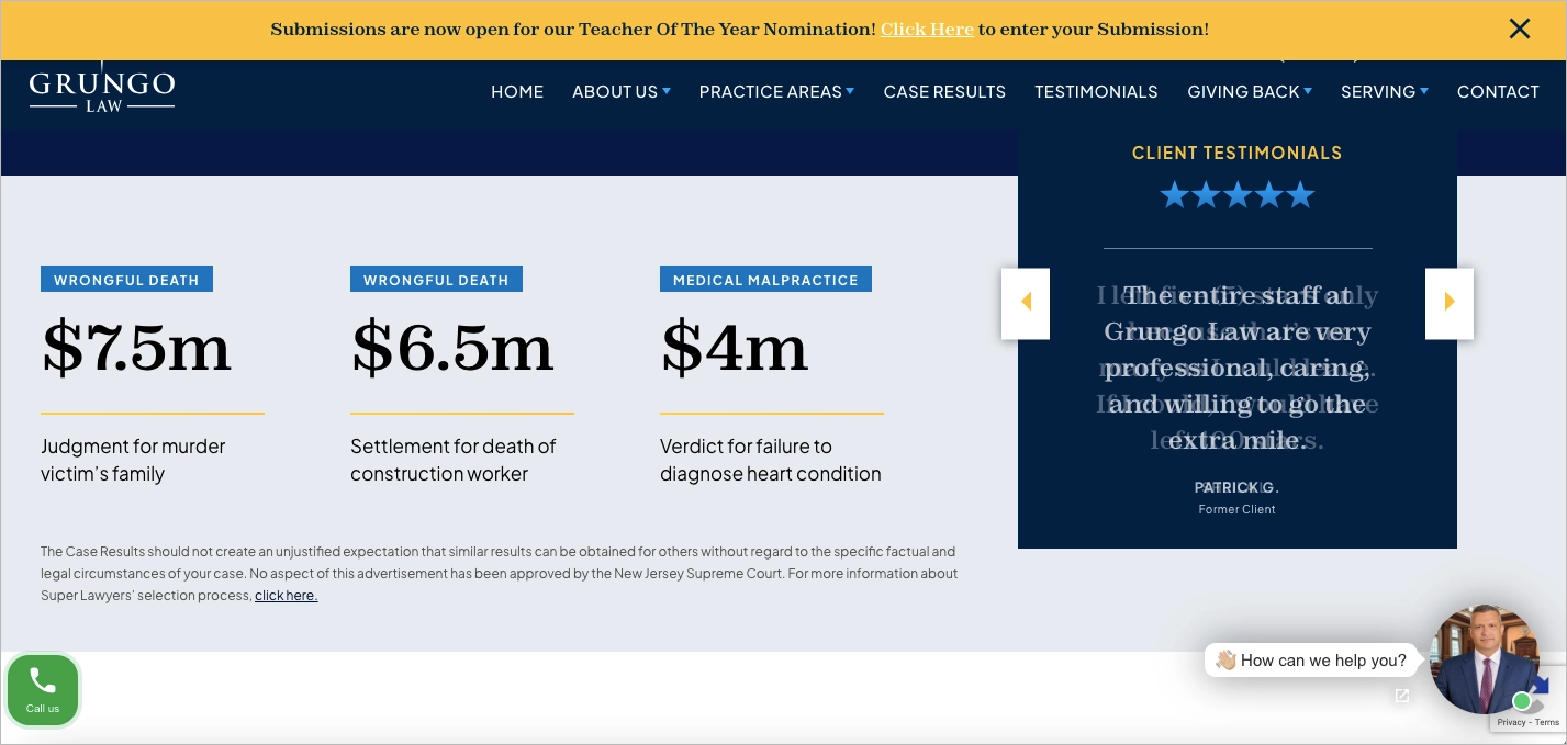
What they did well:
- Strong trust elements (awards, testimonials, case results)
- Above-the-fold consultation form
- Clear no-fee guarantee messaging
- Professional, authority-driven design
- Multiple visible CTAs
What could be improved:
- Page speed – Optimizing images and assets would improve load time.
- Mobile form usability – Simplifying input on smaller screens could increase conversions.
- Visual quality – Updating select images to higher resolution would enhance polish.
#20 Farrer & Co
Farrer & Co is a long-established UK law firm serving individuals, businesses, and institutions. The landing page highlights the firm’s heritage, sector expertise, and premium positioning.
The design uses muted colors, refined typography, and high-quality photography to project authority. Service sectors, insights, and case studies are easily accessible from the main view, allowing visitors to navigate based on their needs. The structure supports exploration while maintaining a calm and professional tone.
The page reinforces reputation through subtle brand storytelling and consistent visual identity. The user experience feels structured and polished across key sections.

What they did well:
- Elegant, authority-driven design
- Clear navigation by service sector
- Subtle integration of legacy and expertise
- High-quality visuals and typography
- Structured, intuitive user flow
What could be improved:
- CTA clarity – Adding more visible action buttons such as “Speak to an Expert” would guide conversions.
- Mobile refinement – Improving section resizing and scroll behavior would enhance the mobile experience.
#21 ER Law
ER Law provides legal services in three core practice areas and offers bilingual support in English and Spanish. The landing page promotes consultations through a strong promise-driven headline that immediately encourages contact.
The hero section features a professional background image, concise copy, and clear alternative CTAs, including options for Spanish-speaking visitors. Dedicated sections introduce the attorney team and outline practice areas with buttons leading to detailed descriptions. Reviews, association badges, and visible contact details for two office locations, including a map and “Call Now” button, reinforce credibility and usability.
The structure combines information and accessibility. Language selection and multiple contact paths make the page functional for a broader audience.

What they did well:
- Clear, structured layout
- Compelling, promise-focused headline
- Bilingual CTAs and language selection
- Strong trust signals (reviews and association badges)
- Visible “Call Now” button in a strategic position
- Contact details with map and multiple office locations
What could be improved:
- Experience metrics – Adding quantifiable data such as years in practice or number of cases handled would strengthen authority and persuasion.
Promote your legal services effectively—create a landing page with Landingi!
How Do I Create a Law Firm Landing Page?
To create a law firm landing page that generates client inquiries, define one clear goal, such as booking consultations or collecting case evaluations. Identify the target audience and tailor the message to their legal problem. Focused positioning improves relevance and conversion rates.
You can build the page in Landingi using a drag-and-drop editor without coding or CMS limitations. Add a strong headline, professional visuals, concise service descriptions, and visible trust elements such as certifications or testimonials. Include one primary CTA, such as “Schedule a Consultation,” supported by a short contact form to capture leads.
Below, you’ll find a 7-step guide to building a high-converting law firm landing page.
Step 1. Define Your Goal and Audience
Start by defining one primary objective for the law firm landing page, such as scheduling a free consultation or generating case evaluation requests. A single goal determines the headline, CTA, form structure, and overall layout. Clear focus prevents mixed messaging and improves conversion rates.
Next, identify the exact audience you want to reach. A first-time personal injury client requires reassurance and urgency, while a business owner seeking ongoing legal counsel expects expertise and stability. Understanding the visitor’s situation allows you to adjust tone, proof elements, and service details to match their expectations.
Ready to grow your law practice? Build a high-converting landing page with Landingi!
Step 2. Choose a High-Converting Template
Landingi has over 400 ready-made templates built to help you get more clicks and leads — fast. Whether you’re promoting divorce services, business contracts, or free legal consultations, you’ll find a layout that fits. Just hit “Create new landing page” and pick a template that feels clean, trustworthy, and professional — all things people look for when choosing an attorney.

You can also start from a blank page, upload a custom design, or generate a layout using Composer. Customize the page with your branding, attorney bios, practice areas, testimonials, and FAQs using the drag-and-drop editor. If you create multiple landing pages for different legal services, Smart Sections help maintain consistent headers or footers across all versions.
Step 3. Craft Compelling Content
Write clear, client-focused copy that addresses the visitor’s legal problem. Use direct language and avoid complex legal terms unless necessary. The goal is to show understanding and position your firm as the solution.

Start with a headline that reflects the client’s situation, such as “Injured in an accident? Get legal help today.” Follow with short sections explaining your practice areas, experience, case results, or client outcomes. Specific proof builds confidence and increases the likelihood that visitors will contact your firm.
Step 4. Add Visual Appeal with High-Quality Images and Videos
Even in the legal world, first impressions matter — a lot. Clean, professional visuals can instantly build trust and make your landing page feel more credible. Use high-quality photos of your attorneys, your office, or even client meetings (with permission, of course) to give visitors a sense of who they’ll be working with.

You can also add a short video — maybe a welcome message from the lead attorney or a quick explainer about your services. Landingi’s built-in tools, like background remover, can help you keep things polished and distraction-free. Just make sure everything loads quickly — slow pages lose leads.
Step 5. Implement a Lead Capture Form with a Strong CTA
Your landing page needs to collect leads. That’s where a solid contact form comes in. Use Landingi’s form builder to create a quick, easy form that asks for just the basics: name, email, and phone number. The shorter it is, the more likely people are to fill it out.
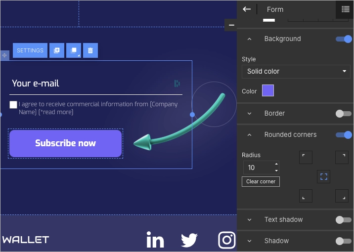
Right next to it, drop in a clear, action-driven CTA — something like “Book a Free Consultation” or “Talk to an Attorney Today.” Make sure the button stands out with bold colors and shows up more than once across the page, especially near the top and after key info.
Step 6. Add Interactive and Trust-Building Elements
People don’t hire a lawyer lightly — they want to know they can trust you. Add elements to your landing page that make visitors feel confident and keep them engaged. A short testimonial from a happy client, a badge showing your bar certification, or a “Featured In” logo if you’ve been mentioned in the media — all of these help build credibility fast.

You can also use simple pop-ups to promote limited-time offers, like free case evaluations or discounted consultations. And don’t forget to link your social media — it shows you’re active, transparent, and real.
Step 7. Optimize for Mobile and Publish with a Custom Domain
Many people search for legal help on their phones — often in stressful moments — so your landing page has to look and work great on mobile. Use Landingi’s mobile view editor to fine-tune the layout, adjust text sizes, and make sure buttons are easy to tap.

Before going live, connect your own domain — it makes your firm look more professional and keeps your branding consistent. Once everything’s published, keep an eye on how the page performs. Landingi’s built-in analytics and A/B testing tools make it easy to see what’s working — and tweak what’s not.

If you craft your law firm landing page in accordance with the above instructions, you can be sure it looks professional and effectively converts visitors into leads and clients.
See top law firm landing page examples—start building yours with Landingi!
What Is a Law Firm Landing Page?
A law firm landing page is a specific type of webpage crafted to convert visitors into leads or clients for a law firm, focused on a single goal, such as encouraging visitors to schedule a consultation, inquire, or sign up for a newsletter. This targeted approach is designed to minimize distractions and guide the visitor toward taking a desired action, using elements specifically chosen to appeal to the law firm’s prospective clients.
Such landing pages are crucial in a law firm’s online marketing strategy. They are the first point of interaction for many potential clients searching for legal assistance. These pages aim to build trust and persuade visitors of the firm’s expertise and value by providing relevant, concise information and a clear call to action. Tailored content that speaks directly to visitors’ needs can significantly enhance conversion rates, turning casual browsers into engaged leads.
Moreover, law firm landing pages are essential in segmenting and targeting various legal services and specialties. They allow firms to create focused campaigns that address specific legal issues or services, enabling a more personalized approach and engaging with different client groups. When a law firm’s landing page is well-designed and regularly optimized, it can significantly improve the effectiveness of digital marketing efforts in a competitive legal environment.
What Are the Key Elements of an Effective Law Firm Landing Page?
An effective law firm landing page combines key elements, like clear headlines and informative content, social proof, trust signals, and high–quality imagery, directing visitors‘ attention to a strong CTA and simple contact form. Get to know the essential elements that constitute a successful tech landing page, as outlined below:
1. Clear and compelling headline
A strong headline explains what the firm offers and who it helps. The message should communicate value immediately, such as the type of case handled or the benefit provided. Clear positioning reduces confusion and increases engagement.
2. Engaging subheadline
A subheadline expands on the main promise and adds context. It can mention experience, specialization, or a key advantage. Supporting detail encourages visitors to continue reading.
3. Prominent CTA
A visible CTA directs visitors to take action. Phrases like “Schedule a Free Consultation” or “Speak With an Attorney Today” set clear expectations. Placement above the fold and repeated throughout the page increases conversions.
4. High-quality imagery
Professional photos of attorneys or office spaces reinforce credibility. Visual consistency supports brand authority. Authentic images build stronger trust than generic stock photography.
5. Social proof
Client testimonials, case results, and reviews validate expertise. According to Unbounce, adding social proof can increase conversions by up to 34%. Real outcomes reassure potential clients and reduce hesitation.
6. Clear, informative content
Content should explain services, process, and benefits in plain language. Avoid excessive legal terminology. Clarity helps visitors understand how the firm can solve their specific problem.
7. Responsive design
The page must function smoothly on mobile devices and tablets. Responsive design ensures forms, buttons, and text remain easy to use on any screen. Mobile optimization directly impacts lead generation.
8. Contact form
A short form reduces friction and increases submissions. Ask only for essential information, such as name, phone number, and case type. Clear labeling and easy access improve usability.
9. Trust signals
Awards, bar associations, certifications, and media mentions strengthen authority. Displaying recognizable logos and credentials reinforces legitimacy. Strong trust indicators support decision-making.
When combined, these elements create a law firm landing page that converts visitor interest into consultation requests.
What Is the Best Law Firm Landing Page Builder?
The best law firm landing page builder is Landingi, a platform designed to create and optimize high-converting pages without coding. The builder combines an intuitive drag-and-drop editor with marketing-focused features tailored for lead generation. Legal professionals and marketing teams can launch pages quickly without relying on developers.
Landingi offers over 400 templates that can be adapted for different legal services, from personal injury to family law. After publishing, tools such as A/B testing and EventTracker help measure performance and identify improvements. Continuous testing supports higher conversion rates over time.
Additional features, including AI Assistance, customizable forms, pop-ups, and integrations, support both usability and marketing automation. The platform enables law firms to create, manage, and optimize landing pages efficiently while maintaining professional design and clear conversion paths.
Build a Law Firm Landing Page with Landingi
In a competitive legal market, a focused law firm landing page can significantly increase consultation requests. The page should communicate professionalism, authority, and clarity from the first screen. Strong design and persuasive copy create the foundation, but consistent optimization drives long-term results.
Using best practices inspired by high-performing law firm landing page examples, you can structure a page around one goal and one audience. In Landingi, drag-and-drop editing, A/B testing, and built-in forms allow you to launch and refine pages without developer support. Optimization features help align messaging, design, and SEO elements with measurable conversion goals.
With the right structure and tools, a standard page becomes a reliable client acquisition channel. You can start building and testing your law firm landing page in Landingi and improve performance over time through data-driven adjustments. Try Landingi now!


