
A mobile landing page is a dedicated page built specifically for smartphone users. A mobile landing page is designed to load fast, present a clear value proposition, and drive one focused action without friction. Over 62% of global web traffic now comes from mobile devices, according to StatCounter 2024, and users abandon pages that take longer than 3 seconds to load, as reported by Google Consumer Insights. Strong mobile landing page design is no longer optional – it directly impacts conversions and paid campaign performance.
If you run Google Ads or other paid campaigns, building a mobile landing page inside a traditional CMS often requires plugins, developer support, and manual optimization. Platforms like Landingi are built specifically for campaign pages, allowing you to create and test a mobile-friendly landing page without coding. With drag-and-drop editing, built-in A/B testing, fast hosting, and direct Google Ads integration, tools like Landingi help you launch and optimize high-performing mobile landing pages faster and more efficiently.
In this article, we review the 20 best mobile landing pages and explain what makes them effective. Each example shows how good mobile landing pages use speed, structure, and simplicity to guide users toward action. You will see practical mobile landing page design decisions that turn traffic into leads and customers.
20 Examples of Best Mobile Landing Pages
Take a look at the 20 examples of best mobile landing pages, which show how mobile responsiveness affects UX and increases conversions.
#1 Orange County Surgical Specialists
Orange County Surgical Specialists provide periodontal help – their mobile landing page, created by Landingi, was intended to show the essential services they offer patients and promote gum graft services.
A simple and straightforward design with all necessary information placed on the top of the page, a well-designed CTA button, and a simple form guarantee a seamless experience for visitors, encouraging them to ask professionals for help.

A mobile landing page is similar to a desktop one but differs in user experience, providing ease of use and transparency tailored to mobile devices.
Learn from this mobile landing page example:
- Clear layout
- Focused content with essentials on the top
- Well-designed CTAs
- Optimized visuals
Improvement areas for this mobile version:
- Speed index 4,6 sec – the page loads fast, but general speed index could be improved
- Too long content – some blocks are unnecessary in the mobile version
Ready to engage mobile users? Design your mobile landing page with Landingi!
#2 Uber
Uber’s mobile landing page is built around one clear action: requesting a ride in seconds. The headline “Request a ride for now or later” communicates value immediately, while the stacked location and destination fields make the form easy to complete on a small screen. The layout removes distractions and supports fast decision-making, which is essential in mobile landing page design focused on urgency.
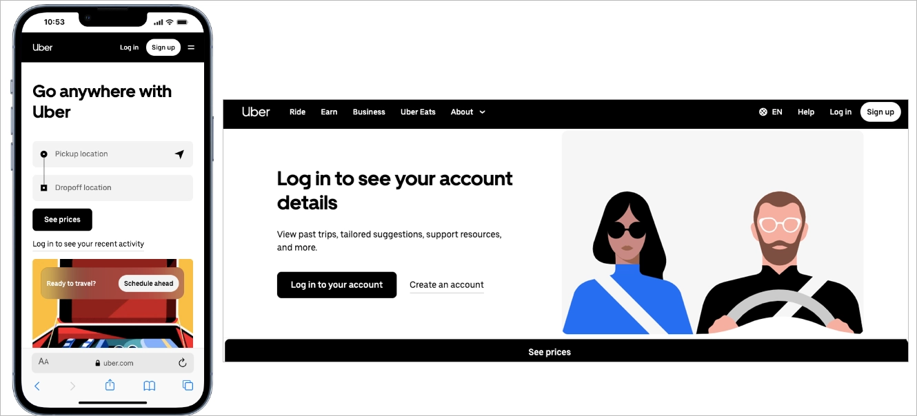
The CTA “See prices” is large, high-contrast, and placed exactly where a thumb naturally lands. Input fields are spaced for easy tapping, reducing friction and errors. Among the best mobile landing pages, Uber stands out because the entire mobile friendly landing page functions like a streamlined app interface – direct, intuitive, and conversion-focused.
#3 CBRE Poland
CBRE Poland is a Polish branch of consultancy services for commercial real estate. Their mobile landing page was created with the best landing page builder – Landingi, to deliver retail reports for their targeted audience.
Its layout corresponds to a desktop landing page, but the design is optimized for mobile devices with a single-column outline, well-placed strong CTAs, and shortened content.
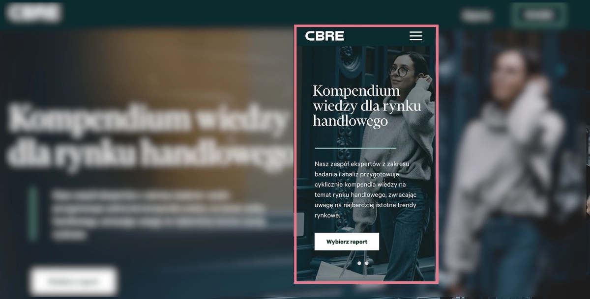
The mobile design includes high-quality visuals but ensures excellent navigation at the same to improve readability and affect high conversion rates.
Learn from this mobile landing page example:
- Clear, alternative CTAs
- High-quality visuals included
- Maximally focused content
- Simple opt-in form
Improvement areas for this mobile version:
- Lack of crucial benefits information on the top
- Speed index – even though the loading time isn’t too high, some elements of this mobile landing page could have been optimized better
See the best mobile landing page examples – build your own with Landingi!
#4 Canva
Canva’s mobile landing page uses a bold, question-based headline – “What will you design today?” – to immediately engage users on a small screen. The supporting subcopy explains the value in one sentence, highlighting AI-powered features without overloading the layout. Large typography, generous spacing, and strong contrast make the message easy to scan, which is essential in effective mobile landing page design.

The primary CTA, “Start designing,” is prominent and thumb-friendly, while alternative entry points like “Log in” remain visible but secondary. This hierarchy supports different user intents without creating friction. A visual preview of design categories below the fold reinforces what users can create, turning the mobile friendly landing page into a guided entry point rather than a static promo page.
Among good mobile landing pages, Canva stands out for balancing clarity and flexibility. The structure keeps the focus on one main action, while the visual layout makes exploration feel simple and controlled on mobile devices.
#5 Mindful Chef
Mindful Chef’s mobile landing page uses a vibrant, food-focused hero image to communicate freshness before users read a single line. The headline combines a clear benefit with immediate social proof, positioning the brand as “UK’s #1 Recipe Box” at the top of the screen. This structure supports mobile landing page design that delivers value and credibility within the first few seconds.

The CTA “Choose Your Recipes” is bold, high-contrast, and placed directly below the core message, making it easy to tap with one hand. A “Free Nationwide Delivery” badge adds a concrete incentive without overcrowding the layout. Below the fold, a visible Trustpilot rating with nearly 10,000 reviews reinforces trust quickly, which is essential for a high-converting mobile-friendly landing page.
Among good mobile landing pages, Mindful Chef stands out for combining strong visuals, concise benefits, and layered social proof in a clean, conversion-focused structure.
#6 Helix
Helix’s mobile landing page immediately defines its audience with the headline “Why Helix is the Best Mattress for Couples.” The message is specific, benefit-driven, and positioned inside a bold color block that dominates the small screen. This type of mobile landing page design reduces ambiguity and helps users instantly understand whether the offer is relevant to them.

The red CTA button “Find Your Match” is large, high-contrast, and centered for easy thumb interaction. The wording suggests personalization, which increases engagement while keeping the action simple. Supporting visuals of a couple on the mattress reinforce the target audience without adding clutter, keeping the mobile-friendly landing page visually focused.
Below the fold, the subheadline “Sharing a bed with someone isn’t easy” introduces a relatable problem. The structure moves from clear positioning to emotional connection, then toward solution framing. Among good mobile landing pages, Helix stands out for combining niche targeting, strong visual hierarchy, and tap-friendly design in a streamlined mobile experience.
#7 Loan Expert
The next example is a landing page offering loan consultancy services for individuals and companies. With Landingi, his owner created a landing page, also for mobile, where he encourages visitors to book a call and ask for help with choosing the best loan option.
A mobile landing page with shortened content, including essentials and catchy headlines, clear CTAs, and video content, is tailored for mobile users looking for smooth navigation.

A type of landing page that answers for struggles with a significant part of life, needs a bit more content with information than a simple product page – which requires specific design solutions. One of them is using video content to shorten the page length and give answers to concerns that may appear among users.
Learn from this mobile landing page example:
- Variety of content types
- Simple navigation
- Optimized visuals
- Strong, repeated CTAs
- Well-designed content structure
Improvement areas for this mobile version:
- Lack of sticky bars – it could simplify navigation and improve conversions if CTAs were kept on view within longer mobile landing pages
Explore mobile landing page best practices – create yours with Landingi today!
#8 Wix Studio
Wix Studio’s mobile landing page uses a short, high-impact headline – “Deliver brilliance. Smash deadlines.” – to immediately target busy professionals. The messaging is concise and benefit-driven, which aligns with mobile behavior where users scan quickly. This type of mobile landing page design prioritizes clarity over explanation, reducing cognitive load on small screens.
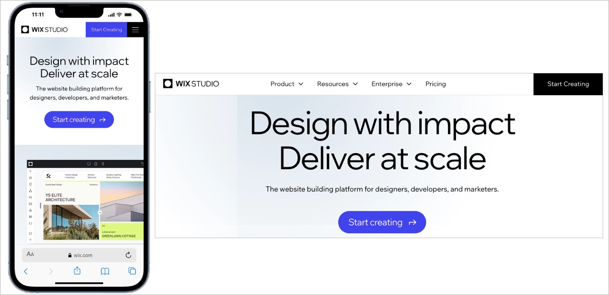
The black background creates strong contrast, making the bright “Start Creating” CTA highly visible and easy to tap. Button size, spacing, and subtle directional cues guide attention toward one primary action. Supporting copy highlights features like AI, full-stack capabilities, and multi-site management, but keeps the text structured and scannable. Among good mobile landing pages, Wix Studio stands out for combining bold visual hierarchy with a single, frictionless conversion path.
#9 Meow Meow Tweet
Meow Meow Tweet’s mobile landing page uses soft colors and generous spacing to create a relaxed browsing experience. The gentle purple background reduces visual strain, which is important in mobile landing page design, where overstimulation can increase bounce rates. The brand identity is communicated immediately through tone, color, and product visuals.
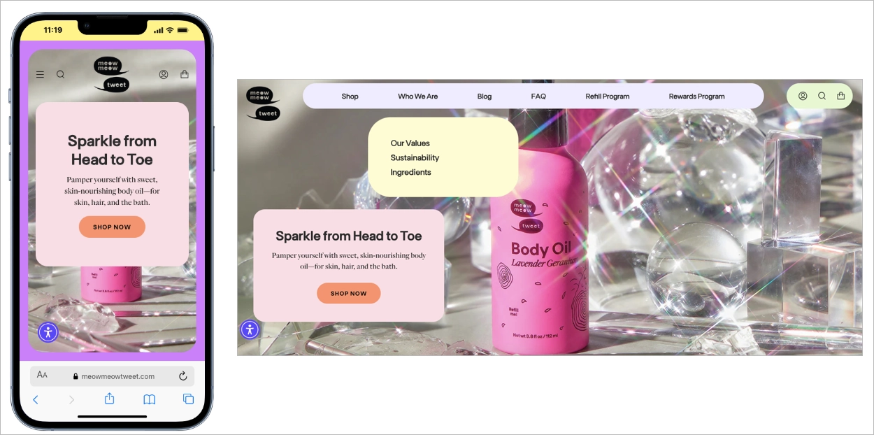
The layout follows a clean vertical flow, with clearly separated sections that guide users step by step. Product images are bright, natural, and optimized for fast loading, supporting performance on mobile devices. CTAs use soft shapes and friendly colors, encouraging interaction without aggressive sales pressure. Among good mobile landing pages, this example stands out for aligning visual calmness with conversion-focused structure.
#10 BeReal
BeReal’s mobile landing page uses extreme simplicity to match mobile behavior. The headline “Your daily dose of real life.” appears in large, high-contrast typography against a black background, making the message instantly clear on a small screen. This mobile landing page design removes secondary content and keeps attention on one core idea.
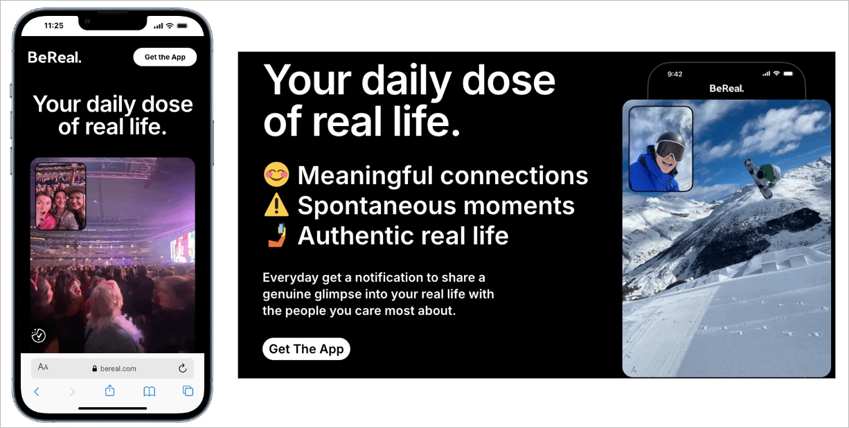
The primary CTA, “Get The App,” is placed at the top and remains visually distinct, guiding users toward immediate action. Instead of long explanations, the page relies on a single authentic image preview that reflects how the app works. This structure supports curiosity while maintaining clarity, which is effective for a mobile friendly landing page promoting an app download.
Among good mobile landing pages, BeReal stands out for reducing friction through minimal content and strong visual hierarchy. The page proves that when brand positioning is clear, a focused layout and one decisive CTA can drive action without additional persuasion layers.
#11 ClickUp
ClickUp’s mobile landing page manages large amounts of information without overwhelming the user. The layout breaks content into short, clearly separated sections with bold headlines and supporting visuals. This approach supports mobile landing page design that respects scanning behavior and reduces cognitive load on small screens.
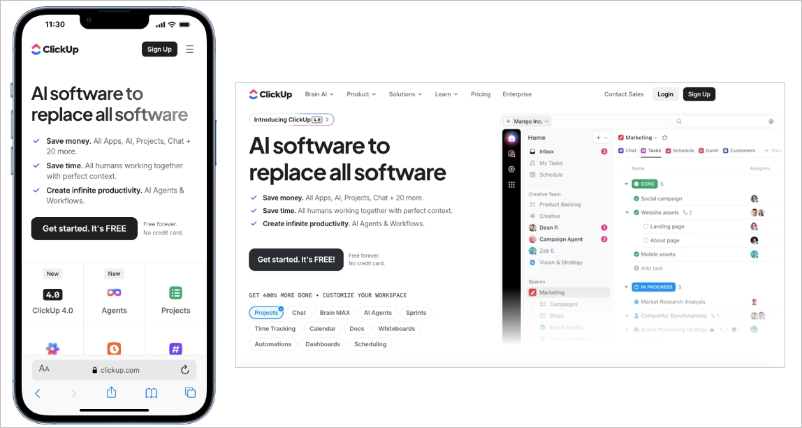
A sticky signup button remains visible as users scroll, keeping the primary conversion action within thumb reach at all times. This design choice shortens the path to action and increases conversion opportunities. Even with extensive product details, the mobile friendly landing page feels organized because content is layered and progressively revealed.
Among good mobile landing pages, ClickUp stands out for proving that depth and clarity can coexist. The page delivers comprehensive information while maintaining structure, readability, and a strong conversion focus optimized for mobile users.
#12 Atelier Redakcji Tekstu
Atelier Redakcji Tekstu is a Polish company that offers proofreading and text correction services. With Landingi, they have created a mobile landing page promoting services for students.
This project shows professional mobile optimization where navigation wins, all significant information is condensed into short content on the top, and the design corresponds with the desktop version.
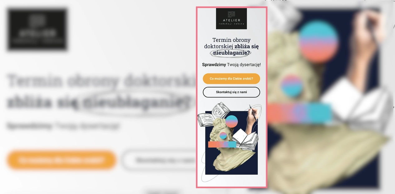
The call now button characteristic for mobile landing pages appears next to a simple opt-in form as the alternative for leaving an e-mail address. It’s one of the best ideas for increasing conversions on mobile devices – adding such a button to the desktop version is pointless. Still, for smartphone users, it simplifies the way to take a desired action: instead of copying the phone number, they can simply click the button to start the call.
Learn from this mobile landing page example:
- Call now button included
- Speed index 3.4 sec
- Excellent navigation
- Content with essentials
- Optimized high-quality visuals
Improvement areas for this mobile version:
- Shorten review box – it could be condensed e.g. into a carousel, to shorten up the page length
Improve your mobile conversions – design a responsive landing page with Landingi!
#13 Teachable
Teachable’s mobile landing page promotes a free webinar using a complete sales structure adapted to small screens. The page includes pain points, benefits, instructor credibility, testimonials, FAQs, and clear CTAs, but each section is condensed into short, scannable blocks. This mobile landing page design keeps momentum high without overwhelming users with dense text.
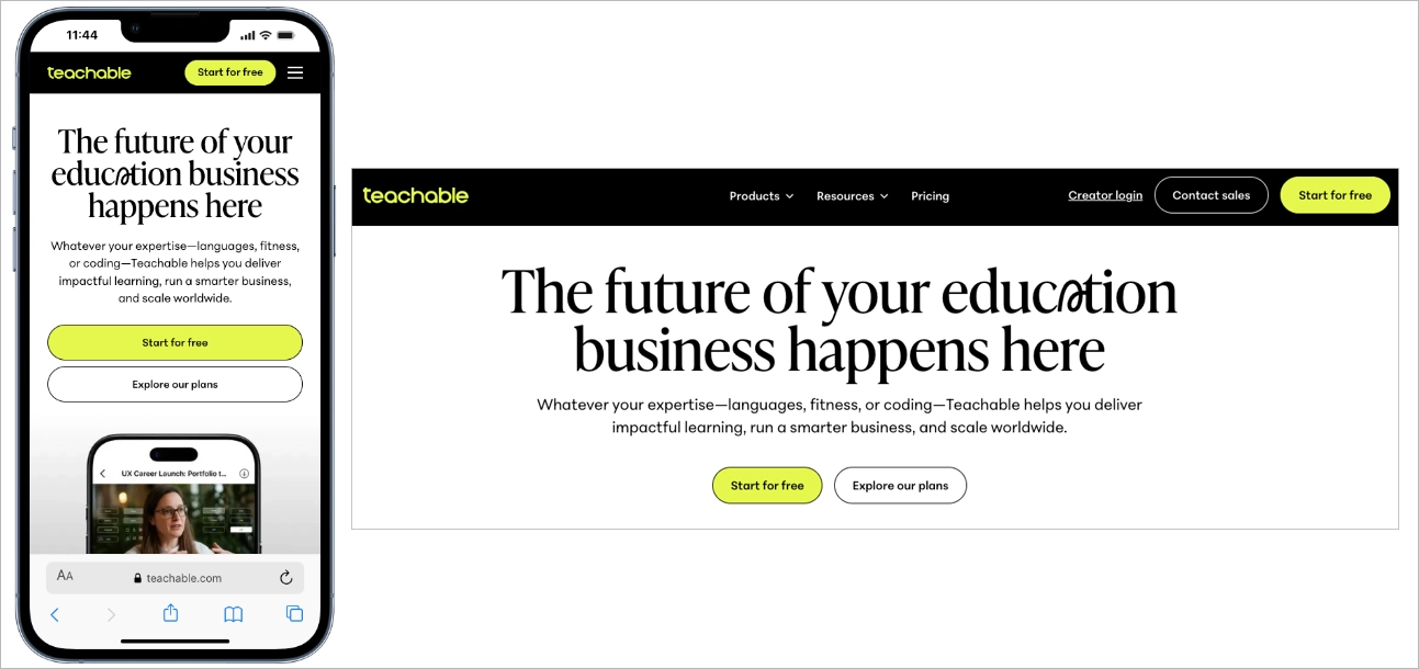
The primary CTA appears above the fold and reappears further down the page, reducing the need for excessive scrolling. Clear section breaks and strong visual hierarchy guide users step by step through the offer. Among good mobile landing pages, Teachable stands out for delivering a high-converting sales flow in a streamlined, mobile friendly landing page format that respects attention span and screen size.
#14 Lyft
Lyft’s mobile landing page immediately separates two user paths: ride or drive. This clear split reduces friction by helping visitors identify their goal within seconds. Effective mobile landing page design often prioritizes intent clarity, and Lyft executes this at the very top of the screen.
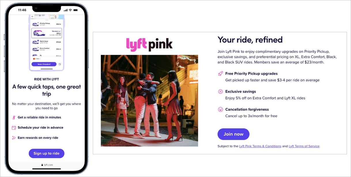
The search bar is positioned front and center, encouraging immediate interaction. Large input fields and tap-friendly elements support one-handed use, which is critical for a high-performing mobile friendly landing page. Entering a destination becomes the first step toward conversion, not just a browsing action.
Below the fold, key benefits for drivers appear in short, scannable sections paired with simple visuals. The structure keeps the page focused on essential information without overwhelming users. Among good mobile landing pages, Lyft stands out for combining clear intent routing with fast, action-driven UX optimized for mobile behavior.
#15 Shopify
Shopify’s mobile landing page centers the entire above-the-fold experience around one action: starting a free trial. A single email field and a large “Start Free Trial” button appear immediately, eliminating navigation friction and decision fatigue. This mobile landing page design reduces steps between interest and signup, which increases conversion potential on small screens
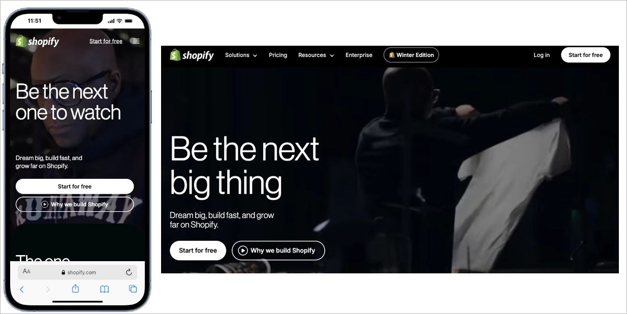
The supporting copy is short and benefit-driven, explaining the core value in simple phrases such as selling, shipping, and getting paid. The CTA includes the word “free,” which lowers psychological barriers and encourages instant action. Among good mobile landing pages, Shopify stands out for stripping the interface down to one clear goal and making the mobile friendly landing page function as a direct signup gateway.
#16 Bose
Bose’s mobile landing page uses whitespace as a structural element to guide focus. The layout isolates the product image, headline, and “Shop” CTA, preventing visual competition on a small screen. This approach reflects strong mobile landing page design, where clarity and spacing directly support conversion.
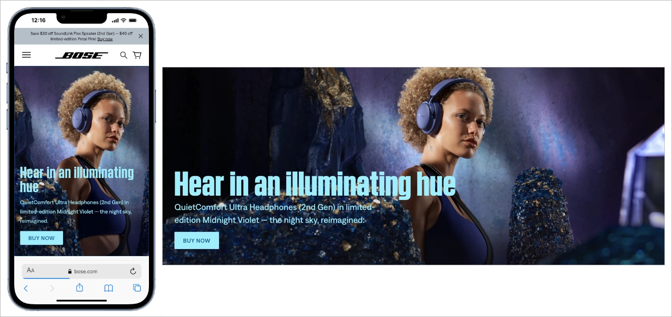
The headline is concise and benefit-oriented, while the product image is large enough to communicate quality without slowing performance. The “Shop” button stands out through contrast and positioning, making it easy to spot and tap. Among good mobile landing pages, Bose stands out for proving that reducing elements can increase clarity and improve the effectiveness of a mobile friendly landing page.
#17 Thrive Themes
Thrive Themes’ mobile landing page prioritizes readability as a core design principle. Headlines, subheadings, and body text are sized and spaced specifically for small screens, making the content easy to read without zooming. This focus on typography reflects strong mobile landing page design, where clarity directly affects engagement and time on page.
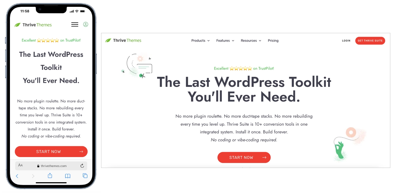
The contrast between text and background improves legibility in different lighting conditions, which is critical for mobile users browsing on the go. Generous line spacing and clean section breaks reduce visual fatigue and support smooth scrolling. Among good mobile landing pages, Thrive Themes stands out for proving that a well-structured, highly readable mobile friendly landing page can drive conversions without relying on heavy visuals or aggressive CTAs.
#18 Square
Square’s mobile landing page relies on direct, jargon-free messaging to communicate value quickly. Short sentences and simple phrasing make the offer easy to understand within seconds, which aligns with effective mobile landing page design. On small screens, clarity reduces friction and helps users grasp benefits without effort.
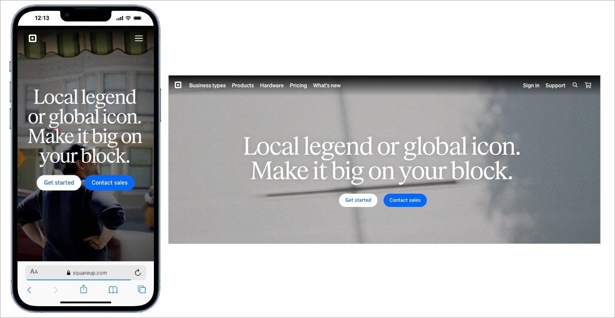
The layout supports this simplicity with short text blocks and clearly separated sections. Key points are scannable, allowing busy users to understand what Square does, how it supports businesses, and how to get started. Among good mobile landing pages, Square stands out for proving that a mobile friendly landing page does not need complex visuals or technical language to convert – just structure, clarity, and focus.
#19 Miro
Miro’s mobile landing page uses strong visual hierarchy to control attention on small screens. Large headlines highlight primary benefits, while bright, high-contrast CTA buttons stand out clearly against the background. This mobile landing page design ensures users immediately see what matters most and where to tap next.
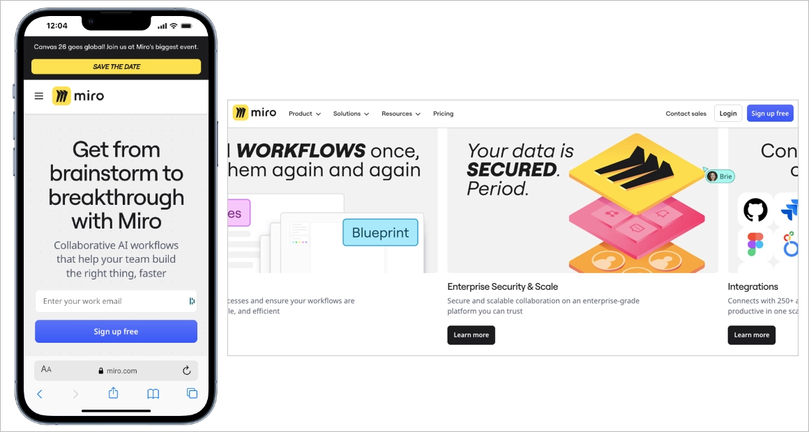
As users scroll, typography and color intensity gradually soften to introduce supporting information without competing with the main message. Subtle directional cues (such as spacing shifts and section breaks) guide movement down the page in a structured way. Among good mobile landing pages, Miro stands out for using hierarchy as a navigation tool, creating a mobile-friendly landing page that feels intuitive, organized, and conversion-focused.
#20 Agrosimex
Agrosimex is a company that provides crop protection products for fruit growers. They have used Landingi and created a landing page, also with its mobile version, to execute their marketing campaign for customers and offer products in a favorable package.
The mobile landing page of Agrosimex shows that the simple design focused on a product, short content, and great navigation are essentials. Users visiting this page have no doubts about what to do to get the product.

A mobile landing page for wholesale products aims at specific customer segments, so the content is shortened to a minimum, which is enough for a targeted audience. The strategy focuses on call-to-action buttons and clear navigation.
Learn from this mobile landing page example:
- Strong CTAs
- Condensed content
- High-quality product visuals
- Ease of navigation
Improvement areas for this mobile version:
- Visible purchasing forms – the type of landing page conditions it as minimizing steps to purchase a product, but form could be hidden under some button to shorten the page length
Create a seamless mobile experience – build your landing page with Landingi!
How to Create a Mobile Landing Page?
To create a mobile landing page, you need to start with two things: a clear goal and a deep understanding of your audience. From there, choose a platform, like Landingi, that lets you build mobile-optimized pages fast, without getting stuck in the tech.
Craft a headline that hooks users instantly, use visuals that load fast but still pop, and write copy that gets to the point. Add social proof to boost credibility, place a clear CTA where thumbs naturally go, and make your lead capture form dead-simple to complete on a small screen.
Follow the 7-step guide below to build a mobile landing page that performs wherever your audience is – especially in the palm of their hand.
Step 1: Define Your Goal and Understand Your Mobile Users
To start, define the purpose of your landing page. Are you driving signups? Promoting a product? Collecting leads? Your goal should guide every element on the page – from the headline to the CTA.
But it’s not just about the what. It’s about the who. Know your mobile users: what device they’re likely using, how they behave on mobile, and what might cause them to bounce. For instance, someone browsing during a lunch break won’t scroll through long paragraphs. They want fast info, fast decisions.
Step 2: Choose a Mobile-Optimized Template That Converts
Pick a template that’s already built for conversions on small screens. Landingi offers over 400 professionally designed templates, many of which are fully optimized for mobile – so you’re not starting from scratch or guessing what works.

Click Create new landing page, head to the template library, and pick one that matches your campaign goal. Choose a layout that’s clean, focused, and easy to scroll through on a phone whether you’re aiming for signups, sales, or lead gen.
You can also build from scratch, upload a .landingpage file, import a design from Figma, or use Composer to generate a layout in seconds. Once you’ve picked your starting point, use the drag-and-drop editor to tweak the design. Keep in mind: mobile users interact differently. Use bigger tap areas, stack content vertically, and keep forms simple.
Step 3: Craft a Compelling Copy
Your headline should grab attention fast and clearly communicate the value of your offer. Mobile users scroll quickly, so you’ve got just a few words to make them stop. Aim for something sharp, benefit-driven, and easy to scan – like “Try It Free Today” or “Instant Access in 60 Seconds.”
Use Landingi’s AI Assistant to help generate persuasive, conversion-focused copy that keeps things tight and relevant. Highlight key benefits, eliminate fluff, and guide the reader toward one clear action.

On mobile, clarity wins. Break your content into short sections with bold subheadings. Avoid long paragraphs, and never let your main message get buried. Bullet points can help – but only if they’re necessary and not too dense.
And remember: mobile search is local by nature. If you’re running paid campaigns or targeting users by location, include location-based keywords that match mobile search intent. This helps improve both relevance and ad performance.
Step 3: Boost Visual Impact
Visuals are crucial on mobile landing pages, but they need to work hard without dragging down performance. Use high-quality images and short, punchy videos to grab attention fast and communicate value visually.

Avoid clutter, and use Landingi’s background image removal tool to strip out distractions so your images stay sharp and focused, even on small screens. If the video adds value (think demos, quick intros, or product previews), keep it short and make sure it’s compressed for mobile. Long load times are conversion killers – mobile users won’t wait. And don’t forget: test your visuals on different devices and resolutions.
Step 5: Add a Simple Form and a CTA That Pops
On a mobile landing page, your form should be as short and smooth as possible. The more fields you ask for, the more users drop off, especially on mobile.
With Landingi’s form builder, you can whip up a clean, mobile-friendly form in minutes. Stick to the basics: name, email – maybe a phone number if you really need it. Every extra field is a chance to lose someone. Keep it simple, keep it scrollable.
Your call-to-action should be impossible to miss and even harder to ignore. “Submit” is boring. Try something that actually speaks to the value you’re offering – like “Get My Free Demo” or “Start Now, No Sign-Up Needed.”
Make your button big, bold, and thumb-ready. Use high-contrast colors, and don’t be shy about repeating it in a few spots. Mobile users don’t always scroll all the way down, so give them more than one shot to click.
Step 6: Make It Trustworthy
Mobile users move fast, but they also need to feel like they can trust you before they tap that CTA.
Add interactive elements that spark engagement and gently push for action. A countdown timer for a limited-time offer? Great for urgency. A quick pop-up with a special deal or lead magnet? Even better – just make sure it’s easy to close on a phone (nobody likes a tiny “X”).

Then, back it all up with proof. Drop in a few short, punchy testimonials. Show ratings, reviews, or logos of brands you’ve worked with. Even something as simple as “Over 10,000 users and counting” helps mobile visitors feel confident in just a glance.
And don’t forget to link your social media. It adds credibility and gives users a chance to connect with you beyond the page – especially important on mobile, where people are often bouncing between apps anyway.
Step 7: Launch, and Keep Improving
Before you hit publish, use Landingi’s mobile view editor to fine-tune layouts, adjust text sizes, and place buttons exactly where thumbs expect them.

Once everything looks clean and works smoothly, connect your custom domain to give your page a polished, professional feel. It’s a small detail that adds a lot of credibility – and makes your URL easier to share.

Your page needs to work flawlessly across systems like iOS, Android, and even less common platforms. That means testing how your layout, buttons, and forms behave across different devices and screen sizes. One glitchy interaction on an iPhone can kill your conversion rate. Use Landingi’s built-in analytics and A/B testing tools to see what’s working (and what’s not).
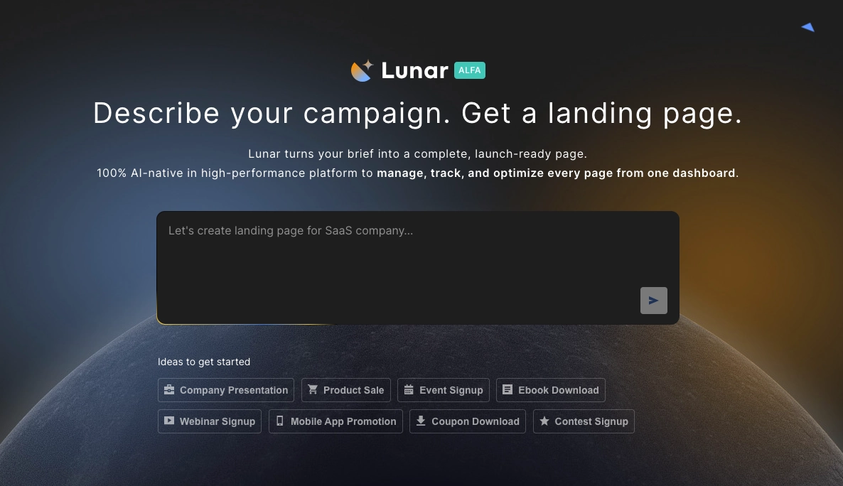
If you want to speed up the process, tools like Lunar – Landingi’s AI landing page generator – can create a complete page structure for you. This makes it easier to focus on refining the user experience instead of building everything from scratch.
What is a Mobile Landing Page?
A mobile landing page is a standalone web page designed specifically for smartphones and small-screen devices. The purpose of a mobile landing page is to guide users toward one clear action, such as signing up, making a purchase, or downloading an app. Unlike general website pages, a mobile landing page is typically tied to a marketing campaign and focuses on a single conversion goal.

Effective mobile landing page design adapts to how people use their phones. A high-performing mobile-friendly landing page includes large tap-friendly buttons, fast loading speed, vertically stacked content, and clear visual hierarchy. The structure removes clutter, eliminates the need for zooming, and highlights one strong offer with one simple call to action.
Optimize for mobile users – create a mobile-friendly landing page with Landingi!
Why Do I Need a Mobile Landing Page?
You need a mobile landing page because most online traffic now comes from smartphones. Social media ads, Google Ads, and email campaigns often drive primarily mobile users who expect fast, frictionless experiences. A standard desktop page adapted to mobile rarely delivers the clarity and speed required to convert on small screens.
Mobile users prioritize quick decisions and immediate action. A well-designed mobile-friendly landing page aligns with scrolling behavior, short attention spans, and one-handed navigation. Strong mobile landing page design increases engagement, lowers bounce rates, and improves conversion rates by matching how users actually interact with their devices.
A high-performing mobile landing page should include responsive design, optimized loading speed, concise messaging, and tap-friendly navigation. When performance, usability, and message clarity work together, marketing campaigns generate higher returns from mobile traffic.
7 Mobile Landing Page Best Practices
Creating a mobile landing page has one purpose – engage mobile users who discovered your product or service and encourage them to take the desired action. As long as you understand the mobile users’ habits dictated by SM giants, you know that your magic tool is UX.
To build high-converting mobile landing pages, take the 7 following pieces of advice:
- Keep the design simple,
- Add concise content,
- Use strong CTAs,
- Set a simple navigation,
- Optimize visuals,
- Use a “Call Now” button,
- Optimize the speed index.
Review the brief explanations and examples provided below to gain a deeper understanding of the seven pillars crucial for creating mobile landing pages that drive high conversions:
Make your landing page mobile-first – design it with Landingi now!
#1 Keep the Design Simple
First choose your brand’s colors, set the logo, and keep the layout simple with shapes or fonts. Take a quick look at the example below:

Single color, repeated shapes, and a more distinguished logo make the landing page clear yet attractive for mobile users. Simple design eliminates distraction among users and leads them straight to CTAs.
The example above shows perfection in this area – you can see it’s impossible to miss the calendar button and be sure the next steps are pointed out in the same distraction-free way.
#2 Add Concise Content
Secondly, reach the users’ attention with catchy headlines and add essential information about your product or service on the top of your mobile landing page. Just keep it concise and short enough to maximally focus on the purpose: engaging visitors to take the desired action.
Learn from the example below:

You can see a few good practices, starting from a captivating headline with an offer, through short but inspiring content, to a CTA button boosted with a picture that points the button out.
#3 Use Strong CTAs
Visible and contrasting CTAs with well-designed messaging make the magic. Use alternative buttons to separate actions and choose accurate colors to highlight the essential CTA. Make a choice evident for mobile users and let conversion grow.
Check out the example below:

The example shows how to implement alternative CTAs on your mobile landing page, keeping the main button visible at the same. It leaves no space for doubts; visitors know precisely what to do according to their intentions.
Still, side-conversions don’t make the deal, so for this purpose, there is a main CTA button on the top that can’t be missed with its outstanding size and color.
Learn from top mobile landing pages – start building yours with Landingi!
#4 Set a Simple Navigation
Make an effort and simplify navigation on your mobile landing page, especially when it’s a more extended type. Add a sticky navigation menu, buttons that lead to the top, and repeat CTAs. These practices impact user experience and simplify actions. Remember – the easier navigation, the better for conversions.
Learn from the example below:

If you look at the screenshot, you can see clarity. It goes together with a straightforward CTA and navigation menu in the top right corner of a page. There’s no possibility of “getting lost” so users would most likely click the button or look for other options.
#5 Optimize Visuals
Optimize visuals for mobile – lower the number of pictures, ensure they aren’t too large, and make them fit well with the mobile landing page design. The visuals are attrouble spots – if not optimized, they affect loading speed poorly, which is the fundamental factor of well-working mobile landing pages.
Optimizing doesn’t mean eliminating, though. Visuals are still one of the most essential elements that drive user experience. The point is to find a balance between nice graphics and loading speed, and with that can help the Landingi platform with the landing page builder, which optimizes your design for mobile devices automatically.
Take a look at the example below:

The visuals of magazine covers and collection items are crucial for the mobile landing page offering subscription, but its graphics, even though high-quality ones, are not increasing loading time thanks to proper size optimization.
#6 Use a “Call Now” Button
While creating your mobile landing page, remember to use characteristic buttons,such as “Call Now” or “Navigate,” to simplify actions for smartphone users. These little additions allow visitors to make a call effortlessly by choosing a single button instead of copying the number – and similar, the “Navigate” button starts navigation through Map apps without copying the address.
It’s important to use the potential of mobile landing pages in order to facilitate the user’s path. Look at the example below:

The hairdresser’s mobile landing page includes a “Call Now” button to simplify contact. Even if the primary purpose is to encourage visitors to click the “Booking online” CTA, some customers need a consultation before choosing a date.
The “Call Now” button should exist on every service’s mobile landing pages, though it’s not necessary for product pages.
#7 Optimize the Speed Index
Remember the speed index factor is the one that makes your landing page perfect for mobile devices. With responsive design, compressed graphics, and minimized code, you can achieve better results.
It’s a good practice to use dedicated tools to measure key factors comprising speed index, e.g. Google PageSpeed Insights. The solution is simple and easy to use, it’s enough to copy and paste your page’s URL to start analyzing.
What To Avoid While Creating Mobile Landing Pages?
While creating a mobile landing page, avoid 8 pitfalls that badly impact your mobile landing page:
- Excessive content,
- Complex navigation,
- Slow loading times,
- Non-mobile-friendly forms,
- Unoptimized visuals,
- Lack of testing,
- Unclear call-to-action (CTA),
- Ignoring analytics.
Creating a mobile version of your landing page is an excellent chance for your business, so don’t make common mistakes that can distance you from success.
How Do I Make My Landing Page Mobile-Friendly?
To make your landing page mobile-friendly, incorporate best practices described in this blog post, avoid the 8 most common mistakes mentioned above, and remember about analytics with regular optimization.
To minimize your efforts, try out the landing page builder that provides mobile optimization features that automatically adapt your design to various devices.
Do Mobile Apps Have Landing Pages?
Mobile apps themselves do not have landing pages, but their promotion and marketing efforts may involve landing pages to attract and inform potential users.
Mobile apps are typically showcased and introduced via app store listings, such as the Apple App Store. These listings function as a type of landing page featuring vital details like app descriptions, screenshots, user reviews, and options for download and installation.
Yet, certain mobile apps might utilize dedicated promotional or marketing landing pages beyond app stores. In this case, landing pages serve to raise awareness, furnish extra information, and motivate users to download or sign up before guiding them to the app store for installation.
How Long Should a Mobile Landing Page Be?
The mobile landing page should be as short as possible and include catchy headlines, short yet inspiring content, and strong CTAs. Still, an ideal length for a mobile landing page depends on the goals of the page, so the product landing page will differ from the service landing page, etc.
However, as a general guideline, mobile landing pages are often more effective when concise. Usually, the mobile version of a landing page is way shorter than the traditional desktop one.
To drive the best results, try to maximally shorten your page and add only necessary information with great CTAs and memorable graphics.
Create a Mobile Landing Page That Gets Results
A high-performing mobile landing page works because it is simple, fast, and conversion-focused. Strong mobile landing page design ensures that content loads quickly, messaging is clear, and one primary action dominates the screen. The best mobile landing pages remove distractions and guide users toward a single tap that completes the goal.
With Landingi, you can build a mobile-friendly landing page using ready-to-use templates optimized for small screens. The drag-and-drop editor allows you to adjust layout, headlines, forms, and CTAs without coding. Unlike creating pages in a traditional CMS, which often requires plugins, developer support, and manual speed optimization, Landingi is built specifically for campaign-driven landing pages.
Landingi also allows you to create dedicated pages for paid Google Ads campaigns and connect them directly to your traffic sources. This separation from your main website improves load speed, message alignment, and Quality Score performance. Built-in A/B testing, analytics, and conversion tools help you continuously improve results and turn good mobile landing pages into the best mobile landing pages for your campaigns.Mobile traffic continues to grow, and campaign performance increasingly depends on mobile optimization. Build, test, and refine your mobile landing page with tools designed specifically for conversions. Try Landingi and launch pages that are built to perform.


