

A newsletter landing page is a dedicated page designed to collect email subscribers. The page focuses on one objective: converting visitors into subscribers through a clear value proposition and a visible sign-up form. A focused structure increases lead generation because it removes distractions and centers attention on a single action.
You can build a newsletter landing page in Landingi using templates, a drag-and-drop editor, built-in forms, and direct integrations with email marketing tools. Unlike creating a page in a traditional CMS, Landingi does not require coding, plugin management, or developer support. Features such as A/B testing, mobile editing, and fast publishing make optimization simpler and faster.
In this guide, you will explore newsletter landing page examples, newsletter signup examples, and email landing page examples that demonstrate what makes the best newsletter landing pages effective. Each example shows how persuasive copy, clean layouts, and strategic CTA placement drive conversions. The breakdowns explain how specific elements influence user decisions.

14 Best Examples of Newsletter Landing Pages
With the theoretical knowledge about newsletter landing pages, it’s time to check out real-life examples of how to gather newsletter subscribers with an effective, high-converting landing page that generates leads in just a few seconds. Scroll through our 14 picks of the best newsletter landing page examples in 2025 to inspire yourself and get important key takeaways to adopt while creating your own landing page.
1. Later
Later is a marketing platform that helps brands run influencer campaigns using AI-driven strategy and real performance data. The newsletter landing page promotes insights related to social media trends, influencer marketing, and digital growth strategies.
The landing page captures attention with a bold headline that promises the latest social media trends delivered directly to the subscriber’s inbox. Supporting copy highlights credibility by stating that more than 1 million marketers already subscribe, which strengthens trust through social proof. A single-field opt-in form and a clear “Subscribe” button reduce friction and keep the focus on conversion.
The design supports the message with visuals inspired by platforms such as Instagram and TikTok. Bright colors, structured layout, and content previews like “8 Skills Every Social Media Manager Needs to Have” demonstrate the type of value subscribers can expect. A mobile-friendly layout and minimal distractions further increase the likelihood of sign-ups.
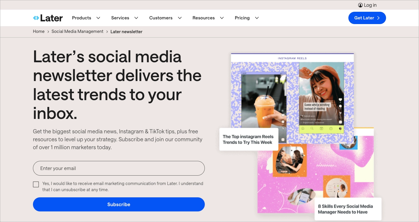
What they did well:
- Engaging copy
- Strong value proposition
- Clear social proof
- High-contrast CTA button
- Relevant, platform-specific imagery
What could be improved:
- Lack of testimonials – Adding direct quotes from subscribers or industry experts could strengthen credibility and reinforce the newsletter’s authority.
2. House Beautiful
House Beautiful is an interior decorating magazine focused on home design and domestic arts. Their newsletter landing page promotes design inspiration, decorating ideas, and curated home content for readers who want regular updates.
The page uses a question-based headline to immediately engage visitors and encourage action. A short value description explains what subscribers will receive, followed by a single opt-in form and a clear call-to-action button. The structure works because it presents only the information needed to make a decision.
The visual design reflects the brand’s identity through a stylish background image and a clean layout. The page remains easy to navigate on both desktop and mobile devices, which supports usability. A visible privacy notice also reassures users that their data is handled responsibly.

What they did well:
- Visually consistent, brand-aligned design
- Engaging headline in question format
- Clear and concise value description
- Simple, low-friction sign-up form
- Strong CTA button with direct messaging
- Trust element in the form of a privacy notice
What could be improved:
- Content previews – Adding a short preview of recent newsletter topics could better demonstrate the quality and style of the content, making the subscription decision easier.
Check out the newsletter landing page template in the Landingi platform and customize it effortlessly with a user-friendly editor. Add a stunning background image, create catchy headlines, and convert visitors into subscribers with well-designed forms.

3. Huge Alerts
Huge Alerts is a financial newsletter focused on real-time stock market updates and trading insights. The landing page promotes fast access to financial news, market trends, and personalized alerts for active traders.
The design immediately signals urgency through bold typography and the headline “Financial News In Real Time.” A futuristic visual theme, combined with a prominent email input field and “Submit” button, keeps the focus on one action: subscribing. A countdown timer adds scarcity, encouraging visitors to act quickly instead of postponing the decision.
Below the fold, the page reinforces value with clear benefit statements such as global updates and trend notifications. The layout remains structured and easy to scan, which supports quick decision-making in a time-sensitive niche. The hierarchy of elements makes the sign-up goal unmistakable.

What they did well:
- Distinctive, high-impact visual theme
- Large, clear headline that communicates urgency
- Conversion-focused layout with minimal distractions
- Countdown timer to increase urgency
What could be improved:
- Timer placement – Displaying the countdown timer above the fold would strengthen urgency from the first second and potentially increase conversions.
4. Morning Brew
Morning Brew is a media company that delivers daily business and tech news in a concise, conversational format. The newsletter landing page promotes its tech edition, focused on witty, plain-English reporting for modern professionals.
The page uses a one-section layout that fits entirely on a single screen. There is no navigation menu or footer, which keeps attention on the email field and primary call to action. The subheading clearly explains the benefit, while a tilted phone mockup previews the newsletter and shows exactly what subscribers will receive.
The headline “Business as usual? No thanks.” reflects the brand’s informal tone and differentiates the newsletter from traditional business media. The CTA button copy, “Join Over 4 Million Readers Now,” combines social proof and urgency in a single line. The result is a fast, low-friction experience that makes the offer easy to understand within seconds.
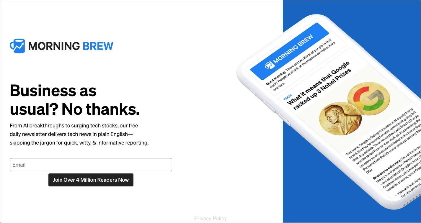
What they did well:
- Single-section, distraction-free layout
- No navigation or external links
- Clear newsletter preview image
- Strong, personality-driven headline
- CTA that combines social proof and urgency
What could be improved:
- Mobile visual balance – The mobile version removes the large phone graphic to save space, but the layout can feel overly minimal. Adding a subtle visual element could increase engagement without reducing clarity.
5. Vogue
Vogue is a global fashion and lifestyle magazine known for trend coverage, runway reports, and cultural commentary. The newsletter landing page promotes curated fashion updates, editorials, and exclusive content aligned with the brand’s premium positioning.
The page reflects Vogue’s visual identity through high-resolution editorial imagery, refined typography, and a clean, modern layout. A short two-sentence description explains the value of subscribing, while previews of past newsletters show the type and quality of content readers can expect. The sign-up form appears after clicking a prominent CTA button, which keeps the design visually streamlined.
Strategic white space guides attention toward the call to action and prevents visual overload. The combination of minimal copy and strong visuals supports quick decision-making. Content previews add credibility by demonstrating substance rather than relying only on branding.

What they did well:
- Design aligned with Vogue’s visual identity
- Clear, elegant layout
- Strong and visible CTA button
- Concise value description
- Strategic use of white space
- Previews of previously published newsletters
What could be improved:
- Personalization options – Allowing subscribers to select content preferences during sign-up could improve engagement and long-term retention.
Craft your newsletter landing page easily with Landingi – choose the newsletter template, and customize it with a user-friendly editor. Track conversions with a built-in EventTracker solution, test various versions of your landing page, and drive effective marketing strategies with just one multifunctional platform – Landingi.
6. Ahrefs
Ahrefs is an SEO software company that provides tools for keyword research, backlink analysis, and competitive intelligence. The Ahrefs Digest newsletter landing page promotes curated SEO news, blog updates, and digital marketing insights for professionals.
The page builds credibility immediately by stating that the newsletter is read by 284,000 SEOs and marketers. Testimonials and a custom illustration reinforce trust, while a “sneak peek” of a recent edition shows exactly what subscribers will receive. Transparent previews reduce uncertainty and help potential subscribers evaluate the content before signing up.
The main “Subscribe” button is visually prominent and supported by concise copy that outlines key content categories. Generous white space and bold typography make the offer easy to scan in seconds. The layout supports clarity and keeps attention on the subscription goal.
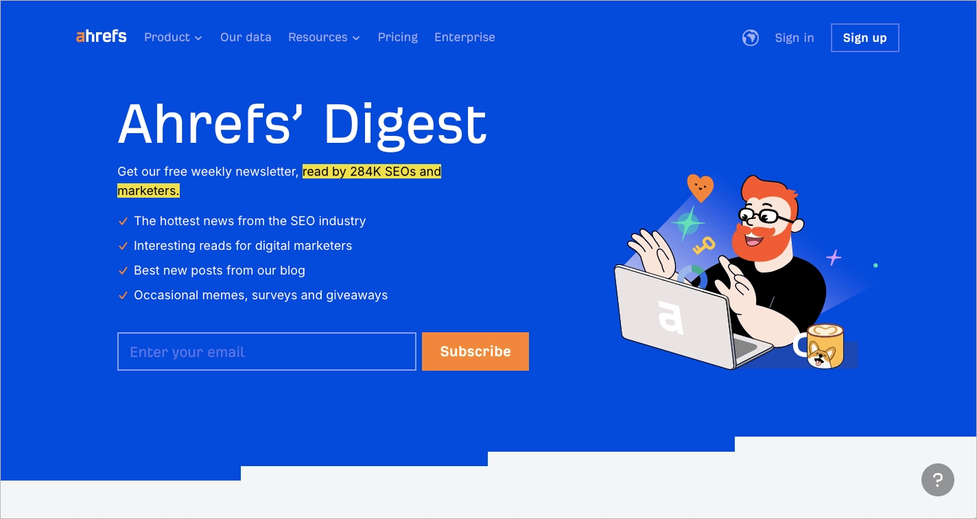
What they did well:
- Social proof highlighted in the subheading
- Testimonials that reinforce credibility
- Preview of a past newsletter edition
- Clear value proposition with defined content categories
- Clean layout with strong visual hierarchy
What could be improved:
- CTA repetition – Adding a second call-to-action button at the bottom of the page could capture users who scroll before deciding to subscribe.
7. Growth in Reverse
Growth in Reverse is a newsletter focused on analyzing how creators and founders grow their audiences and businesses. The landing page promotes in-depth breakdowns of real growth strategies, targeting builders who want practical, data-backed insights.
The page uses a single, distraction-free section with no navigation links or competing elements. A bold headline highlights the core benefit: access to proven growth strategies used by successful creators. A smartphone mockup displays a past issue, giving visitors a concrete preview of the format and depth of analysis.
Social proof strengthens credibility by stating that more than 40,000 creators and founders already subscribe. The CTA button copy, “Join 40k+ Smart Humans,” reinforces that number while adding personality. Copy above the form promises to save hours of research, which clearly defines the practical value of subscribing.
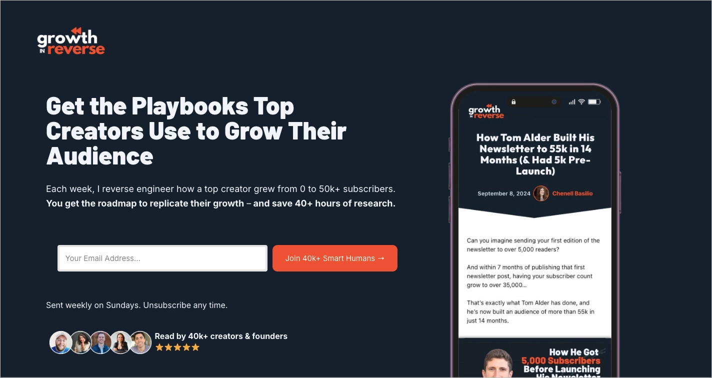
What they did well:
- Single, highly focused layout
- No navigation or visual distractions
- Strong social proof with subscriber count
- Engaging, personality-driven CTA copy
- Clear visual preview of past content
What could be improved:
- Unused space below the main section – Removing or redesigning the empty area would improve visual balance and overall polish.
8. Virtuoso
Virtuoso is a global network specializing in luxury travel experiences, including premium hotels, cruises, and exclusive tours. The newsletter landing page promotes curated travel inspiration, expert recommendations, and content from the brand’s magazine.
The page leads with a large background image that showcases an aspirational travel scene, immediately positioning the newsletter as a gateway to exceptional experiences. The copy emphasizes high-quality writing and photography, setting expectations about the editorial standard. The subscription form includes several fields, but not all are required, which reduces friction while still allowing for richer data collection.
Trust signals, such as a visible privacy policy link, support credibility. The CTA button is clearly placed and easy to identify, keeping the sign-up process straightforward despite the longer form. The overall layout remains intuitive and aligned with the premium nature of the brand.

What they did well:
- Strong, immersive background image
- Clear and structured form with optional fields
- Visible trust signals
- Layout aligned with a luxury brand image
- Prominent CTA button
What could be improved:
- CTA messaging – The button text is clear but not particularly compelling. More benefit-driven wording could increase motivation to subscribe.
Find the effective newsletter landing page template in the Landingi template gallery, add a single opt-in form, create a visible CTA button, and experiment with its various versions, thanks to built-in A/B testing features.

9. The Daily Upside
The Daily Upside is a financial news publication that delivers market analysis and business insights for professionals. The newsletter landing page promotes concise, clarity-focused reporting designed to help readers understand the news shaping the market.
The page uses a single, distraction-free section built around one action: subscribing. The headline, “Clarity on the news shaping the market,” communicates the core benefit in direct language. A clean layout, bold typography, and a muted color palette reinforce credibility, while the email field and green “Subscribe” button create a clear visual path.
Newsletter previews displayed alongside the form show the structure and tone of past editions. The absence of navigation links or competing elements keeps attention on the subscription goal. The design prioritizes focus, readability, and fast decision-making.
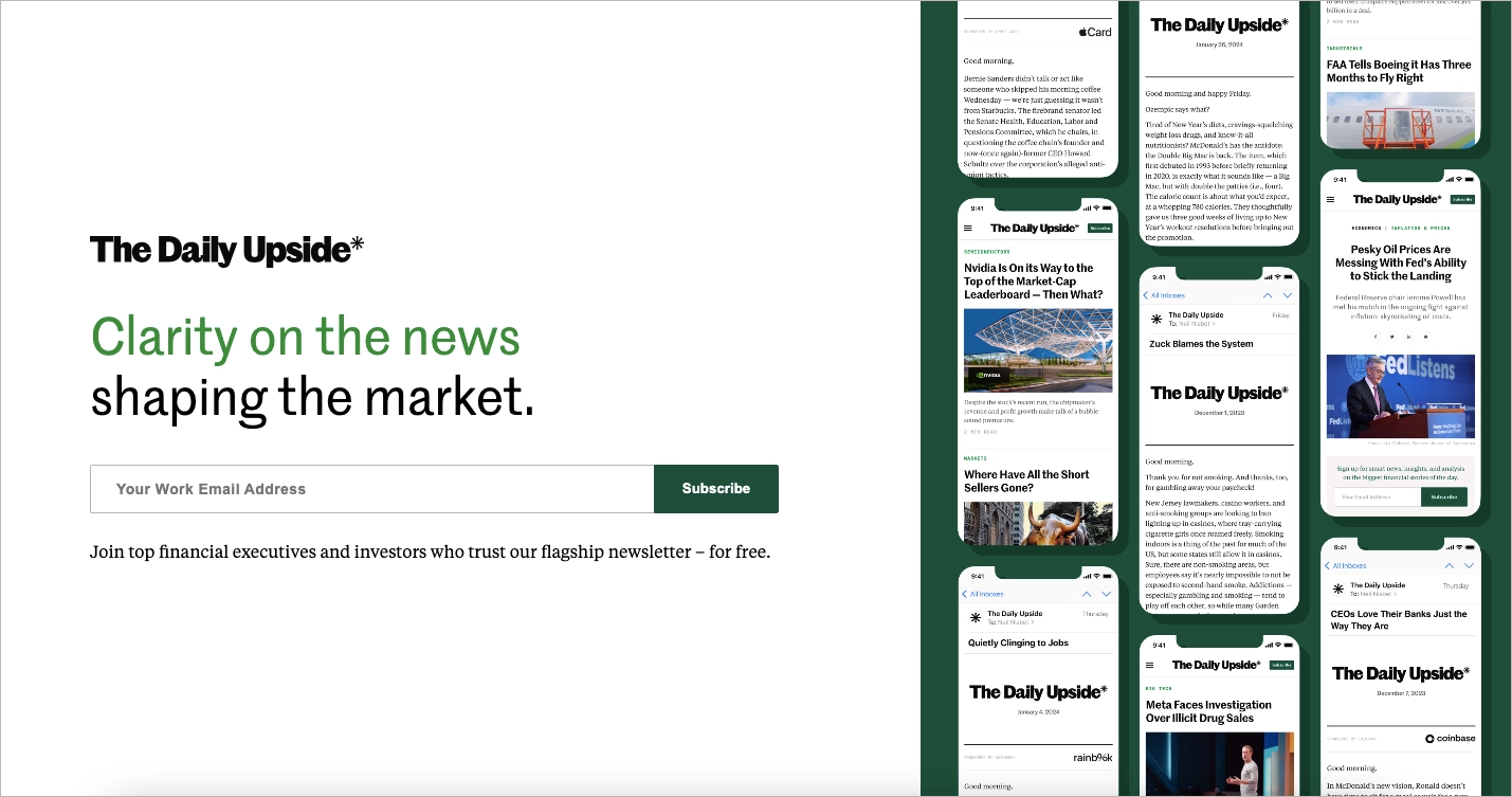
What they did well:
- Single-section, conversion-focused layout
- Clear and benefit-driven headline
- Clean, professional design
- Visible newsletter previews
What could be improved:
- Limited social proof – Adding subscriber numbers or media logos could strengthen trust.
- No benefit bullets – Listing two or three specific insights readers gain would clarify the value proposition and improve conversions.
10. The Perfect Loaf
The Perfect Loaf is a baking website dedicated to sourdough bread education. The newsletter landing page targets home bakers who want detailed guides, practical tips, and tested recipes focused exclusively on sourdough.
The page promises to simplify sourdough baking and highlights a community of more than 122,000 readers. A short description explains that subscribers receive high-quality, spam-free content centered on bread making. A single opt-in form and a prominent CTA button keep the process simple and aligned with the page’s focused goal.
The design is clean and intuitive, supported by strong visuals and a headline that clearly communicates the benefit. Badges of reputable partner brands add credibility and reinforce trust. The layout reflects the brand’s educational positioning and community-driven approach.

What they did well:
- Clear and intuitive layout
- Strong, niche-specific value proposition
- Visible subscriber count for social proof
- Partner brand badges that build trust
- Single opt-in form with a prominent CTA
- Consistent, high-quality visuals
What could be improved:
- Value proposition visibility – Increasing the font size or visually emphasizing the core benefit could make the main promise more immediately noticeable and improve conversions.
Create successful newsletter pop-up with Landingi – choose the sign up template and customize it easily with a drag-and-drop editor, add stunning visuals, and create a high-converting form to boost newsletter signups.
11. Bloomreach
Bloomreach is a commerce experience platform that helps brands personalize digital shopping journeys. “The Edge” is Bloomreach’s newsletter focused on ecommerce strategy, industry insights, and conversations around digital commerce.
The landing page uses a simple two-column layout. A short introduction explains the purpose of the newsletter and positions it as a space for commerce-focused discussion, while the email sign-up form with a clear “Subscribe” button stands out on the right. Privacy terms and a legal note placed directly below the form reinforce transparency and trust.
A second section highlights logos of well-known brands, such as Puma and Boohoo, that read the newsletter. This social proof strengthens credibility and signals relevance for established ecommerce companies. The modern design, soft color palette, and absence of distractions keep the focus on conversion.
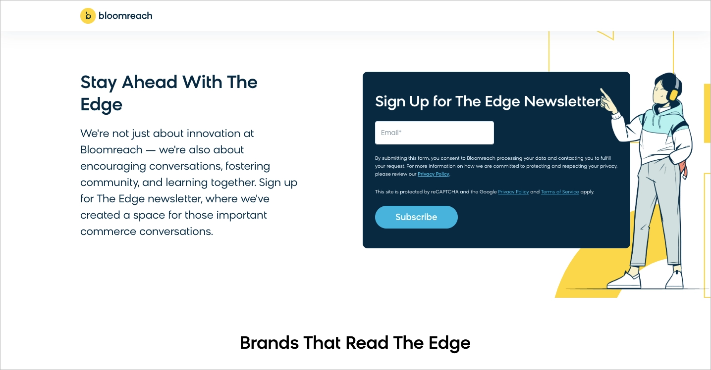
What they did well:
- Short, focused two-section structure
- Clear and prominent CTA button
- Strong brand-based social proof
- Clean, modern, distraction-free layout
What could be improved:
- Lack of quantifiable proof – Adding subscriber numbers or engagement metrics could increase perceived value.
- Subheading clarity – Shortening the subheading and specifying concrete benefits, such as exclusive insights or publishing frequency, would strengthen the value proposition.
12. USAFacts
USAFacts is a nonprofit organization that provides nonpartisan data about government spending, policy, and social issues. The newsletter landing page promotes weekly, data-driven insights covering topics such as the economy, health, and crime.
The hero section uses a bold magenta background and the headline “Skip the spin. Get the stats.” to position the newsletter as factual and unbiased. A clear value proposition, “Hours of analysis in minutes of reading. Every Monday,” explains both the benefit and frequency. A simple opt-in form removes friction, while a humorous line comparing the 600,000+ subscriber base to the population of Vermont adds personality and social proof.
Below the hero section, the page outlines the range of covered topics and allows visitors to browse past newsletters by month. Public access to previous editions increases transparency and helps potential subscribers evaluate content quality. The structure balances strong messaging with practical proof.
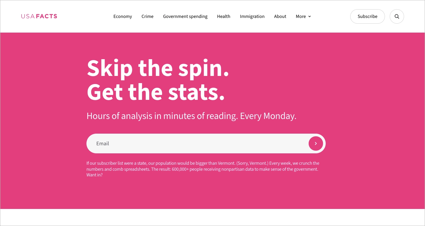
What they did well:
- Bold, concise headline and positioning
- Clear value proposition with frequency
- Strong social proof with subscriber count
- Visible archive of past newsletters
- Simple, easy-to-use opt-in form
What could be improved:
- CTA clarity – Replacing the arrow-only submit button with descriptive text such as “Sign Up” would make the action clearer and potentially improve conversions.
13. Nik Sharma
Nik Sharma is a marketer and advisor specializing in growth strategies for direct-to-consumer (DTC) brands. The newsletter landing page promotes actionable insights, case studies, and tactical advice designed to help ecommerce operators scale revenue.
The page communicates value through concise, conversational copy and a bold headline that speaks directly to DTC founders and marketers. A single opt-in form with a strong CTA button keeps the structure focused on conversion. Testimonials, subscriber count, and references to Sharma’s industry recognition reinforce authority and expertise.
The layout uses generous white space to guide attention toward the form and key proof elements. Sections such as “Who’s talking” introduce the newsletter’s voice, while award badges and social media testimonials build trust. The combination of credibility signals and clear positioning supports higher sign-up intent.

What they did well:
- Clear, niche-specific value proposition
- Bold headline and focused layout
- Single opt-in form with strong CTA
- Subscriber count and testimonials as social proof
- Award badges and author credibility elements
Effective use of white space
What could be improved:
- Newsletter preview – Adding a short excerpt or example from a past edition would make the value more tangible and increase conversion potential.
Pick the Business template and easily create a landing page that converts – a simple layout and a short newsletter sign-up form with a standout CTA will work perfectly!

14. Databox
Databox is a business analytics platform that helps companies track performance metrics and visualize data. The “Move The Needle” newsletter promotes insights for B2B leaders focused on growth, marketing performance, and decision-making.
The landing page uses a modern gradient color scheme and generous white space to create a clean, readable layout. Key subscription benefits are presented clearly, helping visitors understand the value of joining. Social proof placed near the sign-up form, including the message “Join more than 15,000+ B2B leaders,” strengthens credibility at the point of action.
The page also includes access to a newsletter archive and recent issues, which allows potential subscribers to review past content before committing. This transparency supports informed decision-making and builds trust. The overall structure balances design consistency with practical proof.
What they did well:
- Modern and consistent color palette
- Effective use of white space
- Social proof placed near the CTA
- Clearly listed subscription benefits
- Visible archive and recent issues
What could be improved:
- Visual distractions – The navigation bar, floating chat bubble, and top infobar compete with the main call to action.
- Above-the-fold clarity – The large “Move The Needle” header dominates the first screen without immediately explaining the subscription offer.
How Do I Create a Newsletter Landing Page?
To build a high-converting newsletter landing page, use Landingi – start by logging into your account, choosing a template or blank layout, and jumping into the drag-and-drop editor to customize your content, form, and call to action.
Here’s a step-by-step guide tailored specifically for newsletter sign-up pages.
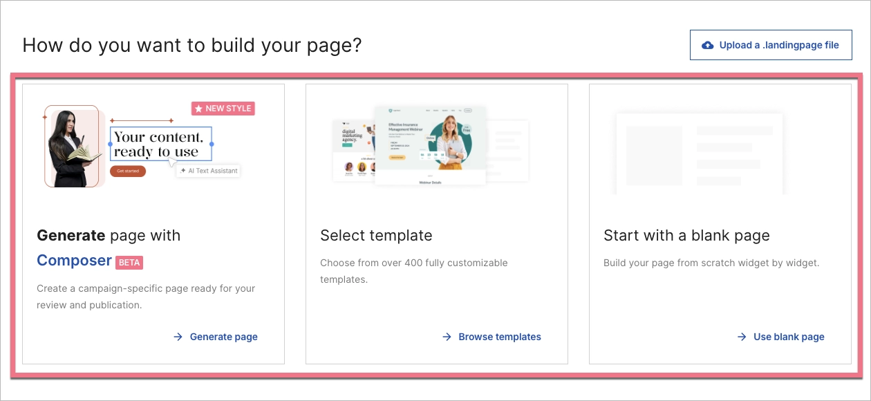
1. Log In and Create Your Landing Page
Start by logging in at landingi.com and selecting “Create new landing page” from the dashboard. Choose a professionally designed template, begin with a blank layout, or use Composer to generate a page with AI assistance. For a newsletter sign-up page, select a clean, distraction-free design that highlights the value proposition and places the opt-in form in a prominent position.
A focused layout improves conversions because visitors immediately understand the purpose of the page. Removing navigation menus and unnecessary elements helps keep attention on the subscription form. Clear structure at this stage simplifies every step that follows.
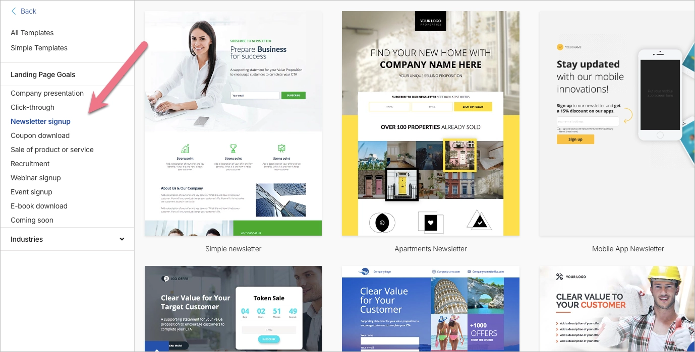
2. Choose a Template (Optional) and Start Editing
If you choose a template, browse by industry or campaign goal and preview several options before deciding. Select a design where the headline, value proposition, and sign-up form are immediately visible, since those elements drive conversions on a newsletter page. After selection, the drag-and-drop editor opens automatically so you can start customizing the content right away.
3. Edit the Page Using the Drag-and-Drop Builder
Use the visual editor to customize the headline, supporting copy, and opt-in form. Place the form near the top and clearly explain the benefit of subscribing, such as exclusive content, special offers, or expert insights. Remove any elements that do not support the primary goal of collecting email addresses.
Rearrange sections, adjust fonts and colors, and replace images to match your brand. In the mobile view editor, hide unnecessary blocks that may clutter smaller screens without affecting the desktop version. A streamlined layout improves clarity and keeps the focus on conversion.

4. Build and Configure the Sign-Up Form
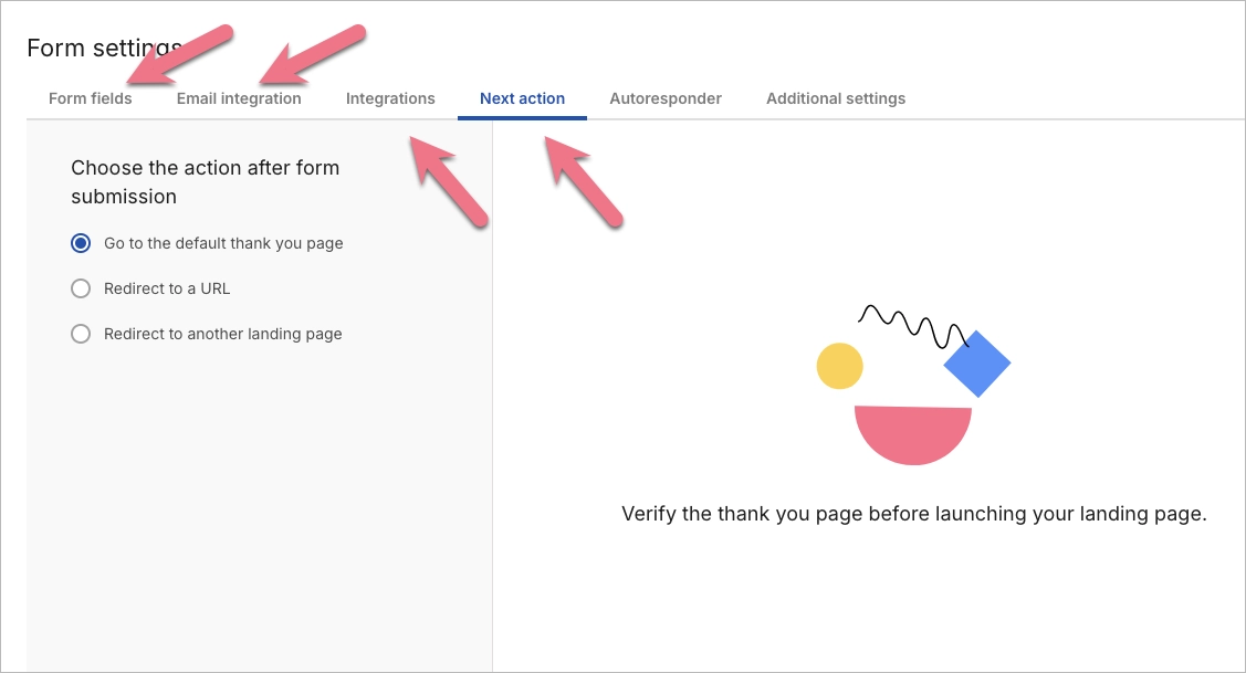
Click the form to open its settings and define the required fields. For a newsletter landing page, collect only essential information, such as an email address and optionally a first name for personalization. Connect the form to your email marketing tool or CRM, enable notifications, and choose what happens after submission.
Set up either a confirmation message or a redirect to a dedicated thank-you page. A separate thank-you page allows you to confirm the subscription, explain next steps, and prompt users to check their inbox if double opt-in is enabled. Clear post-submission guidance increases confirmation rates and keeps engagement high.
5. Use Smart Sections for Branding (Optional)
Smart Sections allow you to create reusable blocks, such as headers, logos, or footers, that stay consistent across multiple pages. Design the section once and apply it to every newsletter-related landing page within the campaign. Centralized control saves time and ensures visual consistency when promoting the same newsletter to different audience segments.
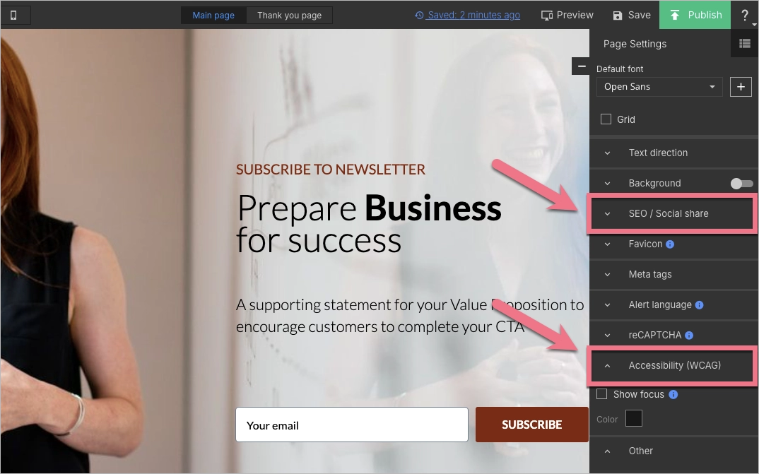
6. Set Up SEO and Page Settings
Open “Page Settings” to add an SEO title and meta description that describe the newsletter and include relevant keywords. Clear metadata helps search engines understand the page topic and improves click-through rates from search results. Accurate titles and descriptions increase visibility and attract qualified visitors.
Review basic accessibility settings before publishing. Add descriptive alt text to images, ensure visible focus indicators for keyboard navigation, and check that text contrast meets readability standards. Accessibility improvements make the newsletter landing page usable for a wider audience, including visitors using screen readers or keyboard-only navigation.
7. Preview and Test the Page
Click “Preview” to review the landing page on both desktop and mobile devices. Test the sign-up form, CTA button, and overall layout to confirm that every element works as expected. A high-converting newsletter page should load quickly, display correctly on all screen sizes, and clearly direct users toward one action: subscribing.
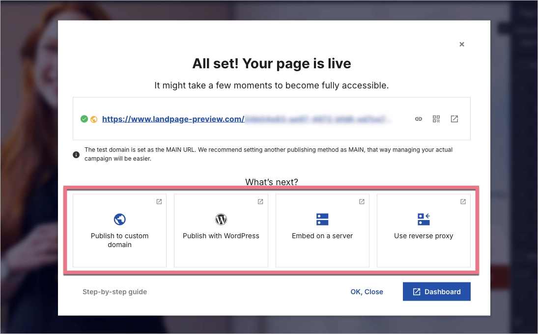
8. Publish Your Page
Click “Publish” and select how you want to share the page. Use a Landingi-generated URL, connect a custom domain, or embed the landing page into your existing website. Choose a publishing option that makes the newsletter link easy to distribute through email campaigns, social media, and paid ads.
9. Track Sign-Ups and Connect Tools
Use the “Leads” tab in Landingi to monitor new newsletter subscribers and review submission data. Integrate the form with tools such as Mailchimp, ActiveCampaign, or Zapier to automatically send contacts to your email list and trigger follow-up workflows. Automation ensures that every new subscriber receives immediate communication without manual work.
10. A/B Test and Improve
After publishing, run A/B tests to compare variations of headlines, CTA buttons, or form layouts. Landingi’s A/B testing and EventTracker features provide data on user behavior and conversion rates. Ongoing testing helps identify which elements increase sign-ups and supports continuous optimization.
Create a newsletter landing page that converts—get started with Landingi today!
What Is a Newsletter Landing Page?
A newsletter landing page is a standalone page created to collect email subscribers. The page has one objective: capturing email addresses from visitors who want ongoing updates. A single goal shapes both the layout and the messaging.
Most newsletter landing pages center on a subscription form, often with just one required field: an email address. The page presents a short explanation of what subscribers will receive, such as industry insights, practical tips, product updates, or exclusive offers. Clear expectations help visitors decide quickly whether the content matches their interests.
Immediate benefits may include access to premium content, while long-term benefits may include regular education or early access to announcements. Specific outcomes make the subscription feel useful rather than generic.
A well-structured page also addresses trust. Details about email frequency and privacy policies reduce concerns about spam. When messaging, design, and reassurance work together, the page turns casual visitors into engaged subscribers.
Grow your subscribers—create a high-converting newsletter landing page with Landingi!
3 Newsletter Landing Page Best Practices
Effective newsletter landing pages share a few consistent traits. High-performing pages clearly explain the benefit of subscribing, reinforce credibility with social proof, and use well-placed prompts to increase conversions. Applying structured best practices separates optimized pages from average sign-up forms.
1. Set a clear value proposition
A value proposition explains why someone should leave an email address. The message should define the main benefit, such as exclusive insights, weekly discounts, or expert strategies. Clear positioning reduces hesitation and improves sign-up rates.

Strong newsletter pages specify the type of content and its relevance to the target audience. For example, an ecommerce brand may offer early access to sales, while a B2B company may share industry reports or case studies. Tailoring the incentive to audience expectations increases perceived value and drives conversions.
2. Add the number of subscribers
Displaying the number of subscribers provides measurable social proof. A visible count, such as “Join 40,000+ marketers,” signals that others already find the newsletter valuable. Social validation reduces uncertainty and increases trust.

Subscriber numbers work best when paired with audience context. Instead of showing a raw figure, specify who subscribes, such as founders, ecommerce managers, or designers. Defining the audience helps visitors identify themselves in the group and increases the likelihood of conversion.
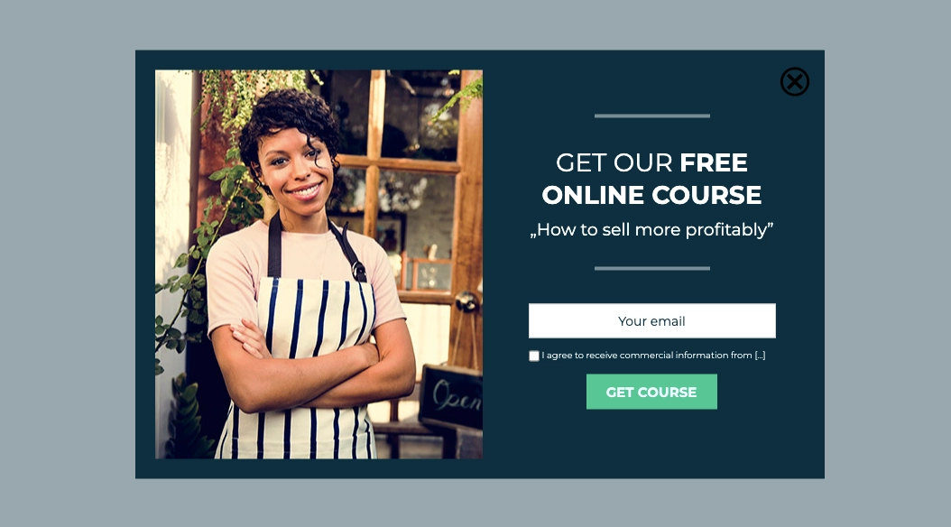
3. Use pop-ups
Pop-ups are short, focused forms that appear over existing content to capture email addresses. A newsletter pop-up typically includes a brief value statement, a single input field, and a clear CTA button. The limited space keeps attention on one action: subscribing.

Pop-ups can be triggered at different moments in the user journey. Common triggers include entry pop-ups, timed pop-ups after several seconds of browsing, exit-intent pop-ups that appear when a visitor is about to leave, or action-based pop-ups after adding a product to the cart. Strategic timing increases visibility without interrupting the browsing experience too early.
When aligned with user behavior and a clear incentive, pop-ups can significantly increase sign-up rates. The key is relevance, timing, and a concise value proposition.
Stop losing subscribers at the door! Build a newsletter page that sells your offer in seconds.
What Are the Key Elements of an Effective Newsletter Landing Page?
An effective newsletter landing page includes six essential elements: a clear headline, benefit-focused copy, a strong call to action, a simple sign-up form, engaging visuals, and social proof like subscriber numbers.
These elements work together to create a page that’s visually appealing, easy to navigate, and persuasive enough to convert visitors into subscribers. Keep the design clean and focused – avoid unnecessary distractions, align everything with your brand identity, and make the subscription process as intuitive as possible. A well-designed newsletter page not only captures leads but also sets the tone for ongoing communication and future marketing efforts.
Ready to increase your newsletter sign-ups? Build your landing page with Landingi!
What Is the Best Newsletter Landing Page Builder?
The best newsletter landing page builder is the one that lets you design focused, high-converting pages without relying on extra tools or technical skills. Landingi stands out here by offering a complete, easy-to-use platform with everything you need to create and optimize newsletter pages that deliver results.
It’s built for marketers and non-designers, with features like a form editor, pop-up creator, and a wide selection of templates to help you launch pages quickly. You can choose a ready-made layout and adjust it to your needs or build a custom design from the ground up while staying in full control of content and structure.
What makes it especially useful is how much it simplifies ongoing optimization. You can run A/B tests without third-party tools, monitor user behavior with EventTracker, and get AI-driven suggestions for content and SEO. Mobile responsiveness is built in, and integrations with CRMs, email platforms, and marketing automation tools make it easy to connect with the systems you already use.
While there are other page builders on the market, Landingi brings together usability, flexibility, and performance tools in one budget-friendly package, making it a smart choice for businesses of any size.
Follow best practices for newsletter landing pages—start building with Landingi!
Build Newsletter Landing Pages in Landingi
Newsletter landing pages support lead generation by turning website visitors into email subscribers. A focused page with a clear value proposition and optimized form helps build a qualified audience over time. Consistent optimization improves conversion rates and increases the return on traffic.
Landingi provides tools to design, publish, and test newsletter landing pages without coding. The platform includes templates, a drag-and-drop builder, integrations with email marketing tools, and built-in A/B testing. Practical features reduce setup time and allow faster iteration.
Effective design combines visual clarity, usability, and mobile responsiveness. A well-structured layout, strong CTA, and accessible form increase sign-ups across devices. You can start building and testing your newsletter landing page in Landingi with a free trial. Try Landingi now for free!


