
UX optimization for landing pages means improving how users interact with a page to increase the likelihood of conversion. UX and CRO are directly connected – every change to layout, messaging, or flow affects how visitors behave and whether they take action.
That impact is larger than many marketers assume. According to Mike Gualtieri from Forrester, a well-designed UI can increase a website’s conversion rate by up to 200%. When paired with strong UX, that number can reach 400%. On landing pages, where every element supports one focused goal, better UX directly improves conversion performance.
Landing pages are also better suited to continuous optimization than traditional CMS-based websites. A landing page platform lets marketing teams build, test, and update pages quickly without involving developers in every change. Landingi supports this workflow as an AI landing page operation system, combining fast page creation with ongoing optimization. With Lunar for generation and Solis for performance analysis, teams can move from idea to iteration much faster.
This article breaks down 10 practical ways to optimize landing page UX and explains how better UX can improve conversions, lower acquisition costs, and reduce bounce rates.
Key Facts
- UX and CRO are directly connected – better UX improves conversion performance
- Strong UI can increase conversion rates by up to 200%, and strong UX can push that gain up to 400%
- Landing pages work better for ongoing optimization because they focus on one conversion goal
- Landing page platforms support faster testing and updates than traditional CMS workflows

Lunar is almost here!

What is UX Conversion Optimization?
UX conversion optimization is the process of improving a landing page’s user experience to increase the likelihood of conversion. It combines user data, usability testing, and design changes to reduce friction and help visitors take a specific action, such as making a purchase, downloading an ebook, or signing up for an event.
UX and CRO are directly connected. Every change to layout, clarity, navigation, or messaging affects how users move through the page and whether they convert.
Design plays a central role in this process. According to Trevin Shirey’s “Why User Experience Matters to Marketing” published by WebFX, 94% of first impressions are design-related, and 75% of a website’s perceived credibility depends on design. These numbers show why UX improvements influence both trust and conversion behavior.
UX conversion optimization includes a wide range of actions, from improving UI clarity to segmenting audiences and refining page structure. On landing pages, this matters even more because every element supports one conversion goal.
Why UX Optimization Works Best on Landing Pages?
UX optimization is especially effective on landing pages because these pages are designed with a single, focused conversion goal. Unlike full websites, which often include multiple navigation paths and content types, landing pages direct users toward one specific action, such as signing up, downloading a resource, or making a purchase. This clarity allows UX improvements to have a direct, measurable impact on user behavior.
Users form an impression of a page in just 0.05 seconds, making that initial moment critical. On a landing page, this first impression often determines whether the visitor continues engaging or leaves. A clean design, intuitive layout, and clear calls to action reduce confusion and hesitation, increasing the likelihood of conversion.
Since landing pages typically attract paid or highly targeted traffic, improving the user experience can directly impact return on ad spend (ROAS). Small UX changes – like adjusting button color, shortening forms, or improving visual hierarchy – can significantly raise conversion rates.
This also means landing pages are easier to optimize at scale. When changes can be deployed instantly – without development cycles – teams can run more experiments and improve results faster. In practice, faster iteration leads directly to better conversion performance, because insights can be tested and implemented without delay.
10 UX Conversion Rate Optimization Tips
Improving landing page UX requires a structured, data-driven approach. The following 10 tips focus on identifying friction, testing changes, and optimizing elements that directly impact conversion rates.
UX CRO is not a one-size-fits-all process. It depends on how your users behave, what they expect, and how they interact with your page. That’s why effective optimization is always based on real user data and continuous testing.
The goal is simple – remove friction, improve clarity, and make it easier for users to take action. The strategies below show how to do that in practice.
1. Analyze your conversion funnel and find mistakes
Start by analyzing your conversion funnel – the path users take from first interaction to final action. This is where you identify where users drop off and what blocks conversions.
A structured analysis should include:
- identifying funnel stages
- mapping the user journey
- tracking key metrics
- pinpointing friction points
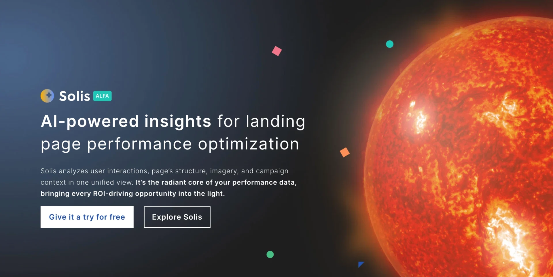
Tools like Google Analytics 4, Hotjar, and ClickFunnels help reveal where users lose interest or encounter obstacles. Platforms like Landingi support this process with built-in analytics such as EventTracker, which tracks microconversions, scroll depth, and user behavior. Solis – AI agent for landing page optimization – builds on this data to highlight friction points and recommend improvements automatically.
2. Define goals for conversion rate
Set clear, measurable goals that align with your business objectives and focus on specific user actions.
Examples include:
- increasing purchases by 15% over the next quarter
- boosting newsletter sign-ups by 20% within two months
- raising ebook downloads by 30% over six weeks
- increasing webinar attendance by 25% for the next event
- improving app signup conversion rate by 10% within two months
To define these goals, analyze user behavior, run UX tests, and gather feedback through analytics and surveys. Focus on metrics that directly reflect performance, such as click-through rates, form completion rates, and session duration.
Tracking progress with the right tools ensures your goals are realistic and your optimization efforts stay measurable.
3. Collect, segment, and analyze visitor data
Start by collecting and analyzing visitor data to understand how users interact with your landing page. Focus on traffic sources, device types, bounce rates, and interaction patterns.
Segmenting this data – by location, behavior, or entry point – helps identify trends and uncover friction points.
Use these insights to adjust your page structure and content. Highlight high-interest sections, simplify navigation, and align the experience with user expectations to increase conversions.
4. Create a compelling and clear value proposition
Your value proposition is one of the first things users see, so it needs to communicate value immediately. It should clearly explain what you offer, why it matters, and how it differs from competitors.
Keep it concise, specific, and easy to understand. Focus on benefits, not features, and address the main problem your audience is trying to solve.
A strong value proposition reduces confusion, builds trust, and helps users quickly decide whether to continue or leave.
5. Use conversion copywriting and create enticing CTAs
Conversion copywriting uses user-focused language and proven frameworks to drive action. It should be based on real user insights and clearly communicate value.
Focus on:
- voice-of-customer data
- frameworks like AIDA or PAS
- clear, benefit-driven messaging
Your CTA is just as important. It should guide users to the next step and make the action feel obvious.
Effective CTAs:
- start with a strong action verb
- highlight a clear benefit
- create urgency when relevant
- stand out visually
For example, “Get My Free Guide” performs better than “Submit” because it clearly communicates value. Without strong CTAs, users are more likely to leave without taking action.

6. Provide various forms of social proof
Social proof builds trust and reduces uncertainty by showing that others have already had positive experiences with your product or service. It often influences decisions more than promotional messaging.
Use different types of social proof, such as testimonials, case studies, and user-generated content, to support your value proposition.
Place social proof close to key decision points – such as near CTAs or pricing sections – to reinforce trust at the moment users are ready to act. Make reviews easy to scan by using filters, summary scores, and highlighted insights.
7. Perform competitor analysis
Competitor analysis helps you identify gaps and opportunities in your UX strategy. It shows what others in your market are doing to attract and convert users – and where you can do it better.
Start by identifying direct competitors targeting a similar audience. Review how they structure key pages, including layouts, messaging, and CTAs. Pay attention to usability, clarity, and visual hierarchy.
Analyze their SEO strategy as well. Tools like Semrush or SpyFu can show which keywords they rank for, helping you refine your positioning and visibility.
8. Run user experience tests
Testing is essential for improving UX and increasing conversions. It shows what works and what needs improvement based on real user behavior.
A/B testing compares two versions of a page to determine which performs better. You can test elements like CTA buttons, headlines, or form layouts to see what drives more conversions.
Usability testing goes further by observing how real users interact with your page and where they encounter friction.
Other methods include:
- multivariate testing, which compares multiple element combinations
- eye-tracking, which shows where users focus their attention
Use these insights to improve layout, copy, and navigation. Regular testing leads to continuous optimization and more consistent results.
The next step is reducing the time between insight and action. AI-powered workflows allow teams to implement changes immediately, instead of waiting for manual updates.
9. Use a dedicated landing page for ads
When running ad campaigns, direct users to focused landing pages – not your homepage. A dedicated landing page matches the ad’s message and drives users toward a single, clear action, such as signing up or making a purchase.
These pages remove distractions and improve clarity. For example, a landing page for a fitness app might include a headline like “Get Fit in 30 Days,” a signup form, and testimonials – all above the fold.
Segment your audience and tailor landing pages to each group. Adjust messaging, visuals, and offers for returning visitors, first-time users, or specific campaigns to increase relevance and conversions.
A dedicated landing page platform allows teams to create, test, and adapt pages without relying on developers, which significantly accelerates optimization cycles. With tools like Lunar – an AI landing page generator – teams can generate campaign-specific landing pages much faster and iterate on them continuously.
Generate high-converting landing pages for your campaigns in minutes.
10. Ensure your website is accessible
Accessibility is a critical part of UX optimization. If users can’t navigate or interact with your page, it directly impacts conversions and limits your reach.
To improve accessibility, follow key principles:
- ensure sufficient contrast between text and background
- add descriptive alt text for images
- provide captions or transcripts for video and audio
- use clear structure with headings and logical flow
- support screen readers and keyboard navigation
For example, captions help users understand video content, while proper structure improves navigation for assistive technologies.
Improving accessibility doesn’t just make your page more inclusive – it improves usability for all users, reduces bounce rates, and removes barriers to conversion.
6 Key Benefits Of UX Conversion Rate Optimization
UX Conversion Rate Optimization (UX CRO) improves how users interact with your landing pages, leading to better engagement, higher conversions, and more efficient use of marketing budgets.
A poorly optimized user experience can result in the loss of up to 89% of potential customers to competitors, according to Trevin Shirey (“Why User Experience Matters to Marketing”). That’s why improving UX is not just about design – it directly impacts business performance.
Below are the key benefits of UX CRO:
Increased conversions
By streamlining the user journey and removing friction points, UX CRO increases the likelihood that visitors take action – whether it’s making a purchase, signing up, or requesting a demo. Even small improvements, such as clearer messaging or simplified forms, can lead to measurable gains.
Reduced acquisition costs
Higher conversion rates mean you need less traffic to achieve the same results. Improving UX allows you to get more value from existing campaigns, lowering your cost per acquisition without increasing ad spend.
Enhanced user experience
UX CRO improves clarity, usability, and overall flow. A better experience makes it easier for users to navigate your page, understand your offer, and take action – which directly impacts engagement and satisfaction.
Higher customer retention
Optimized landing pages don’t just convert – they create consistent, relevant experiences that encourage users to return. Personalized content, familiar layouts, and faster access to key information all increase the likelihood of repeat engagement.
Decreased bounce rates
Clear structure, faster load times, and focused messaging help users stay on the page longer. Reducing friction at key points keeps visitors engaged and signals higher content quality.
Faster testing and optimization cycles
UX CRO enables continuous testing and iteration. The faster you can test ideas, the faster you can improve results. Solis, an AI landing page optimization tool, helps teams analyze user behavior and turn insights into concrete improvements without slowing down the workflow.
The biggest advantage is speed. When you combine fast testing with rapid page creation, you can launch, validate, and optimize landing pages much faster, without operational bottlenecks.
FAQ
Here are some of the most common questions about improving landing page UX and measuring its impact on conversions.
How do you measure the success of landing page UX changes?
Measure success by tracking key performance indicators such as conversion rate, bounce rate, and engagement metrics like session duration or click-through rates.
To get a complete picture, combine this with deeper analysis of:
- user behavior (heatmaps, click tracking)
- A/B test results
- goal completion rate
- revenue per visitor
The most reliable insights come from combining quantitative data with real user behavior.

What to avoid when optimizing landing page UX?
Avoid common mistakes that increase friction and reduce conversions, like prioritizing aesthetics over usability, neglecting mobile optimization, and creating generic experiences that don’t match user intent.
Ignoring usability issues – such as slow load times or unclear navigation – can also significantly impact performance. Each of these factors directly affects how users interact with your page and whether they convert.
What tools help improve landing page UX?
Improving landing page UX requires a mix of analytics, behavior tracking, and testing tools. Google Analytics 4 helps track performance, while heatmaps and session recordings reveal how users actually interact with your page. A/B testing tools allow you to validate changes and measure impact.
Platforms like Landingi bring these elements together. EventTracker collects behavioral data, and Solis – an AI landing page optimization tool – analyzes it to deliver actionable recommendations, helping teams move faster from insight to implementation.
How to choose UX CRO expert?
Choose experts who combine UX design with data-driven testing. Look for proven results, relevant case studies, and experience with landing pages and conversion optimization.
A strong UX CRO expert should be able to translate data into clear, actionable improvements. In practice, effective optimization is always based on measurable impact, not subjective design decisions.
Optimize Landing Page UX Faster With Landingi
UX optimization delivers the strongest results where conversions happen – on landing pages. Their focused structure, fast iteration cycles, and measurable outcomes make them the most effective environment for improving performance.
Landingi supports this process as an AI landing page operation system. Instead of treating UX optimization as a series of isolated changes, teams can manage the entire workflow – from creation to optimization – in one place.
Lunar, an AI-native landing page generator, allows teams to create complete pages from a prompt. Solis, an AI landing page optimization tool, analyzes user behavior and provides actionable recommendations. Orbit connects these workflows with preferred AI tools, enabling teams to operate without switching environments.
This approach shortens the distance between insight and execution. Teams can test faster, implement changes immediately, and scale what works without operational bottlenecks.
If your goal is consistent growth, focus your UX optimization where it has the most direct impact – on your landing pages.


