
Less than 15 seconds. That is how long an average user initially views the landing page. That is all you have to catch one’s interest and increase the time spent on the page to the massive… wait for it…. 52 seconds. This time is (almost) the most important reason for “Why should I enhance my landing page?”. In a way, it is a make-or-break where the outcome of your campaign is considered.
In other words, the first part of the landing page is the most important, the most crucial one.

Headings and subheadings
You may think this is obvious thing that the page needs headings and how important they are. However, this part was mainly overlooked during my work with clients, more often than I can count.
The headings should be large, quickly catch an eye and give the reader all the information about this next part. It would be best if you could combine two things. Make the heading informative and compelling to act at the same time. The best headings complement the CTA message. But, it may be hard to create a few different ones that will fully fulfill the task above. This is where subheadings come to play.
Your heading may be short. Three or four words, a catchphrase. But below, you can add a subheading. It will be slightly longer and written in a smaller font but easily distinguishable from the text paragraph below. These are a few examples of combining a heading with a subheading.

Make sure you use them on your page.
Once you have your headings ready, make sure you mark them as H1, H2, H3, and so on. It may impact the amount of money you will need to pay for your clicks, once your ad will win an auction. More on SEO here.
The unfolding section – let visitors discover more with a single click!
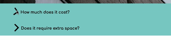
Suppose your offer may raise some important introductory questions. Some of these may be a make-or-break deal, and you will want to address them immediately and put your potential customers at ease. An example of such questions is quite often a so-called FAQ.
Will I get my money back? Do I need to pay for extras? How soon will I get the product? Can I return it? And so on.
Suppose that is just one or two questions with short answers, no problem. But if there are more of them and the explanations are more complex, you may end up with a large and long “wall of text”. Not only may this look offputting, but it may also pull your clients away from your CTA.
This is the perfect example of using the “unfolding section feature”.
For example, there will be a small heading with one of the frequently asked questions, but the answer and explanation will remain hidden from the viewer until the trigger is clicked.
This is what it may look like:
Those of your customers who would need that information before making a purchase or fulfilling the desired CTA will have it available. Others will not be bothered by its presence.
Click if you wish to know how to enhance the landing page with an unfolding section.
Image Gallery – because “A picture is worth a thousand words”
I do not need to tell you that you need pictures and photos on your landing page. But – we’ve all been there – almost all and any of us like to look at the things we are about to purchase carefully. In the case of services and offers, when we are almost ready to sign up, we may like to see what some additional details look like. Simply, what lies ahead, and what will we get?
If we are talking about a physical object in the shop, we can take it off the shelf and look at it from all angles for as long as we want. In the online world, things are a bit more tricky. We need to use pictures that will show the potential clients what we are offering.
But again, as with the FAQ section I talked about above. Putting ten or more pictures on top of each other may stretch your page, and instead of being an asset might become tedious and troublesome to scroll. People are not very keen on scrolling, and scrolling, and scrolling… endlessly.
Instead, using all those pictures in one place will be much better. With additional arrows, you give your clients complete control over how many of them they want to browse through. And it makes the look of the page more interesting.
Click if you wish to know how to enhance the landing page with an image gallery.
Slider – to make sure they will see the most important!
The gallery I discussed above puts the control in your customer’s hands. But sometimes, you may want to be sure that your visitors see some particular images.
Again, you could do that by simply adding them to your page. But that will take more space than it should. More importantly, adding an animated bit might give your page a more dynamic feel.
If you wish to do so, use the slider. It will automatically scroll the images for your clients. Those can be simple images or, better yet, images with text in the form of headings/key points.
Using it in the top sections of your page may significantly and positively impact your conversion rate.
Click if you wish to know how to enhance the landing page with a slider.
Unsplash – don’t waste time when searching for a perfect free image!
This may not be exactly an enhancing feature on its own, but since I talked about images, sliders, and galleries, it is definitely worth mentioning. If you are using WordPress, you may already have encountered this problem. “Ok, I need an image. I do not have my own. Where do I get one free?”. On the other hand, if you are in the market for a web page-building service, it is worth checking before subscribing. Easy access to a large number of free-to-use images. Landingi customers can use the Unsplash gallery. Thousands of shots waiting for your right there, in the editor. And since images can significantly enhance your page, why would you want to waste time looking for a perfect one all over the internet?

Lightbox – additional info can pop out but not pop up
I am sure you are familiar with pop ups. Despite how annoying they can be on some pages on landing pages, they do work, increasing the conversion rate. But those can only be used to enhance your CTA message.
There is, however, a similar feature to pop ups, but not as annoying – its display will solely depend on the user’s action – and that can massively boost the information available to your customers.
Let’s say you are offering a product with more complex functionality or a few features.
Instead of adding sections or parts of the page describing them (again, you may end up with a very, very long page), you can present those with icons and lightboxes.
An icon will present a specific functionality of your product or service. When clicked on, an additional box will appear with graphics and text giving your potential customer important information.
Trust me. It works really well. It enhances page design and functionality, keeping the landing page compact.
Click if you wish to know how to enhance the landing page with a lightbox.


