When crafting a landing page, you want it to convert well, right? While many marketers believe that nothing matters more than the offer, when it comes to turning website visitors into customers, choosing from landing page templates plays an important role, too. With a great amount of branded information on the web, it’s important to be any different from hundreds of other landing pages hoping for the attention of the same audience.
In this post, you will learn why you need to pay close attention to best landing page examples and what design trends are predicted to dominate in 2019.

Why Best Landing Page Design Matters
Believe it or not, effective landing page optimization starts with the right design. It takes just 2.6 seconds for online visitors to form a first impression of your brand, so the eye-catching design is a proven way to grab their attention.
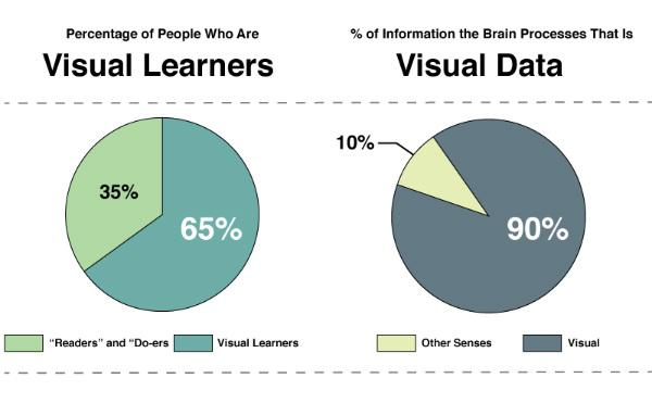
No matter what your niche market is, chances are that your target customers are visual beings: 65% of people are visual learners and we remember pictures with at least 90% accuracy. In other words, landing page design has an impact on user behavior.
The right landing page design helps your brand stay one step ahead of your competitors: it not only makes the lasting impression but it also convinces users to take the desired action faster. As a result, your landing page converts better.
If you keep up with design trends, your landing page is more likely to grab visitors’ attention, engage them, and convert.
However, it’s also important to stay up-to-date with the latest trends in landing page design as it helps to give visitors what they crave.
What are the Top Design Trends for Landing Pages?
The design is what makes your landing page visually appealing. And if you want to stand out from your competitors, you need to keep an eye on trends as they are constantly changing. While there’s no one-size-fits-all page design that can work well for all digital campaigns and products, there are six design trends for 2019 to create landing pages that convert. Check our landing page best practices:
#1. Minimalism
Have you ever heard the phrase “less is more”? When it comes to creating landing pages, minimalist design isn’t a new concept. Since it’s a proven way to deliver the brand message, simple landing pages help to achieve marketing goals faster.
Minimalist design is about containing all important characteristics without bombarding visitors with a great amount of visual information which also helps visitors view content on mobile phones and tablets. If you wonder whether this design can hook your audience, think about two main advantages it also has:
- Improved functionality: the average attention span is 8 seconds, so when your landing page has fewer images, sound effects, and simpler navigation, it’s easier for people to perceive information.
- Web page speed optimization: Since a 1-second delay in your site speed can result in a 7% reduction in conversions, using a simple design is a way to increase the loading speed.
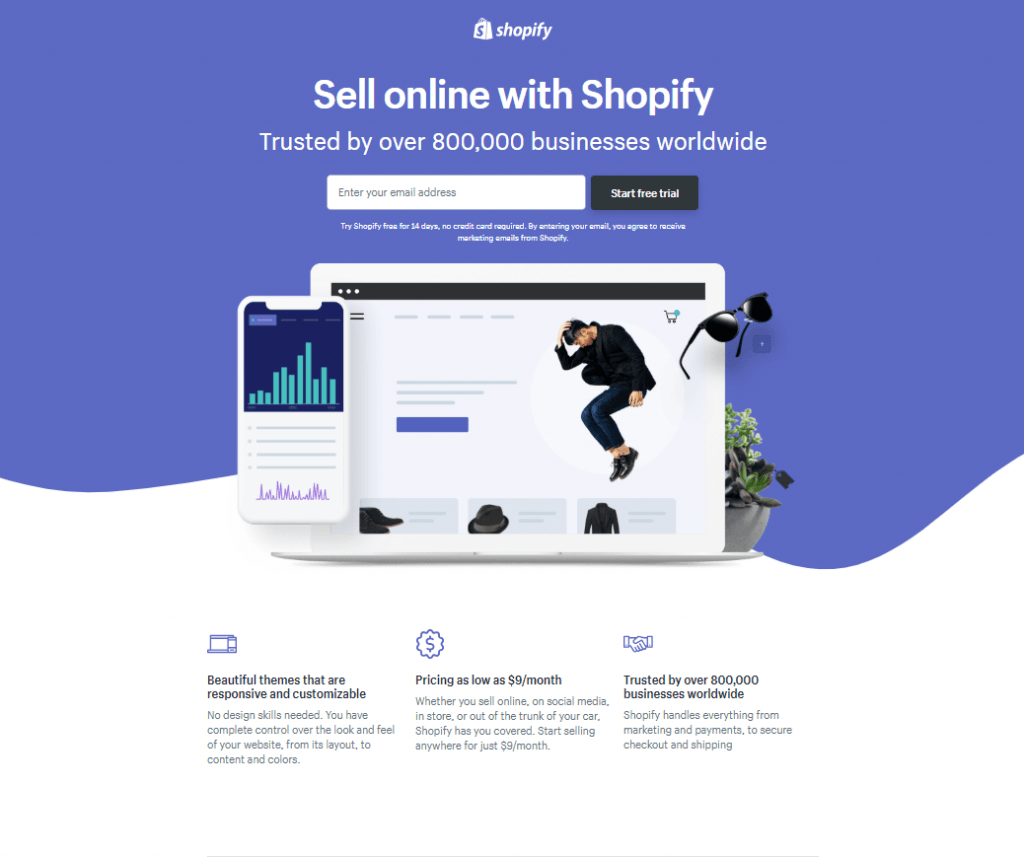
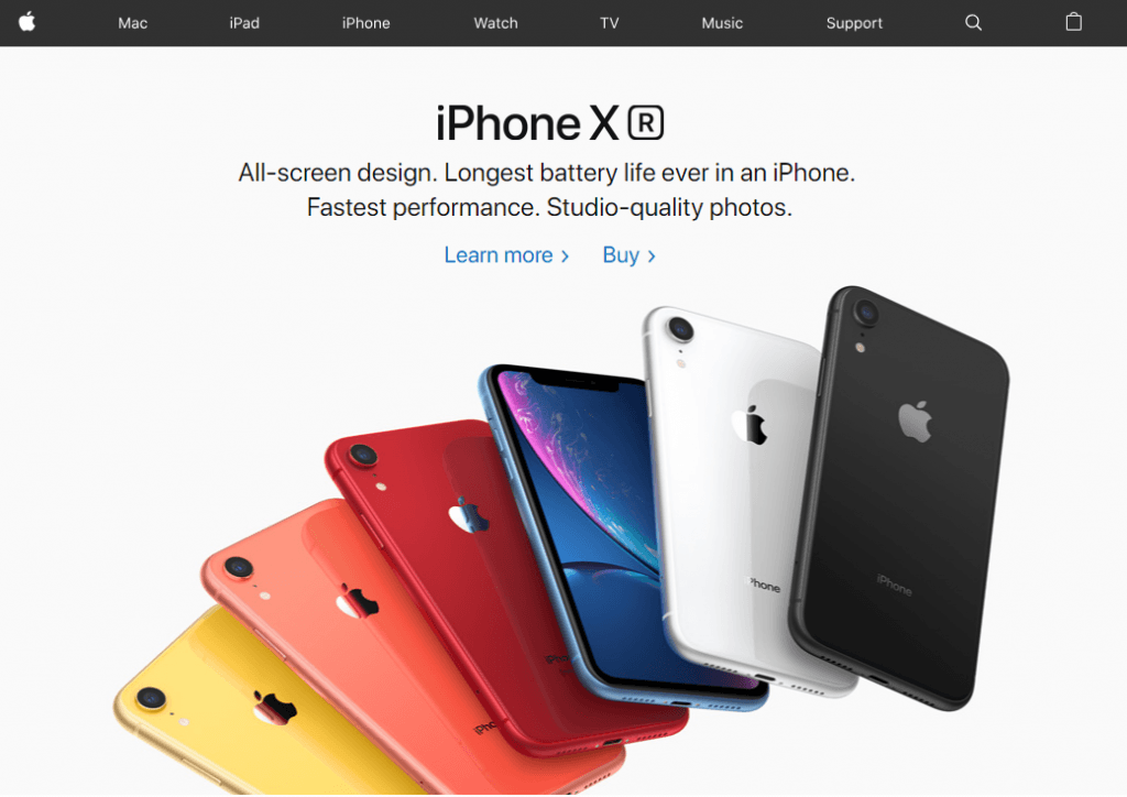
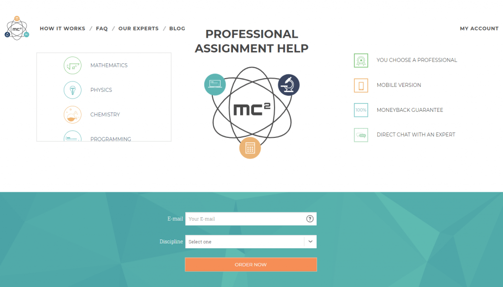
All in all, the simpler the design is, the better for perception. Thus, the minimalist landing page is not just a design trend; it’s also a way to get better results with digital campaigns. Here’s an landing page example from Shopify:
Let’s take another example from Apple:
Or another one from MC2 Bid4Papers:
Every landing page must have a purpose, and when you use a simple design – you keep a focus on your message. With a minimalist design, you declutter the landing page, allowing visitors to pay attention to details that matter. As a result, you get a better conversion rate.
#2. Geometric shapes
Squares, circles, triangles – all people are familiar with these geometric shapes and their derivatives. The combination of certain shapes and colors have a defined connotation in our subconscious. So, it’s no wonder we pay attention to landing pages that include these shapes.
Here’s why:
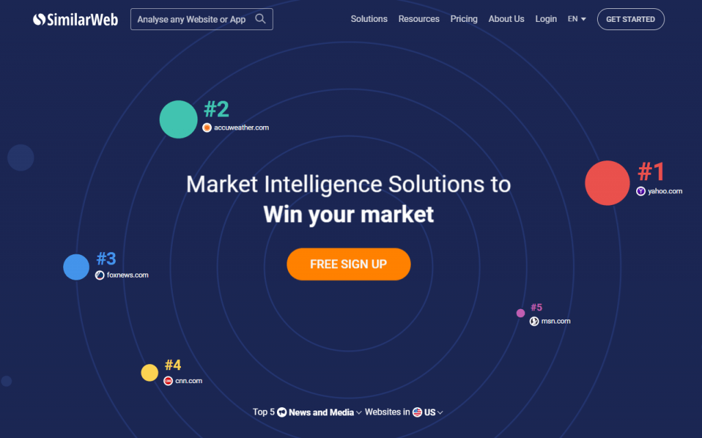
It goes without saying that emotions are integral to all decisions people make. Thus, using emotions in marketing is a great way to affect customer behavior, and geometric shapes can help a lot. In 1978, John N. Bassili revealed that humans associated geometric shapes with emotions. According to Bassili’s experiment, the circle is an abstract symbol for happiness, so companies like Similar Web try to trigger positive emotions with these shapes:
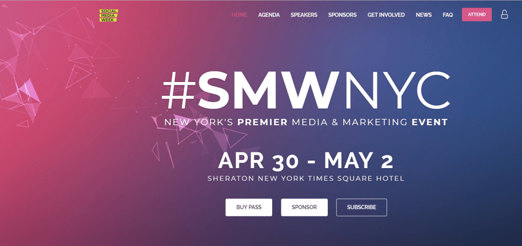
Using geometric shapes is trendy, and more brands jump on the bandwagon. Here’s how Social Media Week uses shapes:
What is more, companies like Nike take the next step, combining geometric and organic shapes. The landing page looks stylish so it will be more likely to attract the target audience – fashion lovers.
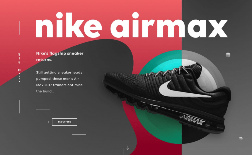
The psychology of shapes in design helps marketers convey the right message, and this trend has become one of the most important in web design over the last few years.
#3. Custom Illustrations
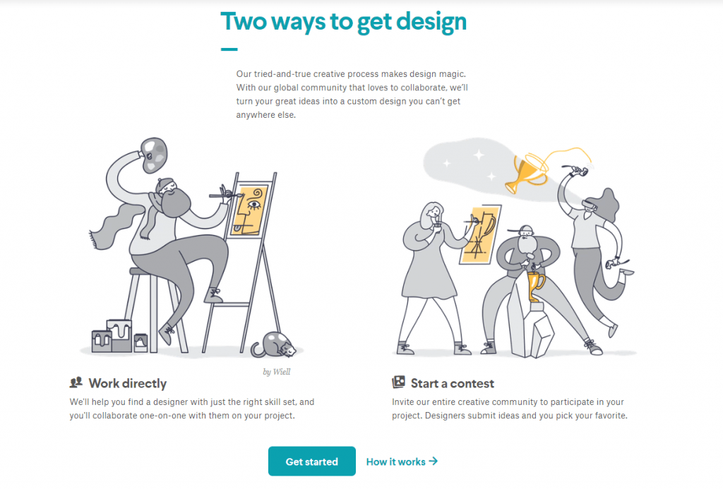
No matter what your business niche is, your customers crave authenticity – they don’t want to see overly-polished stock images that look too good to be true. Thus, another design trend is taking the world by storm – custom illustrations are more likely to attract customers’ attention. Not only unique images bring value and uniqueness to your brand, but they also match your brand message better.
As the global creative platform, 99designs knows the importance of using self-made illustrations to make landing pages eye-catching and original. In this case, using custom images is a way to grab attention, add value, and demonstrate expertise in the niche.
Another way to stand out from competitors and get better brand recognition is to have a mascot. For example, Woorank uses a penguin as a brand mascot.
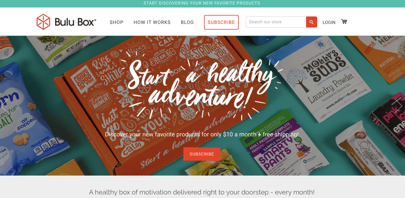
If you want to grab and hold your visitors’ attention, using custom illustrations isn’t an option. It’s also a great way to stay creative, genuine, and convey the message. When you use stock images, your brand suffers, and it has a negative impact on business growth.
#4. Video Content and animation
Creating a landing page, don’t forget to include video content as it’s on the rise in 2019: 93% of users consider video creation a priority, 80% of the US internet traffic comes from video, and using videos for marketing helps to grow revenue 49% faster.
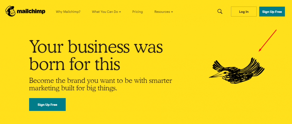
With the popularity of video content, video landing pages are a perfect way to attract the audience, cover and explain information, and achieve marketing goals. Since these landing pages are more appealing to customers, brands include videos and animations to interact with their visitors. For instance, MailChimp includes animation to give life to the characters, explain the concept of the idea in the short term, and entertain visitors who come across the landing page.
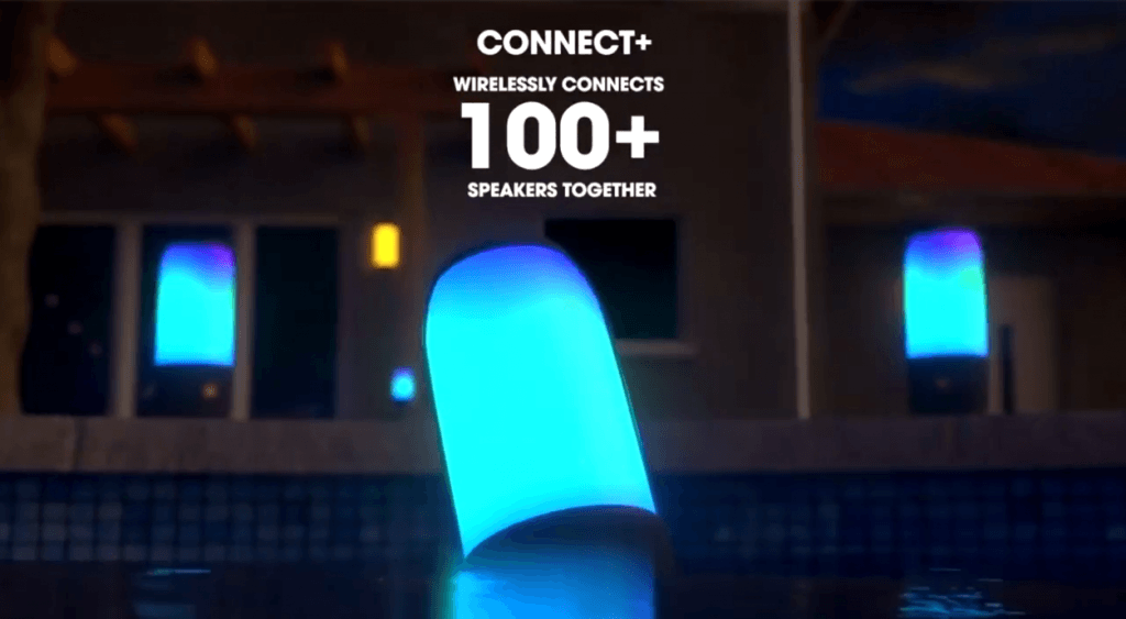
With video and animation, it’s easier to use the art of storytelling to connect your brand with the audience. Let’s take JBL, for example. To promote the new portable speaker, the JBL Pulse 3, the company uses video content to tell visitors more about the device and its benefits which also keeps the audience engaged.
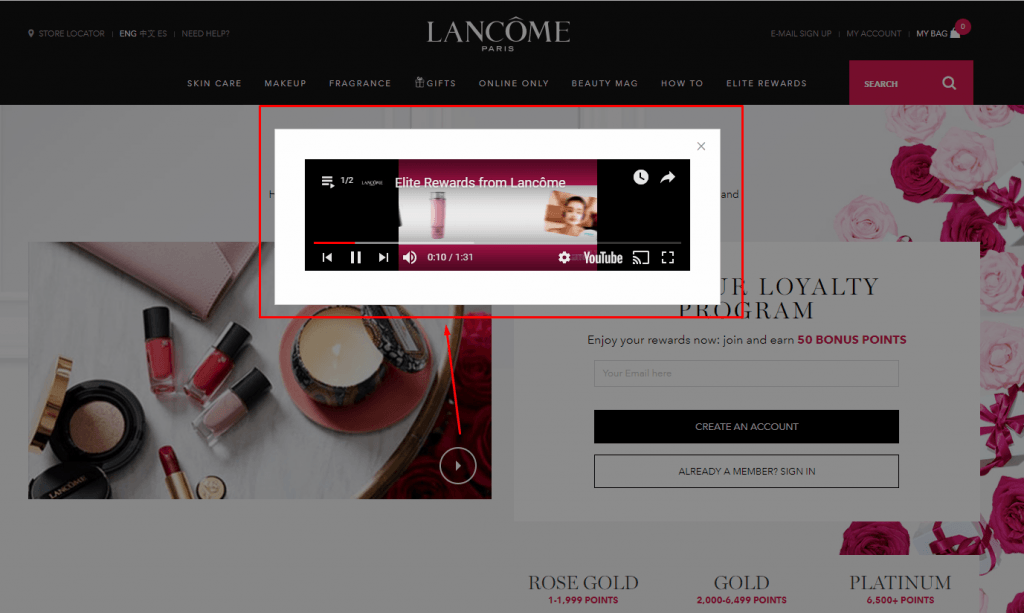
For 90% of customers, video content is believed to help them make purchase decisions. Why? It’s easy to pack a lot of information into videos and they are more engaging, so it’s easier for brands to tell more about the product or explain how to use it. Thus, it’s no wonder that using videos on landing pages can increase conversions by 86%, and brands like Lancome use this type of content to grab visitors’ attention and provide them with detailed information about the product.
So with that said, video content is not just another buzzworthy trend: it’s a great tool to engage visitors and convince them to learn more about your product.
#5. Live Chats
It goes without saying that well-designed landing pages help visitors decide whether or not they are interested in your product. And if you want to turn visitors into customers, you need to improve customer satisfaction – answer all questions with live chats.
‘An old, outdated form submission on the right sidebar with lots of form fields can’t compete with the expertly designed, customized page with live chat built in. Use clean, bold typefaces that speak to personalized pain points. Plus, inspire urgency and provide quick answers with live chat in order to boost engagement and increase lead volume.’
Adam Enfroy, Content Marketing Consultant and Blogger
If you wonder whether you need a live chat or not, pay attention to CrazyEgg. As an application that helps to track a website’s operation, its potential customers always have many questions about its features. To convert more visitors into customers, the company uses a live chat bot that builds a connection with interested people who want to find out more about the tool. Once people know the answers to their questions, they are more likely to choose your product.
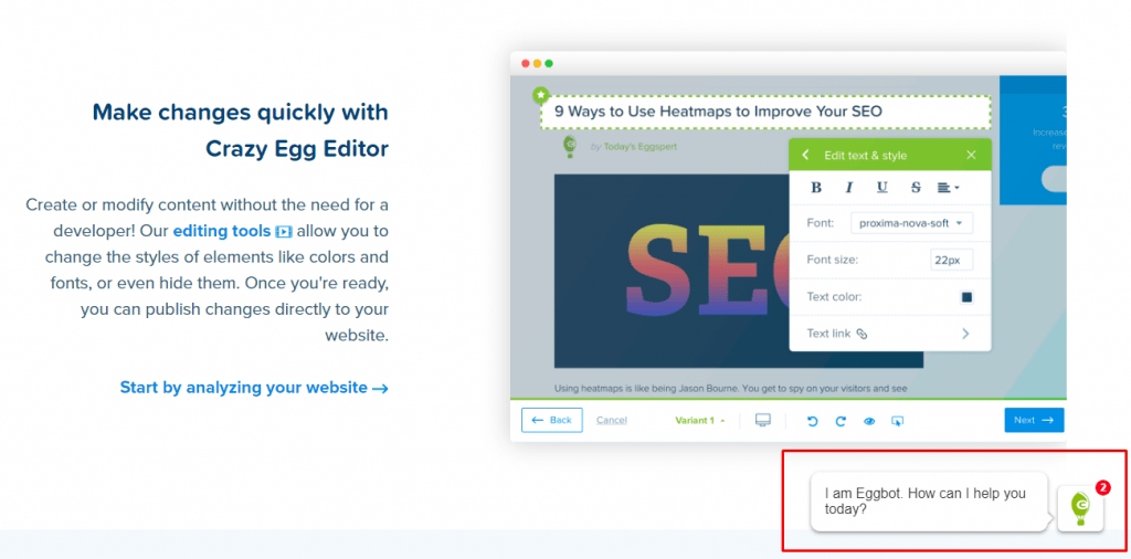
Proper customer service is what makes your brand any different from other competitors. When designing a landing page, include a little box with a live chat in the corner of your landing page to provide visitors with more information if needed.
#6. Contrasting CTA buttons
Call to action (CTA) buttons are highly important for achieving goal conversion. Did you know that more than 90% of visitors who read your headline also read your CTA copy? When your CTA button contrasts with other elements on the landing page, it grabs attention. As a result, visitors are more likely to click on it, and therefore take action.
Obviously, CTA buttons may vary in size, form, and color, but using contrasting colors is the easiest way to attract visitors’ attention. Yes, this trend isn’t new in the world of conversion rate optimization, but it gives great results, so it’s important to pay close attention to the CTA design.
No matter what color you choose for your CTA button, whether orange, purple, or red, it must contrast with the overall page design. Just take a look at Ahrefs:
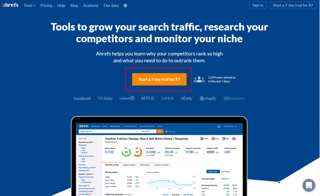
When done right, a CTA button not only draws attention but it also convinces visitors to take action faster. As a result, your landing page generates business leads faster.
How can you create a landing page that draws attention?
If you want to create a landing page that converts, knowing current design trends isn’t enough. Drawing attention with landing pages is not just about eye-catching design. It’s about giving your potential customers what they really want. In 2019, a perfect landing page must be:
- Audience-oriented: What works for your target audience doesn’t work for another one. Thus, you must know your potential customer well: beliefs, values, problems, etc. Once you create a great offer for your audience, your visitors will be more likely to get interested in it. As a result, you grab their attention.
- High-qualitative: Before launching your landing page campaign, ensure its text doesn’t have typos, grammar or stylistic mistakes, images are fine to see on both desktop and mobile gadgets, and all buttons work well.
- Mobile-friendly. Since 75% of Americans use their smartphones to get access to Internet, your landing page must be mobile-friendly. It’s important to ensure your landing page doesn’t have too many images, links aren’t too close together, and the text isn’t too small to read on devices.
In a word
Long gone are the days when customer acquisition was possible without landing pages. Today, any business needs this tool to attract new customers. However, the great number of businesses on the market make it more difficult to cut through the noise of branded information if landing pages don’t draw attention. Thus, keeping up with design trends is a great way to stay appealing to your audience.
