

Selling your products online is far from being a walk in the park – especially if your branch is broad and full of competition. But fear not! You can make it significantly easier by using proper marketing tools – like Shopify – as well as by promoting your goods with landing pages – made in editors like Landingi. And the best way to build a successful e-commerce environment is to mix these two. Get to know how to create the best landing pages for Shopify with Landingi!
Before we get into details, tips, and Shopify landing pages examples, there’s one question worth answering. Why bother with landing pages, especially if you already have a well-functioning online store? Aren’t product pages enough to present your offer?
Fact number one: Online shopping is getting more and more popular. 2020 has been a very strange moment in our lives, indeed, with more and more businesses going online (for example, U.S. online sales of groceries in June reached a 9% increase over May). We may debate whether the growth was caused by the pandemic or the convenience of online shopping. But you can’t deny the fact that it’s getting crowded in the e-commerce sector.
Fact no. two: One of the largest eCommerce platforms, namely, Shopify, now allows users to add their own landing pages to their stores. No wonder – external editors allow a lot more possibilities of customization and Shopify is well aware of that. If eCommerce platforms allow adding landing pages, there must be something useful about them, right?

How is a landing page different from a product page?
The product page is meant to include all the information about the product by definition. Full tech specs, dimensions, certificates, price, information about delivery, possible modifications.
Just like this one here:

Is it clear what this product page is about?
Sure – buying a brand new iPhone.
But is there a reason for me, a simple girl browsing through the internet, to buy it?
Well… that depends.
It depends on whether I know what this particular iPhone goes with and whether I understand why it’s a great value for money. I mean, this page allows me to choose a color, capacity, and payment method, but is there any reason for me to become interested in this device?
If only there was a tool to both present benefits, to address objections and to help me make the one and only decision. If only, indeed.
So, let me now present to you why landing pages surpass product pages when it comes to good ol’ gentle persuasion.


If your client is already looking for a product you sell, if they know what they need, it’s enough for them to have a look at your product page. But if they are not really interested in spending $399 on a phone, it would take something more to make them do so. It would take – you guessed it – a landing page.
Apple did their best to present their new product – their landing page is interactive, stylish, and classy. There’s a science behind this, of course:
- Overcoming typical objections (like “Apple’s expensive” or “I’ll have to buy another one soon and spend even more”).
- Focusing on benefits instead of features so that users understand why a product is worthy of their attention. Just take a look at a page below:
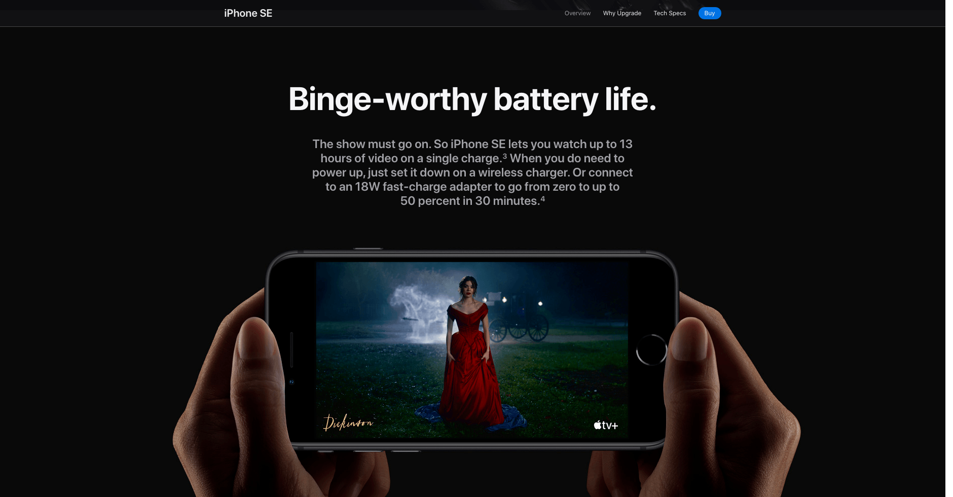

Of course, there is no rose without thorns (and no apples without bite outs). To me, this landing page lacks one strict goal (to buy a product) and it’s more of a leaflet on how the new iPhone works than a standard landing page. As a rule of thumb, you should use only one call to action on your landing page, not dozens of “learn more” hyperlinks.
However, it definitely follows best landing page creation practices and it’s worth checking out.
Let’s have a look at a few more examples that may inspire you to create your Shopify landing pages. Each of them serves a specific purpose:
Shopify landing pages examples
Amazon Business Card

What works great:
Benefits for the card owners are clearly listed.
What could be improved:
The CTA button is a bit small. Although it actually reminds one of typical “buy now” buttons in the Amazon store and it does make sense for the landing page to keep the design of Amazon product pages, I’d go with a bigger button to catch users’ attention and highlight the purpose of this page (“apply now”).
MateCaps
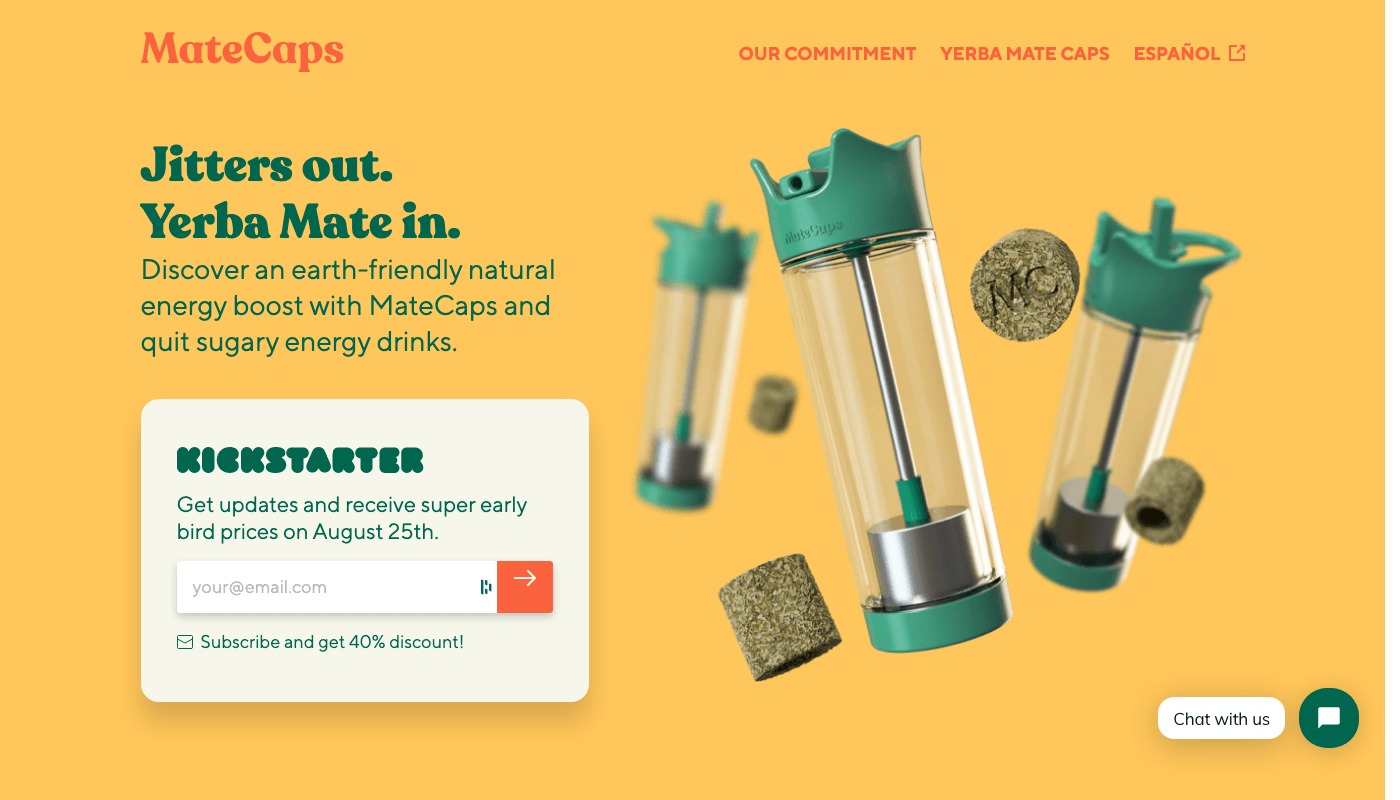
What works great:
This landing page is all about energy (just like yerba), which fits the purpose of the product. Also, the header focuses on benefits (the end of jitters and energy rushes) and images present the product in use (every yerba mate enthusiast fed up with their gourd should appreciate the convenient infusion bottle).
What could be improved:
There is a bit too much going on on this landing page and the overall effect is a bit chaotic: a callback widget, subscribe form and links in the top-right section could distract users from the main goal of this section. Also, the information on the 40% discount is easy to look past.
Kinder Beauty Box

What works great:
This landing page’s header speaks to clients’ needs: both to vegans and to people who care about animal rights. There are also logotypes of brands where Kinder appeared (popular ones like Cosmopolitan or Forbes) to prove the brand is tried and tested. What is more, a “get started” button fuels curiosity and serves as a great example of how to make use of a click-through landing page.
What could be improved:
Copy in the header looks a bit disorganized and could be arranged in a better way.
Trade Coffee

What works great:
Presenting the subscription offer as a gift – because who doesn’t like receiving gifts? Also, a Chemex in the background speaks to specialty coffee lovers’ needs – they will surely recognize the shape and believe there’s some specialty coffee just around the corner.
What could be improved:
The header overlaps the photo and is partly unreadable. And there are two call to action buttons instead of just one – there is no single goal to this page.
CyberPunk 2077

What works great:
The bright, neon header on the left both fits the design of the game and explains what the landing page is about. Contrasting colors and neons are a great choice for a landing page advertising a (long-awaited) game taking place in cyberpunk lore.
What could be improved:
Without looking on the left, it’s unclear why we should select any of the platforms on the right. I mean, “select” does not equal “buy” and I’d go with a bit more persuasive copy in the yellow section. However, it’s a nuance you don’t necessarily have to agree with… and when it comes to nuances on landing pages, you can always use A/B testing, test two versions differing in one small detail and analyze which one converts better.
Scrivener

Pros:
This is an example of a software product that solves a specific problem of a particular persona and as such is highly personalized and user-oriented. An animated widget presents four different benefits coming with using Scrivener – the above one clearly solves problems with hundreds of loose pages (if you’re an analog writer) or the dilemma of thousands of “I’m definitely gonna use it” links and images if you’re fully digitalized.
Cons:
There are two buttons on this page: “buy now” and “download free trial”. It may be debatable whether two buttons are necessary or if it’s better to focus on the possibility of a free trial. However, it’s worth mentioning that this page uses testimonials, videos and all other means to engage users almost perfectly.
Sephora

What works great:
Elegant background and stylish letters evoke the feeling of luxury and exclusiveness. Also, the copy focuses on earning instead of spending to assure the user they’re making the right decision choosing the credit card program.
What could be improved:
Not-so-visible CTA button (it blends in).
The Notebook

What works:
The idea behind bullet journaling is quite simple, it all begins with… a notebook. While other landing pages focus on super exciting features and benefits, this one surprises viewers with a simple, yet intriguing product simply being The Notebook.
What doesn’t work:
Bullet Journal method has become quite known around the world, yet there is little about it mentioned on this landing page. The page could use some testimonials for users not yet familiar with the bujo method. Given the fact there are hundreds of materials on how this method is used, this should not be a problem.
Storytel

What works great:
“Unlimited access to a world of stories” is an example of great copy for a story-related service.
What could be improved:
Although it’s convenient to place a QR code on the landing page, this landing page could do with a button encouraging visitors to download the app. Yes, the QR implicates that an app is downloadable, but doesn’t really persuade viewers to do so.
Zalando

What works great:
Only one field to fill in and one question to answer – that’s enough to ask for on a newsletter signup landing page. Adding a link to a guide on how to unsubscribe is, in spite of appearances, a good idea, as it ensures the visitors that we understand they do not wish to receive spam.
What could be improved:
A header with an asterisk may cause the viewer to hesitate before signing up (what if they don’t qualify for the discount)?
Marine Aces

From a technical point of view, it is a very well-made landing page. There is one version of a CTA button, which takes you to the bottom of the page where you can choose the size of the hoodie and make a purchase. That’s where the Shopify extension makes a difference. Click the “buy now” button, and you will be taken to a payment window. The whole process is quick and smooth.
Furthermore, links open in lightboxes instead of taking you to a new tab. Great solution. One more thing that stuck with me was the copy. It may not be super catchy, but it is as genuine as any copy I’ve seen before.
Of course, no landing page is perfect, and there are things here that need slight improvement. The overall look of the page would have improved with the addition of some colors in the background. Offer-wise, the 30-day Money Back offer should be moved to a different section to make a better impression.
How to Create a Shopify Landing Page
Landing pages are not webpages, which means there are some guidelines for you to follow if you care about good conversion rates. Let’s list some Shopify landing page best practices that will set the right direction for your further work.
- Make it simple – No matter how complex your product is, do whatever you can to present it in the simplest way you can imagine.
- Keep the design cohesive – Both landing page and ads directing to it should share the design. They are supposed to look similar to avoid confusion.
- Start with a catchy headline – If your landing page is a book, then the headline is a cover. You know what they say about not judging the book, but the fact is, we all do this every now and then.
- Include high-quality visuals –A landing page design has to be complemented with great visuals: high-quality (and original, if it’s possible) photos and videos. Say no to stock images – the Internet is literally flooded with derivative pictures, which is a terrible trend from both users and the search engines’ point of view. Quick reminder: image and video compression is your friend!
- Competitive content – So you have a design, a headline, some pictures and/or a video. Now it’s time to say something about the product. What is it? How would users benefit from it? Why is it the best choice for them? What makes it special? The thing is, you have to answer all these questions in no more than a few sentences.
- Going live – If you already have a website on WordPress and you wish to keep your brand image consistent, you can enhance the website by publishing WordPress landing pages on your own domain.
How to get the most out of Landingi integration with Shopify?
Thanks to Shopify’s latest integration, if you own a store on their platform, you now have a possibility to add external landing pages to it.
Once you create a landing page in Landingi, you can generate a code to copy and paste in the appropriate place in the Shopify platform. You can find a step-by-step guide in our Help Center.
There is also a second possibility to connect the functionalities of Landingi and Shopify. You can create a convincing landing page with a “buy now” button that links to the payment page of your online store. To make use of this option, you have to add the buy button sales channel. To read the details instruction, follow this link.
Do consider adding a landing page to your eCommerce website if:
- You wish to focus your visitors’ attention on one action only (no additional links).
- Your product is new, innovative and you need more space to present its features.
- You’d like not just to sell but also to encourage visitors to take other actions (like downloading a coupon or signing up to a newsletter).
Tips for creating Shopify landing pages that convert
- Scarcity – create limited-time offers, limit the quantity of available products
- Concrete vs. abstract – instead of big yet meaningless words like „special”, „splendid” and „outstanding” give your visitors a solid reason to buy the product („long-lasting battery to allow 24 hours of work”)
- Verbs, not negatives („Buy our products” instead of don’t waste your time”)
- Simple navigation and elements associated with buying (cart icons, credit card logos)
- Visuals, not blocks of text
- Spellcheck and proofreading – if you sell on your landing pages, you have to make them look as professional as possible. Would you trust anybdy whose ladning pages are looking this?
- SSL security certificate – assure your customers that it’s safe to trust you with their personal data
- Show your product in action – include human element on its photos
How to optimise Shopify landing pages?
One more thing to remember is: a landing page is never ready. It’s never complete nor perfect. After you publish it, there are a number of options you may use to make it perform even better.
Use Google Analytics to measure traffic on your landing page and discover its pain points. Run some A/B tests to check which element converts better. Include new pop ups by Landingi on your landing pages to encourage visitors to stay a little longer and perform the desired action.
Landing pages for your e-commerce business are a must-have. Use them to present products, show some special offers and – most importantly – to sell.
Summary
It’s not good when price becomes the only argument to buy, so make sure to present benefits coming from your products and then encourage visitors to place orders in this one special store.
Your store, of course.


