The Accordion widget is a page element that can be expanded or collapsed by clicking on it to show or hide associated content panels, allowing for the presentation of abundant content while saving space. It is commonly used to create FAQs, provide details, product descriptions, pricing, bios, terms and conditions, and disclaimers.
This guide will walk you through adding and editing the Accordion widget in the Landingi builder and provide some examples of its usage.
Jump right into the examples to explore the possibilities!
NOTE: The Accordion widget only supports text content. If you want to include an image or another widget within the unfolding element, you can achieve this by using additional JavaScript code and classes. Read the guide on an advanced unfolding section.
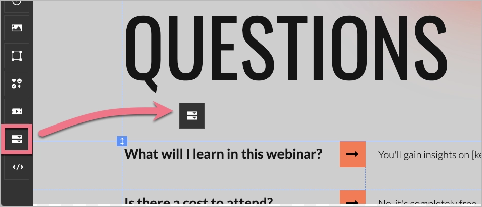
Add the Accordion widget
On the left side of the editor, find the Accordion widget and drag and drop it into the active area of your landing page.
IMPORTANT: Add only one Accordion widget to a single section. If you want to have more accordions on the page, place them in separate sections.
NOTE: Expanding accordion elements will enlarge the section where the widget is placed, requiring only as much space as in the default view.
Edit the Accordion
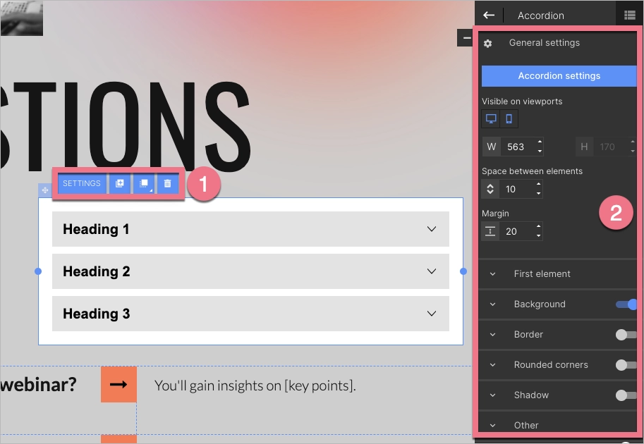
Click on the Accordion to start editing. You will see its context menu (1) and toolbar on the right side of the editor (2).
- In the context menu, you can change the width of the Accordion by clicking on the dots on the frame. The remaining icons let you duplicate the widget, move it to the top or bottom, delete it, and go to its settings.
- In the right-side toolbar, you can enter Accordion settings, turn on/off the mobile or desktop view (the widget is visible in both views by default), and change the Accordion width, space between elements, and margin. Underneath, you will find tabs with additional options. The slider located in the right-hand corner of each tab (except the First element tab and the Other tab) allows you to turn them on or off.
Accordion settings
Accordion settings is where you can specify the number of collapsing items in the widget and their content.
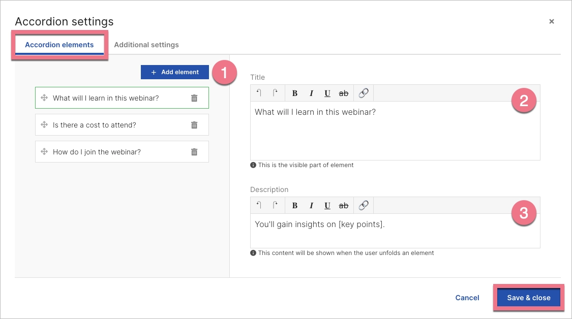
1. Enter Accordion settings from the context menu or the right-side toolbar.
2. In the Accordion elements tab, you can add new elements to the widget or delete existing ones (1). You can change their position by simply dragging and dropping them to the desired place. In the Title (2) field, type the content that will always be visible. In the Description (3) field, type the content that will be shown when a user expands the element.
When you’re ready, save the changes.
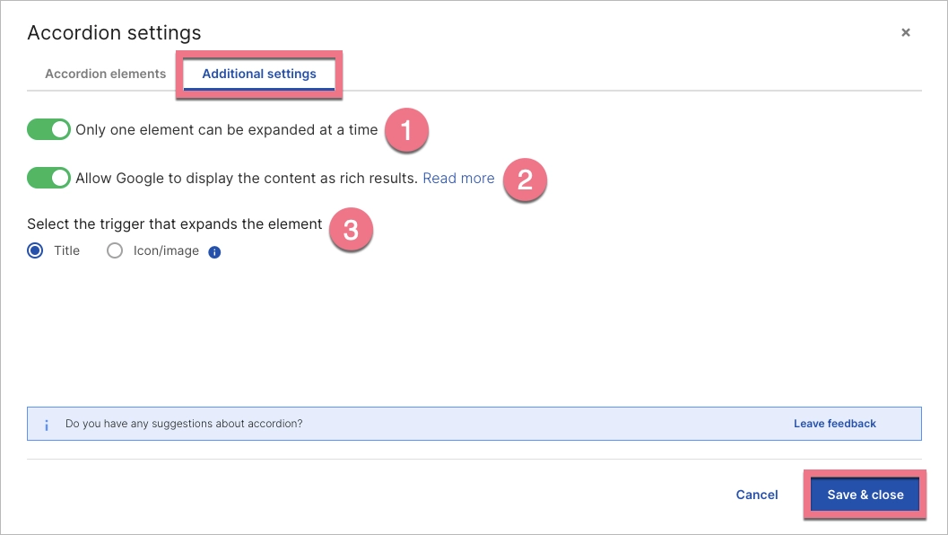
3. In the Additional settings tab, you can set three more options:
- Enable to allow only one element to be expanded at a time. Disable if more than one element can be expanded at a time.
- Enable this option to allow Google to read the content typed in Accordion and display it in rich results. Whether the content will be displayed in Google results depends on Google’s algorithm. Learn more.
- Decide if the element is expanded by clicking on a title or an icon/image.
When you’re ready, save the changes.
Editing the design
Accordion’s right-side toolbar allows you to customize the widget’s design.
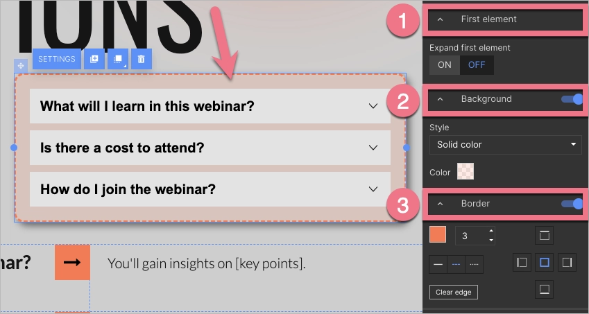
1. Click the outer space of the widget to edit the following:
- First element: Decide whether the first element in the accordion will be expanded by default or not.
- Background: Choose a background style for the whole widget. You can choose from Solid color, Gradient, and Image.
- To customize solid color and gradient options, you can adjust the transparency, including full transparency, and set an angle for the gradient.
- When selecting an image, you can choose one from your gallery or browse the Unsplash library. If you use a background with an image, you can apply a parallax effect.
- Border: Set the thickness, color, style (solid, dashed, or dotted), and placement of a border.
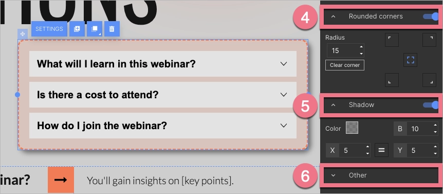
- Rounded corners: Set specific values to round corners. To do this, select a corner or choose all, then specify the radius.
- Shadow: Set values for the shadow of the Accordion. You can specify the color, blur, horizontal distance, and vertical distance of the shadow.
- Other: Copy the Accordion ID or add a class.
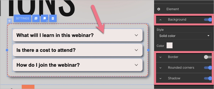
2. Click any element (not the text) to customize its design. Background, Border, Rounded corners, and Shadow options function similarly to the corresponding options for the entire widget (as mentioned above).
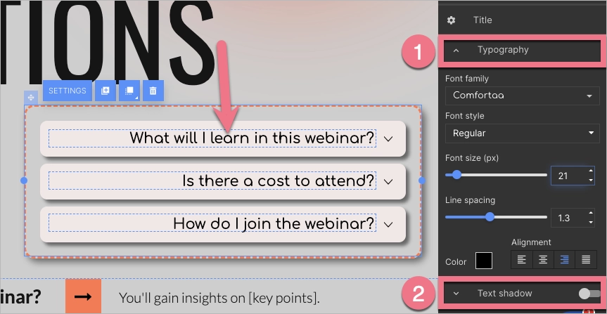
3. Click a text field to customize its design.
- Typography: Choose font family, style, size, line spacing, color, and alignment for the text.
- Text shadow: Set values for the shadow of the text. You can specify the color, blur, horizontal distance, and vertical distance of the shadow.
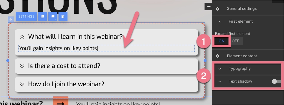
4. To customize text in an element content, first turn on the Expand first element (1). Then click on the text and customize its typography and shadow (2).
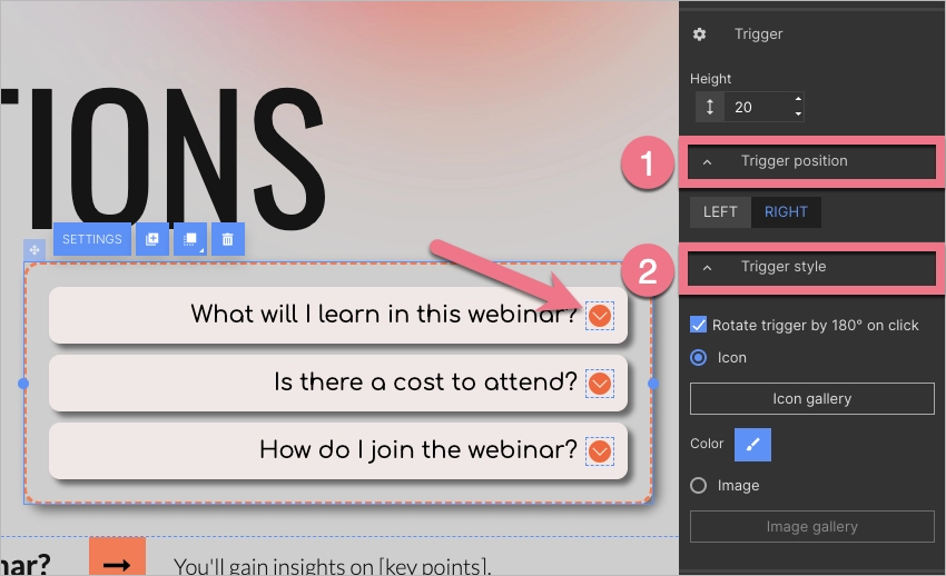
5. Click an icon (trigger) to customize its design.
- Trigger position: Decide whether the trigger should be displayed on the right or left side of an element.
- Trigger style: Decide whether to rotate a trigger by 180 degrees upon clicking. Select an icon or image. You have the option to modify the color of an icon. Learn about editing icons.
Examples
The Accordion widget is commonly used for FAQs, but it has various other potential applications limited only by imagination. Continue reading for examples of Accordion usage.
FAQs
Play the video below to view the Accordion widget as a FAQ section.
Benefits details
Play the video below to view the Accordion widget used to display benefits or details of an offer.
Event host’s bio
Play the video below to view the Accordion widget used to introduce event hosts or presenters without taking up much space.
Good practices and tips
- Make sure the accordion is responsive. Check the widget in the mobile view editor and test the landing page on your mobile device after it’s published. Ensure touch targets are large enough for easy interaction on mobile devices.
- Unfolding elements may entice you to use a smaller font size – however, avoid going too small. Ensure accessibility and maintain adequate size and color contrast for visibility.
- If you want to add visuals (image, icon, shapes) right under the accordion, place them in a separate section. This way, they will move down when the accordion’s element expands.
- Consider keeping the most crucial element expanded by default. Place the most important or frequently accessed information at the top.

