

A click-through landing page is a standalone page that warms up your visitors before sending them to the next step — usually a product page, checkout, or signup form. Instead of pushing for an immediate conversion, it pre-sells the offer with just enough info to get that next click.
The best-performing click-through landing pages follow a few timeless principles. They speak directly to the right audience, spotlight the core benefit, and keep the layout clean and responsive — often using proven templates to speed things up. A strong CTA leads the way, while videos or visuals keep people engaged just long enough to earn the next click.In this article, you’ll find 16 real click-through landing page examples — from SaaS to ecommerce — that nail the balance between persuasion and simplicity. You’ll see what works, why it works, and how to apply it to your own campaigns.

Lunar is almost here!

What Is a Click-Through Landing Page?
A click-through landing page is a type of web page built to guide visitors one step closer to conversion, usually toward a product page, checkout, or sign-up form. It warms people up with just enough info to make that next click feel like the obvious move.
Unlike lead-gen pages that collect emails or demo requests upfront, click-through pages act as a bridge. They introduce your offer, build interest, and ease any hesitation — all without overwhelming the visitor. Think of it as a soft pitch: you’re not closing the deal yet, but you’re setting it up.
These pages usually skip sidebars, menus, or anything that could pull attention away from the goal. It’s all about clarity, focus, and a single CTA. A strong headline, a few convincing benefits, maybe a customer quote or two — that’s all it takes when done right.
They work best when the product or service needs a little context before someone’s ready to commit. Whether you’re promoting a SaaS tool, a digital course, or a new skincare line, a click-through landing page can warm up cold traffic without putting pressure on the first impression.
Create a high-converting click-through landing page—start with Landingi today!
Why Do I Need a Click-Through Landing Page?
You need a click-through landing page because it builds trust, removes distractions, improves ad performance, and gives you a cleaner path to conversion. It turns casual interest into serious intent — without forcing a decision too early.
Here’s what well-optimized click-through landing page does for you:
It builds trust before the pitch.
Click-through pages give visitors space to learn more about your offer — whether it’s a product, service, or subscription. When people understand what they’re getting and why it matters, they’re more likely to move forward.
It keeps the message laser-focused.
Unlike homepages packed with links and distractions, a click-through page has one job: get the click. That single goal makes your messaging clearer, your CTA stronger, and your visitor less overwhelmed.
It smooths out the conversion path.
Going straight from an ad to a checkout page is like proposing on the first date. A click-through page acts as the in-between — a quick conversation that makes the next step feel natural.
It helps you test and improve.
With just one action to track, it’s easier to run A/B tests and see what’s working. You can tweak headlines, visuals, or CTAs — and actually know what’s moving the needle.
It boosts paid ad performance.
When your landing page closely matches the promise of your ad, people are more likely to stick around and click through. Better relevance = better ROI.
In short, if you want higher conversion rates, clearer messaging, and more control over the customer journey — a click-through landing page is one of the smartest moves to get there.
Learn how to create an effective click-through landing page—design yours with Landingi!
How Do I Create a Click-Through Landing Page?
To create a click-through landing page, start by getting crystal-clear on your goal: you’re not closing a deal here — you’re warming people up just enough to click through to the next step.
Begin with your audience. Who are you talking to, and what do they need to hear before they’ll take action? That clarity will shape everything else — from the headline to the visuals. Next, pick a landing page builder that makes the process easy and flexible. A platform like Landingi lets you launch quickly without getting stuck in code. Once you’re inside the editor, focus on these essentials:
Craft a headline that immediately tells visitors what’s in it for them. Add visuals that support the message, not distract from it. Your copy should do just one thing: build interest and confidence in the offer waiting on the other side of the click. Trust signals matter here too — logos, short testimonials, or benefit icons can help reassure visitors that the click is worth it. Then comes the CTA: make it bold, clear, and focused on the next action (not the final conversion). You’re asking for a click, not a commitment. Also, make sure your design is responsive, fast, and distraction-free across devices.
Follow the 7-step breakdown below to build a click-through landing page that actually gets the next click — and sets your campaign up to convert.
Ready to boost your conversions? Build a click-through landing page with Landingi!
Step 1. Define Your Goal and Audience
Start by asking: what’s the next click you want? Maybe it’s a product page, a signup flow, or a pricing screen. Whatever it is, your entire landing page should point to that one destination. A clear goal keeps the page focused and your message sharp.
Now think about who you’re talking to. Are they ready to buy or just starting to explore? Are they comparison shopping or landing cold from an ad? The more you understand their mindset, the better you can speak their language — and nudge them toward the click.
Step 2. Choose a High-Converting Template
You don’t need to start from scratch. Landingi gives you access to 400+ templates designed with conversions in mind — including plenty that are perfect for click-through pages. Just hit Create new landing page, browse the library, and pick a layout that fits your message.

Want more control? Build from a blank canvas or generate a page with Composer. Once inside the editor, use drag-and-drop to tweak the layout, swap images, and fine-tune your copy. Smart Sections help you stay on-brand across multiple campaigns — without repeating work.
Step 3. Craft a Compelling Headline and Engaging Copy
Your headline should clearly state what’s in it for the visitor and hint at what they’ll get after the click. Think benefit-first, not buzzwords.
Skip vague promises like “The best solution for you”. Go for something tighter, like “Save 20% — See How It Works First” or “Start Free. Upgrade Anytime.” That kind of clarity sets expectations and drives curiosity.

As you write the copy, keep things moving. Each sentence should bring the reader one step closer to clicking. Use short paragraphs, subheadings, and bolded phrases to guide their eye. If you’re using Landingi, try the AI Assistant to quickly draft benefit-focused copy or test variations for different segments.
Step 4. Enhance Visual Appeal with High-Quality Images and Videos
Design matters — a lot. Clean, fast-loading visuals help build trust and keep visitors engaged just long enough to say “yes” to that next click.
Use high-resolution images that support your message, not distract from it. If you’re adding video, keep it short — under a minute works best — and place it near your CTA. The goal isn’t to entertain; it’s to reinforce the reason to click.
Step 5. Focus on the CTA
Unlike lead-gen pages, click-through landing pages don’t ask for personal info upfront — they guide the visitor toward a next step. So instead of a long form, zero in on your call-to-action.
Your CTA should match the intent behind the visit. If they clicked an ad, make the button reinforce that promise: “See Plans,” “Watch the Demo,” “Get Started — No Sign-Up Needed.” Keep the copy active, clear, and benefit-driven.
Use bold, contrasting colors for your CTA buttons and place them strategically — above the fold and again near the bottom. And if you’re using Landingi, you can A/B test button text, color, and placement without touching code.
Step 6. Add Interactive and Trust-Building Elements
Click-through pages may be short, but they should still build confidence. Adding trust signals — like testimonials, star ratings, or review snippets — helps reassure visitors that clicking is a safe next move.
Want to drive urgency? Use interactive features like countdown timers or exit-intent popups for limited-time offers. These small touches can boost engagement without overwhelming the experience.
And don’t underestimate social proof. A few logos, a “featured in” section, or even subtle mentions of user count (e.g. “Trusted by 10,000+ teams”) can push that nudge into a click.
Step 7. Optimize for Mobile and Launch on a Custom Domain
Most clicks happen on mobile — so if your page doesn’t look good on a phone, you’re losing conversions. Use Landingi’s mobile view editor to fine-tune text size, spacing, and button placement so everything feels smooth and easy to tap.
Before you hit publish, connect a custom domain to keep your branding consistent and build trust at first glance. Visitors are more likely to click through when the URL looks clean and recognizable.

After launch, track how your page performs. Use built-in analytics to monitor clicks and behavior, then A/B test variations to see what really works. A simple headline tweak or button color change might be all it takes to lift your conversion rate.
16 Examples of Click-Through Landing Pages
Take a look at the 16 examples of click-through landing pages that will help you visualize the theoretical concepts. Learn what makes a click-through landing page effective, and check out templates that can be a great starting point for designing your own page.
1. 100% Spanish
The click-through landing page for “100% Spanish” in Louisville focuses on Spanish language learning through cultural immersion. The page highlights the founder’s background and the unique approach of the institute, comparing its in-person classes to app-based learning.

They use informative but concise text blocks to describe available courses. The encouraging background video showcasing the lesson flow is a great choice to promote language courses. The main CTA is placed in the strategic top right corner, which is a good practice for enhancing user experience across various devices.
Key takeaways to learn from this example:
- Intuitiveness – simple layout and user-friendly navigation.
- Strong CTA – contrasting design, clear messaging.
- Informative content – well-written, concise descriptions.
- Background video – showcasing lessons flow.
- Trust elements – renowned brands that were their clients.
Improvement areas:
- Social proof – they could add client testimonials to boost visitors’ engagement and affect the decision-making process.

Find the best click-through landing page template for education services and customize it easily with Landingi. Run A/B tests, track user behavior, and be ready for higher conversion rates!
See top click-through landing page examples—start building yours with Landingi!
2. Malaria Consortium
Malaria Consortium’s click-through landing page does a great job of turning information into action. Focused on malaria prevention and broader health programs, the page walks visitors through the real-world impact of their work — and makes it easy to support the cause.The layout is clean and straightforward, which helps keep the attention on what matters: the mission. From the very first headline, you understand both the urgency and the purpose. It’s not just “what we do,” it’s why it matters — and that emotional clarity makes the message land.

Each section tells part of the story — from current projects and research to hard-hitting statistics and success stories across Africa and Asia. Real-life photos add depth and authenticity, helping visitors connect on a human level.
The donation CTA is placed just right: easy to find, visible without screaming for attention. It’s a natural part of the journey, not a pop-up demand.
Smart move: this page informs first, then invites action — which is exactly how nonprofit click-through pages should work. A few interactive elements like visualized impact data or short video stories could elevate the experience further, but even without them, the clarity, compassion, and structure make this page quietly powerful.

Try Landingi’s template that perfectly fits the donation click-through landing page’s needs.
Maximize your click-through rates—create an optimized landing page with Landingi!
3. Focus Entertainment – Banishers
This click-through page from Focus Entertainment hits the mark for a story-driven action RPG — and it does so with atmosphere, intensity, and style. It’s immersive from the first scroll, pulling you straight into the haunting world of Banishers: Ghosts of New Eden without wasting a word.The visuals steal the spotlight. Cinematic clips, gameplay previews, and moody artwork bring the game’s universe to life, while short, well-crafted descriptions keep the momentum going. The headlines are sharp and inviting — more “step into the story” than “read about the features”, which is exactly the right approach for this genre.

CTAs are placed where they count: high up for eager fans, and again after key selling points for those who need a little more convincing. The sticky “Buy now” bar ensures that whenever you’re ready, the next step is always in sight.
Technically, it’s a smooth experience. Clean navigation, quick load times, and a layout that’s layered without ever feeling confusing — it’s clear this page was built for both engagement and conversion.
Smart move: the page doesn’t tell you to buy the game — it lets you feel like you need to see what happens next. That emotional pull is powerful. A few trust elements like early player reviews or critic quotes could seal the deal, but even without them, this page leaves a strong impression — and a strong urge to click.

To create a stunning game click-through landing page, use Landingi’s template and easily customize it with a user-friendly page builder.
Turn visitors into buyers—design a high-converting click-through page with Landingi!
4. Fresh n’ Lean
Fresh n’Lean’s layout is clean and distraction-free, making it easy to scroll through the offer. Right away, you’re hit with persuasive headlines and a standout CTA tied to a strong discount. The copy focuses on benefits — better health, less prep time, zero stress — all backed by well-written descriptions that make the value obvious. Meal visuals look delicious (and real), giving visitors an immediate sense of quality. The “How it works” section is a key part of the journey — it simplifies the process into easy steps and makes trying the service feel totally doable.
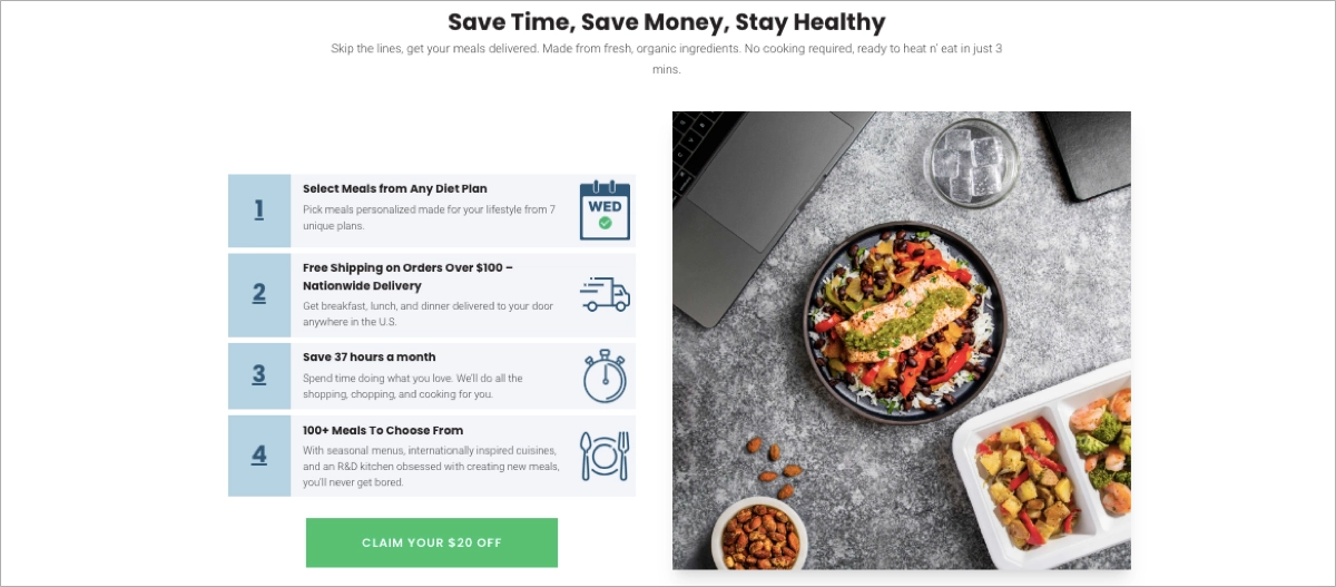
Customer testimonials add credibility and human warmth. Real people, real results — always a good move for click-through pages that aim to convert without the hard push.
Smart move: the page delivers just enough detail to build trust and curiosity, while keeping the focus on that next click. A short explainer video could take it a step further — but even without it, this page does what a great click-through page should: serve up value, fast.

Check out Landingi’s template and customize it with the drag-and-drop editor to create the best click-through landing page for your healthy products.
Discover best practices for click-through pages—create yours with Landingi now!
5. Wind
Wind’s click-through landing page does a great job introducing its digital wallet for international money transfers — and it does it without overcomplicating the message. It combines short, informative copy with clean visuals and a quick explainer video, giving visitors just enough to feel confident about what’s next.
The layout is simple but effective. Each section highlights a key benefit, broken down in digestible pieces. There’s plenty of white space, which keeps the page breathable and easy to follow — especially on mobile. The responsive design feels smooth across devices, and the content never feels cramped or rushed.

The CTA buttons are spot on — they stand out with contrasting color and direct, actionable copy. No guesswork. No fluff. Just a clear path to the next step.
Visuals are crisp and purposeful, showing off the app interface and features in a way that feels real, not staged. Add in a few genuine user testimonials and a helpful FAQ section, and Wind manages to tick all the trust-building boxes too.
Smart move: Wind doesn’t try to sell the entire product in one scroll. Instead, it gives just enough value and clarity to earn the click — while keeping things smooth, informative, and user-first. A few specific use cases wouldn’t hurt, but overall, it’s a great example of letting the product speak for itself.

Choose the perfect click-through landing page template to showcase your software or app functionalities and invite more visitors to try your product.
Increase your click-through rates—build an optimized landing page with Landingi!
6. Chanel
Chanel’s click-through page for Coco Mademoiselle is elegance in digital form. It’s not loud, it’s not pushy — it simply feels like luxury. From the high-gloss visuals to the fluid layout, every element aligns perfectly with the brand’s timeless image.
The page opens with striking product imagery and a polished headline that evokes emotion more than explanation. There’s no long list of features — just mood, atmosphere, and a promise of sophistication. Short, immersive video clips elevate the experience, inviting visitors to step into the world of Coco Mademoiselle rather than just browse it.

A clear CTA — “Shop now” — is placed where it matters, guiding the visitor to move closer to the purchase. It blends beautifully with the design, although it could benefit from being slightly more prominent to catch the eye faster.
The layout is fully responsive and flows effortlessly on mobile. Navigation is intuitive, and the entire experience feels more like flipping through a premium magazine than clicking through an ad.
Smart move: Chanel doesn’t sell the product — it sells the feeling. This click-through page is a soft nudge toward luxury, wrapped in visuals, movement, and tone. It’s proof that less noise and more atmosphere can still lead to a confident “Shop now” click.

Unleash your creativity – choose the best pattern from the Landingi template gallery and build engagement among your audience effortlessly.
7. Animoto
This click-through page nails the balance between clean design and conversion-focused structure. It doesn’t just look good — it makes taking action feel easy.The headline leads with a clear benefit, so visitors instantly know what they’re getting. Just above it, the phrase “do-it-yourself” reinforces the idea of creative control — a smart psychological nudge for their target audience.
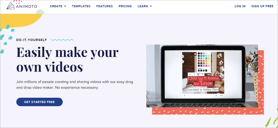
The overall design and color palette feel aligned with the product: sleek, professional, and video-centric. The dark blue CTA button pops against the background, drawing your eye exactly where it should — and the word “free” lowers friction, encouraging more clicks.
Next to the CTA, a short product video does double duty. It explains the value and acts as a live preview of what Animoto helps you create. That kind of relevance builds trust fast — and it’s way more effective than long blocks of text.
There’s also a second CTA further down the page. Same message, same intent — just a second chance for visitors who need a moment to scroll before they’re ready to act.
Smart move: everything on this page points to a single action, but it does so gently. No hard sell, no clutter — just a smooth path forward, backed by visual proof and a clear value promise.
Unlock the potential of click-through landing pages—get started with Landingi!
8. Nationwide Pet Insurance
This click-through page has a few solid elements working in its favor — and a couple of areas that could use some polish.
The headline, “America’s most trusted pet insurer,” doesn’t promise a specific benefit, but it leans into social proof — and that alone can be enough to make visitors stick around. Just below, a short list of bulleted points explains why they’ve earned that trust, with key phrases in bold to make scanning easy. That’s a small but smart detail that improves readability and keeps visitors moving down the page.
The CTA button stands out in bright yellow, offering clear direction with the phrase “Get a quote.” No guesswork, just a logical next step. There’s also a click-to-call number right at the top of the page — great for mobile users who prefer real-time answers over forms or waiting.
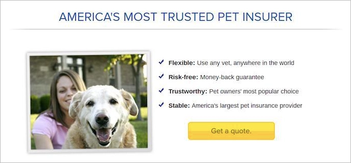
Now, for a few things that could be better.
The page uses photos of characters looking directly into the camera. While that’s common, studies show that eye direction influences focus — so if those models were looking at the CTA or headline instead, it could help guide visitors more effectively. The overall design also feels a bit dated. It lacks the polish that makes a modern landing page feel trustworthy and engaging. Clean visuals, tighter spacing, or more playful branding elements could go a long way here.
Still, the page does a decent job leading visitors toward the next click. It gives social proof, highlights trust points, and uses clear direction — all essential parts of a working click-through page. With a few visual tweaks, it could perform even better.
9. SEMrush
SEMrush somehow fits an entire suite of 50+ marketing tools into a clean, click-worthy layout that feels more like a helpful nudge than a hard sell.
The headline is what really pulls you in: “Grow your online visibility. On all key channels. Using just one platform.” That’s a bold promise — and it lands. Right underneath, the subheadline gets specific without getting stuffy. SEO, content, social, PPC… if it touches traffic, SEMrush has it covered. And you know it within seconds.
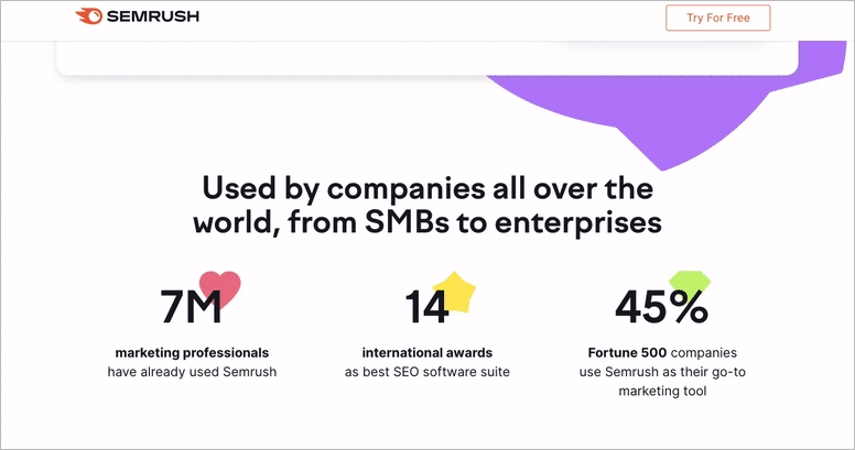
What’s clever here is how the page talks benefits, not just features. It doesn’t say “we have 50+ tools” — it says “you’ll grow faster, rank higher, and work smarter.” Big difference.
The design stays focused, and so does the call-to-action. No distractions, no fluff — just a clear path to creating your account. And that’s the goal of a click-through page, right? One message, one action.
Smart move: instead of overwhelming users with all it can do, SEMrush zooms out and sells the transformation. It shows the big picture, builds trust fast, and makes that next click feel like a step forward — not a commitment.
10. Adobe
Adobe knows its audience — and this click-through page shows it from the very first frame. Instead of listing out all 15+ Creative Cloud apps, they let the visuals do the talking.
Right at the top, there’s a hero video that flips through dozens of beautifully designed Adobe CC logos — each one created with a different app in the suite. No voiceover, no clutter — just a seamless reel of pure creative energy. It’s bold, simple, and instantly communicates the power of what you’re getting.
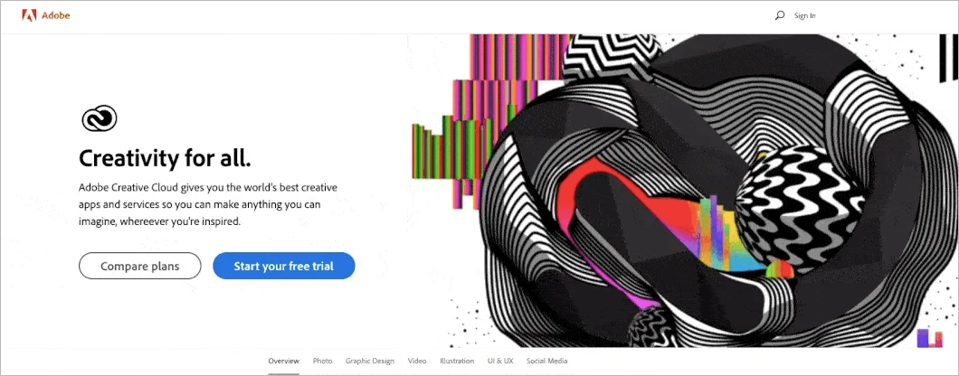
It also sets the tone for the rest of the page: modern, sleek, and built for creators. You don’t need a paragraph to explain Photoshop or Illustrator when you can show what they’re capable of in five seconds flat.
Smart move: Adobe doesn’t oversell. It leans into identity — the kind of page that makes creatives think, “Yep, that’s for me.” The video doesn’t just look good — it feels like Adobe. And that’s what makes the click feel natural.
11. Scribd
This is a great example of how simple doesn’t have to mean boring. Scribd keeps things clean, direct, and built for action — all while inviting users into a 30-day free trial.
The headline makes an immediate impression — bold in size and message. No confusion, no fluff. Just “Start Reading Free” and you’re off. Beneath that, a smart comparison table puts Scribd side by side with Storytel and Kindle Unlimited. It’s not just helpful — it’s persuasive. Nothing pushes clicks quite like a visual “why we’re better” moment.
The design stays true to Scribd’s identity: minimalist, uncluttered, and calm. Everything feels intentional — no visual noise, just space to focus and scroll.
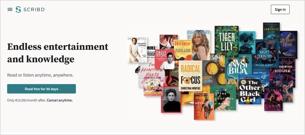
There’s room for improvement, though. The text is pretty light — a bit more explanation about what you’re getting (especially for first-timers) could boost clarity and build more trust. And the footer? It’s a bit much. Too many links can distract from the main goal: the click.
Smart move: Scribd uses comparison, clarity, and a no-risk offer to create just enough momentum to push visitors toward that free trial. No pressure — just a quiet, confident nudge forward.
12. Mailchimp
Mailchimp’s click-through page does exactly what it should: explains the value, shows how it works, and makes the next step easy. The pitch? Create a website for free — and they back it up with a clear walk-through of the builder’s features.
The headline leads with a benefit — you get a site, and you don’t pay a cent. It sets the tone right away. Supporting visuals guide the visitor through how the tool works, which makes it feel more hands-on and less abstract. The CTAs vary throughout the page, which helps capture different user intents without breaking the flow.
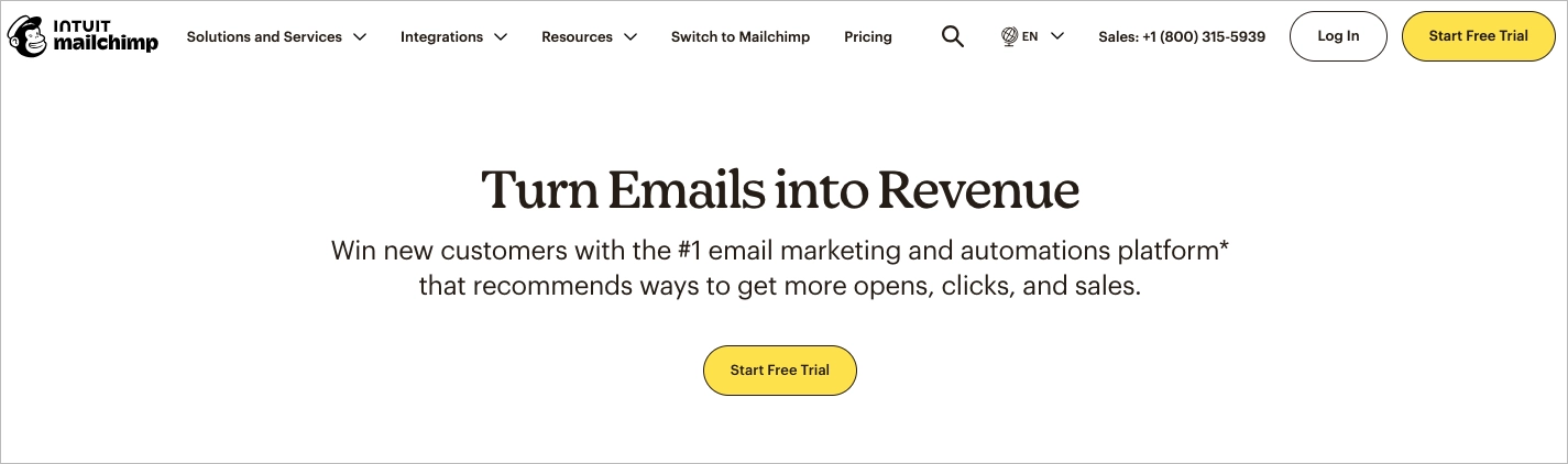
One subtle highlight: the section just before the footer wraps things up nicely. It’s the final nudge — a quick reminder of what you’re getting and why it’s worth clicking.
That said, a few things could make this page even stronger. Adding a testimonial or two would build trust — especially from users who’ve launched real websites with the builder. And while sticky elements like “Feedback” and “Talk to us” can be helpful, having both visible at once might distract visitors from the main CTA.
Smart move: this page gently eases visitors in, showing value before asking for anything. It’s not flashy, but it’s effective — because it builds curiosity, lowers friction, and invites you to explore without pressure.
13. The New York Times
This landing page from The New York Times is a great example of how to make urgency work for you, not against you. With phrases like “Limited time offer” and “Ends soon,” it taps into that classic FOMO effect — in a way that feels motivating, not pushy.
The offer itself is clean and to the point: unlimited access for a reduced price. Instead of showing one big monthly fee, the cost is broken down to just €0.50 per week — a simple trick that makes the deal feel lighter and more approachable.
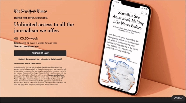
Visually, it’s just as smart. The bold orange background brings energy and grabs attention fast, while the rest of the layout stays minimal and focused. No clutter, no distractions — just one message and one clear path forward.
They also use a subtle but strong image: a phone screen showing a relevant article. It’s a quick, visual way of saying, “Here’s exactly what you’ll get.” That kind of clarity builds confidence fast.
Smart move: everything here is designed to remove hesitation. Urgency, simplicity, and a tangible preview of value — all wrapped up in a design that’s hard to ignore.
14. Calm
Calm’s click-through page feels exactly like its brand — calm, confident, and quietly persuasive. From the start, the headline speaks directly to their audience’s goals, offering value before asking for anything. It’s not just about mindfulness — it’s about being the go-to solution for mental fitness.
Right below that, a trust-building moment: over 1,000 organizations already use Calm, including major names like Universal and Lincoln. That kind of social proof gives the page instant credibility, especially for business buyers.
The design keeps things minimal, but purposeful. Clean sections, intuitive layout, and just the right amount of space between elements make it easy to focus on what matters. You’re gently guided from headline to offer to CTA — without even realizing it.
Midway down, a strong message stands out: “Build a more resilient organisation.” It’s not just catchy — it hits a real pain point. And Calm smartly expands on it without overwhelming the reader.
Partner quotes seal the deal. Short, believable, and relevant, they do exactly what good testimonials should — reduce doubt and reinforce value.
Smart move: Calm doesn’t oversell. It invites. The page is clear, focused, and human — exactly what you want when the goal is to build trust and earn the next click.
15. Shopify
Shopify’s free trial page is a great reminder that structure sells. Instead of listing out endless features, it takes a smarter route: a simple 3-step framework that walks visitors through how fast they can launch an eCommerce store. It’s not just informative — it’s reassuring.
The headline grabs attention with a clear value prop, and then the page flows naturally from “here’s what you get” to “here’s how it works” to “others like you already love it.” That kind of progression builds momentum without pressure.
Right under it, the subheadline does the heavy lifting: it mentions the price and the fact that you can cancel anytime. Just like that, the two biggest objections (cost and commitment) are handled in one line.
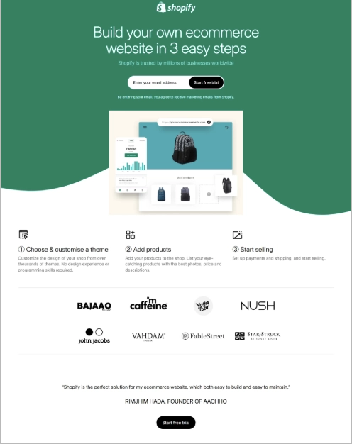
There are two CTA buttons — one up top for visitors who are ready right away, and another after the core benefits for those who need a little more convincing. It’s a small detail, but one that shows real awareness of how different people scroll, pause, and decide.
What’s especially well done is how the page handles a lot of information without feeling heavy. Thanks to generous white space, clean sectioning, and focused copy, everything breathes. You’re never hit with a wall of text or forced to dig for the next step.Smart move: Shopify doesn’t try to wow you with complexity — it wins with clarity, flow, and timing. It shows you exactly what to expect, gives you room to think, and makes clicking through feel like the natural next step.
16. Netflix
Netflix shows just how powerful simplicity can be. This click-through page strips away the noise and focuses on one thing: getting your email. No plan comparisons, no credit card forms — just a low-pressure, high-conviction “Get started.”
The headline taps into something universal — the idea of endless entertainment. It doesn’t explain what you get; it promises what you’ll feel. That emotional trigger is way more effective than listing features right off the bat.

Right under it, the subheadline does the heavy lifting: it mentions the price and the fact that you can cancel anytime. Just like that, the two biggest objections (cost and commitment) are handled in one line.
The email field is as low-friction as it gets — one box, no barriers. Paired with a bright, friendly CTA button that repeats across the page, it keeps the momentum going whether you act immediately or need a moment to scroll.
Visually, it’s spot-on. A background packed with recognizable titles builds instant trust, while the layout below the fold reinforces the offer with more reasons to join — like FAQs and user benefits — but without overwhelming the top section.Smart move: Netflix doesn’t oversell. It welcomes. This page knows exactly what stage you’re in, warms you up with just the right amount of info, and gives you one, easy decision to make. And that’s exactly what a great click-through landing page should do.
Follow the best click-through landing page examples—design yours with Landingi!
3 Click-Through Landing Page Best Practices
To create a high-converting click-through landing page, consider the following 3 best practices:
#1 Use engaging visuals
Use high-quality images or videos that are relevant to the product or service. This enhances user engagement and helps communicate the offer more effectively.
Take a look at the example below:

Suit the user’s expectations and provide information in a time-saving way. Video content shortens the time the visitor takes to meet your product while describing it more effectively and in an attractive way. That’s why around 90% of landing page visitors prefer to watch a short video than read extensive text blocks.
#2 Implement concise copy
The content should be straightforward and focused on the benefits of the offer. Avoid overwhelming visitors with too much text. This approach involves distilling the essence of what you’re offering and how it benefits the user.
Take a look at the example below:

The key is to communicate value in a succinct manner, highlighting what makes your offer unique or advantageous. Avoid lengthy, detailed descriptions, as these can overwhelm or distract the visitor from the primary message. Instead, use short descriptions, and hide them under visually attractive icons or pictures. This balance ensures that the visitor receives the necessary information to make an informed decision, leading them seamlessly to the CTA.
#3 Choose strong CTA
The CTA should be prominent and clear, encouraging visitors to take the next step, such as “Discover”, “Shop Now”, or “Download”. Use the outstanding button design – choose contrasting colors, experiment with shapes and fonts, and pay attention to messaging.
Take a look at the example below:

Use a sticky button, or place your CTA on the sticky navigation bar, to ensure a seamless user experience across various screen sizes. Additionally, you can use graphic elements that point out the button to focus users’ attention.
What to Avoid While Creating Click-Through Landing Pages?
While creating click-through landing pages, try to avoid overloading your page with content, hiding your CTA, and ignoring mobile users — these are some of the fastest ways to lose a potential conversion.
Saying too much is a common mistake. If your page is packed with long paragraphs, too many images, or scattered messages, it overwhelms instead of persuades. Keep your content tight and to the point. Just enough to spark interest and earn the click — nothing more.
A weak or hard-to-find CTA can break the whole flow. If your call-to-action is vague, visually dull, or buried in the layout, users will miss it. Make it bold, clear, and benefit-focused. That’s the action you’re building the entire page around — don’t let it blend in.
Mobile experience is non-negotiable. If your page doesn’t load fast or function smoothly on smaller screens, you’re instantly losing visitors. Use a responsive layout that looks good and works well on every device.
Skipping A/B testing? That’s leaving easy wins on the table. Without testing different versions of headlines, visuals, and CTAs, you’re just guessing. With tools like Landingi’s built-in A/B testing, optimizing becomes fast, measurable, and simple.
Page speed matters too. Heavy images or unnecessary scripts slow things down — and slow pages kill engagement. Keep it light and fast to hold attention.
One more thing: don’t forget trust. Without testimonials, recognizable logos, or even basic contact info, your offer can feel uncertain. A few simple trust signals go a long way in helping users feel safe to click.
And finally, if you’re not tracking behavior, you’re missing valuable insights. Use analytics tools like EventTracker in Landingi to follow user actions and fine-tune your page based on real data.
Create High-Converting Click-Through Landing Pages with Landingi
Click-through landing pages are the best tool for your marketing strategy; they can warm up the traffic and encourage customers to take action. At this point, as you’ve gained theoretical knowledge and important insights from real-life examples, you know what to do to make your landing page convert.
By implementing these elements:
- catchy headlines,
- immersive content,
- outstanding CTAs,
- high-quality visuals and videos,
- user testimonials,
and keeping responsive design, you can craft a click-through landing page that efficiently converts visitors and drives sales. Try the Landingi platform and use the toolkit to build pages with AI Assistance, run A/B tests, track user behavior, and optimize landing pages for higher conversions – it’s never been easier.


