

A Facebook landing page is a purpose-built web page designed specifically for visitors coming from Facebook ads or posts. Landing pages for Facebook campaigns mirror the look, tone, and message of the ad that drives the traffic, creating a seamless experience that builds trust and improves engagement. More than just a pretty page, it’s a key part of any social media marketing strategy – turning clicks into real outcomes like leads, sign-ups, or sales.
In this guide, you’ll discover what makes a Facebook campaign page truly effective – from compelling copy and striking visuals to strategic layouts and strong calls-to-action. We’ll show you 12 standout Facebook landing pages that deliver real results, revealing smart ways brands are converting attention into action. You’ll not only see what works – you’ll also learn how to create your own target pages for Facebook ads using Landingi, a platform built to streamline the process and help you launch high-converting pages without relying on developers or a clunky CMS.
Uncover the finest Facebook landing page examples, take an in-depth look at their key elements, and ignite your creativity to craft a landing page that fuels successful campaigns!

12 Best Examples of Facebook Landing Pages
Our 12 top-performing Facebook landing page picks illustrate techniques that effectively support marketing goals. Each Facebook campaign page in this list features clear design strategies, effective calls to action, or well-integrated content that drives engagement. Use these insights to improve your current page or build a high-converting one from the ground up.
1. Facetune by Lightricks
The Facetune by Lightricks landing page is designed to convert Facebook traffic into app trials. The page targets both digital content creators and casual users by mirroring the tone and style of the original Facebook ads. Visual elements, such as bright images and bold headlines, immediately draw attention and guide users to a clear call to action.

Direct messaging and social proof encourage engagement. User-generated content and testimonials appear near key conversion points, reinforcing the value of the Facetune app. A strong call-to-action button – “Start free trial” – is placed prominently and supported by short, benefit-driven descriptions. The layout of the Facetune landing page is optimized for mobile users and includes clear sections such as FAQs, product features, and customer feedback. Each design choice supports the user’s path from interest to action, creating a smooth and focused landing page experience.
Key takeaways to learn from the Facetune landing page:
- Design that matches the Facebook ad
- High-impact visuals (images and animations)
- Short, persuasive product descriptions
- Integrated social proof
- FAQ section for objections
- Prominent call-to-action button
- Mobile-friendly structure
What could be improved on the Facetune landing page:
- Videos – animations are great, but adding a short explainer video on the Facetune landing page that showcases how the app works would boost user engagement, ultimately leading to higher conversion rates.
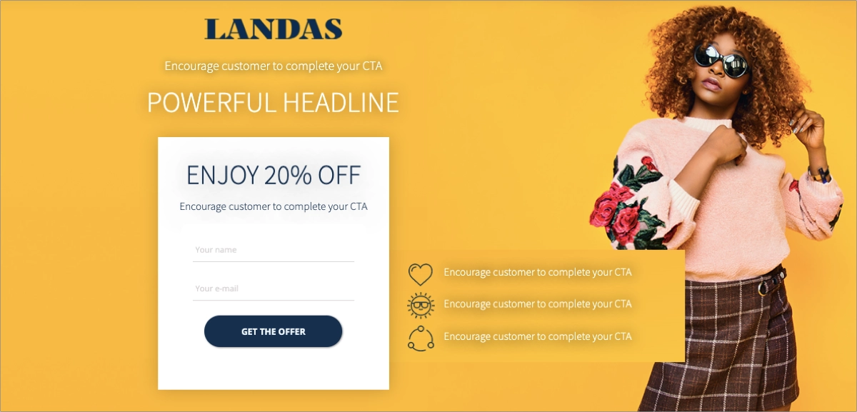
Choose the Your Music App template and change it into a perfectly tailored Facebook ad landing page for your campaign – its layout, focused on a single campaign goal, is designed to engage visitors from the first moments.

2. Goodiebox
The Goodiebox landing page for Facebook campaign is designed to support a beauty box subscription campaign with a single, focused offer. The page highlights up to 70% savings on beauty products, using visuals and copy that match the messaging in the original Facebook ads. This alignment between ad and landing page builds trust and draws immediate attention to the value of the subscription.

The Goodiebox landing page uses an intuitive layout that guides visitors through key benefits. Visuals reinforce the product’s appeal, and sections like “How it works” and the FAQ address common questions. Customer testimonials and trust badges appear near the call-to-action button to build credibility and reduce hesitation before subscribing. Each design element supports a clear user journey from discovery to conversion, making the Goodiebox page one of the most effective Facebook landing pages.
Key takeaways to learn from the Goodiebox landing page:
- Intuitive layout
- High-quality visuals
- Clear, time-sensitive offer
- Pop-up with exclusive deal
- “How it works” section
- Prominent CTA
- FAQ support
- Mobile optimization
What could be improved on the Goodiebox landing page:
- Loading time – the Goodiebox page is well-designed, but needs loading speed optimization to ensure a seamless experience and prevent bounce rates.
The Spa Discount template is perfectly tailored to promote beauty products or services, including the benefits section, special offer section, outstanding CTAs, and clear form. Customize it by creating your unique selling proposition, add high-quality pictures and run your Facebook campaign.

3. HP – for Business
The HP Facebook landing page for business customers presents a clear offer for companies seeking reliable technology solutions. The page uses bold headlines and subheadings to highlight HP’s value proposition, focusing on business-oriented products and services. The design, layout, and messaging all reflect the needs of professional buyers looking to improve operational efficiency.

HP’s page structure supports quick access to product information with minimal clicks. Prominent call-to-action buttons appear throughout the layout, including a sticky bar with the main CTA and a “Call Now” button in the top-right corner. Professional imagery adds credibility and reinforces HP’s position as a trusted provider of business solutions. Each element of the HP landing page directs users to a specific business offer, making it both functional and conversion-focused.
Key takeaways to learn from the HP landing page:
- Clean, simple layout
- Bold, informative headlines
- Clear product messaging
- Professional imagery
- Well-placed CTAs
- “Call Now” option
- Mobile-ready design
What could be improved on the HP landing page:
- Interactive elements – the HP page could include more interactive elements, such as animations or videos, to engage visitors further and boost conversion rates.
See the best Facebook landing page examples—start building yours with Landingi!
4. Essilor – Find an Eyecare Professional
The Essilor landing page for the Facebook campaign is designed to connect users with local eyecare providers through a clear and streamlined experience. The page centers on a single campaign goal: helping users quickly find and locate eyecare professionals in their area. A built-in search tool is placed at the top of the page, supported by an intuitive layout that reduces user effort and increases engagement.

Half of the Essilorlanding page features an interactive map that visually guides the user through nearby options. The only other graphic is the Essilor logo – fewer visual distractions help maintain focus on the search function. The minimalist design supports users in completing their goal efficiently. The page linked to Essilor’s Facebook campaign is fully responsive. Strategically placed social proof – such as customer testimonials and expert endorsements – adds credibility to the experience.
Key takeaways to learn from the Essilor landing page:
- Minimalist layout focused on function
- Integrated interactive search map
- Clear, purpose-driven headline
- Prominent and easy-to-use search tool
- Mobile optimization
What could be improved on the Essilor landing page:
- Content – Essilor’s page works well; the only thing that could further engage visitors could be adding short instructions as an attractive subheading.
Drive more conversions with a perfectly tailored Facebook landing page – choose Clothing Sale – Squeeze Page template and create a minimal page with an irresistible offer!
5. Wessper – D2 BOROSILICATE futureflow™
The Wessper Facebook landing page for the D2 BOROSILICATE futureflow™ jug targets users interested in home water filtration solutions. The design is clean and modern, focused on presenting product benefits through high-quality images and animated backgrounds. The landing page highlights the jug’s health-related advantages and energy-free filtration efficiency.

Moreover, the structure of Wessper’s landing page guides users through the product’s key features, supported by informative content sections. Navigation is seamless, allowing visitors to explore product specifications, read reviews, and access clear purchasing options without distraction. Trust badges placed throughout the page build credibility and support purchasing decisions. Each element on the Wessper Facebook campaign page serves to simplify decision-making and increase conversions by combining product storytelling with a user-friendly shopping experience.
Key takeaways to learn from the Wessper landing page:
- Immersive layout with clear flow
- Strong, benefit-driven headlines
- High-quality visuals and animation
- Clear calls-to-action
- Informative product descriptions
- Multiple purchasing options
What could be improved on the Wessper landing page:
- Social proof – the Wessper page could include testimonials, as social proof efficiently increases conversions.
Turn Facebook visitors into leads—design your landing page with Landingi!
6. Cosentino – Kitchen Renovation
The Cosentino Facebook landing page for kitchen renovations is designed as a lead generation tool for homeowners exploring design upgrades. The layout is clean and structured, combining a modern aesthetic with direct messaging about Cosentino’s offer. The page centers around a strong call-to-action that invites users to request up to three free, no-obligation quotes.

The main focus of the Cosentino Facebook page is a simple form that allows visitors to book a consultation. The form is paired with concise content that explains the process clearly and highlights the value of expert input. Mobile-friendly design ensures that users can engage with the form and visuals on any device. By reducing friction in the lead collection process and emphasizing simplicity, the Cosentino landing page increases the chances of turning Facebook traffic into qualified leads.
Key takeaways to learn from the Cosentino landing page:
- Simple and clean layout
- Targeted headline with direct value
- Strong visual design
- Effective CTA buttons
- Informative “How it works” section
- User-friendly 3-step form
- Mobile responsiveness
What could be improved on the Cosentino landing page:
- Trust-building elements – the Cosentinopage should include some trust-building elements like customer testimonials, realization pictures, or an experience section with numbers involving years of experience and total realizations.
Create a Facebook landing page for your offers with Landingi and choose the Windows Sale template. It’s designed to promote your offer efficiently by guiding visitors through the benefits section with concise descriptions and attractive visuals to an outstanding CTA.

7. SkyShowtime
The SkyShowtime Facebook landing page extends the brand’s visual identity from ad to destination page with full continuity. The design mirrors the original Facebook creative in tone, typography, and color scheme, ensuring a smooth user transition. The headline, “40% Discount for 12 Months,” is placed prominently, making the value proposition instantly clear.
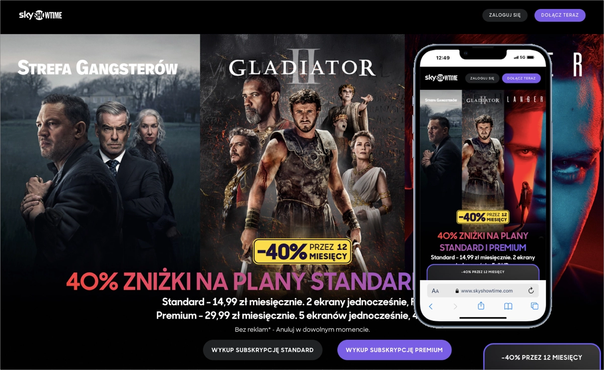
The SkyShowtime landing page layout supports vertical scrolling with bold typography, immersive imagery, and clean segmentation. The core offer is repeated across sections to reinforce its appeal, while reassurance messaging such as “Cancel anytime” addresses common objections. Trust signals, including network logos and concise benefit explanations, strengthen credibility on first contact.
Key takeaways to learn from the SkyShowtime landing page:
- Seamless visual consistency from ad to landing page
- Responsive, mobile-first design
- Clear value proposition
- Strong CTA placement
- Effective visual hierarchy
What could be improved on the SkyShowtime landing page:
- More social proof – adding user reviews or ratings would increase trust for new SkyShowtime landing page visitors unfamiliar with the brand, leading to higher conversion rates.
Ready to boost your Facebook engagement? Build your landing page with Landingi!
8. Luxury Properties in Dubai – EMAAR BEACHFRONT
The page created by Luxury Properties in Dubai sets a high benchmark for real estate Facebook campaign performance. The layout continues the aesthetic of the Facebook ad with beachfront photography, elegant typography, and a minimalist structure. A single CTA button in the hero section opens a registration form in a lightbox, minimizing friction.
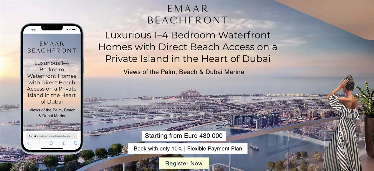
Every section of the Luxury Properties in Dubai page emphasizes exclusivity through color, composition, and imagery. The landing page avoids clutter by limiting text and showcasing aspirational visuals of premium Dubai real estate. The entire design mirrors the visual language of high-end Facebook ads, creating a seamless user experience.
Key takeaways to learn from the Luxury Properties in Dubai landing page:
- High-end, aspirational visuals
- Minimalist, distraction-free layout
- Lightbox lead form
- Consistent premium color palette
- Strong, focused CTA
What could be improved on the Luxury Properties in Dubai landing page:
- Interactive elements – adding an interactive map or virtual tour would increase engagement and time on the Luxury Properties in Dubai Facebook page.
9. SproutSocial
SproutSocial’s Facebook landing page is a lead-generation tool built around brand consistency and clarity. The design features the brand’s signature green color across CTA buttons and icons, ensuring instant recognition. The headline is bold and emotion-driven, immediately positioning the value of the platform.
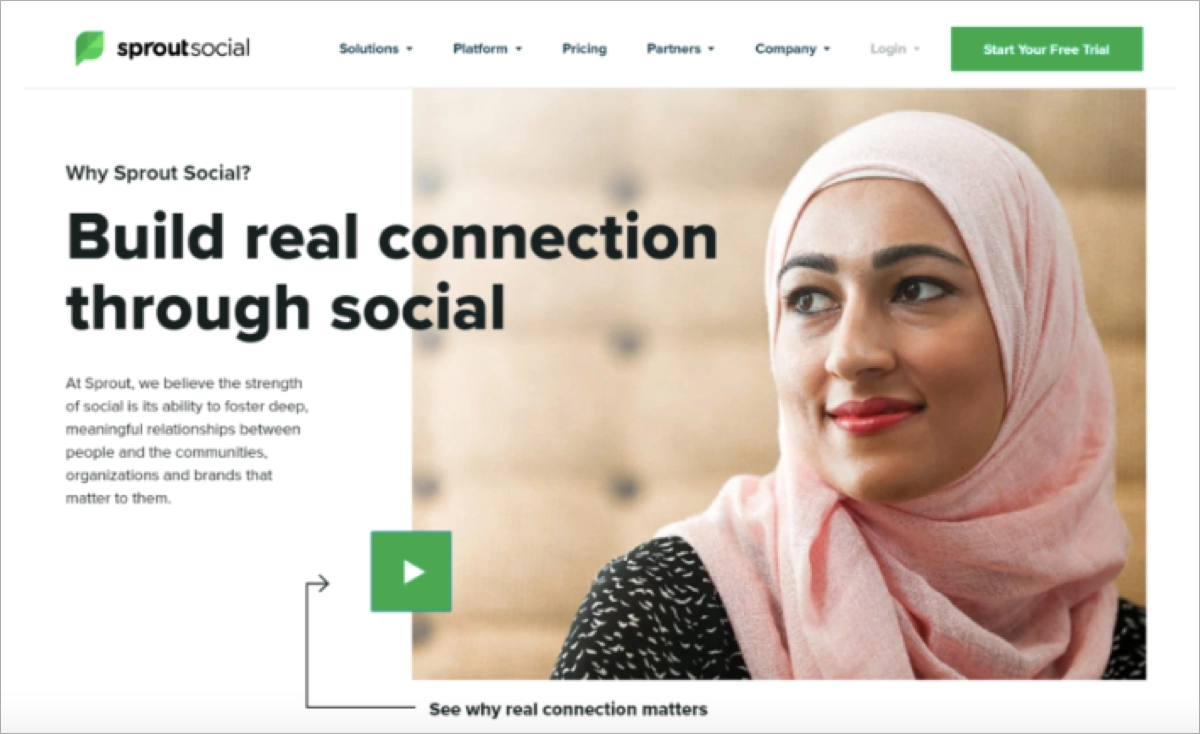
A green “Start Your Free Trial” button sits in the top-right corner of SproutSocial’s page, inviting action without distraction. An embedded video with a prominent play button encourages users to explore the platform through visual storytelling. Human-centric visuals and clean typography reflect the brand’s mission of building authentic relationships through social media.
Key takeaways to learn from the SproutSocial landing page:
- Consistent use of branded CTA colors
- Embedded video for engagement
- Clear headline and supporting copy
- Human-focused visuals
- Balanced layout
What could be improved on the SproutSocial landing page:
- Trust elements – the SproutSocial page could benefit from a testimonial or success metric near the fold to build instant trust.
Maximize your Facebook conversions—create an optimized landing page with Landingi!
10. Bambino
The landing page for Bambino’s social media campaign delivers a beautifully crafted user experience. The use of soft pastel colors, caring imagery, and delicate typography reinforces the brand’s gentle identity. The design mirrors the Facebook ad, ensuring brand recognition and message continuity.
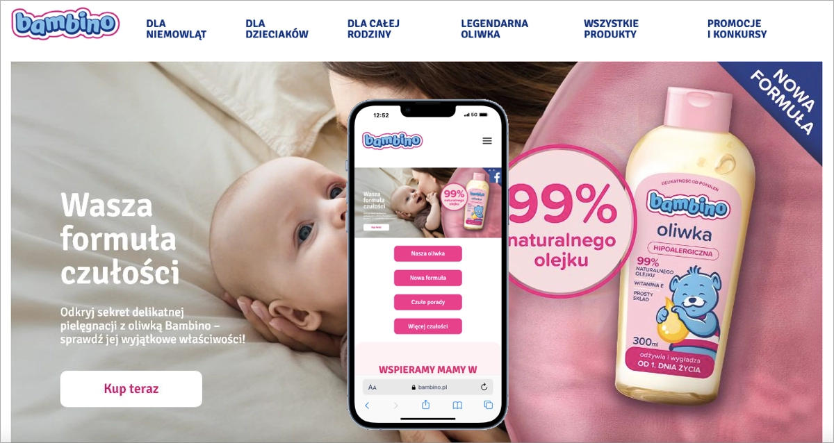
Bambino’s page layout is optimized for mobile, with smooth scaling, well-spaced interactive elements, and preserved image quality. A minimalist structure focuses attention on one core goal. However, the hero section could benefit from a resized background image and a larger CTA for improved clarity. The overall design blends emotion and usability in a cohesive experience.
Key takeaways to learn from the Bambino landing page:
- Emotion-driven storytelling
- Soft, brand-aligned color palette
- Clean, minimal structure
- Intuitive mobile design
- Clear content flow
What could be improved on the Bambino landing page:
- User-generated content – a promotional page for such a well-known and appreciated brand could include user-generated content to reinforce authenticity and increase engagement.
Create high-converting product pages that bring high ROI. Avoid common mistakes by choosing a well-designed Watch Sale template. Start building your page with Landingi, showcase your offer, and use it as a final point for Facebook advertising.

11. Amy Porterfield
Amy Porterfield’s Facebook campaign page uses a personality-driven strategy to convert busy entrepreneurs through an interactive and friendly experience. The headline introduces a customized podcast playlist, and the landing page offers a low-friction path: answer four quick questions to get matched with relevant episodes. The approach creates a feeling of personalization without overwhelming the visitor.
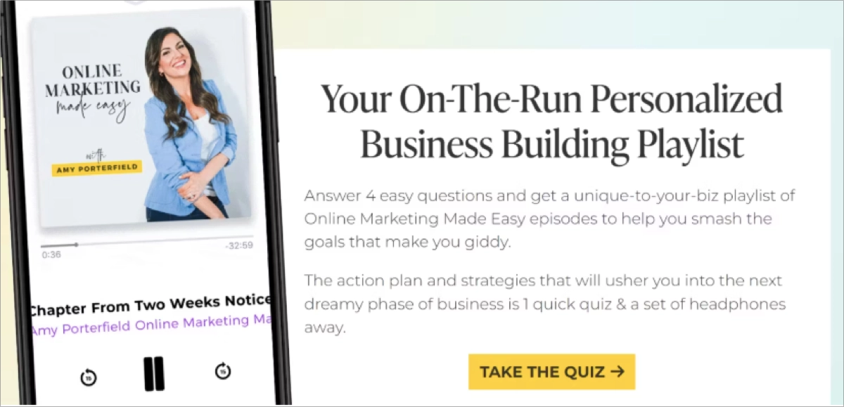
Visual storytelling plays a central role on Amy Porterfield’s Facebook page. A mobile mockup shows the podcast interface, adding context and credibility. The yellow “Take the Quiz” button stands out visually and is placed for easy interaction. The entire page uses warm, conversational language aligned with Amy’s approachable brand, keeping users engaged from headline to CTA.
Key takeaways to learn from the Amy Porterfield landing page:
- Interactive quiz for engagement
- Conversational, brand-aligned copy
- Visuals that reflect real usage
- High-contrast CTA button
- Minimal, focused layout
What could be improved on the Amy Porterfield landing page:
- Urgency – a brief line emphasizing urgency under the CTA could improve conversion rates on Amy Porterfield’s page.
Generate leads with an Electronics Discount template – direct users from FB ad to a perfectly crafted landing page that excels in guiding visitors to complete the desired action. Customize form, add attractive visuals, and drive high conversions.

12. Hortex
The landing page for Hortex’s Facebook contest campaign is a prime example of vibrant, high-energy design that converts. The layout uses bold colors, vibrant visuals, and energetic product imagery to reflect the brand’s playful, refreshing tone. The headline “Refreshment in Your Style” connects emotionally while emphasizing the product’s lifestyle appeal.
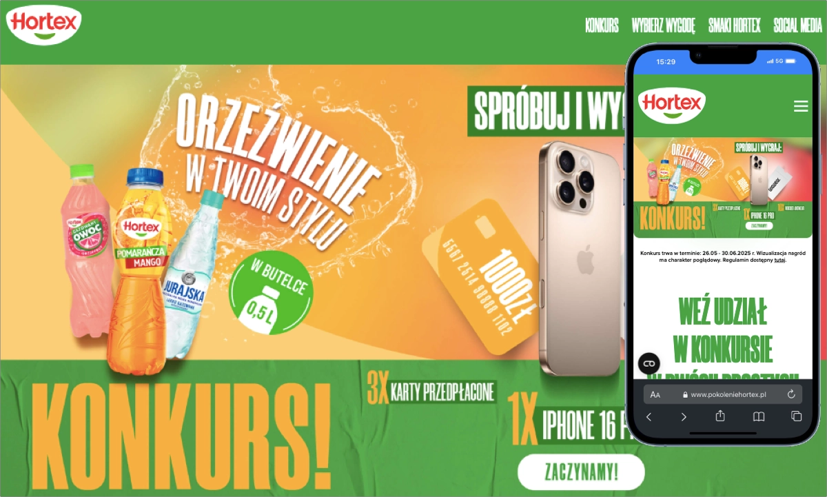
Hortex’s landing page design is optimized for desktop with fast loading, minimal distractions, and a straightforward CTA. Visual hierarchy and graphic icons make the offer easy to understand. However, the mobile hero section needs improvement – its CTA button is too small and poorly placed, reducing usability for mobile users.
Key takeaways to learn from the Hortex landing page:
- Bold, dynamic visuals
- Product-focused storytelling
- Clear contest incentive
- Easy-to-follow layout
- Strong CTA on desktop
What could be improved on the Hortex landing page:
- Countdown timer – adding a countdown timer on Hortex’s campaign page could create urgency and increase conversions.
Learn how to create a Facebook landing page—get started with Landingi now!
How to Create a Landing Page for Facebook Ads?
Creating a landing page for Facebook ads starts with a clear objective and a deep understanding of your target audience. A successful landing page matches the message of your ad, engages the visitor, and focuses on a single conversion goal. The page should load fast, look great on mobile, and guide users to take action without distraction.
Follow these 8 steps to build a Facebook landing page that converts:
1. Define your objectives
A Facebook landing page needs a clear purpose to be effective. The goal may be generating leads, selling a product, or increasing webinar sign-ups. Defining this objective helps shape the landing page structure, messaging, and call to action. A clear goal keeps the page focused and prevents unnecessary distractions.
2. Understand your audience
Your landing page for a Facebook campaign should speak directly to the needs and preferences of a specific audience. Knowing what your target users care about allows you to tailor content, design, and tone to match their expectations. A user-focused message increases engagement and makes conversion more likely.
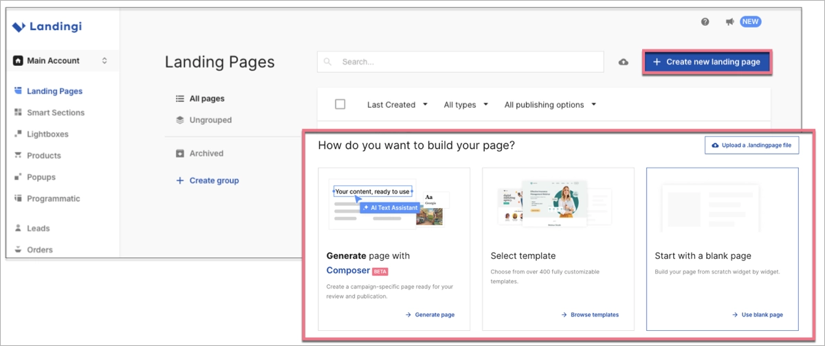
3. Choose a landing page builder
A landing page builder makes it easy to design and launch your Facebook campaign page. Tools like Landingi offer templates, AI tools for layout generation, drag-and-drop functionality, and built-in integrations with payment processors or CRM systems. Choosing the right builder saves time and ensures your page meets technical and design requirements.
To get started in Landingi:
- Go to your dashboard and click Create new landing page.
- Choose between Composer, a template, or a blank page.
- Use the drag-and-drop builder to customize your layout and branding.
4. Craft compelling content
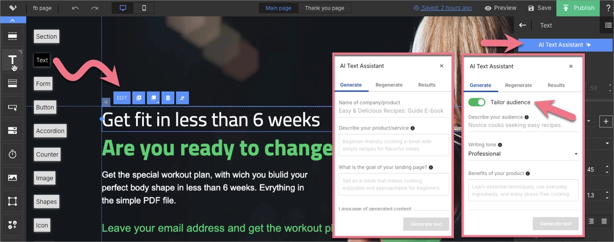
A successful landing page starts with a headline that clearly explains the value of your offer. Subheadings and supporting copy should be concise and persuasive. Visuals like images or illustrations should reinforce the message and match the Facebook ad that brought users to the page.
To speed up content creation, use the AI landing page features in Landingi. For example, an AI Text Assistant generates headlines and copy based on your offer and target audience.
5. Design for conversion
Every element on your Facebook landing page should support the main conversion goal. A clearly visible call-to-action button, such as Download Now or Start Free Trial, should stand out. The layout must be easy to navigate, with no unnecessary distractions that pull focus from the action you want the user to take.
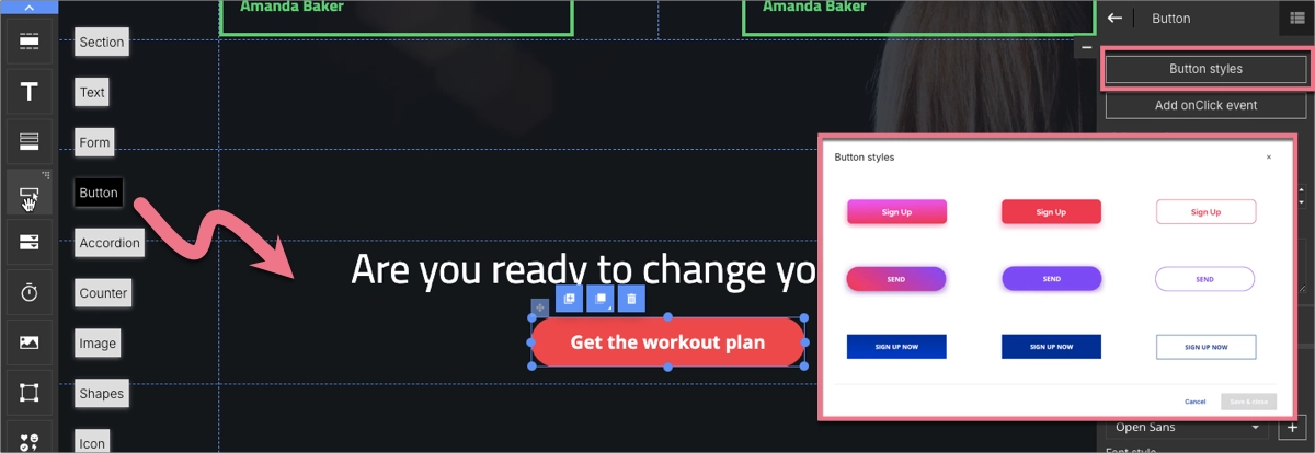
Want to sell directly on your landing page? Landingi offers pre-styled buttons that can be customized and linked to forms, downloads, or external pages. You can also use the Pay Button to collect payments through PayPal, PayU, or Stripe.
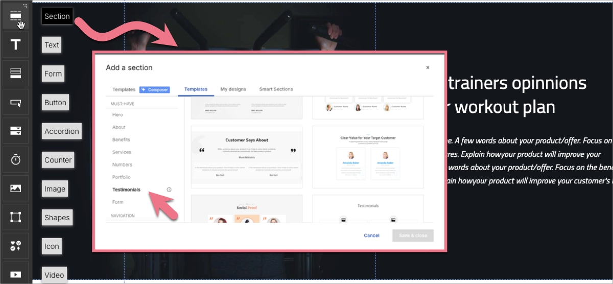
6. Incorporate social proof
Social proof builds trust and reduces hesitation. Adding testimonials, star ratings, or trust badges helps validate your offer. These elements reassure users that others have already benefited, making the offer feel safer and more credible.
Use Landingi’s testimonial sections to quickly insert reviews and adjust them with your own customer stories.
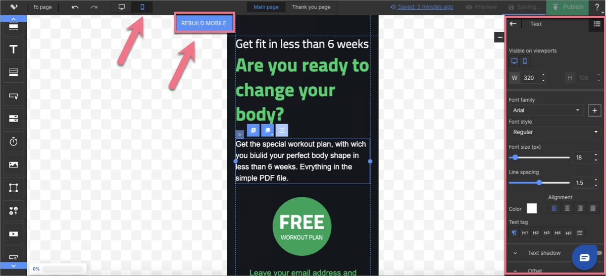
7. Optimize for mobile
Most Facebook users browse on mobile devices, so mobile optimization is essential. A mobile-optimized landing page loads fast, displays correctly, and keeps key content visible without extra scrolling or zooming.
Landingi automatically creates a mobile version of your page, and you can fine-tune it with the mobile view editor for best results across all screen sizes.
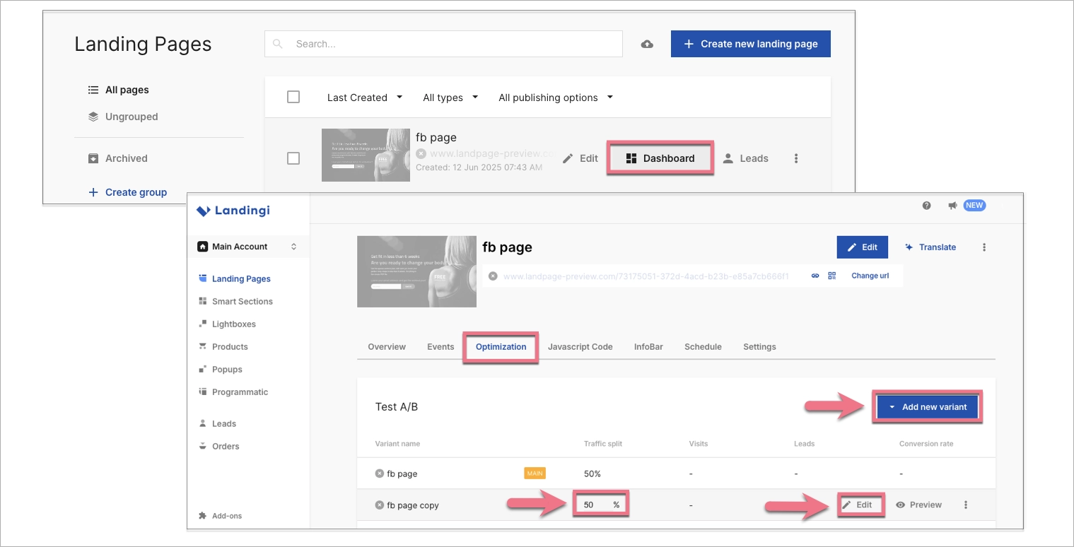
8. Test and optimize
Continuous testing helps improve conversion rates. A/B testing lets you compare two versions of your page by changing elements like the headline, CTA, or layout. Data from these tests helps you decide what works best.
In Landingi:
- Go to the Dashboard of your landing page.
- Click the Optimization tab, then Add new variant to begin A/B testing.
- Monitor performance with built-in analytics tool and make data-driven updates.
By following this 8-step process, you can build a Facebook campaign page that is focused, persuasive, and designed to convert ad clicks into measurable results.
Follow the best practices for Facebook landing pages—design yours with Landingi!
What Is a Facebook Landing Page?
A Facebook landing page is a dedicated web page created to convert users who arrive from a Facebook ad or post. Unlike a standard website page, a Facebook campaign page is built with one specific goal, such as generating leads, selling a product, or registering users for an event.
Facebook landing pages are optimized for mobile devices and designed to match the look and message of the Facebook ad. This consistency makes the transition feel smooth and builds trust. Key elements include bold headlines, minimal distractions, clear calls to action, and fast load times.
Structured landing pages help marketers capture user attention in the Facebook ecosystem by focusing on a single action. With targeted content and streamlined design, a Facebook ad page increases the chance of turning a scroll into a conversion.
Create a high-converting Facebook landing page—start with Landingi today!age tailored to your needs.
FAQ – Facebook Landing Page
Get detailed answers to frequently asked questions and learn how to create high-performing Facebook landing pages that support your campaign goals.
How to Create Social Media Landing Pages?
To create a high-performing social media landing page:
- Define your audience and landing page goal.
- Write clear, concise, and visually appealing content.
- Use a mobile-optimized design.
- Choose a builder like Landingi, which offers integrations, templates, and optimization tools.
Your social media landing page should be tailored to match the fast-scrolling nature of social media traffic and the need for instant understanding. A well-built social media landing page increases engagement and reduces bounce rates by offering a focused, relevant experience that aligns with user expectations.
What Is the Difference Between an FB Lead Form and a Landing Page?
An FB Lead Form collects user data directly inside the Facebook platform. It is designed for speed and ease of use on mobile devices, with minimal user effort. A landing page is a standalone web page. It offers more space for brand storytelling, visuals, and customized calls-to-action.
Choose a Facebook lead form for simple data capture, or use a landing page when you need more room to educate, showcase a product, or reinforce your message.
Do I Need Landing Pages for Facebook Ads?
Facebook ads do not require landing pages, but using one significantly improves campaign performance.
A target page for Facebook ads provides more detailed information and focuses the user on a single goal. Additionally, it improves personalization and targeting and enables better tracking of campaign success. A well-designed Facebook landing page builds brand credibility.
Using landing pages for Facebook ads increases conversion rates by offering a focused experience after the click.
What Is the Purpose of a Facebook Landing Page?
A Facebook landing page is designed to convert ad traffic into measurable outcomes such as leads, sign-ups, or purchases.
Its main purposes are:
- Guiding users to take a specific action.
- Presenting detailed information about an offer.
- Improving the experience by matching the ad message.
- Allowing campaign performance tracking.
- Supporting audience segmentation and personalization.
A Facebook landing page connects the ad experience to a clear business objective, boosting the chance of conversion.
How to Optimize Facebook Landing Pages for Higher Conversion Rates?
To optimize Facebook landing pages for higher conversion rates:
- Use clear, benefit-driven headlines and calls-to-action.
- Keep the layout simple and mobile-friendly.
- Improve load times by optimizing images and scripts.
- Use A/B testing to refine design, copy, and visuals.
- Add social proof such as testimonials or user ratings.
These improvements help reduce bounce rates and increase the likelihood of conversion.
What to Avoid while Creating a Facebook Landing Page?
Avoid these common mistakes when building your Facebook landing page:
- Overwhelming content – use short, scannable sections.
- Slow load times – compress files and limit heavy visuals.
- Weak or hidden CTAs – use bold, action-oriented buttons.
- Inconsistent messaging – match the ad and page in tone and offer.
- Ignoring mobile design – test across devices to ensure accessibility.
Fixing these issues improves user experience and conversion outcomes.
How do Facebook Landing Pages Integrate with Meta Pixel or Other Tracking Tools?
Target page for Facebook ads support tracking with Meta Pixel and other analytics tools.
To integrate tracking:
- Add the Meta Pixel code to your landing page.
- Track key events like form submissions, clicks, and purchases.
- Use analytics platforms like Google Analytics for broader insights.
Tracking helps optimize campaign targeting, measure success, and improve ROI through better data.
Can I Use Facebook Landing Pages for A/B Testing?
Yes, A/B testing allows you to compare different landing page versions to see what works best.
With tools like Landingi, you can easily create multiple page variants, test different elements such as headlines, CTAs, images, and layouts, and split traffic. Built-in EventTracker allows you to analyze results to improve conversion rates.
A/B testing helps identify winning combinations and ensures your campaign evolves based on user behavior.
What Are the Legal or Compliance Considerations for Facebook Landing Pages?
Facebook landing pages must follow privacy and data protection regulations such as GDPR (Europe) and CCPA (California).
To stay compliant:
- Include visible privacy policy links.
- Collect explicit user consent where needed.
- Offer options to access or delete user data.
- Follow truthful advertising standards.
Compliance builds trust and reduces the risk of legal issues or ad disapprovals.
How to Personalize Facebook Landing Pages for Different Audiences or Ad Campaigns?
To personalize your Facebook-linked page effectively:
- Segment your audience based on demographics or behavior.
- Customize content by adjusting headlines, visuals, and offers.
- Use dynamic content to show different versions to different users.
- Test multiple variations to see what resonates best.
- Integrate with CRM tools to use existing customer data.
- Localize content by adapting to regional languages and cultural cues.
Personalization increases relevance and conversion by tailoring the landing page experience to each audience segment.
Create a Facebook Landing Page with Landingi
Much like crafting a targeted marketing strategy, your Facebook landing page requires a thoughtful blend of enticing visuals and compelling content aligned with ads to drive meaningful interactions and conversions. A well-designed page captures attention, delivers a clear message, and guides users toward one specific action.
But building the page is only the beginning. Continuous testing and improvement are essential to increase conversion rates and keep your page aligned with changing user behavior. When paired with the right tools, your landing page becomes a powerful part of your marketing funnel.
With Landingi, you can create Facebook landing pages faster and more efficiently than using a standard CMS. Unlike a CMS, which often requires plugins, developer input, or additional configuration, Landingi offers a drag-and-drop builder, ready-made templates, and built-in features such as A/B testing, AI landing page tools, mobile responsiveness by default, and analytics and performance tracking.
These features make Landingi ideal for marketers who want control without coding. Try Landingi now and build your Facebook campaign page to turn ad clicks into real results. Create pages quickly, match them to your campaign goals, and optimize performance – all from a single platform.


