

A high-converting game landing page doesn’t happen by accident – it’s the result of smart design and strategic marketing. Whether you’re promoting a release or running a campaign, a well-structured page is the key tool to convert visits into downloads, sign-ups, or pre-orders.
The 20 landing page examples in this guide show how top creators use design, copy, and structure to lead players from curiosity to commitment. These are pages that convert – and they’re easier to create than you think.
Professional landing page platforms, like Landingi, let you build, test, and launch landing pages without code or CMS limitations. Whether you’re planning a mobile game landing page for early access or a bold video game landing page for launch day, the tools are ready. Just bring your vision.

20 Best Examples of Gaming Landing Pages
Game landing pages serve as focused marketing tools that highlight a game’s identity, features, and value. The strongest game landing page examples balance compelling visuals, strategic copywriting, and clear calls to action to guide users toward downloads, sign-ups, or purchases. This list features 20 of the best gaming landing pages – from immersive RPG campaigns to high-intensity strategy titles – each showcasing a unique approach to digital promotion.
1. Banishers: Ghosts of New Eden
The Focus Entertainment game landing page for Banishers: Ghosts of New Eden introduces a supernatural narrative centered on spirit hunters confronting loss, love, and sacrifice. The page presents the story’s stakes through immersive copy and emotionally charged visual content. Each section reinforces the game’s theme of moral choice and its narrative-driven gameplay.

The page uses cinematic visuals, interactive scroll effects, and a moody color palette to reflect the game’s atmosphere. High-resolution artwork and subtle animations build a sense of mystery. A persistent call-to-action button with direct messaging appears in the sticky top navigation bar, improving accessibility across devices.
Key takeaways from Focus Entertainment’s page example:
- Cinematic and immersive design
- Clear, persistent CTA in a mobile-friendly layout
- Scroll-triggered animations and interactive sections
- Emotion-driven copy tied to the game’s narrative
- Trust signals through recognizable brand logos
Improvement areas:
- User testimonials: including user testimonials or early player impressions could increase emotional engagement and improve the page’s conversion rate.
Don’t forget about testimonials and reviews – choose the Sale Page template and customize it with Landingi. Its user-friendly editor lets you change your ideas into perfectly crafted high-converting game landing pages.
2. The Elder Scrolls: Blades
The landing page for The Elder Scrolls: Blades presents a classic dungeon-crawler experience through clear structure and focused storytelling. The page combines high-quality visuals with concise, persuasive copy to introduce the game’s setting and mechanics. Each section guides visitors through the core gameplay loop without overwhelming the layout.

This Bethesda page features multiple call-to-action buttons that link directly to relevant app stores. The hero section highlights cross-device availability to encourage broader adoption. Strategic white space separates content blocks and directs attention toward primary actions.
Key takeaways from Bethesda’s page example:
- Clean layout supported by strategic white space
- Strong headlines that communicate the game’s genre and appeal
- Multiple CTAs linked to specific platforms
- High-quality visuals that support the game’s atmosphere
Improvement areas:
- Videos and animations: adding gameplay videos or subtle animations could better demonstrate the game mechanics and increase user engagement.
To create a clear but attractive game page, try out the Game template and customize it by adding immersive game visuals, descriptions, and irresistible CTAs – with Landingi, the best landing page builder, it takes minutes!
3. Dune: Spice Wars
The game landing page of Dune: Spice Wars transports players to the dunes of Arrakis, where strategy and survival are key. The page highlights core gameplay mechanics such as exploration, expansion, and control of the Spice resource – central to the Dune universe. The visual theme reflects the world’s political tension and environmental extremes.
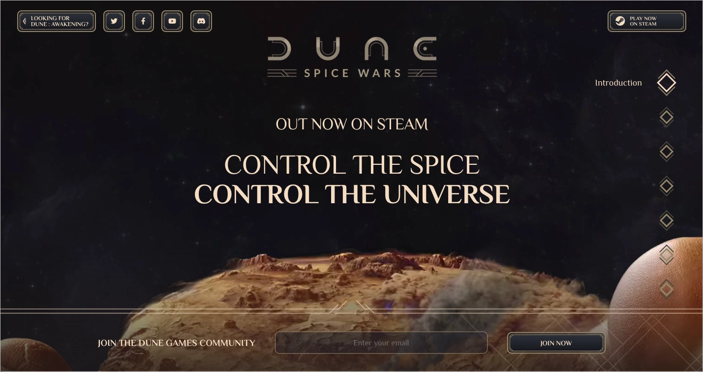
The Dune: Spice Wars landing page emphasizes the game’s ongoing development by highlighting early access and upcoming updates. High-resolution videos, animated transitions, and bold visuals add depth and context. Prominent call-to-action buttons link directly to the digital store, while social features encourage community engagement.
Key takeaways from the Dune: Spice Wars page example:
- Immersive and intuitive design
- Animated visual elements and embedded gameplay videos
- High-quality graphics
- Clear navigation and content structure
- Visible social media buttons
- Brand logos and distribution badges as trust signals
- Action-focused CTA buttons
Improvement areas:
- Reviews: adding player reviews or community testimonials would increase credibility and motivate hesitant visitors to engage with the game.
If you want to create a dazzling, aesthetic game landing page that literally creates a jaw-dropping effect among visitors, hire a professional landing page design expert who will change your ideas into reality.
4. Assassin’s Creed: Mirage
The Assassin’s Creed: Mirage landing page introduces Basim, a street thief navigating a journey of identity, justice, and transformation in 9th-century Baghdad. The page focuses on the return to classic Assassin’s Creed mechanics, blending stealth, parkour, and close-quarters combat in a narrative-driven format.

This Ubisoft page features high-quality visuals and gameplay trailers that immerse users in the game’s historical setting. A main call-to-action button appears in the top right corner, styled to match the site’s visual theme. A dedicated “Latest News” section provides updates, announcements, and early access offers to keep users engaged.
Key takeaways from the Ubisoft page example:
- Intuitive and historically themed layout
- High-quality images and gameplay videos
- Strategically placed CTA button aligned with the design
- News section with relevant content updates
- Highlighted exclusive promotional offers
Improvement areas:
- Social proof: incorporating user reviews or testimonials would reinforce trust and improve conversion, especially for visitors unfamiliar with the series or new to this installment.
5. Destiny 2: The Final Shape
The landing page for the title Destiny 2: The Final Shape presents the final chapter of the Light and Darkness saga through a product-focused structure designed to drive pre-orders. The page clearly targets both long-time fans and new players by outlining the stakes of the upcoming release and offering edition-specific purchase options.

Bungie’s landing page for Destiny 2 uses a clean layout and high-contrast call-to-action buttons to highlight pre-order options. A structured table details the features of each game edition, helping users make informed decisions. The hero section displays the release timeline, while the visual design remains consistent across devices. A video is included below the fold, complementing the static visuals above.
Key takeaways from Bungie’s page example:
- Simple and clear layout optimized for all devices
- High-visibility CTA buttons with edition-specific messaging
- Organized feature tables for each game edition
- Hero section that communicates the game’s launch details
- Descriptive copy tailored to both new and returning players
Improvement areas:
- Interactive elements: incorporating interactive animations or hover effects would enhance user engagement and provide more dynamic visual feedback during navigation.
Select the game click-through template to create a high-converting gaming landing page. Don’t forget to add a reviews section to boost engagement and build trust.

6. Forza Motorsport
Forza Motorsport’s landing page presents a high-performance racing game through a visually dynamic and responsive design. The page introduces the game’s focus on speed, realism, and vehicle precision using sharp imagery and short, action-focused descriptions. Each section is crafted to reflect the visual fidelity and competitive spirit of modern motorsport.
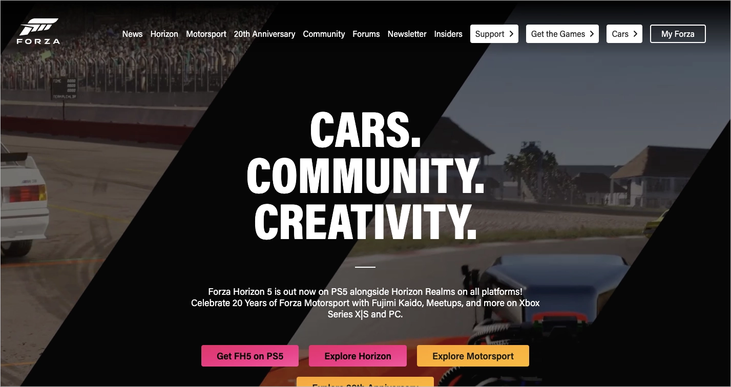
This game landing page uses bold colors, clean typography, and fluid animations to communicate motion and intensity. Interactive elements simulate the in-game interface, reinforcing the user’s sense of control. A strong call to action invites visitors to learn more or pre-order, while the layout supports a smooth navigation flow. An FAQ section answers common questions, reducing friction and improving clarity.
Key takeaways from Forza’s page example:
- Intuitive layout with fast-loading sections
- Short, high-impact copy blocks
- Background animation that reflects speed and performance
- Interactive UI elements inspired by the game’s controls
- Clear call-to-action buttons
- Informative FAQ section
Improvement areas:
- Social proof: displaying user testimonials or community feedback would add authenticity and help new visitors connect with the Forza Motorsport experience.
7. Senua’s Saga: Hellblade II
The Senua’s Saga: Hellblade II game landing page introduces a dark, narrative-driven experience through a minimalist and emotionally charged design. The layout focuses on psychological tension, mythic storytelling, and visual intensity. High-resolution imagery reflects the game’s cinematic quality and dramatic themes.

The Hellblade II landing page is short but impactful, consistent with the goals of a coming-soon format. A standout call-to-action button encourages visitors to watch the trailer, which serves as the main engagement point. Additional CTAs allow users to wishlist or pre-install the game, supporting early conversion and interest tracking.
Key takeaways from the Hellblade II page example:
- Minimalist layout with intuitive navigation
- Emotionally resonant visuals and short descriptions
- Embedded cinematic trailer as the focal point
- Clear CTAs for wishlisting or pre-installation
- Focused storytelling aligned with the game’s tone
Improvement areas:
- Award badges: including award badges from the previous installment would reinforce credibility and appeal to users who recognize visual trust signals.
Encourage visitors to complete CTA – purchase the game, or subscribe to a newsletter – by implementing an exit-intent pop-up with an irresistible offer.
8. Mafia: The Old Country
The landing page for Mafia: The Old Country introduces a dark, story-driven game through cinematic visuals and a cohesive visual theme. The hero section features a bold image with a noir aesthetic that establishes the game’s tone within seconds. A black-and-gold color palette reinforces the historical mafia setting while maintaining a sleek, modern look.
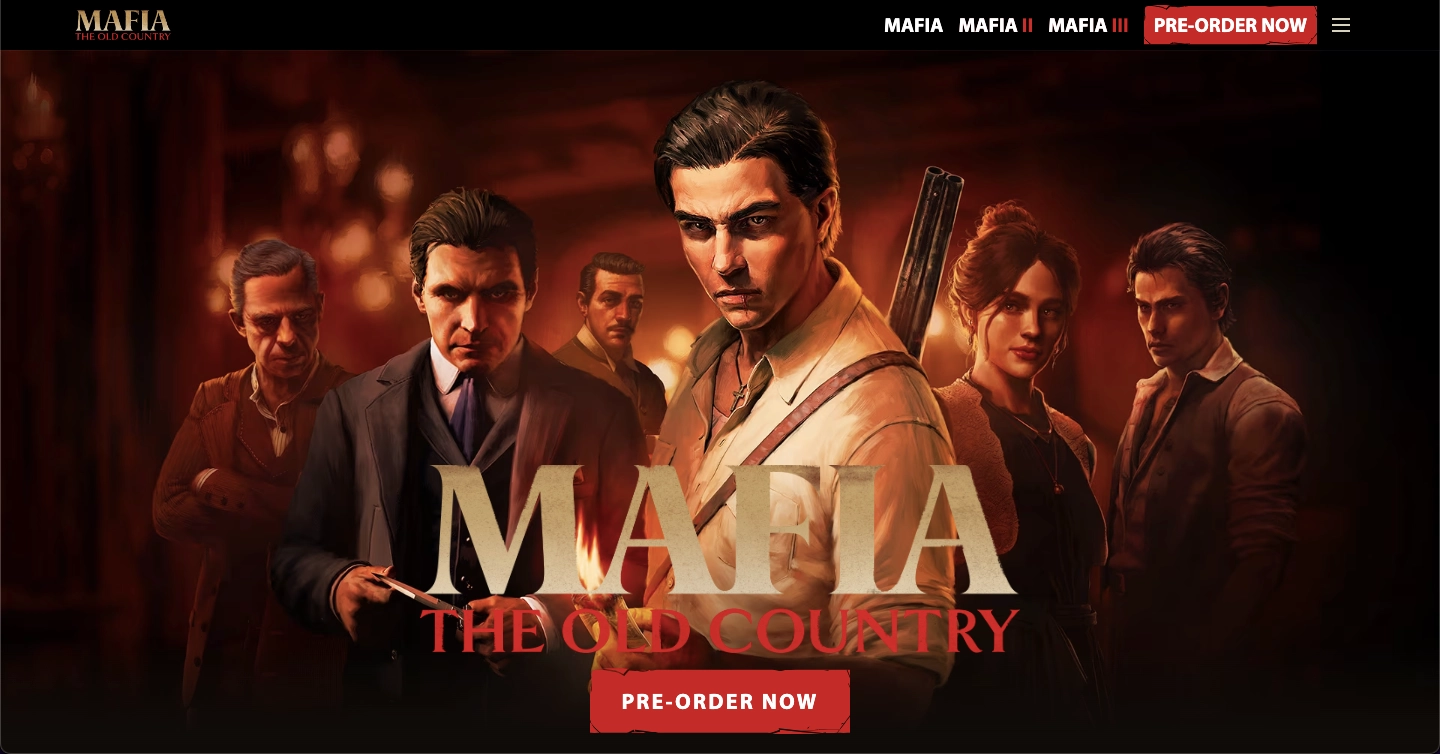
The rest of the page supports the product’s storytelling with trailers, character introductions, and lore elements that build excitement and anticipation. The seamless design of this game landing page and consistent visual language give the impression of a high-budget, cinematic experience.
Key takeaways from Mafia’s page example:
- Visually bold hero image with strong thematic cues
- Cohesive color palette that reflects the game’s genre
- Persistent, clearly worded CTA for pre-orders
- Clean layout with focused storytelling and media
Improvement areas:
- Lack of social proof: including testimonials from early-access players or influencers would add credibility and help potential players build trust before pre-ordering.
9. Sid Meier’s Civilization VII
The landing page for Sid Meier’s Civilization VII promotes the next installment in the renowned strategy series with a balanced mix of visuals, interaction, and conversion-focused design. The opening section features a full-width hero image paired with a bold call to action for pre-orders, giving both returning players and newcomers a clear entry point.
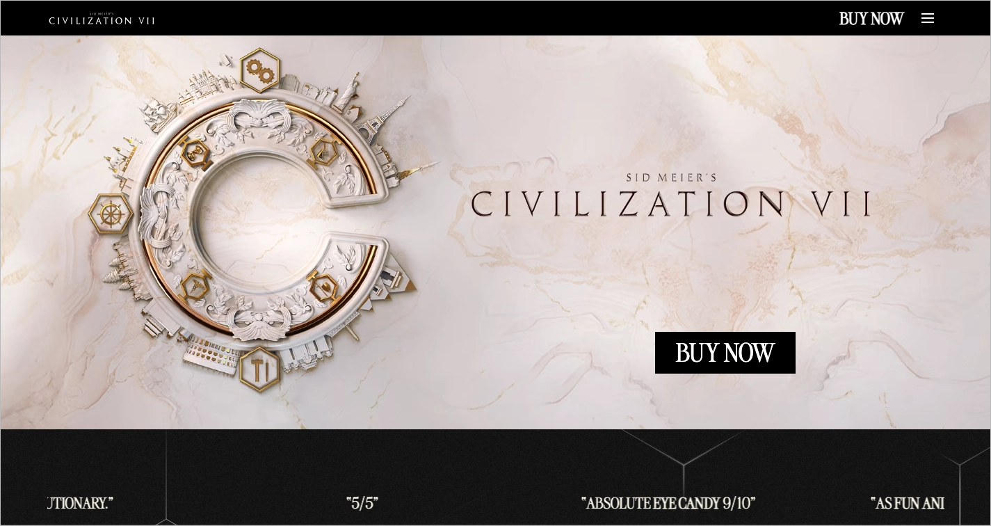
The second section of the Civilization VII landing page displays animated praise from media outlets, enhancing trust and keeping attention focused through motion. The overall layout is visually cohesive, with design elements and typography that reflect the game’s tone of historical depth and strategic decision-making.
Key takeaways from the Civilization VII page example:
- Clear and action-oriented CTA in the hero section
- Animated testimonials from trusted media sources
- Cohesive design elements that align with the game’s theme
- Clear presentation of platform availability
Improvement areas:
- Distracting news links: reducing the number of outbound news links would help maintain focus on conversions.
- Content density: simplifying the layout and media density – especially for mobile visitors – could improve the overall user experience.
10. Moss
The landing page for Moss by Polyarc Games presents a VR adventure through immersive design and well-integrated media. A high-resolution background video in the hero section introduces the game’s world and animation style. A clearly labeled “Buy Now” call to action guides users toward conversion from the start.
The Moss landing page includes an embedded trailer and a dedicated video section to deepen engagement. Strategically placed screenshots highlight the game’s fantasy setting and artistic detail. Platform-specific links for PlayStation VR, Meta Quest, Steam, and Pico allow users to purchase the game directly from their preferred storefronts.
Key takeaways from Polyarc Games’ page example:
- Background video showcasing in-game action
- Prominent and clear “Buy Moss” CTA
- Embedded launch trailer for user engagement
- Multiple high-resolution screenshots
Improvement areas:
- Page load speed: optimizing video and image file sizes would reduce page load times, especially for mobile users on slower networks, improving accessibility and retention.
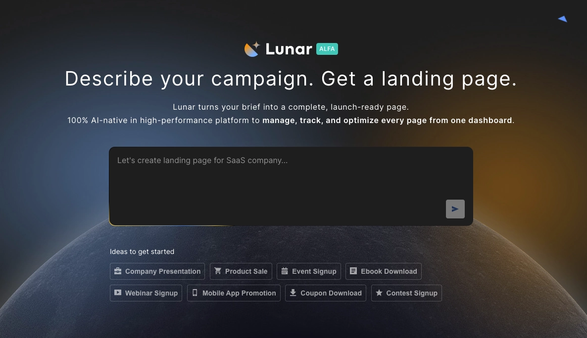
If you want to speed up the process, Lunar – Landingi’s AI landing page generator – can create a complete page structure for you. This gives you a solid foundation that you can enhance with visuals, animations, and storytelling elements tailored to your game.
11. Kingdom Come: Deliverance 2
The game landing page for Kingdom Come: Deliverance 2 presents a historically grounded RPG through a layout optimized for game-focused audiences. The structure includes a full-screen cinematic hero section, sticky navigation, embedded ratings, and an integrated trailer – mirroring the layout style seen on digital storefronts like Steam. User and critic scores are placed above the fold to establish immediate trust and relevance.
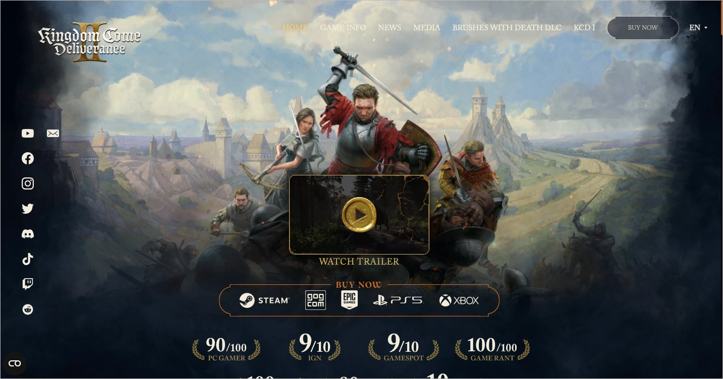
The Kingdom Come landing page uses medieval-inspired design choices, including dark tones, period-accurate typography, and an atmospheric video background. These elements reinforce the game’s setting and narrative tone, creating a unified visual experience that immerses users from their first interaction.
Key takeaways from Kingdom Come’s page example:
- Layout familiar to digital game platforms
- Ratings and reviews placed above the fold
- Strong visual styling rooted in historical themes
- Sticky top navigation for improved usability
Improvement areas:
- Overloaded hero section: reducing visual density in the hero section – such as limiting overlapping text, motion, and ratings – could help maintain focus and reduce user distraction.
12. Avowed
The Avowed landing page introduces a narrative-focused RPG through atmospheric visuals and layered motion effects. The design uses earthy tones and soft lighting to establish a fantasy world with a sense of depth and mystery. Subtle animations and parallax scrolling bring a modern, cinematic flow that enhances the page’s visual appeal.
The layout effectively balances visual and written content to guide users toward the game’s core themes and features. High-resolution screenshots and embedded trailers convey gameplay style, while a “Buy Now” call to action links users to platform-specific purchasing options.
Key takeaways from the Avowed page example:
- Rich, fantasy-inspired color palette
- Subtle animations and parallax scrolling
- Cinematic visuals with high production quality
- Concise storytelling and structured layout
- Focused CTA supporting purchase intent
Improvement areas:
- Distraction from main CTA: the global Obsidian navigation bar includes multiple unrelated CTAs, which may distract from the game-specific “Buy Now” action.
- CTA placement and repetition: repeating the main CTA throughout the page – especially near trailers and feature highlights – would better support conversion.
Use the Video Story landing page template to create a page similar to the one above! Customize the fonts, colors, and backgrounds, and upload your game trailer to enhance engagement.
13. Citizen Sleeper
The landing page for the game Citizen Sleeper presents a narrative-rich indie game through cinematic visuals and cyberpunk-inspired styling. A fullscreen video background introduces the game’s world and sets a moody, immersive tone from the start. The visual style includes deep blacks, neon accents, and futuristic typography that align with the game’s dystopian setting.
Citizen Sleeper’s landing page uses minimalist layout elements and subtle animations to guide user interaction. Typeface choices and interface simplicity support a clean reading experience. Animated transitions add movement without distraction, reinforcing the game’s atmosphere and emotional tone.
Key takeaways from Citizen Sleeper’s page example:
- Fullscreen video background that sets the tone immediately
- Animated transitions that support storytelling
- Futuristic color palette and typographic choices
- Minimalist interface for intuitive exploration
Improvement areas:
- Button visibility risk: some CTA buttons, such as “Wishlist” and “Learn More,” lack visual prominence due to low contrast or small size; improving visibility would reduce friction.
- Page loading speed: optimizing video and animation files would improve load performance on slower connections and older devices.
14. South of Midnight
The landing page for the game South of Midnight by Compulsion Games introduces a stylized action-adventure title through moody visuals and interactive elements. A subtle entry animation in the hero section sets a mysterious tone that aligns with the game’s folklore themes. Strategically placed call-to-action buttons appear throughout the page, inviting users to engage with trailers and gameplay footage.
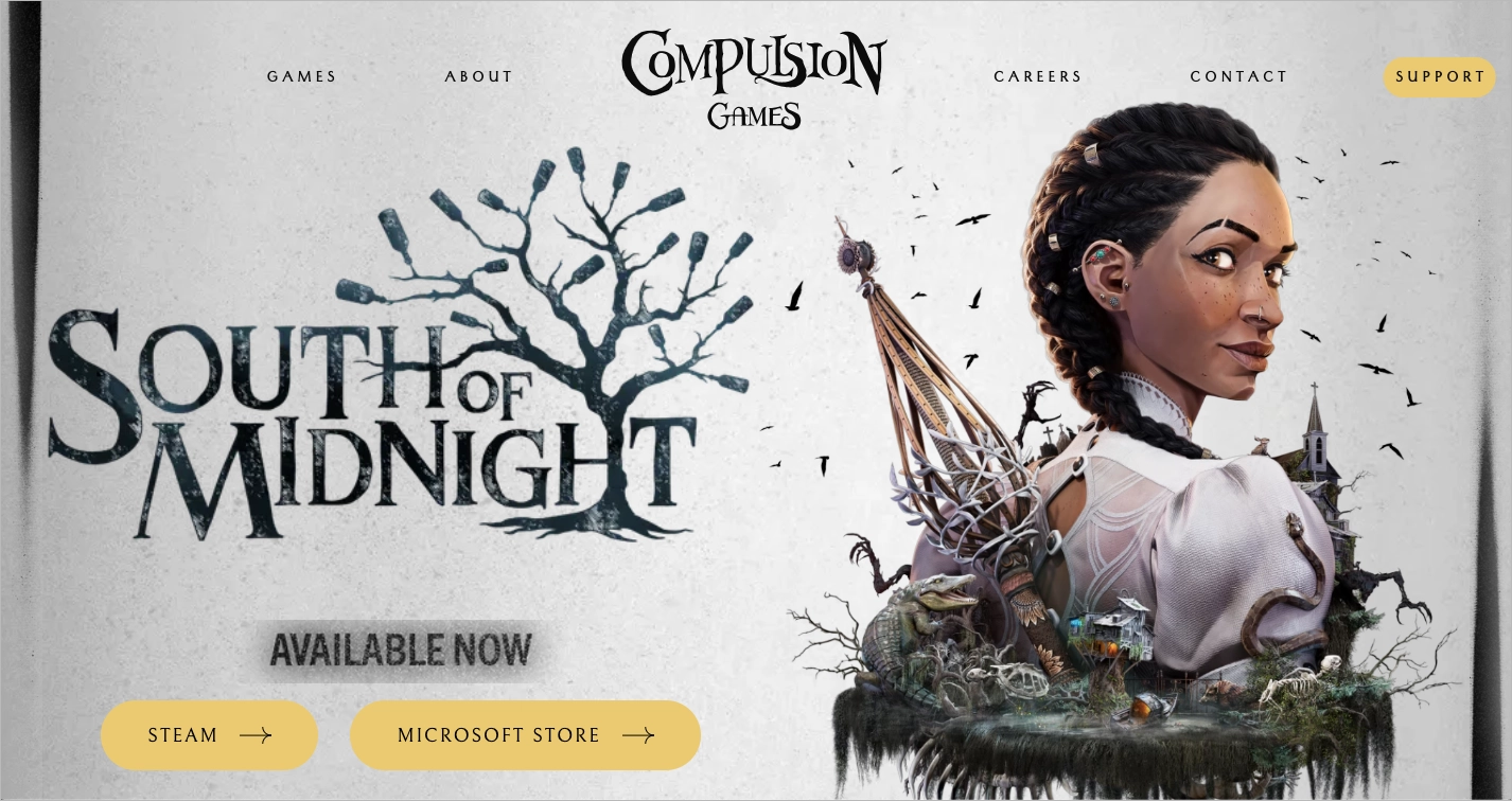
This Compulsion Games’ page features high-resolution images, looping video segments, and embedded trailers that highlight both mechanics and worldbuilding. An FAQ section addresses common questions, improving user clarity and reducing hesitation. Bold typography and stylized graphics enhance the thematic presentation while supporting smooth navigation across sections.
Key takeaways from Compulsion Games’ page example:
- Entry animation that sets an atmospheric tone
- Multiple CTAs placed along the scroll path
- High-quality gameplay footage and cinematic trailers
- Well-structured FAQ that anticipates user concerns
Improvement areas:
- Lack of social proof: adding social proof – such as early player feedback, press quotes, or community engagement stats – would enhance trust and support stronger conversion.
15. Blue Prince
The game landing page for Blue Prince introduces a mystery-themed indie game through creative layout and cinematic presentation. The first section occupies minimal vertical space and reveals part of the next section, encouraging users to scroll. A full-width background video immediately follows, establishing the game’s tone with atmospheric visuals and moody pacing.
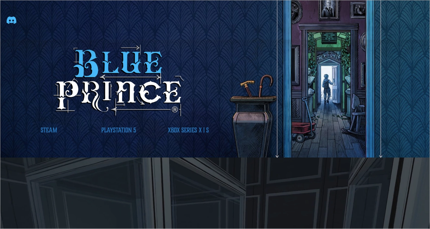
One of the page’s standout strengths is its color palette. The dark blues and deep hues echo the game’s mysterious tone, while still allowing foreground text and calls to action to remain legible and prominent. Foreground text and calls to action remain clear and legible against the dark tones. The header and video blend seamlessly into the layout, creating a cohesive and immersive experience. Minimal navigation keeps the focus on visual storytelling and user engagement.
Key takeaways from Blue Prince’s page example:
- Harmonious color palette that reflects the game tone
- Smart layout structure that guides scrolling
- Full-width video background to enhance immersion
- Minimal navigation for a distraction-free experience
Improvement areas:
- CTAs: adding more visible and clearly labeled call-to-action buttons, especially near key visuals or trailers, would help convert user interest into downloads or wishlists.
Create another opportunity to capture your visitors’ attention with a pop-up! Use this pop-up template to encourage newsletter sign-ups where you can send updates about upcoming releases or game modifications.
16. Indiana Jones and the Great Circle
The landing page for Indiana Jones and the Great Circle shows an action-adventure experience through cinematic visuals and dynamic animated transitions. The visual design reflects the tone of the Indiana Jones franchise, with rich textures, dramatic movement, and thematic typography. Full-screen animations and transitions guide the user’s attention across sections while reinforcing the game’s adventurous theme.
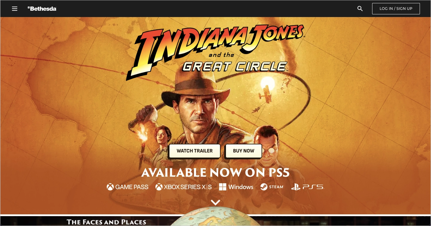
This Bethesda’s landing page includes a persistent “Buy Now” button fixed in a sticky header. This ensures the primary call to action remains accessible as users scroll. A media-rich gallery of trailers and screenshots provides detailed insight into the game’s mechanics and story elements. The layout is structured to keep the user focused while progressively revealing content tied to gameplay features.
Key takeaways from Bethesda’s page example:
- Cinematic transitions and atmospheric motion effects
- Persistent “Buy Now” CTA that improves accessibility
- High-resolution media gallery with trailers and screenshots
- Thematic fonts and visuals that reflect the franchise’s identity
Improvement areas:
- Heavy page load: animation and large media files can cause slow load times, particularly on mobile devices; optimizing file sizes would improve performance.
- Bethesda global navigation: the global header includes redundant elements and even a separate CTA (buy/redeem links), which could be minimized or hidden to reduce distraction and improve conversion rates.
17. The Elder Scrolls IV: Oblivion Remastered
Another Bethesda landing page, this time for The Elder Scrolls IV: Oblivion Remastered, introduces the updated fantasy RPG with cinematic design and focused messaging. A full-width animated background in the hero section sets the tone, immersing users in the world of Tamriel. A dark visual theme emphasizes the fantasy genre while helping key text elements and call-to-action buttons stand out.
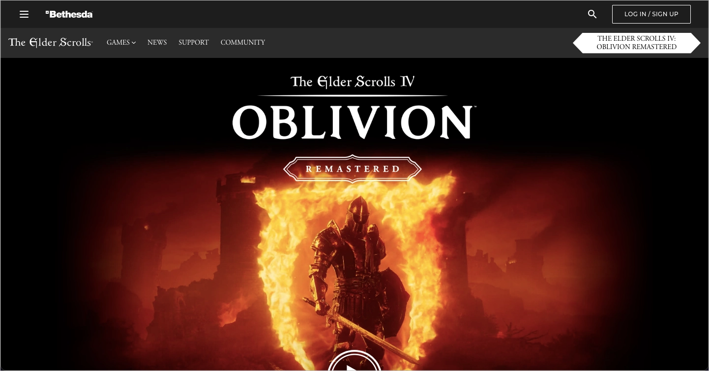
The Oblivion landing page features smooth scroll-based transitions and responsive layout behavior. Typography choices evoke a cinematic tone, supporting the visual identity of a remastered premium title. Content is structured to encourage exploration of media galleries, gameplay features, and lore elements.
Key takeaways from Bethesda’s page example:
- Full-screen hero animation that sets a fantasy tone
- Dark color scheme to emphasize contrast and genre identity
- Visually prominent CTA with contrasting styling
- High-end typography that matches the remastered theme
Improvement areas:
- Double navigation menus: two menus, one from the standalone page and one from the Bethesda global header, create potential confusion; simplifying the navigation structure would improve clarity.
- CTA button placement: placing the “Buy Now” CTA higher on the page would reduce friction and increase conversion opportunities.
18. Monster Hunter Wilds
The landing page for Monster Hunter Wilds by Capcom shows a next-generation action RPG through high-impact visuals and layered motion effects. A full-screen background video plays on arrival, showing cinematic gameplay footage that immerses users in the game’s scale and energy. Prominent award badges from gamescom 2024, including “Most Epic” and “Best Trailer,” provide social proof and industry credibility.
Caprom’s landing page includes a clearly labeled call-to-action placed early in the scroll path. The layout presents game features, platform availability, and media assets in a structured sequence. Platform icons for PS5, Xbox Series X|S, and Steam guide users to the appropriate store. Social and community links are positioned at the footer to support post-visit engagement.
Key takeaways from Caprom’s page example:
- Cinematic video background that establishes visual tone
- Award badges that reinforce recognition and quality
- Early-stage “Purchase” CTA to support conversions
- Cross-platform layout with clear icons and links
- Smooth transitions and polished animation effects
Improvement areas:
- First section clutter: the header area is overloaded with logos, animations, and platform buttons, which makes it hard to immediately locate the main CTA.
- CTA visibility: while the “Purchase” button exists, it is somewhat visually lost in the motion and competing visual elements; simplifying or spacing content could improve clarity and conversions.
Elevate your landing page using this event template by incorporating a captivating fullscreen image background. Pair it with engaging copy to create an inviting space that effectively introduces your game to users.
19. Slay the Princess
The landing page for the game Slay the Princess uses a unique sketch-like art style to reflect its psychological horror tone. A monochrome color palette, composed of stark blacks and whites, reinforces the narrative’s tension while blending the website’s visual design with the game’s in-world aesthetic. A well-positioned trailer and a smooth scroll-through experience help draw users into the narrative before they read a single line of copy.
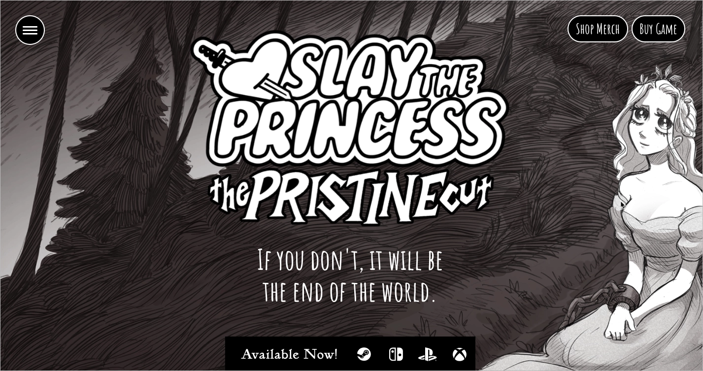
Slay the Princess’s landing page also includes a reviews carousel featuring praise from established media outlets, strengthening credibility and user interest. Each graphic, font, and animation is carefully selected to support immersion. However, the subdued color scheme limits the visibility of key calls-to-action, potentially impacting conversions.
Key takeaways from Slay the Princess’s page example:
- Hand-drawn visual design aligned with game art
- Monochrome aesthetic that supports horror genre tone
- Smooth animations and immersive scroll behavior
- Integrated trailer and reviews from media outlets
- Newsletter sign-up for ongoing engagement
Improvement areas:
- Improve CTA visibility: call-to-action buttons need greater contrast or animated cues to stand out from the background.
- Consider accessibility: the current low-contrast palette may hinder accessibility for visually impaired users and could be adjusted to meet inclusive design standards.
20. Sunderfolk
The Sunderfolk game landing page by Dreamhaven is a community-driven couch co-op experience through a clean, cinematic design. A full-width hero image sets the visual tone and draws users into the game’s world. The top navigation remains minimal and unobtrusive, allowing the main content and visuals to guide the experience. The second section opens with the phrase “Rediscover Game Night”, highlighting the game’s focus on shared play and social connection.
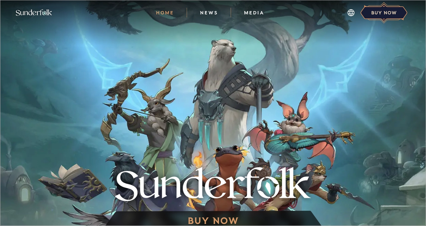
The Sunderfolk landing page features a high-visibility “BUY NOW” call-to-action that remains fixed on scroll. This persistent CTA reinforces the page’s conversion goal and keeps the user focused on taking action. Animated transitions, consistent color use, and rich visual content—including character features and platform icons—support a polished and informative presentation.
Key takeaways from the Sunderfolk page example:
- Minimalist top menu that avoids distraction
- Full-width hero image that sets a cinematic tone
- Persistent and prominent “BUY NOW” CTA
- Clear, theme-aligned messaging
- Smooth layout with animated transitions and platform visibility
Improvement areas:
- Accessibility optimization: increasing contrast ratios and adding descriptive alt text to all media would make the experience more inclusive and compliant with accessibility standards.
Want your game to convert like Sunderfolk? Let our designers craft your next blockbuster landing page.
How Do I Create a Game Landing Page?
To create a landing page for a game, the initial step is to have a defined goal, whether that’s growing your mailing list, promoting a demo, or selling pre-orders. With Landingi, you can build and launch your page quickly, even if you don’t have coding skills. Below are the key steps to help you plan and publish a landing page that promotes your game and drives player engagement.
Instead of building your game landing page from scratch, you can use Lunar, Landingi’s AI landing page generator, which creates complete, launch-ready page structures with all essential elements already in place. This lets you focus more on the creative layer rather than the technical setup.
Step 1: Define Your Audience and Your Goal
Before building the page, identify your target audience. Answer basic questions: Are you designing for console gamers, mobile users, or PC players? What matters most to them – graphics, gameplay depth, narrative, or competition?
Once you understand the audience, define the single action you want them to take, such as signing up for updates, watching a trailer, or placing a pre-order. This step ensures your messaging, layout, and media support one clear objective.
Speak to the right players! Build a page that talks their language – and gets them to act.
Step 2: Choose a template and customize your layout
A landing page template gives you a structured starting point that saves time and ensures visual consistency.
Landingi offers a range of templates designed for different use cases and styles. Choose one that fits the atmosphere and genre of your game – whether it’s dark and moody, bright and colorful, or minimalist and clean.
Once you’ve selected a template, use the drag-and-drop editor to adjust sections, move elements, and shape the layout to match your brand identity. A well-customized layout supports readability, emphasizes key visuals, and improves the overall user experience.
Step 3: Add High-Impact Visuals and Motion
Game visuals create the first impression and anchor a visitor’s attention. Add high-resolution screenshots, concept art, or a trailer to showcase your game’s tone and style. Include video backgrounds or animated hero sections to give your page a dynamic feel.
Motion-based elements – such as gameplay clips or character animations – demonstrate how the game works in real time. Visual movement helps communicate mechanics, set expectations, and build excitement quickly.
Step 4: Write a Headline and Description That Sells the Experience
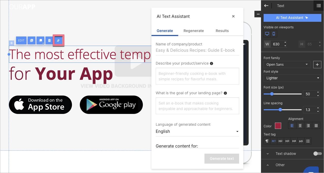
A headline is your game’s first pitch. Use a short, bold phrase that communicates the game’s core hook or emotional appeal. Examples include: “Escape a haunted wilderness”, “Fight to survive in a dying galaxy”, or “Command an empire from the shadows.” Place your headline in the hero section using Landingi’s Text widget, and style it to reflect your game’s tone.
Follow with a concise description that expands on the gameplay experience. Focus on what makes the game unique – its genre, mechanics, narrative, or competitive elements. Use formatting options like bold and italics to highlight keywords such as “co-op mode”, “roguelike progression”, or “launching soon”.
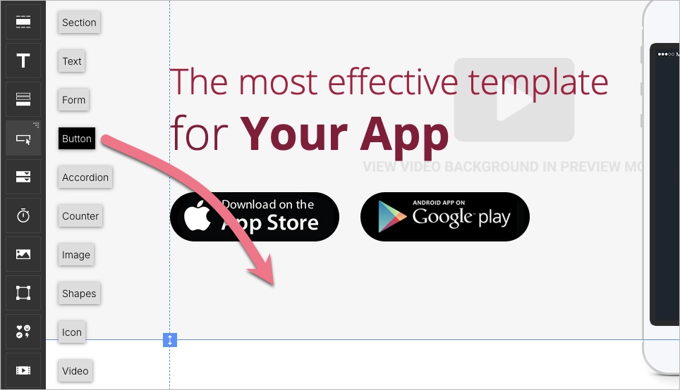
Step 5: Set a Clear and Visible CTA
A landing page exists to drive one action – your call to action (CTA). Use Landingi’s button or form widgets to create CTAs like “Join Beta”, “Pre-Order Now”, or “Wishlist on Steam”. Make the primary CTA visible in the first section of the page, and repeat it in other sections, such as below the trailers or in feature lists.
Consistent messaging and prominent placement help users take action without confusion. Effective CTA design improves conversions by removing friction and guiding users clearly.
Step 6: Add Social Proof to Build Trust
Visitors often look for signals that a game is worth their time. Add testimonials from playtesters, press quotes, influencer reactions, or award badges to establish credibility. Landingi allows you to easily embed star ratings, logos, or review snippets from trusted sources.
Social proof reassures new visitors by showing that others have already played, enjoyed, or endorsed the game – making it easier for them to commit.
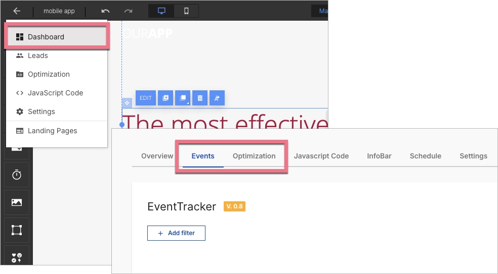
Step 7: Optimize, Launch, and Improve
Once the page is built, it’s time to test and refine. Landingi includes built-in tools to optimize your landing page before and after publishing. Use A/B testing to compare different headlines, CTA positions, or media layouts. Monitor user behavior with EventTracker to see which sections get the most engagement.
Ensure your landing page is mobile-optimized and loads quickly. Fast, responsive performance builds user trust and increases conversion rates. If you’re selling the game or offering pre-orders, connect payment services like Stripe, PayPal, or PayU to process transactions directly (learn more in Add-on Store).
What Is a Game Landing Page?
A game landing page is a standalone web page designed to introduce a game, highlight its key features, and guide visitors toward one specific action – such as pre-ordering, signing up for updates, or downloading a demo. The goal is conversion, and every visual and textual element on the page supports that outcome.
A game landing page serves as a focused stage where the game takes center stage. A clearly visible call to action appears early in the layout, inviting users to engage immediately. The page uses compelling visuals, short-form copy, and interactive elements to build emotional interest and explain what the game offers.
As part of a broader marketing strategy, the game landing page often serves as the first point of contact between a title and its audience. This page is built to convert curiosity into action by offering a curated glimpse into the game’s world – whether through screenshots, trailers, or feature lists.
By placing the game’s title prominently and surrounding it with high-resolution visuals, the landing page invites exploration. The layout encourages players to imagine themselves in the game world, creating anticipation and guiding them toward the next step – playing.
Bring your game to life with a landing page that immerses, intrigues, and converts!
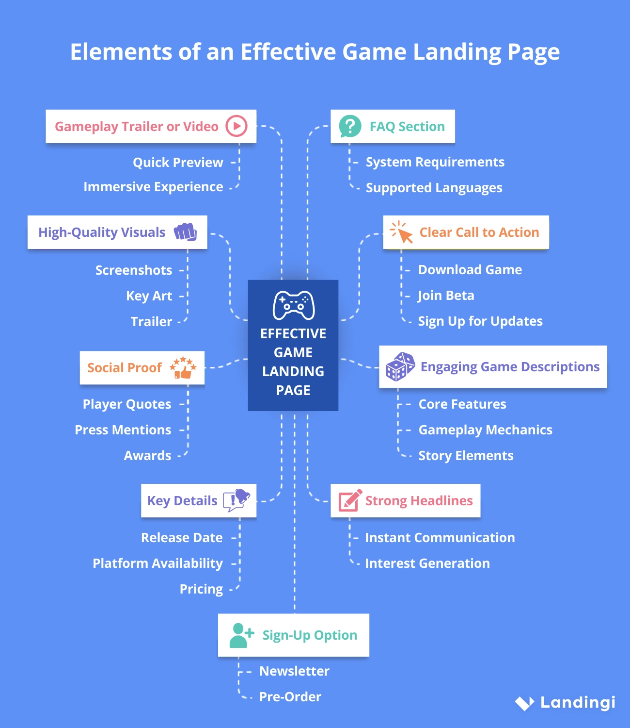
What Are the Key Elements of an Effective Game Landing Page?
An effective game landing page includes clear messaging, strong visuals, and one focused conversion goal. The most important elements work together to attract attention, build interest, and guide visitors toward action – such as pre-ordering, joining a beta, or signing up for updates.
Each well-structured game page should start with a headline that communicates the game’s core appeal in a single line. This headline should introduce the game and set the tone. It must be followed with visuals – such as key art, screenshots, or a video trailer – that immerse users in the game world before they read further.
The game landing page must include a short game description that outlines key features, gameplay mechanics, or story elements. A call-to-action (CTA) should appear early on the page and be repeated strategically. The next key element of a game landing page is social proof that builds trust. Quotes from players, reviews from press outlets, or awards help validate the game’s quality. The page must include key facts – such as release date, pricing, and supported platforms – in a clearly visible location so users don’t have to search.
A gameplay trailer gives users a fast and immersive preview, while a FAQ section can answer common concerns like system requirements, supported controllers, or multiplayer modes. To continue the connection beyond the visit, include a newsletter sign-up or pre-order option.
Each element on the page should serve one purpose: helping visitors understand the game quickly and feel confident taking the next step.
What Is the Best Game Landing Page Builder?
A game landing page builder should combine design flexibility, marketing tools, and ease of use to help developers create effective, conversion-focused pages. The best tool supports both beginners and experienced marketers, making it possible to launch polished landing pages without relying on a developer.
Landingi is a strong choice for building game landing pages. It allows users to create visually rich, on-brand pages using a drag-and-drop editor. No coding is required, and users can choose from a large library of customizable templates that fit different game genres and visual styles.
Landingi includes features tailored for marketing performance. Built-in AI landing page tools help generate layouts, headlines, descriptions, and SEO content quickly. You can run A/B tests to compare page versions and track user activity with EventTracker to understand where visitors click or drop off. Tools like Form Builder, pop-ups, and Smart Sections make it easy to collect leads or update multiple pages at once.
For game developers selling directly, Landingi includes an e-commerce hub that connects to Stripe, PayPal, and PayU. This feature enables pre-orders, early access sales, or limited edition offers to be handled directly on the landing page – without relying on a third-party store.
With over 170 integrations, Landingi also connects easily with your broader marketing stack. The platform supports newsletters, analytics, CRM tools, and ad platforms, helping developers turn a landing page into a revenue-generating tool.
One platform, every tool you need! From A/B tests to lead capture – Landingi does it all.
Build a Game Landing Page in Landingi
After reviewing top examples, it’s clear that a game landing page is more than a marketing tool – it’s a gateway into your game’s world. What makes it effective? Compelling visuals, a strong call to action, clear storytelling, and trust-building social proof. Use these principles as inspiration. Don’t copy – adapt. Choose visuals and strategies that reflect your game’s unique identity, and focus on a clear message with a layout built to convert.
Inspired to launch your next game landing page? Forget building within your existing CMS – which often requires plugins, developer support, or slow design iterations. Landingi offers a specialized platform made for fast, focused page creation. You don’t need to touch code. You don’t need to manage hosting or worry about compatibility. With Landingi, you can:
- Launch your video game landing page with drag-and-drop design tools
- A/B test headlines, CTAs, and layouts to improve conversion
- Add forms, pop-ups, and payment integrations with a few clicks
- Monitor behavior with built-in analytics
- Publish fully responsive versions for desktop and mobile game landing page visitors
Landingi helps creators move fast – ideal for solo developers, indie studios, or publishers preparing for early access or full release campaigns. The platform replaces technical bottlenecks with flexibility, empowering you to focus on what matters: your message, your visuals, and your audience.
You now have everything you need to build an effective game landing page – from design inspiration to platform choice. Try Landingi now for free and start transforming casual visitors into passionate players!


