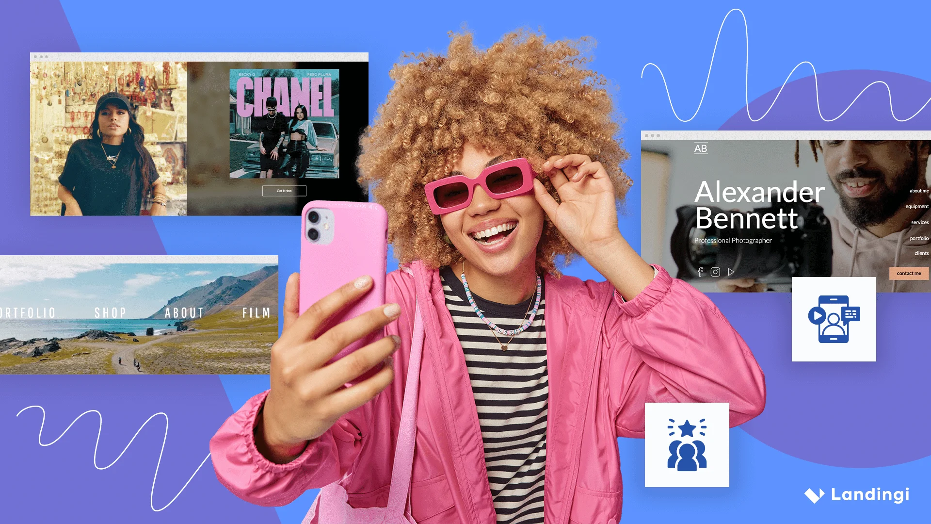

An influencer landing page is a standalone webpage built to convert traffic from an influencer’s audience. Most visitors arrive via a link in bio, swipe-up, or caption – and expect a page that feels aligned with the creator who sent them.
To work, the page needs to match the influencer’s tone, build trust fast, and guide users toward one clear action – like signing up, purchasing, or downloading.
While traditional CMS platforms can slow you down, tools like Landingi are built for speed and performance. You can create dedicated pages for influencer campaigns, including paid traffic like Google Ads, without touching your main site.
In this guide, you’ll find actionable tips and 12 influencer website examples that show how to build landing pages that look right, feel on-brand, and actually convert

12 Best Examples of Influencer Landing Pages
Let’s take a look at some of the best landing page examples in influencer marketing to see how they’re done right.
#1 Chris Burkard
Chris Burkard’s influencer landing page is a strong example of how to align visual storytelling with audience expectations. Visitors arriving from social platforms are immediately welcomed with immersive, full-screen photography that reflects Burkard’s identity as an outdoor creator.
The design reinforces his brand without distraction. A clean, minimal layout lets the visuals take center stage while supporting easy navigation — ideal for audiences who already trust and follow his content.
This landing page works because it maintains continuity between Burkard’s social presence and the on-page experience. The tone, typography, and imagery feel native to his personal brand, which strengthens user trust and makes conversion pathways — like signing up for a workshop or buying a print — feel natural.
As an influencer landing page, it succeeds by extending his online persona into a focused, conversion-ready space without losing authenticity.

What works
- Simple layout with plenty of breathing room
- Gorgeous photos and a background video that sets the vibe
- Clear, consistent messaging
- Trust signals like partner and sponsor logos
- A short, personal note from the author
- Strong, easy-to-spot CTAs
- Social buttons right where you’d expect
What could be improved
The mobile version could use some fine-tuning – it’s great on desktop, but on smaller screens, it feels a bit clunky.
Choose the Company Presentation template from the Landingi library and customize it easily with its drag-and-drop editor to create your perfect influencer landing page.

#2 Jack Morris
Jack Morris uses a direct, results-driven approach that focuses on transformation. His influencer landing page opens with before-and-after photos that clearly show what his fitness program delivers.
The offer is easy to understand: lifetime access, multiple formats, and a quick way to start. The layout is stripped down, the visuals are sharp, and every CTA is positioned to drive signups.
From headline to form, everything is designed to keep the user on track. The experience is fast, smooth, and distraction-free — optimized for action.

What works
- A bold, catchy headline that gets straight to the point
- Clear CTA buttons that stand out
- Hamburger menu in the top-right corner for easy navigation
- Layout that just makes sense – nothing confusing
- A quick, no-fuss signup form with a strong CTA
- High-quality, polished images
- Short, punchy copy that keeps people interested
What could be improved
There’s one thing missing: social proof. A few testimonials or success stories from real users would add trust and give visitors that final push to sign up.
Choose the template available on the Landingi platform, customize it, and use your influencer landing page as a great lead generation tool.

#3 Becky G
Becky G’s influencer landing page feels more like a fan destination than a sales page. It opens with strong visuals, bold colors, and immediate access to her latest music and videos.
The design focuses on connection. Every element — from the layout to the background video — reflects her energy and personality. It’s a space built to keep fans engaged, not just push a product.
Navigation is smooth, content is minimal but effective, and the experience feels personal. For an audience coming from social media, the tone and structure hit exactly the right note.

What works
- Super intuitive layout – everything’s easy to find
- Bold headline that grabs attention
- Engaging visuals and background video that set the vibe
- Minimal text that keeps things quick and clear
- Strong CTAs that guide visitors naturally
- Social icons placed right where you need them
What could be improved
The mobile experience needs a little work. Faster load times, smoother navigation, and more touch-friendly elements (like bigger CTA buttons) would go a long way in making the page more effective on phones.
Promote your content effectively – design your influencer landing page with Landingi!
#4 Mrwhosetheboss – Arun Maini
Arun Maini, known as Mrwhosetheboss, uses a landing page that mirrors his content style: clean, direct, and quietly confident. There’s no clutter, no hard sell — just a clear summary of who he is and how to connect with him.
The design feels like a digital business card. It offers quick links to his YouTube channel, social profiles, and media mentions, all wrapped in a minimalist layout that’s easy to scan. The tone matches his tech content — calm, focused, and professional.
By keeping the structure simple, the influencer landing page delivers exactly what visitors came for without distraction. It’s a strong example of how less can do more when your brand and audience are already well aligned.

What works
- Minimal, no-distractions design
- Catchy, straight-to-the-point headline
- Clear, concise messaging
- Short signup form with a strong CTA button
- Eye-catching profile photo that adds personality
- Social media icons placed neatly in the top-right corner
What could be improved
A background video would add a bit more life to the page – something subtle to match the tone, but enough to keep visitors engaged and maybe even boost conversions.
Start crafting your own influencer page with the best builder – Landingi, an all-in-one, user-friendly platform. Choose the Business Page template, customize it, and run A/B tests to optimize it for better results.

#5 Simone Giertz
Simone Giertz’s landing page captures her personality perfectly — inventive, a little messy, and completely original. From the first scroll, visitors see her latest robots, DIY projects, and ongoing experiments laid out with playful energy.
The layout is easy to follow but intentionally offbeat, echoing her blend of engineering and humor. Content blocks are casual but purposeful, encouraging exploration without overwhelming the user.
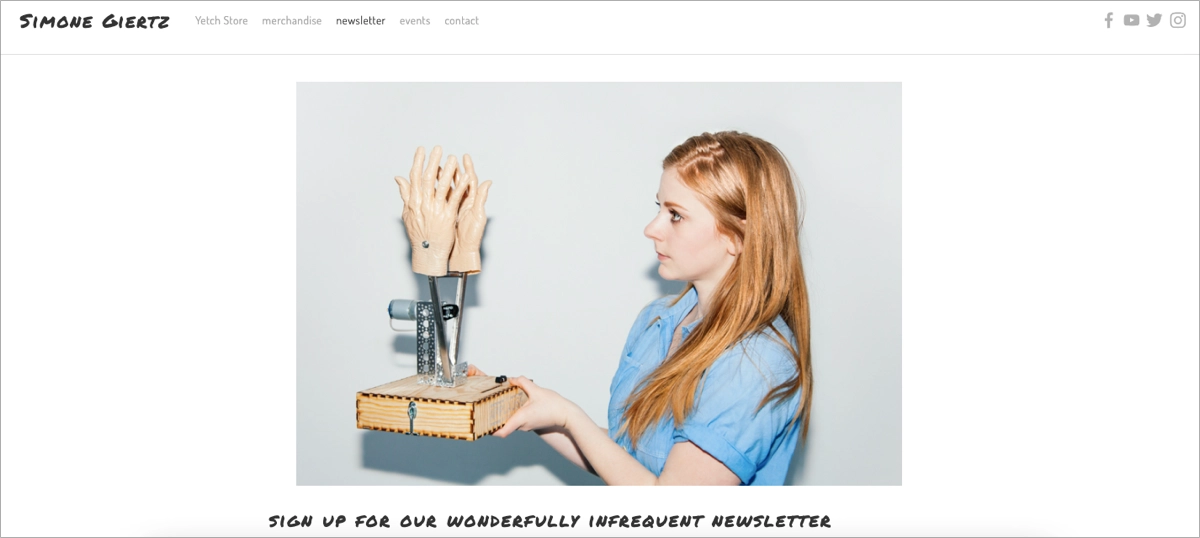
A behind-the-scenes section adds more depth, offering a glimpse into her workshop and creative process. The result is a page that feels authentic, personal, and true to Simone’s brand — equal parts clever, chaotic, and charming.
What works
- Clean layout with lots of white space – nothing feels cramped
- Eye-catching visuals that match her personality
- Short, engaging copy that keeps it light
- Easy newsletter signup to stay in the loop
- Strong CTA that stands out
- Social buttons right where you expect them
What could be improved
The form could be simpler. Even if some fields aren’t required, they can still feel like a chore. A basic, one-field opt-in would make signing up way easier and more inviting.
Pick the Newsletter template, add your content, and customize the form easily. Ask only for the visitor’s email address to streamline the sign-up process, and don’t forget about the outstanding CTA button!

#6 UX.MARS
UX.MARS, created by Salim Dabanca, is designed as a resource hub for UX and UI designers. The landing page introduces visitors to a full ecosystem of tools, content, and community built around design growth.
The standout feature is the Mars Design Club, which offers daily design feedback, portfolio reviews, and access to premium resources. Notable tools include the “Learn UI Design from Zero” eBook and the “Interview Presentation Kit,” both aimed at helping designers level up.
In addition to community features, the page highlights Dabanca’s portfolio, blog content, and social links to Instagram, Dribbble, and Medium. The result is a well-structured, content-rich page that balances personal branding with real value for the design community.

What works
- A well-rounded content hub full of value – both free and premium
- Clean layout and navigation that keeps things easy to explore
- Great use of multimedia – ebooks, design kits, and more for different learning styles
What could be improved
Some of the resources and community perks could use clearer descriptions to help new visitors understand the benefits faster.
#7 Abi Connick
Abi Connick’s landing page is a strong example of personal branding done right. As a designer, mentor, and creator, she uses the page to introduce her work with clarity and visual appeal.
The layout is clean and focused, featuring soft tones, high-quality photos, and a hero image that makes the experience feel personal from the start. Visitors are immediately shown who she is and what she offers, with easy access to her services, mentorship programs, and digital products.
What stands out is the sense of balance — the design feels approachable yet professional. Testimonials and client logos add social proof without cluttering the page, reinforcing trust while keeping the overall experience smooth and on-brand.

What works
- Her brand shows up in every scroll – tone, visuals, structure, everything
- She promotes multiple offers without overwhelming the user
- The CTAs are placed with purpose and feel natural, not forced
- The design is clean and calming, but still has personality
What could be improved
Since the page is fairly image-heavy, a little speed optimization for mobile wouldn’t hurt.
#8 Lucy Lugi
Lucy Lugi’s landing page, created under the Lugi Design brand, immediately communicates a premium experience. The design combines neutral colors, refined typography, and generous white space to establish a calm and confident visual tone.
From the first scroll, the page feels elevated and well-structured. Each section supports her brand without overexplaining — the style alone conveys professionalism and attention to detail.
The layout is focused and intuitive. Visitors can explore her portfolio, understand her design process, or complete a client application form without friction. Every element contributes to a polished, high-end user experience.

What’s works
- The design feels premium without trying too hard – clean fonts, muted tones, and intentional spacing
- The layout is minimalist but still covers all the right points
- It reinforces her positioning as a high-end creative
- CTAs are gentle, but clear – perfect for a service-based creator
What could be improved
The desktop version features a creative custom cursor – a fun touch that fits the aesthetic. But it’s a bit sluggish, which slightly hurts the user experience. A snappier cursor would keep things feeling just as stylish, but smoother to navigate.
Grow your influence online – create a custom landing page with Landingi!
#9 Marie Forleo
Marie Forleo’s landing page feels like a central hub for personal and professional growth. It features her flagship programs — like B-School and The Copy Cure — along with free resources, training sessions, and episodes of MarieTV.
The design is clear and intentional. Navigation is simple, the layout is polished, and the overall tone matches Marie’s personal brand: approachable, encouraging, and energetic.
What makes the page work is how well it supports deep engagement. Whether users are casually browsing or diving into specific content, the experience feels rich, motivating, and easy to stay with.

What works
- A solid content hub with paid programs and free resources
- Clear, user-friendly navigation that makes exploring easy
- Consistent branding that feels true to her voice
- Strong social proof – testimonials and success stories are everywhere
- Video and podcast content to match different learning styles
What could be improved
Adding interactive elements like quizzes or personalized suggestions could make the site feel even more tailored and engaging.
#10 Johnny Harris
Johnny Harris’s landing page reflects his strength as a visual storyteller. The structure is clear, the content is purposeful, and the tone invites exploration without overwhelming the user.
The page functions as both a professional portfolio and a creative collaboration space. It highlights high-profile work — including Borders and projects with The New York Times — while offering pathways for pitches, partnerships, and job opportunities.
Visitors can browse long-form videos, access travel courses from his company Bright Trip, or simply get a sense of his style and values. The overall feel is polished, personal, and built for genuine connection.

What works
- A strong, well-organized portfolio that shows range and depth
- Clear ways to get involved
- Clean, easy-to-navigate design that keeps things flowing
- Smart use of multimedia – everything connects smoothly with his YouTube and socials
What could be improved
Some elements could use more detail – a quick summary or a few context lines would give new visitors more to dig into.
#11 Julie Solvstrom
Julie Solvstrom’s landing page captures her artistic identity from the very first screen. Bold colors, hand-drawn lettering, and an expressive layout make the site feel like an extension of her sketchbook.
The page serves as both a portfolio and an online store. Visitors can browse collaborations with brands like Champion or shop her original work — including prints, postcards, and greeting cards.
The navigation is intuitive, and every section feels purposeful. The overall experience blends creativity with clarity, showcasing Julie’s art in a way that feels both personal and professional.
What works
- Bright, colorful design that grabs your attention and matches her vibe
- A strong portfolio that shows both client work and personal projects
- Clear navigation that makes it easy to browse and shop
- Newsletter sign-up and social links that keep the connection going
What could be improved
The mobile version needs a bit of cleanup – some text overlaps in certain sections, and a few CTA buttons have broken or stretched fonts. A bit of layout adjusting would go a long way here.
Turn followers into leads – build your influencer landing page with Landingi!
#12 Hazel Wallace
Dr. Hazel Wallace’s landing page brings together all aspects of her brand in one well-organized space. The focus is on women’s health, nutrition, and science-based wellness, delivered through clinics, courses, books, and a podcast.
The design is calm and professional, with clear navigation and a tone that’s warm and accessible. Visitors can easily find what they need, whether they’re booking a service or exploring educational content.
A live Instagram feed adds personality and social proof. Community posts, testimonials, and health tips appear in real-time, making the site feel current, trusted, and directly connected to her audience.

What works
- Instagram feed adds real-world proof and ongoing engagement
- Clean, intuitive layout that’s easy to follow
- Clear breakdown of services, books, and programs
- Consistent branding that flows from site to socials
What could be improved
The mobile experience could use a little work. While the services and courses are listed clearly, short descriptions with more detail could help users understand what they’re getting and why it matters.
What Is an Influencer Landing Page?
An influencer landing page is a standalone webpage built for one purpose: turning social media followers into customers, subscribers, or leads. It’s where people land after clicking a link in an influencer’s bio, story, or caption — and it’s crafted to match their expectations and the influencer’s voice.
A strong influencer landing page feels like the creator who promoted it – same tone, same visual vibe, same energy. It should feel instantly familiar, as if the visitor stepped from the influencer’s content into their digital space. That sense of continuity builds trust, and trust drives clicks.
So what makes a landing page “influencer-style”? It feels like a natural extension of the influencer’s social media. It’s visually and verbally on-brand for their audience. It guides users toward a next step without pressure or confusion.
A few conversion-focused elements are essential. Think email signup, a short video, a testimonial or two, maybe a limited-time freebie. These aren’t just nice-to-haves, they’re tools designed to move users from attention to action.
When done well, an influencer landing page tells a clear story, reinforces the offer, and removes friction from the decision. Every example in this guide takes a different approach, but they all follow one rule: keep it clear, keep it clean, and stay true to the creator’s brand.
Build your personal brand – create a stunning influencer landing page with Landingi!
How Do I Create an Influencer Landing Page?
To create an influencer landing page, start with the right builder — one that lets you design fast, stay on brand, and keep full control without touching code. Platforms like Landingi make it easy to build beautiful, high-converting pages that match the influencer’s style and speak directly to their audience.
Scroll on for a step-by-step guide to building a landing page that looks great, feels on-brand, and actually delivers.
Step 1. Set One Clear Goal
Before you design anything, decide what the landing page is meant to achieve. Are you selling a product, sharing a free resource, or collecting emails through a form? Choose one goal and build everything around it.
Your goal should guide the entire structure – from layout and copy to CTAs and content flow. If you try to serve multiple purposes at once, the message gets diluted and conversions drop.
Keep the audience in mind. Visitors aren’t strangers – they’re fans of the influencer who shared the link. The page should speak in a voice that feels familiar, direct, and relevant to that specific community.
When the offer matches the user’s expectations and intent, they’re far more likely to take action. Relevance and clarity are what make influencer landing pages work.
Step 2. Choose a Template
A good template can save you hours – and set you up for better results from the start. In Landingi, you’ll find over 400 professionally designed templates made to convert, not just look nice.
To start, go to the Pages tab and click Create new landing page. Browse the library for a layout that supports your goal and aligns with the influencer’s brand tone. Clean design, simple navigation, and easy-to-edit sections are key.
You can also start from scratch, upload a custom design, or generate a page with Composer. But starting with a purpose-built template often gives you the best mix of speed and flexibility.
Once you’ve chosen a layout, use the drag-and-drop editor to customize it. Swap visuals, adjust sections, and update the content to match the campaign. The interface is intuitive – no coding needed.

If you’re managing multiple campaigns, Landingi’s Smart Sections let you apply consistent branding and updates across many pages. That helps save time and maintain a unified look, even at scale.
Convert followers into clients – design your influencer landing page with Landingi!
Step 3. Write a Headline That Hooks – and Copy That Connects
Your headline is the first element visitors notice, and it needs to do two things quickly: grab attention and clearly communicate the offer. Keep it simple, specific, and focused on the benefit.
Examples that work:
“Get 20% Off [Influencer Name]’s Favorites – Today Only”
“Join [Influencer Name]’s Newsletter – Free Weekly Wellness Tips Inside”
Once the headline does its job, the body copy should reinforce the message. Explain what the visitor gets, why it matters, and how to claim it — using clear, human language, not generic marketing phrases.
Highlight any bonuses or exclusivity tied to the influencer. If it’s a free resource, say that upfront. If the offer is limited or personalized, make that obvious.
Break the content into skimmable chunks. Use subheadings, short paragraphs, and bullet points to maintain flow. Each section should move the visitor closer to action — whether that’s signing up, clicking a CTA, or downloading a resource.

If you need help with the wording, Landingi’s built-in AI Assistant can help you shape your message or try a few variations. Perfect if you want to test what converts better.
Step 4. Make It Look Good
Before anyone reads a word, they judge your landing page by how it looks. Strong visuals create instant trust — and for users coming from Instagram, TikTok, or YouTube, visual quality is non-negotiable.
Use high-resolution images that align with the influencer’s aesthetic. Show the product in use, add clean branded graphics, and choose colors and fonts that reflect the influencer’s vibe. The goal is to make the page feel like an extension of their content.

If you’re building in Landingi, features like the background remover help create polished, distraction-free visuals. But make sure all media loads quickly — slow pages lose conversions before they even start.
Video can boost results even more. According to HubSpot, nearly 40% of marketers say video is the most effective tool for landing page conversions. A short intro, demo, or behind-the-scenes clip — especially one featuring the influencer — can make the experience feel personal and persuasive.
Step 5. Add a Lead Capture Form and a CTA That Works
If your goal is to collect emails, keep the form simple. Ask only for what’s essential — usually just a name and email address. You can include one optional field, but anything more increases the chance of drop-offs.
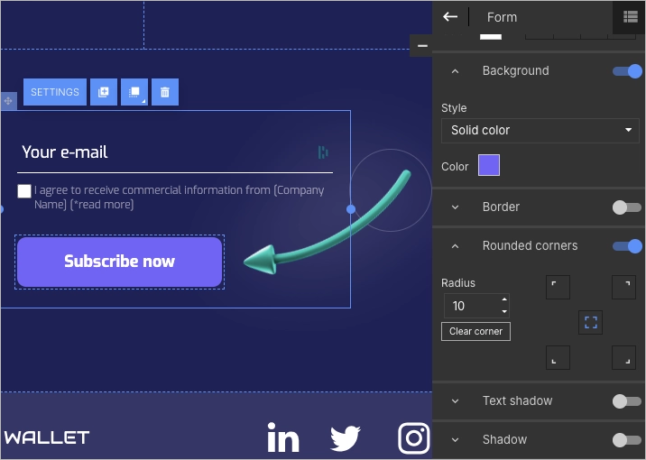
A strong call-to-action (CTA) makes the form worth submitting. Avoid generic buttons like “Submit.” Instead, use action-oriented text that ties directly to the offer — for example: “Get the Free Guide,” “Unlock the Discount,” or “Join [Influencer Name]’s Inner Circle.”
Make sure the CTA stands out visually. Use bold colors and high contrast so it’s easy to see at a glance. Don’t hide it at the bottom of the page — repeat it in key spots to keep users moving toward conversion.
An effective form plus a well-placed CTA can dramatically increase engagement. It’s one of the simplest, most reliable ways to turn page visits into leads.
Step 6. Add a Little Trust and a Bit of Interaction
Visitors may trust the influencer who sent them — but your page needs to reinforce that trust. Add simple proof points like a testimonial, a short influencer quote, or a few kind words from real customers.
Even small trust signals can make a difference. A quick “As seen in…” row with recognizable brand logos can increase credibility without needing much space.

Interactive elements help keep users engaged. A countdown timer for a time-limited offer, or a soft pop-up offering a free bonus, can add urgency without pressure.
Finally, link to the influencer’s social profiles or recent content. This reassures visitors that they’re in the right place — and strengthens the connection between the brand, the influencer, and the audience.
Step 7. Make It Mobile-Friendly and Hit Publish
Most users clicking from influencer content are on mobile. That means your landing page needs to load fast, look clean, and function smoothly on small screens.

Use Landingi’s mobile view editor to adjust how the page appears on phones. Resize headlines, reposition buttons, and check that the layout stacks properly. A few small tweaks here can dramatically improve performance.
Before publishing, connect a custom domain. It keeps your branding consistent, adds credibility, and makes the page feel more official — especially for new visitors.
Once the page is live, track performance using Landingi’s built-in analytics. A/B testing tools let you experiment with headlines, CTAs, or layouts so you can keep optimizing for better results.
Boost your brand with a professionally designed landing page tailored to your needs.
3 Influencer Landing Page Best Practices
Creative design and personal branding are important — but without a strong foundation, even the best-looking landing page will underperform. High conversions depend on clarity, consistency, and user-focused structure.
No matter the niche, every influencer landing page should follow a few essential rules. Below are three must-have elements that keep influencer landing pages effective. When these are in place, the page is more likely to perform well — across channels, devices, and campaign types.
#1 Clear CTA
Your call-to-action (CTA) is the most important clickable element on the page. It should be obvious, direct, and easy to find — no guesswork, no distractions.
A case study by Michael Aagaard showed that simply changing CTA copy led to a 304% increase in conversions. That’s a powerful reminder: small improvements can have outsized impact when clarity is the focus.
Strong CTAs use plain language that matches your tone and sets expectations. “Get the Free Guide” or “Start the Trial” works better than vague prompts like “Submit” or “Click Here.”

CTAs also benefit from design decisions. High-contrast buttons, clear placement, and smart use of whitespace all help guide attention. According to CXL, red buttons often outperform green ones — but color psychology should always match the brand and audience.
A good CTA also creates urgency without pressure. Words like “Today Only” or “Limited Spots” add momentum when used honestly and sparingly. When the action is clear and compelling, users are far more likely to follow through.
Maximize your online presence – design a professional landing page with Landingi!
#2 Strategically placed SM buttons
Social media is central to influencer marketing, so your landing page should make it easy for visitors to connect across platforms. Well-placed social buttons help extend your message beyond the page through likes, shares, and follows.
Placement should be intentional. Buttons should support the landing page’s main goal — whether that’s boosting visibility, driving engagement, or building long-term audience relationships.

Design also matters. Use platform-specific icons and maintain visual consistency with the rest of the page. Social buttons should feel like part of the design, not an afterthought.
To create a cohesive experience, include these buttons across key sections of your site — especially near CTAs or content highlights. This encourages interaction at natural touchpoints and reinforces your cross-channel presence.
Monetize your influence – build your influencer landing page with Landingi!
#3 Mobile responsiveness
Mobile responsiveness is no longer optional — it’s essential. Since most social media traffic comes from smartphones, your landing page must work flawlessly on smaller screens.
A mobile-optimized page loads quickly, displays clearly, and focuses the visitor’s attention on one key action. The layout should be simple, with a strong headline, visible CTAs, and enough white space to avoid visual clutter.

Touchscreen usability is critical. Design with finger-tapping in mind by using larger buttons, adequate spacing, and layouts that prevent accidental clicks or scroll frustration.
A responsive mobile experience keeps bounce rates low and conversions high. From social ad to signup or purchase, every step should feel seamless — because mobile users won’t wait or zoom in to figure it out.
Create a landing page that drives brand deals – get started with Landingi!
How Can I Optimize My Influencer Landing Page for Higher Conversion Rates?
To optimize your influencer landing page for higher conversion rates, follow the six-step guide. This multifaceted approach combines strategic content placement, user experience enhancements, and data–driven adjustments.
Step 1. Speed things up
Page speed directly impacts bounce rates. Even a one-second delay can cause visitors to leave before they see your offer.
Optimize load times by compressing images, streamlining code, and choosing reliable hosting. A fast page keeps attention and builds trust instantly.
Step 2. Create an irresistible CTA
Your call-to-action should stand out — not blend in. Use action-driven language like “Get the Guide” or “Start Free” to create urgency and clarity.
Test different button colors, sizes, and placements. Small changes in your CTA can lead to big jumps in conversion when done right.
Step 3. Use visuals that stop the scroll
High-quality visuals can quickly build trust and reinforce your message. Include authentic photos, quick video intros, or behind-the-scenes clips that match the influencer’s style.
Visuals should support the offer, not distract from it. Keep file sizes light so everything loads quickly and looks sharp on any device.
Step 4. Show off social proof
Testimonials, reviews, and reposted content from real users give your landing page credibility. Social proof reduces hesitation and validates your offer.
Place the strongest quotes or mentions directly on the page. Make them easy to find — especially near CTAs — to reinforce confidence at key decision points.
Step 5. Make mobile a priority
Most influencer traffic comes from mobile. That means your landing page must be fully optimized for smaller screens.
Use layouts that are clean and scroll-friendly. Ensure buttons are large enough to tap easily, and test performance on real devices to catch friction before users do.
Step 6. Tes
A/B testing allows you to improve performance based on real user behavior. Start by testing one element at a time — like a headline, image, or CTA — to isolate what drives change.
Platforms like Landingi make it easy to run tests without code. Use built-in analytics to compare results and iterate based on what actually works, not just assumptions.
By following these six steps, you can systematically improve your landing page’s ability to turn visits into signups, sales, or other conversions. Optimizing regularly — not just once — ensures your page stays aligned with your audience, your offer, and your performance goals.
Enhance your influencer marketing – design a landing page with Landingi today!
What Are the Key Elements of an Effective Influencer Landing Page?
A high-converting influencer landing page combines trust, clarity, and strong visual messaging. The goal is to guide visitors from initial interest to action — whether it’s a purchase, signup, or download. Below are seven key elements every influencer landing page should include.
- Influencer endorsement – this could be in the form of a video, image, or written testimonial. The content should feel personal and authentic, reflecting the influencer’s genuine recommendation of the product or service.
- Compelling headline – a strong, attention-grabbing headline that communicates the value proposition or main benefit of the offer. It should resonate with the influencer’s audience and encourage them to read on.
- High-quality visuals – images or videos that feature the influencer using the product or service. Visual content should be engaging and professional, helping to visualize the benefits and reinforce the message.
- Clear CTA – the main element of each landing page that can’t be missing on an influencer’s one. The CTA should be prominently displayed, encouraging visitors to take the next step with well-matched messaging and outstanding design.
- Social proof – a list of partners and media mentions that build a person’s credibility. If it’s only possible, an influencer landing page should also include testimonials, user reviews, or case studies that showcase the product’s or service’s effectiveness.
- Exclusive offer – an offer that is exclusive to the influencer’s audience; this could be a discount code, free trial, or bonus content that adds value to the purchase. Offering something valuable for the target audience significantly increases conversion rates.
- FAQ or additional information – this element helps to address common concerns or barriers to conversion, providing visitors with the confidence to take action.

Each of these elements plays a specific role in guiding the visitor’s journey. Together, they transform a single landing page into a high-performing space that reflects the influencer’s voice while delivering measurable results for your brand.
Boost your credibility – build a professional influencer landing page with Landingi!
What Is the Best Influencer Landing Page Builder?
The best influencer landing page builder is the one that provides features to create and optimize pages that truly convert – it plays a crucial role in bringing your creative vision to life. Landingi stands out with its user-friendly builder and optimization features, making it a highly trusted choice among the many available tools.
Your journey with the Landingi platform can start with choosing the perfect template among over 400 propositions. You can build a perfect page with its intuitive drag-and-drop editor, ensuring creative freedom. Adding forms, pop-ups, and widgets like a countdown timer lets you turn pretty design into a conversion-driving digital marketing tool.

Built-in optimization features, like the A/B testing tool, allow experimentation with various page versions and finding the most effective one. For measuring page performance, the best side feature is EventTracker, a built-in user behavior tracking tool that allows you to gather significant data in one intuitive dashboard. What makes Landingi an even better choice is the AI Assistance feature, which helps to create compelling content and optimize your page for SEO with minimal effort.
Landingi platform is a high-end quality digital marketing tool that was invented to simplify the landing page creation process. Its page builder makes a huge difference for those seeking a user-friendly, fully equipped, yet budget-friendly option. A platform created for both advanced and inexperienced users is objectively the best one for creating effective landing pages.
Ready to increase your influence? Create a landing page with Landingi!
Create Your Influencer Landing Page in Landingi
An influencer landing page doesn’t have to be complex, but it does need to feel like an authentic extension of the creator’s brand. With Landingi, you can build a focused, high-converting landing page in minutes – no coding needed.
Unlike traditional CMS platforms, Landingi is built specifically for creating marketing-driven landing pages. That means faster setup, cleaner design control, and better optimization for things like mobile responsiveness and conversion tracking.
Landingi also gives you tools to support paid ad campaigns, including Google Ads. You can build dedicated landing pages for each ad group, match the message to the offer, and keep performance high without redesigning your entire influencer website.
With over 400 templates, A/B testing tools, and features like Smart Sections and lead tracking, Landingi helps you move fast and make changes without developer help. It’s ideal for brands and creators who want to launch quickly and iterate often.
You now have everything you need: real influencer website examples, expert-backed tips, and clear steps for building a page that converts. So go ahead — get creative, stay on brand, and use Landingi to launch a single influencer landing page that actually gets people to act.


