

Landing page size plays a key role in the page creation, affecting everything from visual appeal and image quality to loading time and user engagement. By choosing the perfect landing page dimensions, you can create a seamless journey for your visitors, allowing them to easily navigate through your brand narrative and take the desired action.
From this insightful article, you’ll learn about optimal landing page sizing for different devices, so your next landing page won’t be just another drop in the digital ocean but a lighthouse guiding visitors to your brand. Whether you aim to optimize for desktops, tablets, or smartphones, understanding how to size your landing page perfectly is key to enhancing the user experience and increasing conversion rates.
For a good start, learn what the high-converting landing page’s optimal sizes are:
- desktop landing page standard size: 940-960 px width
- mobile landing page standard size: 320 px width
The width of your landing page stands as a fundamental dimension to maintain, but grasping this concept in isolation isn’t enough. Dive into our guide for professional advice and techniques on optimal landing page sizing, ensuring your brand shines in today’s competitive digital landscape.

Lunar is almost here!

What Size Should the Landing Page Be?
The landing page size should be tailored to various screen sizes – standard dimensions vary depending on designs for various devices, as they must be adaptable to their specific requirements, from desktop computers with large screens to smartphones with much smaller displays.
While setting your page’s size, consider your target audience and how they possibly discover your landing page – whether they use mobile devices or search from a desktop, the page should suit both larger and smaller screen sizes, ensuring a seamless user experience across all devices. This adaptability is crucial for maintaining visual appeal, readability, and functionality, regardless of how the user accesses the page.
Moreover, responsive designs seamlessly change and adapt to any device’s screen size and resolution, ensuring the layout, text, images, and call-to-action buttons are always presented most effectively and engagingly. This approach eliminates the need to create multiple versions of landing pages, simplifying content management and providing a consistent brand experience for all users.
Use Landingi now and craft well-optimized landing pages that adjust to all screen sizes!
What Size Should the Landing Page Have for Desktop?
The size of the desktop landing page is based on two measures: frame and content area. The frame usually takes 1400 px in width, while the content area should range from 940 to 960 px in width. The height depends on specific requirements.
Desktop visitors typically use PCs or Macs, so you can safely assume a minimum monitor resolution of 1024 x 768. You can be sure that 960 px of the content area is the right choice, as it perfectly suits the minimum desktop screen size. The frame you leave will adjust other screen sizes, ensuring your content area looks perfect, even on bigger screens.
Using a pixel-perfect tool, like Landingi, to build your page assures size control, so you don’t have to do any manual work to achieve the desired results.

What Size Should the Landing Page Have for Mobile Devices?
The size of a mobile landing page should be tailored to smaller screen sizes to ensure a seamless experience also for smartphone users – content from a landing page designed for large desktops might not render correctly on a mobile device, leading to content spilling over the edges or shrinking to a size that’s difficult to read.
A mobile landing page size is also based on two measurements: frame and content area. The standard frame width for smartphones is 393 px, and the content area should be kept at 320 px width. The height depends on specific requirements, but you can display 560 vertical pixels of content simultaneously on the screen, so keep this measure in mind while creating particular landing page sections.
Use Landingi’s pixel-perfect builder now to craft user-friendly mobile landing pages!
By creating your landing page with the right tool, such as Landingi, you can be sure the page’s mobile version will maintain ideal dimensions. Its pixel-perfect builder allows you to rebuild the layout of a mobile landing page but ensures that the content area is the right width, so you have the freedom to create without worrying about page responsiveness.

What Is the Aspect Ratio of a Landing Page?
The aspect ratio of a landing page applies more directly to elements within the landing page, such as images, videos, or embedded content blocks, which need to maintain specific proportions to display correctly across devices. For the landing page itself, the aspect ratio isn’t standardized in the same way as it is for images or videos, primarily because web pages are designed to be scrollable and adaptable to different screen sizes.
Web content, including landing pages, is generally designed to be responsive, meaning the layout adjusts dynamically to fit the width of the browser window or screen on which it’s being viewed. This adaptability ensures that whether a visitor uses a smartphone, tablet, laptop, or desktop, the content will rearrange itself to provide an optimal viewing experience without being tied to a single aspect ratio.
Common aspect ratios include 16:9 for wide–screen media, which is popular for videos, and 4:3 or 1:1 for images, depending on the page‘s visual style and content strategy. Designers and developers focus on creating a responsive design framework for the overall landing page that allows these elements to resize and reflow as needed rather than adhering to a specific aspect ratio for the page.
What Is the Best Aspect Ratio for Desktop Landing Pages?
The best aspect ratio for desktop landing page elements is the following:
- Video: 638 x 356 px (16:9)
- Image: 605 x 386 px (3:2)
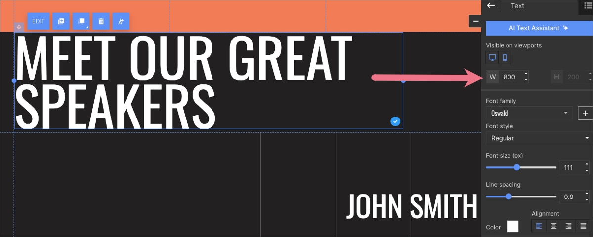
- Header: 800 x 200 px (4:1)
When designing elements for a desktop landing page, selecting the right aspect ratios and dimensions is crucial to ensuring that the content fits the screen properly and enhances the overall aesthetic and user experience.
Sign up and use Landingi to easily build right-sized landing pages!
To understand better the optimal sizes for different elements, check the explanation below:
Video: 638 x 356 px
Choosing a video size of 638 x 356 pixels is effective for integrating videos into desktop landing pages. This dimension maintains a near 16:9 aspect ratio, which is the standard for most video content, offering a balance between width and height that is pleasing to the eye and compatible with various media playback platforms. This size ensures that videos are large enough to be engaging and clear without overpowering other elements on the page or requiring excessive bandwidth to load.
Image: 605 x 386 px
For images, a dimension of 605 x 386 pixels works well, striking a balance close to the traditional 3:2 aspect ratio. This size is versatile enough to make images stand out, providing clarity and detail that can capture the visitor’s attention while still fitting neatly within the landing page’s layout. It’s particularly suited for showcasing products, team photos, or other visuals that support your landing page’s message and goals.
Header: 800 x 200 px
A standard header size of 800 x 200 pixels (aspect ratio 4:1) suggests a very wide and relatively thin element, ideal for spanning the full width of a standard desktop view. This dimension supports a clean, modern look, allowing for a bold visual statement at the top of your page that can include your logo, navigation links, or a compelling call to action. The height of 200 pixels is sufficient for readability and visual impact without taking up too much vertical space, ensuring visitors can quickly move to other content on your landing page.
These specific sizes for videos, images, and headers allow for a harmonious design that significantly improves the visual flow and user engagement on desktop landing pages. However, it’s also important to ensure these elements are optimized for responsiveness, allowing them to adapt smoothly to screens of different sizes and resolutions to maintain a high-quality user experience across devices.
What Is the Best Aspect Ratio for Mobile Landing Pages?
The best aspect ratio for mobile landing page elements is the following:
- Video: 256 x 144 px (16:9)
- Image: 256 x 256 px (1:1)
- Header: 320 x 56 px (40:7)
Designing mobile landing pages requires careful consideration of aspect ratios and dimensions to ensure content is visually appealing and functional on smaller screens. Here’s a detailed look at optimal sizes for mobile landing page elements:
Video: 256 x 144 px
A dimension of 256 x 144 pixels for videos is well-suited for mobile screens, adhering to the 16:9 aspect ratio standard for video content. This compact size ensures videos load quickly and play smoothly on mobile devices. It’s critical for maintaining user engagement in a mobile context. Despite the smaller size, this resolution can still deliver a clear and concise visual message, making it effective for short, impactful videos designed to catch the viewer’s attention without dominating the screen space or consuming excessive data.
Image: 256 x 256 px
Images sized at 256 x 256 pixels are perfect for mobile landing pages, following a 1:1 aspect ratio. This square format is particularly versatile, offering an aesthetically pleasing and efficient balance regarding space usage on mobile displays. Square images work well for product shots, icons, and other visual elements that can be quickly understood and appreciated without scrolling. This uniformity in height and width also simplifies the design process, ensuring consistency across different types of content and devices.

Header: 320 x 56 px
A header size of 320 x 56 pixels (aspect ratio 40:7) is optimized for mobile screens, providing a slim and wide appearance ideal for the top of a mobile landing page. This dimension allows for a concise display of essential information – such as the brand logo, page title, or navigation menu – without overwhelming the viewer or taking up excessive vertical space. The width of 320 pixels spans the typical width of a mobile screen in portrait mode, ensuring the header is fully visible and legible. At the same time, the modest height of 56 pixels preserves valuable screen space for other critical landing page elements, such as calls-to-action and product information.
Choosing these specific dimensions for videos, images, and headers on mobile landing pages helps create a cohesive and user-friendly environment.
What Is the Landing Page Banner Size?
The landing page banner size is another important dimension that, when well calculated, helps to create high-converting landing pages. The banner of your page is the first element every visitor sees opening your web page, and it includes an optional background image, headlines, a CTA button, and often a hero image, all organized with a strategic use of white space.
This page element should display properly on all screen sizes among various devices your target audience uses. Ideally, landing page banners should be designed responsively, meaning they adapt to the screen size and orientation of the device used to view them.
Sign up and use Landingi to easily build right-sized landing pages!
What Size Should the Landing Page Banner Have for Desktop?
The landing page banner’s standard width for desktops is 960 px, although background images can take full frame width (1440 px). All the elements that make up your banner should fit into the width of 960 px, corresponding to the size of the content area of your page.
If you decide to use a different page size with a content area width of 1200 px or smaller – 764 px, your banner should match the accepted dimensions. The height of the landing page banner can vary depending on specific design requirements.
Some pages may opt for wider banners, up to 2560 pixels wide, to accommodate larger screens.
However, a perfectly crafted landing page banner engages, informs, and encourages visitors to dive into your landing page content, often being the conversion point. Choosing the right landing page builder, like Landingi, can simplify the page creation process, ensuring the right landing page size with all the elements you want to include. A good starting point is to choose the template designed by professionals – this step ensures your banner size will perfectly fit all screen sizes.
What Size Should the Landing Page Banner Have for Mobile Devices?
The landing page banner’s standard width for mobile is 320×560 px, although background images can take full frame width (393px). Elements of your banner (headlines, hero image, CTA button) should fit the mobile content frame width of 320 px. The banner’s height can vary depending on specific design requirements, but the standard mobile screen accommodates 560 px.
While creating a mobile landing page, remember the user experience rules. A good practice is setting the CTA button size to nearly match the full width of the content area (250-300 px).
Although the size optimization may seem complex, ensuring mobile responsiveness is crucial. To simplify the process of choosing the correct dimensions, choose Landingi’s page builder, which automatically fits your page elements to mobile screens, ensuring its flawless display is aligned with UX principles.
What Are the Factors that Define Your Landing Page Dimensions?
Various factors influence the dimensions of your landing page, each playing a crucial role in how effectively your page performs and engages visitors. Understanding the following 7 factors can help you design more effective landing pages that cater to the needs of your audience and your marketing goals.
Start designing effective landing pages
with Landingi now!
1. Target audience’s device preferences
The devices your audience predominantly uses significantly impact landing page dimensions. Desktops, tablets, and smartphones all have different screen sizes and resolutions, necessitating a responsive design that adapts to each type of device for optimal viewing.
2. Content volume and type
The amount and type of content you plan to include on your landing page also determine its dimensions. More content might require a longer page, while rich media content like videos and images may need wider dimensions to be displayed effectively.
3. User experience (UX) and usability
The overall user experience, including ease of navigation and content readability, influences landing page dimensions. Adequate white space and distinguishable sections can enhance usability, guiding the visitor’s journey through the page.
4. Branding and design aesthetics
Your brand’s visual identity and the aesthetic appeal of your landing page are crucial. The dimensions should allow for the effective use of colors, fonts, and design elements that reflect your brand and capture the visitor’s attention.
5. Performance and page load time
The size of your landing page, including the dimensions of images and other media, can affect the page’s loading speed. Optimizing dimensions for quick load times is crucial, especially for mobile users who may be on slower connections.
6. SEO considerations
Although not directly related to the physical dimensions, the structure of your landing page, including headings, text, and multimedia content, can impact its visibility in search engine results. A well-structured page that loads quickly and provides a good user experience can perform better in search rankings.
7. Conversion goals
The layout and dimensions of your landing page should be designed with your conversion goals in mind. Whether you’re aiming for newsletter sign-ups, product purchases, or lead generation, the way your page is structured can influence visitors’ actions.
By carefully considering these factors, you can determine the optimal dimensions for your landing page that not only meet the technical requirements of different devices but also align with your content strategy, design preferences, and conversion objectives, ultimately creating a more engaging and effective landing page.
FAQ – Landing Page Size
After scrolling through the landing page size guide, you may have some additional questions – this section of the article answers frequently asked questions and leaves no doubts about page dimensions.
What Is the Page Size for a 16:9 Ratio?
For digital content, common sizes (width x height in pixels) that maintain the 16:9 ratio include the following:
- 1920 x 1080 (Full HD) – this is a popular choice for high-definition web content, providing clear and detailed visuals without requiring excessively large file sizes.
- 1280 x 720 (HD) – a smaller option that still offers decent quality for web content, balancing clarity with faster loading times.
- 3840 x 2160 (4K or Ultra HD) – used for ultra-high-definition content, providing stunning detail at the expense of larger file sizes and potentially slower loading times for web content.
The 16:9 ratio is widely used because it’s the standard for most screens, including desktop monitors, laptops, and TVs. It balances width and height to suit various content types, including videos and web layouts.
Is 16:9 the Same as 1920 x 1080?
The term “16:9” refers to an aspect ratio, and “1920 x 1080” denotes a specific resolution – while 16:9 is the shape of the screen or image, 1920 x 1080 defines the specific pixel dimensions of content designed for that shape.
The aspect ratio is the proportional relationship between the width and height of a display, image, or screen, not specifying exact dimensions but rather how the width compares to the height. In the case of 16:9, for every 16 units of width, there are 9 units of height, making it a widely used aspect ratio for TVs, computer monitors, and most modern screens due to its balanced and visually appealing composition for a wide range of content.
On the other hand, 1920×1080 is a resolution that fits the 16:9 aspect ratio, specifying that the display or image has 1920 pixels across (width) and 1080 pixels down (height). This particular resolution is commonly referred to as Full HD or 1080p and is one of the many resolutions that maintain the 16:9 aspect ratio. Other resolutions like 1280×720 (HD) or 3840×2160 (4K) also adhere to the 16:9 ratio but offer different levels of clarity and detail.
Is 1280 x 720 the Same as 16:9?
1280×720 is a resolution that adheres to the 16:9 aspect ratio. For the 16:9 aspect ratio, the width of the display is 16 units for every 9 units of height. In the case of 1280×720, if you divide both the width (1280) and the height (720) by 80, you get 16 units of width for every 9 units of height, perfectly matching the 16:9 aspect ratio.
This resolution is commonly referred to as HD (High Definition). It is widely used for video content, television broadcasts, and computer and smartphone screens designed to support this aspect ratio, offering a good balance between quality and file size, making it suitable for various media consumption needs.
Is 1080 x 1920 the Same as 9:16?
1080×1920 is a resolution that adheres to a 9:16 aspect ratio. This is essentially the vertical version of the 16:9 aspect ratio, often used for content designed to be viewed on smartphones or other devices in portrait orientation.
When you see resolutions or aspect ratios flipped like this, it typically indicates content formatted for vertical viewing. It has become increasingly popular with the rise of mobile internet usage and platforms that favor vertical video formats, such as social media stories and certain video-sharing apps. The 9:16 aspect ratio is well-suited for these applications, optimizing the use of screen space on devices held upright.
What Is Responsive Landing Page Design?
Responsive landing page design ensures web pages automatically adjust to look and function seamlessly across all devices, from desktops to smartphones. This approach uses fluid grids, flexible images, and CSS media queries to adapt the layout and content for optimal viewing, regardless of the device’s screen size or resolution. The aim is to improve user experience by providing consistent navigation and readability without needing multiple page versions, benefiting SEO and engagement.
What Size Is a Landing Page Header?
The size of a landing page header can vary based on the design and objectives of the page, but there are general guidelines to ensure it is effective and visually appealing across devices.
A common single–line header height ranges from 100 to 150 pixels for desktops. The width typically spans 800 px, but in specific designs, it can take the full width of the content area or even page frame, adapting to the screen size.
For mobile devices, headers are often designed to be slimmer to maximize the available screen space for content. A height of 60 to 80 pixels is common, with the width adjusting to the screen’s size, typically ranging from 320 to 360 pixels for most smartphones.
Sign up and use Landingi to easily build right-sized landing pages!
What Is the Best Image Size for a Landing Page?
The best image size for a landing page depends on several factors, including the image‘s purpose, the page‘s layout, and the target devices of your audience. However, you can follow the general guidelines below to ensure your images are optimized for speed, appearance, and engagement:
- Hero images
For full-width hero images or banners at the top of your landing page, aim for a width of 1920 pixels for high-resolution displays while ensuring the file size is optimized for quick loading. A common practice is to keep the image height between 600 to 800 pixels to make an impact without pushing content too far down the page.
- Content images
For images used within the content of your landing page, such as product photos or feature illustrations, a width of 600 to 800 pixels is often sufficient for clarity without overburdening load times. These images should be visible on the desktop and optimized for mobile responsiveness. Keep the 3:2 aspect ratio for the best results.
- Background images
If you’re using images as a background for sections or containers, ensure they’re at least 1920 pixels wide for full coverage on wide screens but also consider compressing them to reduce file size. The height can vary based on the section’s content length, but fast loading times should always be prioritized.
- Thumbnails and icons
For smaller images like thumbnails or icons, sizes can range from 100 x 100 to 300 x 300 pixels based on the design requirements. These smaller images should be optimized for quick loading while retaining enough detail to be recognizable at a glance.
- Responsive and adaptive images
Use responsive image techniques, such as setting the right attribute in HTML, to serve different-sized images based on the device’s screen size and resolution. This ensures that mobile users don’t need to download large images meant for desktops, speeding up load times and improving the user experience.
Optimize your landing pages for better engagement and higher conversion with Landingi!
Conclusion
Optimizing the dimensions of your landing page is crucial for creating a compelling and effective online presence. The right balance of width, height, and image sizes can significantly enhance the user experience, ensuring your content is accessible, engaging, and visually appealing across all devices. Following the guidelines for responsive design and image optimization can improve load times, boost engagement, and ultimately increase conversions.
Remember, the goal is to design a landing page that looks great and performs well, adapting seamlessly to the diverse range of screens and devices used by your audience. With thoughtful consideration of landing page dimensions, you can create an impactful first impression that captivates and converts. If you don’t feel firm with landing page dimensions, try Landingi – the best landing page builder – and use professionally designed templates that ensure your page will display properly on all devices.


