

People search online for healthcare services before they ever make a phone call or book an appointment. According to Google Health research, most patients use search engines to compare providers, check symptoms, read reviews, or find treatment options before making a decision. That makes a healthcare landing page one of the most important digital touchpoints for clinics, medical practices, and wellness brands in 2026.
The best healthcare landing pages build trust quickly, simplify the path to registration or contact, and help visitors find the right information without friction. Clear CTAs, mobile-first layouts, readable content, and fast-loading pages matter more than ever – especially in healthcare, where users often make decisions under stress or urgency. Platforms like Landingi now help teams generate, publish, and optimize healthcare landing pages faster with AI-powered workflows, behavioral insights, and conversion-focused infrastructure.
In this article, you’ll explore 8 healthcare landing page examples, learn what makes a medical landing page effective, and discover practical healthcare landing page best practices that improve patient experience and conversion rates.
Key Facts
- Healthcare landing pages work best when they focus on trust, clarity, and fast contact paths.
- Mobile-first design is essential because most healthcare searches now happen on smartphones.
- Behavioral analytics and A/B testing help optimize patient landing pages over time.
- AI landing page tools accelerate healthcare campaign creation and optimization in 2026.

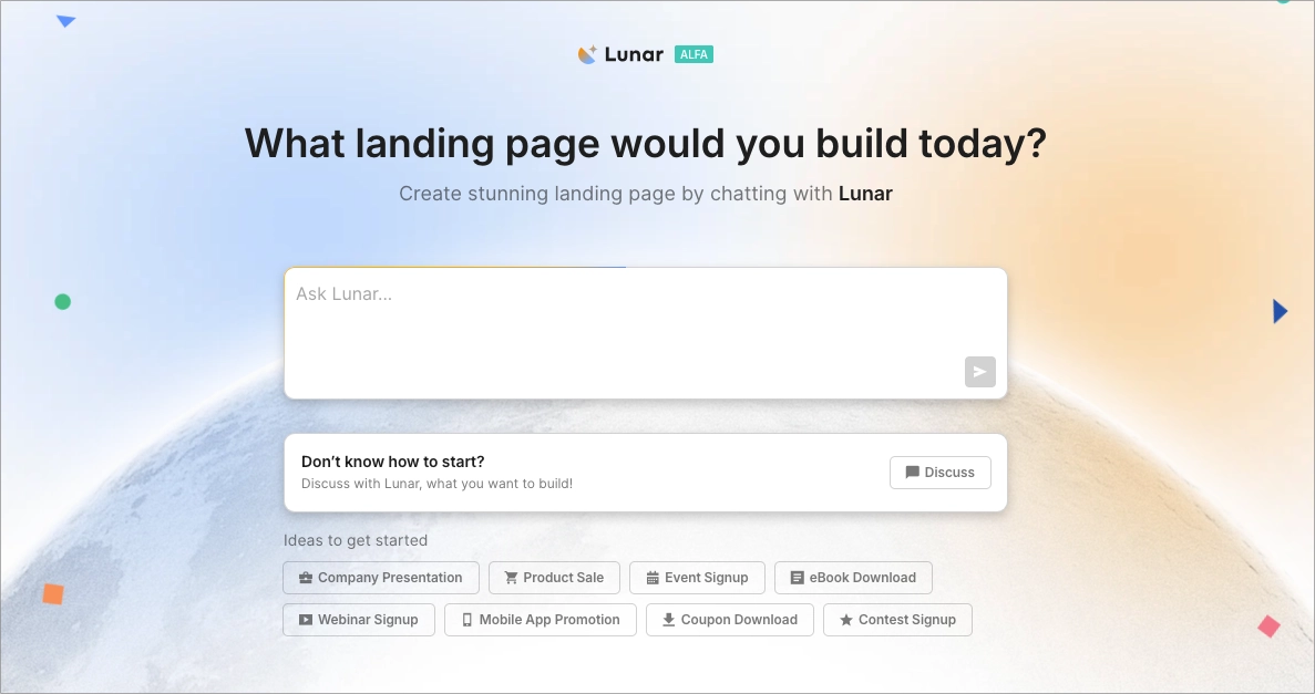
Lunar is almost here!

What is a Healthcare Landing Page?
A healthcare landing page is a focused web page built to convert medical interest into a specific action – booking an appointment, requesting a consultation, registering for a service, or contacting a provider.
In healthcare, clarity is part of trust. Visitors often arrive with a specific concern, limited patience, and a need for quick reassurance. A strong medical landing page answers the core question first, explains the service in plain language, and makes the next step easy to find.
An effective healthcare landing page usually includes a clear headline, patient-focused benefits, visible contact options, credibility signals, and one primary CTA. This structure helps clinics, medical practices, and healthcare brands reduce friction and guide visitors toward action without overwhelming them.
8 Examples of Effective Medical Landing Pages
The best healthcare landing page examples make important decisions feel simpler. They build trust quickly, explain the service clearly, and reduce the friction between interest and action – especially on mobile devices, where most patient journeys now begin.
Below, you’ll find 8 medical landing page examples that stand out for different reasons, from clean booking flows and strong CTAs to better use of trust signals, layout structure, and patient-focused messaging. Some get the conversion path right immediately. Others show how even strong healthcare landing pages can still lose users through unnecessary steps or unclear UX.
1. Fedorov Restore Vision Clinic
Fedorov Restore Vision Clinic uses a straightforward healthcare landing page structure focused on clarity and treatment communication. The page keeps the user’s attention on the clinic’s specialization instead of overwhelming visitors with excessive visual elements.

What works well?
Fedorov Restore Vision Clinic immediately communicates what the clinic specializes in and what kind of results patients can expect. The messaging is direct, medically grounded, and easy to understand – which matters in healthcare, where visitors usually look for reassurance before anything else.
The page also avoids excessive visual clutter. The layout stays focused on the treatment itself, helping users quickly understand the clinic’s offer without forcing them to dig through unnecessary sections or navigation paths.
What could be improved?
The hero section asks visitors to make too many decisions at once. Multiple CTAs competing for attention can weaken the conversion path, especially on a healthcare landing page where users often expect one clear next step – book, contact, or register.The form experience could also be simplified. Long forms increase hesitation, particularly on mobile devices. A shorter patient intake flow or multi-step form would likely reduce friction and improve conversions. This is exactly where behavioral analytics tools become useful. Tracking form abandonment, scroll depth, and click behavior with solutions like EventTracker helps identify where potential patients drop off before completing the process.
See where visitors hesitate, abandon forms, or stop scrolling before booking an appointment.
2. Double Check
Double Check shows how much first impressions matter in healthcare marketing. The page feels modern, calm, and approachable – qualities that work especially well for medical landing pages where visitors often make emotionally driven decisions within seconds.

What works well?
The layout is clean and visually consistent, helping users focus on the offer instead of navigating distractions. Relevant imagery and generous spacing make the healthcare landing page feel trustworthy and easy to process.
The click-to-call functionality also shortens the path to contact. This matters more than ever in 2026, when healthcare users expect immediate action options directly from mobile devices – whether that means calling, booking, messaging, or joining a quick online consultation.
What could be improved?
The CTA lacks direction. Visitors can see the action button, but the next step is not specific enough. On a patient landing page, uncertainty usually lowers conversions. Users should instantly know whether they’re booking an appointment, viewing pricing, checking availability, or starting a consultation.
The copy could also be easier to scan. Large text blocks slow users down, especially on mobile. Shorter sections, stronger hierarchy, and visual benefit highlights would improve readability significantly. Today, many healthcare teams use AI landing page tools to test multiple content structures, CTA variations, and section layouts faster instead of manually rebuilding pages every time engagement drops.
3. Visar Vienna 2019
Visar Vienna 2019 is a good example of how visual consistency can strengthen a healthcare event landing page. The design feels organized and professional from the first screen, which is especially important for medical conferences, webinars, and healthcare networking events competing for attention online.

What works well?
The hero image immediately catches attention without overwhelming the page. Combined with simple icons and a clean layout structure, it creates a more premium and trustworthy impression – something healthcare audiences typically expect from professional medical events.
The visual hierarchy also works well. Visitors can quickly identify the event’s core highlights without reading large amounts of copy, which improves scanability and reduces cognitive load.
What could be improved?
The page takes too long to explain what the event actually is. The header lacks specificity, and the medical context could be communicated faster with a clearer event title and stronger supporting copy. On healthcare landing pages, users should understand the offer within seconds – especially on mobile.
The registration flow also creates unnecessary friction. Clicking “Register now” should move visitors directly into the signup process, not force them through multiple extra steps. In 2026, healthcare event pages increasingly rely on shorter conversion flows, progressive forms, and behavior-based optimization to reduce drop-offs during registration. Even small UX delays between interest and action can significantly lower conversion rates.
4. Harley Medical Group
Harley Medical Group understands something many healthcare landing pages still miss – aesthetic medicine is highly visual. The page immediately focuses on appearance, transformation, and emotional impact, which aligns well with how users evaluate cosmetic procedures online.

What works well?
The large hero image and subtle motion effects help the page feel more dynamic without becoming distracting. Combined with a direct headline, the healthcare landing page quickly communicates what procedure is being promoted and who it is for.
The CTA flow also works well. Instead of stopping at a generic contact page, users are guided toward more detailed information and consultation booking options. That creates a smoother transition between curiosity and action – especially for visitors still comparing providers or researching procedures.
What could be improved?
The page relies too heavily on long-form copy early in the experience. For users at the beginning of the decision process, large text blocks can feel overwhelming. Breaking key benefits into shorter sections, bullets, or visual highlights would make the information easier to scan and absorb.
This is particularly important in aesthetic healthcare marketing, where visitors often browse multiple providers quickly before taking action. Faster content testing, clearer section hierarchy, and shorter mobile-first layouts usually perform better than dense explanatory copy spread across long screens.
5. Diabdis
Diabdis is a strong example of a healthcare landing page built around a specific patient problem instead of generic medical messaging. The page quickly communicates what the service helps with and who it is designed for, which shortens the distance between search intent and action.

What works well?
The headline immediately addresses the visitor’s core motivation: gaining better control over diabetes. That clarity works well because healthcare users rarely want to “discover” what a service does – they want confirmation they’re in the right place.
The icon-based layout also improves scanability. Visitors can understand the main service benefits without reading large sections of copy, which makes the medical landing page feel lighter and easier to navigate.
What could be improved?
The “+” icon is too subtle to function as a strong CTA. On healthcare landing pages, users respond better to explicit actions such as “Book Consultation”, “Talk to a Specialist”, or “Start Monitoring”. A more visible CTA would create a clearer conversion path and likely improve engagement.
The page could also benefit from faster testing of CTA formats and hero section variations. In healthcare marketing, even small changes in wording or layout can influence how quickly users decide to act – especially on mobile devices.
Use Lunar to turn campaign prompts into structured, launch-ready healthcare landing pages without building every section manually.
6. Projekt Zdrowie
Projekt Zdrowie keeps the communication simple, approachable, and easy to understand – which fits the nutrition and wellness space particularly well. The page avoids overly clinical language and focuses instead on habits, lifestyle, and everyday health improvement.

What works well?
The headline is short, memorable, and aligned with the brand’s offer. “We shape good habits” immediately communicates the service direction without sounding overly promotional.
The CTA flow is also well executed. Visitors can move directly from interest to appointment details without unnecessary navigation. That matters because healthcare users often make decisions quickly once they feel trust and clarity are established.
What could be improved?
The page includes too many competing visual elements at the same time. Important information gets diluted by graphics, colors, and section density, which weakens the hierarchy of the healthcare landing page.
The feature presentation could also benefit from structured A/B testing. Testing different section orders, CTA placements, and simplified layouts would make it easier to identify which content actually supports conversions instead of simply filling space. In healthcare marketing, cleaner layouts usually outperform visually overloaded pages because users process information faster and with less friction.
7. Optimax
Optimax uses visual storytelling well. The page immediately connects the treatment outcome with the user experience, making the value proposition feel tangible before visitors even start reading the copy.

What works well?
The sharp imagery and vivid colors reinforce the promise of improved vision in a very direct way. Instead of relying only on medical explanations, the healthcare landing page communicates the result emotionally and visually – which works particularly well in eye care and aesthetic-focused medical services.
The benefits section is also structured effectively. Icons, short statements, and numerical proof points help hesitant users compare options and evaluate credibility quickly. This kind of scannable structure performs especially well on mobile, where most patient research now happens.
What could be improved?
The testimonial section feels incomplete. Ratings from Google or Trustpilot build credibility, but healthcare decisions usually require a stronger emotional layer. Real patient stories, short reviews, or treatment experiences would make the trust signals more persuasive and believable.
The page could also surface social proof earlier in the conversion path. In healthcare marketing, users often look for reassurance before they engage with forms or booking CTAs. Placing testimonials closer to the hero section or consultation offer would likely strengthen conversion performance.
Let Solis uncover where visitors hesitate, abandon forms, or lose trust before booking a consultation.
8. Dr Goziem
Dr Goziem takes a minimal approach to healthcare landing page design. The layout feels calm, spacious, and distraction-free, which supports focus and creates a more premium experience from the first screen.

What works well?
The page uses simplicity effectively. Limited visual noise, soft spacing, and a clearly exposed CTA help visitors stay focused on the next step instead of navigating through excessive content.
The overall atmosphere also fits modern aesthetic medicine trends, where many brands move away from strictly clinical visuals toward more lifestyle-oriented presentation. That softer visual direction can help certain healthcare services feel more approachable.
What could be improved?
The page needs a stronger value proposition. While the design looks polished, visitors still need a clear reason to choose this provider over competing clinics. The headline should communicate a more specific benefit, specialization, or patient outcome instead of relying mostly on aesthetics.
Brand visibility could also be improved. The clinic name appears too low in the layout, weakening immediate recognition and pushing important information below the fold on some devices.
The visual identity itself may benefit from stronger healthcare cues as well. Beige and neutral tones work well in wellness branding, but healthcare landing pages usually perform better when calm aesthetics are balanced with stronger trust and medical credibility signals.
Modern healthcare marketing moves fast. Clinics and medical brands often need separate landing pages for treatments, webinars, local campaigns, or seasonal services – and building every page manually slows the entire process down.
That’s why AI landing page tools like Lunar are becoming part of modern healthcare workflows. Teams can generate structured healthcare landing pages from prompts, refine them for specific patient groups, and optimize performance continuously after launch.
How Do You Create a Healthcare Landing Page?
Creating a healthcare landing page today is less about assembling sections manually and more about building a fast, trustworthy patient journey. Clinics, healthcare brands, and medical providers now launch dedicated pages for treatments, consultations, webinars, screenings, and local campaigns much faster using AI landing page tools that generate layouts, copy, and conversion flows from prompts.
With Lunar, the process usually starts with a short campaign description. Instead of designing every block manually, teams describe the service, audience, and conversion goal they want to achieve.
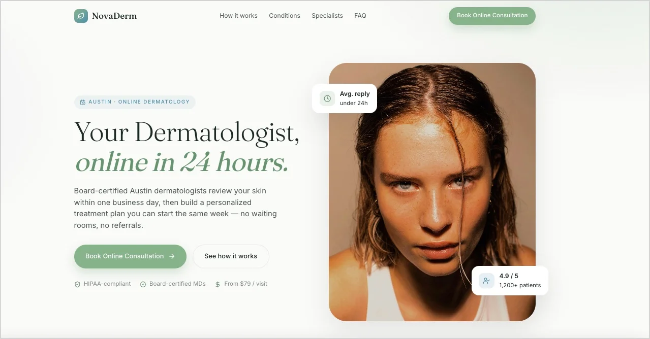
Here’s an example of a healthcare landing page prompt:
Create a high-converting healthcare landing page for NovaDerm Clinic, a private dermatology and aesthetic medicine clinic located in Austin, Texas.
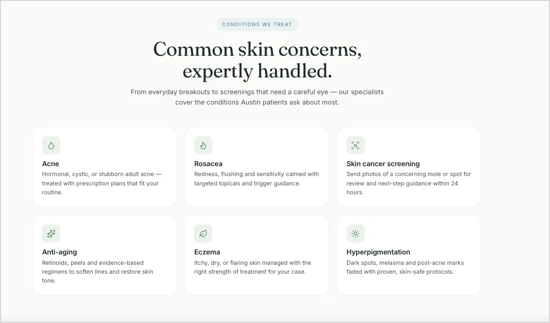
The clinic specializes in online dermatology consultations, acne treatment plans, skin cancer screenings, rosacea care, and personalized anti-aging therapies for adults aged 25–45.
The main goal of the page is to increase online consultation bookings from mobile users.
Use a calm, modern, and trustworthy tone. The design should feel premium but approachable – clean whitespace, soft lighting, rounded sections, and a minimal medical aesthetic. Use a color palette based on white, soft beige, muted sage green, and subtle blue accents associated with trust and healthcare.
The page should feel easy to navigate for stressed or time-limited users looking for quick medical guidance.
Include:
a hero section with a strong CTA (“Book Online Consultation”),
a short explanation of how the online consultation works,
dermatologist credentials and trust signals,
before-and-after treatment visuals,
patient testimonials with photos,
a section explaining common skin conditions treated by the clinic,
FAQ addressing privacy, wait times, pricing, and insurance,
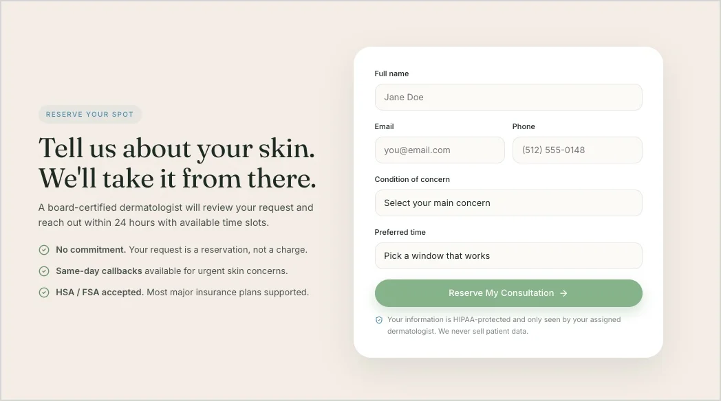
a short mobile-friendly booking form,
sticky mobile CTA buttons,
and a final reassurance section focused on comfort, safety, and fast access to specialists.
Highlight these benefits:
consultations available within 24 hours,
personalized treatment plans,
secure online appointments,
certified dermatology specialists,
and transparent pricing.
Address common patient concerns:
“Can I trust an online consultation?”
“How quickly will I get help?”
“Is my medical data secure?”
“What if I need an in-person visit later?”
Make the healthcare landing page mobile-first, highly scannable, conversion-focused, and optimized for fast decision-making. Prioritize trust, clarity, and a frictionless booking experience.From there, Lunar can generate a structured healthcare landing page with patient-focused copy, CTAs, trust-building sections, contact forms, and a mobile-ready layout.
The next step is refinement. High-performing medical landing pages reduce friction instead of overwhelming visitors with too much information. That usually means simplifying forms, improving scanability, clarifying benefits, and making the CTA visible immediately.After launch, optimization becomes just as important as creation. Scroll tracking, heatmaps, click analysis, and A/B testing help healthcare teams understand where visitors hesitate or abandon the process. This allows patient landing pages to improve continuously based on real behavior instead of assumptions.
Build structured, conversion-focused healthcare pages directly from prompts with Lunar.
What Is the Best Healthcare Landing Page Builder?
One of the best healthcare landing page builders in 2026 is Landingi combined with Lunar – a 100% AI-native landing page generator built for fast campaign execution and optimization.
Healthcare teams often need to launch dedicated landing pages for consultations, treatments, clinics, webinars, or local campaigns quickly. Lunar can generate structured, conversion-focused healthcare landing pages from prompts, including layouts, patient-focused copy, CTAs, and trust-building sections.
What makes this especially useful in healthcare is the ability to optimize pages continuously after launch. Inside Landingi, teams can track patient behavior with EventTracker and improve conversion paths with Solis, an AI landing page optimization tool that analyzes engagement patterns and identifies friction points automatically.
How can I Optimize my Healthcare Landing Page for Higher Conversion Rates?
You can optimize a healthcare landing page for higher conversion rates by simplifying the patient journey, strengthening trust signals, improving mobile usability, and analyzing real user behavior instead of relying on assumptions alone.
Sometimes the issue is obvious – a weak CTA or a form that’s too long. More often, the friction is subtle: mobile users stop scrolling halfway through the page, visitors ignore key trust signals, or appointment forms create hesitation at the final step.
The highest-converting healthcare landing pages usually focus on a few areas:
- Clear patient flow – Visitors should instantly understand the service, its value, and the next step.
- Shorter paths to action – Booking a consultation should feel quick, simple, and mobile-friendly.
- Visible trust signals – Testimonials, doctor credentials, ratings, certifications, and patient outcomes help reduce hesitation.
- Scanable structure – Concise sections, clean hierarchy, and readable layouts improve engagement significantly.
- Continuous optimization – The best patient landing pages evolve based on real behavioral data.
Healthcare teams now increasingly use AI landing page optimization tools like Solis to analyze scroll depth, clicks, form interactions, and conversion behavior automatically.
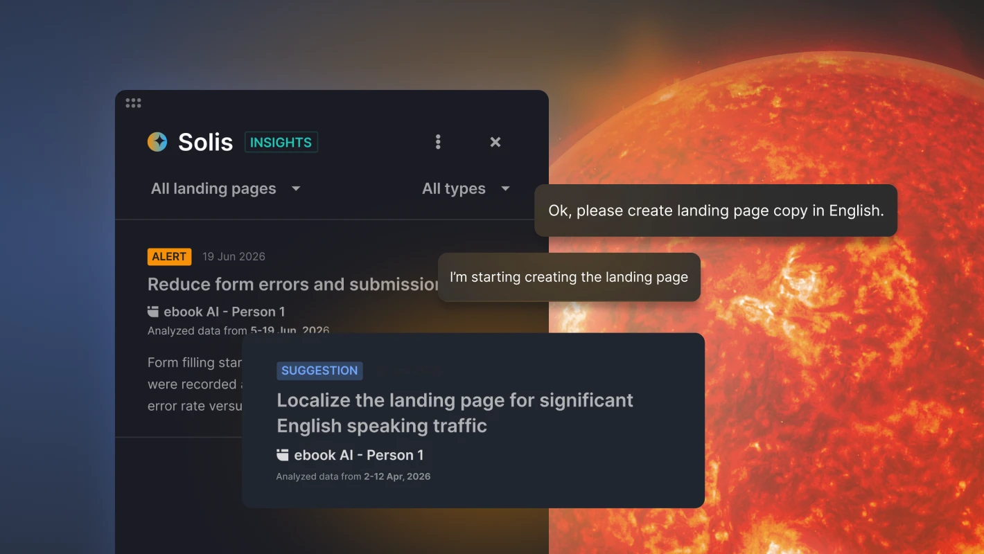
Instead of manually searching for UX issues, teams receive alerts and optimization suggestions tied directly to actual patient activity on the page.
What are the Key Elements of an Effective Healthcare Landing Page?
The key elements of an effective healthcare landing page are clarity, trust, and a frictionless path to action. Visitors should immediately understand the service, feel confident about the provider, and know how to book, contact, or register without confusion.
High-performing medical landing pages typically include:
- a clear, patient-focused headline,
- a visible CTA,
- concise and scanable content,
- trust signals such as testimonials or credentials,
- mobile-friendly forms,
- and easy-to-find contact information.
Strong healthcare landing pages also reduce unnecessary decisions. Instead of overwhelming users with too many options, they guide visitors toward one clear next step.
What is the Average Healthcare Landing Page Conversion Rate?
The average healthcare landing page conversion rate is around 3.6%, according to recent Digital Applied benchmark data. Top-performing healthcare landing pages reach conversion rates of 7.2% or higher, showing how much impact strong UX, clear CTAs, mobile optimization, and trust-focused design can have on patient acquisition.
In healthcare, even small improvements matter. Reducing form friction, simplifying booking flows, or improving mobile usability can noticeably increase appointment requests and patient inquiries over time.
Boost your brand with a professionally designed landing page tailored to your needs.
What are the Healthcare Landing Page Best Practices?
The best practices for healthcare landing pages include optimizing design for mobiles, crafting targeted content (plus avoiding excessive information) and clear CTA, enabling audience focus on the key action, and perfecting contact information. Furthermore, using an adequate page template and optimizing the published landing page would be particularly beneficial. Let’s look for more details.
1. Optimize for mobile devices
Responsive design is no longer optional for a healthcare landing page. Most patients now search for clinics, treatments, and consultations on mobile devices, often while trying to act quickly or compare providers in real time.
A medical landing page should load fast, remain readable on smaller screens, and keep key actions visible without excessive scrolling. Mobile users should be able to book, call, or contact the clinic within seconds.
2. Remove unnecessary content
Healthcare users usually look for answers, not exploration. Strong healthcare landing pages remove distractions and focus on the information patients actually need to make a decision.
Keep the messaging concise, highlight the core benefits clearly, and avoid overcrowding the page with excessive sections or long medical explanations. Simpler structures usually lead to faster decisions and better conversion rates.
3. Use clear CTAs
A healthcare landing page should guide visitors toward one obvious next step. Whether the goal is booking an appointment, registering for a webinar, or requesting a consultation, the CTA must be visible, specific, and easy to understand.
Buttons like “Book Consultation” or “Check Availability” generally perform better than vague CTA copy because they reduce uncertainty and clarify the outcome immediately.

4. Simplify the patient journey
High-converting patient landing pages reduce the number of decisions users need to make. Visitors should move naturally from the problem to the solution without confusion or unnecessary steps.
That also applies to forms. Long intake forms often increase abandonment rates, especially on mobile devices. Shorter flows and step-by-step booking experiences usually perform better in healthcare marketing.
5. Highlight contact information
Healthcare services still happen in the real world, so patients expect clear contact details and location information. Phone numbers, addresses, maps, consultation hours, and booking options should be accessible immediately.
Many healthcare landing pages now also integrate calendars, instant booking sections, or click-to-call functionality to shorten the path between interest and action.
6. Generate pages faster with AI
Healthcare marketing teams often need separate landing pages for treatments, clinics, specialists, webinars, and local campaigns. Building every page manually slows down campaign execution significantly. AI landing page generators like Lunar help teams create structured healthcare landing pages from prompts, including layouts, patient-focused copy, trust sections, and conversion flows. This makes launching and iterating healthcare campaigns much faster.
7. Optimize continuously with behavioral data
The best healthcare landing pages are never truly finished. They evolve based on how real users interact with the page.
Behavioral analytics tools like EventTracker and AI optimization systems like Solis help healthcare teams identify friction points, abandoned forms, weak CTAs, or low-engagement sections automatically. Instead of guessing what hurts conversions, teams can optimize pages using actual patient behavior data.
Use Solis to uncover hidden UX issues and optimize patient journeys with AI-powered behavioral insights.
Build Healthcare Landing Pages With Landingi
The best healthcare landing pages make decisions easier. They help patients find the right information quickly, build trust without overwhelming users, and shorten the path between interest and action.
That matters whether you run a private clinic, promote medical services, organize healthcare events, or launch wellness campaigns. In healthcare marketing, clarity and speed often influence conversions more than aggressive sales tactics ever will.
Landingi helps healthcare teams manage that entire workflow inside one AI landing page operation system. With Lunar, teams can generate structured healthcare landing pages from prompts, while EventTracker and Solis help monitor patient behavior, uncover friction points, and optimize conversion paths continuously after launch.
Modern healthcare marketing moves fast – and with AI-powered workflows for generating, publishing, tracking, and optimizing landing pages, healthcare teams can launch and improve patient experiences far more efficiently than with traditional page-building processes. Try now!


