

A dentist landing page is designed to turn visitors into patients by guiding them toward a specific action, whether that’s booking an appointment, requesting a consultation, or learning about a particular treatment. According to Unbounce, health-related landing pages achieve an average conversion rate of 7.4%, showing how important trust, clarity, and a frictionless booking experience are in healthcare marketing.
The best dental landing pages do more than showcase services. They answer patient concerns, build credibility, and make taking the next step feel easy. That’s why many clinics create dedicated pages for treatments such as Invisalign, dental implants, cosmetic dentistry, or emergency care rather than sending visitors to a generic homepage. With AI-powered platforms like Landingi, practices can quickly create and optimize service-specific landing pages tailored to different patient groups, locations, and advertising campaigns.
In the examples below, you’ll see how successful dental practices use design, messaging, trust signals, and conversion-focused layouts to turn interest into appointments.

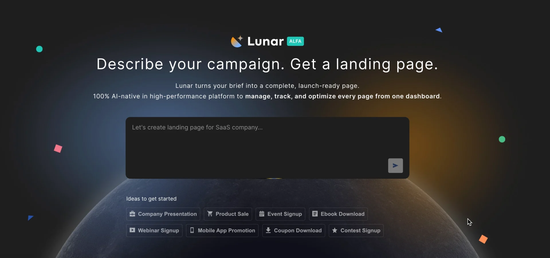
Lunar is almost here!

20 Examples of Dentist Landing Pages
The dentist landing page examples below reveal how successful clinics present their services, reassure potential patients, and turn interest into appointments. Whether you’re building a dental clinic landing page for implants, Invisalign, cosmetic dentistry, or emergency care, you’ll find plenty of ideas worth borrowing.
1. Always Smile DC – general dental care landing page
Always Smile DC uses a clean, patient-friendly layout that makes booking an appointment feel straightforward. Key information, including services, contact details, office hours, and patient reviews, is easy to find, helping visitors quickly decide whether the practice is right for them.

Trust plays a major role throughout the page. Dentist credentials, testimonials, and professional affiliations help reassure prospective patients, while a visible appointment booking form reduces friction and encourages action.
What works:
- Prominent appointment booking CTA
- Strong trust signals and patient reviews
- Clear contact information and office hours
- Easy-to-scan service descriptions
- Professional, welcoming visuals
What could improve:
- A sticky mobile CTA could make appointment booking even easier for visitors browsing on smartphones.
Book more appointments – create an effective dentist landing page with Landingi!
2. DC Dental Spa – emergency dental care landing page
DC Dental Spa’s emergency dentistry landing page is built around urgency and reassurance. From the first screen, visitors understand that same-day dental care is available, making the page especially effective for patients seeking immediate treatment.

The messaging stays focused on emergency services, while prominent CTA buttons, clear contact information, and flexible payment options help reduce hesitation. The page also does a good job of matching patient intent – people in pain don’t want to browse, they want help quickly.
What works:
- Clear emergency-focused value proposition
- Prominent “Call Now” and appointment CTAs
- Same-day care messaging
- Flexible payment information
- Strong alignment with patient intent
What could improve:
- Some content sections are text-heavy and could be broken into shorter, more scannable blocks to improve readability.
3. Smile California – pediatric dental care landing page
Smile California takes a different approach than most dental landing pages. Rather than focusing on a single clinic, it serves as an educational resource that helps parents understand children’s oral health and find pediatric dentists who accept Medi-Cal.

The page balances practical information with clear conversion paths. Educational content, video resources, and child-friendly visuals help build trust, while a prominent dentist search tool makes it easy for visitors to take the next step.
What works:
- Strong audience targeting for parents and caregivers
- Educational content that builds trust
- Clear dentist search CTA
- Video content that increases engagement
- Child-friendly colors and visual design
What could improve:
- The page contains a large amount of information, which can feel overwhelming at first glance. A more streamlined layout could make key actions easier to find.
Generate dedicated landing pages for cosmetic dentistry, implants, Invisalign, and other dental services from a single prompt.
4. North Texas Dental – cosmetic dentistry landing page
North Texas Dental uses a straightforward, conversion-focused approach to promote cosmetic dentistry services. Visitors can quickly learn about available treatments, meet the dental team, and take action through clearly visible contact and appointment options.

The page benefits from a clean structure and strong CTA placement. Service descriptions provide enough detail to educate prospective patients while linking to dedicated treatment pages for those who want to explore further.
What works:
- Prominent appointment request CTA
- Clearly visible “Call Now” button
- Well-structured service information
- Easy access to treatment-specific pages
- Professional imagery that supports credibility
What could improve:
- The page relies heavily on text. Adding before-and-after results or patient success stories could strengthen its persuasive impact.
5. Fusion Dental – oral surgery landing page
Fusion Dental’s oral surgery landing page focuses on what patients need most before making a treatment decision: clear information, easy navigation, and reassurance. The page explains procedures in detail while keeping appointment booking and contact options visible throughout the experience.

Rather than relying on heavy visuals, the page prioritizes educational content and practical information. Patient testimonials help build confidence, while clear navigation allows visitors to explore related topics such as payment options, locations, and provider information.
What works:
- Detailed treatment information
- Visible appointment booking options
- Patient testimonials that build trust
- Clear, distraction-free layout
- Easy access to location and contact details
What could improve:
- Adding treatment outcome visuals or patient success stories could make the page more engaging and help visitors better understand the benefits of oral surgery.
6. Endodontics Northwest – endodontic care landing page
Endodontics Northwest demonstrates how a specialist dental landing page can educate patients without overwhelming them. The page explains endodontic procedures in a clear, approachable way while making it easy for visitors to contact the clinic or request an appointment.

Trust-building elements are integrated naturally throughout the experience. The “Meet the Doctors” section helps humanize the practice, while intuitive navigation and location details make the next step feel straightforward. Small touches, such as the appointment CTA paired with a calendar icon, also help reinforce the page’s purpose.
What works:
- Clear explanations of specialized treatments
- Mobile-friendly navigation
- Strong doctor profiles and trust signals
- Visible appointment booking CTA
- Easy access to location information
What could improve:
- Adding patient testimonials or treatment success stories could provide additional reassurance for visitors considering specialized procedures.
Convert visitors into loyal patients – design your landing page with Landingi!
7. Dental Minds – dental exam and cleaning landing page
Dental Minds combines a strong introductory offer with a clear explanation of what’s included in a dental exam and cleaning visit. The page is designed to attract new patients by reducing uncertainty and making preventive dental care feel accessible and affordable.

The $149 new-patient offer immediately communicates value, while the layout keeps key information easy to find. Appointment CTAs, insurance information, and contact options are visible throughout the page, helping visitors move from interest to action with minimal friction.
What works:
- Attractive new-patient offer
- Clear explanation of included services
- Strong appointment booking CTA
- Accepted insurance badges
- Clean, easy-to-navigate layout
What could improve:
- Adding patient testimonials or review ratings could strengthen trust and help first-time visitors feel more confident about booking.
See how prospective patients interact with your landing pages using EventTracker’s Event Maps and Scroll Maps, then uncover optimization opportunities with Solis.
8. SF Dentistry – bruxism treatment landing page
SF Dentistry’s bruxism treatment landing page focuses on a specific patient problem and presents a clear solution. The page explains how Botox can help reduce teeth grinding and jaw clenching, making it easy for visitors to understand both the treatment and its potential benefits.

The design strikes a good balance between education and conversion. Short content sections, professional visuals, patient reviews, and video content help build confidence, while prominent consultation CTAs ensure visitors always know what to do next.
What works:
- Treatment-specific messaging
- Clear consultation CTAs
- Patient reviews and social proof
- Video content that supports engagement
- Professional imagery and clinic photography
- Well-balanced use of whitespace
What could improve:
- Including before-and-after results or additional patient success stories could further strengthen credibility for visitors unfamiliar with Botox-based bruxism treatment.
9. Pearl Dentistry – teeth whitening landing page
Pearl Dentistry understands that cosmetic dental treatments sell through results. The landing page puts before-and-after transformations front and center, helping visitors visualize the outcome and build confidence in the treatment before they even contact the clinic.

The page combines strong visuals with practical information about the whitening process, while patient testimonials add another layer of credibility. Clear contact options and prominent CTAs make it easy for motivated visitors to schedule a consultation.
What works:
- Before-and-after treatment results
- Strong visual storytelling
- Patient testimonials and social proof
- Clear explanation of the whitening process
- Visible contact and booking options
- Mobile-friendly navigation
What could improve:
- Adding information about treatment duration, expected results, and candidate suitability could help answer common patient questions earlier in the decision process.
10. DRAKE Dental Lab – dental solutions landing page
DRAKE Dental Lab takes a B2B approach, targeting dental professionals rather than patients. The landing page focuses on communicating expertise, showcasing available solutions, and helping visitors quickly find the services most relevant to their practice.

The page uses strong visual hierarchy and concise, benefit-driven messaging to make complex offerings easier to understand. Service categories are clearly organized, while strategically placed CTAs encourage visitors to request information, contact the team, or begin the onboarding process.
What works:
- Clear value proposition above the fold
- Well-organized service categories
- Strong visual hierarchy
- Professional branding and custom visuals
- Multiple conversion paths for different user needs
- Mobile-friendly experience
What could improve:
- Adding client testimonials, case studies, or measurable outcomes could further strengthen credibility and help differentiate the lab from competitors.
11. Invisalign – orthodontic products landing page
Invisalign’s orthodontic products page demonstrates how a healthcare brand can combine trust, ecommerce functionality, and a premium user experience. The page promotes oral care products and accessories designed to support Invisalign treatment while making the purchasing process simple and intuitive.

The design follows a clean, minimalist approach that keeps the focus on products. High-quality visuals, clear pricing, and straightforward navigation help visitors quickly find what they need, while a smooth checkout experience supports conversions across desktop and mobile devices.
What works:
- Premium, brand-consistent design
- Strong product imagery
- Mobile-first shopping experience
- Clear product information and pricing
- Intuitive navigation and product categories
- Frictionless checkout process
What could improve:
- Adding customer reviews or user-generated content could strengthen social proof and help first-time buyers feel more confident about their purchase.
Generate dedicated landing pages for teeth whitening, implants, Invisalign, and other dental services with Lunar, Landingi’s AI-native landing page generator.
12. Tessin Dental – dental clinic landing page
Tessin Dental shows how local dental practices can combine strong branding with a patient-friendly experience. The page immediately establishes trust by highlighting its location, core services, and easy booking options, helping visitors quickly understand what the clinic offers and how to get started.
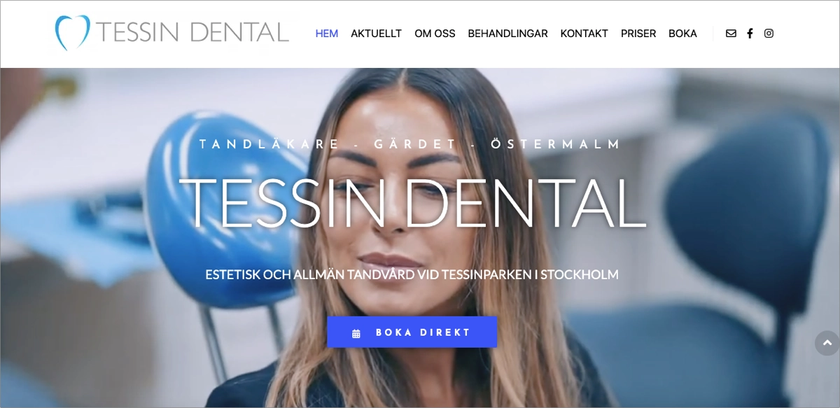
The design feels modern and welcoming, using high-quality photography, concise service descriptions, and prominent booking CTAs. Local references and patient-focused messaging reinforce credibility, while multilingual accessibility makes the page more inclusive for a broader audience.
What works:
- Strong local positioning
- Clear service presentation
- Visible appointment booking CTAs
- Professional photography and branding
- Patient-focused messaging
- Multilingual accessibility
What could improve:
- Adding more detailed patient success stories or treatment outcomes could further strengthen trust and help differentiate the clinic from local competitors.
13. Dr. Rhona – cosmetic dentistry landing page
Dr. Rhona Eskander’s landing page demonstrates the power of personal branding in healthcare marketing. Rather than focusing solely on treatments, the page builds a premium experience around expertise, reputation, and transformation, positioning Dr. Rhona as both a trusted dentist and a recognized industry voice.

The combination of a video hero section, media mentions, awards, patient results, and strong visual storytelling creates immediate credibility. Service information remains easy to navigate, while aspirational messaging appeals to patients seeking cosmetic treatments such as veneers, bonding, and smile makeovers.
What works:
- Distinctive personal brand positioning
- Engaging video hero section
- Strong social proof and media coverage
- Patient success stories and visual results
- Premium visual design
- Clear consultation CTAs
What could improve:
- Some visitors may be drawn to the personal brand before understanding the full range of services. Highlighting treatment categories earlier could help improve navigation for high-intent patients.
Create dedicated landing pages for Invisalign consultations, orthodontic treatments, and dental product campaigns with AI-powered workflows built for faster launch and optimization.
14. Dentologie – emergency dental care landing page
Dentologie shows how thoughtful design can reduce anxiety during urgent situations. The page combines empathetic messaging with a clean, approachable visual style, helping patients feel supported from the moment they arrive.

One of its strongest features is the step-by-step explanation of the patient journey, which clearly outlines what happens before, during, and after treatment. Combined with visible booking options, insurance information, and a comprehensive FAQ section, the page removes uncertainty and makes taking action feel easier.
What works:
- Empathetic, patient-focused messaging
- Step-by-step treatment process
- Strong visual hierarchy
- Clear and frequent booking CTAs
- Insurance and payment information
- Comprehensive FAQ section
- Mobile-friendly design
What could improve:
- Including estimated wait times or treatment availability could further help emergency patients make quick decisions when comparing providers.
15. NORIS Medical – implant dentistry webinar landing page
NORIS Medical proves that not every dental landing page needs to focus on patient acquisition. This page is designed to attract dental professionals, promoting an educational webinar on implant dentistry through a clear value proposition and a frictionless registration process.

The page places key information exactly where visitors expect to find it. Event details, speaker credentials, and registration options are visible immediately, while concise content explains what attendees will learn and why the webinar is worth their time. The result is a focused experience that keeps attention on a single conversion goal.
What works:
- Event details visible above the fold
- Strong speaker credibility
- Clear registration CTAs throughout the page
- Concise, benefit-oriented content
- Mobile-friendly layout
- Consistent visual branding
What could improve:
- Adding attendee testimonials or highlights from previous webinars could further increase registration rates and strengthen social proof.
From webinars and workshops to patient education events, Lunar helps create dedicated landing pages tailored to specific audiences, goals, and registration flows.
16. Bulletproof Summit – dental event landing page
The Bulletproof Summit landing page shows how event marketing can create excitement long before registration closes. Rather than simply listing speakers and agenda items, the page sells a vision of professional growth, positioning the event as a must-attend experience for ambitious dental professionals.

A video hero section, countdown timer, speaker profiles, and persuasive messaging work together to build anticipation. The page also does an excellent job of balancing emotion and information, giving visitors enough practical details to register while maintaining momentum throughout the experience.
What works:
- Engaging video hero section
- Strong event-focused messaging
- Countdown timer that creates urgency
- Visible registration CTAs
- Detailed speaker profiles
- Consistent visual identity
- Testimonials and social proof
What could improve:
- A simplified agenda overview near the top of the page could help visitors quickly assess the event’s value before exploring the full program.
17. DEO – on-demand webinar landing page
The DEO webinar landing page is a strong example of lead generation done right. Designed for dental practice owners and entrepreneurs, it focuses on a single goal: turning visitors into webinar registrants through a clear value proposition and a streamlined signup process.

The page removes distractions and keeps attention on the offer. Benefit-focused messaging explains exactly what attendees will gain, while testimonials and authority signals help reinforce credibility. Combined with a concise registration form, the result is a focused experience that makes signing up feel like an easy decision.
What works:
- Clear value proposition
- Benefit-driven messaging
- Conversion-focused registration form
- Strong trust signals and testimonials
- Minimal distractions
- Fast, mobile-friendly experience
What could improve:
- Adding a short speaker video or webinar preview could increase engagement and help visitors better understand what to expect before registering.
18. Smile Clinic – dental practice landing page
Smile Clinic demonstrates how premium branding can help a dental practice stand out in a competitive market. The page immediately creates a sense of exclusivity through its elegant visual identity, combining sophisticated design with messaging focused on both general and cosmetic dentistry.

The experience feels carefully curated from start to finish. Service sections, practitioner information, and patient-focused content are presented through a highly visual, scroll-friendly layout that keeps visitors engaged while guiding them toward booking a consultation.
What works:
- Distinctive luxury branding
- Premium visual design
- Service-focused page structure
- Engaging scroll experience
- Team profiles and trust signals
- Multilingual accessibility
- Strong consultation CTAs
What could improve:
- The emphasis on aesthetics may overshadow practical information for some visitors. Bringing pricing guidance, treatment timelines, or FAQs closer to the top could help patients make faster decisions.
Turn patient behavior data into actionable recommendations and discover what helps more visitors book consultations.
19. OP Dental Care – dental clinic landing page
OP Dental Care combines professional credibility with a welcoming, patient-centered experience. The page immediately highlights appointment booking options while introducing visitors to the clinic’s services, team, and patient-first philosophy through a clean, approachable design.

What makes the page particularly effective is its balance between trust and accessibility. Doctor profiles, patient testimonials, multilingual support, and online forms help reduce friction, while the friendly visual style makes the clinic feel approachable rather than overly clinical.
What works:
- Prominent appointment booking CTAs
- Strong doctor and practice branding
- Multilingual accessibility
- Online patient forms
- Testimonials and trust signals
- Clear service presentation
- Mobile-friendly navigation
What could improve:
- The homepage covers many services at once. Dedicated treatment-specific landing pages for implants, cosmetic dentistry, or emergency care could create more focused experiences and improve conversion rates from paid campaigns.
20. Smileboston – prosthodontics landing page
Smileboston shows how a specialist dental practice can make complex treatments feel approachable. The page combines clear messaging, strong local positioning, and prominent booking options to help prospective patients quickly understand their options and take the next step.

The design focuses on simplicity and trust. Contact information, location details, and appointment CTAs are easy to find, while concise content explains the clinic’s expertise without overwhelming visitors. The result is a smooth experience that supports both patient confidence and conversion.
What works:
- Clear value proposition
- Strong local focus
- Prominent appointment booking CTAs
- Easy access to contact information
- Clean, distraction-free design
- Patient-friendly navigation
- Mobile-responsive experience
What could improve:
- Adding patient testimonials, treatment outcomes, or before-and-after examples could further strengthen trust for visitors considering prosthodontic procedures.
Generate webinar landing pages with Lunar, then use EventTracker and Solis to identify where visitors engage, hesitate, or drop off before completing registration.
How Do I Create a Dentist Landing Page That Convert Patients?
To create a dentist landing page that converts patients, use Lunar, Landingi’s AI-native landing page generator, to turn a clear campaign brief into a treatment-specific page with persuasive copy, trust-building sections, appointment CTAs, and a patient-friendly booking flow.
Creating a dental landing page today is less about assembling sections manually and more about shaping a focused patient journey. A person looking for emergency dental care needs speed and reassurance. Someone comparing Invisalign providers needs proof, treatment clarity, pricing guidance, and confidence. A patient considering implants needs trust, expertise, and a clear next step.
With Lunar, the process starts with a prompt that describes the dental service, target patient, location, campaign goal, and tone of the page.
Here’s an example of a dentist landing page prompt:
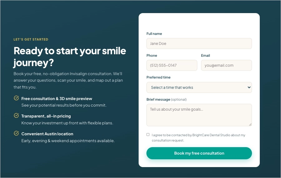
Create a high-converting dentist landing page for BrightCare Dental Studio, a modern dental clinic in Austin, Texas.
The page should promote Invisalign consultations for adults aged 25–45 who want straighter teeth without traditional braces. The primary goal is to increase appointment bookings from Google Ads and local search traffic.
Use a warm, professional, and reassuring tone. The page should feel modern, clean, trustworthy, and easy to navigate. Avoid overly clinical language. Focus on confidence, comfort, treatment clarity, and fast booking.
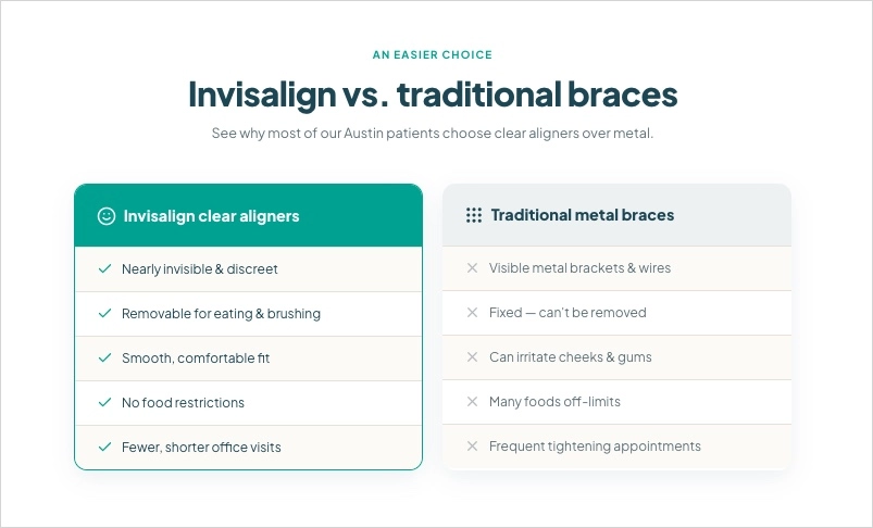
Include:
a hero section with a clear headline and CTA ("Book Invisalign Consultation"),
a short explanation of how Invisalign works,
benefits of clear aligners compared with traditional braces,
before-and-after treatment visuals,
dentist credentials and clinic trust signals,
patient testimonials,
accepted insurance and payment plan information,
FAQ covering treatment time, pricing, pain, eligibility, and follow-up visits,
a short mobile-friendly appointment form,
sticky mobile CTA buttons,
and a final reassurance section focused on comfort, transparency, and personalized care.
Highlight these benefits:discreet treatment, customized aligner plan, flexible consultation times, experienced dental team, clear pricing guidance, and easy online booking..
Address common patient concerns:
"Am I a good candidate for Invisalign?"
"How long does treatment take?"
"How much will it cost?"
"Will it hurt?"
"Can I use insurance or payment plans?"
Make the dental landing page mobile-first, highly scannable, conversion-focused, and optimized for a dentist PPC landing page campaign.From there, Lunar can generate a structured dentist landing page with service-focused messaging, booking CTAs, patient trust sections, FAQs, and a mobile-ready layout. The generated page gives your clinic a strong starting point that can be refined with real service details, authentic patient reviews, team photos, and compliance-friendly medical claims.
After launch, optimization matters just as much as creation. EventTracker can show how visitors interact with your dental clinic landing page, including CTA clicks, form starts, form submissions, and scroll depth. Solis can then analyze that behavior in the context of the page and recommend improvements that help reduce friction and increase appointment bookings.
Generate treatment-specific dental landing pages faster from a single campaign prompt.
5 Dentist Landing Page Best Practices
The best dentist landing pages don’t succeed because they look good – they succeed because they make patients feel confident enough to book. Trust, clarity, and convenience have become just as important as the treatments themselves, especially for visitors arriving from Google Ads, local search, or social media campaigns.
After reviewing the examples above, let’s look at five dentist landing page best practices that consistently help dental clinics attract more patients, improve booking rates, and create a smoother patient experience.
1. Create treatment-specific landing pages
One of the biggest mistakes dental practices make is sending every visitor to the same homepage. Patients searching for Invisalign, dental implants, emergency care, or teeth whitening have different concerns and expectations.
Instead, create dedicated dentist landing pages for individual treatments. A focused page allows you to match the visitor’s intent, address treatment-specific questions, and present a clear next step. This approach typically performs better in both organic search and dentist PPC landing page campaigns because the content feels more relevant from the first click.
Build, launch, and refine dental landing pages faster with Landingi’s AI-native landing page generator.
2. Reduce booking friction
Every additional step between a visitor and an appointment increases the risk of losing a potential patient. High-converting dental landing pages make booking as simple as possible.
Keep forms short, display appointment CTAs prominently, and include click-to-call functionality for mobile users. If you offer financing, insurance support, or flexible scheduling, highlight these details early. The easier it feels to take action, the more likely visitors are to become patients.
3. Build trust before asking for commitment
Dental treatments often involve significant financial, health, and emotional considerations. Patients want reassurance before they book.
Use dentist profiles, professional credentials, patient testimonials, treatment results, awards, certifications, and insurance information to establish credibility. Trust signals should appear throughout the page, not only near the form. The goal is to answer the question every patient is asking: “Can I trust this clinic with my care?”
4. Showcase real treatment results
For services such as Invisalign, veneers, smile makeovers, implants, or teeth whitening, visual proof is often more persuasive than any sales copy.
Include before-and-after photos, patient success stories, video testimonials, or case studies that demonstrate real outcomes. Showing transformations helps visitors visualize their own results and increases confidence in the treatment process.
5. Optimize with behavioral data
Launching a dental landing page is only the beginning. The highest-performing pages improve continuously based on real visitor behavior.
Track CTA clicks, form submissions, scroll depth, and user engagement with tools such as EventTracker.
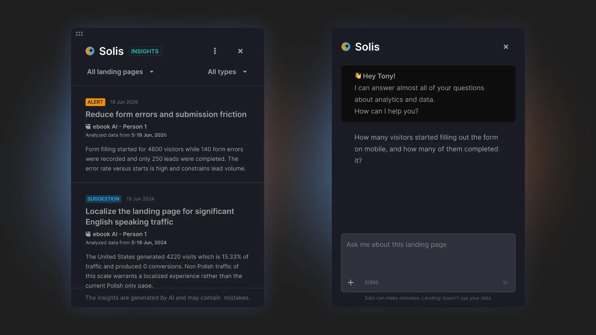
Then use Solis, Landingi’s AI landing page optimization tool, to identify friction points and uncover opportunities to improve conversions. Small adjustments based on behavioral data often produce bigger gains than complete redesigns.
Discover where potential patients hesitate, abandon forms, or stop scrolling – and get AI-powered recommendations to improve conversions.
FAQ About Dentist Landing Pages
Below, you’ll find answers to common questions about creating, optimizing, and managing high-converting dental landing pages.
What is a dentist landing page?
A dentist landing page is a dedicated page designed to turn visitors into patients. It focuses on a specific service, treatment, or campaign and guides visitors toward one action, such as booking an appointment or requesting a consultation.
Effective dental landing pages combine clear messaging, trust signals, patient-focused content, and prominent CTAs to make taking the next step feel easy. They are commonly used for services like Invisalign, dental implants, cosmetic dentistry, and emergency dental care, as well as local SEO and dentist PPC landing page campaigns.
What are the key elements of an effective dentist landing page?
The most important elements of an effective dentist landing page include:
- A clear headline and value proposition
- Prominent appointment booking CTAs
- Treatment-specific content and service information
- Patient testimonials and reviews
- Dentist credentials, certifications, and trust signals
- Before-and-after photos or treatment results
- Mobile-friendly design
- Simple appointment forms or click-to-call options
- Contact details and location information
- FAQs that address common patient concerns
The highest-converting dental landing pages remove uncertainty and make it easy for visitors to take the next step, whether that’s booking a consultation, calling the clinic, or requesting more information.
What should I avoid on a dental landing page?
Avoid overwhelming visitors with too much information, using generic stock photos, hiding contact details, and sending users to multiple pages before they can schedule a visit.
You should also avoid lengthy forms, vague CTAs, slow-loading pages, and treatment pages that don’t address common patient concerns such as cost, pain, recovery time, or insurance coverage. The best dental landing pages reduce friction, answer questions clearly, and make booking an appointment feel simple.
What is the best dentist landing page builder?
The best dentist landing page builder is Landingi, an AI-powered landing page operation system that helps dental practices generate, launch, manage, and optimize landing pages for specific treatments, locations, and campaigns.
With Lunar, marketers and clinics can create dedicated dentist landing pages from a prompt. EventTracker provides insights into patient behavior through event tracking, scroll maps, and event maps, while Solis analyzes that data and recommends improvements designed to increase appointment bookings and lead generation.
This workflow makes it easier to create landing pages for services such as Invisalign, dental implants, cosmetic dentistry, emergency care, and local dentist PPC campaigns without relying on developers or lengthy design processes.
Create Dentist Landing Pages for Your Dental Services with Landingi
The best dentist landing pages don’t just look professional – they make it easy for patients to trust your practice and book an appointment. Whether you’re promoting Invisalign, dental implants, cosmetic dentistry, emergency care, or general checkups, a focused landing page can significantly improve patient acquisition compared to sending visitors to a generic homepage.
With Landingi, dental practices can generate, launch, and optimize treatment-specific landing pages through an AI-powered workflow. Use Lunar to create dedicated pages from a simple prompt, then track patient behavior with EventTracker and uncover conversion opportunities with Solis. Together, these tools help clinics build more relevant patient journeys and continuously improve performance based on real visitor behavior. Try Landingi now!


