Imagine yourself walking into a new fashion store in town.
The first step you take into the store, the floors start to creak.
And then, flakes fall off the ceiling.
Before you even have time to cope with all of this, a weird smell kicks in to complement the atmosphere.
You tell yourself “Hey, it could be worse”.
And then, the first thing you see when you finally start paying a bit of attention to the actual store, are clothes thrown all over the place.
Would you buy from this store?
Unless it sold original Hermes scarves for $20 or gave away 99.99% discounts on Mercedes cars, it’s highly unlikely that you will buy from this store, come back to it, or ever recommend it to anyone.
eCommerce users may not see the flaking ceiling in your office or warehouse, and they might not feel the odd smell coming from your office refrigerator.
What they do see, however, is your site. And the first page they land on is the one that can make or break the game.
How, exactly, are your landing page images connected to all of this? How can they be a total Conversion Rate Optimization game changer? What are some of the absolute essentials all eCommerce websites should know about landing pages that actually convert?
I have gathered everything you need to know about this right below – so read on if you want to find out more.
Make your sections smartable and let go of mundane manual tasks with Smart Sections! An easy way to manage bulk changes.
First and Foremost, What IS CRO and What Is It Not?
Unlike its much more famous cousin (SEO), Conversion Rate Optimization tends to be frequently left at the end of the queue in the Digital Marketing industry.
And yet, it should probably be one of the first things to consider, especially once you have established a decent amount of traffic to your site.
Definition of CRO
Conversion Rate Optimization (CRO) is the process by which a team of CRO specialists analyze a website and implement changes that will help its visitors complete the desired action – thus, improving the Conversion Rate (the ratio between the visitors who land on a site and the visitors who land on a site and perform the desired action (e.g. subscribe to a newsletter, make a purchase on an eCommerce site, and so on).
What CRO Involves
Conversion Rate Optimization involves either one or a blend of quantitative (data analysis provided by Google Analytics, for example) and qualitative research (user interviews, for example).
Once you learn your visitors’ pain points and motivations, you move on to implement site changes that will remove those obstacles from their path to making a purchase.
Of course, this is an oversimplification of what CRO involves. Usually, a CRO team consists of a data analyst, a front-end developer and a QA, a copywriter, a UX designer, and a project manager. Moreover, CRO usually involves knowing a “bit of everything” – marketing, psychology, data analysis, and so on.
What CRO Is NOT
A lot of people mistakenly believe that Conversion Rate Optimization is about A/B testing alone. While that is most definitely an important component when it comes to implementing the best changes to a website, it is also most definitely not the only element of a thorough CRO process.
Moreover, CRO is not guesswork. Changing the color of your CTA button is fine, but only if your research shows that this is worthy. Any Conversion Rate Optimization thesis should be based on actual research, rather than guessing.
Landing page optimization should start with deep research of your target audience to build a persona. Persona is a typical customer with all their relevant characteristics including demographics, preferences, hobbies, lifestyle, motivations, decision-making styles, buying model, key concerns, etc. Avoid making assumptions about a persona! Accurate insights can only be gained through careful research, which you can then leverage in your campaigns.

Landing page – Elements To Be Optimized
A landing page is a standalone web page that is specifically designed to convert visitors into leads or customers. It serves as a focused destination for users who click on an online advertisement, email link, social media post, or other promotional channels. The primary goal of a landing page is to encourage a specific action, such as signing up for a newsletter, downloading an ebook, making a purchase, or requesting more information.
Though conversion generation is an integral part of landing page DNA, optimizing landing pages may unlock their full potential. But what actually landing page optimization mean?
Well, it’s a process of improving its elements to maximize a site’s overall outcome (clicks, views, scrolls, purchases, etc.). Here are the landing page elements most often targeted in optimization:
– copy (headlines, taglines, descriptions, CTAs, on-page SEO),
– images (quality, size, content, location, loading time, etc.),
– forms (field numbers, question wordings, position, design, etc.).
Of course, regardless of those on-page elements, there are some technical issues to improve, which may influence CR. For example, your server’s performance may impact page load time, and the latter – if too long – may cause your website visitors to leave before they see anything.
Copy In Landing Page Conversion Optimization
As they say, content is the king! And this applies to landing page content as well. The way you communicate with your visitors weighs on their future actions on your landing page. How to get them to convert more?
Headlines & Taglines: Captivating Your Audience
The first and foremost element of a high-converting landing page is a compelling headline. Your headline should grab your visitors’ attention immediately and provide a clear message about what your page offers. It’s your first opportunity to engage your audience.
- Be Clear and Concise: Your headline should convey the main benefit or solution your product or service provides in a succinct manner. Clarity is key.
- Create Curiosity: Consider using taglines that pique curiosity or raise a question. They should encourage visitors to explore further.
- Highlight Value: Emphasize the value your offer provides. How will it solve your visitor’s problem or fulfill their need?
- A/B Testing: Don’t hesitate to run A/B tests to find the most effective headline. Even small tweaks can make a significant difference.
Descriptions: Persuading with Persuasive Copy
Once you’ve captured your audience’s attention with a compelling headline, it’s essential to maintain their interest with persuasive descriptions. Here’s what to keep in mind:
- Benefits over Features: Focus on how your product or service benefits the user. Highlight what’s in it for them rather than listing features.
- Use Persuasive Language: Employ action-oriented words that encourage users to take action. Words like “get,” “achieve,” and “experience” can be effective.
- Address Pain Points: Understand your audience’s pain points and address them directly in your descriptions. Show how your offer can alleviate these issues.
- Keep it Scannable: Break up long paragraphs into shorter, scannable sections. Use bullet points, subheadings, and visuals to enhance readability.
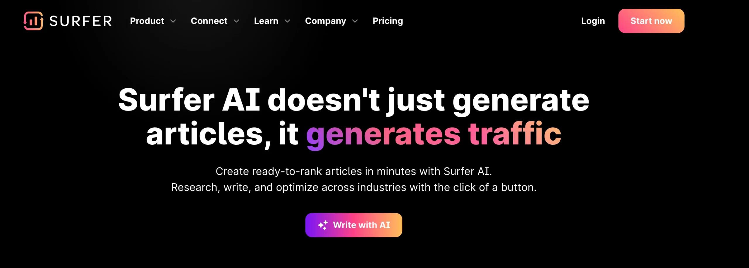
Pro-Tip #1: High-converting landing pages often persuade visitors with facts and numbers, as they leave a stronger impression than words alone. They also
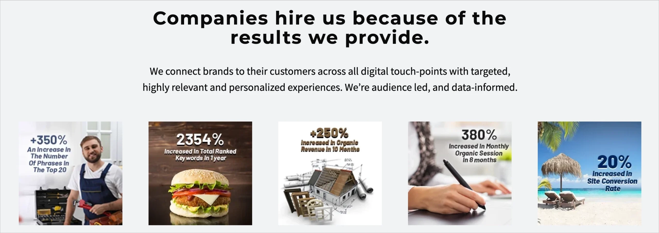
Pro-Tip #2: Use testimonials, as they instill credibility, which is a must while aiming to turn landing page visitors into paying customers. Did you know that – according to Statheap – 77% of people read reviews while searching for local businesses to cooperate with (D. Elder, 18+ Testimonial Statistics That Show Their Impact In The Sales Process, 2023)? Testimonials are actually upgraded form of review.
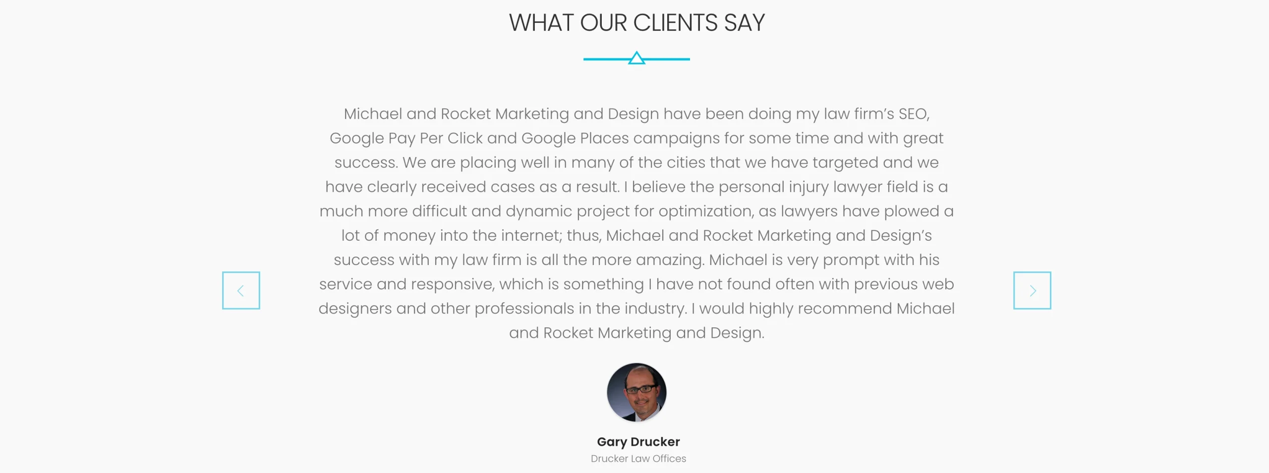
Pro-Tip #3: Trust badges placed on landing pages perform a like function. They represent generalized trust for your brand or company, so typically their impact is even heavier than that of individual testimonials.
CTAs (Call to Action): The Precise Nudge to Convert
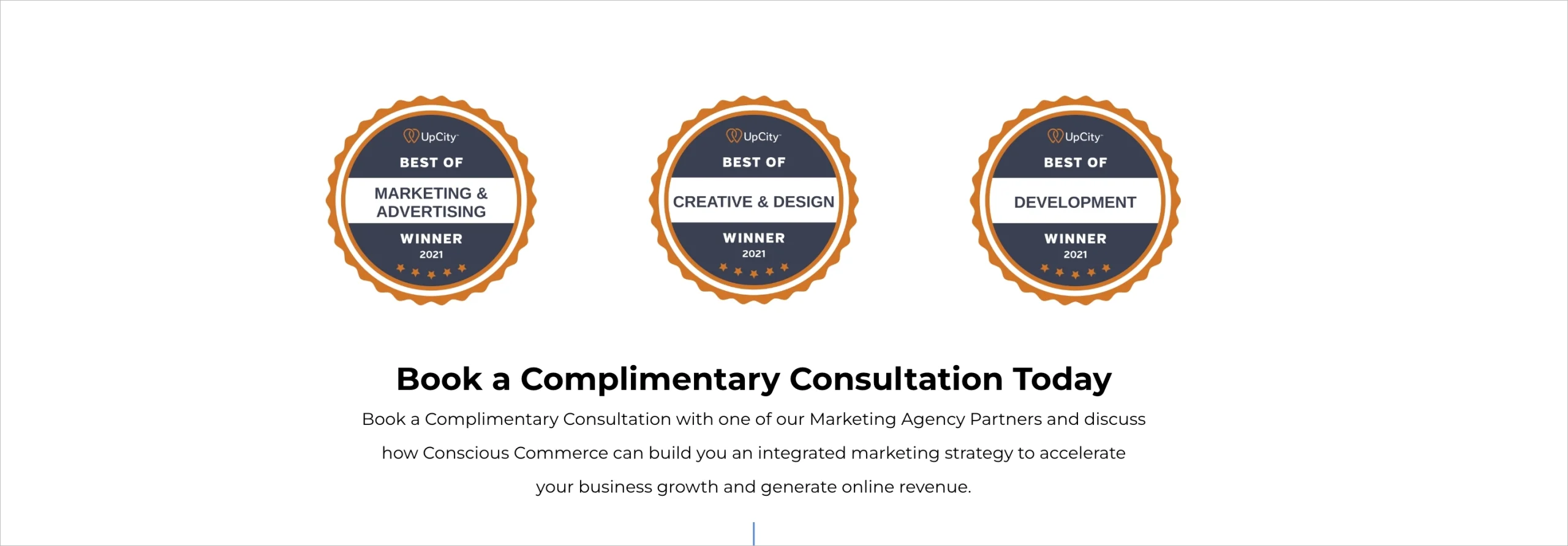
Call to action (CTA) is the linchpin of your landing page. It’s where visitors make the decision to convert or not. Landing page optimization in this realm must follow some basics.
- Clarity is Crucial: Make sure your CTA button is crystal clear. Use action-oriented words like “Get Started,” “Subscribe Now,” or “Download Your Free Guide.”
- Contrasting Colors: Make your CTA button stand out by using a color that contrasts with the rest of your page. It should be immediately noticeable.
- Above the Fold: Consider placing your primary CTA above the fold so users don’t need to scroll to find it.
- Use Urgency: Create a sense of urgency with phrases like “Limited Time Offer” or “Act Now.” Urgency can drive action.
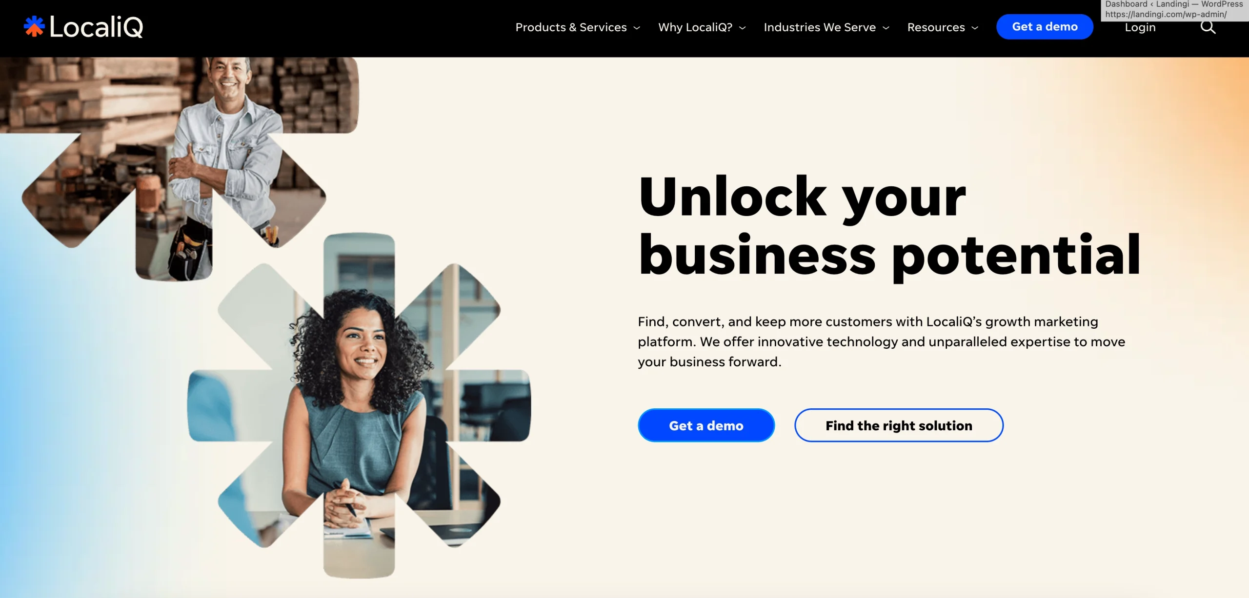
Info: According to WVO (Open Mile Tested Page Elements To Increase Conversions), reducing clutter and incorporating ample white space around CTAs can boost conversion rates by 232%!
On-Page SEO: The Hidden Power of Optimization
Optimizing your landing page copy also means ensuring it’s SEO-friendly. This helps your page rank better in search engines. Optimization in this realm brings you lots of new traffic, which translates to extended possibilities in attracting potential customers. It’s a great alternative for paid online marketing campaigns (including paid search ad), as it doesn’t require any funds! Properly done it may be a key component of your marketing strategy.
Here’s what you can do:
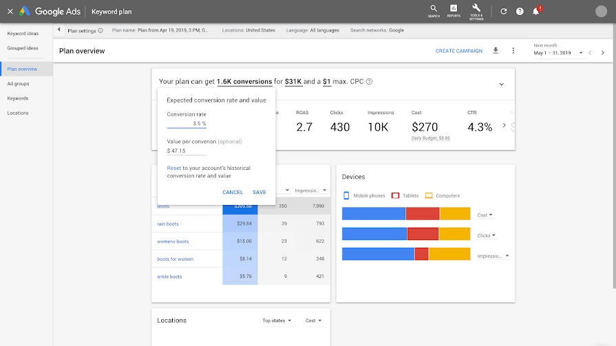
- Keyword Research: Identify relevant keywords related to your offer. Integrate them naturally into your headline, descriptions, and body copy. To find the perfect keyword set use website or landing page optimization tools. Free ones like Google Keyword Planner (see the screen below) are more than enough at the beginning, but to go pro and unlock full SEO potential you will need more advanced apps like Ahrefs, Semrush, etc.
- Meta Descriptions: Craft compelling meta descriptions that encourage users to click when your page appears in search results.
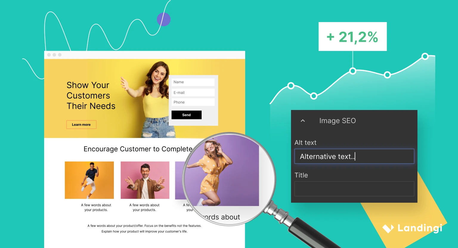
- Alt Text for Images: Use descriptive alt text for images to improve accessibility and enhance SEO.
- Mobile Device Optimization: Ensure your landing page is mobile-friendly. Google favors mobile-optimized pages.
Info: In Landingi mobile view is built automatically based on the desktop version of your landing page. You may, however, modify it any way and at any time.
Heeding the above, your site will be more friendly to the search engine. Optimization for SEO results not only in skyrocketing traffic itself but also in capturing a better-matched audience. Finally, all of this decreases markedly customer acquisition costs.
Optimizing Forms for Higher Conversion Rates
Forms are the gateways to valuable information and leads on your landing page. They play a pivotal role in the conversion process, and their design and placement can significantly impact your conversion rates. Here are some key strategies for optimizing forms on your landing page:
1. Keep It Simple: One of the cardinal rules of form optimization is to keep it simple. The more fields you ask visitors to fill out, the less likely they are to complete the form. Stick to essential fields like name, email, and a few others that are crucial for your marketing objectives.
2. Clear and Compelling Headline: The headline above your form should convey the value of filling it out. Use persuasive language that explains what users will gain by completing the form. For example, “Get Your Free E-book Now!”
3. Strategic Placement: Where you position your form matters. Generally, placing it above the fold (visible without scrolling) is effective. However, test different positions to see what works best for your audience.
4. Minimize Friction: Make it as easy as possible for users to complete the form. Remove distractions and unnecessary fields. Consider using inline validation for real-time feedback.
5. Compelling Call-to-Action (CTA): The CTA button should be eye-catching and use persuasive language. Instead of a generic “Submit” button, try something more specific like “Get Started” or “Send My Quote.”
6. A/B Testing: Continuously run A/B tests to fine-tune your forms. Test different form lengths, button colors, and text to see what combination yields the best results.
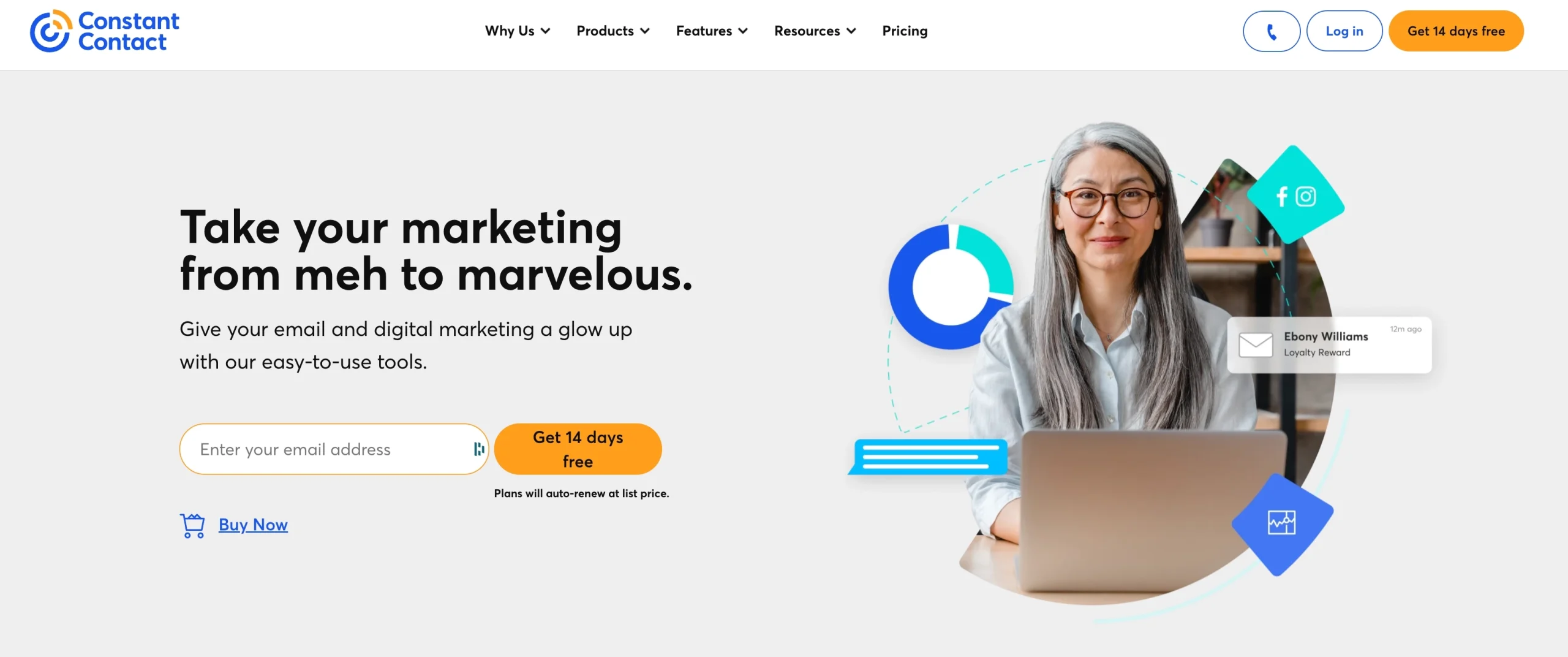
Pro-Tip: If you need some details, you may break down the process into stages so as not to discourage impatient users. See the above example by Constant Contact. The form has only one necessary field. After filling, more valuable information may be asked with another form or via e-mail. Forms with many fields are on the flip side and can really ruin the landing page conversion rate.
Landing Page Optimization Through Visuals
We live in a world of pure…imagery.
Just stop for a moment and think of how crucial images are in your life. In a digital world, it’s how you perceive the products you’re buying, the people you interact with, and even the vibe you get from a shopping experience.
Superficial?
Not really.
Turns out, the world’s always been prone to judging a book by its covers. The actual saying “Don’t judge a book by its covers” dates as far back as 1944. And if that’s not reason enough to think of how powerful images are, take a look at the Sistine Chapel’s ceiling.
Over the course of history, images have been used to do more than just tell a story – they have been used to convey powerful messages and convince people. I won’t get political here, but images have not always been used for the greater good – there are plenty of examples that go in the exact opposite direction, actually.
Get 111 Landing Page Examples—The Ultimate Guide for FREE
So, Why Are Images So Important?
It has become kind of a given that images are important in marketing – but if you’re still not convinced, here are some statistics:
- The human mind processes images 60,000 times faster than text. So, before your users even get to read the first line of copy, they will have already formed an opinion about your landing page.
- 90% of the human brain works in visual mode. That means that only the remaining 10% is split among the other senses (all of which are important, of course, but in a much smaller proportion).
- Humans are the only species capable of articulated language – and while that’s a great achievement on the evolutionary scale, it’s also not what we’re all about. In fact, 93% of all communication is non-verbal
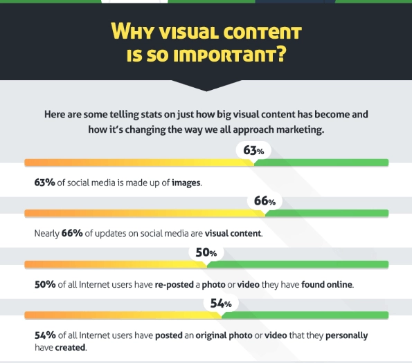
- On average, more than half of the Internet is all about images (as shown below in a screenshot from this infographic created by QuickSprout).
And here’s a linguistic approach to images: all basic communication can be encapsulated in a basic schema that includes a sender, a message, a code, a channel, and a receiver. In the case of a landing page, you (the eCommerce Manager/ designer/ developer/ copywriter) are the sender and your site’s visitors are the receivers. The message is whatever you want to put on your landing page – visual or not. The code is the language, while the channel is, well, the Internet itself.
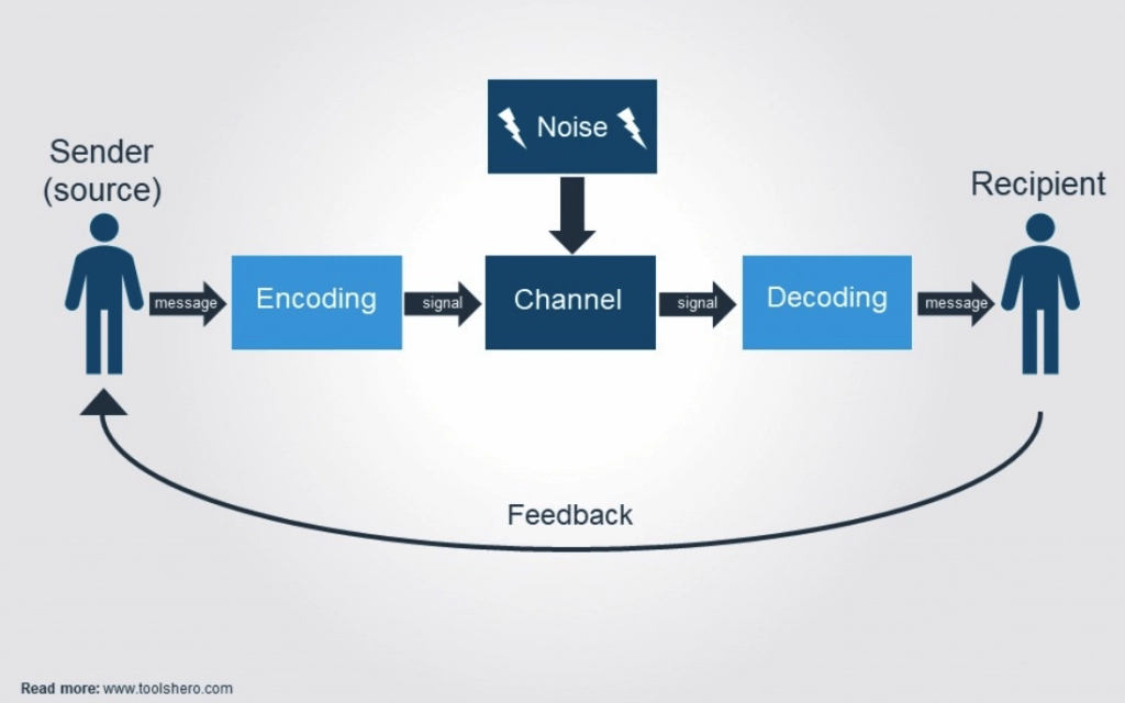
Great copywriting is crucial for the success of a landing page – but if you think of the aforementioned schema, images become even more important in online communication. Basically, images can make your message come across even if the person at the other end of the communication channel doesn’t speak English (but still pertains to the same general cultural context as you do and is triggered by the same signs, symbols, and connotations they’ve been “wired’ with ever since childhood).
For instance, an image with a person nodding their head will mean the same thing for most of the world, except for countries where nodding is a sign of negative reinforcement of a message, rather than positive.
Aside from these exceptions, most people are triggered by more or less the same visual signals (e.g. an open palm facing upwards is a sign to take action).
Yes, images are of the utmost importance in marketing – and your landing page is the first element of your brand visitors connect to. So yes, you need great images to convince them to buy from you.
The Essential Landing Page Image Tips for Your eCommerce
Going back to the example I gave in the introduction, landing pages are just like a storefront: they either make or break the game.
Sure, there might be in-betweens, but that’s not where you generally want to lie when it comes to anything in life: you want to be at the very top of the chain, not stuck somewhere in the middle for an indefinite amount of time.
Conversion Rate Optimization Tips for Landing Page Images
In our experience as Conversion Rate Optimization pros at Omniconvert, we have found that some things work better than others. This is not to say that we have the universal recipe when it comes to landing page success (on the contrary, we always encourage everyone to analyze and test before making a final call).
I have laid out some of the most important tips in this direction.
How to Define a Good Image for a Landing Page
It is a truth universally acknowledged that there’s no one success recipe when it comes to marketing (or anything else, really).
However, there are some basic criteria a good landing page image should meet:
- Your landing page images should be high quality (this comes without saying, but you really can’t put a pixelated image on your landing page – same as you wouldn’t put a rugged, muddy, colorless welcome mat in front of your physical store);
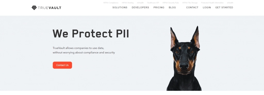
- Your landing page images should be colorful and vibrant. Unless you’re selling something that’s ultra-luxurious and sophisticated, using a black-and-white image is probably not a good option. Colors, on the other hand, will make your landing page images more memorable.
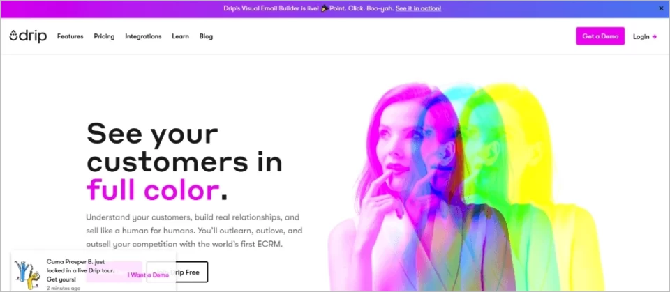
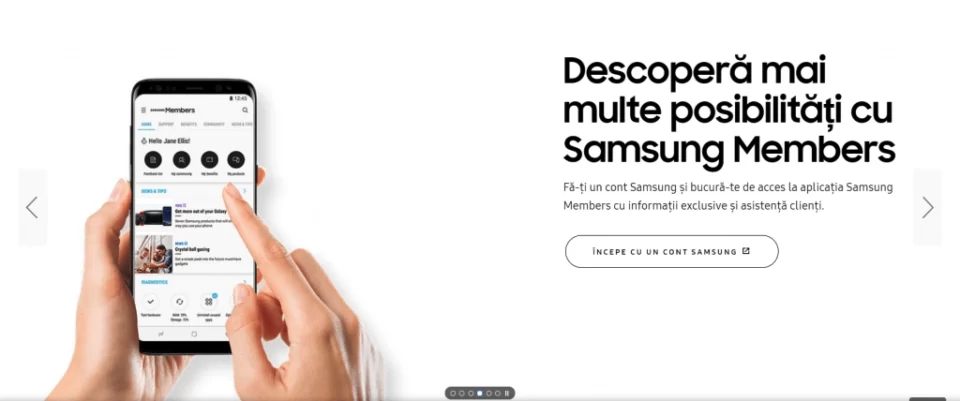
- Your landing page images should include humans (it’s not an absolute must, but these tend to convert better). Also, the humans in the image should have their eyes/ bodies pointed at the main written message on the landing page (also a trick that converts better).
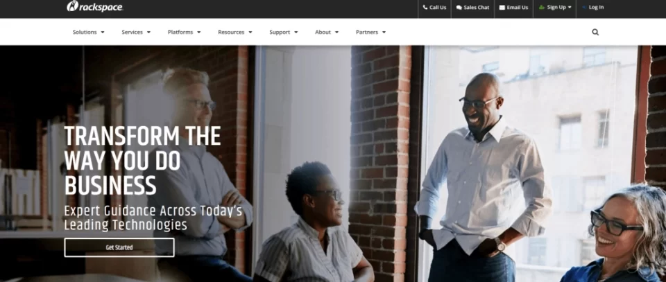
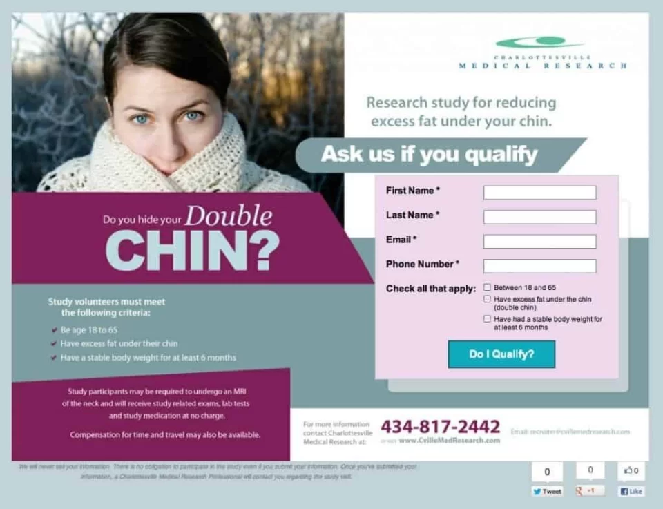
- The people in your photo should be smiling – or at least they should be emanating a state of positivity and well-being. Images of sad people function well when you want to show them the situation they’re in now (as exemplified below in the Charlottesville Medical Research landing page). In general, though, you want to keep things positive – on your landing page and in life :). See this example from Coca-Cola.

- Your landing page images should show visitors why the products/ services you offer are going to ease their pain points/ meet their needs/ fulfill their desires;
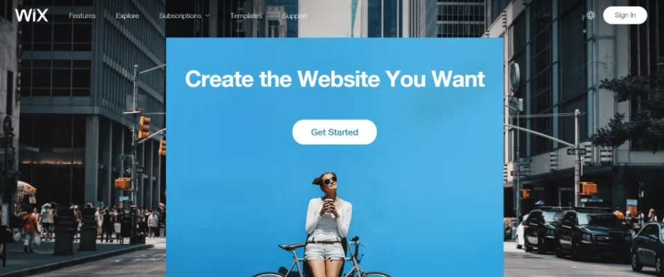
- Your landing page images should be backed up by research (quantitative and/or qualitative). At the end of the day, choosing landing pages images is all about Conversion Rate Optimization – and we have established in the beginning of this article that CRO is not guesswork;
- If you are selling a service, your landing page images should appeal to an emotion your visitors have. The images could underline:
– The problem your visitors are having – such as in this example from Charlottesville Medical Research (source)
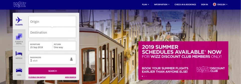
– The outcome your solution is offering – such as in this example from Wizzair (beautiful images of the cities users will visit once they book a plane ticket on the site)
-
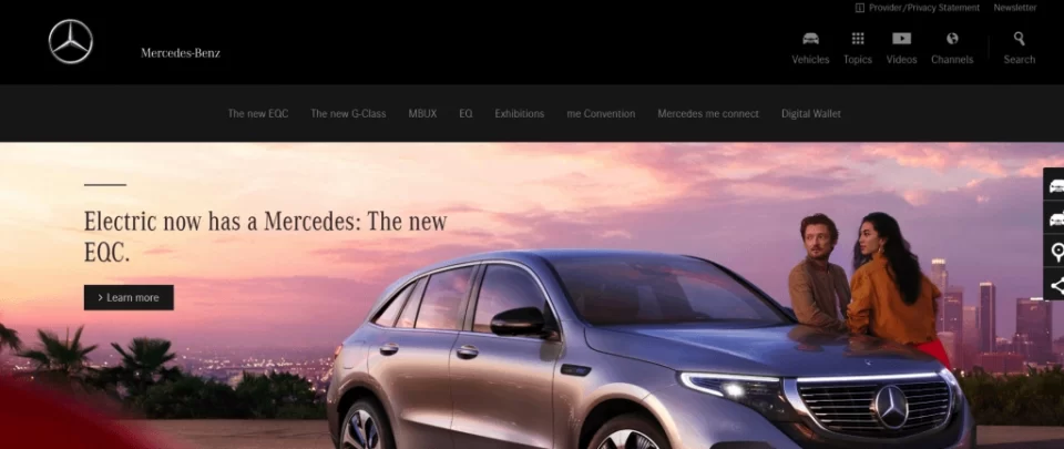
- If you are selling a physical product, your landing page image should absolutely, definitely, unequivocally include the product itself. Aim for the very best shot of the product (think of how car manufacturers show off their models on the landing page and apply the same quality principles to your product).
- If you are selling a physical product, your landing page image should absolutely, definitely, unequivocally include the product itself. Aim for the very best shot of the product (think of how car manufacturers show off their models on the landing page and apply the same quality principles to your product).
- Try to only use one image at a time. You can create a slideshow for your landing page, but don’t interconnect multiple images at the same time because it might create a sense of disorganization and it might take the focus from what’s important: your product/ service.
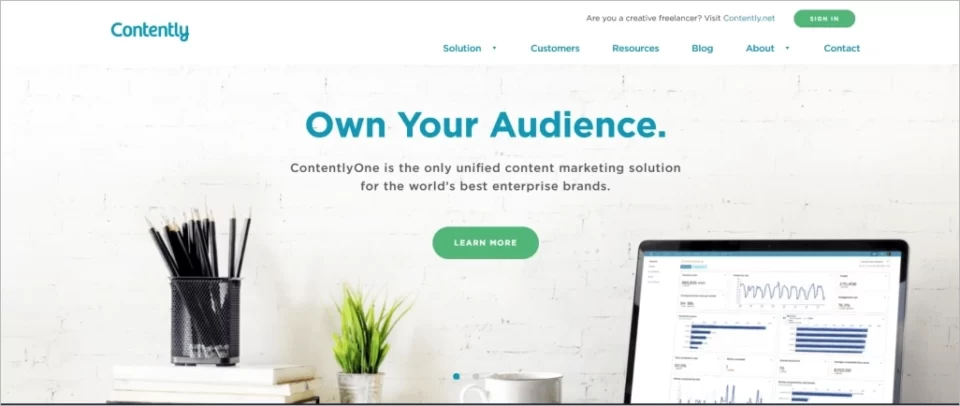
Info: Some websites or landing page platforms have built-in solutions for placing a slider on your pages with no code! Check out how to add a slider to your landing pages created with Landingi.
- Also valid for physical product landing pages: the more detailed, the better. An up-close shot of a watch can convert a lot more than showing it on someone’s hand.
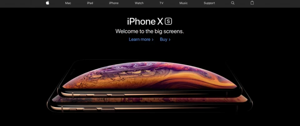
- Use big photos. As shown before in this article, images are extremely important – so make the most out of your little slice of cyberspace and use big, aesthetically pleasing images on your landing page.
What Kind of Images NOT to Use for a Landing Page
It’s easy to make mistakes when choosing your landing page image – especially when outstanding landing pages are actually pretty rare (they all follow more or less the same pattern, depending on the industry – just a few of them stand out for the strategy that led to choosing them).
What kind of images should you not use for a landing page? Well, here it goes:
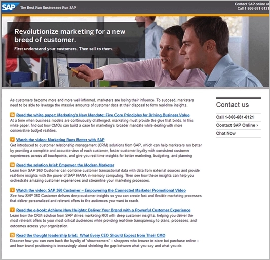
- Old or typical stock images. The 90s called and they want their people-in-business-suits images back ?. Most people really dislike these – so much so that they could actually have the opposite effect on your landing page (instead of making you seem more trustworthy, they will make you seem superficial and not trustworthy).
- Images you don’t have the rights to use or share. That pretty picture of a mountainscape you found on Google Images? It may be marked as “Creative Commons” in search results – but unless you actually track down its original source and ask for permission, you will never know. Sure, the Internet is a large place and there are probably billions of images shared online every hour. That doesn’t mean you should just comply and be part of an issue that affects creators, creatives, and, ultimately, business owners themselves.
- Images that just don’t suit your general audience. Would you use a Harry Potter wand as an image on a landing page about tractors (where the target audience is male, mostly between 35 and 55 years old)? Probably not. Think of the imagery that triggers your target audience.

- Images that tell, instead of showing. A lot of business owners simply use an image of their products or an image of someone working with their tools. However, this is usually not the best way to achieve the highest Conversion Rate. As mentioned in the previous section, your landing page images should trigger an emotional response in visitors, rather than just showing them the product.

Where to Find Good Images
Good images are quite easy to find once you know what you are looking for. This is not to say that you should automatically settle on the first thing that remotely fits your criteria. It’s just a remark on the wide range of decent, totally legal options you have at hand. Some of them include:
These are just some of the resources, of course. If you do find any site online that offers free images, keep in mind that they should be reliable, reputable sources.
Avoid user-submitted sources of free images because those images might not belong to those particular users (and they might not be as “Creative Commons” as they are deemed to be).
While working on your landing page, you may check if your builder has an integrated image gallery. If yes, you have at your disposal an additional image source along with meeting legal requirements guarantee. For example, in Landingi you may use thousands of free images from the integrated Unsplash gallery.
Last, but not least, you can always take your own pictures or ask your designer to create unique, completely original graphics!
How to Test Multiple Image Variations
As mentioned earlier in this article, it is absolutely crucial that you test your landing page images and see which one works best for your particular situation. While there are basic tips you can follow (such as those described above), nobody can make a better case for what works and what doesn’t on your website, other than your very own customers.
That’s what customer-centricity is all about – and that’s what modern businesses should be all about as well. In a world where too many people focus solely on data, numbers, and cha-ching sounds, it is of the utmost importance to go back to your roots and put the customer at the center of your business decisions.

Testing multiple landing page variations is relatively easy, especially when you’re using the right tool. For instance, the Omniconvert platform could be a really good option when it comes to this. Our Software-as-a-Service doesn’t offer just A/B Testing, but also personalization and surveying options – or, in other words, it’s a full-option CRO platform you can test for free for 50K views.
Some of the things I want to point out and/or reiterate here:
- Choose your audience carefully. You want the people who see your Control Variation (i.e. your current landing page) and your Variation (i.e. the new landing page you’re testing) in equal numbers. If you want to test two or more variations, make sure you split the audience equally as well.
- Let your test run for a significant amount of time. In general, the amount of time you need to run an A/B Test is connected to the amount of traffic you’re testing on. However, running the test for 1-2 weeks should give you relevant results.
- Make sure you have enough traffic to test the different landing page options (at least 50k-100k in monthly traffic). A/B Testing is great, but if you have a very small amount of traffic coming to your site, it might be difficult to generate conclusive and realistic insights into whether or not your target audience likes your new landing page (i.e. if it converts better).
- Again, and I’m emphasizing on this one, create a data-based hypothesis before you start testing any kind of landing page variations. A/B Testing can be a golden nugget when it comes to gaining clarity over the things that convert your eCommerce website’s visitors into buyers. Combined with surveys, overlays, and personalization, as well as with a proper segmentation of your customer database, A/B Testing can help you win the race against your competition.
Instead of a Conclusion
In a world swarming with new eCommerce businesses every single day, yours needs to stand out. Even if you’re competing on a very restricted niche, for a very small audience, in limited demographics, making a good case for your eCommerce website’s landing page is crucial. Because if you don’t do this, one day someone will do it – and your customers will turn around to check out the flashier store in town.
We believe in testing everything, rather than taking every tip of advice for granted – and this belief is grounded in our core strategy: that of putting WHO before everything we do. Before you consider images, messages, and CRO tricks, it is of absolute importance to consider your audience first.
They are who you’re talking to.
They are the ones that will eventually make a purchase.
They are the ones who will come back to your store – again, and again, and again.
Be the eCommerce site your target audience yearns to come back to, just like they yearn for their favorite coffee shop in the world.
Create Perfect Landing Pages with Landingi
And the crowning touch ahead!
In your road to perfection, don’t forget that your efforts are determined by the tools you’re using. Landing page optimization practices include at the very beginning choosing the appropriate creator, which allows you to implement all the tips covered in this article.
Beware of builders that enable you to create a perfect landing page in terms of design, but do nothing to address the performance and SEO issues. I mean, among others, the page load times, solid and reliable infrastructure, A/B testing capabilities, etc. Pages created and hosted by such platforms won’t bring you astonishing conversion rates, even if they were design masterpieces.
In Landingi we pay particularly close attention to such issues, regardless of the variety of tools provided for effectively creating landing pages like hundreds of pre-made (yet fully customizable) templates, Smart Sections, and in-build AI copy generator. Some solutions are dedicated strictly to optimizing conversion rates. With Event Tracker you will get a thorough understanding of user behavior (in a much more straightforward way than in Google Analytics), while PageInsider will help you to evaluate the distribution of elements on your landing pages.
Give us a try for free and start to conquer the highest conversion peaks right now!
