

A poorly designed PPC landing page can unravel all the work you’ve done to attract initial visitors to your page from any digital ad campaigns you’re running. A poor landing page experience can cause visitors to lose interest and leave if the landing page fails to impress. It’s crucial, therefore, to know what makes for a successful landing page to retain those visitors. What is important on PPC landing pages? Key elements that contribute to an effective PPC landing page include a clear call to action, relevant content, fast loading times, and a visually appealing design.
Other tips for creating a great PPC landing page include the following:
- Align landing page with PPC ad to boost relevancy and Quality Score.
- Customize landing page for specific ad groups for maximum relevancy.
- Set a clear conversion goal matching PPC campaign objective.
- Tailor landing page content to audience demographics and behaviors.
- Create compelling headline and concise, benefit-driven content.
- Design strong, action-oriented CTA for clear direction.
- Simplify form for improved conversion rates.
- Add trust signals like testimonials and reviews for credibility.
- Ensure mobile optimization for high mobile traffic.
- Implement dynamic content replacement for personalization.
- Conduct A/B testing and use analytics for data-driven improvements.
To prevent visitors from hitting the back button on your landing page, this guide will explore some of the best landing page examples and demonstrate how easy it is to create a successful PPC landing page using Landingi’s extensive template library. Additionally, we will discuss what a PPC landing page is and the key elements that contribute to its effectiveness.
Take a look at a list of examples we’ll analyze:
- Asana
- KlientBoost
- Prudential
- QC Design School
- Motley Fool Auto Insurance
- Inside-Out Leadership
- Los Angeles Film School
- Prose
- Northern Trust
- Woodard
- Steven Cohen Team
- Filmora
- TikTok
- HelloFresh
- No Kid Hungry

Lunar is almost here!

What is PPC Landing Page?
A PPC landing page is a standalone web page specifically designed for a marketing or advertising campaign. It’s where a visitor “lands” after clicking on a PPC ad from platforms like Google Ads or Bing Ads. The primary purpose of a PPC landing page is to convert visitors into leads or customers by encouraging them to take a specific action, such as filling out a form, making a purchase, or downloading a resource.
PPC drives conversion by directing targeted traffic to highly optimized landing pages, which are essential for maximizing the ROI from PPC campaigns by providing a relevant and convincing experience that matches the visitor’s expectations from the ad. This alignment increases the chances of turning clicks into meaningful actions, making marketing efforts more efficient and contributing effectively towards achieving business goals. Well-crafted PPC campaigns have a significant impact on overall marketing success.
For instance, of all high-intent searches, an impressive 65% result in an ad click, highlighting the potential of PPC ads to attract serious buyers. Additionally, paid advertising has been shown to increase brand awareness by 33%, demonstrating its value not only in direct conversions but also in enhancing visibility and brand recall among potential customers. Moreover, traffic derived from PPC campaigns has a 50% higher conversion rate than that coming from organic sources (according to Lauren O’Bryan from Powered by Search). This data shows how effective PPC is at reaching and persuading ready-to-buy customers, making it essential for businesses aiming to get the most out of their online marketing.
How Do I Create a PPC Landing Page?
To create a PPC landing page, align it with your ad content and make ad-specific customizations. Ensure that your landing page headline and content closely match the message, keywords, and intent of your PPC ad. Customize your landing page based on the specific ad or ad group, and then proceed with the following steps: set conversion goals, gather audience insights, create engaging content and compelling call-to-action (CTA), incorporate a form, add trust signals, optimize for mobile, use dynamic content replacement, conduct A/B testing, and set up analytics.
Follow these 11 steps to create a landing page for your PPC campaign:
- Align with Ad Content: Ensure that your landing page headline and content closely match the message, keywords, and intent of your PPC ad. This alignment increases relevancy, improves the Quality Score in platforms like Google Ads, and helps lower your cost per click (CPC).
- Ad-Specific Customization: Customize your landing page based on the specific ad or ad group. Create multiple versions of your landing page if you are running various PPC campaigns targeting different audiences or keywords to ensure maximum relevancy.
- Clear Conversion Goal: Define a single, clear conversion goal that aligns with the objective of your PPC campaign, such as lead generation, product purchase, or event registration. This goal will drive the layout and content of your landing page.
- Audience Insights: Utilize the targeting options and insights from your PPC platform to understand your audience’s demographics, interests, and behaviors. Tailor your landing page to address these specific attributes, making it more appealing to the visitor.
- Compelling Headline and Engaging Content: Create a headline that grabs attention and reinforces the message of your ad. It should be directly relevant to the ad copy and the visitor’s search query, providing a seamless transition from the ad to the landing page. Write concise, benefit-driven copy that clearly communicates the value proposition promised in the ad. Avoid unnecessary information and focus on how your offer addresses the visitor’s needs or solves their problem.
- Strong Call-to-Action (CTA): Design a prominent, action-oriented CTA that stands out visually and uses persuasive language. The CTA should clearly state what the visitor should do next, such as “Get Your Free Quote,” “Buy Now,” or “Download the Guide.” The importance of the placement of the CTA button is demonstrated in a case study presented by VWO. ArchiveSocial, a SaaS firm for social media archiving, increased the visibility of their main CTA by moving it to a prominent position in the first fold on the right and changing its color. The results were impressive, with a 101.68% increase in clicks on the form!
- Optimized Form: Simplify your form to ask only for essential information to minimize friction and improve conversion rates. Use PPC insights to pre-fill fields or tailor questions based on the visitor’s ad click behavior.
- Trust Signals: Include trust-building elements such as customer testimonials, case studies, security badges, industry certifications, and reviews to alleviate any concerns and build credibility.
- Mobile Optimization: Ensure your landing page is fully responsive and performs well on all devices. Given the high percentage of mobile traffic from PPC campaigns, a seamless mobile experience is crucial.
- Dynamic Content Replacement: Use dynamic content replacement to personalize the landing page based on the visitor’s search query or ad they clicked on. This personalization can significantly improve relevancy and conversion rates.
- A/B Testing and Analytics: Continuously test different elements of your landing page, such as headlines, images, CTAs, and form fields. Use A/B testing tools to determine what works best and implement data-driven improvements. Set up tracking using tools like Google Analytics and conversion tracking in your PPC platform to monitor key metrics such as click-through rates (CTR), conversion rates, and cost per conversion.
15 Best Examples of PPC Landing Pages
PPC landing page examples showcase top-notch designs that excel in converting visitors into leads or customers. Each of the following examples is meticulously chosen to demonstrate key elements of effective PPC landing page design, such as clear value propositions, strong calls to action (CTAs), visually appealing layouts, and the use of trust signals. These elements ensure that the landing page attracts clicks by engaging visitors effectively.
For instance, Asana’s page excels in providing a detailed comparison with a competitor to help users make informed decisions, while KlientBoost uses compelling CTAs and trust signals to capture leads effectively. Other examples, like those from Prudential and HelloFresh, highlight the importance of user-friendly design and clear messaging. Read on for valuable insights into areas for improvement, such as optimizing for mobile and simplifying forms, offering a complete guide to successful PPC landing pages.
1. Asana
The PPC landing page for “Asana vs. Monday.com” is designed to capture potential customers interested in project management tools. The page focuses on comparing the features and benefits of Asana and Monday.com to help users decide which tool best suits their needs. The primary call to action (CTA) encourages visitors to sign up for a free trial, while the secondary CTA promotes a demo of Asana.
PPC ad:

PPC landing page:

The landing page features a clean and modern design, with a headline that immediately communicates the comparison between Asana and Monday.com. The content is well-organized, providing a detailed comparison of the features and usability of both tools. High-quality images and graphics enhance the visual appeal, making the information more engaging. Trust signals, such as customer testimonials and company logos, are strategically placed to build credibility and persuade visitors.
Key takeaways to learn from this example:
- Clear value proposition: The headline and subheadings clearly communicate the purpose of the page and the benefits of choosing Asana over Monday.com.
- Compelling CTA: The page includes multiple, cohesive CTA, “Try for free”, encouraging immediate action.
- Informative content: Detailed comparisons, FAQ section, and customer testimonials provide valuable information to help visitors make an informed decision.
Improvement areas:
- Mobile optimization: Ensuring the page is fully optimized for mobile devices can improve accessibility and user experience for mobile users, potentially increasing conversion rates from mobile traffic.
2. KlientBoost
The PPC landing page for KlientBoost, a performance marketing agency, exemplifies a well-designed page focused on maximizing conversions. The primary goal of the page is to capture leads by offering a free marketing plan, prominently highlighted at the top with a clear and engaging call-to-action (CTA) button. The headline “The Performance Marketing Agency That Doubles Revenue, Not Your Budget” immediately conveys a strong value proposition that sets KlientBoost apart from its competitors by promising tangible benefits without increasing client budgets.
PPC ad:

PPC landing page:

The layout is clean and professional, featuring a strategic use of whitespace, high-quality images, and a consistent color scheme that aligns with the brand’s identity. The content is structured to guide the visitor through the benefits of the services offered and a clear value proposition, all of which build credibility and encourage action. Additionally, the inclusion of trust signals such as client logos and industry recognition helps to further build trust with potential clients.
Key takeaways to learn from this example:
- Prominent and clear CTA button: “Get your free marketing plan” is visible and inviting.
- Use of trust signals: Client logos enhance credibility.
- Consistent branding: Colors, fonts, and images are aligned with the brand’s identity.
Improvement areas:
- Conversion funnel: The CTA button redirects to another page where visitors can learn more about KlientBoost’s marketing plan. However, there is no form to capture leads. Adding a simple form, perhaps with just an email address field, could create an opportunity to collect contact data and include prospects in communication.
3. Prudential
The landing page “Now What?” by Prudential Financial is a well-crafted example of a pay-per-click landing page aimed at converting visitors into leads for their annuity solutions. The page prominently features the Prudential brand and addresses the target audience’s needs with clear, compelling content about protecting their life’s work through robust annuity solutions. The layout is clean and professional, ensuring the key message is immediately visible.
PPC ad:

PPC landing page:

Key takeaways to learn from this example:
- Clear and relevant headline: The headline “Protect Your Life’s Work” directly addresses the visitor’s potential concerns, creating an immediate connection.
- Statistics: The inclusion of data, such as poll results and the company’s years in the market, adds credibility and trustworthiness.
- User-friendly design: The page uses a simple, intuitive design that makes it easy for visitors to navigate and find the information they need.
Improvement areas:
- CTAs: The page has too many CTA buttons, which can be distracting for users. Having just one clear call to action would be much more effective.
4. QC Design School
The PPC landing page for QC Design School’s free Interior Decorating Course catalog is designed to capture visitor interest and convert it into leads effectively. The page employs a visually appealing design, featuring background images that align with the theme of interior design and create an inviting atmosphere. The headline and call-to-action (CTA) button, “GET THE CATALOG,” are prominently displayed, ensuring they catch the visitor’s attention immediately. The form is simple and clear, asking only for essential information such as first name, last name, and email address. An optional opt-in checkbox allows users to receive additional emails, making it easy for the school to build a mailing list.
PPC ad:

PPC landing page:
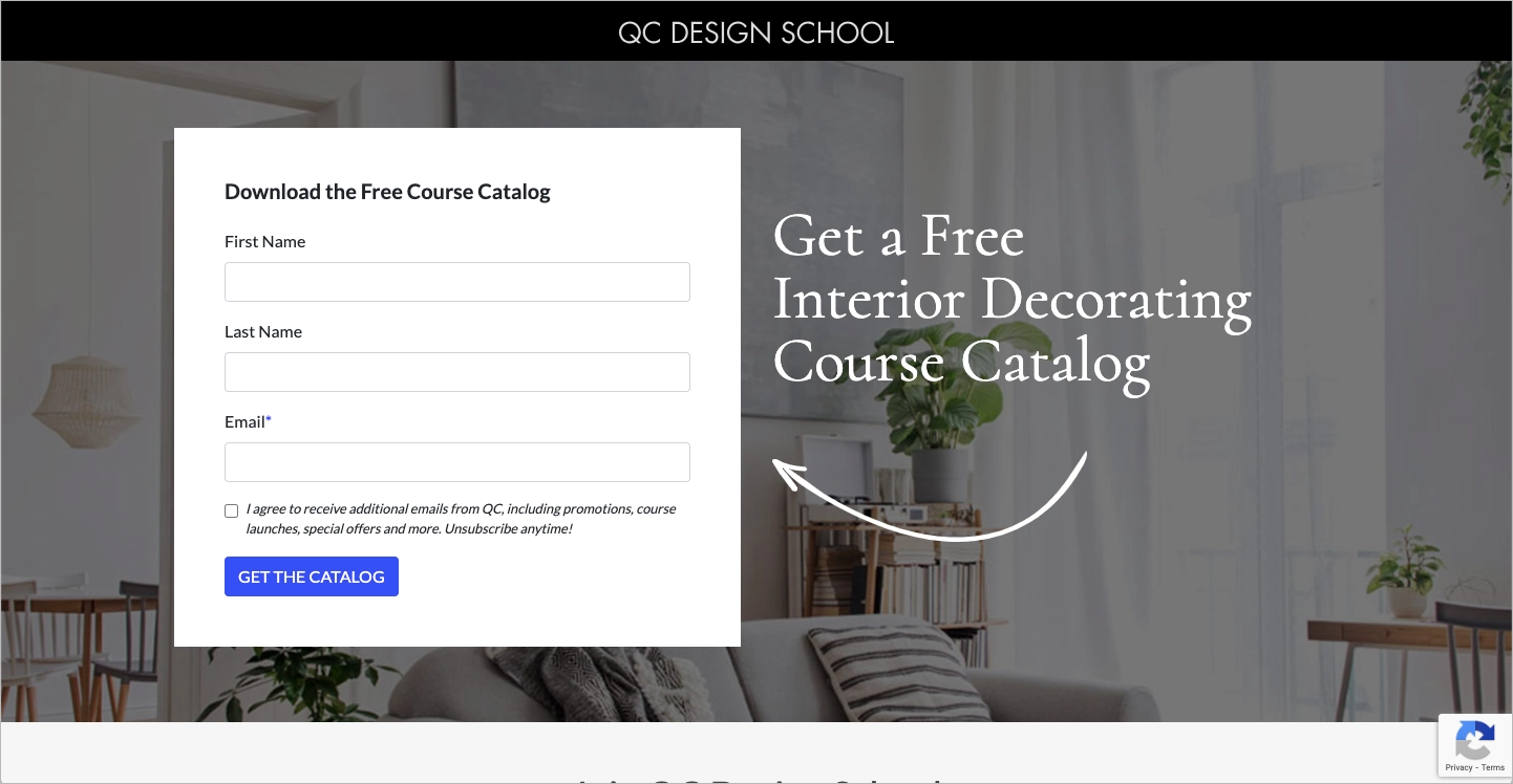
The page effectively uses social proof by including testimonials from satisfied students, showcasing the benefits of the courses and the positive experiences of past attendees. This helps build trust and credibility with potential students. The detailed sections on how the courses work, the certification benefits, and the flexible learning options provide comprehensive information to address any visitor’s queries and concerns. Additionally, the strategic use of images and icons makes the content engaging and easy to understand.
Key takeaways to learn from this example:
- Visually appealing layout: The use of a consistent color scheme creates an inviting and professional look.
- Prominent CTA: The “GET THE CATALOG” button is easily noticeable and encourages immediate action.
- Simple form: Only essential information is requested, making it quick and easy for visitors to sign up.
- Use of social proof: Testimonials from past students help build trust and credibility.
Improvement areas:
- Showing an excerpt: Showing a screenshot of the catalog would further encourage visitors.
5. Motley Fool Auto Insurance
The “Compare Auto Insurance Quotes” page is an example of a PPC (Pay-Per-Click) landing page. This type of landing page is designed to attract visitors who have clicked on an advertisement from search engines and direct them toward a specific action – in this case, comparing auto insurance quotes.
PPC ad:

PPC landing page:

The page opens with a prominent headline that immediately informs the visitor of its purpose: to help them compare auto insurance quotes. This is followed by a clean and simple layout, which is essential for keeping the visitor’s focus on the main call-to-action. The primary CTA button is strategically placed to be highly visible, encouraging users to click through and start comparing quotes. The layout includes trust-building elements such as providers’ logos and testimonials, which help establish credibility and reassure visitors about the legitimacy of the service.
Key takeaways to learn from this example:
- Clear and compelling headline: The headline clearly communicates the benefit of the page, which is to compare auto insurance quotes.
- Strong CTA: The call-to-action button is prominently displayed and likely uses the action-oriented text “Start Quote”.
- Trust elements: The inclusion of recognizable logos increase visitor confidence.
Improvement areas:
- Content personalization: Tailoring the content to different user segments could improve engagement and conversion rates. For example, addressing different types of drivers (e.g., new drivers, families, seniors) with personalized messages could make the page more relevant to a broader audience.
6. Inside-Out Leadership
The landing page for a coaching agency is a well-designed PPC landing page aimed at attracting high-performing entrepreneurs. The primary goal is to convert visitors into leads by offering valuable executive coaching services.
PPC ad:

PPC landing page:

The page features a clean and professional layout, with a strong emphasis on its main offering right from the start. The headline “By entrepreneurs, for entrepreneurs” immediately communicates the value proposition, while the subheading highlights the agency’s mission to help entrepreneurs become extraordinary leaders. The inclusion of a high-quality logo and a clear navigation menu enhances credibility and usability.
Key takeaways to learn from this example:
- Strong value proposition: The headline and subheadline clearly communicate the benefits of the services offered.
- Professional design: The clean layout, quality images, and consistent color scheme create a visually appealing and trustworthy appearance.
- Clear navigation: The navigation menu is straightforward, allowing users to easily find information about the services, coaches, and contact details.
Improvement areas:
- Buttons imitating CTAs: Some buttons that look like the primary CTA lead to different external pages, potentially distracting users from the main goal of the page.
7. Los Angeles Film School
The PPC landing page for the Media Communications degree at The Los Angeles Film School is designed to capture the interest of potential students and drive them toward enrollment. The page features a clean and modern layout that is visually appealing and easy to navigate. The headline immediately captures the visitor’s attention by emphasizing the opportunity to “craft compelling content, connect with the world” with a degree from a well-known institution in Hollywood. This is supported by concise and engaging content that highlights the benefits and opportunities provided by the degree program.
PPC ad:

PPC landing page:

The use of high-quality, modern images and the parallax effect helps to communicate the program’s dynamic and creative nature visually, making the page more engaging and informative. There are no additional links or buttons, aside from the primary CTA, to maintain visitors’ focus on the page’s objective.
Key takeaways to learn from this example:
- Effective use of visuals: High-quality images enhance the page’s appeal and convey the program’s creative environment.
- Clear and compelling headline: The headline quickly communicates the value proposition of the degree program.
Improvement areas:
- Block of text: Icons, bullet points, and dividing the text into more sections could make the text easier to scan.
- Form: Simplifying the form may lead to an increase in conversions.
8. Prose
The Prose custom shampoo PPC landing page is an exemplary model of a product-focused, highly-targeted marketing tool. The page emphasizes personalized haircare solutions, offering visitors a free consultation to determine their unique hair needs. It strategically combines engaging visuals with concise, compelling text to guide users toward customizing their shampoo.
PPC ad:

PPC landing page:

The page features a clean and modern design that aligns with the brand’s identity. It opens with a strong headline and a prominent call-to-action button, encouraging users to start customizing the product. The secondary CTA encourages scheduling a consultation. The use of high-quality images and FAW section helps to build trust and illustrate the effectiveness of the products. Furthermore, the page includes detailed product information and benefits, addressing potential customer concerns and questions upfront.
Key takeaways to learn from this example:
- Personalization focus: Emphasizes custom solutions, making the offer highly relevant to individual users.
- Strong visuals: Uses high-quality images and icons to engage visitors and build trust.
- Effective CTAs: Prominent and clear calls to action guide users toward the desired conversion.
Improvement areas:
- Loading speed: Optimizing scripts and assets could ensure the page loads quickly, enhancing user experience and reducing bounce rates.
9. Northern Trust
The “For Where Wealth Goes Next” landing page by Northern Trust serves as a prime example of a Pay-Per-Click landing page designed to capture the interest of high-net-worth individuals seeking wealth management services. The page is meticulously structured to guide visitors through a seamless experience, starting with a compelling hero section that features an eye-catching headline, “Advice as unique as the world you live in,” supported by a professional background image and a clear call-to-action (CTA) button inviting visitors to “Consult an Advisor.”
PPC ad:

PPC landing page:

The page utilizes various interactive elements to engage visitors, including a carousel showcasing key wealth management services, a featured video emphasizing the importance of modern wealth planning, and a form to collect visitor information for lead generation. The layout is clean and user-friendly, with strategic use of empty space, professional imagery, and consistent branding that aligns with Northern Trust’s high standards.
Key takeaways to learn from this example:
- Compelling headline and CTA: The headline immediately captures attention, and the CTA is strategically placed to encourage user interaction.
- Visual appeal: High-quality images and a professional design enhance the page’s credibility and engagement.
- Lead generation form: The integrated form is used effectively to capture visitor information and convert leads.
Improvement areas:
- Content personalization: Adding more personalized content based on visitor data can improve engagement and conversion rates by addressing specific visitor needs and preferences.
10. Woodard
The PPC landing page for Woodard’s professional carpet cleaning service in St. Louis is designed to capture leads and drive conversions. The page features a clean layout, focusing on the value proposition of their carpet cleaning services. It highlights key services, trust signals, and a clear call to action (CTA) to request an estimate. The page structure ensures visitors can quickly understand the benefits of choosing Woodard for their carpet cleaning needs.
PPC ad:

PPC landing page:

Key strengths of this PPC landing page include its use of high-quality images that align with the service offered, enhancing visual appeal and trustworthiness. The headline is clear and concise, immediately informing visitors of the service provided. Additionally, the CTA is prominently displayed, making it easy for visitors to take the desired action.
Key takeaways to learn from this example:
- Visual appeal: High-quality images and a clean layout enhance the user experience.
- Clear CTA: A prominently placed call to action encourages visitor engagement.
- Trust signals: Testimonials and service guarantees build credibility.
- Detailed service information: Clear descriptions of services help visitors understand what is offered.
Improvement areas:
- Load speed: Optimizing images and scripts to improve the page load speed could enhance user experience and reduce bounce rates.
- Simplifying the form: Removing one or two fields from the form would simplify the process for visitors to complete.
11. Steven Cohen Team
The Steven Cohen Team’s landing page is a quintessential example of a PPC landing page, designed to capture leads and drive conversions in the competitive New York real estate market.
PPC ad:

PPC landing page:
The landing page prominently features high-quality images and a sleek, modern design that aligns with the luxury real estate market. The headline “Steven Cohen Team. Your Award-Winning NYC Real Estate Advisors” immediately establishes the team’s credibility. Key information about their expertise in luxury resales and new developments is presented concisely, reinforcing their authority and attracting potential clients. The call-to-action (CTA) buttons are strategically placed and easy to find, encouraging visitors to see home listings, get in touch, or learn more about their services.
Key takeaways to learn from this example:
- Professional design: The page utilizes a clean, professional design with high-quality images to appeal to the target audience.
- SEO optimization: Meta descriptions and titles are well-crafted to improve search engine visibility.
- Responsive design: The page is designed to be accessible and visually appealing across various devices.
Improvement areas:
- Loading speed: The video background is engaging but its optimization and enhancing the page loading speed could improve user experience and reduce bounce rates.
- Multiple CTA: Multiple call-to-action buttons make it overwhelming for visitors.
12. Filmora
The landing page for the Filmora Video Editor is a prime example of a PPC landing page. It is designed to attract visitors through targeted ads and convert them into users by emphasizing the powerful features of the Filmora software.
PPC ad:

PPC landing page:

The page opens with a strong visual and a headline highlighting Filmora as “The Best Video Editor,” followed by a concise description of its features like drag-and-drop interface and powerful editing tools. The design is sleek and modern, featuring a prominent “Free Download” button for both Windows and Mac users, making the call-to-action (CTA) highly visible and easy to access. Below, the page elaborates on the key functionalities of the software with sections detailing different features like editing, audio, color correction, and effects. Each section includes a brief description, an illustrative video, and additional download buttons, reinforcing the CTA.
Key takeaways to learn from this example:
- Clear and engaging hero section: The headline immediately captures attention and communicates the core benefit.
- Strong visual appeal: High-quality images and videos showcase the product.
- Prominent and repeated CTA: “Free Download” buttons are strategically placed throughout the page.
- Detailed feature highlights: The content gives potential users a comprehensive view of the software’s capabilities.
Improvement areas:
- Enhance loading speed: Optimizing interactive elements for quicker load times, especially when there are many of them, is crucial to enhancing user experience and decreasing bounce rates.
13. TikTok
The PPC landing page for TikTok for Business focuses on attracting businesses to advertise on TikTok. The page prominently features a compelling headline, “Grow your Business with TikTok ads,” which immediately communicates the primary value proposition. This is reinforced by a subheading that highlights the benefits of TikTok Ads Manager, describing it as an all-in-one solution for creating and managing ad campaigns.
PPC ad:

PPC landing page:

The page includes detailed sections explaining how businesses can set their ad budget, choose target audiences, and utilize TikTok’s creative tools to craft engaging ads. There are multiple CTAs, such as “Get Started” and “Register Now,” strategically placed to guide users toward signing up for TikTok Ads Manager. The design employs high-quality visuals and a modern, clean layout that aligns with TikTok’s brand aesthetics.
Key takeaways to learn from this example:
- Clear value proposition: The headline and subheading immediately communicate the benefits of using TikTok Ads Manager.
- Detailed benefits: Sections break down how businesses can leverage TikTok’s tools to achieve their advertising goals.
- Strong CTAs: Prominent call-to-action buttons encourage user engagement and sign-up.
Improvement areas:
- User testimonials: Including testimonials or case studies from businesses that have successfully used TikTok Ads Manager would build credibility and trust.
14. HelloFresh
The HelloFresh PPC landing page is a well-crafted example designed to attract potential customers for their meal kit delivery service. The page is visually engaging with a clean layout that employs high-quality images and vibrant colors to capture visitors’ attention. The headline, “Delicious From Start to Finish” is prominently displayed, immediately informing visitors of the value proposition. The page includes a clear call-to-action button, “Get Started,” which is strategically placed to guide users towards signing up for the service.
PPC ad:

PPC landing page:

The layout is user-friendly, with a clear and intuitive design that guides visitors through the benefits of the offer. Key features such as flexible plans, a variety of recipes, and convenient delivery options are presented in a clean, organized manner, ensuring that potential customers can easily understand the value proposition. The use of vibrant images and concise, benefit-oriented text helps maintain interest and encourages conversions.
Key takeaways to learn from this example:
- Clear value proposition: The headline and subheadline clearly state the service offered and the primary benefit.
- Engaging visuals: High-quality images of meals appeal to the senses and enhance the attractiveness of the service.
- Mobile optimization: Ensures a seamless user experience across devices.
Improvement areas:
- Trust signals: Adding testimonials and reviews could help build credibility and trust.
15. No Kid Hungry
The “Donate Today” page is a great example of a PPC landing page designed for the No Kid Hungry campaign. The primary goal of this page is to convert visitors into donors through a straightforward and persuasive user experience.
PPC ad:

PPC landing page:

The page opens with a clear, compelling message, “Hunger hurts every day. Your donation helps feed them.” This immediately conveys the urgency and importance of the cause. The use of a supportive image reinforces the emotional appeal. The donation form is prominently positioned on the page, making it easy for visitors to take action without scrolling. The form includes options for different donation amounts and frequencies, allowing donors to choose what suits them best.
Key takeaways to learn from this example:
- Emotional appeal: Use of powerful images and concise, emotionally charged text to motivate visitors.
- Simple navigation: A straightforward layout that guides users directly to the donation form.
- Trust indicators: Secure transaction icons and references to organizational credibility enhance donor confidence.
Improvement areas:
- Social proof and testimonials: Adding testimonials or social proof elements, such as donor comments or impact statistics, could enhance trust and encourage more donations.
5 PPC Landing Page Template Examples
Templates for effective PPC landing pages are crucial for converting ad clicks into actionable leads. This section outlines five exemplary PPC landing page templates tailored for various campaign goals, ranging from local offers to service ordering and upcoming product launches. Each template, provided by Landingi and available for free, includes essential sections like hero shots, value propositions, and forms, which can be customized to fit specific needs. By combining PPC efforts with these targeted landing pages, businesses can enhance their online presence, drive more targeted traffic, and increase conversion rates through tailored, visually appealing, and informative landing pages.
1. Local offer landing page template
Running PPC campaigns for local services can be highly effective when properly managed and accompanied by a relevant landing page. Prepare an offer tailored to the local community and promote your offer through social media channels, local forums, and email marketing to ensure a wider reach within the community. Additionally, leveraging local SEO strategies alongside your PPC efforts can significantly enhance visibility and drive more targeted traffic to your landing page.
Sections include:
- Hero shot with a compelling headline
- Value proposition
- “About us”
- Form
Adjust the template’s visuals and copy to create a place where your potential customers can land after clicking a search ad. This template is free in all Landingi plans, including the Free plan and free trial.
2. Specialist landing page template
Stand out in your industry with paid advertising, guiding interested parties to a matching landing page showcasing your value proposition. To do this, utilize the Financial Specialist template, which includes all the necessary sections to direct visitors to complete a form.
Sections include:
- Hero section
- Primary and secondary CTAs
- Benefits
- Value proposition
- Social proof
- “About me”
- Steps
- Contact form
Add your photos and content, customize colors, and feel free to add or remove sections to create a perfect space for your online presence. This template is free to use in all Landingi’s plans.
3. Discount coupon landing page template
Using a discount coupon is a highly effective way to attract potential customers, especially in remarketing campaigns. Pairing this offer with a specific landing page that persuades those who are still uncertain about your product’s unique qualities is beneficial.
Sections include:
- Hero section with a simple form
- Benefits
- Value proposition
- Product descriptions
- Repeated form
Customize the Electronics Discount landing page template by adding product photos, your content, and changing colors or fonts. This template is available for free on Landingi, including the Free plan and trial period.
4. Service ordering landing page template
Combine your PPC ad with a landing page that expands on its content and the promise you made in a short text in a search engine or a banner on a page. Ensure clear graphics and compelling copy.
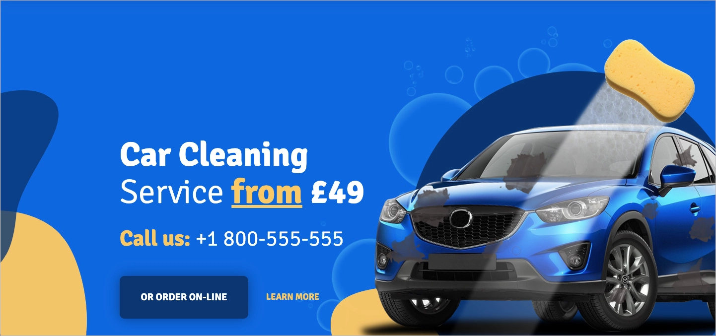
Sections include:
- Compelling hero shot
- Offer overview
- Value proposition
- Pricing
- Testimonials
- Form
You can customize the free Cleaning Services template for various services by adding your own graphics, modifying headings and descriptions, incorporating a price list, and integrating the form with your CRM or email marketing system.
5. Coming soon landing page template
Announcing the launch of a product through campaigns would have little impact without relevant landing pages to which ads direct users. These pages provide an opportunity to highlight the uniqueness of your offer and create a sense of urgency to encourage users to join a waiting list.
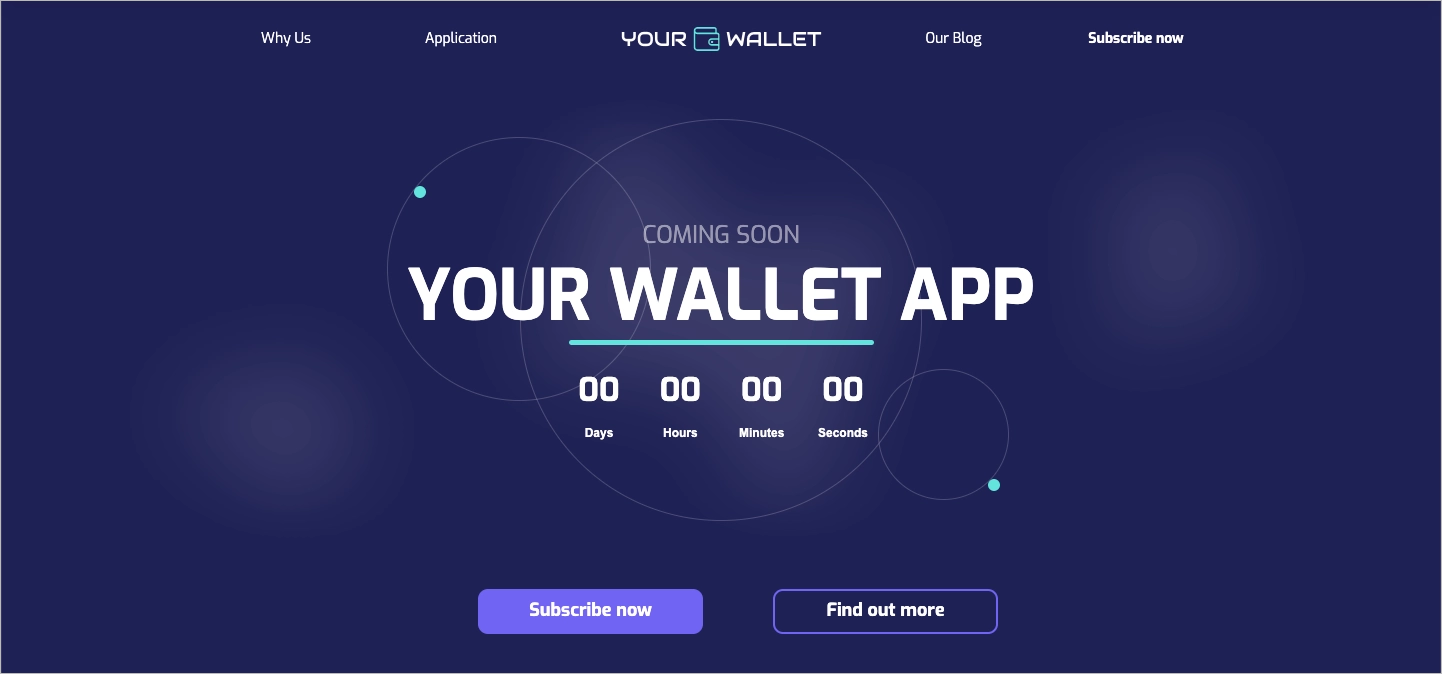
Sections include:
- Headline supported by the time counter
- Visuals
- Description
- Value proposition
- “Read more”
- One-field form
Use the Money App landing page template in the Landingi editor to create buzz for an upcoming product or service. You can customize the design and content for free in the Free plan or during the trial period.
What is The Best PPC Landing Page Builder?
The best PPC landing page builder is Landingi. It excels in the PPC environment because of its user-friendly interface, customizable templates, dynamic content replacement feature, 180+ integrations, A/B testing capabilities, and a built-in tracking tool.
Here’s why Landingi stands out for PPC campaigns:
- User-Friendly Interface: Intuitive drag-and-drop editor makes it easy to create and customize landing pages without needing technical skills. This allows you to quickly adapt and optimize pages for different PPC campaigns.
- 400+ Templates: Landingi provides a wide range of fully customizable templates. They are optimized for conversions and can be easily tailored to match the ad copy and keywords, ensuring consistency and relevancy.
- Dynamic Content Replacement: With Landingi, you can use dynamic content replacement to personalize landing page content based on the visitor’s search query or the ad they clicked on. This feature enhances relevancy and improves conversion rates.
- Integration with PPC Platforms: Landingi integrates with major PPC platforms like Google Ads and Facebook Ads, allowing for easy tracking and optimization of your campaigns. You can monitor performance metrics and make real-time adjustments to improve results.
- A/B Testing Capabilities: Landingi includes A/B testing tool, enabling you to test different headlines, images, CTAs, and other elements. This helps you identify the most effective variations and optimize your landing pages for better performance.
- Mobile Optimization: Landingi templates are designed to be responsive so that your landing pages will both display and function optimally across all devices. While a mobile version of your landing page is generated automatically, you have full control over its final appearance using the mobile view editor. This level of control is essential for PPC campaigns, especially since a significant amount of traffic comes from mobile users.
- Analytics: Landingi provides statistics and reporting features that enable you to monitor conversion rates. The built-in EventTracker tool allows you to gather data on all events occurring on your landing page such as scroll depth, button clicks, and video plays. These insights are valuable for making data-driven decisions and optimizing your PPC campaigns.
- Lead Management and CRM Integration: Landingi supports lead management and integrates with various CRM systems. This ensures that leads captured through your PPC landing pages are automatically synced with your sales and marketing workflows.
Other great tools for building PPC landing pages include:
- Unbounce: Known for its easy-to-use drag-and-drop builder, A/B testing features, and a variety of templates.
- Instapage: Offers advanced personalization and conversion rate optimization (CRO) tools.
- Leadpages: Provides numerous templates and integrates well with other marketing tools.
- ClickFunnels: Ideal for creating sales funnels with a focus on conversion.
How Can I Optimize My PPC Landing Page For Higher Conversion Rates?
To optimize your PPC landing page for higher conversion rates, start by making sure that the content of the landing page closely matches the message and keywords of your PPC ad. This alignment will make the page more relevant to visitors, increasing the likelihood of conversion.
Focus on improving page load speed, as faster pages reduce bounce rates and keep potential customers engaged. According to Portent’s study, the first four seconds of loading time have the most significant impact on conversion rates. The highest e-commerce conversion rates happen between 1 and 2 seconds, with an average of 3.05% at 1 second and 0.67% at 4 seconds. Beyond 4 seconds, conversion rates drop below 2%.
Use clear and compelling headlines that attract attention and quickly communicate the value proposition. Keep your copy short and sweet to improve conversion rates. According to a report published on Medium, landing pages with too much text convert at 11.10% on average, while those with a smaller word count have 14.30% conversion rates.
Simplify your forms by requesting only essential information, which reduces friction and increases the likelihood of completion. Strong visuals, including high-quality images and videos, can effectively engage visitors and support your message.
Continuous A/B testing of different elements, such as headlines, images, and CTAs, is crucial for identifying the most effective combinations and making data-driven improvements. Finally, set up comprehensive analytics to track performance metrics like click-through rates, conversion rates, and cost per conversion. Utilize these insights to continuously refine and optimize your landing page.
What Are The Key Elements of an Effective PPC Landing Page?
The most important elements of an effective PPC landing page are headlines, subheadlines, copy, CTA, visuals, form, trust signals, and mobile optimization. The 8 key elements to consider are as follows:
- Headline: The headline should be directly related to the ad content and should clearly convey the main message or offer.
- Subheadline: The subheadline should provide additional information or incentive to the visitor, encouraging them to continue reading or take action.
- Copy: The copy should focus on highlighting the benefits and value of the product or service to the visitor, addressing their needs and pain points.
- Call-to-Action (CTA): The call-to-action should be clear, compelling, and easy to locate, prompting the visitor to take the desired action, such as making a purchase or signing up.
- Visuals: The page should include high-quality images or videos that support the message, engage the visitor, and enhance the overall user experience.
- Form: If a form is included for lead capture, it should have minimal fields to reduce friction and make it easier for visitors to provide their information.
- Trust Signals: Incorporating reviews, testimonials, and security badges can help build credibility and trust with the visitor, increasing the likelihood of conversion.
- Mobile Optimization: The PPC landing page should be optimized to ensure it looks good and functions well on all devices, providing a seamless experience for mobile users.
What is The PPC Landing Page Builder?
A PPC landing page builder is a tool designed to help you create and optimize landing pages specifically for PPC campaigns. These tools offer features like drag-and-drop editors, templates, A/B testing, and analytics to help you create effective landing pages without needing extensive design or coding skills.
What Are The PPC Landing Page Best Practices?
The best practices for PPC landing pages include:
- Consistency: Ensure your landing page message aligns with your ad copy.
- Simplicity: Keep the design clean and focused on the goal.
- Relevance: Make sure the content is relevant to the visitor’s needs.
- Mobile Optimization: Ensure the page is mobile-friendly.
- Fast Loading: Optimize for quick load times.
- Strong CTAs: Use clear and compelling calls-to-action.
- Trust Signals: Include social proof and security badges.
- Regular Testing: Continuously test and optimize your landing page elements.
What is The Average PPC Landing Page Conversion Rate?
The average conversion rate for PPC landing pages across different industries varies, but it generally stands at 2.35%, according to a report by Adam Heitzman for HigherVisibility. Furthermore, the top 10% of landing pages achieve a conversion rate of 11.45% or higher.
Another study, conducted by Dragos Voicila for Voog, indicates that across all industries, landing pages maintain an average conversion rate of 5.89%. The industries with the highest CR are catering & restaurants, media & entertainment, finance & insurance, and legal. On the other hand, industries such as medical services, real estate, and home improvement have the lowest conversion rates.
To benchmark your performance, consider your specific industry and continuously test and optimize your pages.
Build Landing Pages For Your PPC Business With Landingi
And there you have it – a comprehensive walkthrough of PPC best practices and 15 excellent examples to go along with it. Now it’s time to make your own PPC landing pages.
For that, consider using Landingi! With its user-friendly drag-and-drop editor and a vast library of over 400 customizable templates, Landingi allows you to quickly create landing pages that are perfectly aligned with your PPC ad content. This ensures that your landing pages not only look professional but are also optimized for relevance, helping to improve your Quality Score and lower your cost per click.
Moreover, Landingi’s advanced features, like dynamic content replacement and A/B testing capabilities, make it an invaluable asset for any digital marketer. These tools enable you to personalize your landing page content based on visitor data, continuously optimize your pages for better performance, and easily track key metrics to make data-driven decisions. Use Landingi to ensure that your PPC campaigns are not only attracting clicks but also converting visitors into leads and customers, ultimately driving your business’s success.


