A landing page should not try to do everything at once. The best ones are built around one audience, one offer, and one primary action.
That is what makes them effective.
If you want to create a landing page quickly without ending up with something generic, cluttered, or hard to optimize, this guide will help. Below, you will learn how to plan the page, what elements matter most, and what to avoid if your goal is more leads, sign-ups, sales, or demo requests.

14 Steps to Create a Landing Page That Converts
Creating a landing page becomes manageable when you break it into clear stages. Here is the process:
- Start with a clear goal
- Choose a landing page builder that fits your workflow
- Define your audience and traffic intent
- Pick the right page type or template
- Write a headline that makes the value clear
- Create copy that supports action
- Add a strong call to action
- Build a form that reduces friction
- Use visuals that strengthen the offer
- Keep the layout simple and focused
- Add proof that builds trust
- Make the mobile experience seamless
- Connect your domain and publish properly
- Test, measure, and improve
You do not need to perfect everything before the landing page launch, but you do need a strong foundation. If the goal, message, and structure are unclear, no design tweak or A/B test will fix the page.
In practice, the first four steps shape relevance, the middle steps shape clarity and persuasion, and the final steps determine whether the page is ready to perform and improve over time.
Let’s start with the first and most important step of creating landing pages.
1. Start with a clear goal
Before you choose a template or write any copy, decide what the landing page should achieve.
Every landing page should have one primary goal. That goal shapes the message, CTA, form, layout, and overall structure of the landing page. An undefined landing page goal leads to an unclear message and lower conversion rates.
Define the goal by answering a specific question: What action should the landing page visitor take?
Common landing page goals include:
- generating leads,
- booking demos or consultations,
- driving product sales,
- collecting webinar registrations,
- growing a newsletter list,
- promoting a free trial,
- encouraging resource downloads,
- creating new user accounts.
The key is to choose one main action. A landing page should not ask users to do several different things at once. Too many options create friction and weaken conversions.
A landing page goal should also be measurable. That means tracking a specific action, such as:
- form submission,
- button click,
- purchase,
- booked meeting,
- sign-up,
- resource download.
It is also important to match the goal to the traffic source. A landing page for a free guide should align with ad messaging that promotes a free guide. A landing page for a product demo should align with retargeting campaigns that promote a product demo. The message and CTA should feel consistent from click to conversion.
Use a simple validation rule to check landing page clarity:
A landing page visitor should understand three elements within a few seconds:
- the landing page offer,
- the target audience for the offer,
- the next step required from the visitor.
If any of these elements is unclear, fix the page goal and message before moving on.
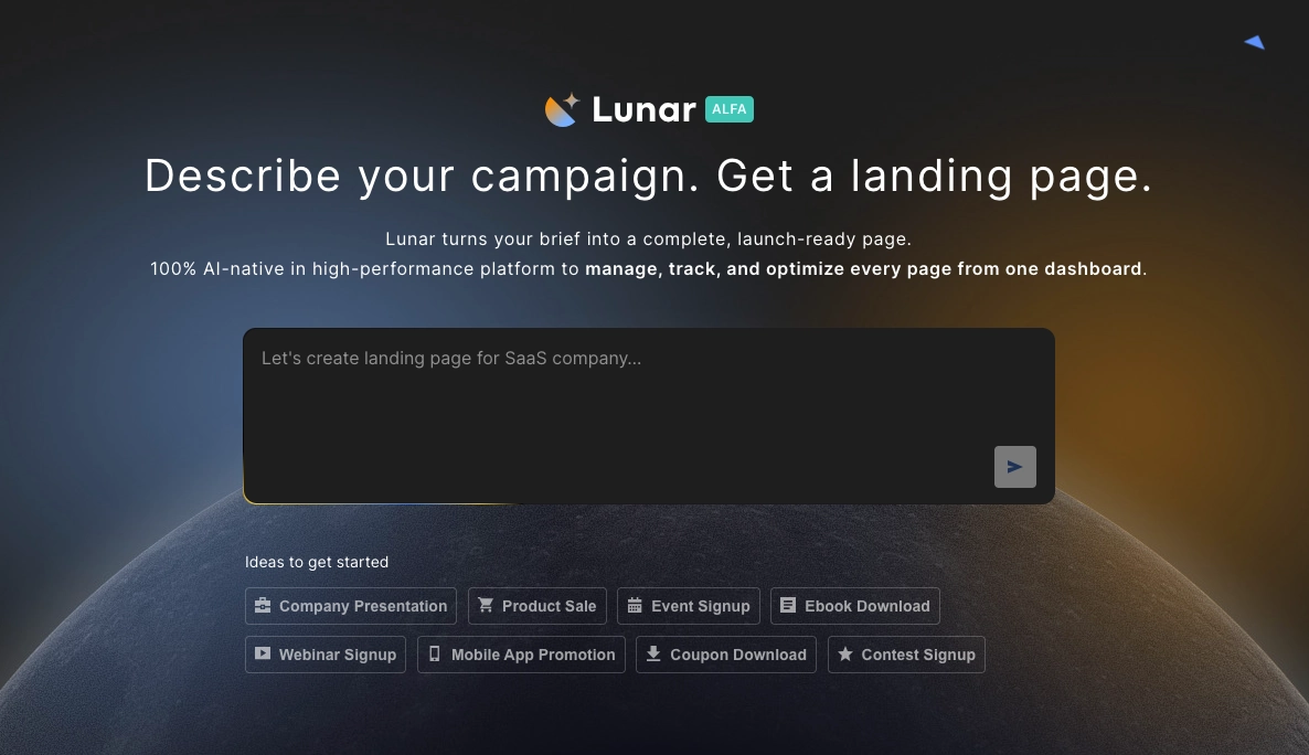
If you already know your campaign goal, you do not have to start from scratch. With Lunar, Landingi’s AI landing page generator, you can simply describe your offer and campaign objective to get a landing page built around it.
What usually comes next depends on the goal: lead generation pages typically require stronger forms and trust elements, while sales or trial pages usually need sharper proof, clearer objection handling, and stronger message match with traffic sources.
2. Choose a landing page builder that fits your workflow
Once your goal is clear, choose a landing page builder that supports the way you work on your campaigns.
Most landing page tools offer the basics: a drag-and-drop editor, ready-made templates, forms, and publishing options. What matters is how well those features match your workflow, technical skills, and campaign requirements. Landingi, for example, combines standard landing page builder features with built-in tools for A/B testing, optimization, and campaign scaling.
A good landing page builder should help you create pages quickly, publish them without technical hassle, improve results over time, and scale your actions when needed.
Evaluate a landing page builder based on the availability of features such as:
- a user-friendly lading page editor,
- mobile-responsive templates,
- customizable forms and sections,
- built-in analytics and A/B testing,
- integrations with marketing and sales tools,
- fast, reliable hosting,
- SEO settings and performance optimization,
- AI-powered enhancements.
A landing page builder should also support long-term scaling. You may be creating one landing page today, but later you might need multiple campaign pages, localized versions, or reusable sections for faster work. With features like Smart Sections, Programmatic Landing Pages, EventTracker, page duplication, and multi-language pages, Landingi makes that transition much easier.
Choose a tool that makes both landing page launching and optimizing easier. A landing page builder focused only on design limits long-term campaign performance.

Pro tip: Before choosing a landing page platform, check recent user reviews on sites like G2 or GetApp. They often reveal practical strengths and limitations that product pages do not show.
If speed of launch is your main priority, focus on editor simplicity and templates first. If long-term performance matters more, prioritize testing, analytics, and scaling features from the beginning.
3. Define your target audience and traffic intent
Before you build your landing page, define the target audience for the landing page and the intent behind the traffic source.
A landing page performs best when it speaks to one audience segment with one clear intent. If the message is too broad, the page usually feels generic and converts worse.
Define the target audience by answering three specific questions:
- What does this audience want?
- What problem are they trying to solve?
- What might stop them from taking action?
The answers to these questions should shape the landing page headline, CTA, proof elements, and overall landing page structure.
Apply the following rules when aligning a landing page with a target audience:
- If the audience already knows your product, keep the landing page copy shorter and move faster to the CTA.
- If the audience is unfamiliar with your brand, explain the offer earlier and add more proof.
- If the action requires commitment, such as booking a demo, reduce doubt with testimonials, client logos, or clear process details.
- If the traffic comes from ads, match the landing page language to the ad message as closely as possible.
- If the audience is comparing options, show what makes your offer different before asking for action.
Good audience research should help you answer practical questions like:
- What outcome is this visitor looking for?
- What objection are they likely to have first?
- How much context do they need before they click?
- What kind of proof will feel credible to them?
Precise audience definition makes it easier to build a landing page that feels relevant to a specific audience segment. A clearly defined target audience reduces generic messaging and improves landing page conversion performance.
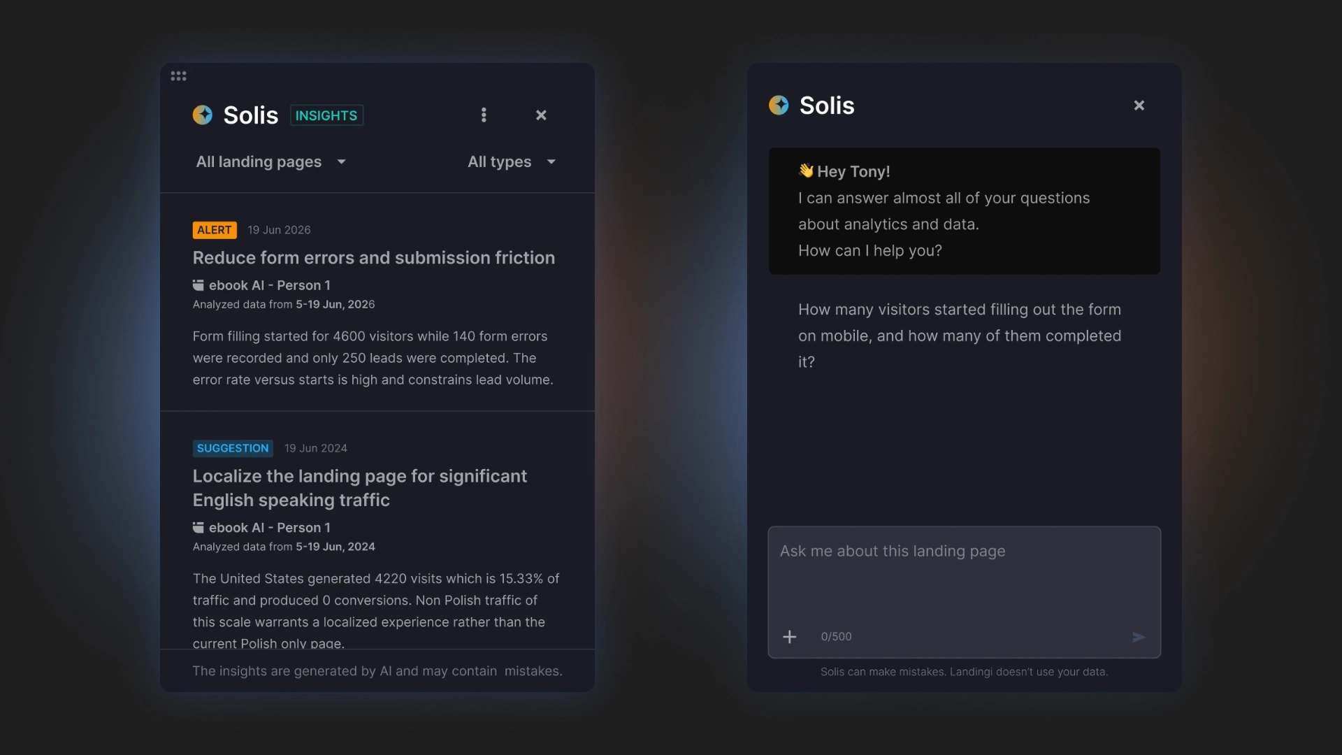
Once you know who the page is for, the next step is improving how well it speaks to that audience. Solis, Landingi’s AI optimization tool, analyzes landing page context, performance data, and user behavior to deliver recommendations that help you improve clarity, relevance, and conversions.
This step determines almost everything that follows: headline angle, CTA wording, proof type, page length, and how much explanation the visitor needs before acting.
4. Pick the right landing page type or template
Choose a template that matches both your landing page goal and your traffic source.
Different landing page goals require different landing page structures. A webinar registration landing page requires a different structure than a product landing page, a lead generation landing page, or a click-through landing page. If the template does not fit the offer, you will spend more time fixing the layout than building the page.
Use a template that already supports the action you want page visitors to take.
Here are simple rules when selecting a landing page template:
- Use a short landing page template for simple offers, low-friction sign-ups, or newsletter pages.
- Use a longer landing page template when the offer needs more explanation, proof, or objection handling.
- Use a sales-focused landing page template when the goal is purchase.
- Use a lead gen landing page template when the goal is form submission.
- Use an event landing page template when visitors need practical details before registering.
Before you choose, verify whether the landing page template includes space for key conversion elements, such as:
- a strong hero section,
- benefit-focused copy,
- a visible CTA,
- a form or signup section,
- trust elements,
- FAQs or objection-handling sections.
Do not choose a template just because it looks modern. A good landing page template should support clarity and conversion, not just appearance.
The most effective landing page template provides a strong structural foundation and minimizes the need for additional layout changes.
In Landingi, you can choose from over 400 templates designed for the following industries: advertising & marketing, software & technology, finance, education, pharmacy, health & beauty, e-commerce, travel, consulting & coaching, automotive, hotel & restaurant, real estate, architecture & design, home & garden, games & entertainment.

A landing page template should accelerate structure, not replace strategy. If the page still feels unclear after choosing a template, the issue is usually the message, not the layout.
5. Write a headline that makes the value clear
Your headline should tell visitors what the landing page offer is and why it matters.
A page headline is usually the first element people see. The first impression depends on how quickly the landing page headline communicates value. Clear language performs better than creative or ambiguous wording.
A strong landing page headline should achieve at least one of the following goals:
- promise a specific outcome,
- highlight a clear benefit,
- explain what the product, service, or offer enables the landing page visitor to achieve.
Use these rules when writing landing page headlines:
- If the landing page offer is simple, keep the headline short and direct.
- If the offer is less familiar, make the headline more explanatory.
- If the landing page traffic comes from ads, repeat the same core message that users clicked on.
A good headline should answer one question immediately: Why should I care about this page?
If the answer is vague, generic, or delayed until lower on the page, the headline needs work.
Support the headline with a short subheadline that adds context, reduces doubt, or makes the value more specific. Together, these two elements should help the landing page visitor understand the offer within seconds.
Avoid landing page headlines that are:
- too abstract,
- packed with buzzwords,
- focused on the brand instead of the page visitor,
- unclear about the outcome or benefit.
The best landing page headlines are easy to understand on the first read.
Here is an example of a landing page by SEO PowerSuite that highlights the versatility of an SEO tool through a clear and benefit-focused headline:

Pro tip: If your headline feels too generic or unclear, use Landingi’s AI Assistant to generate new copy or regenerate existing text based on your campaign goal and target audience. It is a simple way to create stronger, more relevant messaging faster.
Once the headline is clear, the next priority is making sure the supporting copy and CTA continue the same promise without introducing new confusion.
6. Create copy that supports action
Landing page copy should explain the landing page offer and prepare the landing page visitor to take a specific action.
Keep page content clear, specific, and focused on what the user gets. Do not try to explain everything. Include only the information that helps the visitor make the next decision.
Strong landing page copy usually does three things: explains the value of the offer, shows how it solves a real problem, and reduces hesitation before the CTA.
Use the following rules when creating landing page copy:
- Lead with benefits, then support them with details.
- Keep paragraphs short and easy to scan.
- Use plain language instead of buzzwords or filler phrases.
- Address potential objections before the landing page visitor reaches the CTA.
Good landing page copy should clearly communicate the following elements:
- the landing page offer,
- the target audience for the offer,
- the practical value of the offer,
- the differentiating factors of the offer,
- the next step required from the visitor.
If the landing page feels vague, add specificity to the text. If it feels too heavy, cut anything that does not support the conversion goal.
You can also use bullets to make important benefits easier to scan, especially in sections near the top of the page or close to the CTA. Bullet points help the landing page visitor scan information faster and identify relevant value.
The best landing page copy is not long or short by default. It is only as detailed as the offer needs.
Cybrary, a cybersecurity training company, provides a strong example of landing page copy that focuses on clear value, practical benefits, and action-oriented structure:

In practice, landing page copy length should follow decision difficulty: the more doubt, cost, or commitment involved, the more context and proof the page usually needs before the CTA.
7. Add a strong call-to-action
A call-to-action (CTA) on a landing page should clearly define the next step for the landing page visitor.
A good CTA tells visitors exactly what will happen after they click. It should be visible, easy to understand, and directly connected to the landing page offer.
Use short, action-oriented CTA phrases such as:
- Start free trial
- Book a demo
- Download the guide
- Get pricing
- Reserve your spot
Generic button labels like Submit or Click here do not communicate value. A generic CTA label forces the landing page visitor to guess the outcome of the action, which lowers conversion rates.
Use these rules when crafting a CTA:
- If the landing page has one goal, use one primary CTA.
- If the landing page is long, repeat the same CTA in key sections.
- If the offer feels high-commitment, reduce friction near the button with short reassurance, such as “No credit card required” or “Takes less than a minute.”
A CTA should also stand out visually, but clarity matters more than design tricks. A button works best when the surrounding landing page copy already makes the action feel logical.
Before publishing a landing page, evaluate the CTA using a single validation question: What do I get if I click?
If that answer is weak or unclear, improve the call-to-action wording before testing colors or button size.
Intruder, a company offering vulnerability detection software, demonstrates how to create CTA perfectly:

Pro tip: Avoid placing multiple CTAs close together – this only creates confusion for your visitors. Instead, focus on a single, clear action for each section of your page. This focused approach guides users to action.
If the landing page CTA feels weak, the problem is often not the button itself, but the clarity of the offer or the amount of hesitation left unresolved before the click.
8. Build a form that reduces friction
If your landing page is meant to collect leads, your form should feel quick and easy to complete.
In a landing page form, ask only for the information you actually need at the current stage of the funnel. Every extra field adds friction, especially for landing page visitors who are still deciding whether to trust your offer.
Use the following rules when building a landing page form:
- If the offer is low-commitment, keep the form short.
- If the lead needs qualification, ask for more details only if they will help sales follow up better.
- If one long form feels too heavy, consider a multi-step landing page form to distribute the effort across steps.
In most cases, a landing page form should collect basic contact details, such as:
- name,
- email address,
- company name,
- phone number, if it is truly necessary.
Place the form where visitors can find it without effort. For lead gen pages, the form is often positioned near the top of the page or close to the primary CTA to reduce the effort required to find it.
A good form should answer two questions immediately: How much work will this take? What do I get after I submit it?
If either answer feels unclear, the form will create hesitation.
You can also reduce friction by adding short reassurance near the landing page form, such as privacy information, response time, or a simple note explaining what happens next.
Below is a perfect form example from Mavlers:

If the landing page form does not convert, review not only the number of fields, but also the perceived value of the offer, the timing of the ask, and the amount of trust built before the form appears.
9. Use visuals that strengthen the offer
Landing page visuals should help visitors understand the offer faster, not just make the page look better.
Choose images, screenshots, videos, or illustrations that clarify what you are selling, show how it works, or make the outcome feel more real. If a visual does not support the landing page message, it is probably unnecessary.
Use the following rules when selecting landing page visuals:
- Use product screenshots when the product itself is the selling point.
- Use real-life images when trust, emotion, or lifestyle fit matters more.
- Use video only if it explains the offer faster than text.
- Avoid decorative visuals that compete with the CTA or reduce page performance.
Effective landing page visuals usually do one of three things: show the product, support the promise, or guide attention to the next step (such as the CTA).
Images should also feel consistent with the brand and the rest of the page. A mix of unrelated styles, stock-heavy imagery, or oversized assets can make the landing page feel less credible.
Before publishing your landing page, check two things: Does this visual make the offer clearer? Does it help the page load fast enough?
If a visual element does not improve understanding, remove the visual element. If a visual element slows down page performance, optimize the file size or format.
Look at the stunning visual storytelling in LTX Studio’s landing page background below for inspiration:

When in doubt, choose the visual that explains the landing apge offer faster or makes the outcome easier to imagine, not the one that simply looks more polished.
10. Keep the layout simple and focused
A landing page layout should guide attention toward the primary goal and support fast decision-making for the page visitor. A well-structured page layout should makes it easy to understand the offer, scan the key points, and find the CTA without effort. When too many elements fight for attention, landing page visitors slow down or leave.
Use the following rules when designing a landing page layout:
- Give each landing section one job.
- Keep the visual hierarchy clear.
- Remove any element that does not support the main action.
- Use spacing to separate ideas and make the page easier to scan.
A focused landing page layout typically includes:
- a clear hero section,
- a visible CTA,
- short content blocks,
- consistent headings,
- enough white space,
- a logical order of information.
Avoid adding navigation menus, secondary links, or unrelated messages unless these elements directly support the landing page goal. Additional elements introduce distractions and reduce focus. A focused landing page layout makes it easier for the landing page visitor to take action.
Before publishing your page, ask: Is the most important information visible first? Can a visitor understand the page structure in seconds? Does every section support the same goal?
If not, simplify the landing page layout before changing the design details.
Take a look at how Nextiva designs their page effectively:
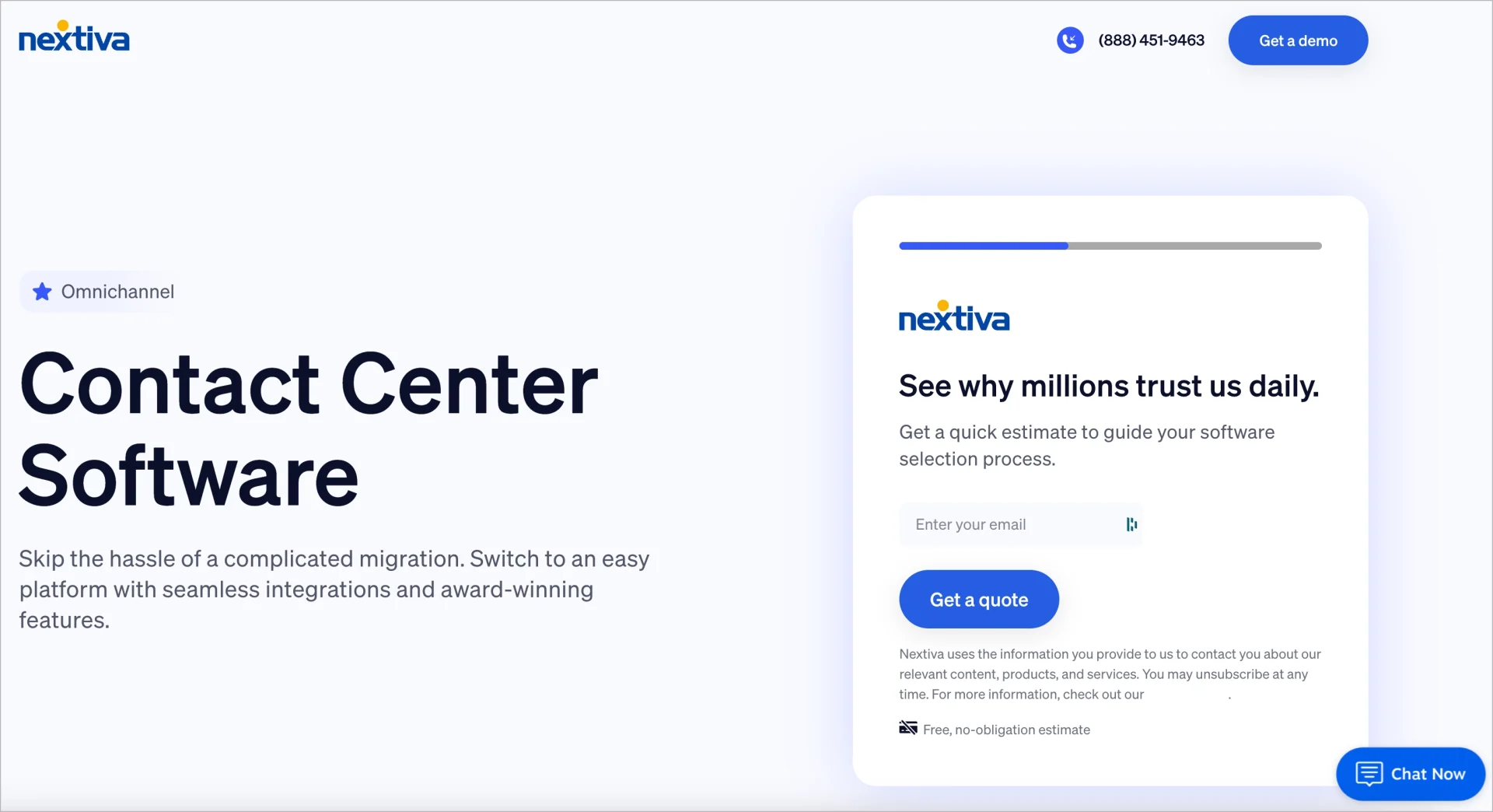
If the landing page structure looks clean but conversions are still weak, the issue is more likely to be message clarity, proof quality, or traffic mismatch than layout alone.
11. Add proof that builds trust
Social proof helps landing page visitors feel that your offer is credible and worth trusting.
A landing page visitor who does not recognize the brand will look for evidence that other users have already selected the offer, used the product or service, and achieved results. Strong proof elements reduce hesitation and support conversion decisions.
Use the following rules when adding proof to a landing page:
- Use customer testimonials when visitors need reassurance.
- Use client logos when brand recognition adds trust.
- Use numbers only when they are specific and believable.
- Place proof close to decision points, especially near the CTA, pricing, or form.
Good social proof can include:
- customer testimonials,
- review scores,
- client logos,
- short case study results,
- user numbers,
- trust badges or certifications.
The most effective proof elements are specific and contextual. A short testimonial with a name, role, or company usually works better than a vague quote. The same applies to numbers. “Trusted by 10,000+ users” is stronger when it feels real and relevant to the offer.
Before publishing your landing page, ask: Does this proof reduce doubt? Does it feel credible for this audience? Is it placed where users need reassurance most?
If a proof element does not meet these conditions, improve its quality and placement rather than increasing its quantity.
Check out the example of perfectly executed social proof on the Smartsapp landing page:

Different proof works for different situations: testimonials help with trust, client logos help with recognition, and concrete results help when visitors are actively comparing options.
12. Make the mobile experience seamless
Your landing page should work just as well on a phone as it does on a desktop.
A mobile-friendly landing page is not only about responsive design. It should also be easy to read, easy to navigate, and easy to act on with one hand and limited attention. Mobile usability directly affects conversion rates, especially for traffic coming from mobile ads or social media platforms.
Use the following rules to optimize a mobile landing page experience:
- Keep the most important landing page message visible early.
- Make CTA buttons easy to tap.
- Use short sections and readable text.
- Check that forms, pop-ups, and sticky elements do not block the main action.
On mobile, landing page visitors often scan faster and have less patience. That means the page needs to communicate value quickly and remove anything that slows down interaction.
Before publishing your page, check: Is the headline still clear on a small screen? Is the CTA visible without friction? Does the page load fast enough on mobile? Can users complete the form easily?
If the mobile version of the landing page feels crowded, slow, or difficult to use, simplify the layout and content before launch.
Landingi provides a mobile view editing mode that allows direct adjustment of layout and elements for mobile devices:

If mobile traffic is dominant for your landing page, mobile clarity should be treated as a starting point, not a final check before launch.
13. Connect your domain and publish
Before you publish, make sure the landing page is configured correctly and ready to function in a live environment.
Most landing page builders, including Landingi, handle hosting for you, so you do not need a separate website to launch a page. What matters most is publishing the landing page on a clean URL, connecting tracking, and checking that everything works after launch.
A domain is your unique web address – in this case, a specific landing page URL (like www.yourbrand.com). It gives your page a professional appearance and makes it easier for users to remember and trust your brand.
When connecting your domain and publishing a landing page, use these rules:
- Use a custom domain when brand trust is important for conversion.
- Keep the landing page URL short and easy to understand.
- Publish only after the form, CTA, and thank-you flow have been tested.
- Make sure analytics and conversion tracking are active before directing traffic to the landing page.
Before publishing a landing page, verify the following elements:
- Is the landing page connected to the right domain or subdomain?
- Does the CTA lead to the correct next step?
- Does the form submit properly?
- Is the thank-you page or confirmation message in place?
- Are your analytics tools and pixels working?
Publishing is not just the moment the landing page goes live. It is the point where design, tracking, and user flow need to work together.
A landing page that appears complete but lacks tracking or contains a broken follow-up step is not ready for publication.
Launch a page you can trust. Design, connect, and publish – without missing a step.
Landing page publishing is not the finish line. It is the moment when assumptions start meeting real user behavior, which is why tracking and post-launch review matter just as much as the build itself.
14. Test, measure, and improve your landing page
A landing page requires continuous optimization after publication.
Once your page is live, start tracking how people interact with it and look for points where they lose interest, hesitate, or drop off. Data-driven testing helps you improve landing page performance based on real behavior, not assumptions. Landingi supports this process through A/B testing, EventTracker for user behavior tracking, and Solis for AI-based recommendations based on landing page context, results, and visitor actions.
Use the following rules to get the highest conversion rate possible:
- Test one meaningful change at a time to isolate the impact of each modification.
- Start with elements that shape the decision first, such as the headline, CTA, form, or hero section.
- Use data to guide changes, not personal preference.
- Keep improving the landing page after it goes live.
Common starting points for landing page testing include:
- headline wording,
- CTA copy,
- form length,
- hero image or video,
- proof placement,
- landing page section order.
Not every page needs constant experimentation, but every page benefits from regular evaluation. Even small, targeted changes can improve clarity and conversion if they solve the right problem.
Before changing anything on your landing page, ask: Where are users dropping off? What part of the page feels unclear or weak? What single change is most likely to improve action?
Effective landing page testing requires a clear objective. Focus on elements that have the strongest impact on user decisions instead of making random adjustments.
The goal is not to test everything, but to identify the next most meaningful improvement based on where landing page users hesitate, disengage, or drop off.
Frequently Asked Questions (FAQ)
Below, you’ll find answers to common questions about landing page creation, optimization, and best practices. These questions also reflect the most common next-step decisions people face after planning or launching a page.
Where can I find landing page templates?
You can find landing page templates in most landing page builders, website platforms, and some WordPress tools. For example, Landingi offers a dedicated template gallery with layouts built for different goals, industries, and campaign types. The best template library is not just large – it should also include templates built for different goals, such as lead generation, webinar sign-ups, product sales, free trials, or newsletter pages.
When choosing a template, look for one that already has the structure you need. A good template should make the page easier to build, not give you more elements to remove.
What is the best landing page builder?
The best landing page builder is the one that fits your workflow, publishing needs, and optimization process – just like Landingi.
Look for a tool that offers:
- an easy editor,
- responsive templates,
- form building,
- analytics and testing,
- integrations,
- reliable hosting,
- SEO and performance settings.
If you plan to create many landing pages, it also helps to choose a builder that supports reusable sections, faster duplication, and easy updates.
Launch faster, optimize easier! Discover the landing page builder that does it all.
How do I create a high-converting landing page?
To create a high-converting landing page, focus on one goal, one audience, and one clear CTA.
The landing page should make three things obvious within seconds:
- what the offer is,
- who it is for,
- what the visitor should do next.
Other important landing page best practices include using relevant copy, effective visuals, trust signals, a simple structure, and a smooth mobile experience. After launch, track performance and test the elements that influence user decisions most.
Can I create a landing page without a website?
Yes. You do not need a full website to create a landing page.
Most landing page builders let you publish pages on built-in hosting, so you can launch a page on its own and use it in ads, email campaigns, or social media. If you want to create a landing page without a website, this is usually the simplest option. You can also connect a custom domain if you want the page to feel more branded and trustworthy.
Can I create a landing page for free?
Yes, you can craete a landing page for free. Some landing page builders offer free plans or free trials, which can be enough to create and publish a basic page. For example, Landingi offers a 14-day free trial, so you can build and test your page before committing to a paid plan.
Before choosing one, check what the free version includes. Some tools limit the number of pages, domains, leads, or features such as forms, analytics, or A/B testing.
How do I create a landing page in WordPress?
You can create a landing page in WordPress with a page builder plugin, a block-based layout, or a landing-page-focused theme.
To build a landing page in WordPress, the easiest option is usually a drag-and-drop plugin that lets you build the page visually. Just make sure the page stays focused. Many WordPress pages fail not because of the tool, but because they include too many navigation links, mixed goals, or unnecessary distractions.
Design in Landingi, publish in WordPress. The easiest workflow starts here.
Is it hard to create a landing page?
Not usually. With the right tool, creating a landing page is fairly simple.
The harder part is not building the page itself, but making it clear, focused, and persuasive. A landing page can be quick to launch, but it still needs a strong goal, a clear message, and the right structure to perform well.
If those basics are in place, the rest becomes much easier.
Create Scalable Landing Pages with Landingi
Now that you know what goes into an effective landing page, the next step is applying the right changes in the right order – starting with goal clarity and message match, then improving structure, trust, and post-launch performance over time.
If you want to build faster without giving up control over design, structure, or optimization, Landingi is a strong place to start. The platform combines an easy-to-use editor with the tools you need to create, publish, and improve landing pages without relying on developers.
With Landingi, you can do much more than just build landing pages. You can also create pop-ups, customize forms, track user behavior, generate pages with Lunar, and optimize them further with Solis.
Landingi also supports scalable landing page management. You can duplicate pages, reuse sections, create multilingual versions, and scale campaigns more efficiently across different audiences and markets.
Whether you are launching your first page or managing many campaigns at once, Landingi helps make the process simpler, faster, and easier to optimize.
If you are ready to start, try Landingi and see how quickly you can go from idea to published page!