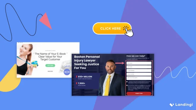

A good landing page starts with the right structure. Clear messaging, visual clarity, and a single focused goal are what make a landing page convert.
The optimal landing page structure includes key elements like a headline, a strong unique selling proposition (USP), visuals, benefit-focused copy, social proof, a Call-to-Action (CTA), form, a minimalistic design, and a footer. These landing page features support the user journey from the first glance to the final click.
Each part of a landing page matters: if the layout is messy, users bounce. If the CTA is hidden, they don’t act. The anatomy of a landing page must be intentional – designed to reduce friction and guide decisions.
Key Facts:
- The headline is the first conversion trigger.
- Visuals increase retention and clarity.
- A clear CTA is essential – one page, one action.
- Trust elements (testimonials, logos) boost credibility.
- Forms should be short and easy to complete.
- Consistent design keeps users focused.
- The landing page content must align with user intent and campaign goals.
- The elements of a landing page should work together as one cohesive experience.
To understand what makes a good landing page, review the components explained in the sections below.

9 Key Components of an Effective Landing Page
A good landing page is clear, goal-oriented, easy to navigate, and built around user intent. The key elements of a landing page include a compelling headline, a strong unique selling proposition (USP), high-quality visuals, benefit-focused copy, credibility-building social proof, a clear Call-to-Action (CTA), a simple form, a minimalistic design, and a concise footer.
1. Compelling Headline
The headline is the first thing users see on a landing page. It must immediately grab attention and communicate what value the page offers.
A compelling headline should speak directly to the visitor’s needs, use clear language, and lead naturally into the rest of the landing page content. It sets the tone and helps reduce bounce rates by aligning with user intent.
Proven headline formulas to try:
- The How-to Formula – Presents a direct solution: “How to get your first 100 subscribers.”
- The Call-to-Action Formula – Uses verbs to drive immediate action: “Grab your free trial today.”
- The Superlative Formula – Highlights uniqueness or market leadership: “The #1 App for Meditation.”
- The Value Proposition Formula – Focuses on benefits: “Boost conversions with one platform.”
- The Agitator Formula – Exposes a pain point: “Tired of low open rates?”
- The Special Offer Formula – Emphasizes a deal: “Save 30% on all plans until Sunday.”
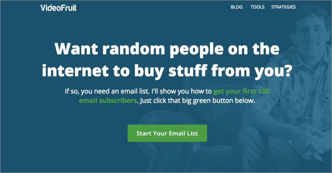
Landing page from VideoFruit uses the Agitator Formula. It asks a bold, slightly provocative question: “Want random people on the internet to buy stuff from you?” The tone is informal, but the message is sharp – it pinpoints a real pain point, then immediately offers a solution with a CTA: “Start Your Email List.”
Top 3 Tips for Creating a Compelling Headline
- Make the value obvious from the first word. A good headline answers the user’s question before they ask it.
- Write to the reader, not about yourself. Use “you” instead of “we” to focus on what matters to your audience.
- Use strong, direct language. Action verbs and emotionally charged words make your message more persuasive and clear.
2. Strong Unique Selling Proposition (USP)
Your landing page needs a clear reason why someone should choose you over the competition. That’s what a Unique Selling Proposition (USP) delivers.
Your USP should focus on one key advantage. It must be specific, believable, and valuable. Without USP, your landing page competes only on price.
USP formulas that work:
- [Product] that [solves a problem] in [time or way].
Example: Skincare kits that calm sensitive skin in under 10 minutes. - [Target audience] + [core value].
Example: Daily planners for freelancers who hate structure but love results. - [Achieve goal] without [pain point].
Example: Grow your newsletter without posting daily on social media.
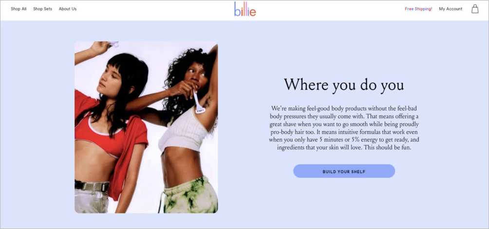
Billie’s landing page offers a strong USP built around values. The message: “Feel-good body products without feel-bad body pressure” speaks directly to an audience that wants personal care without judgment. It communicates inclusion, simplicity, and product benefit, all in a single, user-focused paragraph.
Tips for creating a strong USP:
- Start with what your customer wants. Focus on outcomes, not just features.
- Avoid vague promises. “Great quality” means nothing unless you define why and how.
- Make it easy to remember. A USP should be clear in one or two short lines.
A strong USP helps people say “yes” faster because they instantly understand what makes your offer worth choosing.
3. High-quality Visuals
Strong visuals instantly signal trust and professionalism; they clarify, support your message, and help users connect with your offer faster.
A good landing page design should be clean, on-brand, and easy to navigate. Visuals guide attention, make content easier to scan, and reinforce what the page is saying.
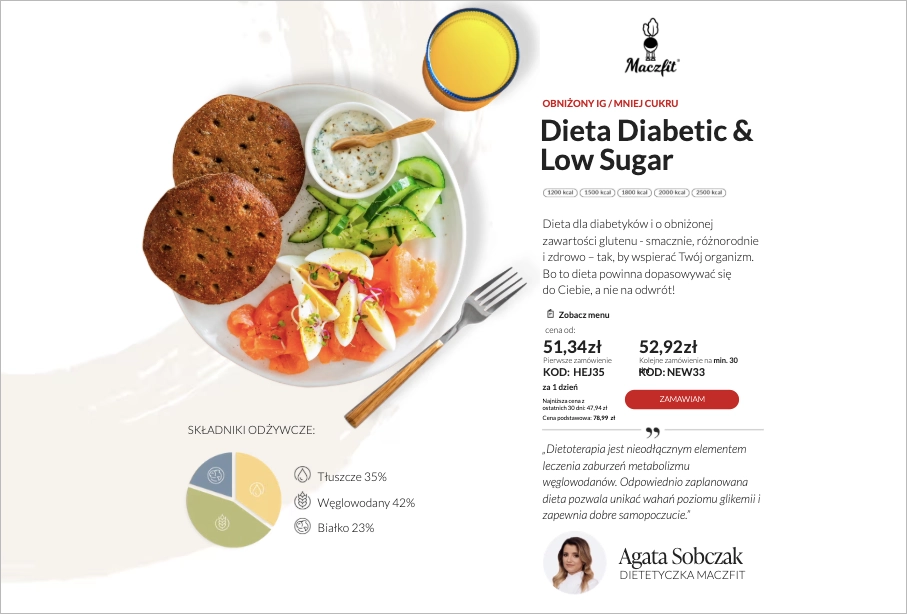
A landing page from Maczfit uses high-quality visuals to support a clear, health-oriented offer. The overhead shot of a plated meal makes the product tangible, while the clean design, nutrient breakdown, and pricing details build immediate trust. Every element – image, layout, and color – reinforces the brand’s promise: healthy eating that feels personal and accessible.
Tips for implementing high-quality visuals:
- Add real images or short videos that show your product or service in context. Avoid generic stock – it weakens credibility.
- Keep branding consistent. Use your logo, brand colors, and fonts so the page feels like a natural part of your site.
- Optimize for mobile. Cut oversized images, tighten space, and make sure CTAs stay visible.
- Check performance. Compress images and use lightweight layouts to keep loading times fast.
4. Benefit-focused Copy
Copy is your landing page’s voice, so it should be sharp, clear, and focused on what the user gains – not what you offer.
Strong copy leads with benefits. Show outcomes instead of listing features. “10 templates” doesn’t sell. “Save hours with ready-made designs” does. Good landing page content puts the user first, answers their unspoken “what’s in it for me?” and drives action fast.
Keep your message simple and intentional:
- Start with a strong headline – it’s your hook.
- Prioritize clarity over cleverness. Your value should be obvious at a glance.
- Trim the fluff. Stick to the essentials that move the user toward your CTA.
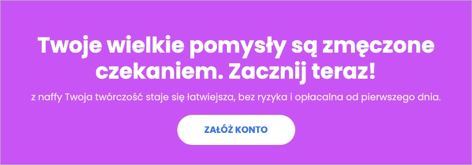
naffy’s example shows a clear benefit-focused copy. It’s catchy, bold, and emotional – it speaks directly to the user’s frustration with delay and their desire to act now. The benefit (“profitable from day one”) is right there, and the tone is full of energy.
Tips for writing benefit-focused copy:
- Talk like a human. Avoid jargon or empty buzzwords.
- Shift from “what we offer” to “how your life improves.”
- Read every sentence and ask: “Does this help someone say yes faster?”
Benefit-driven copy turns scrolls into sign-ups, because people don’t just want products. They want results.
5. Credibility-building Social Proof
Even the best landing page won’t convert if visitors don’t trust you. Social proof and trust signals show that real people and reputable companies already believe in your product. They reduce anxiety, add authority, and help hesitant users say “yes” faster.
Social proof doesn’t just build trust; it boosts SEO. Engagement across platforms, brand mentions, reviews, and user content are all social signals that influence search visibility and ranking. Search engines reward businesses that demonstrate real-world relevance, interaction, and authority.
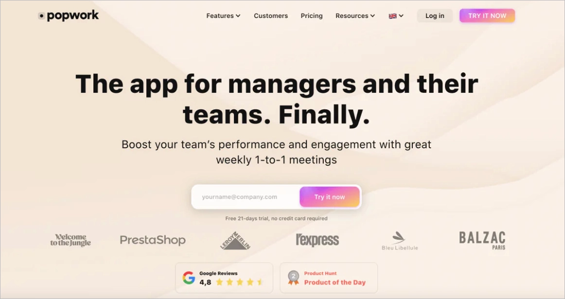
Popwork’s landing page is a masterclass in subtle, effective social proof:
- Logos of trusted clients (PrestaShop, Leroy Merlin, Balzac Paris) build instant credibility.
- Star rating (4.8 on Google) adds legitimacy.
- Award badge (“Product of the Day” on Product Hunt) reinforces product quality.
- All these elements appear above the fold, close to the call to action – exactly where they’re most impactful.
Types of Trust Signals That Work on Landing Pages:
| Social Signal | Why It Matters | How to Leverage It on Landing Pages |
|---|---|---|
| Likes, Shares, Comments | Indirect ranking boost via engagement and visibility | Embed share buttons and UGC content (e.g. Instagram embeds) |
| Brand Mentions | Build authority, increase discoverability | Show featured-in logos, press quotes, or influencer posts |
| Reviews (Google, G2, etc) | Improve trust, click-throughs, and local rankings | Display widgets or badges (Trustmary, Capterra, Trustpilot) |
| Video Testimonials | Authenticity and relatability | Place near CTAs or product descriptions |
| Influencer Endorsements | Higher engagement, credibility, and traffic | Add snippets, quotes, or link to featured posts |
6. Clear Call-to-Action (CTA)
A CTA is the part of your landing page that makes visitors act. It’s the button or form that decides: convert or bounce.
A good CTA is clear, specific, and honest. If your button says “Get the Discount,” the next screen must deliver that discount. The click should feel like a natural step forward.
To improve your CTA’s performance:
- Use action-oriented verbs. “Try,” “Get,” “Start,” or “Join” work better than vague language.
- Match intent to design. If your page promotes a free trial, the CTA should reflect it directly (“Try it free for 15 days”).
- Make it stand out. Choose a button color that contrasts with the rest of your layout but still fits your branding.
- Place it smartly. Top of page, after key benefits, and once again at the bottom. Users should never have to scroll back up to act.
- Ensure mobile usability. Make the CTA large enough to tap, even on smaller screens.
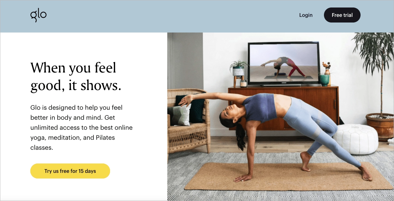
Glo’s CTA says: “Try us free for 15 days” – clear, low-friction, and benefit-driven. It answers “What do I get?” and “When do I get it?” in five words.
If you’re experimenting with CTAs or running multiple landing pages, you can speed things up with tools like Landingi’s Call-to-Action Generator.
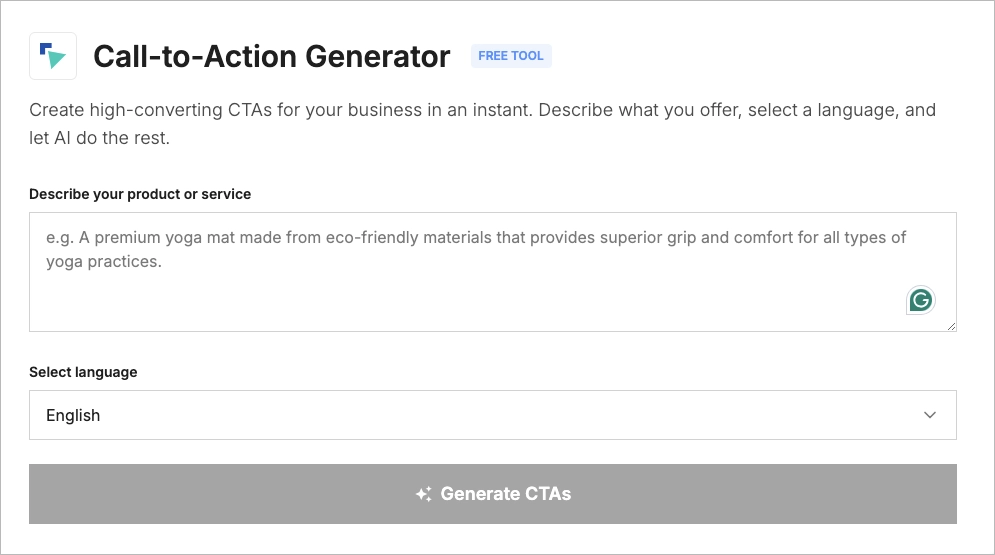
Just describe your product or service, choose a language, and the AI suggests ready-to-use CTA ideas tailored to your offer. It’s fast, free, and good at sparking variation when you’ve run out of wording inspiration.
7. Simple Form
Forms are where landing page visitors become leads. That moment of input – an email, a name, a quick answer – is often the most important conversion point on your page.
A strong form removes friction. It’s short, clear, and respectful of the user’s time and attention. That means:
- Ask only what’s essential. Fewer fields = higher completion rates.
- Use simple labels and placeholders. Guide users, don’t confuse them.
- Make the CTA button easy to find and clearly state the benefit.
- Ensure it’s mobile-friendly. Touch-friendly fields, readable fonts, no horizontal scrolling.
- Be transparent. Let people know what happens next and link to your privacy policy.
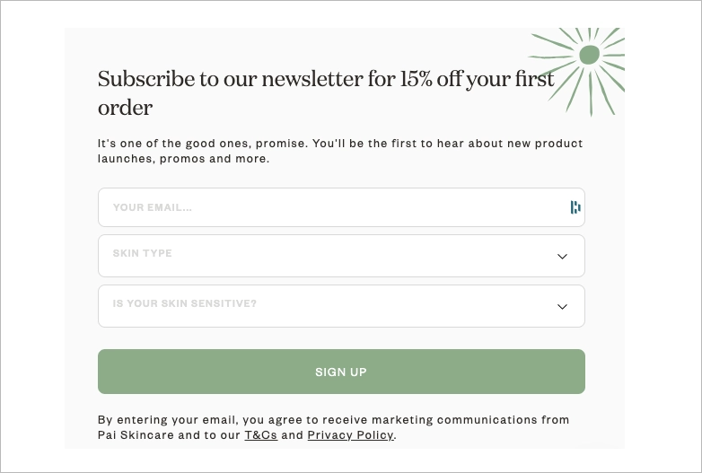
A great example comes from Pai Skincare. Their newsletter form is beautifully designed and perfectly aligned with the brand’s aesthetic. The copy feels friendly and reassuring –“It’s one of the good ones, promise” – setting a warm tone right away. Pai Skincare’s form also includes small personal touches, like asking for your skin type, which makes the form feel more tailored without being intrusive. Most importantly, it clearly communicates the benefit: 15% off your first order and early access to product launches and promotions.
8. Minimalist Design
Every element on a landing page should have a purpose. If something doesn’t help convert, it likely doesn’t belong.
Good minimalist design removes clutter, reduces friction, and highlights the core message. It helps visitors understand what the page is about within seconds and what they should do next.
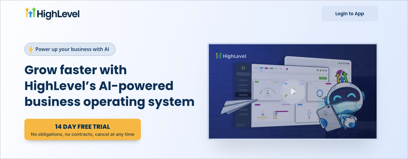
A great example comes from HighLevel. The layout is simple but intentional: a strong headline, a short explainer, one CTA button, and a product visual. Everything supports the action, nothing distracts from it.
A clean design builds trust, improves readability, and drives better conversions – especially on mobile, where attention spans are even shorter.
9. Minimal and Concise Footer
A strong landing page footer should do two things: provide essential information and stay out of the way.
Wantable’s footer is a great example of this. It gives users exactly what they might look for at the bottom of the page – links to shipping, returns, contact info, FAQs, terms and privacy policy – without overwhelming them. There’s also a short email signup form with a friendly message: “Get promos, style tips and more!” It’s simple, compact, and clearly explains the benefit of subscribing.
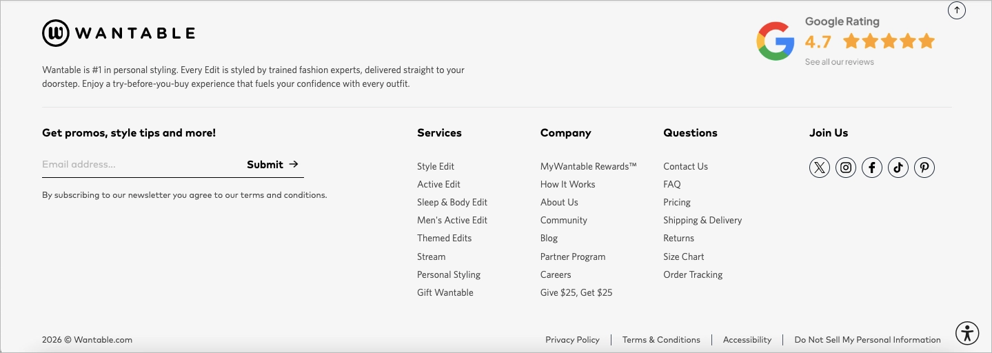
The layout is clean, the sections are easy to scan, and the design is consistent with the brand. Even small touches like the “back to top” button or Google rating badge add value without creating clutter.
Boost your brand with a professionally designed landing page tailored to your needs.
Build your Landing Page Right Now with Landingi
A well-structured landing page helps turn visitors into customers. Understanding the anatomy of a landing page – including its layout, content, and features – is essential for better results.
With Landingi, you can create a landing page by yourself, without coding. The platform includes all the key landing page features: templates, drag-and-drop editor, mobile optimization, AI support, and analytics.
You can use AI to generate landing page content quickly, such as headlines, CTAs, and section copy , based on your business goals and target audience.
If you prefer, you can also order a ready-made page from our team. We’ll design and build it for you, based on your brief.
Landingi helps you create the optimal landing page structure for any purpose, whether it’s lead generation, product sales, or campaign traffic. You decide how you want to build. We provide the tools. Try now!


