
A music landing page is a focused page built around one promotional goal – releasing a new album, selling concert tickets, collecting fan sign-ups, driving pre-saves, or sending listeners to streaming platforms. For artists, bands, venues, and music brands, it gives every campaign a clear destination instead of sending fans to a busy website with too many possible next steps.
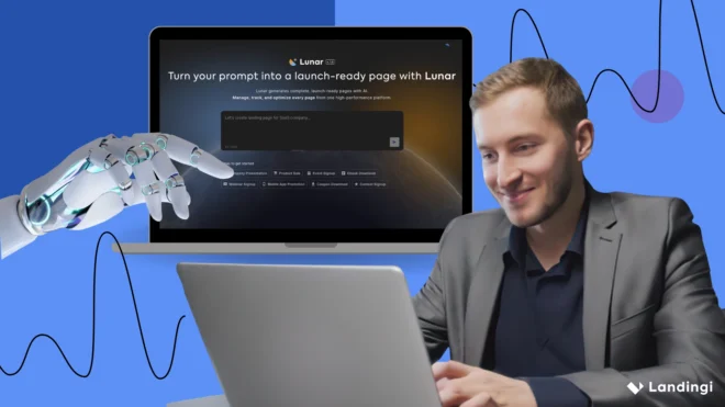
That focus matters because music campaigns move fast. A page promoting a single today may need different messaging a week later for the album launch or tour announcement. In Landingi, you can create dedicated music promotion landing pages for each campaign with Lunar, an AI-native landing page generator that turns a prompt into a complete, editable page. From there, you can publish, test variants, track fan behavior with EventTracker, and use Solis to identify optimization opportunities – all within the same AI landing page operation system.
This guide breaks down strong music landing page examples, shows how to create your own, and explains what to optimize to turn more campaign traffic into streams, sign-ups, and ticket sales.

21 Best Examples of Music Landing Pages
These 21 music landing page examples show how artists and music brands turn attention into action – from selling tickets and promoting new releases to growing fan lists and driving streams. Each takes a slightly different route, but the best ones make it immediately clear what fans should do next.
#1 Ed Sheeran – concert and tour landing page
Ed Sheeran’s website is a good example of a music landing page built around something fans actually came for: tour dates and tickets. The page makes upcoming shows easy to scan, with dates, locations, venues, and direct ticket links, while sold-out concerts are clearly marked.

The page still feels unmistakably connected to the artist. Strong visuals do most of the aesthetic work, while the copy stays minimal. Fans who aren’t ready to buy a ticket can also explore music and merch or sign up for updates, so the page supports the broader relationship with the audience without making the main path hard to find.
What they did well:
- Easy-to-scan tour schedule
- Clear ticket CTAs
- Strong artist branding
- Minimal copy
- Newsletter sign-up
- Quick access to music and merch
What could be improved:
- For paid campaigns promoting a particular city or concert, a dedicated concert landing page could shorten the journey even further by showing only the relevant event and CTA.
Create focused concert landing pages with Landingi and give fans a straight path from campaign click to ticket purchase.
#2 Glastonbury Festival – festival lineup landing page
Glastonbury Festival’s lineup page has a difficult job: show a huge number of artists without turning the page into visual chaos. It handles that well. The bold typography, colors, and poster-like layout feel unmistakably Glastonbury, while the lineup remains easy enough to scan.
The page also understands what festival visitors are looking for. Artist names take priority, information is grouped clearly, and the visual hierarchy lets fans quickly spot acts they care about instead of digging through blocks of copy. It feels busy because Glastonbury is busy, but not accidentally messy.

What they did well:
- Strong, recognizable festival branding
- Clear hierarchy despite a large lineup
- Highly scannable artist information
- Design that builds excitement around the event
What could be improved:
- For promotional traffic, a more focused concert landing page with a stronger path from lineup discovery to ticket or registration action could make the conversion journey shorter.
#3 Lewis Capaldi – album release landing page
Lewis Capaldi’s landing page for Divinely Uninspired to a Hellish Extent keeps the journey about as short as possible: arrive, choose your streaming platform, listen. The cheeky “Be sexy, get my album!” headline sounds like Capaldi rather than generic promo copy, which gives an otherwise very simple page some personality.
Below it, fans can choose between Spotify, Apple Music, Amazon, YouTube, Deezer, and other platforms. There’s little competing for attention, which works particularly well for traffic coming from social media or a release campaign, where the visitor already knows why they clicked.

What they did well:
- Copy that matches the artist’s personality
- Direct links to major streaming platforms
- Very short path from click to music
- Distraction-free layout
- Mobile-friendly experience
What could be improved:
- Stronger album visuals could make the page feel more memorable without complicating the conversion path.
#4 Spotify Premium – music subscription landing page
Spotify’s Premium page shows how a music landing page can sell a service rather than a release or event. The offer takes center stage, followed by the benefits users actually care about: ad-free listening, offline playback, control over what they hear, and different Premium plans.
The page is longer than a typical artist landing page, but it needs to answer a bigger question: why pay for something you can already use for free? Clear benefit sections and plan comparisons do that work, while repeated CTAs give visitors several natural opportunities to upgrade.

What they did well:
- Clear offer and value proposition
- Benefits explained in practical terms
- Easy-to-compare Premium plans
- Strong, repeated CTAs
- Consistent Spotify branding
What could be improved:
- The amount of information can make the path to conversion feel longer. Testing a more compact version for paid campaign traffic could reveal whether some audiences need less convincing.
#5 Aurora – artist and tour landing page
Aurora’s website works as both an artist landing page and a gateway to her music, videos, and live shows. Strong imagery sets the mood immediately, while prominent links make it easy to move from discovering the artist to listening on a preferred streaming platform.
The page goes further than a simple streaming link hub. Embedded music and videos let visitors experience Aurora’s work without leaving the site, while the tour section turns that interest into another clear action: checking dates and buying tickets. It’s visually rich, but the relatively small amount of copy keeps it from feeling overloaded.

What they did well:
- Strong visual identity
- Easy access to music and streaming platforms
- Embedded music and video content
- Clear tour dates and ticket paths
- Minimal copy that lets the artist’s work lead
What could be improved:
- Individual releases or tour campaigns could benefit from dedicated music promotion landing pages with one primary goal, especially when sending paid or social traffic to the site.
Showcase your music effectively – create a custom landing page with Lunar, Landingi!
#6 boygenius – album release landing page
The landing page for boygenius’ the record keeps the release campaign refreshingly simple. Fans arrive, see the album, choose their preferred platform, and move straight to listening or buying. There’s very little standing between interest and action.
That simplicity makes sense for an album release landing page, especially when visitors arrive from social media, email, or another channel where they already know the artist. Spotify, Apple Music, YouTube, Amazon, and other options are presented together, so nobody has to hunt for their preferred service.

What they did well:
- Short path from campaign click to music
- Multiple streaming and purchase options
- Clean, distraction-free layout
- Strong mobile experience
- One clear purpose
What could be improved:
- A little more visual storytelling around the record, such as stronger album imagery or a featured track, could give new listeners more reason to explore without making the page feel busy.
#7 Florence + The Machine – artist landing page
Florence + The Machine’s official page takes a more atmospheric approach to music promotion. Instead of filling the screen with information, it keeps the experience focused around a few things fans are most likely to do: discover the latest music, listen, and stay connected with the band.
The restrained design fits the artist particularly well. Strong imagery, plenty of space, and minimal copy make the page feel like an extension of Florence + The Machine’s visual world rather than a generic promotional site. That consistency matters for an artist landing page – especially when fans arrive directly from social media or a release campaign.

What they did well:
- Strong visual identity
- Clear paths to music and artist updates
- Minimal, focused copy
- Design that feels consistent with the artist
- Mobile-friendly experience
What could be improved:
- Campaign-specific releases could use a more focused music promotion landing page with one dominant CTA, giving visitors an even shorter path from discovery to listening or signing up.
#8 Becky G – album promotion landing page
Becky G’s page puts the music first. Album artwork does most of the visual work, while clear CTAs take fans directly to the platforms where they can listen. There’s almost no copy competing for attention, which makes the next step obvious from the start.
This approach works particularly well for an album promotion landing page. Someone arriving from Instagram, TikTok, an ad, or an email probably doesn’t need a long introduction to the artist – they need a quick way to find the release and play it on their preferred platform.

What they did well:
- Strong album visuals
- Clear streaming CTAs
- Very little friction between click and listen
- Minimal, distraction-free content
- Mobile-friendly layout
What could be improved:
- A short video or featured track could give visitors who don’t already know the release a stronger taste of what they’re about to hear.
Turn visitors into fans – design your music landing page with Landingi today!
#9 Son Lux – band landing page
Son Lux’s website works as a central hub for the band without trying to squeeze everything onto one screen. Fans can quickly move between tour information, band details, contact options, and newsletter signup, while links to the individual members add a more personal layer to the experience.
For a band landing page, that structure makes sense. Son Lux has more to communicate than a single release, so the page gives visitors several relevant paths while keeping navigation simple and the band’s distinctive visual identity intact.

What they did well:
- Clear, easy-to-follow navigation
- Visible newsletter signup
- Easy access to tour information
- Links to individual band members
- Strong, consistent visual identity
What could be improved:
- For a specific album, single, or tour push, a dedicated music promotion landing page could give campaign traffic one clearer action instead of several equally prominent paths.
#10 Martin Garrix – artist and tour landing page
Martin Garrix’s website looks and moves like the artist it represents. Large visuals, performance footage, and bold typography create an energetic first impression, while the navigation keeps practical fan actions – music, tour dates, and merch – easy to reach.
There’s a lot happening visually, but the page doesn’t make fans work for the basics. Social links and newsletter signup give visitors ways to stay connected, while tour and music sections move people toward more immediate actions. It’s a good example of an artist landing page where branding and usability actually work together.

What they did well:
- Strong visual identity tied to the artist
- Easy access to music, tour dates, and merch
- Rich video and photography
- Clear navigation
- Multiple ways for fans to stay connected
What could be improved:
- Dedicated pages for individual releases or tour campaigns could create a more focused conversion path for traffic coming from ads and social media.
#11 Sierra Hull – artist and tour landing page
Sierra Hull’s website takes a quieter approach, and it fits her music. Warm photography and a clean layout create the right atmosphere without getting in the way of what fans are likely looking for: tour dates, music, and tickets.
The tour section is especially practical. Upcoming shows are easy to scan and paired with clear ticket buttons, while simple navigation leads to music, bio, and store pages. For an artist landing page, it’s a nice balance between personality and usefulness.

What they did well:
- Visual style that feels true to the artist
- Easy-to-scan tour dates
- Clear ticket CTAs
- Simple navigation
- Warm, uncluttered design
What could be improved:
- A featured track or short music preview could give first-time visitors an immediate introduction to Sierra Hull’s sound.
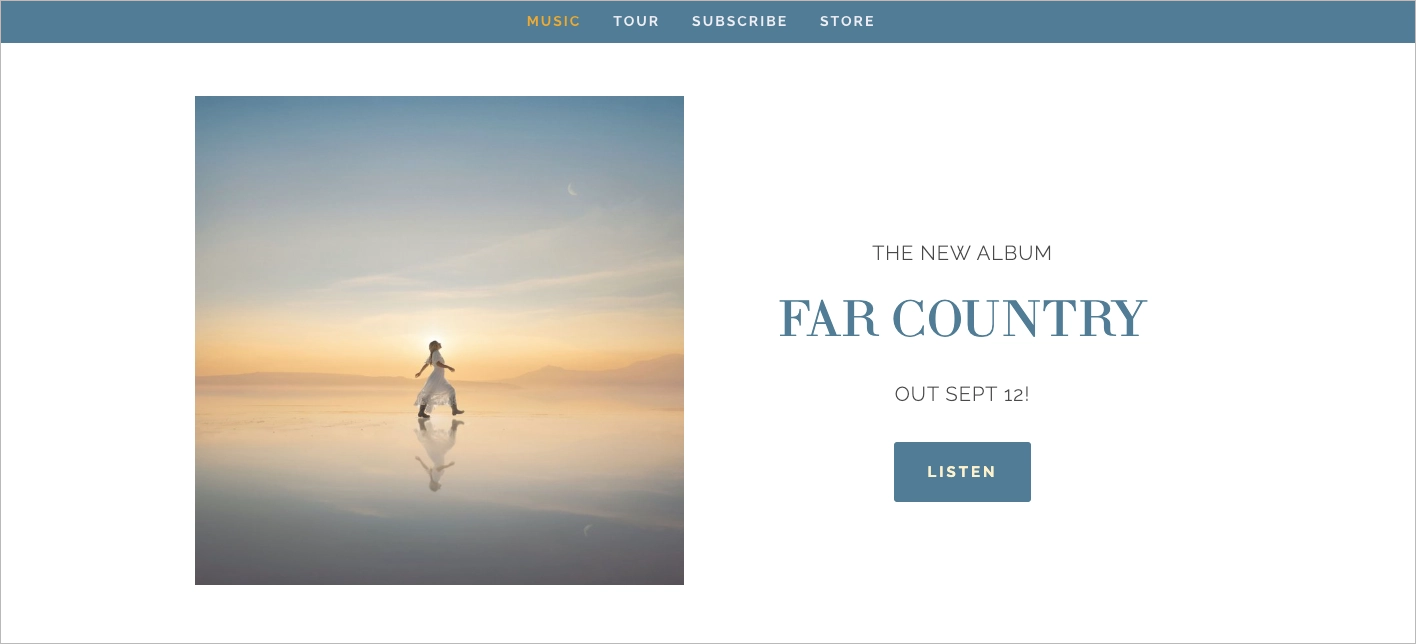
#12 Ellie Holcomb – artist and music promotion landing page
Ellie Holcomb’s website feels warm and personal from the first screen, which fits her music well. A large hero visual puts the current project in focus, while clear paths lead fans to listen, check upcoming shows, or visit the store.
The page does a good job of combining promotion with artist branding. The photography, typography, and soft visual style feel consistent, but they don’t get in the way of practical actions. For a musician landing page, that balance is important: fans get the atmosphere, then quickly find somewhere to go.
What they did well:
- Strong, recognizable artist identity
- Current release given prominent space
- Clear paths to music, tour dates, and merch
- Consistent visuals and tone
- Simple navigation
What could be improved:
- A short artist introduction could give first-time visitors a little more context and make the page feel even more personal.
#13 Apple Music – music streaming landing page
Apple Music’s landing page is a strong example of how to promote a music subscription service without overexplaining it. Large product visuals and short, benefit-led sections introduce the experience, while clear CTAs move visitors toward trying the service.
The page gradually gives visitors more reasons to subscribe, from ad-free listening and offline access to Spatial Audio and the size of the music catalog. Pricing and plan options appear alongside the benefits, so users can understand both what they’re getting and what it costs without hunting for details.

What they did well:
- Strong product visuals
- Clear value proposition
- Benefits explained without too much copy
- Visible subscription CTAs
- Clear plan and pricing information
- Consistent Apple branding
What could be improved:
- For traffic from campaigns promoting a particular feature or offer, a shorter dedicated landing page could keep that single benefit and conversion path in sharper focus.
Boost your music sales – create an optimized landing page with Landingi!
#14 James Bay – artist and music release landing page
James Bay’s website puts the latest release straight in the spotlight. A large hero section, strong photography, and a clear CTA give fans an immediate route to the music, while the rest of the page stays relatively restrained.
The visual style fits Bay’s music particularly well – polished, slightly moody, and minimal without feeling generic. Fans can easily move on to tour dates, tickets, music, merch, or the mailing list, so the page works both for a current release campaign and for people who simply want to explore more of the artist.

What they did well:
- Latest release given top priority
- Strong, recognizable visual identity
- Clear music and ticket paths
- Minimal, easy-to-follow navigation
- Mailing list and fan touchpoints built into the experience
What could be improved:
- The homepage is quite sparse beyond its main promotional content. A small section for recent videos, news, or other current activity could give returning fans more to discover without making the page feel crowded.
#15 Pickup Music – music education landing page
Pickup Music shows that a music landing page can sell more than albums or tickets. Its page promotes an online guitar learning platform, so it has a bigger job to do: explain the product, show what learning actually looks like, and give visitors enough confidence to subscribe.
The page is longer than most artist pages, but the content earns its space. Course previews show what users can expect, testimonials bring in real learner experiences, and clear explanations make the offer easy to understand. CTAs appear naturally throughout the journey, so visitors don’t have to scroll back once they’re convinced.

What they did well:
- Clear value proposition
- Course and lesson previews
- Strong video content
- Student testimonials and social proof
- Benefits explained in concrete terms
- CTAs placed throughout the page
What could be improved:
- There’s a lot to explore. For paid campaigns promoting a specific course or skill level, a shorter dedicated page could match the visitor’s intent more closely and get them to the relevant offer faster.
Promote your latest album – generate a music landing page with Landingi!
#16 TIDAL for Artists – artist platform landing page
TIDAL for Artists targets musicians rather than listeners, so the page focuses less on discovering music and more on what artists can actually do with the platform. The offer is easy to understand, while short sections break down features such as artist analytics, profile management, and tools for understanding an audience.
The dark, minimal design feels consistent with TIDAL without distracting from the product itself. Screenshots and product visuals add context, while clear CTAs give artists a straightforward route to getting started.
What they did well:
- Clear audience and purpose
- Benefits explained in short, scannable sections
- Product visuals that show the platform
- Consistent TIDAL branding
- Clear path to action
What could be improved:
- More real artist stories or examples of how musicians use the platform could make the benefits feel more tangible and bring a little more human proof to an otherwise product-focused page.
#17 Kaleidoscope Festival – festival landing page
Kaleidoscope Festival’s page looks like the event it’s selling: colorful, energetic, and family-friendly. Bold typography, playful graphics, and festival photography create the atmosphere, while clear navigation keeps practical information such as the lineup, tickets, activities, and event details easy to find.
That balance is especially useful for a festival landing page, where visitors often need more than a ticket button. Someone discovering Kaleidoscope for the first time can explore what’s happening and decide whether the event fits them, while returning visitors can quickly jump to the lineup or ticket information.

What they did well:
- Visual identity that captures the festival atmosphere
- Clear access to lineup and ticket information
- Easy-to-follow navigation
- Good mix of photography and graphic elements
- Content for both music fans and families
What could be improved:
- A compact “What to Expect” section or visual schedule could help first-time visitors understand the festival experience at a glance and make the decision to attend a little easier.
#18 Alice Merton – artist and music release landing page
Alice Merton’s website puts her current music first. Strong photography and a prominent “Listen” path make it easy to move straight from the page to streaming, while videos, tour information, and social links give fans more ways to explore her work.
What works particularly well is that the page doesn’t rely on long descriptions to prove interest in the artist. Music videos, streaming links, and visible activity across platforms do much of that work naturally. The result is an artist landing page that feels polished but still keeps the music at the center.

What they did well:
- Latest music given clear priority
- Strong, visual-first design
- Easy access to streaming platforms
- Tour and video content within easy reach
- Cross-platform presence that reinforces artist credibility
What could be improved:
- A short audio preview or another lightweight interactive element could let new visitors sample the music before moving to an external streaming platform.
#19 John Mayer – artist and tour landing page
John Mayer’s website keeps the focus on what fans are most likely to look for: current music, live shows, and ways to stay connected with the artist. Large photography does most of the visual storytelling, while relatively little copy keeps the experience clean and easy to explore.
The understated approach fits Mayer’s established identity. Rather than explaining the artist through long sections of text, the page lets the music, imagery, and current activity speak for themselves. Tour information and links to music give existing fans quick access to what they need, while the overall presentation still feels polished enough to introduce new listeners.

What they did well:
- Strong, recognizable artist branding
- Music and live shows given clear priority
- Clean, uncluttered layout
- High-quality artist photography
- Straightforward fan journey
What could be improved:
- More prominent current content, such as a featured performance or latest release, could give returning visitors a stronger reason to engage with the page again.
#20 Deezer – music streaming service landing page
Deezer’s Features page takes a product-led approach to music promotion. Instead of simply telling visitors to subscribe, it gives them concrete reasons to use the service, introducing features such as Flow, SongCatcher, lyrics, and offline listening through short, easy-to-scan sections.
The copy works because it stays close to what listeners actually get from each feature. Product visuals support the explanations, while the modular layout makes a fairly large amount of information easy to browse. It’s a useful music landing page example for apps and streaming services that need to sell an experience rather than a single song or album.

What they did well:
- Features connected to clear user benefits
- Short, scannable copy
- Clean, modular page structure
- Product visuals that support the message
- Consistent Deezer branding
What could be improved:
- Stronger conversion points between feature sections could make the next step more obvious once a particular benefit has convinced the visitor.
#21 Dua Lipa – album preorder landing page
Dua Lipa’s preorder page shows how little a music promotion landing page needs when the audience already knows the artist. Strong album imagery, the release information, and a prominent preorder CTA do most of the work. There’s no long pitch because fans arriving here probably don’t need one.
That makes the page particularly effective for traffic coming from social media, email, or an album announcement. Instead of asking visitors to explore first, it turns existing excitement around the release into a clear next step: preorder the album.

What they did well:
- One clear promotional goal
- Strong album imagery
- Release information immediately visible
- Prominent preorder CTA
- Very little distracting copy
- Short path from campaign click to purchase
What could be improved:
- A short track preview or teaser video could give fans another taste of the release while keeping the page focused on the preorder.
Build a focused music promotion landing page with Landingi and turn release-day attention into streams, preorders, and sales.
How To Create a Music Landing Page?
To create a music landing page, define one campaign goal, describe the audience and creative direction, generate the first version with AI, refine the fan journey, publish it, and improve it based on real behavior. In Landingi, that workflow stays in one AI landing page operation system: Lunar creates the page, EventTracker measures what visitors do, A/B testing validates changes, and Solis helps decide what is worth optimizing next. Lunar generates complete, editable landing pages from prompts, including structure, sections, copy, and layout, and generated pages become part of the same Landingi workspace for further management and optimization.
Define one campaign goal and give Lunar a real brief
Start with the action you actually want from fans. A music promotion landing page for a new single may drive streams or pre-saves; a concert landing page should move people toward tickets; an artist campaign might focus on newsletter sign-ups, merch, or a new album.
Then give Lunar, Landingi’s AI-native landing page generator, enough context to build around that goal. Don’t stop at “create a landing page for my band.” Include the artist, campaign, audience, tone, visual direction, primary CTA, content you already have, and the sections the page needs. Lunar can turn that brief into a complete, structured page and lets you refine copy, sections, and layout through chat before publishing.
For example:
Create a landing page promoting the new indie-pop single “After Midnight” by a female solo artist. The campaign targets listeners aged 20–35 arriving mainly from Instagram, TikTok, and paid social. The primary goal is to drive streams on Spotify and Apple Music.
Use a warm, slightly nostalgic tone with short, natural copy. The visual direction should feel cinematic and nocturnal, based around deep blue, black, and warm amber accents. Start with a hero section featuring the single artwork, release title, short supporting line, and a clear “Listen Now” CTA. Add streaming platform links, a short artist introduction, an embedded video teaser, one press quote, upcoming tour dates, and a final CTA. Keep the page mobile-first, visually strong, and focused on the release rather than the artist’s full biography.
Within a few minutes, you have a complete first version to work with rather than a blank canvas.
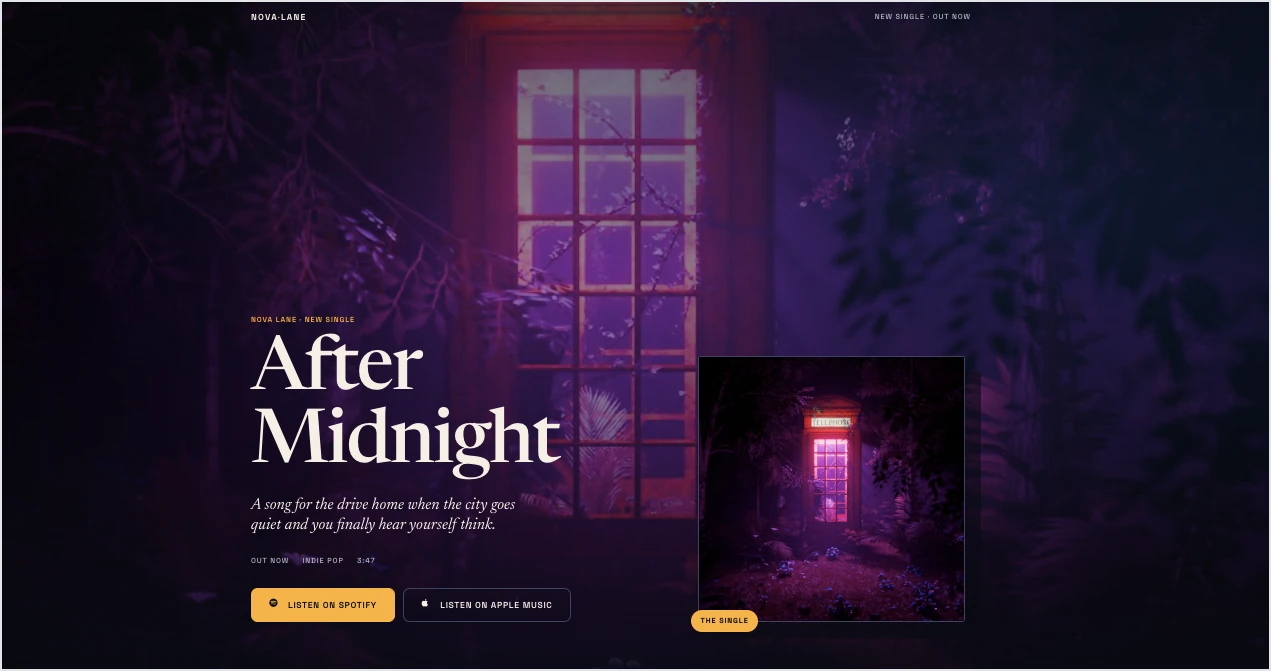
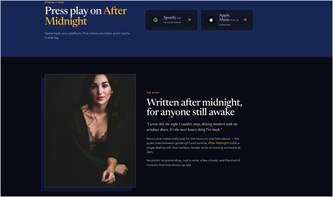
Review the generated claims and copy, add your real artwork and media, and tighten anything that doesn’t quite sound like the artist. The AI gets you much closer to launch, but the final page should still feel unmistakably yours.
Turn your music campaign brief into a complete, editable landing page and refine it before launch.
Build the page around the fan’s next move
Once the first version exists, look at it from the visitor’s side. Someone arriving from TikTok to hear a new track shouldn’t have to scroll through an artist biography before finding Spotify. Someone clicking a tour ad should see the relevant date and ticket path immediately.
Keep the primary action obvious and support it with only the information needed to make that action easier. Depending on the campaign, that might mean album artwork, a short preview, streaming links, tour dates, press quotes, artist photography, a newsletter option, or merch. Rich media works well in music campaigns, but it still needs to earn its place – a beautiful video that slows the page down or pushes the CTA three screens lower is doing more harm than good.
Publish, track, and learn what fans actually do
Publishing is where the useful part of optimization starts. Every Lunar-generated page remains in the Landingi workspace, where it can be managed and its performance tracked rather than exported into a separate tool. Pages can also be published on your own domain.
Use EventTracker to see what happens after traffic arrives. For a music campaign, that might mean checking whether fans reach the streaming links, which CTA gets clicked, how far visitors scroll, or whether mobile users abandon the page before the ticket section.

That behavioral layer matters because the final conversion rate doesn’t always explain why a campaign is underperforming. A page may have strong traffic but bury the main CTA, or fans may engage heavily with a teaser and never continue to the ticket link.
Create, publish, test, and manage music campaign landing pages with Landingi.
Use Solis to decide what to improve next
Once enough behavioral data is available, Solis helps turn it into something actionable. Solis is Landingi’s AI landing page optimization tool and continuously analyzes EventTracker data alongside the page structure, imagery, and campaign context. It monitors signals including scroll depth, clicks, conversion events, and other interactions, then surfaces alerts, discoveries, and practical optimization suggestions.
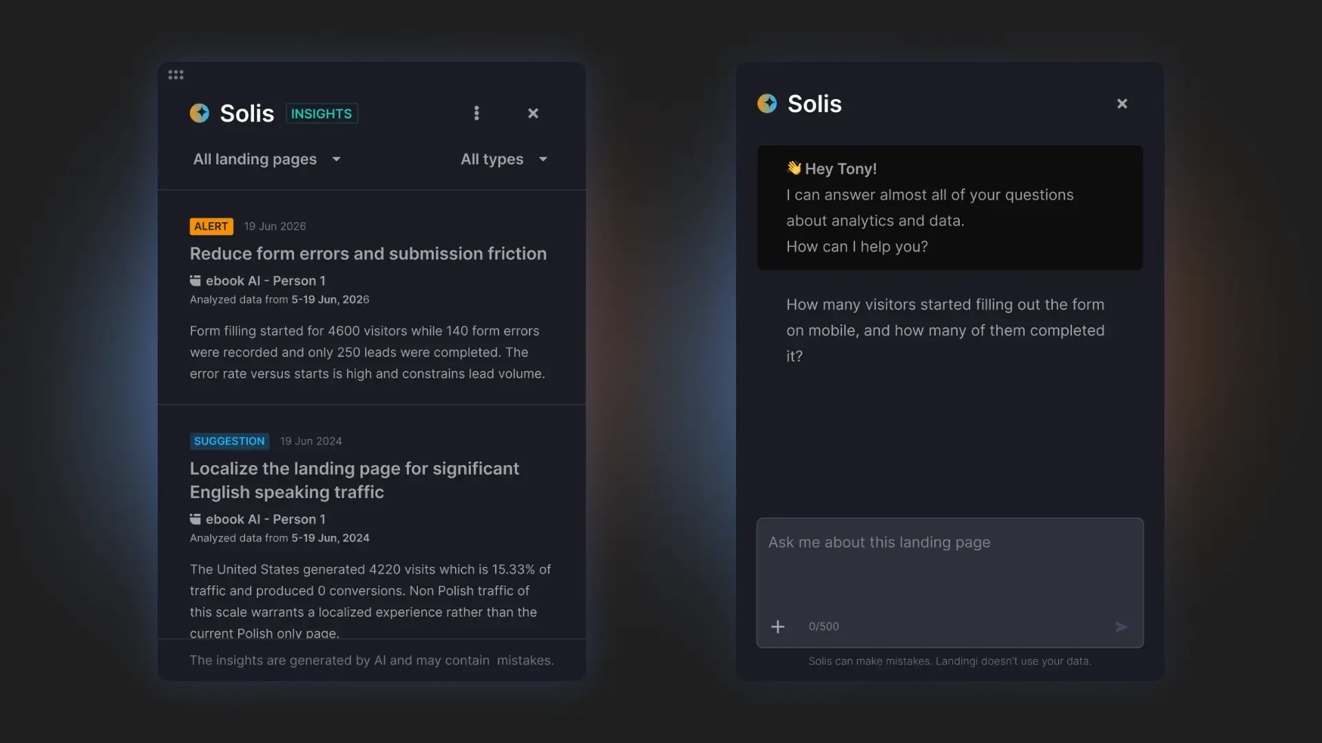
So if fans repeatedly leave before reaching tour dates, interact with one streaming CTA but ignore another, or encounter friction on mobile, you have a clearer starting point for optimization. You can turn that insight into a hypothesis and use A/B testing to compare a new headline, hero layout, CTA placement, artwork, or campaign offer against the current version.
That gives music promotion a much healthier rhythm than “publish and hope”: generate → publish → observe → improve → test. A page for today’s single can become a better starting point for the next album, tour, or fan acquisition campaign.
Turn real fan behavior into practical recommendations for your next landing page improvement.
5 Music Landing Page Best Practices
A strong music landing page should do more than look like the artist. Once the basic structure and conversion path are in place, these five practices can make the experience more useful for fans and more effective across release, tour, and promotion campaigns.
#1 Let fans experience the music on the page
Don’t make visitors leave the page just to find out what you sound like. A short audio preview, embedded music video, live performance clip, or album teaser can turn a static artist landing page into a small piece of the listening experience.

Keep it selective, though. One strong preview is usually more useful than several heavy embeds competing for attention. For a new release, feature the lead single; for a tour, try a short live clip; for a music course or app, show the product in action. Compress media carefully so the experience stays fast, especially on mobile.
#2 Match the page to the traffic source
A fan coming from a TikTok teaser has different context than someone clicking a Google ad for concert tickets. Your music promotion landing page should continue the story that brought them there.
Match the artwork, headline, offer, and CTA to the campaign. A tour ad for Chicago should ideally lead to the relevant show rather than a generic list of every tour date. A post teasing a new single should land on a page centered on that release. This message continuity makes the journey feel natural and removes unnecessary decisions.
#3 Give fans their preferred way to listen or buy
You may have one conversion goal, but fans don’t all use the same platform. If the goal is listening, offer relevant choices such as Spotify, Apple Music, YouTube, or other services where the release is available. If you’re promoting a tour, link each show to the appropriate ticket path.
The trick is to provide choice without creating chaos. Keep one action visually dominant, then group secondary options around it. A music landing page should feel like a shortcut, not another place fans have to search.
#4 Capture interest before it disappears
Not every visitor will stream, preorder, or buy a ticket on their first visit. Give interested fans a low-friction way to stay connected, particularly around upcoming releases and tour announcements.

A simple email signup can work well when there is a concrete reason to join: early ticket access, presale codes, release alerts, exclusive content, or first access to merch. Ask only for information you actually need and make the exchange clear. “Get presale access” gives someone a much better reason to share an email address than “Subscribe to our newsletter.”
#5 Treat every campaign as data for the next one
Music campaigns have short, intense lifecycles, which makes their performance especially useful for learning. Instead of rebuilding the next band landing page or release page based on taste alone, use the previous campaign to see what fans actually responded to.
With EventTracker in Landingi, you can examine clicks, events, and scroll behavior and see where engagement drops. Test meaningful alternatives with A/B testing rather than changing several things at once. Solis can then analyze EventTracker data in the context of the landing page and campaign and surface optimization recommendations.
That turns each release into useful input for the next one. You may learn that fans respond better to live imagery than album artwork, that “Pre-Save the Album” beats “Listen Now,” or that the ticket section needs to appear much earlier on mobile.
Use Solis to turn real landing page behavior into ideas for improving your next music campaign.
How Can I Optimize My Music Landing Page for Higher Conversion Rates?
To optimize a music landing page, focus on the points where fans can lose interest between arriving and taking action. For music campaigns, that usually means mobile usability, media load time, CTA visibility, and how closely the page matches the release, tour, or ad that brought someone there.
Many fans will arrive directly from Instagram, TikTok, ads, email, or messaging apps, so keep the mobile journey short. Your main action – Listen Now, Pre-Save, Get Tickets, or Join the Fan List – should appear early and be easy to tap. Tour dates, streaming buttons, forms, and embedded players need to work just as smoothly on a phone.
Be selective with media, too. Artist photography, album artwork, video, and audio can make a musician landing page much stronger, but several heavy embeds can slow down the very experience meant to build excitement. Prioritize the content that supports the campaign and compress visuals wherever possible.
Once the page is live, optimize the conversion path rather than changing things based on taste. Use EventTracker to see clicks, events, and scroll behavior. If fans watch a teaser but never reach Spotify, or browse tour dates without clicking for tickets, you have a specific point to investigate. A/B testing can then compare meaningful alternatives such as hero artwork, CTA copy, ticket placement, or video versus a static visual. Solis can analyze EventTracker data in the context of the page and campaign and suggest areas worth improving next.
For pages intended to attract organic traffic, optimize titles, metadata, headings, and copy around searches that make sense for the campaign – artist name, album, tour, venue, city, or release. Keep it natural. SEO should help people discover the page, not turn an atmospheric artist landing page into keyword-heavy promo copy.
The goal is simple: find where fans hesitate, test a better route, and make the journey from campaign click to stream, signup, preorder, or ticket purchase shorter.
Use EventTracker to see how visitors interact with your music landing page and uncover the friction between attention and conversion.
FAQ About Music Promotion Landing Pages
These quick answers cover the basics of using a music promotion landing page to turn fan attention into streams, sign-ups, and sales.
What is a music landing page?
A music landing page is a focused page created around one music-related campaign and action, such as streaming a release, pre-saving an album, buying concert tickets, joining a mailing list, or signing up for a music service. It removes the broader navigation and content of a full website so visitors have a clear next step.
How do musicians use landing pages?
Musicians use landing pages for single and album releases, pre-save campaigns, tours, ticket sales, merch drops, fan-list growth, and paid promotions. An artist landing page can also direct fans to multiple streaming platforms without forcing them to search for the release themselves.
Can I sell concert tickets from a landing page?
Yes. A concert landing page can display dates, venues, ticket availability, and clear purchase CTAs. You can direct visitors to an external ticketing provider or, where your setup and integrations allow it, build a purchase flow around the campaign.
Should musicians have a website or a landing page?
Often, both serve different purposes. A music website acts as the artist’s permanent online home for music, biography, tour information, news, and merch. A music promotion landing page is better for a specific release, concert, ad, or campaign because it can focus attention on one conversion goal.
What is the best music landing page platform?
Landingi is a strong choice for musicians, labels, agencies, and music marketers who want more than a basic page builder. It’s an AI landing page operation system where you can generate complete, editable campaign pages with Lunar, publish them on your domain, create variants, run A/B tests, and track clicks, events, and scroll behavior with EventTracker.
Once traffic starts coming in, Solis can analyze EventTracker data together with the page and campaign context to surface optimization recommendations. This makes Landingi particularly useful when you’re running multiple releases, tours, or paid campaigns and want to improve them based on fan behavior rather than rebuilding pages from scratch each time.
Create, publish, test, and optimize music landing pages with Landingi.
Build Landing Pages for Your Band, Concerts, and Music Campaigns with Landingi
A good music landing page gives every campaign its own clear destination. A new single can lead straight to streaming platforms, a tour campaign to ticket sales, and a fan acquisition campaign to a simple signup – without sending people through an entire music website to find what they came for.
With Landingi, that process can move from idea to optimization in one AI landing page operation system. Use Lunar to generate a complete, editable page from a prompt, customize it for your artist or campaign, and publish it on your own domain. Once traffic arrives, EventTracker shows how fans interact with the page, A/B testing lets you validate different versions, and Solis analyzes behavioral data to suggest where the experience could perform better.
That makes it easier to run separate artist landing pages, album launches, concert promotions, and paid campaigns without starting from scratch every time. Build your next music campaign with Landingi and give every stream, signup, preorder, and ticket sale a page designed to move fans toward it. Try now!