
A portfolio landing page gives potential clients, employers, or collaborators a focused way to understand what you do, see the quality of your work, and decide whether they want to contact you. It should do more than display projects – the best pages also give those projects context, show a clear professional identity, and make the next step easy to find.
The right structure depends on the type of work you’re presenting. A photographer may rely heavily on imagery, while an architect, designer, or strategist may need more room for case studies, project details, or results. What matters is that the page feels intentional, easy to explore, and built around the work rather than decorative extras.
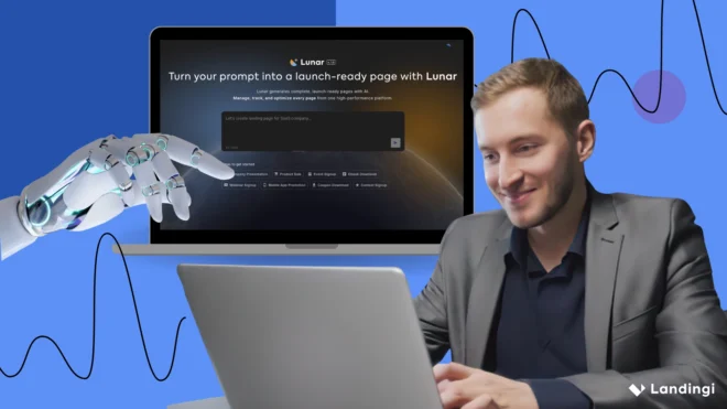
In Landingi, you can create a portfolio landing page yourself in the editor or use Lunar, the AI-native landing page generator, to turn a detailed prompt into a complete, editable page and refine it from there.
Below, you’ll find 15 portfolio landing page examples from different creative fields, with a closer look at the specific design and content choices that work well – and the areas that could still be improved.

15 Best Examples of Portfolio Landing Pages
The best portfolio landing page examples don’t follow one visual formula. Some rely almost entirely on imagery, while others use detailed project descriptions, case studies, or bold interactions to make the work memorable. What matters is how well the page presents the creator’s strengths and helps the right visitor understand them quickly.
The 15 examples below show different ways to approach portfolio landing page design. For each one, we’ll look at the specific choices that work well, what could be improved, and which ideas are worth considering for your own portfolio.
1. Britlyn Simone Floral – florist portfolio landing page
Britlyn Simone Floral’s portfolio puts the finished work where it belongs – front and center. Large, high-quality photographs showcase individual wedding projects, while short descriptions provide just enough context without competing with the arrangements themselves. Each project is identified by the couple and location, which makes the portfolio feel more like a collection of real events than a generic image gallery.

The horizontal browsing experience is a particularly nice touch. It gives the portfolio the feel of flipping through an editorial lookbook and encourages visitors to explore several projects. Once someone is interested, the path to inquiry is easy to find: a prominent button leads to the contact form, while testimonials add reassurance before a potential client reaches out.
What they did well:
- Large, high-quality project photography
- Individual projects organized by couple and location
- Distinctive horizontal portfolio navigation
- Minimal copy that keeps attention on the work
- Prominent inquiry path
- Testimonials supporting the decision to get in touch
What could be improved:
- Adding a little more context to selected projects – such as the brief, venue, or floral concept – could show not only the final result but also the thinking behind the work. For prospective clients comparing florists, that can be more useful than adding extra visual effects or video simply for engagement.
2. David M. Schwarz Architects – architecture portfolio landing page
David M. Schwarz Architects has a large body of work to present, so the portfolio wisely avoids turning the page into a parade of oversized project images. Instead, projects are arranged in a structured grid of thumbnails, making it easy to scan the collection and choose what to explore in more detail.

Each project has a concise title and opens into a dedicated presentation, allowing the main portfolio to stay visually clean despite the amount of content. This approach works particularly well for an architecture portfolio landing page, where visitors may want to compare several projects before committing time to a deeper case study.
What they did well:
- Scannable grid for a large project portfolio
- Consistent, high-quality architectural photography
- Clear project titles
- Individual project pages for deeper exploration
- Contact information easy to access
- Consistent visual presentation across very different projects
What could be improved:
- The portfolio is effective at encouraging exploration, but the path from viewing projects to starting a conversation could be stronger. A visible, contextual CTA such as “Discuss a Project” or “Contact the Studio” would give interested visitors a clearer next step without disrupting the visual experience.
3. Dana Osborne Design – graphic design portfolio landing page
Dana Osborne Design keeps the portfolio personal without letting the introduction overshadow the work. A short opening explains Dana’s approach to design, while illustrated project thumbnails quickly move visitors into the portfolio itself. The result feels more like meeting the designer through her work than browsing a generic gallery.

Client testimonials are particularly useful here. They add another layer to the projects by showing what it’s like to actually work with the designer, not just what the finished pieces look like. Contact details and a clear CTA then give interested visitors a natural route from browsing to starting a conversation.
What they did well:
- Distinctive project thumbnails that make the portfolio easy to browse
- Short introduction that communicates the designer’s approach
- Strong visual consistency
- Testimonials from previous clients
- Clear contact path
- Personality without unnecessary visual clutter
What could be improved:
- Selected projects could benefit from slightly more context around the brief, challenge, or design decisions. Showing a little of the thinking behind the final work would help potential clients evaluate Dana’s process as well as her visual style.
4. Emerse Design – design agency portfolio landing page
Emerse Design uses interaction to make a fairly extensive portfolio easier to explore. Projects appear as visual tiles, with client branding and hover effects revealing additional information and a CTA to view the work in more detail. It gives visitors a quick overview first, then lets them choose which projects deserve a closer look.

The purple visual system runs consistently through the page, including interactive states, which helps a portfolio containing work for different clients still feel cohesive. The surrounding content stays relatively restrained, while contact details and company information are available once visitors have seen enough to consider working with the agency.
What they did well:
- Interactive project grid that encourages exploration
- Hover states that reveal information without cluttering the initial view
- Client logos that make projects easier to recognize
- Strong visual consistency across the portfolio
- Dedicated project details beyond the main gallery
- Accessible contact information
What could be improved:
- Some project previews could communicate the agency’s contribution more clearly before the click. Adding a concise service or outcome label, such as branding, UX/UI, or web design, would help potential clients scan the portfolio by the kind of expertise they’re looking for.
5. Duhon – photography portfolio landing page
Duhon takes a minimal approach that makes sense for a photography portfolio: the photographs get nearly all the attention. High-resolution images are organized into separate categories, so visitors can quickly browse the type of work that interests them instead of moving through one long, mixed gallery.

There’s very little copy, but the information that does appear is useful. An Instagram link gives visitors another place to explore recent work, while the email address and note about last-minute bookings signal that inquiries are welcome. The About and booking sections provide more context without adding clutter to the main portfolio experience.
What they did well:
- Photography-first, minimal layout
- Work organized into clear categories
- Large, high-quality images
- Easy access to additional work on Instagram
- Straightforward contact information
- Booking information kept separate from the portfolio itself
What could be improved:
- The contact path could be more visible. A clear “Book a Session” or “Check Availability” CTA alongside the gallery would make it easier for someone who likes the work to move directly from browsing to an inquiry.
6. Maya Francis – writer and strategist portfolio landing page
Maya Francis’s portfolio makes her professional range clear almost immediately. She positions herself as a copywriter, journalist, editor, and strategist, then backs that up with a visual grid of work for recognizable brands including Netflix, AARP, Hilton, and Midol. For someone working across several creative disciplines, that structure is useful: visitors can understand both what she does and the caliber of clients she has worked with without reading a long introduction.

The project thumbnails bring more color and personality to an otherwise restrained layout, while concise labels keep the grid easy to scan. Each project can then be explored individually, so the main page works almost like a visual resume without trying to squeeze every detail into one place.
What they did well:
- Clear positioning across several creative disciplines
- Recognizable client work used naturally as credibility
- Scannable visual project grid
- Concise project labeling
- Strong use of white space
- Clean typography that keeps attention on the work
What could be improved:
- The portfolio proves Maya’s experience well, but the next step for a potential client could be more prominent. A visible “Work With Me” or “Get in Touch” CTA near the portfolio would connect that credibility more directly with an inquiry.
7. Eva Sánchez – interactive designer portfolio landing page
Eva Sánchez’s portfolio is a good example of minimalism that feels deliberate rather than empty. As an interactive designer, she effectively uses the page itself to demonstrate the kind of work she does: clean typography, generous spacing, subtle motion, and carefully controlled visual hierarchy create a polished digital experience before visitors even open an individual project.

The restraint also makes the portfolio easy to navigate. Instead of adding long explanations to the main view, the design gives individual projects room to stand out and lets visitors explore further when something catches their attention. Responsive behavior and subtle interactions reinforce her positioning as someone who thinks about both aesthetics and usability.
What they did well:
- Portfolio design that demonstrates her interactive design skills
- Strong visual hierarchy and use of white space
- Subtle motion that supports rather than distracts
- Clear, understated navigation
- Consistent experience across screen sizes
- Strong personal visual identity
What could be improved:
- The work itself makes a strong case for Eva’s skills, but a small amount of external proof could strengthen it further. A few carefully selected client testimonials or recognizable client references would add another layer of credibility without compromising the minimal design.
8. SK TANG – fashion stylist portfolio landing page
SK TANG’s portfolio feels closer to a digital fashion editorial than a conventional professional website. Large-format photography takes over most of the experience, while the interface stays deliberately quiet. Visitors can move between editorial and commercial work, which is a useful distinction for someone whose potential clients may be looking for very different kinds of projects.

The minimal navigation leaves plenty of room for the styling itself. Rather than surrounding each image with explanations, the page relies on careful visual curation and sequencing, creating the feeling of browsing a polished lookbook. For a fashion-focused creative portfolio landing page, that restraint becomes part of the personal brand.
What they did well:
- Clear separation between editorial and commercial work
- Large-format photography that gives projects room to breathe
- Strong visual curation and sequencing
- Minimal navigation that doesn’t compete with the portfolio
- Consistent editorial aesthetic
What could be improved:
- Selected projects could use a little more context, such as the publication, client, photographer, or SK TANG’s specific role. That would preserve the visual-first experience while helping potential clients understand the scope of each collaboration.
9. Koichi Takada Architects – architecture portfolio landing page
Koichi Takada Architects treats each project almost like a visual case study. Large architectural photographs lead the experience, but they’re not presented as a simple gallery. The imagery is sequenced to show the building from different perspectives and communicate the ideas, materials, and natural forms behind the design.

The broader project portfolio is easy to explore through filtering and restrained navigation, so visitors can move between projects without losing the visual flow. Branding stays deliberately understated, which makes sense here – the architecture is distinctive enough to carry the page.
What they did well:
- Large-scale architectural photography
- Visual storytelling that goes beyond finished-building shots
- Project filtering that makes a substantial portfolio easier to browse
- Minimal navigation that keeps attention on the work
- Consistent presentation across projects
- Strong connection between the studio’s nature-led philosophy and its visual identity
What could be improved:
- Selected projects could benefit from richer spatial context, such as a short walkthrough video or interactive view. For architecture in particular, this could communicate scale and movement through a space in ways static photography cannot.
10. Studio Libeskind – architecture portfolio landing page
Studio Libeskind has an enormous international portfolio, so organization matters almost as much as presentation. Projects are arranged in a structured visual grid, with high-quality photography accompanied by practical details such as project name, location, and status. This lets visitors scan the studio’s work quickly instead of opening every project just to understand what it is.

Once a project catches the eye, its dedicated page provides the deeper layer: architectural concept, background, and additional visual documentation. The restrained typography and largely neutral interface work well with projects that differ significantly in scale and character, from museums and cultural institutions to residential towers.
What they did well:
- Structured grid for navigating a large portfolio
- Useful project information visible during browsing
- High-quality architectural photography
- Filtering that makes different types of work easier to explore
- Detailed individual project presentations
- Restrained interface that keeps the architecture in focus
What could be improved:
- With so many high-resolution project images, performance deserves particular attention. Careful image optimization and progressive loading can preserve the visual impact while making the portfolio faster for visitors on slower connections or mobile devices.
11. Jessica Bobince – fashion stylist portfolio landing page
Jessica Bobince’s portfolio keeps the interface almost invisible and lets the styling take over. Large, full-bleed editorial images dominate the page, creating an experience closer to browsing a fashion magazine than a traditional portfolio. For a stylist, that choice works particularly well because visitors can understand her aesthetic almost immediately.

The restrained layout also gives very different shoots enough room to stand on their own without making the portfolio feel inconsistent. There’s little explanatory copy, so photography, styling, composition, and project selection build Jessica’s professional identity together.
What they did well:
- Large-scale editorial imagery
- Strong and selective visual curation
- Minimal interface that keeps attention on the work
- Consistent aesthetic across different shoots
- Simple, fluid browsing experience
- Portfolio design that fits the fashion industry
What could be improved:
- A more visible “Work With Me” or “Contact” CTA would give editors, brands, and agencies a clearer route from discovering the work to making an inquiry.
12. HANAZAKI – architecture portfolio landing page
HANAZAKI’s portfolio uses a calm, editorial presentation that fits the studio’s residential architecture particularly well. Large photographs, generous spacing, and restrained typography give each project room to breathe, while the neutral interface complements the natural materials, light, and landscaping visible throughout the work.
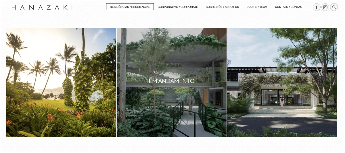
Rather than squeezing many projects into a dense gallery, the page creates a slower browsing experience, closer to an architecture magazine. That helps individual projects feel more substantial and reinforces the studio’s high-end positioning without relying on lengthy descriptions or decorative effects.
What they did well:
- Large, carefully selected architectural photography
- Generous spacing that separates individual projects
- Restrained typography and interface
- Consistent visual language across the portfolio
- Editorial presentation suited to premium residential work
- Responsive layout that preserves the visual impact on smaller screens
What could be improved:
- The transition from admiring the work to contacting the studio could be clearer. A discreet but visible “Start a Project” or “Get in Touch” CTA would give prospective clients a natural next step without disturbing the portfolio’s minimal aesthetic.
13. Rinko Kawauchi – photography portfolio landing page
Rinko Kawauchi’s portfolio feels less like a conventional website and more like a carefully curated digital photo archive. Each project is represented by a single photograph with only the title and year alongside it, giving visitors enough information to navigate while leaving the images to set the mood.

The portfolio is also divided into Works, Video Works, and Installation Views, which makes different parts of Kawauchi’s practice easy to explore without crowding the main experience. The subdued interface, generous spacing, and minimal navigation suit photography built around subtle details and observation – the portfolio doesn’t try to compete with the art it presents.
What they did well:
- Image-first presentation with very little visual noise
- Clear separation between photography, video, and installations
- Minimal captions that keep attention on the work
- Generous spacing between projects
- Consistent visual language throughout the portfolio
- Navigation that supports exploration without interrupting it
What could be improved:
- Brief contextual notes on selected series could help visitors understand the ideas or circumstances behind the work, particularly those discovering Kawauchi for the first time, without compromising the portfolio’s deliberately minimal character.
14. Michelle Carroll – designer portfolio landing page
Michelle Carroll’s portfolio is structured around a clean project grid that makes the work easy to browse without reducing it to tiny thumbnails. Large, editorial-style previews give each project enough visual presence, while consistent spacing and restrained typography keep very different pieces feeling like part of the same portfolio.

The page doesn’t over-explain. Instead, its muted palette and minimal interface create a polished frame for the projects themselves. It’s a good approach for a designer whose potential clients or collaborators want to understand her visual sensibility quickly before exploring individual work in more detail.
What they did well:
- Clear, well-structured project grid
- Large previews that make projects easy to evaluate
- Consistent spacing and visual hierarchy
- Restrained palette that doesn’t compete with the work
- Strong personal branding
- Minimal interface that keeps browsing intuitive
What could be improved:
- The portfolio makes the work easy to discover, but the route from interest to inquiry could be more prominent. A well-placed “Work With Me” or “Get in Touch” CTA would give potential clients a clear next step without changing the page’s understated character.
15. Elisa Miller – fine art photographer portfolio landing page
Elisa Miller’s portfolio leans fully into the atmosphere of her photography. Large-format images take up much of the screen, while careful spacing, subtle interactions, and restrained typography create the feeling of moving through a digital gallery. The presentation suits work centered on identity, femininity, and contemporary visual storytelling without competing with it.

The navigation adds useful structure to what could otherwise become a difficult portfolio to browse. Collections are organized under the Portfolio menu, while separate sections for Prints, Exhibitions, and Press serve different audiences – from potential clients and curators to people interested in purchasing her work. They also provide credibility without crowding individual project pages.
What they did well:
- Large-format photography that preserves the impact of the work
- Clear organization of individual collections
- Subtle interactions that complement the gallery-like experience
- Strong and consistent artistic identity
- Dedicated sections for exhibitions and press
- A separate path for visitors interested in buying prints
What could be improved:
- Selected collections could benefit from a short introduction explaining the idea or context behind the series. Even a few sentences would give new visitors another way into the work without interrupting the portfolio’s deliberately visual character.
How Do I Create a Portfolio Landing Page?
To create a portfolio landing page, first decide what the page should achieve: win client inquiries, generate bookings, attract employers, or present your work to potential collaborators. Then choose a small set of projects that support that goal, decide what each one needs to show – visuals, your role, brief, process, or results – and build the page around one clear CTA, such as Discuss a Project, Book a Session, or Get in Touch.
In Landingi, you can build the page manually when you want direct control over the layout, or start with Lunar, the AI-native landing page generator. Lunar turns a prompt into a complete, structured landing page with copy and layout, and the generated page becomes part of your Landingi workspace, where it can be managed, published, tracked, and optimized.
A useful prompt should give Lunar more than your profession. Tell it who the portfolio is for, what kind of work you want to emphasize, the visual direction, and what visitors should do next. For example:
Create a portfolio landing page for a freelance brand designer working with premium hospitality and lifestyle companies. Use a clean editorial style with warm neutral colors, generous white space, and large project imagery. Open with a short positioning statement, then showcase 5 selected projects with space for the client, brief, solution, and outcome. Add a short About section, recognizable client logos, 3 testimonials, and a contact section. The primary CTA should be “Discuss a Project.” Keep the copy concise, confident, and professional.That gives AI enough context to create something closer to a real creative portfolio landing page, rather than a generic page with a gallery attached to it.
Turn your portfolio brief into a complete, editable landing page and refine it from there.
Once the initial structure is ready, curate the work ruthlessly. Five strong projects usually tell a potential client more than twenty average ones. Lead with work that reflects the projects you want to attract next, and give selected pieces enough context to show what you actually contributed. Depending on your field, that might mean the brief and result for a designer, project type and location for an architect, or client and publication credits for a stylist.
The visual system should support that work rather than compete with it. Keep typography, spacing, colors, image treatments, and CTA styles consistent, and check how image-heavy sections behave on mobile. High-resolution work matters in a portfolio, but so does loading speed, so optimize large photography and video instead of uploading everything at maximum weight.
Then build a clear route from “I like this work” to “I want to work with this person.” Add a focused CTA such as Get in Touch, Discuss a Project, Check Availability, or Request a Quote, supported where relevant by testimonials, client logos, press mentions, or recognizable collaborations. A simple contact form can capture the information you actually need without turning the first conversation into an application process.
After publishing, treat the page as something you can improve rather than a finished digital business card. EventTracker can show clicks, events, scroll depth, and other visitor behavior, while Solis analyzes EventTracker data together with the page and campaign context to surface alerts, discoveries, and practical optimization recommendations. This can help reveal whether visitors reach your strongest projects, engage with them, and eventually make it to the contact point.
See where your portfolio holds attention, where visitors hesitate, and what may be worth improving next.
The result should be more than an attractive archive of past work. A strong portfolio landing page design selects the right projects, explains just enough, establishes credibility, and gives the right client or employer an easy reason to start a conversation.
3 Portfolio Landing Page Best Practices
A strong portfolio landing page should make your work easy to evaluate and the next step easy to take. Beyond the basics of good visuals and clear project descriptions, three practices are especially useful for turning a portfolio from a gallery into a page that can generate real inquiries.
#1 Make the next step specific
A portfolio can hold attention and still fail to generate inquiries if visitors don’t know what to do next. Use a clear CTA that reflects the service you actually offer: “Discuss a Project,” “Check Availability,” “Book a Session,” or “Request a Quote” says much more than a generic “Learn More.”

Keep the CTA visible near key decision points, particularly after your introduction, strongest projects, and credibility section. On mobile, make sure it’s easy to spot and tap without competing with the portfolio itself.
#2 Curate projects around the work you want to attract
A strong portfolio isn’t the one with the most projects. It’s the one that makes your expertise easy to understand. Select work that represents the clients, industries, or assignments you want more of, and organize it so visitors can recognize relevant projects without digging through a long gallery.
Give each featured project enough context to mean something. Depending on your field, that might include the client, your role, the brief, key decisions, or measurable results. For larger portfolios, categories, filters, and clickable project previews can keep browsing manageable without squeezing every case study onto the main page.
AI makes it much faster to generate and restructure portfolio pages, but curation remains a human decision. A tool can help build the presentation; you still need to decide which five projects tell a stronger professional story than twenty loosely related ones.
#3 Use proof that adds context to your work
Testimonials, recognizable client logos, awards, press mentions, and publication credits can strengthen a portfolio, but they work best when they support specific claims. A testimonial explaining how you handled a difficult brief is more useful than generic praise, while a client logo next to the relevant project connects credibility directly to the work.

Place the strongest proof close to your projects or contact CTA. Visitors have already seen what you can produce; social proof helps answer the next question: what is it actually like to work with you?
Build a portfolio landing page in Landingi that gives your best projects a clear path to conversion.
FAQ About Portfolio Landing Pages
The answers below cover the practical questions that come up when creating, optimizing, and choosing the right setup for a portfolio landing page.
What is a portfolio landing page?
A portfolio landing page is a focused page that presents selected work, explains what you do, and gives visitors a clear next step, such as getting in touch, requesting a quote, or booking a session. It usually highlights only the projects and proof most relevant to one audience or professional goal.
What is the best portfolio landing page builder?
Landingi is a strong option for creating and managing portfolio landing pages because it brings creation, publishing, testing, analytics, and AI-assisted optimization into one AI landing page operation system.

You can build the page manually in the editor or use Lunar to generate a complete, editable portfolio from a detailed prompt. After launch, EventTracker shows how visitors interact with projects and CTAs, while Solis analyzes that behavior and points to areas worth improving.
Let Solis analyze visitor behavior and show you where your portfolio could perform better.
How can I optimize my portfolio landing page for higher conversion rates?
Focus on the path from project discovery to contact. Put your strongest work early, keep images optimized for fast loading, make the CTA easy to find, and remove sections that add little value.

Then check what visitors actually do. EventTracker can show clicks, events, and scroll behavior, A/B testing lets you compare meaningful variations, and Solis can surface optimization opportunities based on the page and campaign context.
See which projects visitors explore, how far they scroll, and where they click.
What are the key elements of an effective portfolio landing page?
An effective portfolio landing page design needs clear positioning, a selective project showcase, strong visuals, concise project context, credibility signals, and a visible CTA.
Project context should fit the profession. A designer may show the brief and outcome, an architect the location and project type, and a stylist the client, publication, or collaborators. The goal is to help visitors understand the quality and relevance of the work, not simply display more of it.
What is the difference between a portfolio landing page and a portfolio website?
A portfolio website usually covers a broader professional presence, with separate pages for projects, services, bio, contact details, and sometimes a blog or shop.
A portfolio landing page is narrower. It can focus on one service, audience, campaign, or type of work. A photographer, for example, may keep a full portfolio website and use a dedicated landing page specifically for wedding photography leads.
Do I need a website to create an online portfolio?
No. A standalone portfolio landing page can be enough if your main goal is to show selected work and collect inquiries.
A broader portfolio website becomes more useful when you need several service pages, a large project archive, editorial content, ecommerce, or more complex navigation.
Can I create a portfolio landing page with AI?
Yes. With Lunar, Landingi’s AI-native landing page generator, you can create a complete portfolio landing page in minutes using a prompt. Describe what you do, who you want to reach, the projects you want to feature, your visual direction, and the action visitors should take. Lunar uses that brief to generate the page structure, copy, and design as an editable landing page in Landingi.
From there, you can replace project visuals, refine the content and design, and publish the page on your domain. AI handles much of the initial build, while you decide which work best represents you and how the final portfolio should look.
Build a portfolio landing page that gives potential clients a clear reason to contact you.
Build a Portfolio Landing Page in Landingi
A strong portfolio should do more than collect your best work in one place. It should help the right client, employer, or collaborator quickly understand what you do, see proof of your skills, and know how to contact you.
With Landingi, you can manage that entire process in one AI landing page operation system. Start from a prompt with Lunar to generate a complete, editable portfolio landing page, or build it yourself in the editor when you want more hands-on control. Once the page is live, EventTracker shows how visitors interact with your projects and CTAs, while Solis analyzes that behavioral data and suggests where the experience could be improved.
Your portfolio will change as your work does, so the page shouldn’t be treated as a finished archive. Add stronger projects, refine the story they tell, test what encourages more inquiries, and keep the path to contact simple. With Landingi, you can create, publish, and optimize your portfolio landing page in one workflow – and turn your work into a convincing reason to start a conversation. Try now!