

A recruitment landing page is a dedicated web page built to attract qualified candidates and turn interest into completed applications. Instead of sending job seekers through a crowded careers page, companies use focused hiring landing pages to promote specific roles, teams, locations, or recruitment campaigns in a clearer and more engaging way.
The best recruitment landing pages do much more than list open positions. Pages from brands like LEGO, Slack, Netflix, and Airbnb show candidates what the company actually feels like – the people behind the brand, the work environment, growth opportunities, and the values shaping everyday work. Strong visuals, clear messaging, and a frictionless application flow make the experience feel fast, modern, and candidate-friendly.
In 2026, recruitment teams increasingly treat recruitment landing pages as part of a broader recruitment marketing workflow. Instead of manually building every career landing page from scratch, teams now launch, test, optimize, and scale hiring campaigns much faster with AI-powered landing page systems. Platforms like Landingi help recruiters generate recruitment landing pages with AI, analyze candidate behavior with EventTracker, and improve conversion rates with AI optimization tools like Solis.
In this guide, we’ll explore some of the best recruitment landing page examples, explain what makes them effective, and show how to create a recruitment landing page that attracts top talent and converts more candidates.

Lunar is almost here!

9 Examples of Best Recruitment Landing Pages
The best recruitment landing pages make applying feel simple, fast, and worth the effort. Strong hiring landing pages combine clear messaging, employer branding, and frictionless candidate experience to attract and convert top talent.
Below, we’ll explore some of the best recruitment landing page examples from brands like Spotify, LEGO, Netflix, and Airbnb, and break down what makes them effective.
#1 Spotify
Spotify’s recruitment landing page is a strong example of how employer branding and candidate experience can work together. The page immediately feels modern, welcoming, and people-focused, using bold visuals, short messaging blocks, and dynamic layouts to make browsing careers feel engaging instead of overwhelming.
One of the strongest elements is the way Spotify presents job opportunities. Instead of displaying a static wall of listings, the careers landing page uses interactive sections, clear categorization, and a visible search function that helps candidates quickly find relevant roles. The page also balances recruitment messaging with culture-focused content, giving visitors a better sense of the company before they apply.

Winning Points
- Strong employer branding throughout the page
- Clear and easy-to-use job search experience
- Dynamic, visually engaging layout
- High-quality visuals and video content
- Clear CTA driving users toward open roles
- Good balance between company culture and job listings
Room for Improvement
- More employee testimonials and career stories could make the recruitment page feel even more authentic and personal
#2 LEGO
LEGO’s recruitment landing page perfectly matches the energy of the brand itself – creative, colorful, and genuinely engaging. From the very beginning, the page encourages visitors to explore careers through bold visuals, playful design elements, and clear recruitment messaging that feels approachable rather than corporate.

One of the strongest parts of this career landing page is its search experience. Candidates can quickly filter roles by keyword, location, or category, which makes browsing open positions feel simple even with a large number of listings. The page also does a great job of combining employer branding with recruitment content, showcasing LEGO’s values, diversity initiatives, and collaborative work culture throughout the experience.

Winning Points
- Strong employer branding consistent with the LEGO identity
- Clear and intuitive job search functionality
- Visually engaging and interactive design
- Good balance between company culture and job opportunities
- High-quality visuals and video content
- Clear recruitment messaging throughout the page
Room for Improvement
- The mobile experience could be slightly smoother in some sections with heavy visual elements and animations
#3 Contentsquare
Contentsquare’s recruitment landing page takes a more modern and minimalist approach, focusing on clarity, accessibility, and strong employer branding. The page immediately communicates growth, innovation, and global culture without overwhelming candidates with too much information at once.

What works especially well here is the structure. Job listings are easy to browse, sections feel clean and well-organized, and the page uses whitespace effectively to keep the experience readable and focused. Contentsquare also balances recruitment content with culture-driven storytelling, using visuals, videos, and short messaging blocks to make the company feel approachable and people-oriented.

The CTA placement is another strong point. Calls-to-action appear naturally throughout the page, helping candidates move from browsing to applying without disrupting the experience.

Winning Points
- Modern and clean recruitment page design
- Clear navigation and organized job listings
- Strong employer branding and company culture messaging
- Effective use of whitespace and layout hierarchy
- Well-placed CTAs across the page
- High-quality visuals and video content
Room for Improvement
- Slightly faster loading speeds could improve engagement on more content-heavy sections
#4 Netflix
Netflix’s recruitment landing page is one of the strongest hiring landing page examples when it comes to visual storytelling and candidate experience. The page immediately grabs attention with dynamic visuals and a cinematic hero section that gives visitors a behind-the-scenes look at the company culture instead of pushing job listings right away.

What makes this careers landing page especially effective is its simplicity beneath the visual layer. The job search bar is highly visible from the start, navigation feels intuitive, and the content structure keeps candidates moving naturally through culture, values, and open roles. Netflix also does a great job of balancing employer branding with usability, making the experience feel polished without becoming difficult to browse.

Winning Points
- Visually strong and engaging hero section
- Clear focus on employer branding and culture
- Easy-to-use job search functionality
- Clean and intuitive navigation
- Strong use of video and visual storytelling
- Sticky CTA improves visibility during scrolling
Room for Improvement
- Reducing the number of competing CTA buttons could create a slightly more focused application flow
Generate, optimize, and scale recruitment landing pages faster with AI-powered workflows built for modern hiring campaigns.
#5 Red Bull
Red Bull’s recruitment landing page feels energetic from the very first second, which fits the brand perfectly. Large visuals, motion-heavy sections, and bold messaging create the impression that candidates are joining a fast-moving global brand rather than simply applying for a job.

What makes this hiring landing page effective is that the experience still stays easy to navigate despite the amount of visual content. Candidates can quickly browse open roles, explore office locations, and learn more about the company culture without feeling lost. Red Bull also adds more interactive elements than most recruitment page examples, including the Wingfinder assessment tool, which makes the experience feel more personalized and engaging.

Winning Points
- Strong employer branding and energetic visual identity
- Clear and intuitive navigation
- Easy-to-browse job listings and categories
- Interactive elements that improve engagement
- Strong global recruitment positioning
- Good balance between visuals and usability
- Helpful FAQ and candidate support sections
Room for Improvement
- Some highly animated sections could be slightly better optimized for mobile responsiveness and loading speed
#6 Slack
Slack’s career landing page takes a simpler and more minimalist approach than many other recruitment landing page examples, which works strongly in its favor. The layout feels clean, structured, and easy to navigate, while the messaging focuses heavily on flexibility, remote work, and healthy work culture – topics that matter strongly to modern candidates.

The page guides visitors naturally through company values, culture, and open positions without overloading them with too much information. Strong CTA placement and clear content hierarchy make browsing effortless, while the overall visual consistency keeps the experience polished and professional.

Winning Points
- Clean and modern recruitment page design
- Clear navigation and logical page structure
- Strong focus on flexibility and work culture
- Well-placed CTA buttons
- Consistent visual branding
- Smooth and simple application experience
Room for Improvement
- Adding more employee stories or testimonials could make the employer branding feel even more personal and trustworthy
#7 Boeing
Boeing’s recruitment landing page takes a more corporate and structured approach, but it still manages to feel inspiring and candidate-focused. Strong headline messaging and a large hero section immediately position careers at Boeing as mission-driven, appealing to candidates looking for long-term growth and meaningful work.
The page is organized around clear career categories like engineering, cybersecurity, manufacturing, and data science, which makes navigating large numbers of job listings much easier. Boeing also does a good job of combining recruitment content with employer branding by highlighting company values, benefits, diversity initiatives, and career development opportunities throughout the experience.

Winning Points
- Strong and inspiring hero messaging
- Clear career path categorization
- Easy-to-use job search functionality
- Good balance between recruitment and employer branding content
- Clear CTAs guiding users toward applications
- Helpful job alert signup functionality
Room for Improvement
- More interactive content, such as employee stories or workplace videos, could make the page feel more personal and engaging
#8 Forbes
Forbes uses a more editorial-style approach than most recruitment landing page examples, which fits the brand naturally. The page combines strong messaging, clean structure, and minimalistic design to position Forbes as a place for ambitious, growth-oriented professionals.

The careers landing page feels easy to browse from the start. Job openings are clearly structured, CTAs are highly visible, and the content focuses heavily on innovation, career development, and company values. Strategic use of whitespace also helps the page feel modern and readable, especially compared to more crowded corporate hiring pages.

Winning Points
- Strong employer positioning and value proposition
- Clean and modern page structure
- Easy-to-browse job listings
- Clear CTA placement throughout the experience
- Strong focus on career growth and company culture
- Good use of whitespace and content hierarchy
Room for Improvement
- Adding more visual storytelling, such as employee videos or behind-the-scenes content, could make the recruitment experience feel more immersive
#9 Airbnb
Airbnb’s recruitment landing page feels warm, modern, and highly candidate-focused from the very beginning. The page combines strong employer branding with simple navigation, using inviting visuals and concise messaging to create an experience that feels approachable rather than overly corporate.

One of the biggest strengths of this careers landing page is its balance. Airbnb manages to showcase company culture, flexibility, inclusion, and career growth opportunities without overwhelming visitors with too much content at once. The page structure flows naturally between sections, while clear CTAs and a visible search function help candidates quickly move toward relevant job openings.
Winning Points
- Strong employer branding and visual storytelling
- Welcoming and candidate-friendly design
- Clear CTA placement and easy navigation
- Good balance between culture and recruitment content
- Strong focus on flexibility and inclusion
- Effective use of visuals and concise messaging
Room for Improvement
- Some mobile interactions and transitions could feel slightly smoother on slower devices
How To Create a Recruitment Landing Page That Converts?
To create a recruitment landing page that converts, start with a clear hiring goal and a candidate-focused experience. The best recruitment landing pages quickly communicate why the role matters, what the company offers, and why candidates should apply now instead of continuing their job search elsewhere.
Today, recruitment teams rarely build every hiring landing page manually from scratch. Instead, many companies use AI landing page tools to generate, launch, test, and optimize recruitment campaigns much faster – especially when hiring across multiple roles, locations, or departments.
Platforms like Landingi simplify this workflow with AI-powered landing page generation, behavioral analytics, and conversion optimization tools built specifically for scalable landing page operations. With Lunar – Landingi’s 100% AI-native landing page generator – teams can generate a complete recruitment landing page from a simple prompt, including structure, copy, and conversion-focused sections.
Example prompt:
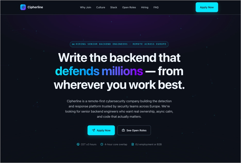
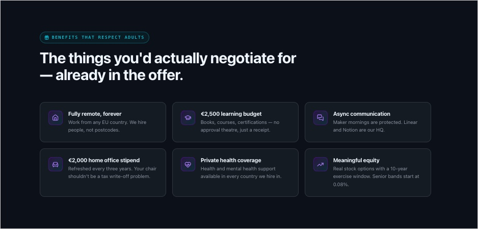
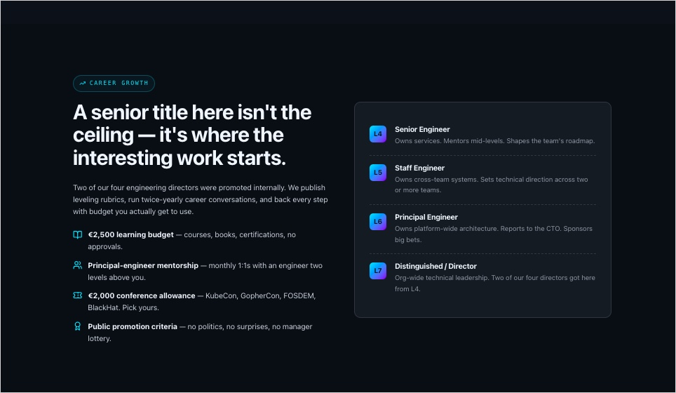
Create a recruitment landing page for a remote-first cybersecurity company hiring senior backend developers across Europe. Use a modern, high-trust design with dark UI elements, clean typography, and strong employer branding. Highlight flexible remote work, engineering culture, advanced infrastructure projects, career growth opportunities, learning budget, async communication, and transparent hiring process.
Include a hero section with a strong CTA, employee-focused messaging, company culture section, benefits overview, engineering stack section, testimonials from developers, FAQ, and a fast application form optimized for mobile devices. Use concise, conversion-focused copy that feels modern, human, and technical without sounding overly corporate.
Create the page structure for high candidate conversion rates with visible CTAs throughout the page, easy navigation, and strong emphasis on innovation, security, and team autonomy.
Within minutes, Lunar generates a complete recruitment landing page structure with ready-to-publish copy, conversion-focused sections, and a mobile-first layout that recruitment teams can immediately customize, launch, and optimize further.
From there, recruitment teams can optimize the page further with EventTracker and AI-powered recommendations from Solis, helping improve candidate engagement and application conversion rates over time.
Create recruitment landing pages with AI-generated structure, copy, and conversion-focused sections in minutes.
How Can I Optimize My Recruitment Landing Page for Higher Conversion Rates?
To optimize a recruitment landing page for higher conversion rates, focus on clarity, speed, trust, and candidate experience. The best hiring landing pages remove friction from the application process, communicate the value of the opportunity quickly, and guide candidates naturally toward applying.
Today’s recruitment landing pages also rely much more heavily on data and continuous optimization than they did a few years ago. Recruitment teams regularly test headlines, layouts, CTAs, application flows, and employer branding sections to understand what actually drives more qualified applications.
A modern recruitment landing page should feel fast, mobile-friendly, easy to scan, and highly relevant to the specific audience you want to attract. Below are the most important optimization tactics used in high-performing recruitment landing page examples today.
#1 Use role-specific messaging
Generic recruitment messaging rarely converts well. Strong recruitment landing pages speak directly to a specific audience, role, or department. Candidates should immediately understand who the position is for, what problems they’ll solve, and why the opportunity stands out.
#2 Make the value proposition obvious
Candidates evaluate employers quickly. Salary transparency, flexibility, remote work options, career growth, tech stack, benefits, and work culture should appear early on the page instead of being hidden deep in the content.
#3 Reduce friction in the application flow
Long and complicated application forms still kill conversions. The best job application landing pages simplify the process with shorter forms, resume uploads, LinkedIn integrations, and mobile-friendly application flows.
#4 Use authentic employer branding
Candidates trust real people more than polished corporate messaging. Employee stories, behind-the-scenes content, workplace visuals, and team-focused messaging help recruitment landing pages feel more trustworthy and relatable.
#5 Optimize for mobile-first browsing
Most candidates now discover jobs on mobile devices first. A careers landing page should load quickly, remain easy to navigate on smaller screens, and keep CTAs visible throughout the experience.
#6 Keep CTAs clear and visible
Strong CTAs reduce hesitation and guide candidates toward action. Phrases like “Apply Now”, “Explore Open Roles”, or “Join Our Engineering Team” usually perform better than vague or passive CTA copy.
#7 Use behavioral data to improve conversions
High-performing recruitment teams continuously analyze candidate behavior to understand where users drop off, hesitate, or abandon applications. Tools like EventTracker and Solis help identify friction points and optimization opportunities across recruitment landing pages.
#8 Test different page variations
Small changes can significantly impact recruitment conversion rates. A/B testing different headlines, layouts, visuals, CTAs, or form lengths helps teams understand which recruitment page versions perform best for specific candidate groups.
#9 Improve page speed and readability
Fast-loading pages consistently perform better in recruitment marketing. Compressing media, simplifying layouts, and using scannable content structures improve both user experience and conversion rates.
#10 Match the page to the hiring campaign
The highest-converting recruitment landing pages are highly targeted. Instead of sending all traffic to one generic careers page, companies increasingly create dedicated landing pages for specific campaigns, roles, industries, or candidate segments.
Launch and optimize recruitment landing pages faster with AI-powered workflows and candidate insights.
your needs.
FAQ About Recruitment Landing Pages
Below, you’ll find answers to the most common questions about recruitment landing pages, hiring landing pages, employer branding pages, and recruitment conversion optimization.
What is a recruitment landing page?
A recruitment landing page is a dedicated web page designed to attract candidates and encourage them to apply for a specific role, team, department, or hiring campaign. Unlike a traditional careers page that lists all company openings in one place, a recruitment landing page focuses on a single hiring goal and guides visitors toward a clear action. The best recruitment landing pages combine employer branding, job information, company culture, and conversion-focused design in one streamlined experience.
Why do I need a recruitment landing page?
A recruitment landing page helps companies attract more qualified candidates through targeted messaging and a better candidate experience. Instead of sending traffic to a generic careers page, recruiters can create focused hiring landing pages tailored to specific roles, locations, seniority levels, or recruitment campaigns.
Modern recruitment landing pages also support faster optimization and better recruitment marketing performance. Teams can test messaging, analyze candidate behavior, improve application flows, and scale campaigns more efficiently using AI-powered tools, behavioral analytics, and conversion-focused landing page workflows.
What are the key elements of an effective recruitment landing page?
The best recruitment landing pages usually include a strong headline, visible CTAs, role-specific messaging, company culture sections, employee testimonials, benefits overview, mobile-friendly application forms, and authentic visuals that make the workplace feel real and approachable. Clear structure and fast-loading design also play a major role in keeping candidates engaged throughout the experience.
Modern hiring landing pages increasingly use behavioral analytics and AI-powered optimization to improve candidate conversion rates over time. Recruitment teams continuously test layouts, messaging, and application flows to understand what actually drives more qualified applications.
Create recruitment landing pages faster with AI-powered generation, testing, and optimization tools built for modern hiring teams.
What is the best recruitment landing page builder?
Landingi is one of the strongest recruitment landing page builders for teams that want to launch, test, and optimize hiring campaigns quickly without relying heavily on developers. Instead of functioning only as a traditional landing page builder, Landingi works more like a complete landing page operation system for managing recruitment campaigns at scale.
One of the biggest advantages is Lunar – Landingi’s AI-native landing page generator. Recruitment teams can generate complete hiring landing pages from prompts within minutes, including structure, copy, CTAs, and mobile-ready sections tailored to specific roles or campaigns. This makes launching dedicated recruitment landing pages for different positions, locations, or departments significantly faster.
Landingi also includes EventTracker, which helps teams analyze candidate behavior across recruitment pages in real time. Recruiters can see where visitors engage, where they drop off, and which sections affect application conversions most strongly. Solis adds another optimization layer by identifying friction points and suggesting improvements based on behavioral patterns and conversion data.
Beyond AI features, Landingi offers A/B testing, Smart Sections for scalable updates across multiple recruitment landing pages, built-in form builder tools, and integrations with over 180 marketing platforms. Teams can also automatically translate recruitment landing pages into more than 35 languages, making international hiring campaigns much easier to manage.
What are the recruitment landing page best practices?
The best recruitment landing pages focus on clarity, relevance, and candidate experience. Strong hiring landing pages use role-specific messaging, visible CTAs, mobile-friendly layouts, and simple application flows that reduce friction and help candidates move quickly from interest to application.
Modern recruitment landing page best practices also include authentic employer branding, fast-loading design, clear value propositions, and continuous optimization through A/B testing and behavioral analytics. The highest-performing recruitment pages are regularly updated and tailored to specific roles, departments, or hiring campaigns instead of relying on one generic careers page.
What is the average recruitment landing page conversion rate?
Average recruitment landing page conversion rates usually fall between 2% and 5%, although results vary depending on the role, industry, traffic quality, and application process. Highly targeted recruitment landing pages with clear messaging and simplified application flows often perform significantly better than generic careers pages.
Conversion rates also depend heavily on optimization. Strong CTAs, mobile-friendly layouts, faster loading speeds, and role-specific messaging can all improve candidate conversion rates over time. Many recruitment teams now use behavioral analytics and A/B testing tools like EventTracker to continuously improve recruitment landing page performance.
Use EventTracker to identify drop-off points, analyze candidate engagement, and improve recruitment landing page conversions with real-time behavioral insights.
What should you avoid while creating a recruitment landing page?
Avoid cluttered layouts, generic recruitment messaging, long application forms, and poor mobile experience. Candidates should immediately understand the role, the company, and the next step without searching through walls of text or complicated navigation.
Another common mistake is sounding overly corporate or vague. The best recruitment landing pages feel human, specific, and role-focused instead of relying on generic phrases and buzzwords. Companies should also avoid creating one generic careers landing page for every campaign. Dedicated recruitment landing pages tailored to specific roles or audiences usually convert much better.
Finally, don’t ignore optimization. Slow-loading pages, hidden CTAs, and untested application flows often reduce conversion rates significantly. High-performing recruitment teams continuously improve hiring landing pages using behavioral analytics, A/B testing, and candidate feedback.
Build and optimize recruitment landing pages faster with AI-powered workflows, testing, and conversion tools.
Build Recruitment Landing Pages with Landingi to Hire Top Talents
The best recruitment landing pages combine strong employer branding, clear messaging, and frictionless candidate experience to turn job seekers into applicants. The strongest hiring page examples don’t just promote open roles – they help companies communicate culture, values, growth opportunities, and what makes the workplace genuinely worth joining.
Landingi helps recruitment teams create, launch, and optimize recruitment landing pages without heavy developer involvement. With AI-powered generation through Lunar, behavioral analytics from EventTracker, and optimization support from Solis, teams can build employer branding landing pages and recruitment campaigns faster while continuously improving candidate conversion rates.
Whether you’re creating a job application landing page for a specific role, scaling global recruitment campaigns, or testing different hiring page examples, Landingi gives teams the tools to manage the entire recruitment landing page workflow in one place. Try Landingi now!


