
Product landing pages give marketers something a traditional CMS rarely does: the freedom to build pages around a single campaign, audience, or offer without affecting the rest of the website. That makes them easier to test, update, duplicate, and optimize as campaigns evolve.
Dedicated landing page platforms streamline that workflow even further. Instead of depending on developers or modifying an existing website, marketing teams can create, publish, manage, and optimize campaign pages in one environment. Product landing pages work just as well for physical products, digital downloads, SaaS platforms, mobile apps, online courses, and ecommerce campaigns.
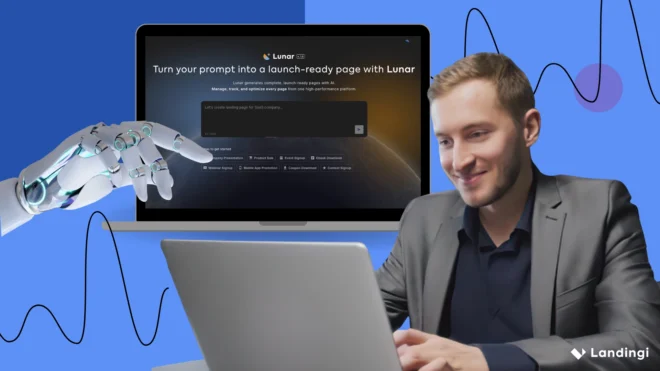
Landingi is one example of that approach. The platform combines visual page building with AI-powered workflows and optimization tools, making it easier to move from campaign idea to published landing page and continuously improve performance based on visitor behavior. Lunar accelerates page creation from a short brief, while EventTracker and Solis provide insights that support ongoing optimization rather than one-time page launches. To learn how successful brands put these principles into practice, explore the 20 product landing page examples below.

20 Best Examples of Product Landing Pages
Explore 20 product landing page examples from ecommerce, SaaS, digital products, and consumer brands. Each one takes a different approach to presenting value, building trust, and guiding visitors toward a purchase or signup.
As you go through the examples, pay attention to the design decisions, messaging, page structure, and conversion techniques behind each campaign. Some focus on storytelling, others rely on social proof, interactive elements, or striking visuals. Together, they offer practical ideas you can adapt to create a high-converting product landing page of your own.
1. Dyson Hair Styler
Dyson is a technology company known for premium home appliances and beauty devices. This landing page promotes the Dyson Hair Styler by showing the product in action instead of relying on technical specifications. It’s a great example of a landing page best for premium products that customers want to see before making a purchase.
The first thing visitors notice is movement. Videos show different hairstyles being created, close-up shots explain how the attachments work, and the page gradually introduces features, tutorials, reviews, and FAQs. Every section answers another question a potential customer might have, so by the time the CTA appears, there’s very little left to wonder about.

Why this page converts
The page removes uncertainty before asking visitors to buy. Instead of simply describing the product, it demonstrates how it works and backs every claim with tutorials, reviews, and real-life examples.
What they did well
- The product is demonstrated throughout the page, making its benefits easy to understand.
- Reviews, awards, and customer content appear naturally alongside the product information, adding credibility without interrupting the experience.
What could be improved
A few sections feel a little too packed with information. Giving the content more breathing room would make the page easier to scan.
Showcase your product’s features – generate a compelling landing page with Landingi!
2. Steph Tylor Podcast Course
Steph Taylor helps entrepreneurs launch and grow podcasts through online education. This landing page promotes her flagship podcast course by combining educational content with personal storytelling. It’s a strong example of an approach best for creators, coaches, and educators selling digital products that require trust before visitors are ready to buy.
It’s a long page, but it never feels long just for the sake of it. Every section has a clear purpose. One explains why podcasting works, another introduces Steph’s experience, while the next shares results from her students. Instead of jumping straight into the offer, the page gives visitors enough context to feel confident before making a decision.

Why this page converts
Rather than pushing visitors toward the checkout, the page earns their trust first. It answers common objections, reinforces its claims with student success stories, and makes the final CTA feel like a natural next step.
What they did well
- Personal storytelling makes the course feel authentic and relatable.
- Testimonials appear throughout the page, reinforcing key messages exactly where visitors are most likely to need reassurance.
What could be improved
The main CTA could appear a little sooner. Visitors who are already know they want to enroll shouldn’t have to scroll to find it.
3. Snoozy App
Snoozy is a sleep app designed to help users build healthier bedtime habits and improve their sleep quality. This landing page introduces the app with a simple, distraction-free design that keeps the focus on a single goal: getting visitors to download it. This approach works best for digital products with one primary conversion goal.
There are no busy navigation menus or competing messages to pull visitors away. Instead, the page relies on concise copy, clean visuals, and subtle animations to explain the app’s value, while the layout naturally guides the eye toward the CTA.

Why this page converts
The page keeps decision fatigue to a minimum. Visitors immediately understand what the app does, why it matters, and what they’re expected to do next.
What they did well
- A distraction-free layout keeps all attention on the product and the CTA.
- Concise copy, simple visuals, and subtle animations make the page easy to scan without feeling empty.
What could be improved
Adding customer reviews or testimonials would make the page feel more trustworthy. For a digital product, even a few authentic opinions can help reassure first-time visitors.
Turn visitors into buyers – create a product landing page that converts with Landingi!
4. Oatly Oat Drink
Oatly is a food and beverage company best known for its oat-based dairy alternatives. This landing page showcases the brand’s oat drinks in different varieties while highlighting the personality that’s made Oatly instantly recognizable. It’s a great example of an approach best for consumer brands that want to sell both a product and a lifestyle.
Rather than filling the page with technical details, Oatly leans into storytelling, playful copy, and bold visuals. Product information is still easy to find, but the overall experience feels more like spending time with the brand than browsing a product catalog.

Why this page converts
Instead of competing on features alone, the page creates an emotional connection through branding. Visitors remember the personality behind the product, making the buying experience feel more engaging and memorable.
What they did well
- The distinctive brand voice makes the page stand out from more conventional product pages.
- Helpful features like the FAQ and Oatfinder answer questions while encouraging visitors to keep exploring.
What could be improved
Although Oatfinder is one of the page’s most useful features, it doesn’t stand out enough. Making it a more prominent CTA would help visitors find nearby retailers more quickly and encourage more interaction.
Promote your new product – design a landing page with Landingi today!
5. Wellbel Supplements
Wellbel is a wellness brand offering supplements designed to support healthy hair, skin, and nails. This landing page presents its product range with a clean, minimalist design that keeps the focus on the supplements themselves. It’s a strong example of an approach best for health and wellness brands that want to communicate benefits without overwhelming visitors.
Instead of relying on long descriptions, the page uses product photography, short copy, and simple icons to explain what each supplement does. Individual product cards make browsing easy, while newsletter and social media sections encourage visitors to stay connected with the brand beyond their first visit.

Why this page converts
The page is easy to scan and keeps the shopping journey simple. Visitors can quickly understand the products, compare options, and move toward a purchase without digging through large blocks of text.
What they did well
- High-quality product photography does most of the selling, supported by concise, benefit-focused copy.
- Product cards make it easy to compare supplements and jump directly to the purchase page.
What could be improved
Short videos showing how the supplements fit into a daily routine or featuring customer experiences would make the page feel more engaging and help reinforce the product’s value.
Ready to boost your product’s success? Build a landing page with Landingi!
6. Marshall Headphones
Marshall is an iconic audio brand known for combining high-quality sound with its signature rock-inspired design. This landing page showcases its headphones by blending lifestyle imagery with technical information. The overall structure is best for premium electronics that need to appeal to both emotion and product research.
From the first screen, the page feels unmistakably Marshall. Bold typography, immersive photography, and subtle animations create a strong first impression, while comparison tables, specifications, reviews, and FAQs make it easy for visitors to dig into the details before buying.

Why this page converts
The page captures visitors emotionally first, then gives them all the practical information they need to justify the purchase. That combination makes the buying journey feel both inspiring and reassuring.
What they did well
- Strong visual storytelling reinforces the brand while showcasing the product from multiple angles.
- Technical specifications, pricing, reviews, and a clear CTA make the decision-making process straightforward.
What could be improved
The mobile experience could be further optimized to improve loading speed and navigation, especially considering the number of large visuals and animations throughout the page.
7. ReTime
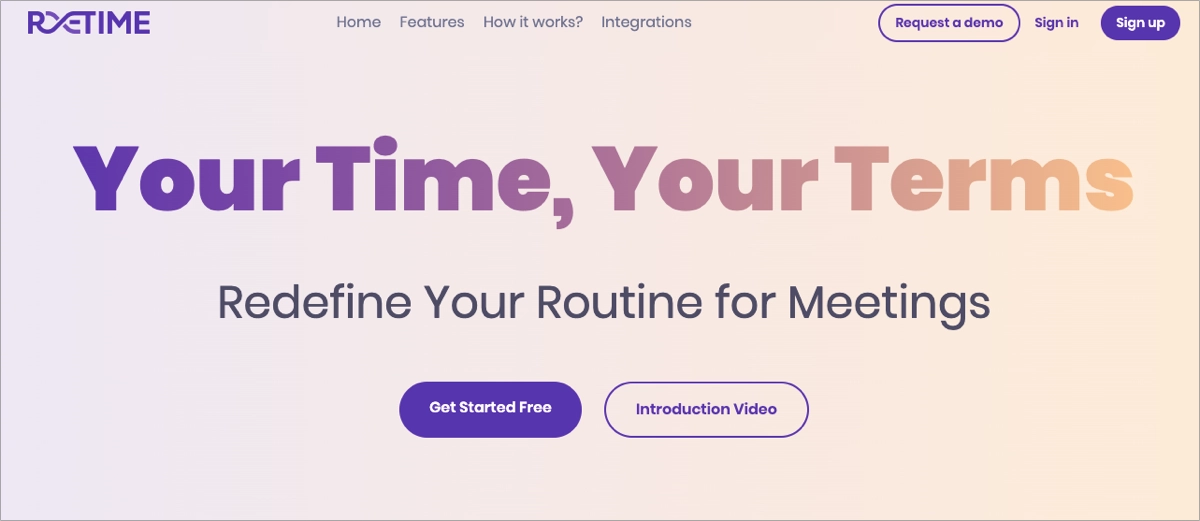
ReTime is a productivity tool designed to help teams manage schedules and workflows more efficiently. This landing page introduces the platform with a clean, spacious layout that makes even complex features feel easy to understand. This approach works best for SaaS products that need to explain their value without overwhelming first-time visitors.
Instead of trying to fill every section with information, the page gives key messages, product videos, and CTAs plenty of room to breathe. A dedicated “How it works” section walks visitors through the platform, while testimonials and integrations show how ReTime fits naturally into existing workflows.
Why this page converts
The page keeps the experience simple from start to finish. It introduces the product gradually, supports every claim with visuals or social proof, and places CTAs where visitors are most likely to be ready for the next step.
What they did well
- Strategic use of white space makes the most important content and CTAs stand out.
- Product videos, integrations, and testimonials work together to explain the platform and build credibility.
What could be improved
Adding more customer stories or measurable results would strengthen the page even further, especially for visitors comparing ReTime with similar tools.
8. Videotoflip
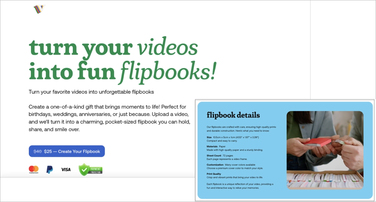
Videotoflip transforms digital videos into personalized flipbooks for gifts, celebrations, and special occasions. This landing page explains the idea in just a few seconds with a playful design and a hero video that immediately shows how the product works. It’s a great example of a layout best for products that are easier to understand through demonstration than description.
The page follows a simple, step-by-step structure that walks visitors through the ordering process. Interactive previews, customer examples, and testimonials make it easy to imagine the finished product, while payment badges and clear CTAs help remove hesitation before purchase.
Why this page converts
Instead of asking visitors to picture the product, the page shows it in action. Combined with a straightforward buying journey, that makes the offer easy to understand and even easier to act on.
What they did well
- The step-by-step structure makes the ordering process feel simple and intuitive.
- Interactive previews, testimonials, and payment badges reinforce trust throughout the page.
What could be improved
The hero video and other rich media could be optimized to improve loading speed, especially for mobile visitors using slower internet connections.
9. Jivati
Jivati is a beverage brand offering ready-to-drink alcoholic cocktails with a fresh, lifestyle-focused identity. This landing page introduces the brand with vibrant visuals, bold messaging, and a shopping experience that feels quick and effortless. It’s a great example of an approach best for lifestyle brands that want to combine strong branding with direct online sales.
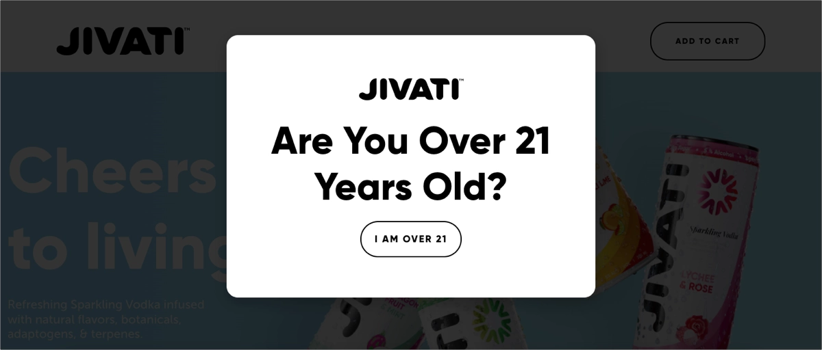
Before visitors even enter the page, an age gate sets clear expectations. Inside, they’re greeted with colorful product photography, subtle animations, and a confident “Cheers to Living” headline. Promotions, clear CTAs, and built-in purchasing options keep the journey simple, while shipping details and secure checkout badges help build confidence before the final click.
Why this page converts
The page balances inspiration with convenience. It creates an emotional connection through branding, then removes friction with clear purchase options and reassuring trust signals.
What they did well
- Vibrant visuals and consistent messaging create a premium brand experience from the first screen.
- Promotions, prominent CTAs, and integrated checkout make the buying process fast and intuitive.
What could be improved
Adding customer reviews or influencer testimonials would strengthen credibility and give first-time buyers more confidence in the product.
Sell your product online – create a high-converting landing page with Landingi!
10. Tala Pineapple
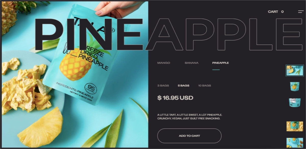
Tala creates premium sparkling beverages, and this landing page puts one of its signature flavors, Pineapple, front and center. This layout works best for consumer products where great photography can do as much selling as the copy itself.
The page keeps distractions to a minimum. Large product images, bright fruit photography, and a clean layout immediately communicate the flavor and personality of the brand. Everything visitors need to buy, from product options and pricing to quantity selection and checkout, is easy to find without extra scrolling or unnecessary steps.
Why this page converts
The page gets straight to the point. Strong visuals create interest immediately, while the clean shopping flow makes it easy for visitors to complete their purchase without interruptions.
What they did well
- Premium product photography creates a strong first impression and keeps the product in focus.
- A simple product selection and checkout flow minimize friction before purchase.
What could be improved
Further optimizing the mobile experience, particularly loading speed and touch interactions, would help maintain the same smooth shopping journey across all devices.
Increase product visibility – build your product landing page with Landingi!
11. Analogue aF-1
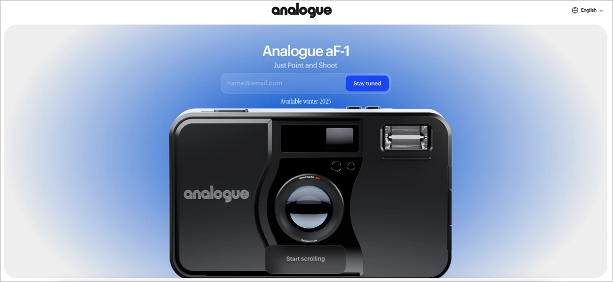
Analogue is a photography brand focused on bringing the experience of analog shooting into the digital world. This landing page introduces the aF-1 camera through storytelling and carefully crafted visuals rather than a long list of technical specifications. This approach works best for premium products that people buy as much for the experience as for the product itself.
From the first screen, the page sets a slower pace. Soft colors, understated typography, and subtle animations create an atmosphere that reflects the brand, while concise copy gradually explains what makes the camera different. Instead of rushing visitors toward the preorder button, the page builds curiosity first and lets the story unfold naturally.
Why this page converts
The page sells a feeling before it sells a camera. By creating an emotional connection first, the preorder CTA feels like a natural next step instead of an aggressive sales pitch.
What they did well
- Storytelling, photography, and subtle animations create a memorable brand experience.
- The clean layout and understated CTAs guide visitors through the page without breaking the narrative.
What could be improved
Since this is a preorder page, adding early reviews, media coverage, or testimonials from photographers would help build credibility before launch.
Maximize your product sales – optimize your landing page with Landingi!
12. Resend
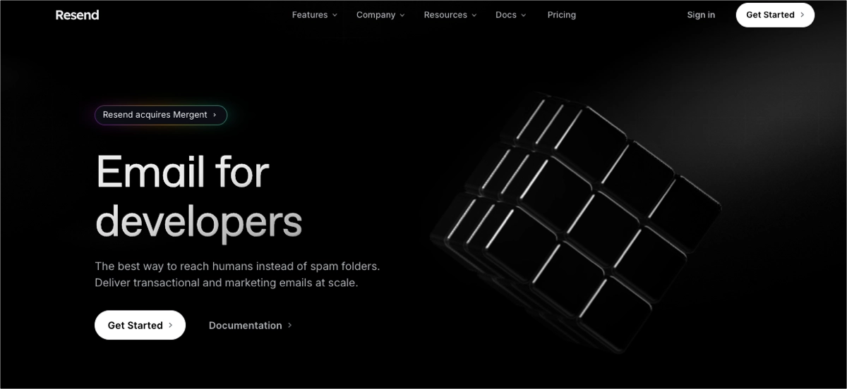
Resend is an email platform that helps developers send transactional and marketing emails through a modern, API-first infrastructure. This landing page makes its audience clear within seconds, using straightforward messaging and clean design that speaks directly to developers. It’s a great example of an approach best for technical products built for a clearly defined audience.
Everything on the page feels purposeful. The headline immediately explains the value proposition, while features, integrations, and use cases are organized into easy-to-scan sections. Instead of trying to simplify the language for everyone, Resend embraces developer terminology, making the product feel trustworthy from the very beginning.
Why this page converts
The page never tries to be something it’s not. By speaking directly to developers and removing unnecessary distractions, it helps visitors quickly decide whether the product fits their needs.
What they did well
- Developer-focused messaging immediately communicates who the product is for.
- Features, integrations, and use cases are organized in a logical order that makes the page easy to scan.
What could be improved
Adding more customer stories or detailed case studies would complement the existing client logos and show how teams use the platform in real-world projects.
13. Saint James
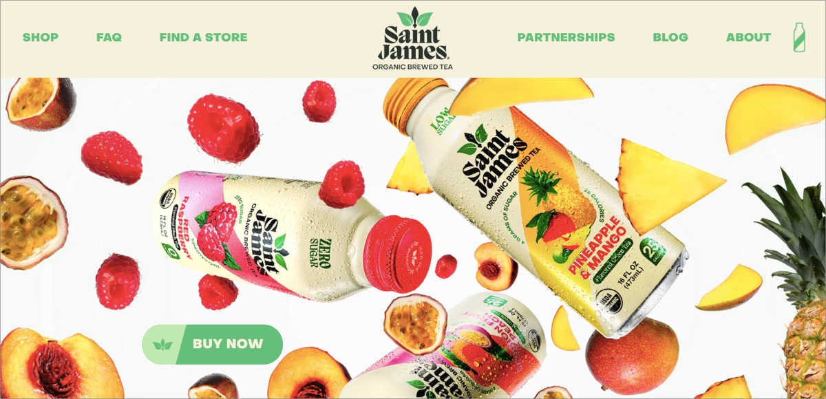
Saint James is a beverage brand specializing in organic iced tea made with real brewed tea and natural ingredients. This landing page introduces the brand through vibrant visuals and lifestyle storytelling instead of focusing only on the product. It’s a great example of an approach best for food and beverage brands that want to create an emotional connection before asking visitors to buy.
As visitors scroll, they’re introduced to different flavors while moving naturally through the shopping experience. Lifestyle photography, product information, and checkout elements are balanced throughout the page, making it feel just as much like a brand experience as an online store.
Why this page converts
The page makes visitors imagine the experience before they think about the purchase. Once that emotional connection is there, buying the product feels like the obvious next step.
What they did well
- Lifestyle photography and storytelling give the brand a distinctive personality.
- The shopping flow stays simple, making it easy to browse flavors and complete a purchase.
What could be improved
Further optimizing the mobile experience would help preserve the page’s visual impact while ensuring fast loading times and smooth navigation on smaller screens.
14. Hevy
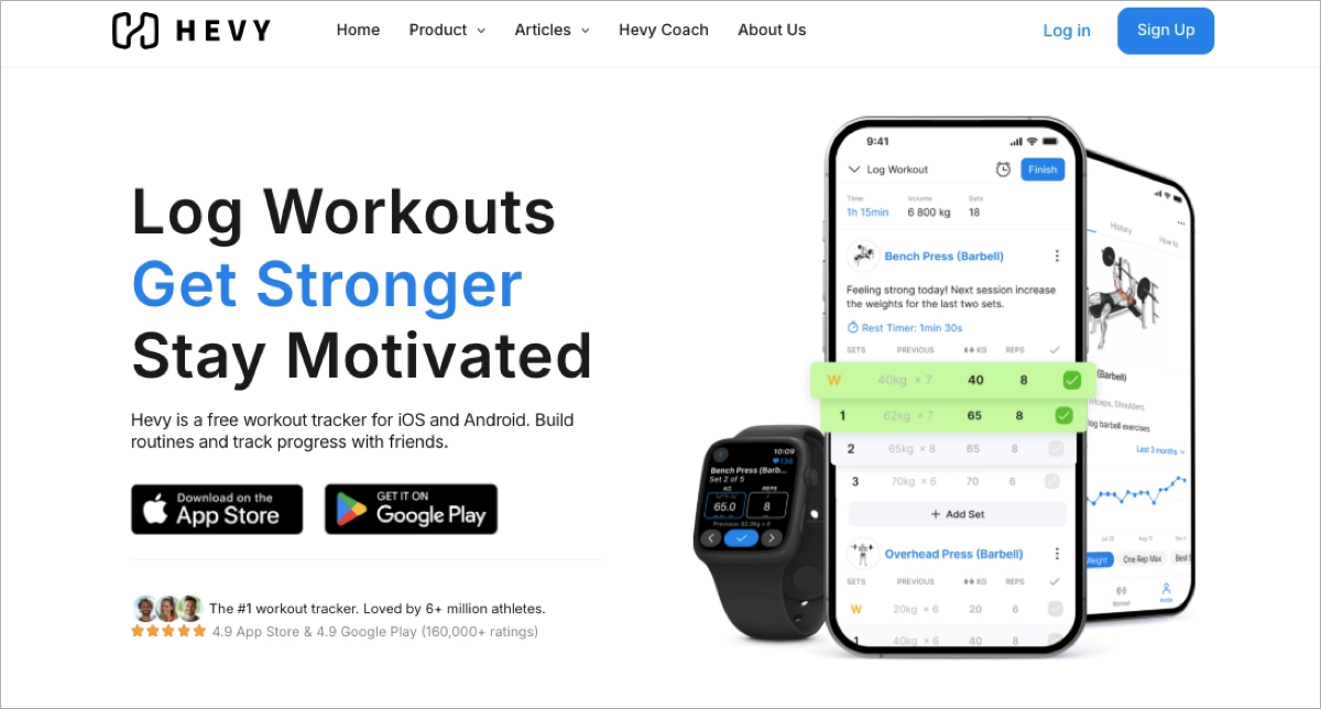
Hevy is a fitness app that helps people track workouts, plan training sessions, and monitor their progress over time. This landing page quickly explains what the app does without overwhelming visitors with unnecessary details. This approach works best for apps that need to communicate their value within the first few seconds.
The page keeps things simple, combining straightforward messaging with clean visuals and clear CTAs. It also highlights the app’s community features, showing that Hevy is more than a workout tracker – it’s a place where users can share routines, motivate each other, and celebrate their progress.
Why this page converts
Visitors immediately understand both the product and its benefits. The page focuses on the most important features, removes distractions, and makes downloading the app feel like the natural next step.
What they did well
- Clear messaging and a clean layout make the page easy to scan from the very first screen.
- Community-focused content helps differentiate the app from other workout trackers.
What could be improved
Interactive product demos or short videos showing the app in action would help visitors better understand the user experience before downloading it.
Increase product visibility – build your product landing page with Landingi!
15. Recess
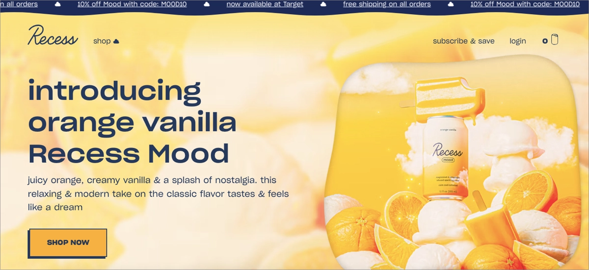
Recess is a wellness brand offering sparkling drinks and powders designed to support relaxation and everyday balance. This landing page reflects that mission from the very first screen, using soft colors, playful illustrations, and plenty of white space to create a calm, welcoming atmosphere. It’s a great example of an approach best for lifestyle brands that want visitors to connect with the brand before exploring the products.
As visitors scroll, the page introduces the product range, explains the ingredients and benefits, and gently leads them toward purchase with well-placed “Shop now” CTAs. Lifestyle imagery and subtle storytelling make the experience feel cohesive from the hero section all the way to checkout.
Why this page converts
The page doesn’t rush visitors into buying. Instead, it creates the right mood first, making the products feel like a natural extension of the lifestyle the brand is promoting.
What they did well
- Consistent branding creates a memorable experience from start to finish.
- The shopping journey is simple, with clear product information and well-placed CTAs.
What could be improved
Adding customer reviews or short testimonials would strengthen trust and give first-time visitors more confidence before making a purchase.
Sell your product online – create a high-converting landing page with Landingi!
16. Xiaomi
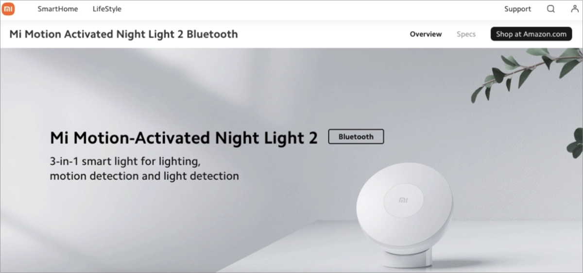
Xiaomi is a global consumer electronics brand known for smartphones, smart home devices, and connected technology. This landing page showcases one of its products with a clean design that makes even detailed technical information easy to explore. This approach works best for technology products that require a balance between product storytelling and technical specifications.
The page is organized around dedicated sections such as “Overview” and “Specs,” allowing visitors to switch between the bigger picture and detailed product information without getting lost. Interactive visuals, concise feature descriptions, and a direct purchase link help keep the experience smooth from start to finish.
Why this page converts
The page makes technical information approachable. Visitors can explore the product at their own pace, finding exactly the level of detail they need before making a buying decision.
What they did well
- Clear navigation makes it easy to move between product highlights and technical specifications.
- Interactive visuals and concise feature descriptions explain the product without overwhelming visitors.
What could be improved
Adding a comparison table with similar Xiaomi products would help visitors choose the model that best fits their needs.
17. MiraLAX
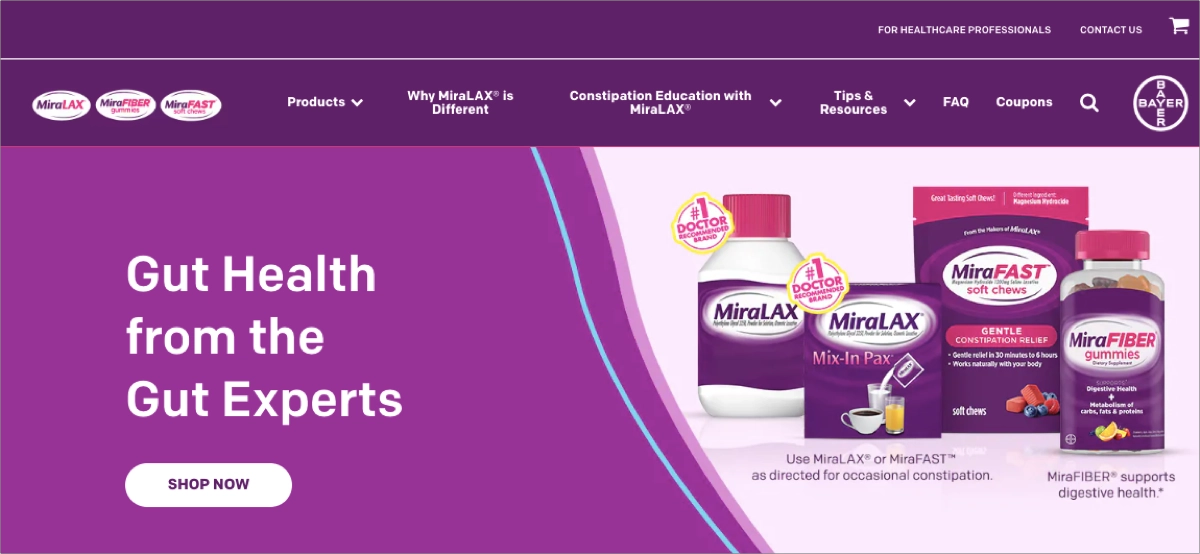
MiraLAX is an over-the-counter laxative brand designed to help relieve occasional constipation. Instead of relying on promotional messaging, this landing page focuses on educating visitors and answering the questions they’re most likely to have before using the product. This approach works best for healthcare products where trust and clear information are just as important as the product itself.
The page is well organized, making it easy to find usage instructions, FAQs, and product details on both desktop and mobile. Straightforward copy, a logical content hierarchy, and an accessible layout help visitors find answers quickly without feeling overwhelmed.
Why this page converts
Rather than pushing visitors to buy immediately, the page builds confidence first. Clear explanations, educational content, and an intuitive structure help people make informed decisions at their own pace.
What they did well
- Educational content and FAQs answer common questions before they become objections.
- The clean layout and logical structure make important information easy to find on any device.
What could be improved
Adding customer testimonials or endorsements from healthcare professionals would provide extra reassurance and strengthen the page’s credibility.
18. Pixelmator: Photomator 3.4
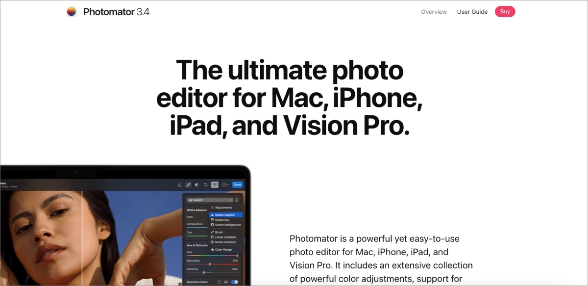
Photomator is a photo editing app developed by the Pixelmator team for Mac, iPhone, iPad, and Vision Pro. This landing page introduces new features almost entirely through visuals, making the product easy to understand before visitors read a single paragraph. It’s a great example of an approach best for creative software that benefits from showing the product instead of simply describing it.
Large product visuals, short videos, and subtle animations demonstrate each feature as visitors scroll. Every section follows the same simple pattern: a brief explanation paired with a visual example, making even advanced editing tools feel approachable. Direct App Store links also make downloading the app quick and friction-free.
Why this page converts
The page lets the product speak for itself. Instead of asking visitors to imagine what the software can do, it demonstrates every major feature through clear visual examples.
What they did well
- Videos and interactive visuals make even advanced editing tools easy to understand.
- A clear content hierarchy keeps the page informative without feeling cluttered.
What could be improved
Adding customer testimonials, professional reviews, or industry awards would provide stronger social proof and reinforce the app’s reputation.
19. Level SuperMind
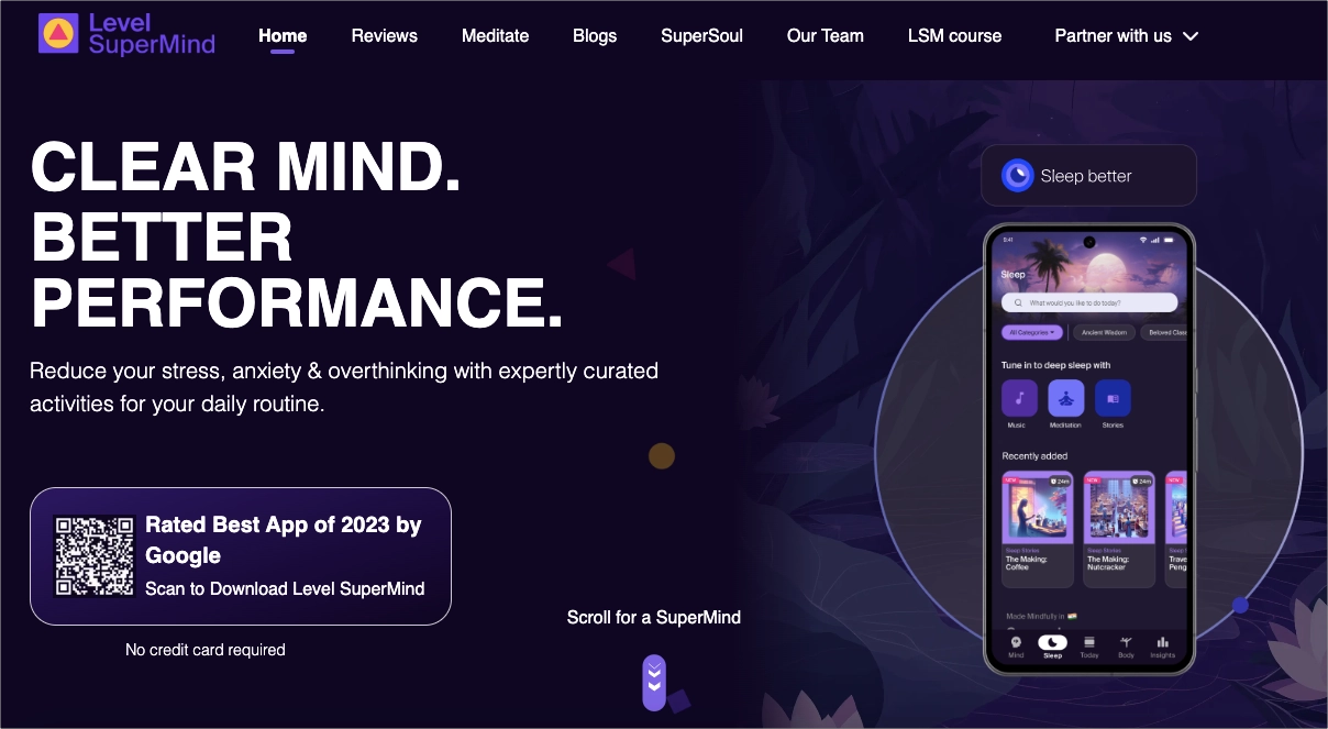
Level SuperMind is a mindfulness app that helps users improve focus, sleep, and overall mental wellbeing through guided exercises and neuroscience-based techniques. This landing page introduces the app with calming visuals and clear messaging that immediately reflect the experience users can expect. It’s a great example of an approach best for wellness apps where the design should reinforce the product’s promise.
The page gradually explains the app’s core benefits while keeping the journey simple and distraction-free. One of its strongest elements is the QR code placed directly in the hero section, allowing visitors to download the app within seconds instead of searching for it manually. Smooth animations and a consistent visual style make the experience feel polished without getting in the way.
Why this page converts
The page makes it easy to understand both the product and the next step. Visitors learn what the app offers, see its key benefits, and can install it almost instantly thanks to the prominent QR code.
What they did well
- The QR code in the hero section removes friction from the download process.
- Consistent visuals and subtle animations reinforce the brand without distracting from the main message.
What could be improved
A feature comparison or a more detailed FAQ would answer additional questions and help visitors evaluate the app before downloading it.
20. ContentStudio
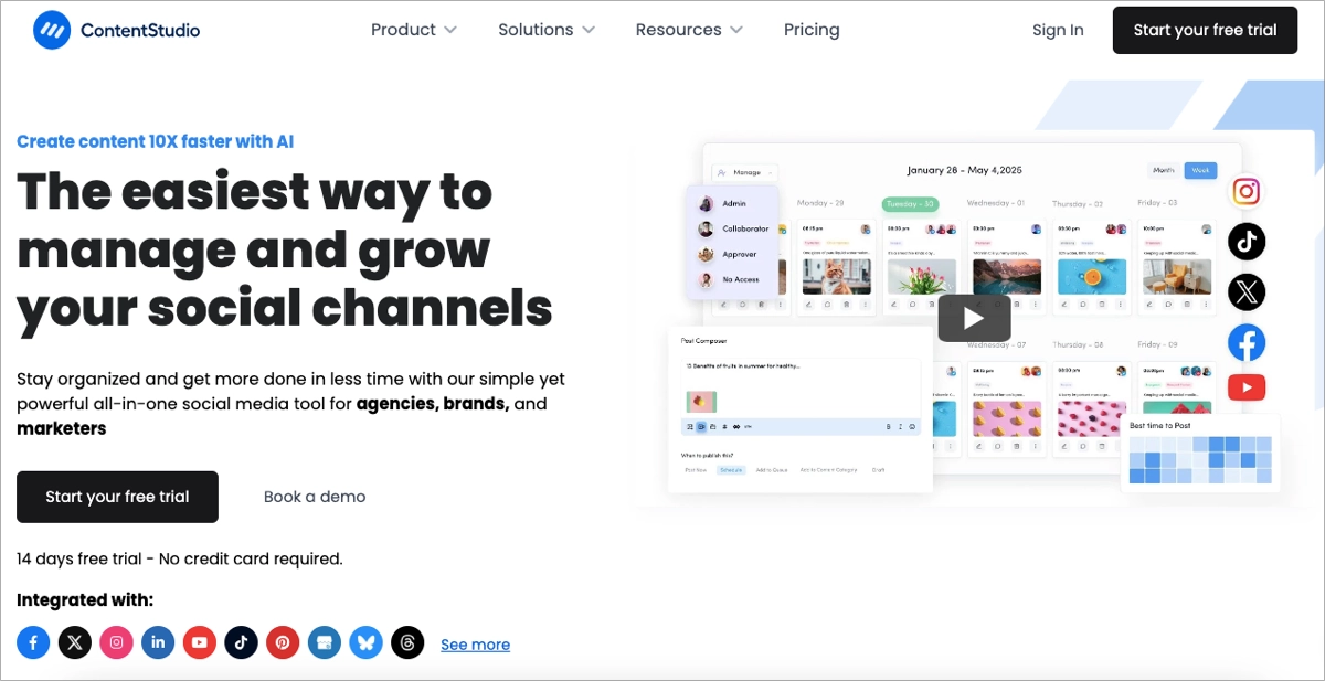
ContentStudio is a social media management platform that helps marketing teams plan, publish, automate, and analyze content across multiple channels. This landing page explains a feature-rich product without making it feel overwhelming. This approach works best for SaaS platforms that need to present multiple capabilities in a way that’s easy to follow.
Instead of listing every feature at once, the page introduces the platform step by step. A guided product tour, clear icons, and logical content sections help visitors understand how the tool works, while consistent visuals and well-placed CTAs keep the experience focused from beginning to end.
Why this page converts
The page breaks down a complex product into manageable sections, making it easy for visitors to connect individual features with real marketing tasks and understand how the platform solves their problems.
What they did well
- A logical content hierarchy makes the platform’s capabilities easy to understand.
- The product tour and clear feature segmentation help visitors connect features with real use cases.
What could be improved
Adding video testimonials or customer success stories would strengthen credibility and show how marketing teams use the platform in their day-to-day work.
Maximize your product sales – optimize your landing page with Landingi!
How Do I Create a Product Landing Page?
To create a product landing page, use a platform that lets you generate, customize, publish, test, and optimize your page in one place. Instead of building everything from scratch, you can create a conversion-focused page in minutes and improve it continuously based on real visitor behavior.
A practical way to do that is with Landingi, an AI-powered landing page operation system. Simply describe your product and campaign in a prompt, and Lunar – Landingi’s AI-native landing page generator – will create a complete landing page with a conversion-focused layout, persuasive copy, and all the essential sections already in place.
For example, you could use a prompt like this:
Create a product landing page for a reusable stainless steel water bottle aimed at hikers and travelers. Highlight its vacuum insulation, leak-proof lid, lightweight design, and lifetime warranty. Use a clean outdoor-inspired design, include a comparison section, customer testimonials, an FAQ, and a strong CTA encouraging visitors to buy with a 15% launch discount.Within a few minutes, you’ll have a complete first draft instead of a blank page.
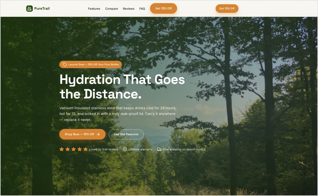
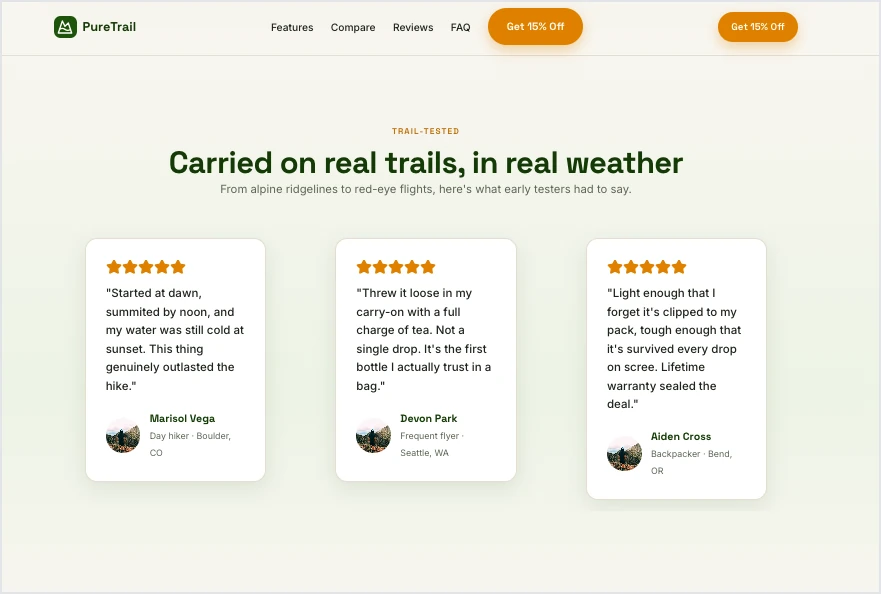
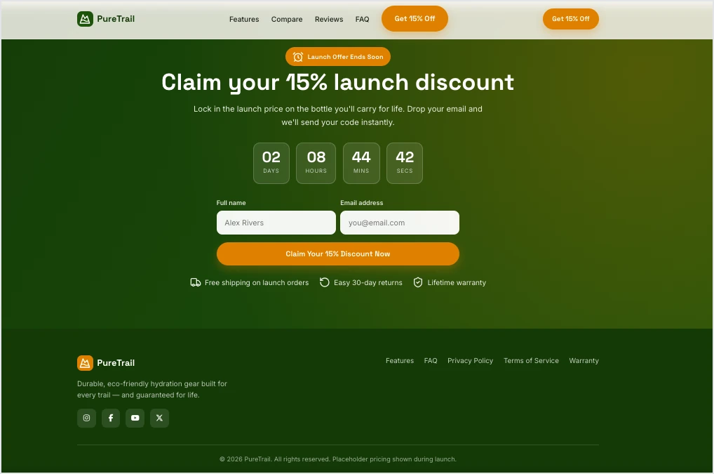
You can then customize the layout, edit the copy, replace images with your own product photography, adjust branding, add custom sections, and publish the page on your own domain – all without writing code.
The final page should always reflect the type of product you’re selling. Physical products usually benefit from lifestyle photography, close-up product shots, comparison tables, and demonstration videos that show the product in use. Digital products, on the other hand, often perform better with interface previews, workflow animations, feature breakdowns, and onboarding or trial-focused CTAs.
Generate your first product landing page with Lunar in minutes.
Launching your landing page is only the beginning. The highest-converting product pages are continuously tested and refined as new data comes in. Experiment with different headlines, product images, CTAs, pricing layouts, or product descriptions to learn what drives the most conversions.
The same applies to optimization. Ecommerce brands often focus on improving product galleries, checkout flows, upsell sections, and payment options, while SaaS companies typically test free-trial messaging, feature presentation, onboarding flows, pricing tables, and analytics-driven conversion paths.
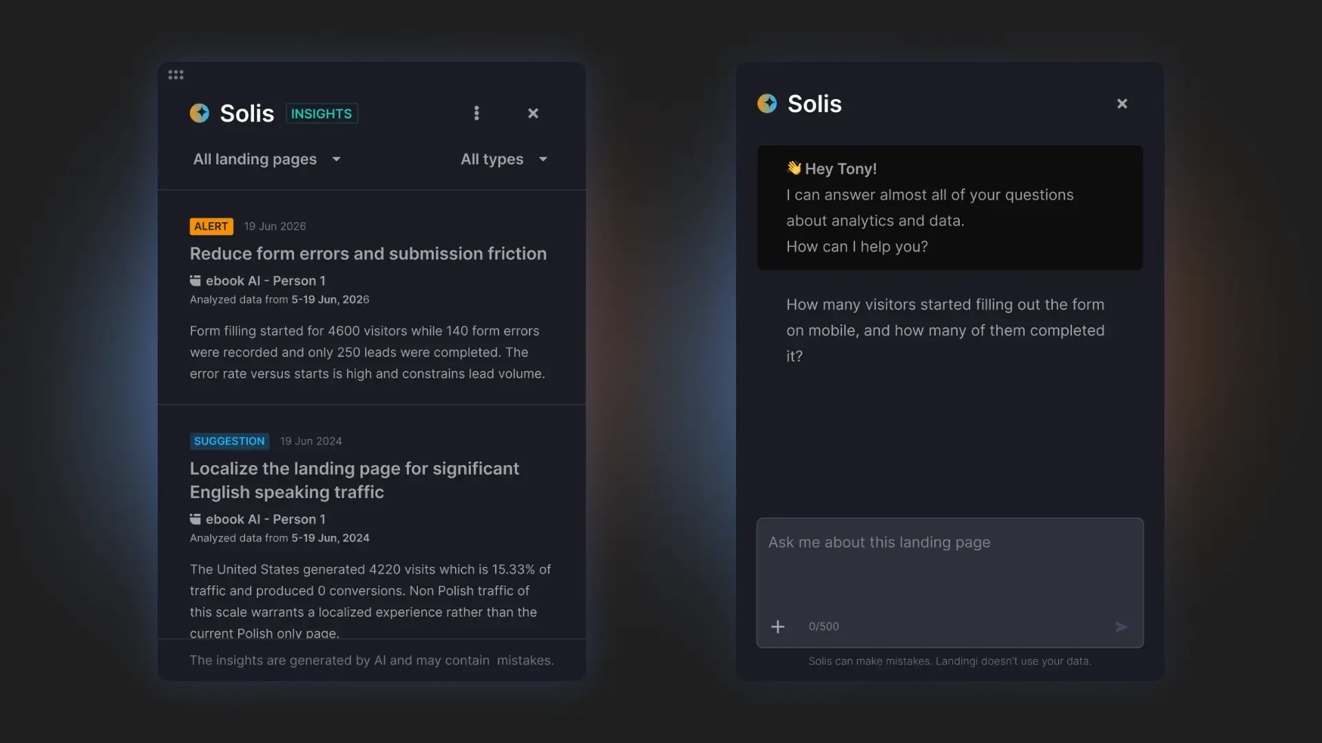
Landingi makes this process easier with built-in optimization tools. EventTracker shows exactly how visitors interact with your landing page, while Solis analyzes that behavioral data, identifies friction points, and suggests practical improvements to increase conversions. Instead of relying on guesswork, you can optimize your page based on real user behavior.
Use Solis to identify what’s helping – or hurting – your results.
What is a Product Landing Page?
A product landing page is a web page dedicated to promoting and selling a single product. It combines product information, persuasive copy, visuals, pricing, customer reviews, FAQs, and a clear call to action to help potential customers make a purchase decision.
The exact structure depends on what you’re selling. Physical products often benefit from lifestyle photography, product demonstrations, shipping details, and customer reviews. Digital products and SaaS tools typically rely on interface previews, feature breakdowns, onboarding flows, integrations, or free-trial CTAs to help visitors understand how the product works.
Product landing pages are especially effective for paid campaigns because they continue the conversation started by your ad instead of sending visitors to a homepage with dozens of competing links. They also make it easier to run A/B tests, optimize individual elements, and steadily improve conversion rates over time.
Build focused product landing pages that turn more clicks into customers.
Product landing page vs. product page
Although the terms are often used interchangeably, they serve different purposes. A product page is part of an online store and helps shoppers browse, compare, and purchase products. A product landing page is built around a single campaign or offer, with one goal: driving a specific conversion.
| Feature | Product Landing Page | Product Page |
| Primary goal | Drive one specific conversion, such as a purchase or free trial | Present product details within an online store |
| Traffic source | Paid ads, email campaigns, social media, influencer marketing | Organic search, category pages, website navigation |
| Focus | One product and one CTA | Product information plus site navigation and related products |
| Navigation | Limited or removed to reduce distractions | Full website navigation |
| Content | Persuasive copy, social proof, FAQs, benefits, campaign messaging | Product description, specifications, pricing, shipping details |
| Best for | PPC campaigns, product launches, seasonal promotions, limited-time offers | Ecommerce catalogs and everyday product browsing |
In practice, many brands use both. A paid ad directs visitors to a product landing page that matches the campaign message and maximizes conversions, while the product page remains part of the online store for customers browsing the catalog or returning later.
3 Product Landing Page Best Practices
After reviewing some of the best product landing page examples, let’s look at three practices that consistently improve conversions across different industries.
1. Match the landing page to the traffic source
The highest-converting product landing pages continue the conversation started by the ad, email, or social media post that brought visitors there. Headlines, visuals, offers, and CTAs should align with the promise that convinced someone to click in the first place.
When visitors see consistent messaging throughout their journey, they’re more likely to trust the offer and complete the purchase. Even small mismatches between the ad and the landing page can increase bounce rates and reduce conversions.
Ready to launch? Create a product landing page that sells with Landingi!
2. Use videos to demonstrate value
Video remains one of the most effective ways to explain a product. According to Blogging Wizard, nearly half of online shoppers watch product videos before making a purchase. A short demonstration often answers more questions than several paragraphs of copy.

The best product landing pages use video strategically. It might be a product demonstration, a feature walkthrough, a customer testimonial, or a lifestyle video showing the product in everyday use. Digital products often benefit from screen recordings, while physical products perform well with hands-on demonstrations.
Attract more buyers – design a product landing page with Landingi!
3. Answer questions with an FAQ
An FAQ section helps visitors overcome the last doubts before buying. Instead of leaving customers to search for answers elsewhere, it brings everything together on the landing page.

A well-written FAQ can explain shipping, returns, sizing, pricing, compatibility, warranties, or onboarding – whatever matters most for your product. Besides improving the user experience, FAQ sections often support SEO by answering questions people actively search for online.
The best FAQs aren’t written for search engines. They’re written for customers who are almost ready to buy but still need one final answer.
How Can I Optimize My Product Landing Page for Higher Conversion Rates?
Start by checking what visitors actually do on the page. In Landingi, EventTracker shows clicks, scroll depth, form interactions, conversions, and payment button events, so you can quickly see where people stop, hesitate, or leave. It also includes a scroll map and event map, which make weak sections much easier to spot.
Once you know where the friction is, test one change at a time. You can run A/B tests directly in Landingi and compare different headlines, CTA copy, product images, layouts, pricing sections, or form lengths. This gives you a clear answer about what improves performance, rather than relying on instinct.
Solis makes this process faster. It analyzes the behavioral data collected by EventTracker together with the page structure, imagery, and campaign context. It can flag issues such as an abandoned form or a mobile layout problem, then present alerts, discoveries, and practical optimization suggestions.
That gives you a simple workflow: publish the page, collect real user data, review Solis recommendations, make a focused change, and test the result.
Let Solis identify unanswered questions and discover opportunities to improve your landing page.
FAQ About Product Landing Pages
Below you’ll find answers to the most common questions about creating, optimizing, and using product landing pages.
What are the key elements of an effective product landing page?
An effective product landing page combines a compelling headline, persuasive copy, high-quality product visuals, a clear CTA, pricing information, customer reviews, trust signals, and an FAQ section. Every element should support the same conversion goal and make it easier for visitors to complete the desired action.
What is the best product landing page builder?
The best product landing page builder is one that lets you create, publish, test, and optimize pages without relying on developers. Landingi combines a drag-and-drop editor with Lunar for AI-powered page generation, EventTracker for behavioral analytics, Solis for AI-driven optimization, built-in A/B testing, and integrations that help improve conversion rates over time.

Who needs a product landing page?
Any business promoting a specific product can benefit from a product landing page. They’re especially useful for ecommerce brands, SaaS companies, startups, subscription services, mobile apps, and businesses running paid campaigns or launching new products.
Do I always need a dedicated product landing page?
Not always. If customers are browsing your online store, a well-designed product page is often enough. However, dedicated landing pages usually perform better for PPC campaigns, email marketing, social media ads, influencer collaborations, and product launches because they match a specific campaign message and keep visitors focused on a single conversion goal.
What are the most common product landing page mistakes to avoid?
The most common mistakes include promoting multiple products on one page, using weak CTAs, providing too little product information, hiding pricing, overlooking customer reviews, adding unnecessary navigation, and never optimizing after launch. Monitor visitor behavior, run A/B tests, and make improvements based on real data instead of assumptions.
Ready to convert more visitors? Build your product landing page with Landingi!
Create Product Landing Pages That Sell with Landingi
A successful product landing page doesn’t end with publishing. The highest-converting pages are continuously tested, refined, and optimized based on how real visitors interact with them.
With Landingi, you can create a product landing page from a simple prompt using Lunar, customize every section with the drag-and-drop editor, and publish it on your own domain in minutes. As your campaign starts collecting traffic, EventTracker shows how visitors navigate the page, while Solis analyzes their behavior and highlights opportunities to improve conversions with practical, AI-powered recommendations.
Whether you’re launching a new product, promoting a seasonal offer, introducing a SaaS feature, or scaling paid campaigns, Landingi gives you everything you need to build, test, and optimize product landing pages from one platform. Start creating product landing pages that turn more clicks into customers.