A high-converting landing page is an essential component of any digital marketing strategy, designed meticulously to turn visitors into leads or customers. A landing page’s success is measured by its conversion rate, the percentage of visitors who complete the desired action out of the total number of visitors.
Great conversion results are the ultimate goal of all landing pages. Yet, achieving higher conversion rates involves a strategic blend of psychological insight, compelling design, succinct copy, and smart visual placements. Effective pages go beyond merely drawing in traffic; they significantly enhance the visitor experience to boost conversion rates – but how well can they perform? What exactly means high conversion, and what is the recipe for success?
In this article, we explain the importance of conversion-optimized landing pages in digital marketing with specific data on 17 examples of the best-converting pages. Read on to discover what makes a good landing page and learn about the competition to prepare your perfect landing page campaign.
How to Define a High-Converting Landing Page?
A high-converting landing page is a web page specifically designed to compel visitors to take a specific action, such as signing up for a newsletter, registering for a webinar, purchasing a product, etc. The main objective of this type of landing page is to maximize the percentage of visitors who complete the desired action, which is known as the conversion rate. Top landing pages achieve a conversion rate of 11.45% or higher, according to WordStream statistics.
What Is the Average Conversion Rate for Landing Pages?
The average conversion rate for landing pages reaches 2.35% across all industries, as evidenced by Stacey Corin in the SeedProd article from March 2024: What Is a Good Landing Page Conversion Rate in 2024? Although this is less than a quarter of the high-performance threshold, considering the site’s traffic, this result brings campaign success. If your landing page’s traffic is 100,000 and the conversion rate reaches 2.35%, you gather 2 350 new leads or customers, depending on the landing page type and its conversion goal.
Other sources, like HubSpot, say the average conversion rate for landing pages is 5.89%, but most pages achieve a CVR of around 3% and never reach 10% results. The relative truth is that an average landing page conversion rate varies by industry, page type, and campaign goals.
The indisputable rule is that if your landing page achieves a conversion rate of less than 1%, your efforts are unprofitable, and you must pay attention to optimization.
Does the Landing Page Conversion Rate Depend On the Industry?
The landing page conversion rate depends on the industry, as different industries have varying customer expectations, purchase behaviors, and competitive landscapes, all of which can influence how effectively a landing page converts visitors into leads or customers.
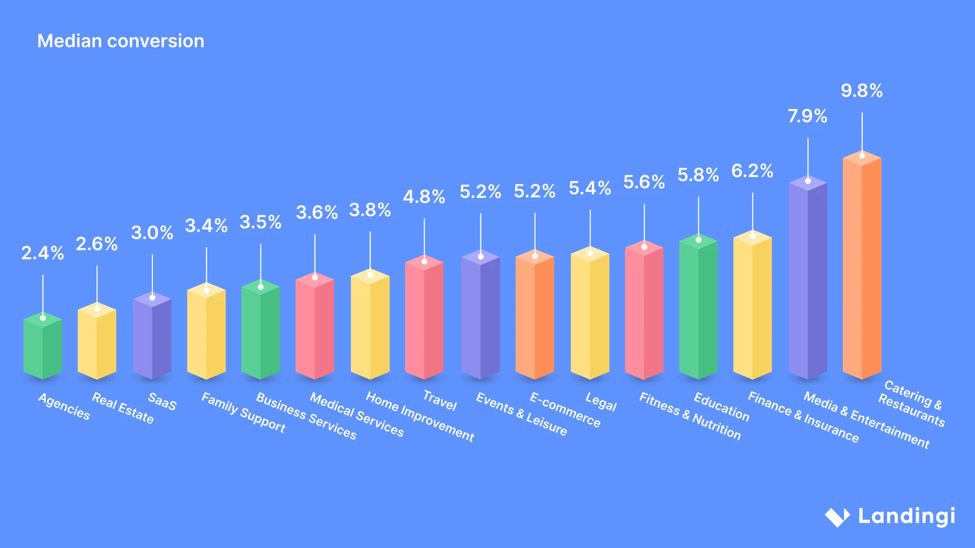
Poul Park, in the Unbounce article published in January 2024: What is the average conversion rate for a landing page? provides essential data distinguishing median conversion rates among industries, as follows:
- Agencies – 2.4%
- Real Estate – 2.6%
- SaaS – 3.0%
- Family Support – 3.4%
- Business Services – 3.5%
- Medical Services – 3.6%
- Home Improvement – 3.8%
- Travel – 4.8%
- Events & Leisure – 5.2%
- E-commerce – 5.2%
- Legal – 5.4%
- Fitness & Nutrition – 5.6%
- Education – 5.8%
- Finance & Insurance – 6.2%
- Media & Entertainment – 7.9%
- Catering & Restaurants – 9.8%
Some industries generate higher conversions due to their nature, like e-commerce, which offers basic necessities or luxury products in valuable offers that encourage purchase. Others, like real estate or medical services, might experience lower conversion rates but higher value per conversion, as decisions in these fields tend to require more consideration and trust.
However, the industry is the general factor contributing to different conversion rates, involving minor indicators, such as product or service type and target audience. The campaign goal also can affect conversions – as presented by Flori Needle in the article for HubSpot, 16 Landing Page Statistics For Businesses in 2023, 43.6% of marketers indicate that their primary objective is to generate leads, whereas 33.7% prioritize direct customer purchases as their main goal.
At this point, it’s important to understand that every type of landing page generates conversion, and each funnel ends up in its hot phase, where actual sales are the only factor allowing businesses to measure campaign efficiency and overall success. However, landing pages are powerful tools in the warm funnel phase, converting visitors into leads, and they play a crucial role in engaging visitors into offers in the cold funnel phase.
Knowing your industry’s average conversion rate is, after all, essential before setting your marketing campaign goals. It allows you to understand what objective you’re aiming for and what you can expect.
How Do I Create a High-Converting Product Landing Page?
To create a high-converting product landing page, keep the form above the fold – place it in the area of a web page that is visible without scrolling. This prominent position can lead to a notable conversion boost for several reasons. It ensures accessibility, engages visitors from the first moment they open your page, and encourages quick decisions.
Yet, creating well-performing landing pages involves more crucial steps, including creating a strong headline, using compelling visuals and persuasive copy, strategically placing CTAs, and continuously implementing data–driven optimizations. Each step is an important element of conversion optimization, providing a comprehensive framework for improving user experience, increasing engagement, and ultimately driving better results.
Follow the short guide below to craft a high-converting product landing page:
1. Create a strong headline
Firstly, focus on creating a strong headline. Be specific and clearly state the product’s benefits and unique selling points. The value proposition presented in your headline should encourage users to get more information about your offer. You should use strong action verbs to create a sense of urgency and excitement. Remember that a good headline is one aligned with your target audience’s needs or expectations, so tailor it to resonate with your ideal customer.
2. Use compelling visuals
Secondly, use compelling visuals across your page. Leverage high-quality images or videos to showcase your product in action or highlight its features. Visuals have the power to engage visitors better and quicker than best-written copy. Keep all the pictures and videos consistent with your branding to strengthen your brand identity and create a cohesive customer experience. Remember, your goal is to drive conversions – avoid clutter and ensure your visuals are focused on the product.
3. Write persuasive copy
Thirdly, write persuasive copy that focuses on the benefits your product offers to your target audience and, whenever possible, use data or metrics to demonstrate the tangible value. Emphasizing its ability to address issues or enhance quality of life, you can craft a persuasive story that connects with prospective clients. Moreover, it’s important to anticipate any potential objections and show that you understand your audience’s requirements while offering solutions to their issues.
4. Use social proof
Fourthly, use social proof elements, such as testimonials, reviews, or case studies. Build trust among your audience by sharing positive feedback from satisfied customers. Highlight real-world examples of how your product has made a difference for businesses or individuals. These examples offer tangible proof of your product’s impact and can establish trust with prospective customers. If relevant, you can also feature endorsements from influencers or experts in your industry.
5. Place CTAs strategically
Fifthly, place CTAs strategically across your page. Ensure your hero section includes an outstanding button with straightforward, action-oriented messaging that encourages visitors to take the desired action from the first moment they enter your product page. Repeat the button in the strategic sections of your page, e.g., in the benefits section, near the social proof, and in the top sticky bar to make your CTA visible and accessible without scrolling. Don’t use alternative buttons directing users to other websites – the landing page must be focused on a single goal, so make good use of a single, well-designed CTA.
6. Conduct A/B tests
Sixthly, conduct A/B tests to experiment with various versions of your page and its elements. This way, you can simply check out new ideas and find out which elements resonate best with your target audience. A/B testing is a powerful tool for optimizing your landing page and increasing conversions. By creating multiple versions of your page with different variations of elements such as headlines, images, CTAs, or copy, you can methodically test which elements perform the best. This data-driven approach enables you to make well-informed decisions and consistently enhance the effectiveness of your landing page.
7. Implement data-based optimizations
Seventhly, implement data-based optimizations. Use professional analytics tools, like EventTracker from Landingi, to track events and user behavior on your landing page. By regularly analyzing metrics such as conversion rates, bounce rates, scroll depth, or form abandonments, you can identify areas for improvement and make targeted changes to enhance your page’s performance. Thanks to landing page analytics, you can leave guesswork and incorporate proper optimization strategies that will help you achieve the desired outcomes.
17 Best Converting Landing Page Examples
Meet the 17 highest–converting landing pages winning the competition and learn about the key elements contributing to their success. This in-depth analysis of the most successful pages offers a unique opportunity to understand these factors, providing valuable information for anyone looking to improve their digital marketing strategies.
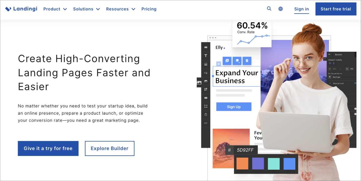
1. Best Converting E-commerce Landing Page: Twillory
Landing pages in the e-commerce industry reach an average conversion rate of 12.9% and a median at the level of 5.2%, based on the Unbounce statistics. While these landing pages aren’t the highest-performing ones, their potential is huge, considering the industry specifics.
Average conversion rate for e-commerce landing pages: 12.9%
Median conversion rate for e-commerce landing pages: 5.2%
Twillory landing page conversion rate: 46.85% (Unbounce, 2023)
One of the best conversion e-commerce landing pages is Twillory, which is featured for a menswear store. It’s an example of a high-conversion design optimized to attract and engage customers effectively. The page leverages a clean and professional layout that highlights its unique selling propositions. The main banner is visually appealing, showcasing their top products with high-resolution images that immediately grab attention. The strategic placement of CTA ensures that it’s prominent and easy to navigate. It enhances user experience and facilitates the shopping process.
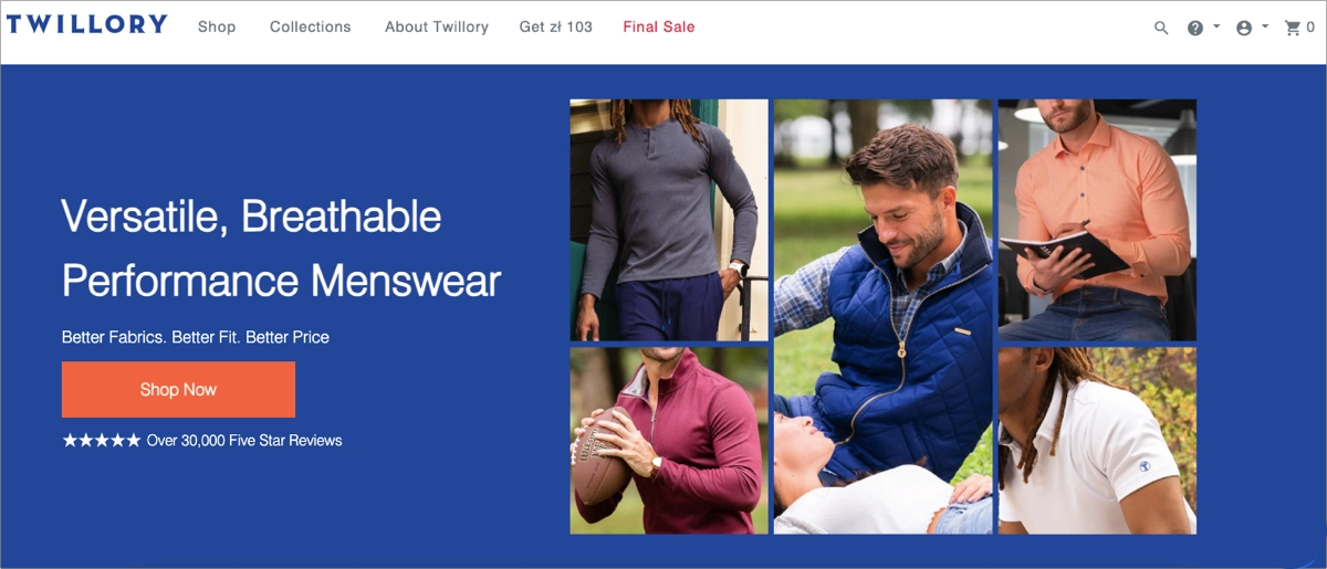
Additionally, the page includes essential elements like customer testimonials and trust badges. These build credibility and reassure new customers of the product quality and service excellence. Every design choice on the page, from color scheme to typography, is made with the target audience in mind, making the site not only aesthetically pleasing but also highly functional.
Key strengths of Twillory’s landing page:
- Strong visuals and clear layout – the use of compelling visuals and a clean layout helps focus the user’s attention on the products and offers.
- Outstanding CTA button – using contrasting colors and straightforward, action-oriented messaging engages visitors to take immediate action.
- Effective use of testimonials – integrating customer feedback provides social proof, enhancing trust and encouraging potential buyers.
Inspire yourself to create your own landing page and check out examples of e-commerce landing pages built with Landingi that convert.
Create Your Own High-Converting E-commerce Landing Page Today!
2. Top Converting SaaS Landing Page: Evolo
SaaS landing pages have an average conversion rate of 9.5%, while the median reaches 3.0%, according to SeedProd statistics. These data place the SaaS industry in the third lowest position in the ranking. Nonetheless, SaaS landing pages bring in relatively high revenue, especially when considering LTV, so a lower conversion rate doesn’t mean poor results for companies.
Average conversion rate for SaaS landing pages: 9.5%
Median conversion rate for SaaS landing pages: 3.0%
Evolo landing page conversion rate: 17.72% (Databox, 2024)
Evolo’s SaaS landing page for building management and energy efficiency systems exemplifies high conversion design in the SaaS industry. The page effectively utilizes a clean, professional design with a strong visual hierarchy that guides visitors through the value proposition and service features seamlessly. It features a dynamic headline that immediately captures attention by using animated text to highlight different user roles that benefit from the system, making it highly engaging from the outset.
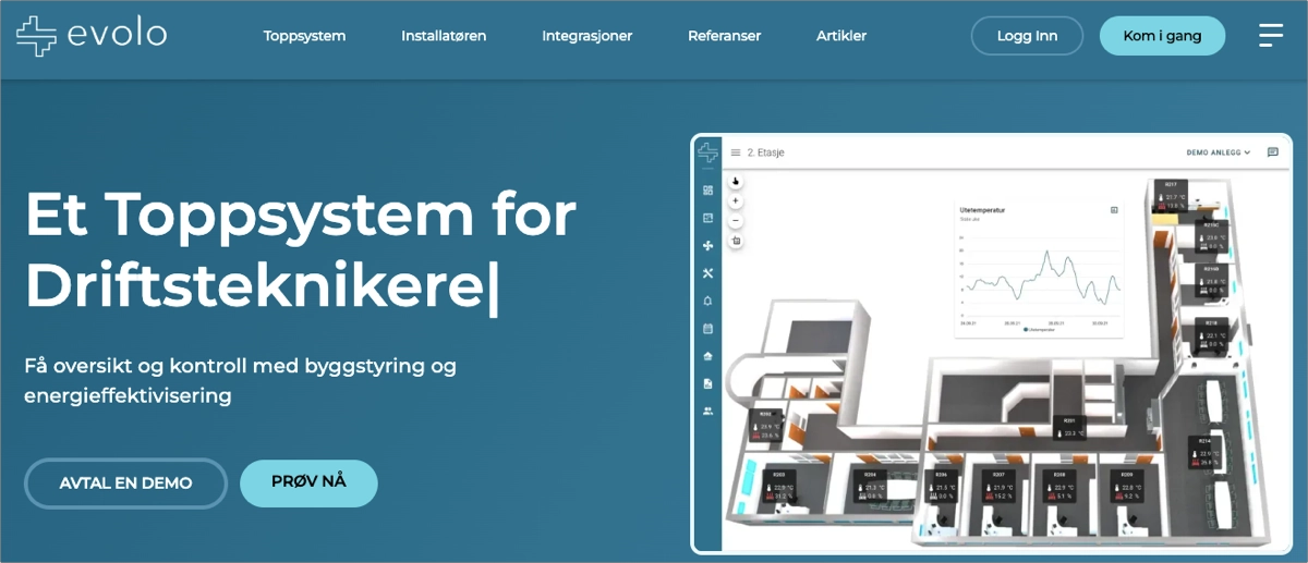
The layout strategically places calls to action that are visible and compelling, inviting users to either request a demo or try the service directly. This dual approach caters to different stages of customer readiness, from those seeking more information to those ready to engage. The use of high-quality, relevant images and a clear, concise message enhances the user experience, reinforcing the benefits of Evolo’s system without overwhelming the visitor with excessive text.
Key strengths of Evolo’s landing page:
- Dynamic and targeted content – the animated text in the header speaks directly to different user roles, making the content highly relevant to a diverse audience.
- Clear and compelling CTAs – the CTAs are prominently placed, clear in their messaging, and offer immediate value by providing easy access to a demo or the service itself.
Find more examples of SaaS landing pages built with Landingi that showcase the best practices for creating high-converting pages.
Create Your Own High-Converting SaaS Landing Page with Landingi!
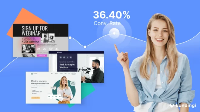
3. High-Effective Webinar Landing Page: Interaction Design Foundation
For webinar landing pages, the average conversion rate is 22,84%, based on the newest Themeisle reports for 2024. The truth is that conversions for webinar pages can considerably vary, depending on their topic and industry. These landing pages appear in all industries and cover thousands of topics, making them one of the most popular types of landing pages.
Average conversion rate for webinar landing pages: 22.84% (depending on industry and topic)
Interaction Design Foundation landing page conversion rate: no specific data
The Interaction Design Foundation’s Master Class landing page focused on “Design for Adaptability: Component-Driven Information Architecture” is an exemplary model of a high-converting webinar landing page – even though we don’t have specific data, this page is perfectly optimized for conversion. In 2022, HubSpot has chosen webinar landing pages from the Integration Design Foundation as the best ones, and we absolutely agree with their decision. The page is thoughtfully designed with a clear, attention-grabbing header that announces the webinar topic alongside a high-quality, relevant image that enhances the visual appeal and draws in potential participants.

The use of a prominent CTA, “Register now”, is strategically placed at multiple intervals on the page, ensuring that it’s easily accessible at any point as visitors scroll through. Furthermore, the landing page effectively uses trust signals such as detailed speaker information and a countdown timer that adds a sense of urgency, encouraging users to register before time runs out. Each page section is designed to seamlessly guide visitors through the benefits of attending the webinar, ultimately leading them toward registration. Including a video snippet, pricing details, and additional elements, such as the FAQ section and certification sample, provides clear value propositions aligned with the needs and interests of potential attendees.
Key strengths of the Interaction Design Foundation‘s Master Class landing page:
- Engaging visual design – the use of compelling visuals and a professional layout that aligns with the informational content.
- Clear and immediate CTAs – multiple calls to action, making it easy for users to decide to register as they read through the page.
- Countdown timer – using countdown timers on webinar landing pages creates urgency and impacts higher conversion rates.
Check more perfect examples of Webinar landing pages built with Landingi and learn how to create a great landing page that generates leads efficiently.
Create Your Own High-Converting Webinar Landing Page with Landingi!
4. High-Converting eBook Landing Page: Hip2Keto
The average conversion rate for eBook landing pages reaches 24%, according to Leadpages’ statistics. However, eBook landing pages significantly vary in topics, so conversion rates can differ and depend on the industry.
Average conversion rate for eBook landing pages: 24% (depending on industry and topic)
Hip2Keto landing page conversion rate: 88% (Leadpages, 2023)
The landing page for Hip2Keto’s eBook is a sterling example of a high-converting landing page within the health and wellness niche, particularly for ketogenic diet enthusiasts. Great eBook landing pages clearly showcase the value proposition and this page effectively utilizes a straightforward, visually appealing design that communicates what is being offered and the value it provides. Its primary focus is on the free eBook, which is an excellent strategy for capturing the interest of potential subscribers looking for keto diet resources.
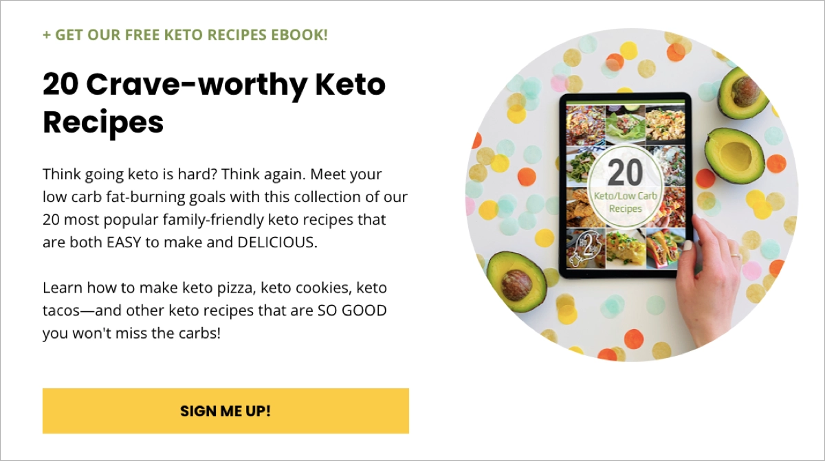
The headline immediately identifies the offer’s value, catering directly to keto dieters looking to expand their recipe collections. An outstanding CTA button supplementing the value proposition is well-designed with contrasting colors and straightforward, action-oriented messaging, encouraging visitors to take immediate action.
Key strengths of Hip2Keto’s landing page:
- Engaging visuals – the use of an appealing book cover likely resonates well with the target audience, making the offer more enticing.
- Clear CTA – a prominent and clear CTA button, such as “Download Now,” encourages quick action, minimizing any hesitation.
- Simple design – the page avoids any unnecessary navigational elements or content that could distract from the conversion process, focusing users on downloading the eBook.
Try Landingi and Create Your Own High-Converting Ebook Landing Page!
5. High-Converting App Landing Page: onX
The average conversion rate for media and entertainment landing pages reaches 18,1%, while the median is 7.9%, as presented in Unbounce statistics. This specific industry is relatively high in the general comparison of conversion rates across all industries, placed in second best position of the list.
Average conversion rate for App (Media & Entertainment) landing pages: 18.1%
Median conversion rate for App (Media & Entertainment) landing pages: 7.9%
onX landing page conversion rate: 61.15% (Unbounce, 2023)
The onX landing page for their GPS Hunting App is an excellent example of a high-converting app landing page. App landing pages must answer visitors’ needs – this page effectively uses a clean, modern design with a strong emphasis on visual elements directly appealing to the target audience of hunters and outdoor enthusiasts. High-quality images and videos of the app provide a preview of what users can expect, enhancing the page’s persuasive power.
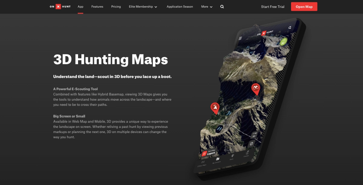
The CTA buttons are strategically placed and designed with contrasting colors to stand out on the page. The text on the CTA is direct and action-oriented, encouraging immediate downloads or purchases. It’s one of the key elements that affect high conversions. Red CTAs have a 21% higher performance rate than green CTAs, as showcased in HubSpot statistics, so using this color was probably the best idea, even though hunting and outdoors bring to mind greenery.
Key strengths of onX’s landing page:
- Clear and engaging headline – the headline clearly communicates the core benefit of the app, emphasizing its utility in land mapping, aerial imagery, and tracking, which are crucial features for the target users. Moreover, the headline aligns with PPC Ads, directly answering visitors’ intent.
- Compelling CTA – the outstanding CTAs are prominent, clearly state what visitors should do next, and encourage them to take action.
- Social proof and testimonials – including testimonials and reviews from real users provide social proof, lending credibility and trust to the app’s capabilities.
Create Your Own High-Converting App Landing Page Today!
6. High-Converting Real Estate Landing Page: Realtor.com
Real estate landing pages rank low in the general industry comparison, reaching an average conversion rate of 7.4% and a median of 2.6%, based on Unbounce statistics. SeedProd showcases higher median marks for this industry – 2,8%. Even though real estate pages have lower conversions, sales in this industry bring relatively high outcomes.
Average conversion rate for real estate landing pages: 7.4%
Median conversion rate for real estate landing pages: 2.6%
Realtor.com landing page conversion rate: no specific data
The landing page of Realtor.com stands out as a premier example of a high-converting real estate landing page – we can’t share specific data, yet, its design indicates it’s a well-performing example. ConvertFlow listed this page in their article, 6 Real Estate Landing Page Examples Proven to Convert, as one of the most successful real estate landing pages, and we think so too. The Realtor.com landing page is expertly designed with a clear focus on user experience, presenting a clean and intuitive interface that facilitates quick and easy property searches.
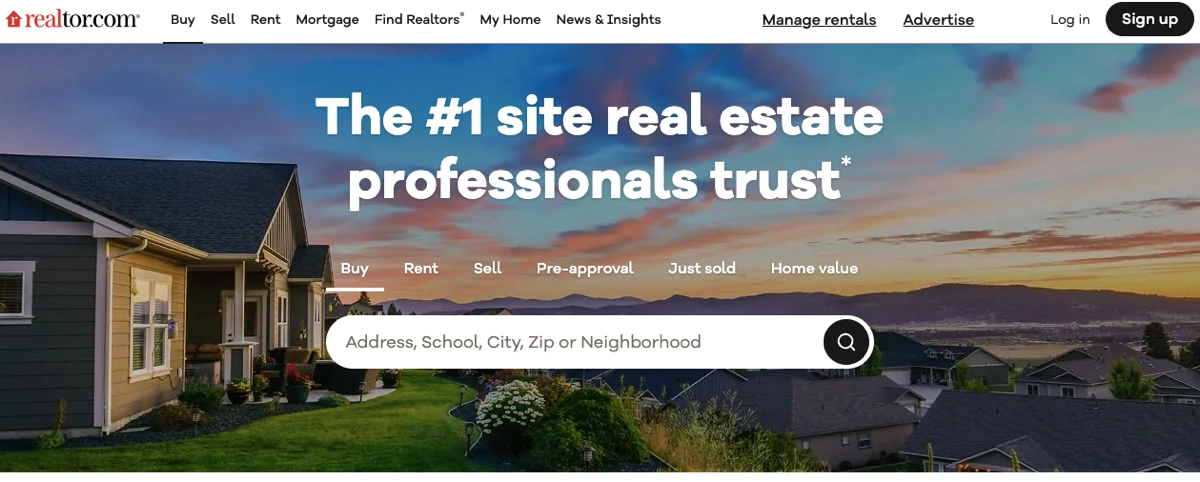
The page prominently features a search bar in the hero section, allowing visitors to immediately enter their desired location, effectively capturing user intent from the moment they arrive. It also uses high-quality images to give visitors a clear view of properties, which is essential for attracting potential buyers and renters. The main CTA is clear and action-oriented, even though they have used a search icon instead of any written messaging – and this works perfectly.
Key strengths of Realtor.com’s landing page:
- User-friendly design – the page is structured to guide users smoothly through the process of finding a new home or apartment.
- High-quality visuals – images of properties engage visitors to dive deeper into the page’s functionality and encourage potential buyers to search for their dream houses.
- Effective use of content – the content is strategically crafted to address visitors’ needs, offering valuable insights and tips about property buying and renting, which enhances user engagement and trust.
Look for excellent examples of real estate landing pages built with Landingi to get inspired to create your own landing pages.
Create Your Own High-Converting Real Estate Landing Page Today!
7. High-Converting Event Landing Page: Women of Silicon Roundabout
Based on data from SeedProd, the average conversion rate for event and leisure landing pages reaches 13.4%, and the median is 5.2%. This is the middle level of the general dataset of average conversion rates for landing pages across industries, which means event landing pages are generally successful, regardless of their specific topic.
Average conversion rate for event landing pages: 13.4%
Median conversion rate for event landing pages: 5.2%
Women of Silicon Roundabout landing page conversion rate: no specific data
The Women of Silicon Roundabout landing page, created for a tech event, is an exemplary high-converting event landing page tailored to a technology-focused female audience. Event landing pages should be visually attractive yet informative and usable, and this page effectively harnesses the principles of compelling design, clear messaging, and strategic user engagement to maximize conversions.
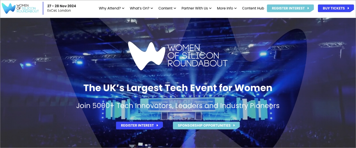
The page features a striking balance between aesthetic appeal and functionality. Its clean, navigable design showcases key information about the event dates, venue, and keynote speakers. The inclusion of a teaser video with shots from previous events effectively engages visitors and encourages them to take action and register interest or make a ticket purchase.
Key strengths of the Women of Silicon Roundabout landing page:
- Engaging visuals and media – utilizing a video background on the hero section provides an immersive first impression that captures attention immediately.
- Clear and actionable CTAs – CTAs such as “Register Interest” and “Buy Tickets” are prominently displayed, using contrasting colors that stand out against the page’s background, making them easy to locate and act upon.
- Informative content structure – the page is well-structured, offering visitors easy access to essential information such as event highlights, speaker lineups, and schedules. This organization helps provide a seamless user journey from initial interest to registration.
Create Your Own High-Converting Event Landing Page Today!
8. High-Converting Fitness Landing Page: Chris Lee Fitness
Fitness landing pages have an average conversion rate of 13.2%, while the median reaches 5.6%, as showcased in the Unbounce report. These pages rank relatively high in comparison across industries, which means they have a huge potential in converting visitors into leads or customers.
Average conversion rate for fitness landing pages: 13.2%
Median conversion rate for fitness landing pages: 5.6%
Chis Lee Fitness landing page conversion rate: 51% (Leadpages, 2024)
The landing page for Chris Lee Fitness, specifically designed to promote fitness tips for training with an injury, showcases an excellent example of a high-converting fitness landing page. This page is crafted precisely to cater to individuals seeking fitness routines that accommodate physical injuries, demonstrating a clear understanding of its audience’s needs.
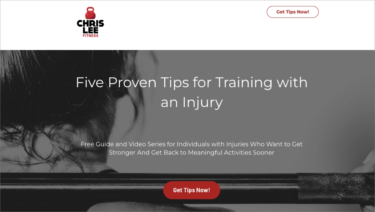
The landing page’s design is clean and uncluttered, which helps minimize distractions and focus users on the primary message and CTA. This simplicity delivers a clear path to conversion, which translates into a great success, bringing more than three times better scores than the average conversions in the industry.
Key strengths of Chris Lee Fitness’s landing page:
- Focused content – the page addresses a common concern among fitness enthusiasts: how to continue training when injured. This focus meets the specific needs of its target audience, enhancing relevance and engagement.
- Clear and persuasive CTA – the CTA for downloading the eBook is prominently displayed, encouraging users to take immediate action. The action-oriented language in the CTA captures attention and prompts conversions.
- Visual appeal – the page utilizes motivating and relevant imagery that resonates with the fitness community.
Find a way to incorporate conversion rate optimization on your fitness, nutrition, or health pages – check the best examples of health landing pages built with Landingi and learn the best practices.
9. High-Converting Travel Landing Page: Airbnb
Travel landing pages have an average conversion rate of 11.9%, and the median is 4.8%, based on SeedProd statistics. This data places the travel industry in the middle of landing page conversion comparison.
Average conversion rate for travel landing pages: 11.9%
Median conversion rate for travel landing pages: 4.8%
Airbnb landing page conversion rate: no specific data
Airbnb’s landing page, specifically for hosting homes, exemplifies a high-converting design tailored to attract homeowners interested in renting out their properties. SeedProd mentioned it as one of the successful landing pages that convert, and we agree with this statement. The page is meticulously crafted, combining aesthetic appeal with functional design to ensure a seamless user experience from start to finish.
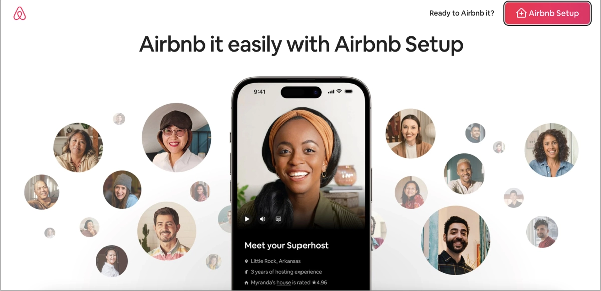
The headline instantly communicates the benefit of hosting, encouraging homeowners to consider the profitability of renting out their space. Engaging visuals supplement the informative copy and engage visitors to delve into the topic. Strategically placed CTAs guide users through the necessary steps to become hosts, from learning more about hosting to starting the signup process. CTAs are noticeable and persuasive, positioned at key points throughout the page.
Key strengths of the Airbnb landing page:
- User-friendly design – the layout is intuitive, making it easy for homeowners to navigate and find information about the process, benefits, and responsibilities of hosting.
- Effective visuals – high–quality images and videos showcase diverse properties and happy hosts, making the page visually appealing, helping to build trust, and illustrating the potential of Airbnb hosting.
- Informative content – detailed sections explain the advantages of hosting with Airbnb. This comprehensive information helps potential hosts to make informed decisions.
- Social proof and testimonials – the inclusion of testimonials from existing hosts adds a layer of credibility and reassures potential hosts about the reliability and benefits of the service.
Create Your Own High-Converting Travel Landing Page Today!
10. High-Converting Education Landing Page: MyTutor
Education landing pages have an average conversion rate of 14.2% and a median of 5.8%, according to SeedProd reports. This puts the education industry at the fourth-best position in conversion rate comparison. The education sector is huge, covering university pages, e-learning pages, course pages, campus pages, and more – some convert better than others, but together they make up a great general result.
Average conversion rate for education landing pages: 14.2%
Median conversion rate for education landing pages: 5.8%
MyTutor landing page conversion rate: 55.29% (Unbounce, 2023)
The landing page of MyTutor for online tutoring exemplifies a high-converting education-focused landing page. This page is effectively designed to target parents and students looking for quality online tutoring services. The overall design is clean and professional, leveraging an intuitive layout that makes navigation straightforward and user-friendly.
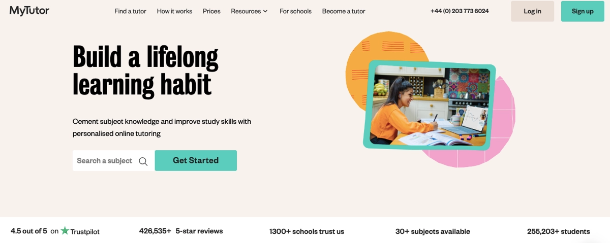
Education landing pages have to be informative, and the MyTutor example perfectly combines informative descriptions with engaging pictures. An outstanding CTA is designed to maximize conversions, including contrasting colors and action-oriented messaging. Incorporating figures showcasing company experience effectively builds trust among site visitors, ultimately leading to higher conversion.
Key strengths of the MyTutor landing page:
- Engaging visual content – the page uses compelling imagery and icons to visually represent the subjects offered, making it easy for users to navigate and understand the services at a glance.
- Effective CTA – prominent and strategically placed CTA encourages immediate interaction, guiding users swiftly towards signing up or requesting more information.
- Testimonials and reviews – including testimonials from satisfied clients add a layer of trust and authenticity, which is crucial for converting new users.
Create Your Own High-Converting Education Landing Page Today!
11. High-Converting Finance Landing Page: Ooba
Finance landing pages have an average conversion rate of 15.8% and a median of 6.2%, as showcased in SeedProd statistics. The finance sector takes the third-best position in the ranking of the best-converting landing pages across industries.
Average conversion rate for finance landing pages: 15.8%
Median conversion rate for finance landing pages: 6.2%
Ooba landing page conversion rate: 35.57% (Unbounce, 2023)
The Ooba landing page promoting home loans is one of the great examples of finance landing pages that showcase how to drive successful marketing campaigns. The page skillfully blends functionality with aesthetics to guide potential homebuyers through the mortgage application process. The informative content is the key element of this page – while bad landing pages would rather use text walls, Ooba effectively conveys information in short, eye-friendly sections.
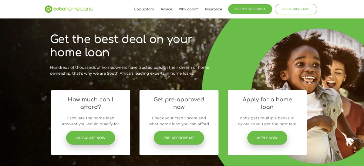
A clear layout helps reduce the intimidation factor often associated with financial services. Adding bullet lists and supplementing them with high-quality pictures makes the page visually attractive. Calls to action are visible and strongly indicate what to do next. A simple inquiry form encourages visitors to get in touch, and a FAQ section explains potential customer pain points. All these elements make the Ooba page functional and lead to high conversion.
Key strengths of the Ooba landing page:
- Clarity and simplicity – the page uses clear, concise language to explain the loan process, making it accessible for first-time homebuyers and seasoned investors alike.
- Strong CTAs – prominent and strategically placed CTAs encourage users to either get started with a loan application or contact a consultant for more personalized advice.
- Trust signals – customer testimonials, expert endorsements, and security badges reassure visitors of the credibility and reliability of the service, which is crucial in the finance industry.
Create Your Own High-Converting Finance Landing Page Today!
12. High-Converting Consulting Landing Page: JLSA
Consulting landing pages reach an average conversion rate of 8.8%, with a median of 2.4%, according to Unbounce statistics. It places agencies at the lowest position in general conversion rate ranking across industries. Still, results over 1% bring good ROI and allow agencies to scale their businesses.
Average conversion rate for consulting (Agencies) landing pages: 8.8%
Median conversion rate for consulting (Agencies) landing pages: 2.4%
JLSA landing page conversion rate: no specific data
The JLSA is one of the best high-converting consulting landing pages in the marketing services niche. It’s been mentioned as a great example in the Instapage article: 10 Agency Landing Page Examples That Market to Marketers, and we agree with this opinion. The page is strategically designed to cater specifically to businesses seeking comprehensive marketing solutions, effectively leveraging both design and content to maximize user engagement and conversions.
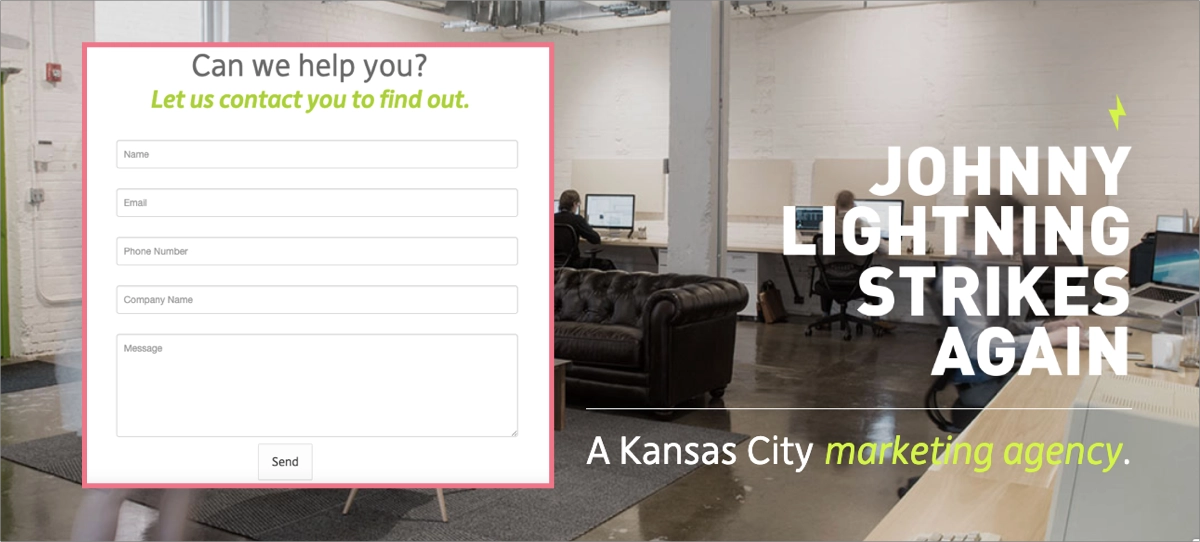
The first thing that makes this page effective is the lack of navigation – it compels you to scroll. Informative and concise written content persuades to fill out the form and send inquiries. The entire landing page is simple and short, but its bottom part includes contact details, highlights specific services the agency offers, and invites to visit the agency website. The contact form itself is clear and requires only necessary information, encouraging visitors to complete it without doubts.
Key strengths of the JLSA landing page:
- Direct messaging – the landing page opens with a compelling headline that directly addresses the visitor’s potential needs and introduces JLSA as a capable full-service creative agency. This clear messaging helps to establish relevance and engage visitors right from the start.
- Informative content – the page effectively outlines offered services and their benefits, providing potential clients with a solid understanding of how the agency can help achieve their marketing goals.
- Clear form – the inquiry form is clear, well-placed, and designed to maximize conversion by minimizing required information.
Create Your Own High-Converting Consulting Landing Page Today!
13. High-Converting SignUp Landing Page: Warp Academy
As many landing pages are signup ones, there is no specific data about their average conversion rate. However, relying on Email Vendor Selection statistics from 2024, landing pages bring a 160% higher conversion rate than other signup forms.
Average conversion rate for signup landing pages: no specific data – they tend to have 160% better conversions than other signup forms. (Email Vendor Selection, 2024)
Warp Academy landing page conversion rate: 29% (Leadpages, 2023)
The Warp Academy landing page is one of the high-converting signup landing pages and deserves to be known more closely. This free trial landing page is tailored specifically for users interested in music production and sound design education. The page employs a highly effective combination of visual and textual elements to engage visitors and guide them toward signing up for a free trial.
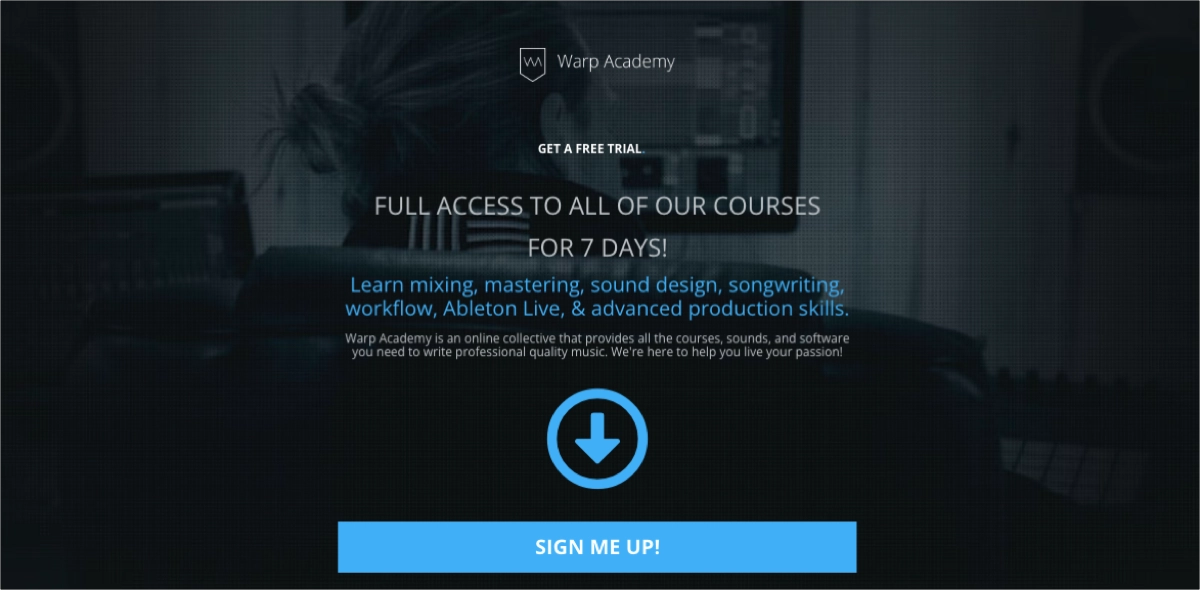
Next to the compelling headlines, the content structure provides detailed information about the offer and guides visitors through the page. Including prominent CTAs in strategic page sections makes the next step clear for visitors – using various action-oriented, personalized messages increases the chance for better conversion. Members’ testimonials and recommendations from professionals boost trust among visitors and help build the brand’s credibility.
Key strengths of the Warp Academy landing page:
- Vibrant visuals – utilizing vibrant and relevant images, the page visually communicates the excitement and creativity associated with music production, which is likely to resonate deeply with the target demographic
- Testimonials and social proof – including testimonials from users who have benefited from the courses provide social proof and build trust with prospective students, enhancing the page’s conversion potential.
- Minimal friction – the signup process is streamlined, requiring minimal input from the user, which helps lower the barrier to entry and increases the likelihood of conversion.
Create Your Own High-Converting Sign-Up Landing Page Today!
14. High-Converting PPC Landing Page: Superprof
According to GetResponse statistics, the median conversion rate for PPC landing pages is 2.35%, which puts them near the general average CVR rate of landing pages.
Median conversion rate for PPC landing pages: 2.35%
Superprof landing page conversion rate: no specific data
The Superprof landing page for guitar lessons in London exemplifies a high-converting landing page for educational services specifically tailored for those seeking private guitar tutors. OptimizePress chose this page as an exemplary model of great PPC landing pages, and we uncover what makes it effective. First of all, the page is expertly designed to engage users by clearly stating the value proposition at the top, with a compelling headline highlighting the accessibility of guitar teachers in London.
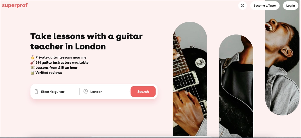
Its PPC Add answers to the target audience’s needs, and landing page visitors find exactly what they need. Short, persuasive copy combined with engaging visuals guides visitors toward taking action and using the intuitive search bar. CTA buttons are outstanding with their design and straightforward messaging. Students’ testimonials build trust among visitors, and the FAQ section provides additional information, ultimately affecting the decision-making process among hesitants.
Key strengths of the Superprof landing page:
- Search functionality – prominently placed search bar on the landing page allows prospective students to immediately start searching for tutors based on their specific needs, enhancing user engagement and conversion potential.
- Trust signals – the page includes verified reviews and ratings for tutors, which build trust and credibility among potential students. The mention of a large number of reviews and high average ratings reassures users of the quality of instruction they can expect.
- Effective calls-to-action– multiple CTAs, including the main search button, are strategically placed to capture user interest and facilitate the conversion process.
Check out the best examples of PPC landing pages built with Landingi and learn more tips on how to create your own landing pages for successful PPC campaigns.
Create Your Own High-Converting PPC Landing Page Today!
15. High-Converting Mobile Landing Page: Copy Posse
According to Instapage reports, the average conversion rate for mobile landing pages is 28.63%. During the last 13 years, mobile traffic has increased from 6.1% (2011) to 61.21% (2024), as showcased in the newest Exploding Topics statistics. This metric continues to grow, opening the gate for better landing page conversions for all industries.
Average conversion rate for mobile landing pages: 28.63%
Copy Posse landing page conversion rate: 80% (Leadpages, 2024)
The landing page for Copy Posse’s free cheatsheet on writing powerful social media copy stands out as a high-converting mobile landing page. It provides a targeted and valuable resource for digital marketers and content creators looking to enhance their social media presence. The design and layout are specifically optimized for mobile users, ensuring easy navigation, quick loading times, and accessible content that enhances user experience on smaller devices.
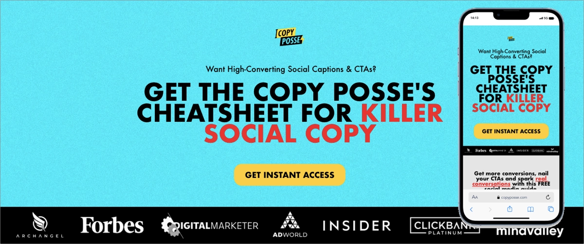
The CTA button is perfectly designed with its contrasting color and action-oriented messaging. The button size for the mobile version is touch-friendly, well-sized, and placed in strategic sections, which positively impacts user experience.
Key strengths of Copy Posse’s landing page:
- Compelling headline and offer – the headline directly addresses the need for powerful social copy and promises an immediate solution through the free cheatsheet.
- Strong visual elements – engaging visuals, including a relevant image of the cheatsheet and the company founder, visually support the text and make the page more attractive.
- Clear CTA – the CTA is prominently displayed and repeated to ensure visibility, encouraging users to take action without having to scroll excessively.
- Concise and targeted content – the content is concise yet informative, providing enough detail to convey the value of the cheatsheet without overwhelming the reader, which is essential for keeping mobile users engaged.
Find out how effective mobile landing pages are designed and gather essential knowledge on landing page mobile optimization to drive successful campaigns and use the potential of continuously increasing mobile traffic.
Create Your Own High-Converting Mobile Landing Page Today!
16. High-Converting B2B Landing Page: Belkins
Business services landing pages have an average CVR of 8.7% and a median of 3.5%, as showcased by Unbounce in their report. Even though this score seems low, B2B landing pages can achieve high ROI, especially considering high LTV per customer metrics.
Average conversion rate for B2B (Business Services) landing pages: 8.7%
Median conversion rate for B2B (Business Services) landing pages: 3.5%
Belkins landing page conversion rate: no specific data; 30% of website conversions come from this page alone (Michael Maximoff for Databox, 2024)
The Belkins B2B landing page showcases that offering a valuable resource is a great conversion-driving machine. The page for their Appointment Setting ROI Calculator is a stellar example of a high-converting landing page in the B2B lead generation and consulting sector. It effectively combines functionality with aesthetics, providing a great tool for businesses. This interactive feature adds value and increases engagement and time spent on the page, enhancing the likelihood of conversion.
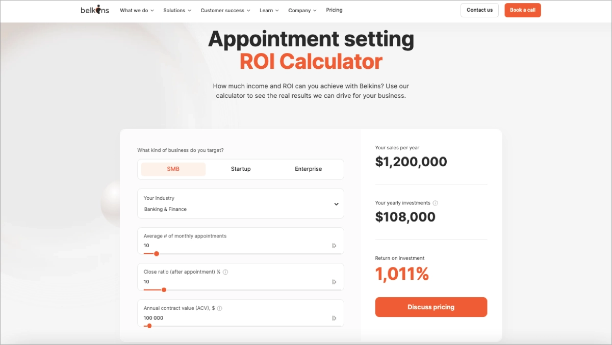
The page uses straightforward messaging that clearly communicates what the tool does and the value it offers, making it easy for visitors to understand how Belkins can help boost their sales processes. Including testimonials and case studies from satisfied customers adds a layer of trust and credibility, reassuring potential clients of the effectiveness and reliability of Belkins’ services.
Key strengths of the Belkins landing page:
- Interactive ROI calculator – the centerpiece of the page, the ROI calculator, engages visitors by allowing them to input specific data and immediately see the potential returns on their investment.
- Strong visual design – the page’s design is professional and clean, focusing on usability and simplicity. It ensures the user’s attention is directed towards the calculator and the call to action.
- Effective CTA – outstanding CTA buttons encourage users to take action, whether it’s contacting Belkins for more detailed services or simply trying out the calculator to see potential results.
Find the best examples of B2B landing pages built with Landingi and inspire yourself to create effective landing pages for your business.
Create Your Own High-Converting B2B Landing Page Today!
17. High-Converting Startup Landing Page: Langbase
Startup landing pages have a median CVR of 2.35%, based on general landing page conversions across all industries stated by SeedProd. As powerful digital marketing tools for all businesses, they have great potential to convert as long as they are well-optimized.
Median conversion rate for Startup landing pages: 2.35% – average for all industries
Langbase landing page conversion rate: no specific data
The Langbase landing page, designed for their LLM App Development Platform, is an exemplary high-converting page for startups. Although this page doesn’t have specific CVR data, its design is optimized to maximize conversions. The main objective of this landing page is to engage a tech-savvy audience looking to develop applications using advanced AI technologies. It’s crafted with a clean and modern layout, which appeals aesthetically and reflects the innovative nature of the technology being offered.
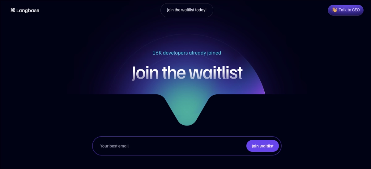
Using a simple opt-in form with a well-designed, outstanding CTA button encourages visitors to join the waitlist and receive updates about their product. The short page includes engaging elements, such as an animated background theme and partner or customer logo badges that boost the brand’s credibility and build trust among potential customers. Concise descriptions deliver persuasive information about the offer, creating interest among the target audience and ultimately leading to higher conversion.
Key strengths of Langbase’s landing page:
- Clear and persuasive messaging – the headlines clearly articulate the platform’s capabilities, emphasizing the ease of building, deploying, and managing generative AI applications. This messaging effectively communicates the unique selling point to potential users.
- Engaging visuals – high-quality graphics and icons help to break down complex information about the technology into digestible visuals, making the page more engaging and easier to understand.
- Strong CTAs – buttons are strategically placed throughout the page, encouraging visitors to sign up and join the waitlist. The language used in the call to action is action-oriented, adding to the page’s effectiveness in converting visitors. Using icons in CTAs shortens the distance and invites visitors to take immediate action.
Discover excellent examples of startup landing pages built with Landingi and learn how to craft a successful page for your business.
Create Your Own High-Converting Landing Page Today!
7 High-Converting Landing Page Best Practices
To achieve the best conversion results, create your landing page incorporating the 7 best practices that combine effective design, compelling messaging, and user experience principles, as follows:
- Set a clear and compelling headline,
- Add strong visual elements,
- Create a concise and persuasive copy,
- Set a strong CTA,
- Incorporate social proof,
- Add optimized forms,
- Remember about mobile optimization.
In the beginning, you have to understand your target audience and clarify the objective of the landing page – it allows you to craft a page that focuses on a singular goal and directs visitors to complete the desired action. Then, to turn a casual landing page into a high-converting, powerful digital marketing tool, consider incorporating the proven strategies described in detail below:
#1 Set a clear and compelling headline
The first best practice for high-converting landing pages is to set clear and compelling headline that instantly convey the unique value proposition of the offer. It’s the first thing visitors see and should clearly explain what they will get by taking the desired action. The goal is to connect with the visitor’s needs or problems and present your offer as the solution.
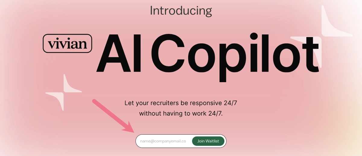
Take a look at the example below:
Additionally, the headline should set the tone for the entire landing page and align closely with the messages in your ads or other promotional materials that direct the visitor to the page. This consistency helps maintain clarity and reinforces the visitor’s expectation, thereby smoothing the path toward taking the desired action, whether it’s signing up, making a purchase, or downloading a resource.
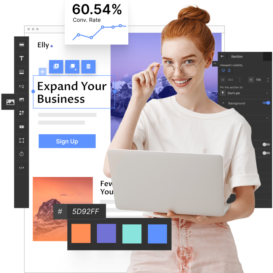
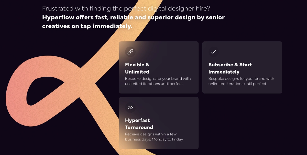
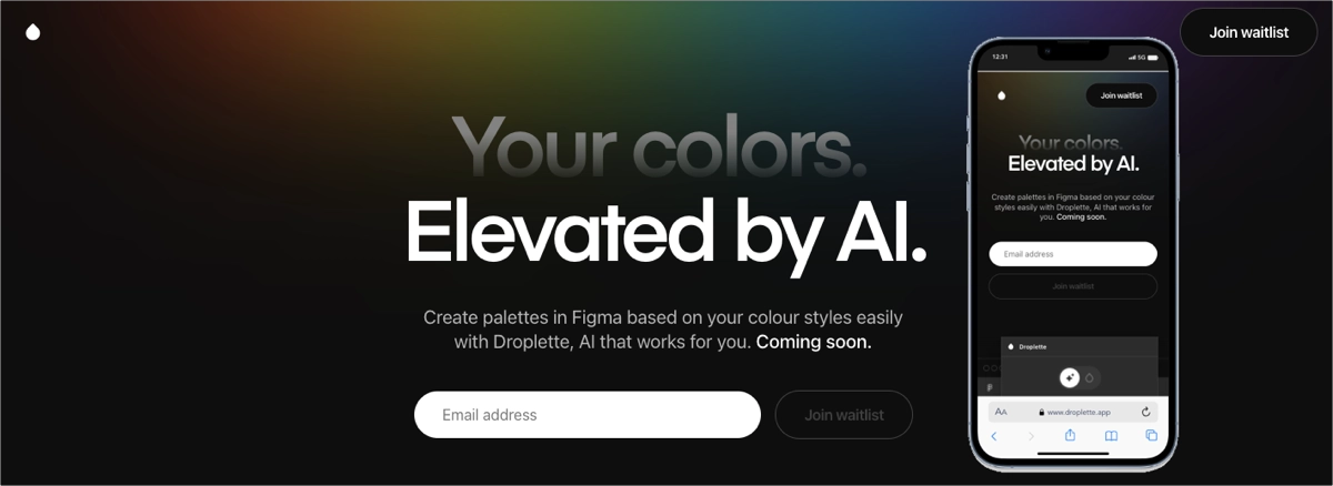
#2 Add strong visual elements
The second best practice for high-converting landing pages is to add strong visual elements that immediately attract visitors’ attention. Visual content plays a crucial role in making an initial impact, drawing in the viewer, and supporting the messaging of the landing page. These visuals must be not only eye-catching but also relevant and aligned with the overall message and goals of the page.
Take a look at the example below:

When choosing visuals, consider using high-quality images, graphics, or videos that reflect the product or service’s benefits. For instance, if you’re promoting a physical product, high-resolution images showing the product in use can help visitors envision themselves benefiting from it. For services, infographics or short explainer videos can effectively communicate complex information quickly and engagingly. It’s important to balance aesthetics with functionality – visuals should enhance the user experience without overwhelming the core content or slowing down the page load time.
Additionally, the emotional appeal of visual content cannot be understated. Colors, composition, and imagery style can evoke emotions and psychological responses that align with your messaging. For example, vibrant colors might be used to invoke excitement or urgency, while softer tones can convey comfort or trust. Ultimately, by carefully selecting and positioning compelling visual elements, you can significantly increase the effectiveness of your landing page by making it more engaging and persuasive.
#3 Create a concise and persuasive copy
The third best practice for high-converting landing pages is to create a concise and persuasive copy. Concise copy is essential because online visitors typically have short attention spans. They prefer to scan content rather than read through dense paragraphs. To accommodate this behavior, it’s crucial to break down your content into digestible fragments by using bullet points, icons with short descriptions, and short text blocks supplemented with engaging visuals.
Take a look at the example below:
Persuasiveness is another critical component. Your copy should inform the visitor, evoke emotions in just a few words, and create a sense of urgency or need. This can be achieved by focusing on the benefits rather than just the product or service’s features.
#4 Set a strong CTA
The fourth best practice for high-converting landing pages is to set a strong CTA that guides your visitors toward the desired action. The design of your CTA button should make it the most noticeable element on the page, so use contrasting colors from the rest of the page to ensure it catches the eye. The messaging of the CTA button should be action-oriented and create a sense of urgency or benefit. This direct approach helps eliminate any ambiguity about what the visitor is expected to do.
Take a look at the example below:
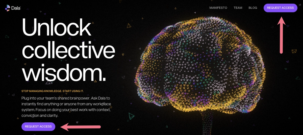
The placement of the CTA is also critical. It should be positioned in a spot on the page where it naturally draws the visitor’s attention. Ideally, it should appear above the fold (sticky bar), in the hero section after some persuasive copy or compelling visuals that prepare the visitor to take action, and repeated in strategic sections of the page.
#5 Incorporate social proof
The fifth best practice for high-converting landing pages is to incorporate social proof, such as testimonials, customer reviews, or logos of well-known clients or partners. These can build trust and credibility, showing potential customers that others have had positive experiences.
Take a look at the example below:
Consider adding the experience section with figures, describing clearly your impact in the industry – it can involve years of experience, number of satisfied customers, amount of sold products, or other significant metrics. Prove your offer is the best choice with award badges or logos of partners and renowned brands. If possible, add video testimonials to build trust among visitors.
#6 Add optimized forms
The sixth best practice for high-converting landing pages is to add optimized forms. It’s critical in the conversion process, as it’s often the point at which a visitor interacts directly with the page to become a lead or complete a purchase. Keep forms as simple as possible. Request only essential information to reduce friction and make the process of filling out the form quick and easy.
Take a look at the example below:
The form should be visually appealing and easy to navigate, with each field clearly labeled with instructions that are easy to understand. Implement real-time validation to provide immediate feedback if a user enters information incorrectly. Don’t forget about including security badges, links to your privacy policy, or statements about data protection – it builds trust and comfort with submitting personal information.
Our advice: Drop the guesswork and focus on real data – use an A/B testing tool and experiment with different versions of the form to find the most effective one. You can test its visual design, the number of form fields, or CTAs complementing the form. However, form optimization is an ongoing process that cannot be done just once – the key to effective landing pages is to continuously optimize their essential elements.
#7 Remember mobile optimization
The seventh best practice for high-converting landing pages is to remember mobile optimization. Given the increasing reliance on mobile devices for internet access, ensuring your landing page performs flawlessly on mobile is critical. A mobile-optimized landing page improves the user experience and supports better conversion rates, as users are more likely to complete a desired action if the process is easy and intuitive on their device.
Take a look at the example below:
Mobile optimization involves several techniques, as follows:
- Responsive design – ensuring the page automatically adjusts to fit the screen size and resolution of any device, from desktops to tablets to smartphones.
- Speed optimization – this can involve compressing images, leveraging browser caching, and minimizing the use of heavy scripts that can slow down the page load time. Faster loading times can reduce bounce rates and increase user engagement.
- Simplified navigation – on mobile devices, space is at a premium. Simplify your navigation to include only essential items, using dropdown menus or a hamburger icon to save space. This helps users focus on the content that matters and avoids overwhelming them with too many options.
- Touch-friendly interface – ensuring that all buttons, links, and form fields are easy to interact with on a touch screen. This means making buttons large enough to be tapped with a finger without the risk of hitting the wrong target.
- Legibility – text size and spacing are particularly important on mobile devices to ensure readability without zooming. Choose fonts that are easy to read on small screens.
- Minimalist design – adopting a minimalist approach to design provides clarity, which can help direct users’ attention more effectively to the most important parts of your landing page, such as the call to action.
What Are the Most Important Elements of a High-Converting Landing Page?
The most important elements of high-converting landing pages involve a catchy headline, engaging subheadings, persuasive copy, high-quality visuals, strong CTA, optimized forms, trust signals, and social proof. A catchy headline is the first noticeable thing on your page, and each visitor sets their expectations based on this persuasive slogan. It has to convey the value proposition compellingly so it engages visitors to scroll for more information about your offer. However, a good headline is supported by engaging subheadings, whose main role is to break up text to improve readability and maintain interest.
Persuasive copy is the strategic element of each high-converting landing page, encouraging visitors to take action and ultimately convert. It’s the art of crafting compelling messaging that resonates with the target audience, addresses their needs, and encourages them to engage with the offered product or service. High-quality visuals can engage visitors, but to ensure their attractiveness, they must be adjusted to the offer, explain complex information quickly, and keep the visitor fascinated.
The most important element behind every effective landing page is a strong CTA. The eye-catching button with concise messaging instructing visitors what to do next is the key to conversion. No less important is the form – when a page includes an optimized form, its converting capabilities are better. A well-designed form is simple and does not require more information than necessary. Such form, when positioned strategically, maximizes visibility and ease of completion, increasing the likelihood of conversion.
The last elements of high-converting landing pages are social proof and trust signals. Social proof involves customer testimonials, reviews, or the number of subscribers, reassuring that others have had positive experiences with the product or service. Trust signals are endorsements, partner logos, security badges, and success metrics, building credibility and trust. It’s proven that including these elements helps visitors in decision-making, increasing the overall landing page conversion rate.
What to Avoid While Creating a High-Converting Landing Page?
While creating a high-converting landing page, it’s crucial to avoid common pitfalls that can detract from the effectiveness of the page, which include overcrowding the page, using unclear CTAs, asking for too much information, neglecting to optimize page loading time, ignoring mobile users, neglecting A/B testing, disregarding analytics, and more. Check out the full list of 10 common mistakes that can make your newly created landing page ineffective:
#1 Overcrowding the page
The first common pitfall in creating landing pages is overcrowding them with excessive elements. Avoid using too many different fonts, colors, or images that don’t contribute to the overall goal of the page. Keep the design clean and focused.
#2 Unclear CTA
The second mistake in crafting a landing page is using an unclear CTA. Avoid vague or multiple buttons that can confuse visitors. Each landing page should have one clear CTA that is easy to find and tells the visitor exactly what action you want them to take.
#3 Asking for too much information
The third mistake that poorly affects conversions is creating extensive forms. You should only ask for the essential information needed to accomplish the page’s goal. Forms that ask for unnecessary information can deter visitors from completing them.
#4 Slow loading speed
The fourth common pitfall in landing page creation is neglecting page loading time optimization. Heavy graphics or unnecessary scripts can slow down the page, discouraging visitors and potentially leading to a decrease in conversions and high bounce rates.
#5 Ignoring mobile users
The fifth mistake you can’t allow yourself to make when building your landing page is ignoring mobile users. Avoid designs that look good only on desktops and ensure your page not only looks but also functions well on mobile devices. Failing to optimize for mobile devices can cause you to lose a significant portion of traffic and conversions.
#6 Lack of trust signals
The sixth common mistake while creating a landing page is not including trust signals and social proof. These elements (testimonials, customer reviews, security badges, or partner logos) are crucial for building brand credibility and encouraging visitors to take action. They help alleviate potential doubts and reassure that your business is reliable and trustworthy.
#7 Too much copy
The seventh pitfall that awaits you when creating a landing page is adding too much copy. Too much text can deter potential customers from conversion. Avoid lengthy paragraphs and dense blocks of text. Use bullet points and short, easy-to-read sections to convey your message clearly.
#8 Inconsistent branding
The eighth common mistake in landing page creation is inconsistent branding. It’s important to establish a cohesive brand identity to foster familiarity and trust with your target audience. If your branding is inconsistent, it can lead to confusion and detract from your brand’s reliability, negatively impacting conversions. Avoid using inconsistent fonts, colors, or messaging, which can confuse visitors and dilute your brand identity.
#9 Neglecting A/B testing
The ninth mistake in creating landing pages is neglecting A/B testing. Experimenting with various page versions can provide valuable insights into what works best and can significantly improve conversion rates. Leverage professional A/B testing tools and ensure your page meets your target audience’s expectations to drive better results.
#10 Ignoring analytics
The last but most influential mistake in landing page creation is ignoring analytics. Don’t forget your page once it’s live – use EventTracker to monitor events and user behavior across your page. This way, you can easily check out where improvements can be made. Ignoring analytics can lead to missed opportunities for optimization.
How to Define a Low-Converting Landing Page?
A low-converting landing page is characterized by its inability to attain the expected level of user engagement or action, usually assessed through its conversion rate. The key characteristics that can define a low-converting landing page include the following:
- poor performance metrics,
- high bounce rates,
- low engagement,
- poor user experience,
- ineffective CTA.
How Do You Measure the Effectiveness of a Landing Page?
Measuring a landing page’s effectiveness involves tracking various metrics that can indicate how well the page is performing in terms of engaging visitors and converting them into leads or customers. The key metrics that you should consider when assessing your page’s performance are conversion rate, bounce rate, user behavior metrics, page load time, and cost per conversion.
Conversion rate measures the percentage of visitors who complete the desired action on the page (such as signing up, downloading, or purchasing) divided by the total number of visitors. If you notice a higher conversion rate, it means your page is generally effective. A high bounce rate (a significant percentage of visitors who leave the page after only viewing it) could suggest that the page isn’t engaging enough or doesn’t match the expectations set by the ads or content that directed users there.
User behavior metrics show how visitors interact with your landing page, including how much time they spend on the page, which elements they click on, and how far they scroll. This data can reveal what’s working and what’s not, allowing for more targeted optimizations. You should also pay attention to page load time. If your page takes too long to load, potential conversions may be lost. Monitoring load times and optimizing for faster performance can directly impact your landing page‘s effectiveness.
Checking out the cost per conversion matters if you’re using paid advertising to drive traffic to your landing page. This tells you how much you are spending to obtain each lead or sale, which directly affects the overall return on investment (ROI). A/B testing results are also important metrics you should check to assess your page’s efficiency. These tests can precisely show which elements perform best and should be used moving forward.
How Does Content Influence Landing Page Conversion?
Well-crafted content can effectively guide visitors toward taking the desired action, no matter which goal you set (making a purchase, signing up for a newsletter, downloading a resource, or other). Content impacts the conversion process on landing pages with clarity, relevance, and persuasiveness, building engagement. Well–crafted content can effectively guide visitors toward your goals as it meets the following assumptions:
- Educates and informs,
- Persuades and convinces,
- Creates a sense of urgency,
- Guides users through the conversion process,
- Builds trust and credibility,
- Addresses objections and concerns.
Remember that content creation should be accompanied by SEO optimization. Including targeted keywords and structuring content to meet SEO standards increases the page’s likelihood of ranking higher in search results.
How Can Social Media and Paid Advertising Boost Traffic to a Landing Page?
Social media and paid advertising enhance visibility and direct relevant traffic to landing pages. Social media boosts landing page traffic by engaging targeted audiences through shared content, interactive posts, and community building. Paid advertising drives traffic by placing highly targeted ads in front of specific demographics, leveraging detailed user data for precision marketing. This precision enhances the quality of traffic directed to the landing page by attracting users who are already prepared to engage, increasing its relevance.
Social media platforms like Facebook, Instagram, and LinkedIn offer opportunities for natural sharing and interaction, which can increase visibility and attract users to your landing page. By creating interesting posts, stories, and collaborating with influencers, you can generate curiosity and interest, prompting followers to click through and explore the landing page for more details.
When used together, social media and paid advertising form a powerful combination of digital marketing strategies for increasing landing page traffic. They attract both organic and targeted audiences, leading to higher engagement and, ultimately, more conversions.
Which Tools Can Aid in Crafting Efficient Landing Pages?
In crafting efficient landing pages, equip yourself with a user-friendly builder, A/B testing tool, user behavior tracking tool, sales funnel managing tool, and SEO tool. Choosing a relevant landing page builder is essential, as it allows you to compose the toolkit tailored to your needs.
You can select from well-known, intuitive builders like Carrd, Unbounce, or Leadpages. Still, the best option is to use a multifunctional platform, like Landingi, that combines all the necessary tools to create the most effective landing pages. Landingi offers over 400 professionally designed templates and a user-friendly builder with AI landing page features. Thanks to them, you can craft compelling, SEO-optimized content for the entire page.
Thanks to Landingi’s A/B testing features, you can easily experiment with various page elements to find the best-performing ones. With a built-in EventTracker tool, you can track events and user behavior across your pages, right in the Landingi platform. This professional solution also offers over 180 integrations, making it the most helpful toolkit for both beginners and professionals wanting to create landing pages that convert.
What Are the Best Practices for CTAs (Calls to Action) on a Landing Page?
To achieve the best conversion results, keep CTAs on your landing page visible and contrasting. This way, you can easily attract the attention of your page visitors and guide them toward the desired action right from the moment they enter your page. The efficiency of CTA depends on its messaging. Use straightforward, action-oriented language to communicate what users should do next directly.
The button placement matters – keep your CTA above the fold. This means placing it prominently across your page. It should be used in a hero section and repeated in all strategic sections, e.g., near the testimonials. It’s a good practice to place CTA on a top sticky bar to ensure its visibility and accessibility without scrolling.
Pay attention to the button’s size and shape. It must be an obvious element of your page. Check out the mobile view – the CTA on a mobile page must be tappable. Another good practice that affects the button’s visibility is to utilize whitespace around the CTA. The last tip is regularly testing your CTA’s different versions with an A/B testing tool. It allows you to measure its efficiency and check out which colors, sizes, shapes, placements, and copy resonate best with your target audience.
Build High Converting Landing Pages with Landingi
Knowing what is the average conversion rate of your industry’s landing pages, what types of pages are winning the competition, and understanding the best practices to improve page performance, you can create the perfect campaign to bring you the success you dream of.
Choose the Landingi platform and start creating your landing page with the best digital marketing tools – use perfectly designed templates, customize them with a user-friendly editor, add powerful elements to drive conversions, track user behavior with EventTracker, and conduct A/B tests to find the best-converting version of your landing page.
Try it out now – Landingi is your best choice for success.