A landing page is a standalone, dedicated webpage that guides visitors toward a specific action. It’s the core of each digital marketing strategy, e.g., paid advertising, social media marketing, or email marketing, serving as a conversion point. Landing pages are designed with minimal distractions, focused on a single goal, and optimized to maximize conversions.
Landing pages across different industries typically convert at a rate of 10.76%, as reported by GetResponse, but according to Unbounce, top pages can achieve a conversion of 27% and higher. Still, crafting a well-performing page can be challenging, as it requires a combination of strategic planning, compelling design, persuasive copywriting, and technical optimization.
In the following sections, we’ll delve deeper into the anatomy of a successful landing page, discuss the psychological triggers that compel visitors to click, and reveal how to leverage design and content to maximize conversion rates. From understanding the importance of A/B testing and analytics to recognizing the influence of mobile optimization and page load speeds, we’ll cover everything you need to know to create landing pages that capture leads and captivate your audience.
What Is a Landing Page?
A landing page is a web page crafted precisely to achieve one goal: conversion. It’s the first touchpoint a visitor encounters after clicking on a link from an email, ad, or other digital avenues, engineered to transform interest into action. Unlike other web pages cluttered with information and options, a landing page relies on a single call-to-action, making it a well-performing conversion-driving tool in any marketing strategy.
The effectiveness of a landing page lies in its simplicity and specificity. It reduces distractions and focuses on a specific demographic, delivering a customized message that aligns with the visitor’s objectives. Whether capturing email addresses through lead-generation landing pages or guiding users to purchase via click-through landing pages, the design, and content are always meticulously aligned with the page’s primary goal of conversion.
While each type of landing page has different requirements, depending on the industry, target audience, and main goal, they all contain the following key elements that make these digital spaces just that – landing pages:
- Captivating and clear headline, providing an immediate understanding of the offering.
- Subheadline offering additional information.
- Single USP stating what makes the offer unique or valuable.
- Enhancing engagement hero image or video that visually represents the product or service.
- Benefits section that lists the key benefits or features of the product/service.
- Motivating social proof that effectively builds trust.
- CTA button encouraging visitors to take a desired action.
- Lead capture form that collects visitor information (e.g., visitor’s email) in exchange for the offer.
- Closing argument which serves as a final statement that reinforces the value of the offer.
Use Landingi to design landing pages that drive real results for your business.
What Is the Function of a Landing Page?
The landing page always has one clear goal – driving conversions, but it can have various functions, such as generating leads, increasing sales, and amplifying marketing campaigns‘ impact. The landing page is usually created for marketing or advertising campaigns – it’s where website visitors land after clicking on a link from an email, ad, browser like Google or Bing, social media posts, etc. It’s a strategic instrument in a marketer’s toolkit, designed to fulfill at least one of the following 4 pillars showcasing the purpose of dedicated pages:
- Lead generation,
- Sales conversion,
- Market testing,
- Content delivery.
The first landing page’s purpose, lead generation, means that the page is designed specifically to gather contact details like email addresses and build a database of prospects. If the page is built for the second purpose – sales conversion, it’s designed to encourage visitors to purchase, subscribe to a service, register for an event, etc. Landing pages can also be leveraged to test the market response to a new product or offer before a full-scale rollout. They also often serve as content delivery points. Such pages provide access to resources like e-books, whitepapers, or courses in exchange for user information.
Landing pages are pivotal for digital marketing campaigns. They create a streamlined path that channels visitor interest into concrete leads or sales. By presenting a clear and enticing proposition, they encourage visitors to commit and engage with the brand meaningfully. Landing pages allow businesses to build their online presence effectively. Still, these standalone pages are not mere online placeholders; they are conversion-centric environments that combine narrative and visually engaging elements to guide visitors toward the desired goal. Businesses use various strategies, such as PPC, to drive a targeted audience to their landing pages, maximizing reach and effectiveness – according to MECLABS, 56% of clicks from paid search advertisements go to a landing page, not the homepage.
With the ability to track and measure success, landing pages provide invaluable data that inform future marketing initiatives, making them indispensable in conversion optimization and achieving campaign objectives. This data-driven approach not only refines the marketing strategies but also offers insights into customer behavior, preferences, and conversion triggers.
Build your page and start tracking conversions with EventTracker today!
The ability to swiftly adapt to these insights allows for real-time campaign adjustments, ensuring that marketing efforts remain agile and responsive to the ever-changing digital landscape. Moreover, landing pages can be integrated with marketing automation tools to streamline the lead nurturing process further, making them a powerful component in a marketer’s toolkit for driving successful outcomes.
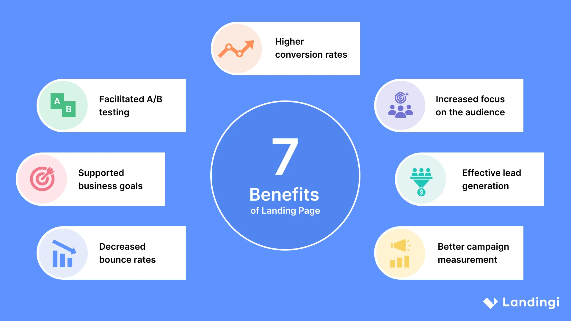
What Are the 7 Benefits of a Landing Page?
The landing page benefits listed below showcase how important tools in the digital marketing world landing pages are. The 7 top profits that businesses can gain by using landing pages include the following:
1. Higher conversion rates
Firstly, landing pages convert more traffic than general websites due to their focused and singular purpose. While a website provides a comprehensive view of a company, its products, and services, it also offers multiple paths for a visitor, which can weaken the effectiveness of a single conversion goal. Landing pages eliminate this complexity by guiding visitors to one specific action, reducing distractions, and making the decision-making process more straightforward.
2. Increased focus on the audience
Secondly, landing pages can be tailored to specific segments of your audience, presenting a customized message that resonates more deeply with visitors’ needs and interests. This focused approach aligns closely with specific visitor intentions, enhancing the message’s relevance. This personal touch increases the likelihood of conversion.
3. Effective lead generation
Thirdly, landing pages directly support your lead-generation efforts. By offering something valuable, for instance, exclusive ebooks, insightful whitepapers, or informative webinars in exchange for contact information, they efficiently gather leads for future marketing efforts. Furthermore, these pages can be optimized with persuasive copy and strategic design to increase the likelihood of visitor engagement, thus maximizing the potential for lead collection.
4. Better campaign measurement
Fourthly, with a single focus, it’s easier to measure the effectiveness of a landing page in achieving its goal. Analytics can provide insights into conversion rates, visitor behavior, and campaign performance, allowing for rapid adjustments and optimizations.
5. Decreased bounce rates
Fifthly, a well-designed landing page with a clear message and call to action is more likely to keep visitors engaged. Since there are fewer distractions than on a full website, visitors are more inclined to stay and take action.
6. Supported business goals
Sixthly, whether promoting a new product, increasing sign-ups, or driving participation in events or webinars, landing pages can be quickly created to support short-term and long-term business objectives.
7. Facilitated A/B testing
Seventhly, landing pages enable A/B testing, a crucial component for continuously optimizing digital marketing strategies. This testing allows businesses to compare different strategies by experimenting with various design features and copywriting options to determine which mix best appeals to their audience and achieves the intended results.
Exploring the capabilities of a landing page uncovers numerous advantages that significantly strengthen a business’s approach to digital marketing. Landing pages are not just about conversions; they are a crucible for insights. Optimized landing pages offer valuable data that:
- Sharpen the focus of paid ad campaigns,
- Boost credibility with concise messaging,
- Reinforce branding,
- Serve as a litmus test for audience preferences, allowing marketers to fine-tune their approach through A/B testing,
- Allow marketers to adapt their tactics based on real-time feedback.
Additionally, with the right SEO enhancements, more landing pages can become a beacon for organic traffic, further extending their reach and impact.
Where to Create a Landing Page?
To create a landing page, consider using user-friendly website builders like Wix or Squarespace, specialized landing page creators like Landingi or Leadpages, or a versatile content management system like WordPress. Choose based on your technical comfort, design needs, and the specific features required for your campaign or business.
Choose a template and create a dedicated landing page for your business!
It’s enough to type “landing page” in a popular browser’s search bar to see how many tools and services are at your disposal. From dedicated landing page builders like Unbounce and Leadpages to content management systems (CMS) like WordPress, options are plentiful for novices and seasoned professionals. Best free landing page builders offer a range of features, from intuitive drag-and-drop interfaces to advanced analytics, catering to digital marketers and business owners’ diverse needs.
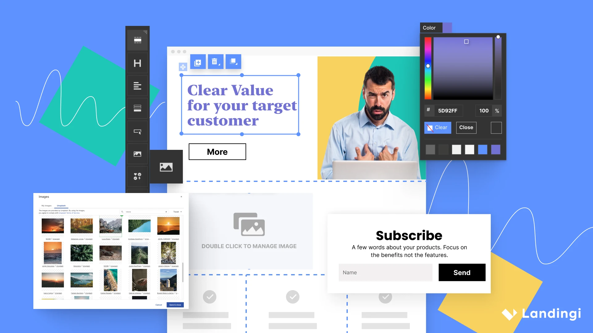
However, if you are looking for a useful tool to build landing pages effortlessly, test them, measure their performance, and optimize them for higher conversions, focus on the best free landing page platform –Landingi. This solution, invented by professionals to answer digital marketers’ needs, was designed to streamline the page-building process and make it available also to inexperienced users.
Landingi stands out with its multifunctional approach, offering an intuitive landing page builder and over 400 fully customizable templates to help you craft an effective landing page. The platform provides AI landing page features, thanks to which you can effortlessly generate content for the entire landing page. You can also craft multi-language pages to reach global audiences – Landingi supports 29 languages and automatically translates your pages in minutes to help you achieve the best campaign results. A Form Builder lets you change casual pages into powerful lead-generation machines. With Smart Sections, you can easily incorporate bulk changes into multiple pages and manage them effortlessly.
Landingi not only streamlines the page creation process but also facilitates conversion optimization by providing the EventTracker tool, which tracks events and user behavior across your pages, collecting all the data in a transparent dashboard. A built-in A/B testing tool allows you to experiment with various page versions to find the one that resonates best with your target audience. Moreover, the platform provides over 180 integrations, making it the top marketers’ choice. The Landingi platform was created to simplify landing page creation and further optimization processes for both advanced and inexperienced users and to allow various marketing campaigns with specific requirements to be run.
The key to success lies in selecting a tool that aligns with your marketing objectives and provides the flexibility to create landing pages that resonate with your target audience, so the best option is to find a solution that answers particular needs and provides user-friendly features. The right tool should empower you to bring your creative vision to life with minimal fuss and maximum impact, leading to landing pages that not only look great but perform exceptionally well.
How to Create a Landing Page?
To create a landing page, define your goal, understand your audience, craft a compelling headline, design the page with clarity, highlight benefits, include social proof, create a strong CTA, and continuously optimize for conversions through A/B testing and analytics, ensuring the design is aligned with your brand and user-friendly across devices.
Follow the 8-step guide on how to create a landing page, and keep in mind that every element must work in harmony to captivate the audience and result in a high conversion rate.
1. Define your goal
Firstly, define your goal, as it will shape the content and design of the page. Without a clear objective, your landing page may lack focus, leading to confusion and a lower conversion rate. Therefore, take the time to understand what you want to achieve with your landing page and let this clarity inform every decision you make in the creation process.
2. Understand your audience
Secondly, understand your audience. Knowing their needs, preferences, and pain points allows you to tailor your message and design to resonate with them. But there’s no room for guesswork – by conducting market research and gathering data on your target demographic, you can create a landing page that speaks directly to their desires and challenges. Personalizing your landing page this way can significantly increase the likelihood of conversion – a significant 89% of marketers reported seeing positive results from implementing personalization in their digital marketing efforts, as reported by Webstacks.
3. Craft a compelling headline
Thirdly, create a compelling headline that cuts through the noise. Your headline should grab attention and convey the value proposition of your offer. It’s the first thing visitors will see, so make it impactful. Make sure it’s bold, clear, and leaves an indelible impression on the visitor’s mind. Think of it as the hook that reels your audience – it should be intriguing enough to pique their interest and reflect the following content.
4. Design a page with clarity and focus
Fourthly, design your page with clarity and focus on your objective. Minimize distractions by removing unnecessary elements that don’t contribute to your goal. Use a clean layout, readable fonts, and appropriate images or videos that align with your message.
Use Landingi to design landing pages that drive real results for your business.
5. Highlight the benefits
Fifthly, highlight the benefits of your offer and focus on how your product or service solves problems or improves your audience’s situation. Delve into the specifics of how it makes life easier, more enjoyable, or more efficient for the user. Don’t just list features; connect them with the real-world benefits that your audience can relate to. If it’s an innovative solution, describe how its cutting-edge technology sets it apart from the competition.
6. Include social proof
Sixthly, include social proof – add testimonials, reviews, and logos of well-known customers or partners to your landing page. These elements can greatly enhance trust among your visitors, motivating them to take the desired action.
7. Create a strong CTA
Seventhly, craft a strong CTA that is visually prominent and worded in a way that encourages visitors to take action. Landing pages with personalized calls to action can see a 202% increase in performance, as highlighted by HubSpot. Use action-oriented language that conveys a sense of urgency or benefit. Ensure the button is placed strategically where it’s easily visible and stands out from the rest of the page’s content.
8. Optimize for conversion
Eighthly, optimize your page for conversion. Implement A/B testing to try out different headlines, CTAs, images, and overall layouts. It’s the proven method to see what works best. Remember to use analytics to track visitor behavior and conversions. Then, make adjustments based on the data. To further enhance the efficacy of your landing page, delve into the nuances of each element. By embracing a culture of testing and data analysis, you can incrementally improve your landing page’s performance.
Turn traffic into conversions! Build high-performing landing pages on Landingi and watch your results soar.
Beneath the landing page’s surface lies the strategic design and optimization framework. A well-designed landing page should:
- Represent colors that reflect the brand’s identity,
- Have a layout that facilitates easy navigation,
- Ensure the visitor’s journey toward conversion is unimpeded,
- Provide an optimal experience across all devices, especially for mobile users.
The process of designing high-converting landing pages actually never ends, as these digital tools are effective only when continuously tested and refined. Regular tests with optimization tools like heat maps are required to perfect the placement and appearance of key elements, like the CTA button.
How to Create a Landing Page Without a Website?
To create a landing page without a website, choose a tool offering hosting for a landing page, like Landingi, Canva, or Instapage. If you haven’t acquired a domain yet but wish to create a landing page, it’s the best option to use dedicated tools to construct a landing page and host it within their solutions. These tools provide users with a shareable link that serves as a standalone online presence, perfect for testing new market ideas or optimizing PPC campaigns.
Creating a landing page without a website is straightforward and cost-effective for those just starting out or operating on a tight budget. By focusing on the landing page’s purpose, selecting a captivating design layout, and building a simple form, users can quickly launch a page that begins engaging with potential customers. Even without a website, landing pages can become powerful tools for lead generation and product promotion.
What Are the Best Tools for Creating a Landing Page?
The top landing page tool is Landingi, the best landing page platform that enables businesses to create, test, and optimize pages, allowing them to achieve their marketing goals. Still, among the best landing page creation tools, Wix, Leadpages, and Unbounce deserve your attention. All mentioned tools combine ease of use, flexibility, and powerful features to cater to various needs, from simple designs to complex, conversion-focused pages.
When choosing the best tools to create a landing page, focus on the 3 usability pillars they should cover, as follows:
#1 Page creation
Choose from the best free landing page builders, like Landingi or Unbounce, that allow you to create landing pages effortlessly. A user-friendly interface and drag-and-drop editor are a must, especially when aiming for time-saving solutions. A good landing page builder should offer templates designed by professionals to maximize performance and drive high conversions.
#2 Conversion optimization
Think broader – in the digital marketing world, nothing happens itself, and crafting a landing page is not the end; further conversion optimization is the key to success. Choose the multifunctional platform, like Landingi, that allows you to run A/B tests, track user behavior, and effortlessly analyze gathered data to implement optimizations.
#3 AI support
Find a tool offering AI features that support content creation and SEO optimization. Best AI landing page generators, like Landingi, can help you match the message to your target audience and boost SEO efficiency with cost-effective solutions.
What Is the Cost of a Landing Page?
The landing page cost varies from $50 to even $3,000, with an average price tag of $350. Costs vary based on several factors, including whether you create it yourself, hire a freelancer, or work with an agency. Hiring a freelancer can be a cost-effective solution for businesses on a tight budget, but it’s essential to carefully review the freelancer’s portfolio and customer reviews before hiring.
Below you can check out a breakdown of the costs involved in each approach:
Creating a landing page yourself
If you decide to create a landing page on your own using a platform like WordPress, Unbounce, or Landingi, your primary costs will be related to the platform’s subscription fees and any premium plugins or themes you choose to use. These platforms often have free plans or start at as low as $10-$30 per month for basic plans, with more advanced features and integrations increasing the price.
Hiring a freelancer or agency
The cost of hiring a professional to design and develop your landing page can vary significantly. The work can cost $15 – $80 per hour, depending on the freelancer’s experience, location, and expertise. For a basic landing page, the minimum creation cost is around $500, with an average cost of $1,000.
Cost of a custom landing page
Custom landing pages designed by professional agencies or experienced freelancers can offer a tailored solution for your business needs and goals. The average price for a custom landing page ranges from $500 to $3,000. These costs can go higher based on the complexity of the design, the number of revisions required, the level of customization, and any specific integrations needed.
As you see, the investment in a landing page can range from zero cost using free platforms to substantial amounts for custom-designed pages crafted by professional agencies. For those opting for a landing page builder, the cost includes a suite of features that support the creation and hosting of multiple landing pages, making it an attractive option for businesses of all sizes.
On the other end of the spectrum, hiring a freelancer or agency can result in a more tailored and sophisticated landing page. Costs in this case can vary based on:
- The complexity of the design,
- The level of customization required,
- Additional factors such as hosting, domain costs, SEO optimization, and ongoing maintenance.
It’s important to consider the upfront costs and the potential return on investment (ROI) a high-quality landing page can bring in terms of leads, conversions, and sales. When budgeting for a landing page, weigh the cost against the expected benefits to your business.
What Are the Types of Landing Pages?
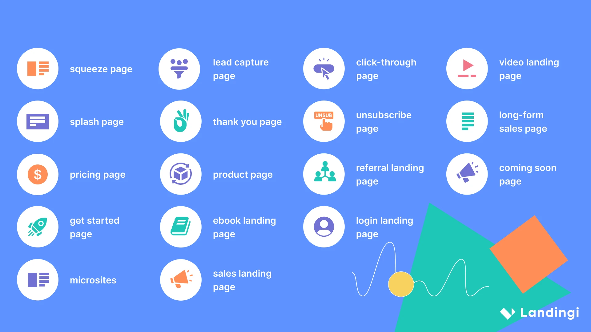
Landing page types are distinguished to suit various industries, from product or service ones through newsletter squeeze pages to event promoting pages. They are meticulously crafted to address the specific needs and goals of each sector. They can be categorized based on their goals, target audience, and the nature of the content they present. Here are the main types:
Squeeze page
A squeeze page is a simple, minimal landing page created to capture leads and collect contact information. The primary goal of a squeeze page is to build an email list, which can be further leveraged by businesses for their marketing purposes, e.g., nurturing leads, distributing content, or promoting products and services. These pages feature valuable offers to attract and encourage users to provide their data. Incentives, such as a free report, webinar registration, newsletter subscription, or discount code, can effectively encourage users to take the desired action.
Lead capture page
A lead capture page is a standalone page specifically designed to collect information from visitors to build a database of potential leads for future marketing efforts. Although the key element of a lead capture page is a well-designed form that gathers users’ contact details, it must also effectively inform and engage visitors into the product or service. The form usually asks for names and email addresses. Still, sometimes it can require additional data relevant to the business, like company size or industry, depending on the depth of the lead qualification process.
Click-through landing page
A click-through landing page is one of the most popular page types. Businesses leverage click-through pages to engage visitors with a product or service before leading them to make a purchase or take other desired actions. Such pages usually focus on informing the visitor and nudging them toward a conversion point, usually through a single, compelling call to action.
Video landing page
A video landing page is a webpage that uses a video as its central element to engage visitors, convey information, and encourage them to take specific action. Videos have the power to capture visitors’ attention quickly and make the message more accessible and compelling than text alone could achieve. Landing pages that leverage immersive video content typically have higher conversion rates.
Splash page
Splash pages are often used as an introduction or a gateway to the website content. These minimal pages can have various purposes, e.g., to verify visitors’ age before accessing the site, to let users choose their country and language, or to highlight a special announcement. These pages usually include straightforward, concise copy, forms or dropdown lists, and clear CTA.
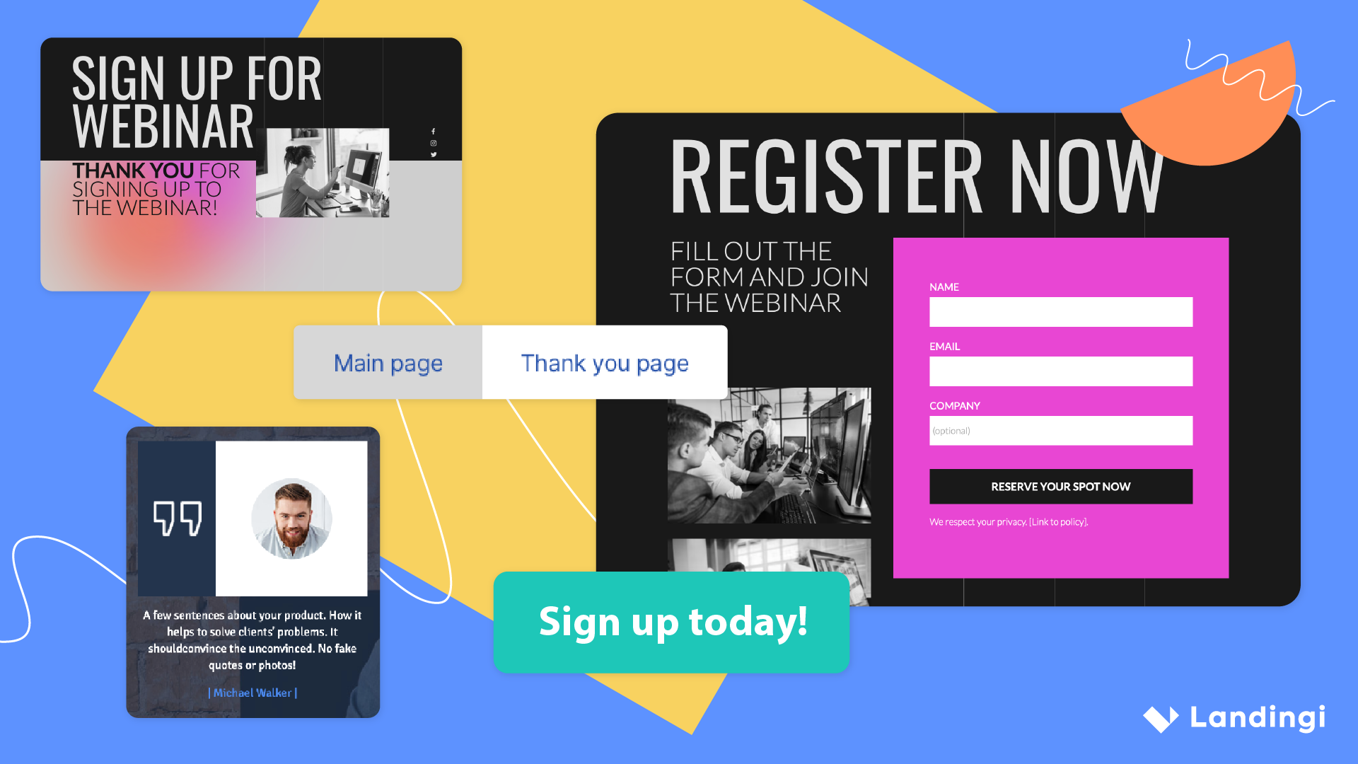
Thank you page
A thank you landing page is a specific page that displays after the requested action is performed, e.g., after purchasing or signing up for a newsletter subscription. Businesses use this type of page to express gratitude and engage users further with offers that can be interesting for them. Thank you pages are crucial in enhancing user experience and strengthening the relationship between a business and its customers.
Unsubscribe page
An unsubscribe page is a specific page that users are directed to when they choose to unsubscribe from a newsletter, email list, product subscription, etc. Creating unsubscribe pages enhances a positive user experience, even when users want to stop receiving communication or using services. These pages are essential for following email marketing best practices and regulations.
404 landing page
404 landing pages are designed to inform users about an error and show them that the content they seek doesn’t exist. Even though you may think using these pages is unnecessary, you are wrong. With well-designed 404 pages, businesses can effectively minimize bounce rates, turning potentially frustrating experiences into positive interactions by guiding users to useful content or back to the home page.
Long-form sales page
A long-form sales page is a comprehensive webpage that aims to persuade visitors to buy a product or service. These pages showcase unique selling propositions, highlight product or service benefits, and address prospective customers’ concerns and questions, encouraging visitors to purchase.
Pricing landing page
Businesses use pricing landing pages to present purchasing options for a product or service in a clear, straightforward way. These pages can be used by various companies, including service providers, SaaS businesses, tech companies, and many others. Pricing landing pages must be intuitive to guide visitors toward purchasing effectively.
Sign up and use Landingi to craft your high-converting pricing landing page!
Product landing page
Product pages are designed to promote and sell a single product or a specific group of products. Unlike general websites or e-commerce platforms that might list multiple items, this landing page type focuses on one specific product offering. Product pages are strategically structured to succinctly communicate the product’s value and persuade users to take action.
Referral landing page
Referral landing pages are used to facilitate and encourage the process of referring new users or customers through existing customers’ or participants’ networks. These pages often include personalized elements, such as the referrer’s name or a specific offer to create a more personalized and engaging experience.
Coming soon landing page
Businesses create temporary coming soon landing pages to inform users about new product or service launches or upcoming events. These promotional pages are great digital marketing tools for building anticipation, capturing users’ interest, and generating early leads and subscribers before the official launch.
Get Started page
Get Started pages are crafted to convert visitors into users or customers by encouraging them to begin the signup process, start a free trial, or take another action that leads them to engage directly with the offering. Each element of such a page has to be strategically designed to guide visitors toward taking the first step in using a product, service, or platform.
Ebook landing page
An ebook landing page promotes a specific ebook and enables users to purchase or download its free version in exchange for their contact details. It’s one of the most powerful types of landing pages, allowing businesses to generate leads by offering a valuable resource as an incentive.
Craft your ebook page with Landingi and boost sales or drive leads easily!
Login landing page
As you surely know from your own online experience, a login landing page is one of the most common pages. It’s a page where users access an existing account by entering their credentials, such as a username and password. These pages facilitate secure and straightforward access for returning users, but they also reflect the brand’s commitment to user experience and security.
Microsite
Microsites are small, simple webpages that highlight specific campaign, product launch, event, or content theme. Businesses use these targeted pages to convey a message to a particular audience segment. The power of microsites lies in their simplicity which effectively reduces disctractions typical for a full-scale website, making them well-converting digital marketing tools.
Sales landing page
A sales landing page is used to promote a single offer and drive visitors towards completing a purchase. Each element of such a page, including a catchy headline, high-quality product visuals, benefits section, and social proof, is strategically designed to persuade users to take the desired action. These pages are effective in driving conversions, as they focus solely on the only one offering.
Although we explained most of the landing page types, there are many more possibilities to make a usage of these digital spaces. As one of the most useful tools, landing pages work efficiently, helping to run a successful marketing campaign for your business. However, each campaign requires strategic approach and choosing a page type depends on its specific goals. Designing separate landing pages for various campaigns can make your digital marketing efforts more effective than ever before.
What Are the Best Practices for Creating Landing Pages?
To craft an effective landing page, ensure a clear, concise headline, compelling and benefit–focused content, and a strong and clear call–to–action, all supported by engaging visuals. Add trust-building elements, optimize your page for mobile, and remember about loading speed. All these elements matter when it comes to creating landing pages that convert.
Check out all landing page best practices listed below, grouped into relevant categories, and use this short guide to create and optimize your landing page for the best results.
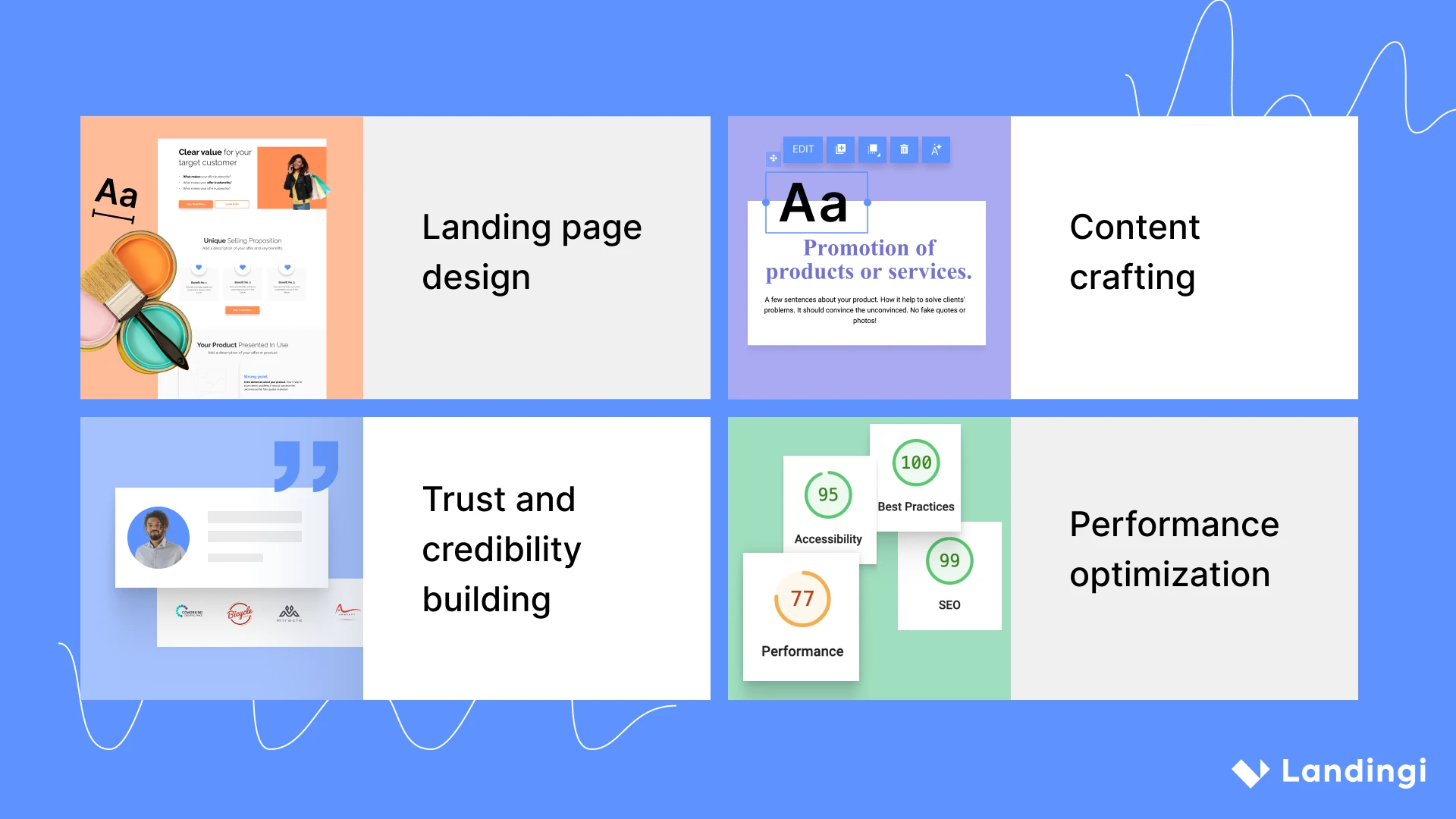
1. Landing page design
Landing page design, when well thought-out, helps to achieve the best campaign results. Make the page intuitive and user-friendly, focused on a single purpose, and implement the following 7 best practices:
- Remove navigation to streamline the user journey toward conversion.
- Keep it consistent to ensure that the overall feel of the landing page aligns with your brand and the campaign it represents.
- Keep the action above the fold to improve user engagement and drive conversions effectively.
- Ensure responsive web design so your page performs well on any device, adapting to different screen sizes.
- Choose the right colors to evoke the desired emotional response and complement the brand identity.
- Design for mobile, ensuring page elements are easily viewable, tappable, and navigable on smaller screens.
- Eliminate distractions to align design and key page elements strictly with the conversion objective.
2. Content crafting
Crafting content that aligns with visitor’s expectations and persuades them to take action is not obvious, so focus on the following 6 best practices to match your message to landing page objectives:
- Use data to understand your audience and tailor your message to resonate with their needs, desires, and pain points.
- Create powerful headlines that balance brevity with impact, enticing visitors to delve deeper into the landing page content.
- Craft a narrative that informs, entertains, and persuades your audience. Ensure the language resonates with your target audience and reflects your brand’s voice.
- Provide a tangible benefit or solution to a problem your target audience faces through a downloadable resource, a free trial, a discount code, or valuable information addressing a specific need or pain point.
- Select visuals that complement and reinforce your message and ensure they are high-quality and relevant to your audience. Images and videos can simplify complex information, evoke emotions, and guide visitors’ attention to CTA.
- Use high-quality images or videos to showcase your product or service in real-life situations. This will bring your product to life in the eyes of your potential customers and make the benefits tangible and immediate.
3. Trust and credibility building
Building trust and credibility among visitors helps realize the main landing page objectives, convince users to take action, and build your brand’s strength. To achieve this, implement the 4 best practices:
- Add social proof, such as customer testimonials, user reviews, case studies, or media mentions and awards, to enhance the credibility of your offer and influence the decision-making process.
- Include partner logos or highlight the number of users who have benefited from your service to reassure visitors that they made a wise choice by engaging with your brand.
- Add privacy note to ensure visitors that their personal information is safe and will be handled with the utmost respect for their privacy.
- Keep the form simple, straightforward, and user-friendly. Request only the necessary information, respecting the user’s time and privacy. This can significantly reduce friction and increase the likelihood of form submission.
4. Performance optimization
Performance optimization is the key to success, but only when run regularly with the right analytics tools. Stick to the 7 following best practices and create a successful landing page:
- Emphasize your CTA and make it the most prominent feature on your landing page, ensuring it’s impossible to miss. Create a sense of urgency or offer a limited-time deal to compel users to click the CTA button.
- Incorporate SEO best practices, such as researching and utilizing relevant keywords, optimizing meta tags and descriptions, and creating high-quality, valuable content. SEO-optimized landing pages display higher in search results.
- Optimize images, leverage browser caching, and minimize the use of heavy scripts, to ensure that your landing page loads swiftly and smoothly, keeping the user’s attention focused on your content and CTA.
- Ensure your landing page is mobile responsive and provides an optimal experience on smartphones and tablets. This includes readable text without the need to zoom, adequate space for tap targets, and fast loading times to accommodate users on the go.
- Ensure that the CTA is always in sight and use the scrolling CTA to guide visitors toward taking action at their own pace. This will effectively increase the likelihood of conversion by providing a constant reminder of the action you want the visitor to take.
- Simplify your forms and ask for the essential information only to maintain user engagement and encourage completion. A complex or lengthy form can be a barrier to conversion.
- Use A/B testing, multivariate testing, and user testing to collect actionable data for incremental improvements.
Try Landingi now and start optimizing your landing page for higher conversion rates!
A landing page can become a high-converting asset in any digital marketing strategy by adhering to these best practices. This mantra of optimization ensures no stone is left unturned in the quest to create the most effective landing page.
What Are the Best Examples of Landing Pages?
The best examples of landing pages are strategically crafted to engage target audiences and effectively achieve business goals. They include key elements, like a clear layout, compelling headlines, concise copy, high-quality visuals, and trust elements that, combined, direct users to an outstanding CTA, convincing them to take the desired action.
Examining the best landing page examples offers a window into the potential of what well-executed digital canvases can achieve. Look at a few picks below and learn from real-life cases what makes a landing page successful.
1. Free trial landing page
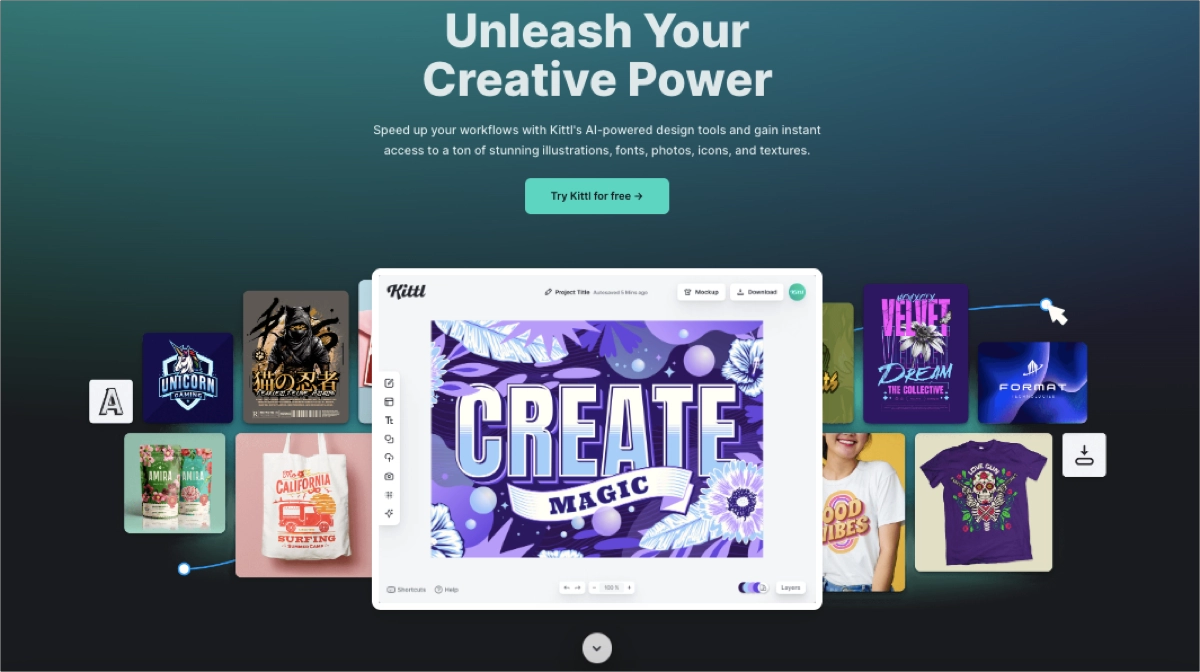
The Kittl free trial landing page features an attractive design that vividly demonstrates the platform’s features. It successfully emphasizes the array of features and benefits they bring to users. Included imagery and graphics adeptly show the outcomes attainable with the tool. The strategic white space and concise but informative content direct visitors’ focus on outstanding CTA, encouraging them to complete the desired action.
2. Service Landing Page
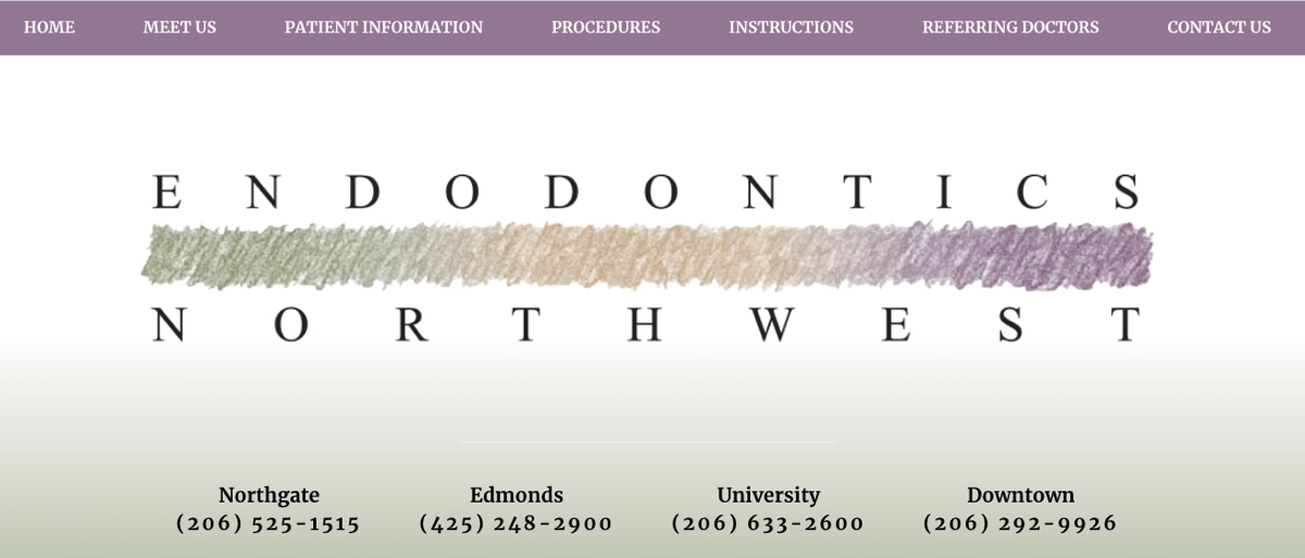
The Endodontics Northwest landing page is designed to appease visitors seeking specialized dentist services. The availability of direct contact methods for booking appointments simplifies the process for prospective patients to proceed. The “Meet the doctors” segment effectively establishes trust, while a map plugin makes locating the facility straightforward. The compelling call-to-action, adorned with a small calendar icon, makes accessing the appointment request form more convenient. All these components create a successful service landing page that converts.
3. Newsletter Landing Page
The newsletter landing page of Mrwhosetheboss showcases a well-structured, minimal page with a single focus that clearly directs visitors’ attention to the desired action – signing up for a newsletter. The short form and outstanding CTA button are well-placed, supplemented with a short description. The background image grabs attention, and social media buttons placed in the strategic top right corner are designed for a better user experience. All these elements build a high-converting newsletter landing page.

These examples showcase how landing pages can be tailored to meet specific marketing objectives while providing an engaging and effective user experience. Inspire yourself with these stunning, powerful pages, and craft your own landing page with Landingi to empower your digital marketing efforts.
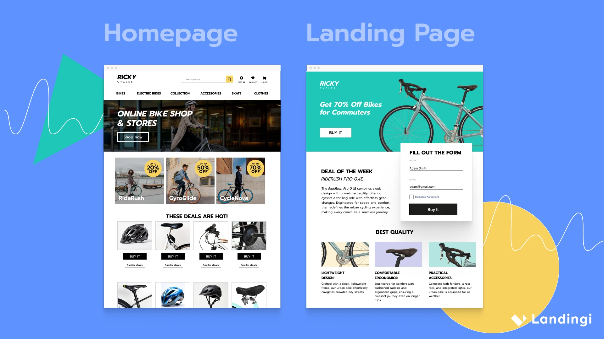
What Is the Difference Between a Landing Page and a Homepage?
The difference between landing pages and homepages lies in their purpose, design, and traffic source, which directly influence how they are used in a business‘s online strategy. The main distinctions cover three areas – navigation, traffic sources, and positioning within the website.
Landing pages are designed with a single focus or goal, such as encouraging visitors to sign up for a newsletter, download a guide, or purchase. To keep visitors focused on this goal, landing pages typically have no navigation menus linking to other website parts. This minimizes distractions and helps guide visitors toward the intended conversion action.
In contrast, homepages serve as the main navigation hub of a business’s website, containing menus and links that direct visitors to other site sections to explore more about the company, its products, and services.
The traffic to landing pages usually comes from specific marketing campaigns, such as pay-per-click (PPC) ads, email marketing, or social media advertisements. These pages are tailored to match the message or offer presented in the ad or email, providing a cohesive experience that leads to higher conversion rates. On the other hand, homepage traffic can come from various sources, including direct visits (typing the website URL into a browser), referrals from other websites, social media, and more. The homepage needs to cater to a broader audience with diverse intentions.
Landing pages are often separate from the main navigation structure of a business’s website. They are designed to fulfill a specific campaign goal and may not always be accessible through the site’s main navigation menu. Their primary function is conversion, and they are optimized accordingly.
Conversely, the homepage is the front page of a business’s website. It acts as the initial welcome point for visitors, providing a general overview of what the business offers and guiding visitors to different areas of the site based on their interests.
In a comparison of landing page vs. homepage, there is no winner, as both of them are two distinct digital marketing tools – however, landing pages can exist without a website, while the homepage is always a part of it. Homepages offer a broader overview of a business and contain navigation to various parts of the website, serving traffic from multiple sources, while, in contrast, a landing page is:
- invented as a targeted conversion machine with no navigation,
- existing independently of the main website,
- tailored to specific marketing campaigns,
- designed to be the culmination of a visitor’s journey,
- delivering a persuasive message aligned with the traffic source,
- designed to provoke an immediate response, whether a sign-up, purchase or another form of engagement.
What Is the Difference Between a Landing Page and a Website?
The distinction between a landing page and a website lies in their scope, design, purpose, and the roles they play in a digital strategy. Landing pages and websites may share the digital space but operate under different mandates. As mentioned above, landing pages are crafted with a singular focus in mind: to achieve a specific conversion goal. Due to this focused intent, the design of landing pages is streamlined to remove any distractions that could detract from the conversion goal, often lacking navigation to other parts of a site or external links.
A landing page is typically standalone in its functionality and designed to lead users to take one specific action. The content on such pages is highly targeted and persuasive, directly supporting the conversion goal. These pages are commonly used with advertising campaigns, email marketing, or social media initiatives to convert traffic from those sources. They are essential tools for targeted marketing efforts, allowing businesses to measure the effectiveness of different campaigns and offers.
In contrast, websites are comprehensive hubs providing information and resources about a business, brand, or individual. They include multiple pages serving different functions, such as detailing products or services, offering contact information, and presenting blog posts. The design and navigation facilitate exploration and interaction with various content. Websites encompass various functionalities and types of content, including informational pages, contact forms, product catalogs, and more. They are built to engage users in multiple ways, providing pathways for exploration, education, and transaction.
What Are the Components of a Landing Page?
Every landing page is constructed from key components, including the headline, visuals, CTA, trust signals, content, layout, form, contact information, and footer, each serving a distinct purpose to convert visitors. Meet the 9 key components of a landing page that, mixed together, create functional, attractive for users, and effective digital marketing tools.
1. Headline
The first element of a landing page is a headline that captures attention and succinctly communicates the main value proposition. It’s usually an attention-grabbing phrase, catchy enough to cut through the noise and informative enough to evoke visitor engagement.
2. Visuals
The second element of a landing page is visuals, such as high-quality images or videos that complement the message and attract visitors. Adequate visuals immediately boost visitors’ engagement, leading to higher conversions.
3. CTA
The third element of a landing page is a visible, straightforward CTA button that encourages visitors to take a specific action. Its design is typically outstanding, with colors, shapes, and fonts that capture visitors’ attention effectively.
4. Trust signals
The fourth element of a landing page is a section with testimonials, reviews, badges, or logos that build credibility and reassure visitors. Trust signals are considered psychologically persuasive elements that help visitors decide to take action.
5. Content
The fifth element of a landing page is concise, persuasive text that explains the offer’s benefits and addresses potential objections. In most cases, content should draw a shape not only of product or service features but also of how the solution solves visitor’s problems, with real-life examples showcasing profits the potential customer can gain.
6. Design and layout
The sixth element of a landing page is the layout – the overall visual composition that guides the visitor’s attention and makes the page easy to navigate. Its structure should be clear, without overwhelming elements, making the CTA completion natural for visitors.
7. Form
The seventh element of a landing page is a data capture form, designed to be as simple and straightforward as possible. Shorter, single opt-in forms simplify visitors’ conversion path, while longer, extensive forms (e.g., appointment booking ones) are usually hidden under CTA buttons and placed on a specific landing page without other elements.
8. Contact information
The eighth element of a landing page is contact information, including brand details, such as e-mail address, phone number, or localization. A good practice is to include social media icons, leading to the brand’s channels.
9. Footer
The last but not least element of a landing page is the footer, which may include additional information, links, or disclaimers, though often minimized to keep focus on the conversion goal.
While crafting a landing page, it’s important to stick to the draft with all key elements. Even though each page is different and specifically designed depending on the industry, these key elements make landing pages well-structured and tailored to UX principles.
Why Is it Important to Test a Landing Page?
Landing page testing, particularly A/B testing, allows marketers to compare different versions of a landing page to determine which elements resonate best with the audience and lead to higher conversion rates.
Through systematic improvement of key elements, such as headlines, layouts, images, or CTAs, marketers can discover the optimal combination that converts visitors into leads or customers.
Beyond the immediate gains in conversion rates, testing a landing page provides long-term benefits. It enhances the user experience by smoothing out friction points and provides a wealth of data-driven insights that inform broader marketing strategies. Continuous testing ensures that landing pages evolve with changing customer preferences and market trends, maintaining relevance and effectiveness over time.
Try Landingi now and experiment with various landing page versions!
How to Optimize a Landing Page to Increase Conversion Rates?
To optimize a landing page and increase conversion rates, pay attention to strategic design, compelling content, and user experience improvements. These pillars make up a meticulous process that demands attention to detail and a deep understanding of visitor psychology.
Check out the landing page optimization guide below and learn how to improve your pages to achieve the best conversion results.
- Craft a catchy headline
- Add engaging visuals
- Create attractive content
- Implement strong CTA
- Use short form
- Implement trust signals
- Ensure mobile responsiveness
- Check loading speed
- Conduct A/B tests
- Implement SEO best practices
- Use analytics tools
#1 Craft a catchy headline
Firstly, craft a clear and engaging headline that captures attention and communicates your offer’s value proposition directly and succinctly. Make it bold, catchy, and engaging, but don’t forget about the product or service context. Tailor the message to your target audience and measure its efficiency through A/B testing to find the most powerful version.
#2 Add engaging visuals
Secondly, add engaging visuals. Use images or videos relevant to your product or service. Visuals should support the message and help illustrate the offer’s benefits. Don’t forget that a mobile-optimized landing page loads quickly, so ensure all included visuals are responsive.
#3 Create attractive content
Thirdly, create clear and concise content. Ensure it is easy to understand and focuses on the benefits of your offer. Use bullet points or short paragraphs to make information easily digestible. Adding adequate graphics can make your content attractive to visitors.
#4 Implement strong CTA
Fourthly, implement a strong CTA button and ensure it stands out visually and conveys exactly what the visitor will get by clicking. The straightforward messaging that creates a sense of urgency or benefit works best on landing pages.
#5 Use short form
Fifthly, add a short form and keep it as simple as possible. The best-converting forms have a minimal number of fields, asking only for the user’s name and e-mail – each additional field can reduce the likelihood of completion.
#6 Implement trust signals
Sixthly, implement trust signals, like testimonials, customer reviews, partner logos, certifications, or security badges, to build trust with your audience. These components affect a psychological aspect of the decision-making process and convince users of the quality of the product or service.
#7 Ensure mobile responsiveness
Seventhly, make your page mobile-friendly. Ensuring mobile responsiveness, you can significantly reduce the risk of mobile users abandoning the page due to poor performance or difficult navigation, thereby increasing the potential for higher conversion rates from mobile traffic.
#8 Check loading speed
Eighthly, check loading speed and optimize your landing page’s loading time – compress images and leverage caching. Faster loading times improve user experience and can help increase conversion rates.
#9 Conduct A/B tests
Ninthly, conduct A/B tests and regularly experiment with key elements of your landing page (headlines, CTAs, images) to see what resonates best with your target audience. A/B testing provides valuable insights into visitor preferences and behavior, allowing you to tailor the page to their expectations and create an irresistible offer, driving high conversions.
#10 Implement SEO best practices
Tenthly, implement SEO best practices to improve your landing page’s visibility in search engine results. Ensure that keywords align with your audience’s search intent for better targeting – otherwise, your landing page will be just one drop in the ocean of similar offers.
#11 Use analytics tools
Lastly, use analytics tools to track your landing page’s performance. This information can help identify areas for improvement and detect the most effective elements. For such purposes, the best option is to use a multifunctional landing page platform, like Landingi, which provides a built-in EventTracker tool.
To maximize the effectiveness of your landing page in a marketing campaign, it’s crucial to optimize it continuously. This process never truly ends, but it’s important to remember that ongoing improvements involve more than just making small changes to what’s already there. It’s about adapting based on user feedback, market trends, and technological advancements to ensure that every aspect of your landing page works seamlessly to convert visitors into customers.
What Is the Right Dimension of a Landing Page?
The landing page size standardized for desktops with a width of 960 px is generally recommended to ensure compatibility across different screen sizes. This dimension adheres to the content area, while the landing page frame is wider, typically reaching 1440 px. The frame makes your page look great on all screen sizes, keeping key elements in the right position with proper sizes.
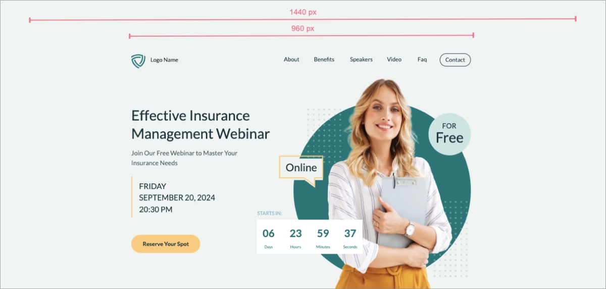
For mobile devices, responsiveness is key; the landing page must adapt to varying screen sizes and orientations, ensuring an optimal viewing experience regardless of the device used. For a mobile version of a landing page, its content area width is typically kept up to 320 px, with a frame width reaching 360 px. The height of a landing page depends on specific design requirements.
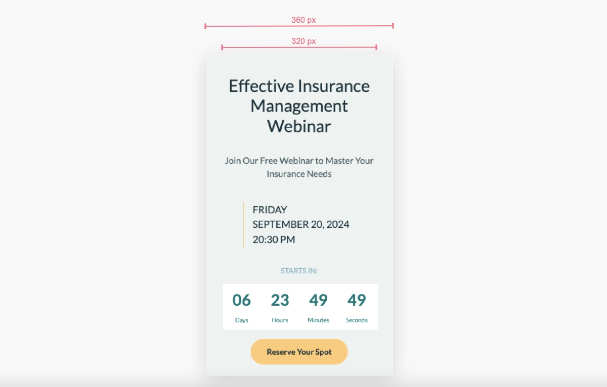
The best option to ensure your landing page dimensions are right is to use templates offered by page builders or find a pixel-perfect editor that keeps the optimal sizes, like Landingi, ensuring your page will look perfect on all devices.
Use Landingi to create mobile-friendly landing pages effortlessly!
How to Create a Landing Page Wireframe?
To create an effective landing page wireframe and organize essential elements that together build a high-converting landing page, start by defining your page’s goal. Then, research and gather content, sketch a layout, and decide on a grid system. Next, place key elements, use wireframing tools, iterate and refine, and test your wireframe.
Firstly, you have to identify the primary objective of your landing page. Once defined, the goal will guide the structure and content of the framework. Before you start sketching, gather all necessary content elements such as headlines, copy, calls-to-action (CTAs), images, and any other components you plan to include. Knowing what content you have will influence the layout and flow of the page.
Then, you can sketch a rough layout and consider where key elements will go. Think about the user’s flow as they navigate the page. Decide on a grid system and decide how many columns your layout will have. This will help you organize content more effectively and ensure consistency across the design.
Using the grid, place the key elements on your wireframe. Position the headline prominently at the top, indicate where images or videos will be placed, and ensure the CTA button is visible and easy to find. Include spots for trust signals, and then arrange the copy in a logical order that guides the visitor toward taking action. Outline the basic layout, indicating spaces for navigation (if any), whitespace, and other design elements. Don’t forget to sketch the form’s location and prepare its fields if capturing leads is a goal. In the end, indicate essential footer elements like contact information, social media links, and legal disclaimers.
The next step is to move your project to a digital wireframing tool like Adobe XD or Figma. These tools offer more precision and flexibility, allowing you to create a more detailed and scalable wireframe. Remember to refine the wireframe based on feedback from team members. At this phase, pay attention to usability and how easily a user can achieve the intended goal of the page. You should also conduct usability tests on your wireframe to understand how real users interact with the layout. Use this feedback to make any necessary adjustments.
While a wireframe is not a final design, creating one is a crucial step in the page-building process. It allows for a collaborative approach to refining the landing page’s structure and ensuring its alignment with marketing goals.
How to Optimize Landing Page for SEO?
To optimize your landing page for SEO, focus on targeted keywords and follow the main optimization areas showcased below:
Keyword research
Firstly, do keyword research and identify those that your target audience is searching for. Use tools like Google Keyword Planner or Ahrefs to find phrases with a good search volume and competition balance. Focus on long-tail keywords, which tend to have lower competition and higher conversion rates.
SEO-friendly URLs
Secondly, ensure your landing page URL is concise, readable, and includes your primary keyword. A well-structured URL helps search engines understand what your page is about.
Title tag and meta description
Thirdly, create a title tag and meta description to entice users to click through to your landing page. The title tag should be under 60 characters, and the meta description under 160 characters to ensure they display properly in search results.
Header tags
Fourthly, use header tags (H1, H2, H3, etc.) to structure your content clearly. Your main headline should be in an H1 tag and include your primary keyword. Subheadings (H2, H3) can help organize the content further. Subheadings should incorporate secondary keywords.
High-quality content
Fifthly, create valuable and engaging content that addresses your audience’s needs and questions. Use your keywords naturally within the text, aiming for a keyword density that feels organic and avoids keyword stuffing.
Internal and external links
Sixthly, include internal links to other relevant pages on your website to help spread link equity and keep users engaged. External links to authoritative sites can also add credibility to your content.
Analytics and tracking
Lastly, use tools like EventTracker, Google Analytics, and Google Search Console to track your landing page’s performance. Monitor metrics such as traffic, bounce rate, and conversions to identify areas for improvement.
Improving a landing page for search engine optimization is a strategic effort that guarantees your page is seen by the appropriate audience at the right moment. By developing a pertinent and captivating user interface and utilizing schema markup, landing pages can gain increased visibility in search results and draw in more organic traffic.
Master landing pages! Use Landingi to design landing pages and optimize them to deliver real benefits.
What Is the Importance of Page Speed for Landing Pages?
Page speed is a critical component of the user experience, determining a landing page’s success. Long loading times increase bounce rate. In simple words, swift page loading can mean the difference between a conversion and a lost opportunity.
Fast-loading landing pages contribute to lower bounce rates, higher engagement, and improved SEO, which, in turn, can lead to increased visibility and traffic. As mobile usage continues to rise, the importance of page speed will only grow, making it essential for businesses to optimize their landing pages for quick load times to maintain a competitive edge.
What Are Some Limitations of a Landing Page?
Landing pages come with certain limitations, which include limited content scope, SEO challenges, CRO limitations, and other minor limitations. Despite their potency in converting visitors, problems may appear in several areas. The first limitation of landing pages that businesses can easily notice is, perversely, their focused approach. They are excellent at increasing conversions, but just as landing pages promote specific offers, they cannot provide comprehensive information or a complete overview of all the company’s products or services, potentially leaving some visitors seeking more information.
Another limitation of landing pages involves SEO challenges, which also refer to their focused nature. Because of that, landing pages might struggle to rank for a broad range of keywords. While landing pages can be highly effective for the audience they’re designed to target, they may not resonate with or appeal to every visitor. This specificity can sometimes lead to missed opportunities with broader audiences.
To remain effective, landing pages require regular testing, updates, and optimization based on performance data. This ongoing maintenance demands resources and time. Another challenge of using landing pages in digital marketing is CRO limits. While landing pages are optimized for conversions, achieving significant improvements can sometimes be challenging without significant changes to the offer, design, or content.
When landing pages are not carefully integrated and consistent with the main website and overall brand identity, they can feel disjointed from a company’s main website regarding design, tone, and user experience. This lack of cohesion can affect brand perception and user trust.
The last landing page limitation that can arise is cost. Designing, developing, and promoting landing pages can incur costs, especially for businesses relying heavily on paid traffic. The ROI may not always justify these expenses, particularly for smaller businesses or those with lower-margin offers. That’s why paid campaigns optimization is key to success in PPC strategies based on landing pages.
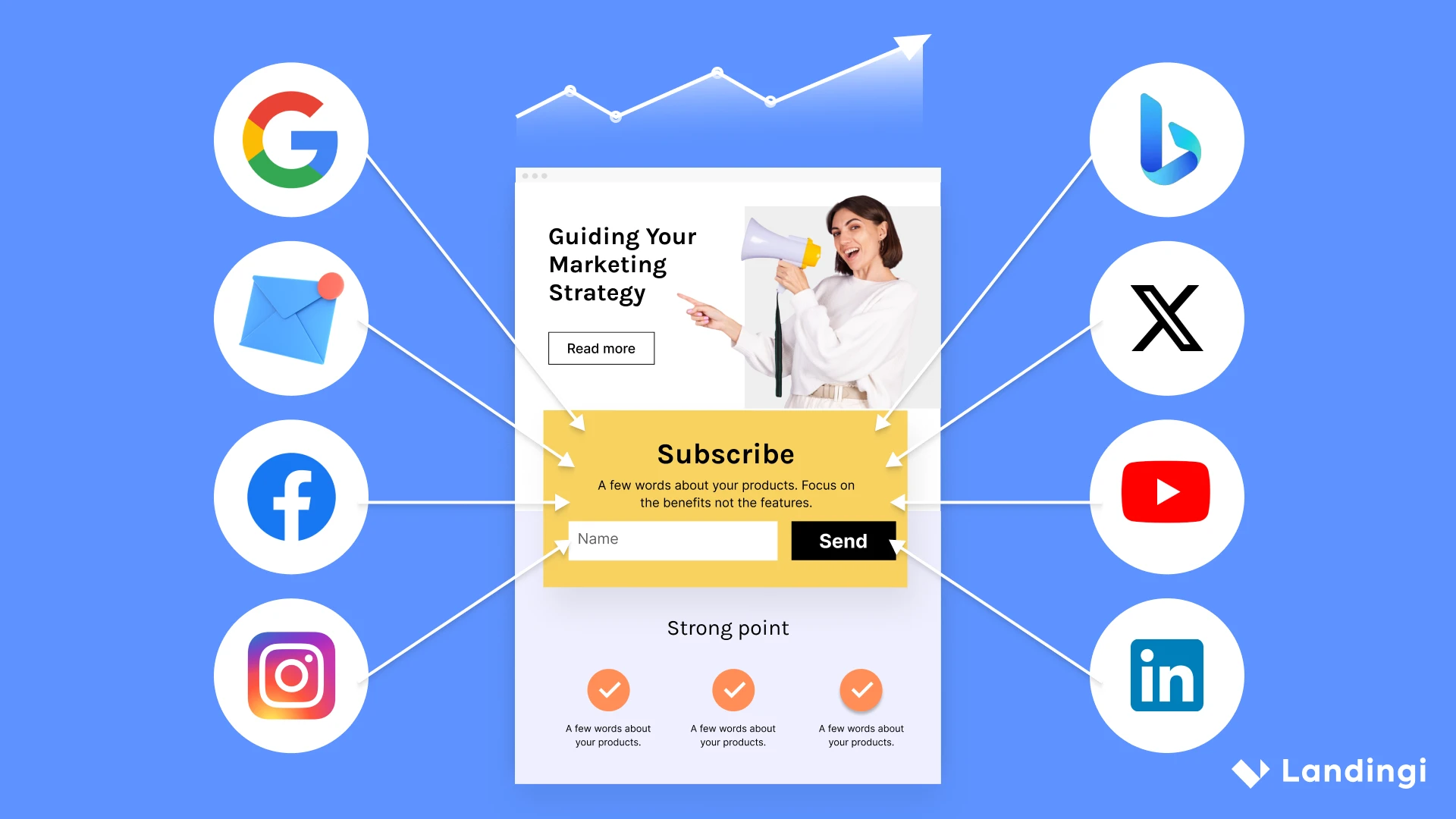
How Does a Landing Page Work?
A landing page operates as the final checkpoint in a visitor’s journey towards conversion: it’s where a visitor “lands” after they click on a link in an email or ads from Google, Bing, YouTube, Facebook, Instagram, Twitter, or similar places on the web. Upon arrival, the visitor is greeted with a carefully crafted headline and supporting copy that presents a compelling offer and articulates the unique value proposition. The page’s design is optimized to guide the visitor toward the CTA, while persuasive elements like testimonials and an engaging hero image bolster the message and encourage action.
The landing page’s mechanics are simple yet powerful; by providing a clear and direct path to conversion, it effectively turns traffic into tangible results. Whether the goal is to sign up for a newsletter, purchase, or download a resource, a well-designed landing page facilitates this transition with minimal distraction. Its success can be measured and analyzed, allowing marketers to refine their approach and ensure that the landing page continues to serve as a potent tool in their digital marketing arsenal.
Start Building Landing Pages with Landingi
As we wrap up, it’s clear that landing pages are more than just web pages – they are a strategic tool that, when used effectively, can significantly enhance the conversion rates and overall success of marketing efforts. With the right design, content, and optimization approach, landing pages can catalyze growth, fostering meaningful connections with visitors and guiding them toward becoming loyal customers. Let this inspire you to embrace the power of landing pages and transform your digital marketing results. Start now, and try Landingi – it’s free!