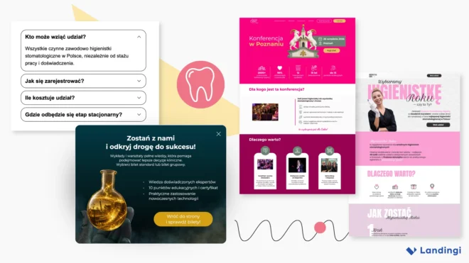
Dental marketing has a visual problem. Open enough websites in the industry and the same patterns start to repeat: white backgrounds, blue accents, smiling patients, clean clinics, and stock photos of people wearing gloves.
That works when you’re marketing dental care. It works much less well when you’re promoting an event.
A conference, workshop, competition, or trade-show activation needs more than professional-looking information. Visitors need to understand what they will get from attending, but the page also has to give them a sense of the event itself.
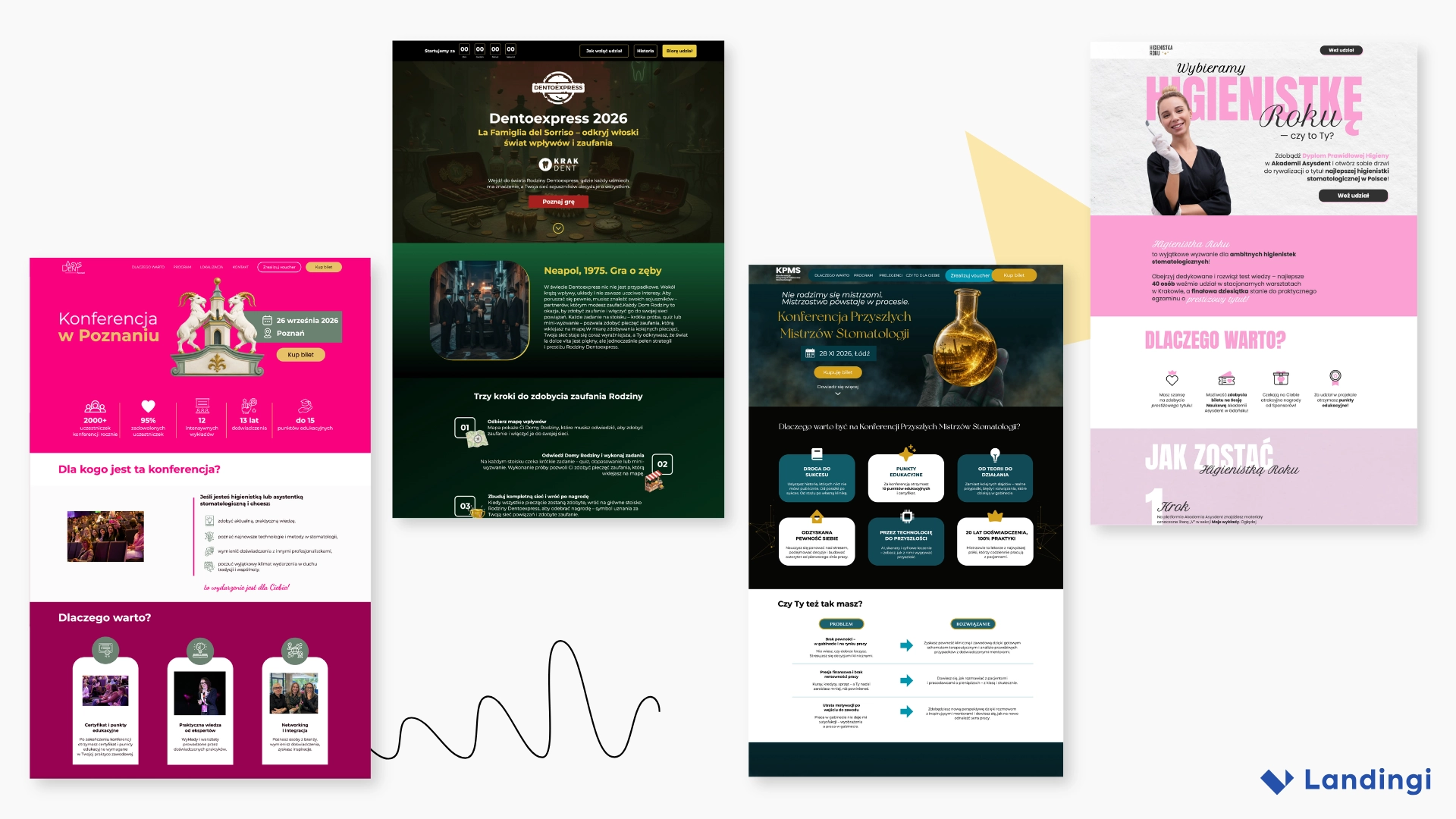
The landing pages created for Asysdent, Konferencja Przyszłych Mistrzów Stomatologii, Higienistka Roku, and Dentoexpress show four different ways to do that. All were built in Landingi, and all use familiar event-page elements – agendas, speakers, ticket CTAs, FAQ, and social proof – without falling into one generic “dental event” template.
The main lesson is simple: design the landing page around the event experience, not around the industry label.
The Problem: Professional Doesn’t Have to Mean Predictable
Dental event pages often need to fit a lot into one place: agenda, speakers, ticket options, location, sponsors, educational value, and practical details. Give every element equal weight and the page starts to look like a brochure. Cut too much and visitors cannot tell whether the event is worth their time.
A better approach is to separate attraction from evaluation. The visual concept creates interest; the page structure helps visitors check the details that matter to them.
Someone may start with the speaker list, then jump to price and location. Another visitor may only need the date, event promise, and one convincing reason to attend. A useful event page should support both quick scanning and deeper comparison.
1. Start With an Event Identity, Not an Industry Template
The four examples do not share one recognizable “dental website aesthetic,” and that is one of their strengths.
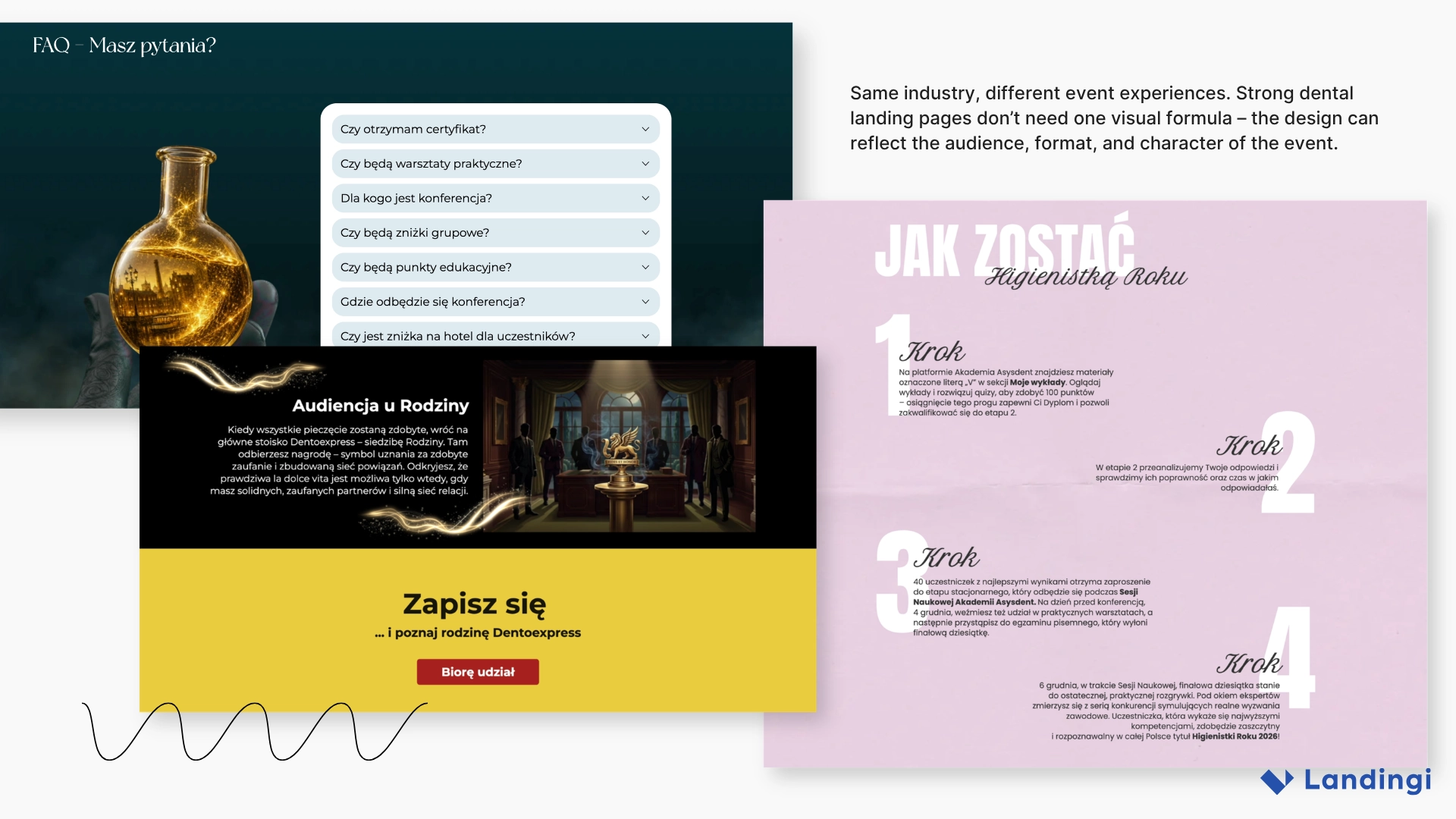
Asysdent uses vivid pink and a high-energy conference style. Konferencja Przyszłych Mistrzów Stomatologii moves toward dark teal, black, gold, and atmospheric imagery. Higienistka Roku uses soft pinks, editorial typography, and generous whitespace. Dentoexpress looks closer to a game campaign, with illustrated environments, challenges, prizes, and a story built into the page.
None could easily be confused with a generic clinic website.
The practical lesson
Before opening a landing page builder, describe the event in one sentence:
A prestigious conference for ambitious young dentists.
A career-building competition for dental hygienists.
An interactive trade-show game based on challenges and rewards.
That sentence should influence the design. A scientific conference may need restraint and authority. A competition can focus more on recognition and ambition. A trade-show game has room for narrative and playful mechanics.
The visual identity should tell visitors what kind of experience they are entering before it tells them what industry the event belongs to.
2. Give Visitors the Decision-Making Information Early
The first screen of an event page should quickly answer: What is this? Who is it for? When and where does it happen? Why should I care? How do I join?
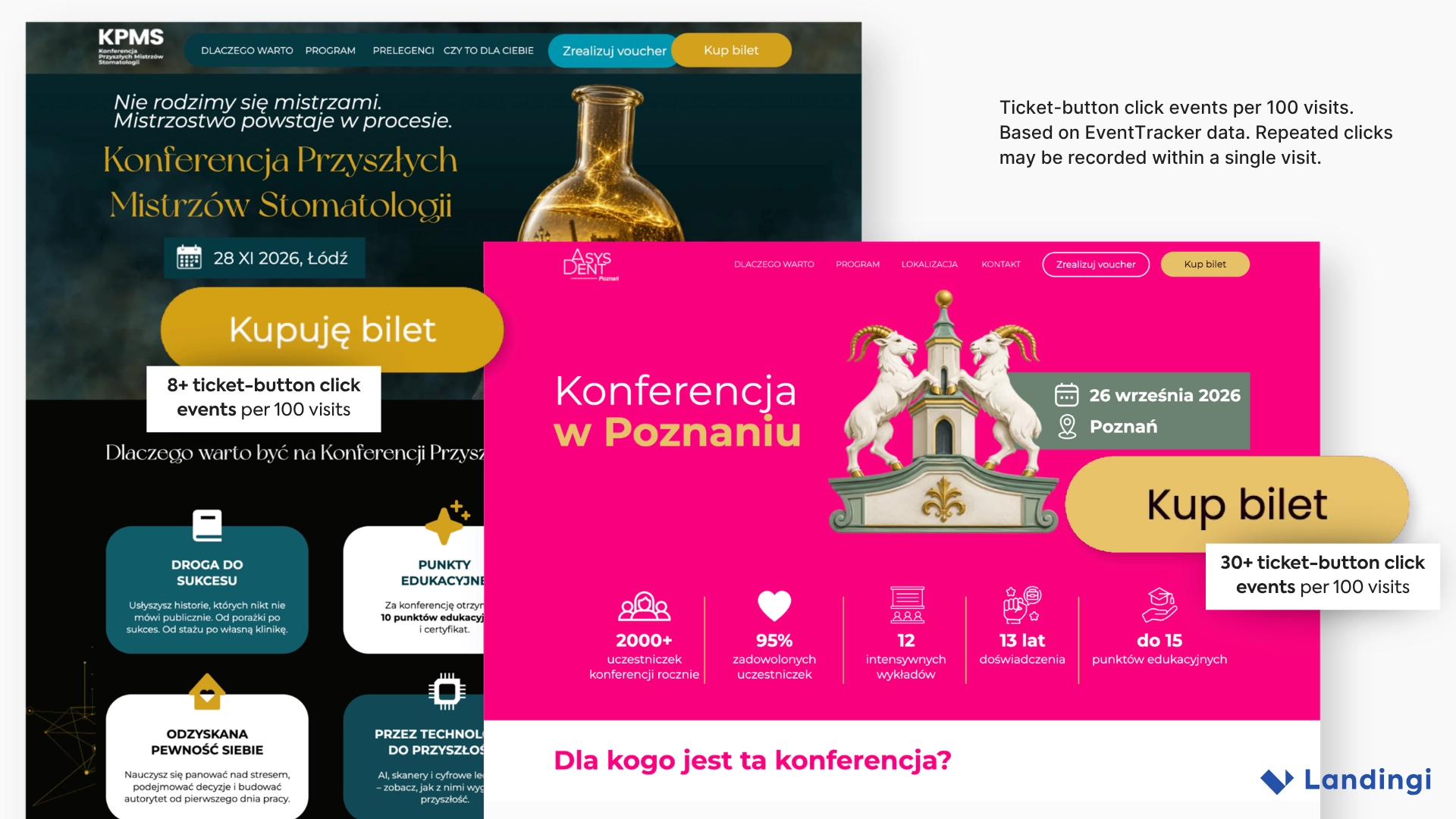
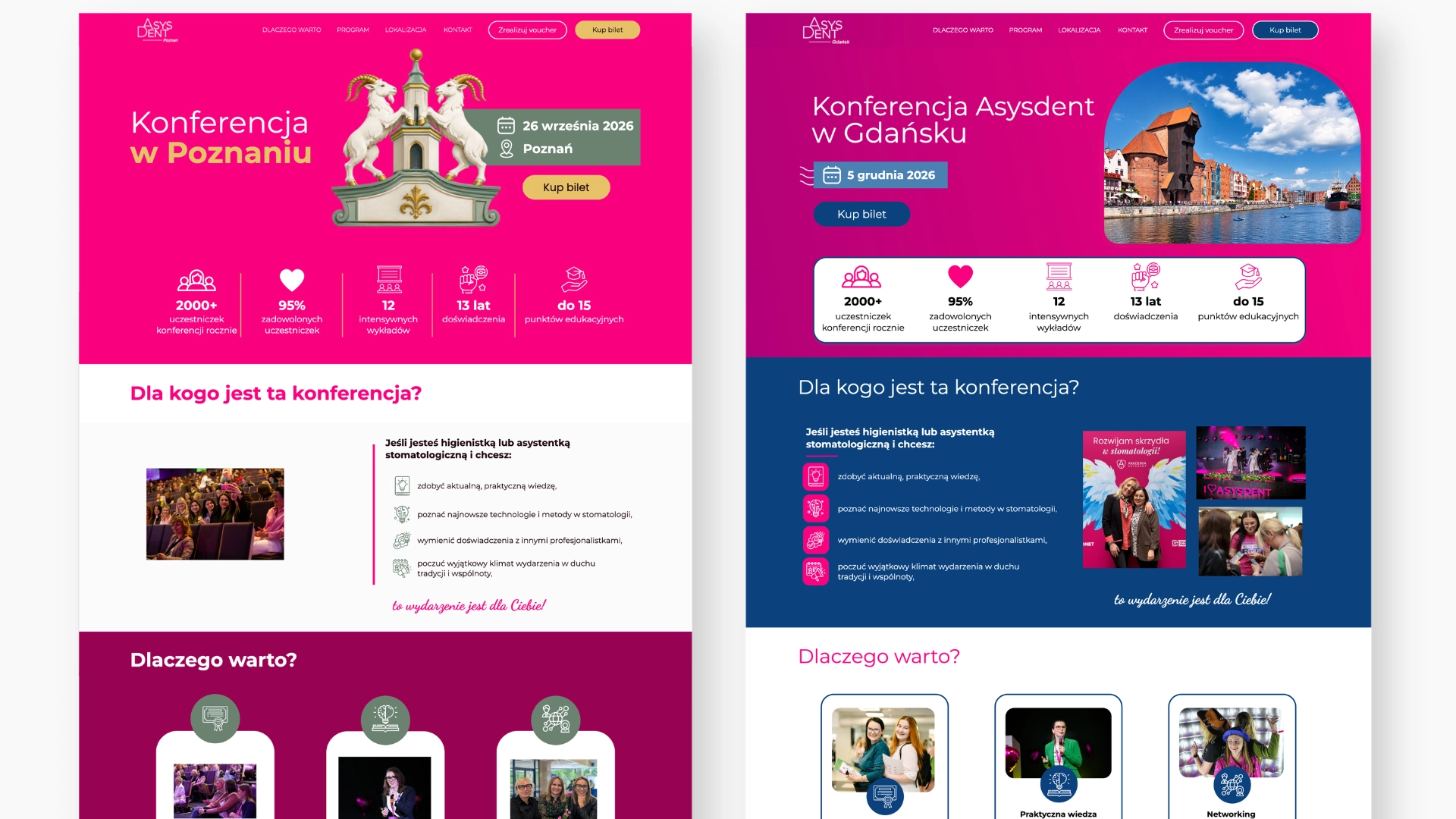
Asysdent does this with a distinctive visual identity, practical event information, clear reasons to attend, and visible ticket CTAs. During the campaign, EventTracker recorded more than 30 ticket-button click events per 100 visits.
These interactions show how visitors engage with the page’s main commercial action. They should not be interpreted as ticket purchases or unique visitor conversions, as one person may click a button multiple times.
Konferencja Przyszłych Mistrzów Stomatologii shows a similar pattern. During the campaign, EventTracker recorded more than eight ticket-button click events per 100 visits.
Since ticket purchases take place outside the landing page, these interactions provide insight into visitor behavior rather than completed transactions.
Track the action you can actually observe
If checkout happens elsewhere, useful metrics can include:
- ticket CTA clicks,
- pricing interactions,
- agenda engagement,
- FAQ opens,
- scroll depth,
- and exit-intent interactions.
A landing page does not need to process the final transaction to provide meaningful behavioral data.
3. Build the Page in Layers: Interest First, Detail Second
Long event pages are not a problem by themselves. Poorly organized long pages are.
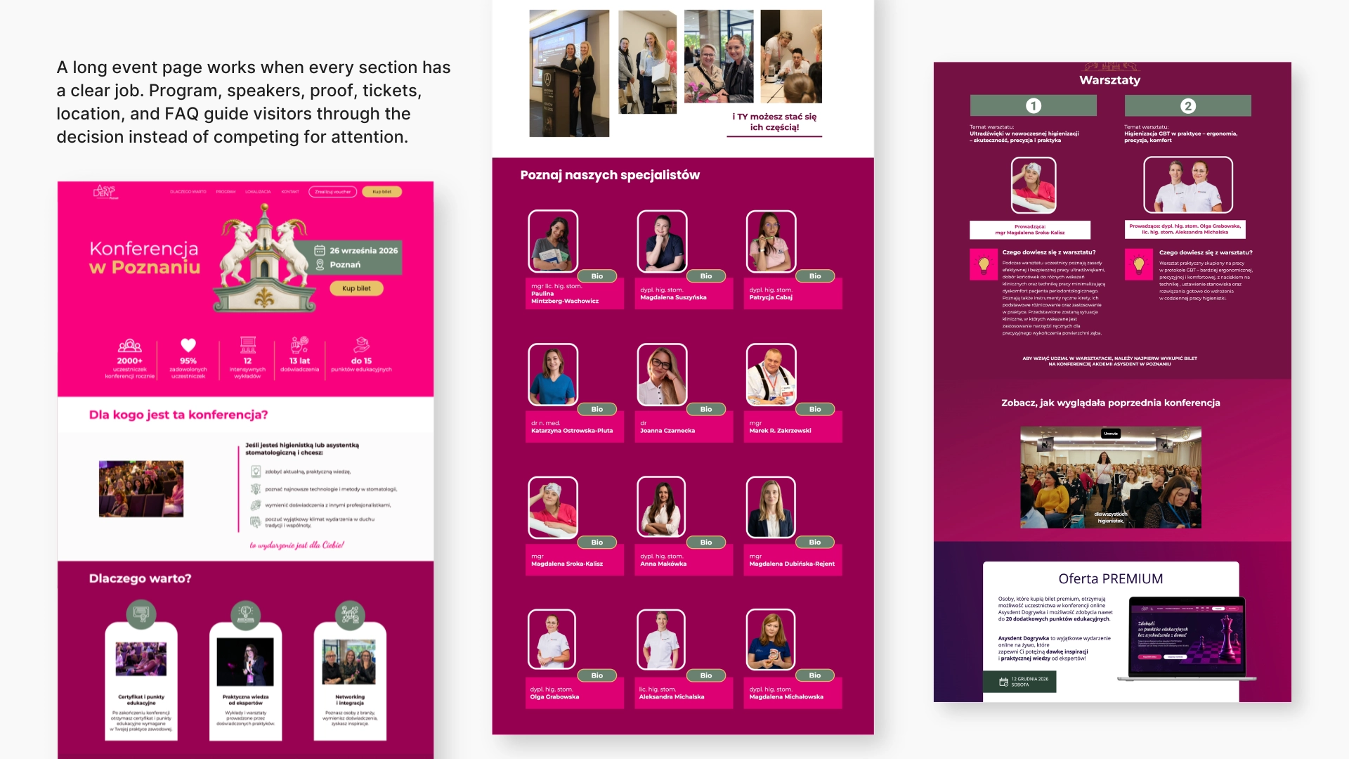
Konferencja Przyszłych Mistrzów Stomatologii includes benefits, agenda, speakers, tickets, testimonials, sponsors, venue information, and FAQ, but those sections do not compete for the same job.
A practical page sequence might be:
Promise → reasons to attend → program → people → proof → tickets → logistics → FAQ
The exact order can change. The useful rule is that each section should answer one main question instead of mixing agenda, pricing, speaker bios, and testimonials into the same block.
Design the agenda like an interface
Conference schedules are dense, so visitors should be able to scan them without reading every session description. Clear time labels, separate session cards, distinct days or tracks, and accordions for secondary detail all help.
A visitor searching for one speaker or workshop should be able to find it in seconds, not scroll through the entire program.
4. Treat Speakers as Part of the Product
For a professional conference, the speaker lineup is often part of the purchase decision, not background content.
A speaker section should quickly answer: Why is this person worth learning from? For a smaller event, a portrait, role, and specialty may be enough. For a larger one, connect speakers directly with their sessions or workshops.
That connection matters. Visitors should not have to remember a name from the speaker section and search for it again in the agenda.
5. Reuse the Structure, Not Necessarily the Look
An event landing page does not need to be rebuilt from zero for every edition.
Konferencja Przyszłych Mistrzów Stomatologii has used the same address across multiple editions, while Asysdent adapts similar page logic for different cities. Dates, speakers, venues, ticket options, imagery, and local proof can change without rebuilding the information architecture each time.
Build an event-page system after the first edition
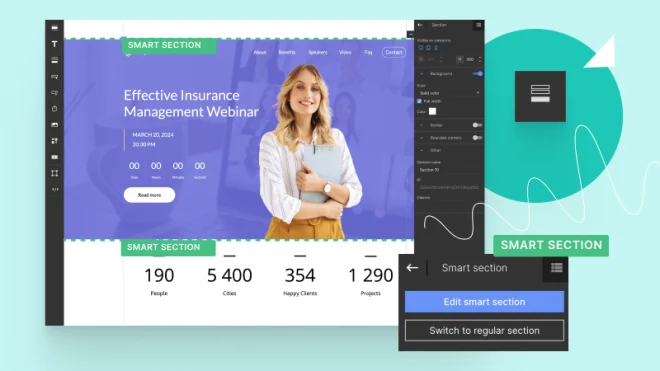
Reusable sections may include the hero, agenda, speakers, pricing, testimonials, sponsors, location, FAQ, and final CTA. In Landingi, they can be duplicated between pages or managed as Smart Sections when shared content needs to stay synchronized.
Reuse the page logic that still makes sense. Refresh the parts that give each edition its own identity.
6. Use Social Proof Where Doubts Appear
Testimonials do not automatically belong near the bottom of the page.
Asysdent introduces social proof early, which fits the decision visitors are making. Before buying a ticket, people often want to know whether the event is established, useful, and worth showing up for.
Different proof answers different doubts:
- “Is this established?” → attendee numbers or previous editions.
- “Will I learn something useful?” → participant feedback or speaker expertise.
- “What is the atmosphere like?” → original photography or video.
That is more useful than collecting every logo, statistic, and testimonial into one oversized proof section.
7. Show the Experience, Not Just the Program
An agenda explains what will happen. Photography and video show what attending may actually look like.
Higienistka Roku uses video to make its workshops and competitive format easier to understand. For recurring events, original photography can do the same job: show workshops, lecture halls, networking, audience reactions, awards, and sponsor areas.
This kind of material is especially useful because it comes from the event itself. Visitors do not have to imagine the atmosphere from a schedule and a stock photo.
8. Give Leaving Visitors One Last Useful Message
Both Asysdent and Konferencja Przyszłych Mistrzów Stomatologii use an exit-intent pop-up, but neither relies on a generic last-minute discount.
Instead, the pop-up summarizes the reasons to attend. The KPMS version highlights expert knowledge, educational points, certificates, and practical applications; Asysdent brings attention back to the event and ticket options.
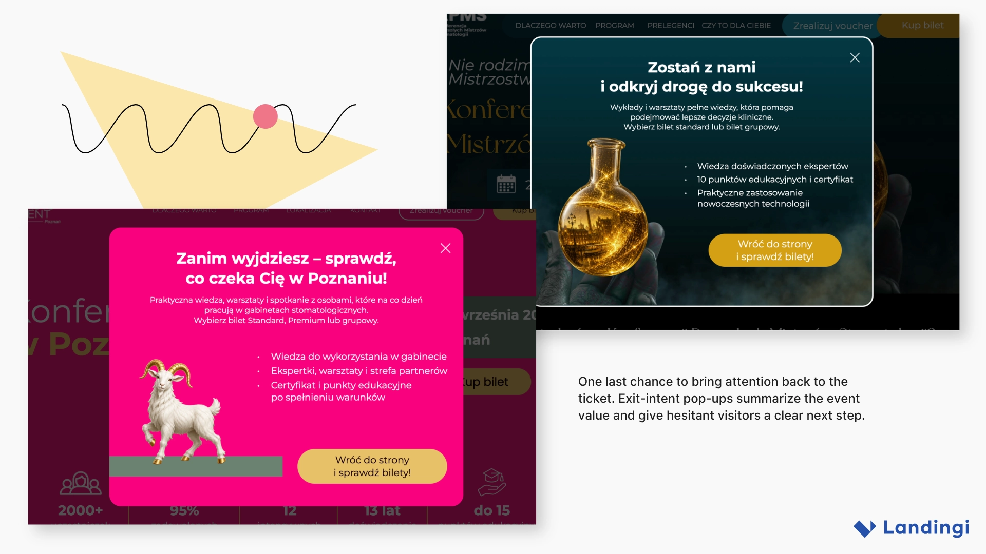
For an event page, a simple exit-intent structure is enough:
- one event-specific headline
- three concrete reasons to attend
- one CTA back to tickets
The pop-up should help someone reconsider the decision, not merely interrupt the exit.
9. Use FAQ Sections to Remove Purchase Friction
Practical questions often appear late in the decision process:
Will I receive a certificate?
Can I get an invoice?
Are the workshops practical?
Are educational points included?
Can I buy a group ticket?
Where is the venue?
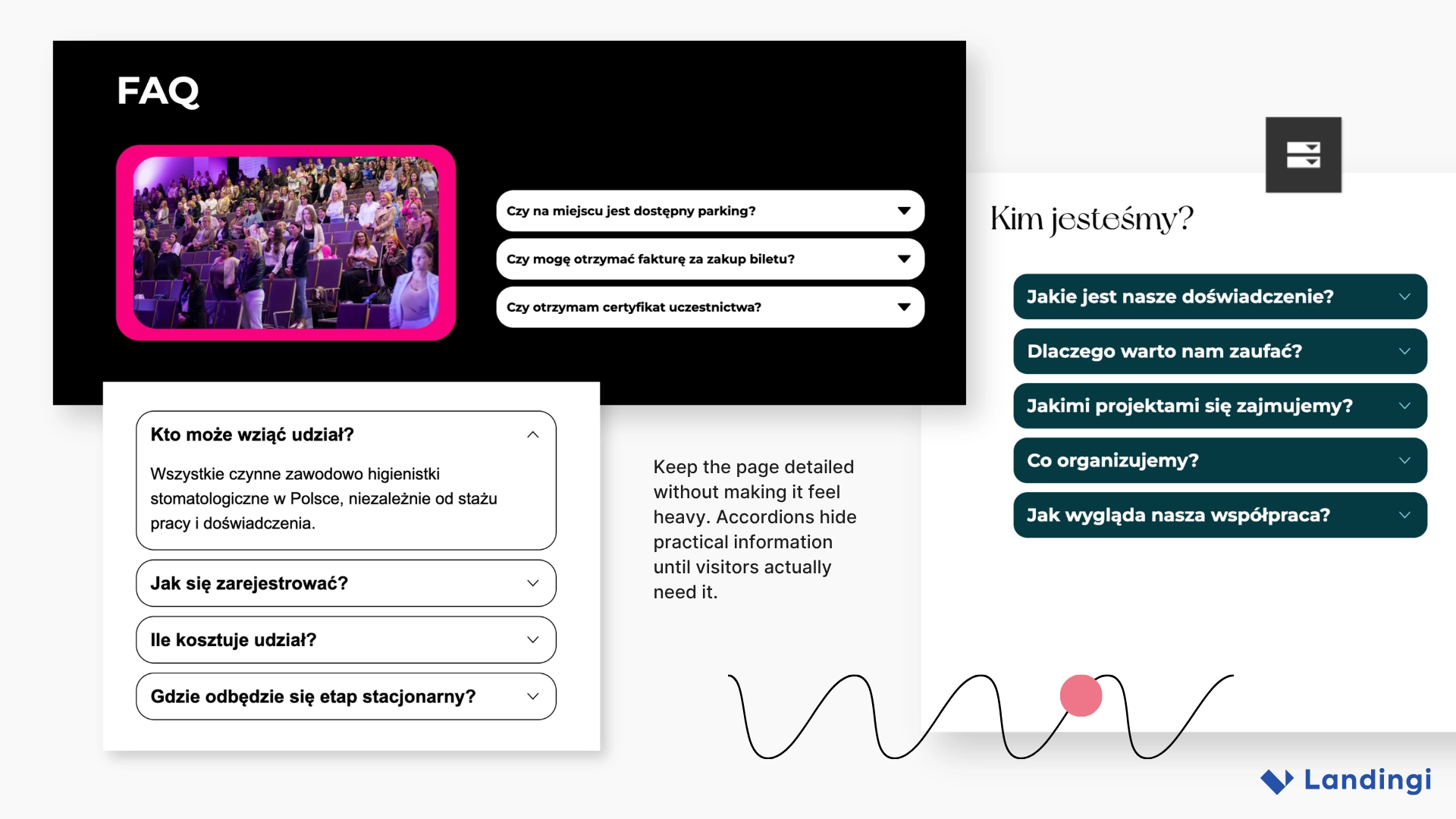
Most do not need their own sections, but leaving them unanswered can delay a purchase. An accordion FAQ keeps those answers available without pushing more important content (such as the agenda, speakers, or offer) further down the page.
Both Higienistka Roku and the conference pages use expandable FAQ sections for exactly that reason.
10. Let Unusual Events Look Unusual
Dentoexpress is the outlier in this group, and that is why it is useful.
The page supports a game running around KRAKDENT rather than standard conference registration, so it behaves more like an introduction to the game itself. Visitors learn the premise, follow instructions, complete steps, and work toward a reward.
The page uses narrative, illustrated environments, numbered stages, visual rewards, and repeated participation CTAs.
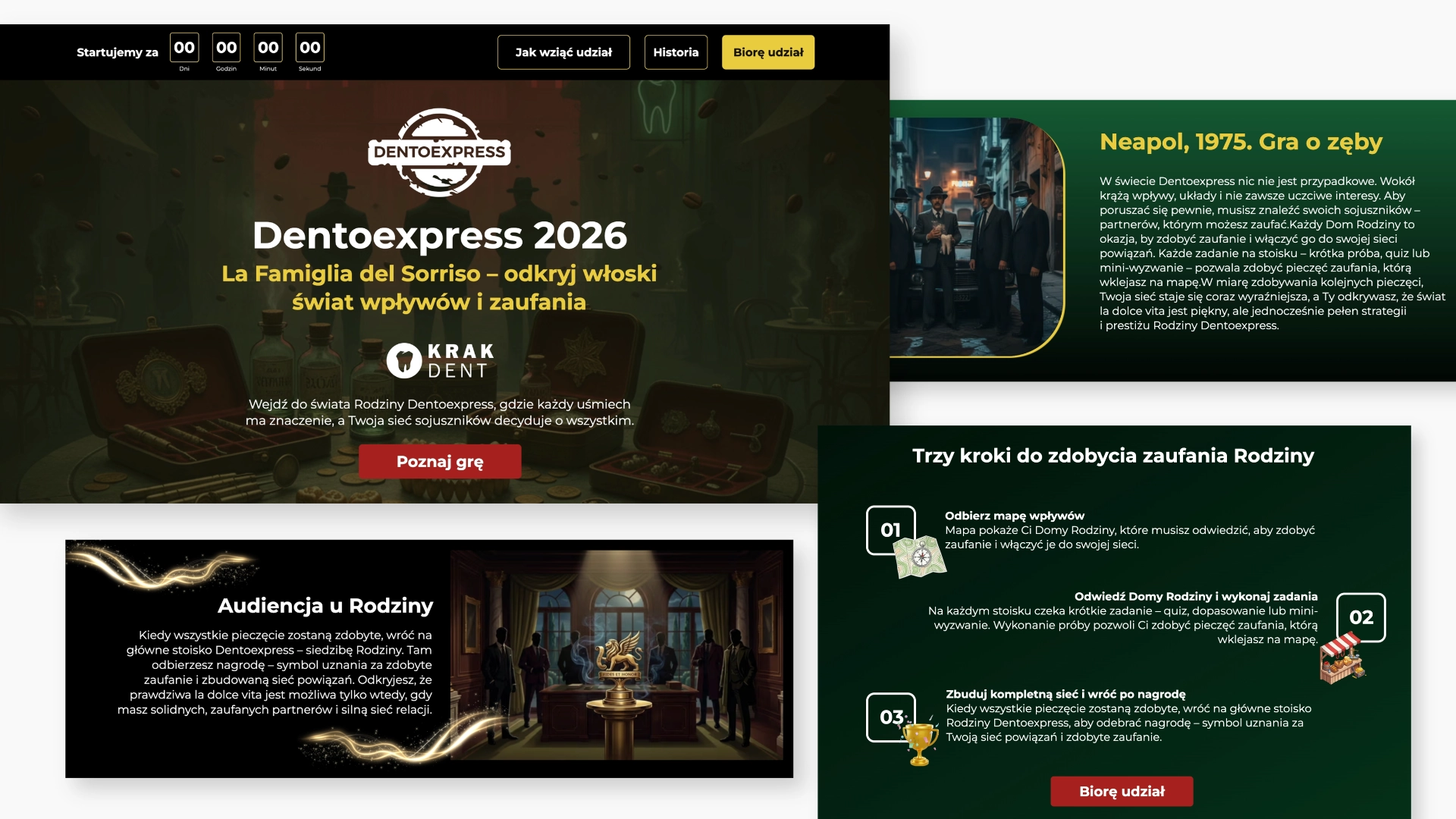
That approach would be a poor fit for a scientific symposium, but it works here because the page mechanics match the event mechanics.
A conference may need authority. A competition can emphasize progress and recognition. If the event is built around a game, the landing page can feel like its first level.
11. Change the Visual Language for the Audience
Higienistka Roku also avoids the standard dental design vocabulary. Pale pink, editorial typography, handwritten accents, soft photography, and a simple layout position the event less like another technical training day and more like an opportunity for recognition and professional development.
The point is not that dental hygienist pages should be pink. The more useful lesson is that audience segmentation should affect design as well as copy.
A page for students can communicate differently from one aimed at clinic owners. A premium workshop does not need the same visual rhythm as a large expo. There is no reason to force every dental campaign into one permanent visual system.
What These Dental Landing Pages Have in Common
The four pages look different, but they support a similar decision process: identify the event, explain why it matters, provide enough detail to evaluate it, answer doubts, and return visitors to the main CTA.
Before launching a dental event page:
- Define the event identity before choosing the visual style.
- Put date, place, audience, and value high on the page.
- Give each major visitor question its own section.
- Use previous editions as proof.
- Repeat the ticket CTA where it fits the decision flow.
- Keep secondary logistics in FAQ or accordions.
- Use exit intent as a short value summary.
- Track micro-conversions when purchase happens elsewhere.
- Reuse page architecture across editions and cities.
- Let the design reflect the event, not just the industry.
The Bigger Lesson: Sell the Event Before You Sell the Ticket
These pages work because they do more than collect event information in one place.
Asysdent builds energy and moves quickly toward reasons to attend. Konferencja Przyszłych Mistrzów Stomatologii gives a complex program enough space without losing its visual identity. Higienistka Roku frames professional development around recognition. Dentoexpress turns a trade-show activation into an experience before the visitor even arrives.
The formats are different, but the principle stays the same:
A dental event landing page should not feel like a digital brochure. It should give visitors an early sense of the event they are considering.
With Landingi, recurring elements such as agenda layouts, speaker sections, ticket blocks, FAQ, social proof, location, and pop-ups can stay reusable while the visual direction changes from one campaign to the next.
Reuse what helps people decide. Change what makes the event feel distinct.
Use the following Landingi features to achieve similar results:
Visual Builder
Smart Sections