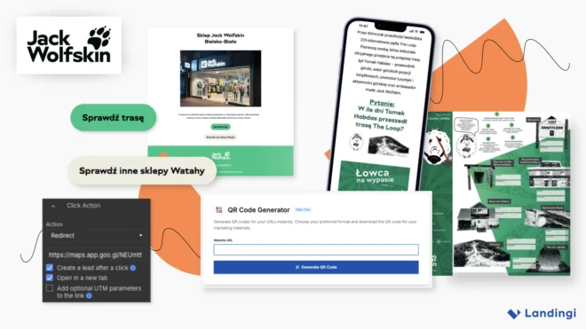
A 78.11% landing page conversion rate sounds like the kind of number you check twice.
Jack Wolfskin actually achieved it. But the interesting part isn’t a clever headline or aggressive offer. The campaign barely felt like selling at all.
Instead, Jack Wolfskin built the campaign around an outdoor experience. Landing pages connected that experience with the brand, useful products, and a physical store visit.
The German outdoor brand has partnered with Szczyrk, Poland, to promote tourism and outdoor activity. Landing pages became part of that strategy, rather than simple product pages.
The result is a useful example of experience marketing with a very practical conversion path behind it.
The Problem: Product Pages Sell Gear, Not the Reason People Want It
Outdoor marketing has an obvious temptation.
Show the jacket. List the waterproof rating. Explain the fabric. Add a button.
That works. But it starts with the product. Jack Wolfskin approached the campaign from the opposite direction.
Their customers weren’t planning hikes because they wanted new backpacks. They wanted weekends outside, new trails, and a reason to explore.
The gear helped make those plans possible.
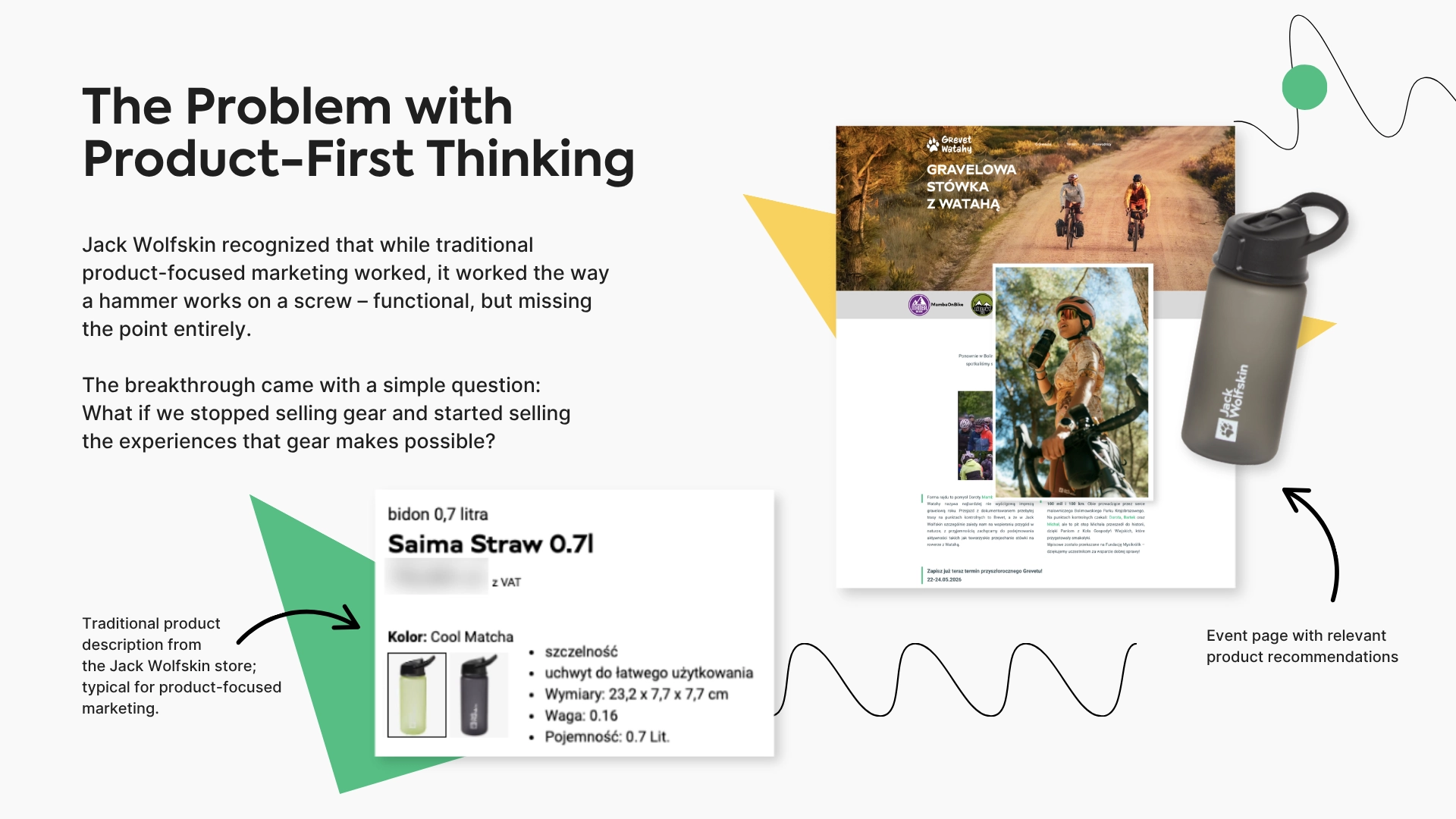
That insight changed the role of the landing page. Instead of promoting a hiking collection, Jack Wolfskin used pages to promote real outdoor experiences. Products remained part of the story, but they stopped being its main character.
Put the product where it becomes useful
That didn’t mean removing commerce.
Product recommendations appeared inside event content under practical messages such as “Get Ready for the Hiking Trail.” They supported what visitors were already planning.
Context changed how the same product information felt. Waterproofing on a product page is a specification. Waterproofing before a mountain trip in uncertain weather is useful advice.
That distinction is small on paper. In the customer journey, it changes a lot.
The Campaign: Turn a Hiking Trail Into a Digital Funnel
One of Jack Wolfskin’s campaigns took the idea much further.
The brand created an outdoor game with the town of Szczyrk. Participants downloaded a map from the main landing page and followed a seven-location route.
At each stop, they found a QR code.
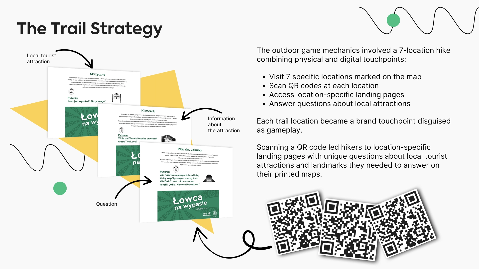
Scanning it opened a landing page created specifically for that location. The page contained information about a local attraction and a question to answer.
The campaign flow was simple:
- visit one of seven locations,
- scan the QR code,
- open the location-specific landing page,
- answer the question on the game map.
QR codes weren’t the interesting technology here. They were simply the bridge.
A physical location became a digital brand touchpoint.
And because participants reached the page while completing the challenge, the interaction didn’t feel like an interruption. It was part of the game.
The funnel continued after the trail
The campaign also connected the outdoor experience with Jack Wolfskin’s local store.
The event page included a CTA that opened directions to the store. Anyone who clicked through to the map was recorded as a lead. That gave the campaign a commercial next step without forcing one too early.
Someone planning a trip to Szczyrk already had a reason to be nearby. Visiting the store could fit naturally into that plan. No “BUY NOW” banner needed.
The Build: Seven Pages Without Seven Separate Builds
The outdoor game needed more than one landing page. There was the main event page, plus separate pages for each trail location.
Those pages also had to work under very specific conditions. Visitors would open them on smartphones, often outdoors, sometimes with weak reception.
That changed the design priorities.
Jack Wolfskin used Landingi’s mobile editor to simplify the experience for people standing on a trail. Buttons were easier to tap. Text was larger. Layouts were stripped down to essential information.
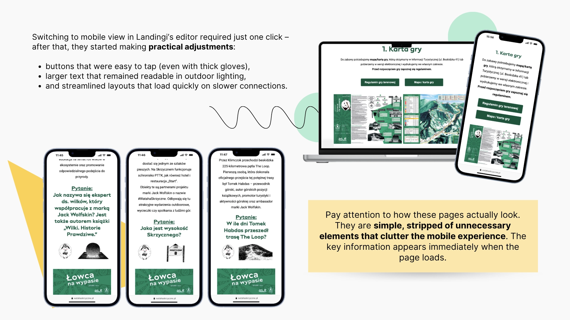
This is a detail marketers can easily miss. A landing page doesn’t exist in an editor preview. It exists wherever the visitor opens it.
In this campaign, that could mean bright sunlight, gloves, and an unstable mobile connection.
Build once, then replicate
Creating seven similar pages independently would also make little sense.
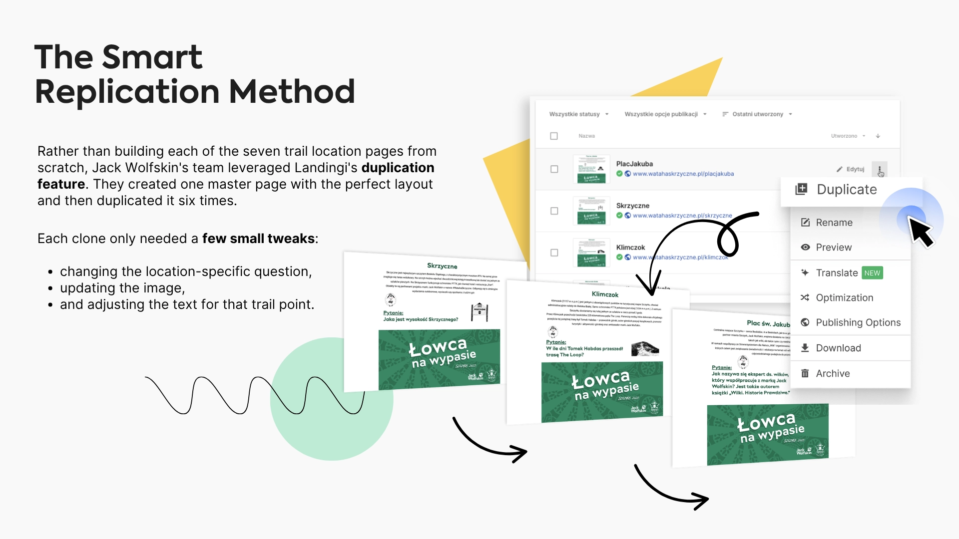
The team built one master version and duplicated it six times in Landingi. Each copy needed only small changes to the question, image, and location-specific copy.
That cut production time from weeks to hours, according to the case study. It also kept the mobile experience consistent across every QR-code destination.
The value here isn’t duplication for its own sake. It’s avoiding seven versions of the same design problem.
Create the structure once. Then change only what the campaign actually requires.
The Result: 78.11% Conversion Without Making the Campaign Feel Like a Sales Pitch
The main event landing page reached a 78.11% conversion rate. That number needs context.
These weren’t cold visitors landing on a standard ecommerce page. They had already engaged with the campaign and planned an outdoor experience.
By the time they reached the commercial parts of the journey, the brand had already given them something useful.
Product recommendations became preparation. The store became part of the trip. The CTA became the next logical action.
That is very different from showing a random visitor a jacket and hoping they want it.
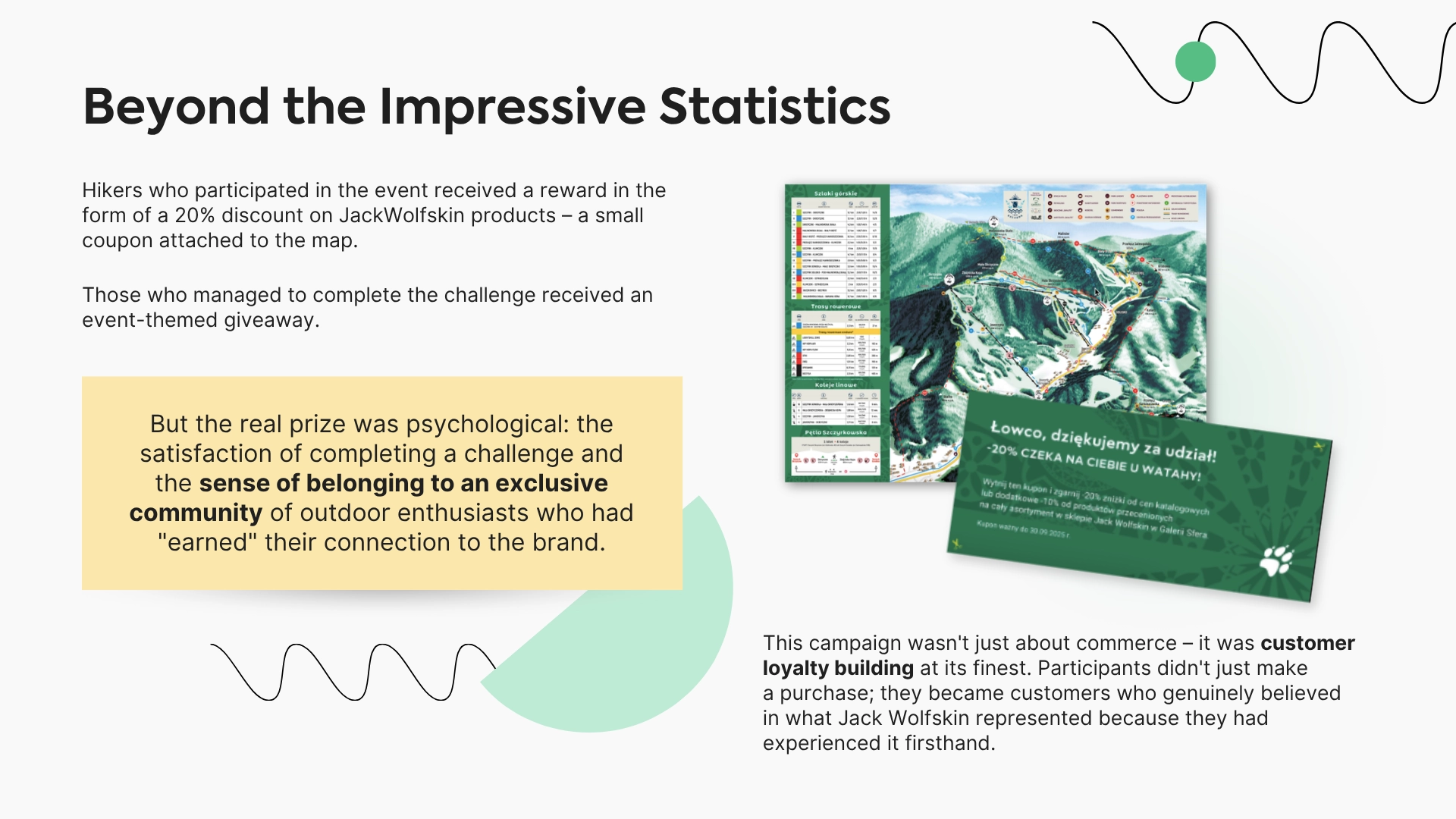
Jack Wolfskin also rewarded participation. Hikers received a 20% product discount with the map. Those who completed the challenge received an event-themed giveaway.
So the landing pages did several jobs at once.
They helped run the event. They connected physical locations with digital content. They supported product discovery and brought people closer to the store.
But the campaign never needed to behave like a traditional online store. That may be the most useful part of this case.
Landing pages don’t have to start with the product. Sometimes they work better when they start with the reason someone might want it.
Use the following Landingi features to achieve results similar to those of Jack Wolfskin:
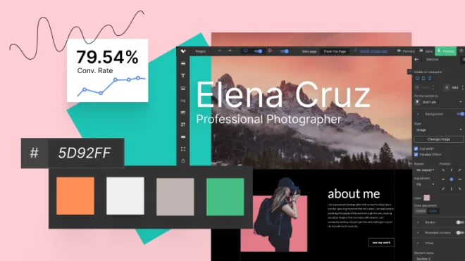
Visual Builder
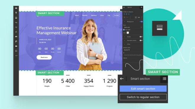
Smart Sections