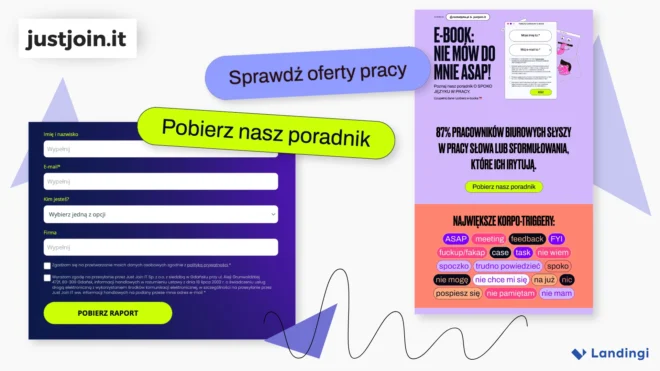
Three content landing pages from Just Join IT and RocketJobs.pl show how different offers create different conversion paths. Form completion, page depth, and engagement vary significantly – and the shortest form does not automatically perform best.
Just Join IT and RocketJobs.pl use landing pages to distribute career reports, practical guides, and educational resources.
The pages share the same basic goal: turn interest in useful content into a measurable action. But visitors behave differently depending on the offer, page structure, and the amount of information they are asked to provide.
The comparison includes:
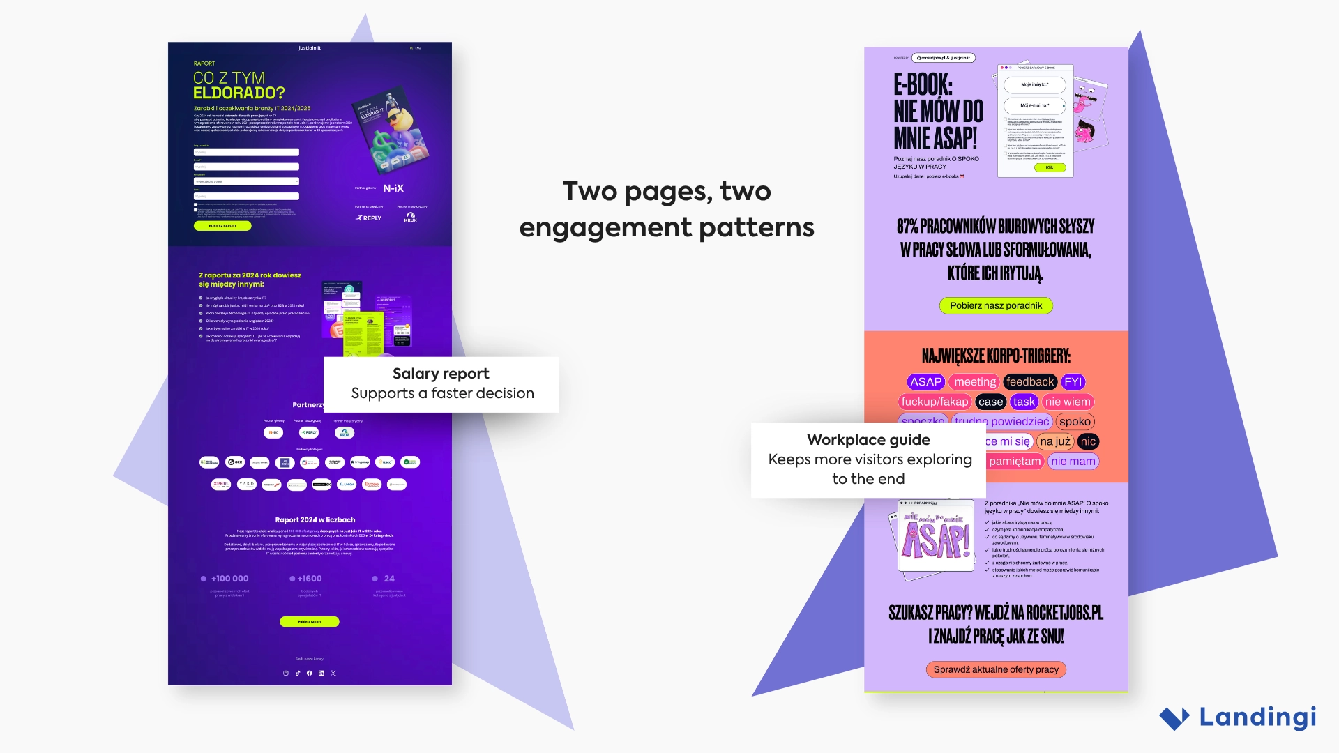
- “Co z tym Eldorado?” – an IT salary and market report
- “Jak pisać spoko CV” – a resume-writing ebook
- “Nie mów do mnie ASAP” – a workplace communication guide
Results: Three Offers, Three Conversion Paths
Across the same 180-day measurement period, all three landing pages generated leads, but they did not do it in the same way.
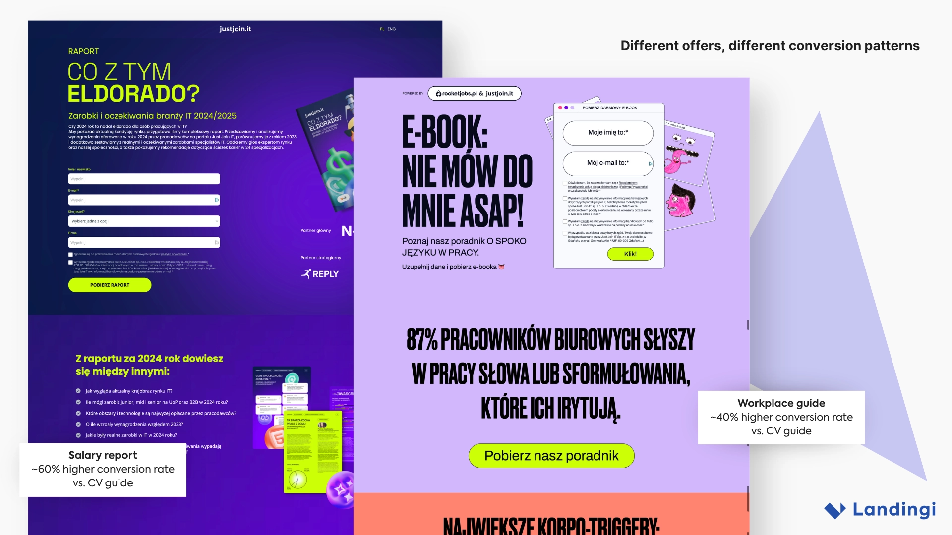
The salary report showed the strongest overall conversion path. Its landing page conversion rate was nearly 60% higher than the CV guide’s, while its form completion rate was more than twice as high as on either of the other pages. That stood out because the form itself asked visitors for more information.
The workplace communication guide followed a different pattern. Its conversion rate was around 40% higher than the CV guide’s, while visitors also spent considerably more time exploring the page. Average active engagement was more than twice as long as on the salary report.
The CV guide converted at a lower rate than the other two and followed a simpler, more direct lead-generation path.
Taken together, the results suggest that there is no single formula for content landing pages. The type of offer can affect how much visitors explore, how readily they complete a form, and how much information they are willing to exchange for the resource.
Pattern: The Offer Shapes the Journey
The three pages address recurring career-related needs, but the commitment they ask from visitors is not identical.
A salary report promises concrete market data. A resume guide solves a practical career problem. A workplace communication guide combines education with a more exploratory, editorial experience.
Those differences showed up in visitor behavior. Some visitors moved quickly from offer to form, while others spent more time exploring the page before taking action.
There is no single ideal landing page journey. The page has to match the perceived value and type of offer.
Structure: Conversion Before Deep Reading
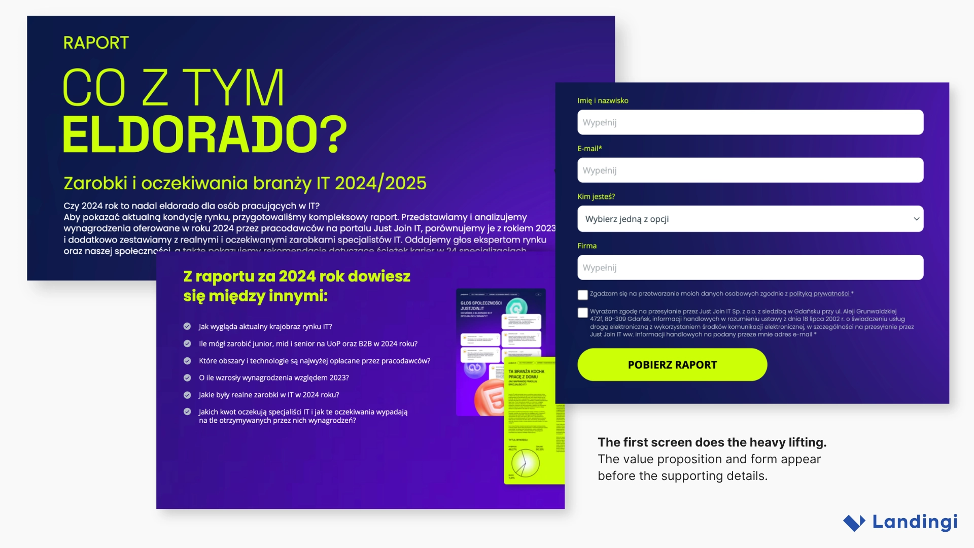
All three landing pages made the offer and form easy to find early in the experience.
Visitors did not need to reach the bottom of the page before they understood what they could get and what they needed to do next.
This was especially visible on the CV guide and salary report. Only a relatively small share of visitors reached the final sections, yet both pages generated conversions.
The lower sections still matter. They add proof, details, partner logos, statistics, and repeated CTAs for visitors who need more context before acting.
The model is simple: the hero gives enough information to act; the rest gives enough information to become convinced.
Engagement: Different Offers Need Different Depth
“Nie mów do mnie ASAP” behaved differently.
Visitors spent more than twice as much active time on the page as they did on the salary report, and they were several times more likely to explore the page to the end.
The reason may lie in the experience itself. Workplace expressions such as “ASAP,” “meeting,” and “feedback” become part of the creative, while later sections preview the guide and introduce its themes.
The page therefore does more than explain an offer. It gives visitors something to explore before they convert.
Some landing pages work because the value is instantly clear. Others benefit from giving people a reason to stay.
Forms: Value Can Beat Minimalism
The clearest difference appeared in the form funnels.
The CV guide and workplace communication guide achieved almost identical form completion rates. The salary report, however, reached more than twice their completion rate.
And its form asked for more information.
That challenges one of the most common assumptions in landing page optimization: that fewer fields automatically mean better results.
Form friction depends on more than length. Perceived value, visitor intent, and the specificity of the offer can change how much information people are willing to provide.
A detailed salary report with concrete market data may justify a higher information cost than a more general educational resource.
So instead of asking only:
“How many fields can we remove?”
marketers should also ask:
“Does the value of the offer justify what we ask visitors to provide?”
Traffic: Distribution Keeps the Page Discoverable
Traffic did not come from a single channel.
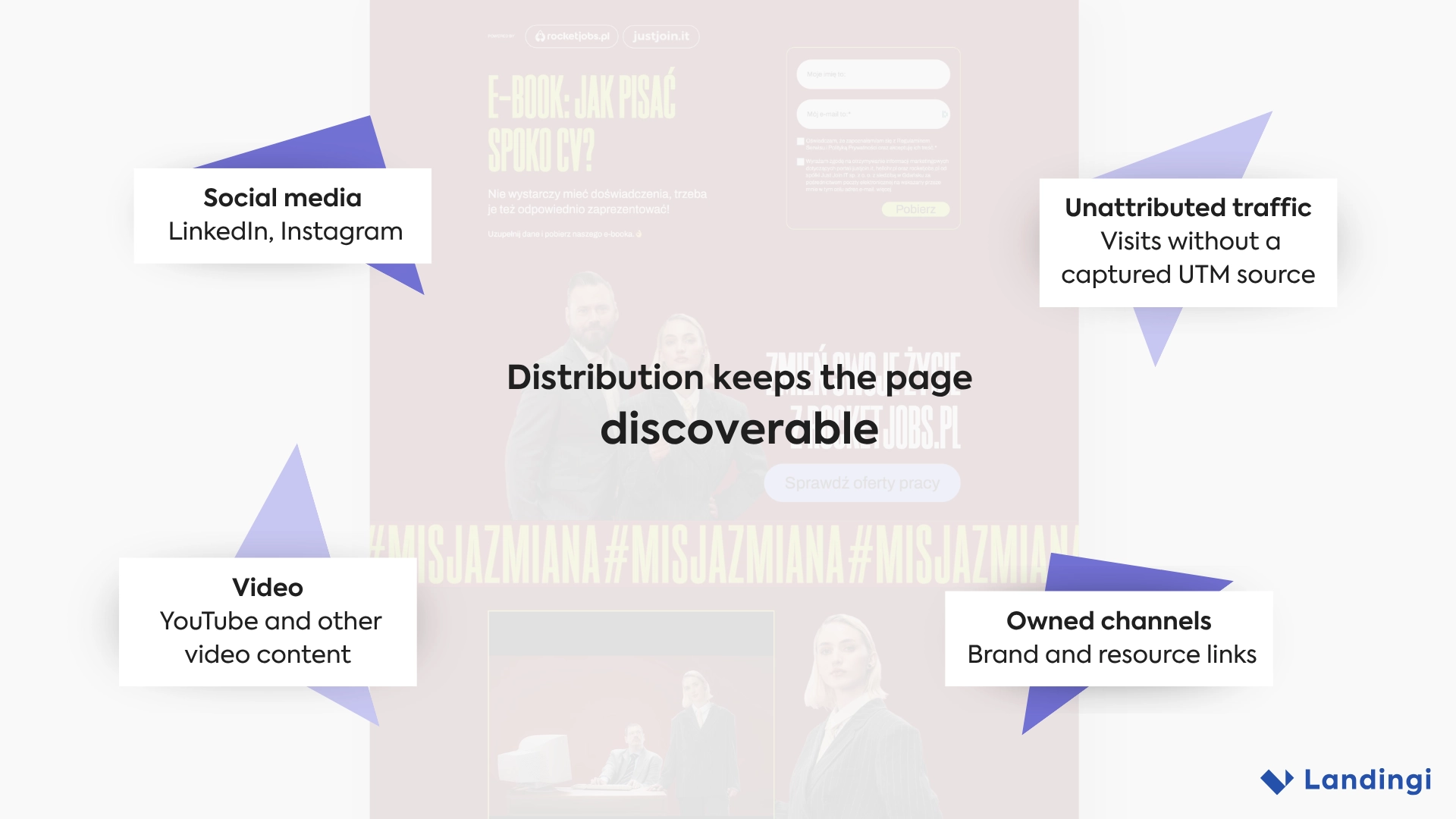
The pages received visitors from a mix of sources, including social media, video content, owned channels, and links that remained available after the original promotion ended.
Some visits could not be attributed to a specific UTM source, so the data should not be treated as a complete channel breakdown.
The broader lesson is more useful than the exact split: content landing pages can keep attracting visitors when their URLs remain connected to durable distribution.
A YouTube description can keep getting clicks. A LinkedIn post can resurface. An article can continue linking to the resource.
That makes distribution part of the landing page lifecycle, not just the launch plan.
Creative: Content That Feels Like a Product
None of these pages looks like a generic lead-magnet template.
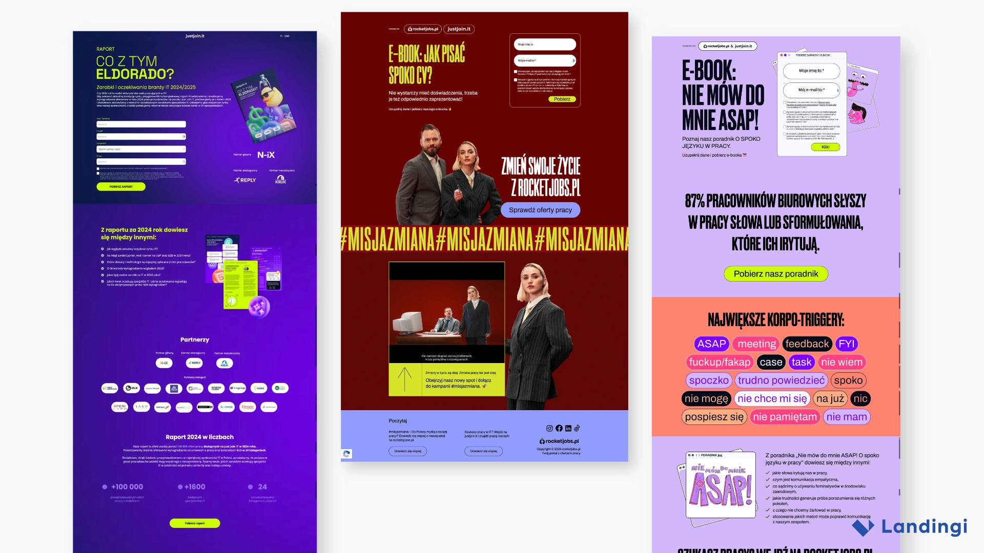
The CV campaign uses deep red, oversized typography, and bold career imagery. “Nie mów do mnie ASAP” combines lavender, acid green, coral, illustrations, and workplace language. “Co z tym Eldorado?” uses a dark blue-purple visual system, bright green accents, report mockups, and partner branding.
Each resource has a distinct campaign identity.
That can support distribution too. A named, recognizable content product is easier to remember, share, and rediscover than another page titled “Download our ebook.”
What Marketers Can Learn
The three examples point to a practical model for content landing pages:
- Match the landing page experience to the type of offer.
- Treat form length and perceived value as one decision, not two.
- Put enough information above the fold for high-intent visitors to act.
- Use deeper sections for visitors who need more context.
- Do not assume higher engagement automatically means higher conversion.
- Give educational content a recognizable campaign identity.
- Keep useful URLs connected to durable distribution channels.
- Track form behavior, not only final conversions.
The Bigger Lesson: Optimize the Exchange, Not Just the Form
These three landing pages show that lead generation is not simply a matter of reducing friction.
One offer achieved more than twice the form completion rate of the others despite asking visitors for more information. Another kept people exploring the page much longer without producing the strongest form funnel.
The difference is the exchange visitors are evaluating:
What am I getting, how useful is it to me, and what do I need to give in return?
Strong landing pages align those three elements. The offer creates the motivation, the page gives enough context to make a decision, and the form asks for an amount of information that feels justified.
With Landingi, teams can track those behaviors in EventTracker and compare how different offers, forms, and page structures affect the path to conversion.
The goal is not simply to make every form shorter. It is to make the exchange feel worth completing.
Use the following Landingi features to achieve similar results:
Visual Builder
Forms