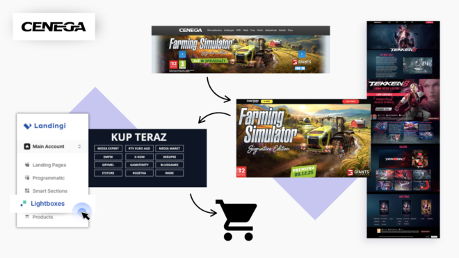

Game marketing has an interesting problem. Getting someone excited about a new title is only half the job. The next step can still kill the sale.
A player clicks an ad, lands in a crowded store, and suddenly has choices everywhere. Different games. Different editions. Different platforms. Different retailers.
The interest was there. The path wasn’t.
Cenega built its landing page strategy around fixing that exact problem. Since 2019, the game publisher has created dozens of pages and funnels in Landingi. They support new releases, special editions, game collections, and seasonal campaigns.
And the part I find most useful is surprisingly simple. Their landing pages don’t try to replace the online store. They make getting there much easier.
The Problem: Game Interest Can Die in a Store Listing
Visit a large game store and you’ll usually see the same thing: lots of titles fighting for attention.
That makes sense for browsing. It makes much less sense after someone clicks an ad for one specific game.
Cenega avoids that jump for its major releases and special editions. Instead, visitors reach a landing page focused on the title they came to see. The same pages can also receive traffic from banners on Cenega’s main website.
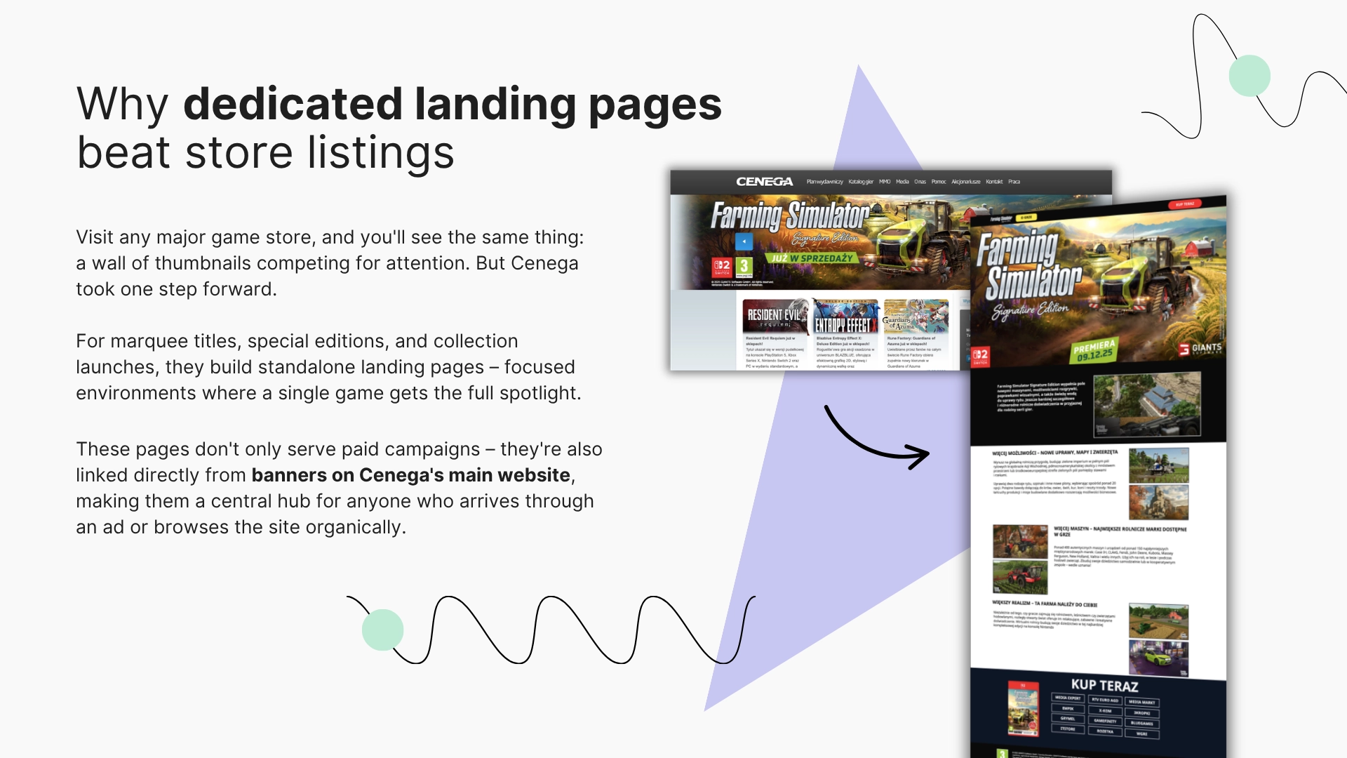
This keeps the campaign message intact.
The player sees the same game, the same visual style, and the same offer. There is no sudden wall of unrelated products competing for the next click.
There’s another issue, too. Buying a game often involves several decisions before checkout. The player may need to choose an edition, platform, and retailer.
Ask for all those decisions at once, and you create friction. Cenega does the opposite. It breaks the purchase path into small steps.
The Fix: Give One Game the Full Page
A landing page gives a game something a standard store listing rarely can: space.
Cenega uses that space to build interest before asking for the purchase click. Each page combines three main elements:
- Immersive visuals with artwork, screenshots, and imagery from the game.
- Video content such as trailers and gameplay clips.
- Product details covering editions, platforms, and bundle contents.
The idea isn’t to stuff every available fact onto the page. It’s to answer the questions that matter before purchase.
A player can explore the game first. Then they decide how they want to buy it. That changes the job of the CTA.
By that point, the button doesn’t need to convince someone that the game looks good. It needs to help them get the correct version from the correct place.
The same idea works for game collections
Cenega also uses landing pages for catalogs with several products. That creates a different problem: more games usually mean more page clutter.
Lightboxes solve it.
A game cover can act as a trigger. After a click, a lightbox shows key art, descriptions, edition details, and sometimes a trailer. The main page stays clean, while each title still gets enough space.
It’s a useful pattern for any gaming campaign promoting several titles at once. You don’t need ten separate blocks with ten long descriptions.
Show the detail when the player asks for it.
The Funnel: Turn Big Decisions Into Small Clicks
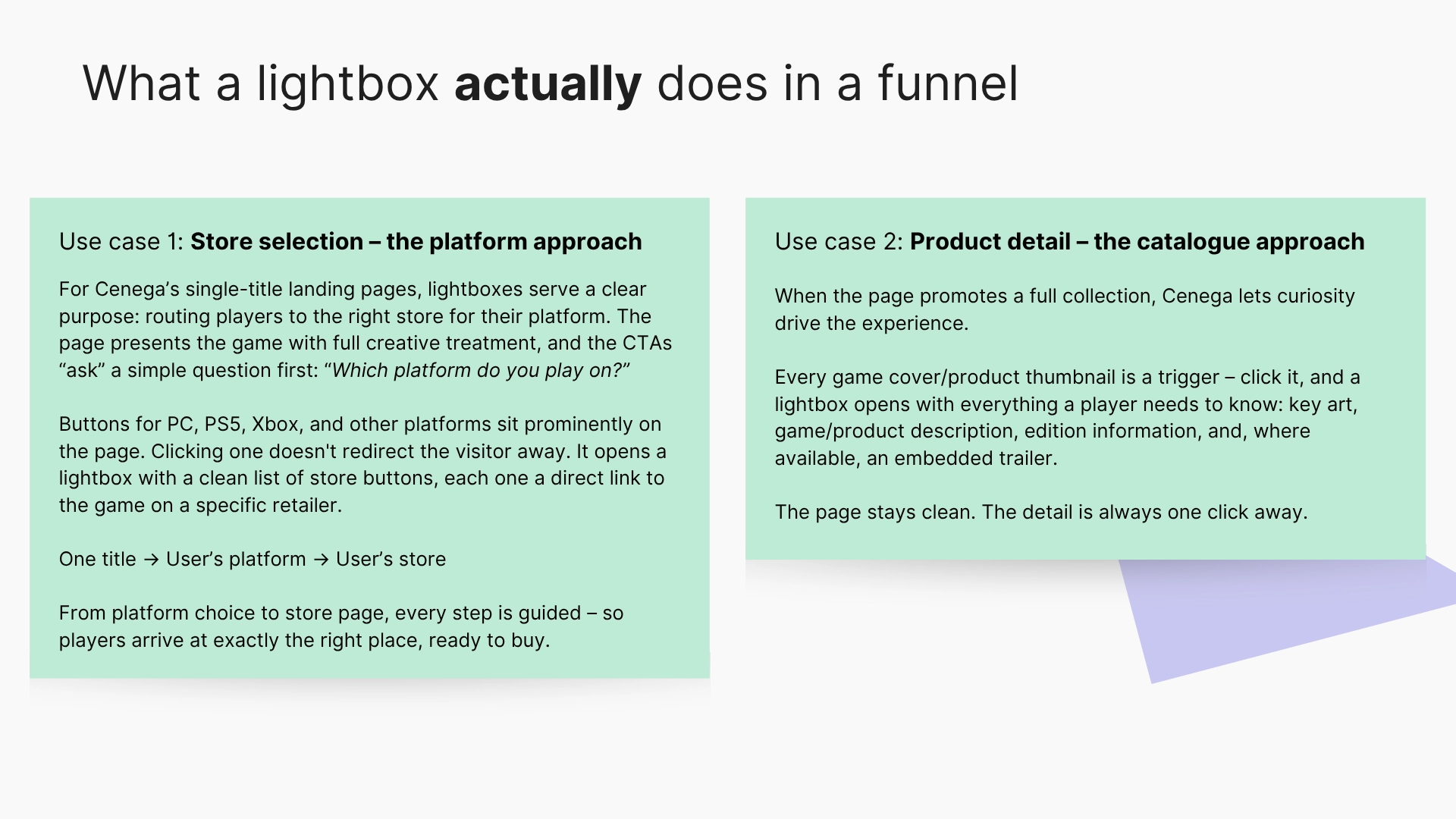
This is where Cenega’s setup gets more interesting. A button does not always send the visitor straight to another page. Sometimes the player needs one more choice first.
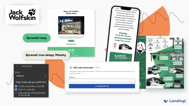
Cenega uses redirects when the destination is already clear. A click simply sends the visitor to the correct product URL. In Landingi, that destination is set through the button’s click action.
But imagine a game available on PC, PS5, and Xbox.
Sending everyone to one generic store page would push the problem further down the funnel. Instead, Cenega can first ask the player to choose their platform.
Platform first, store second
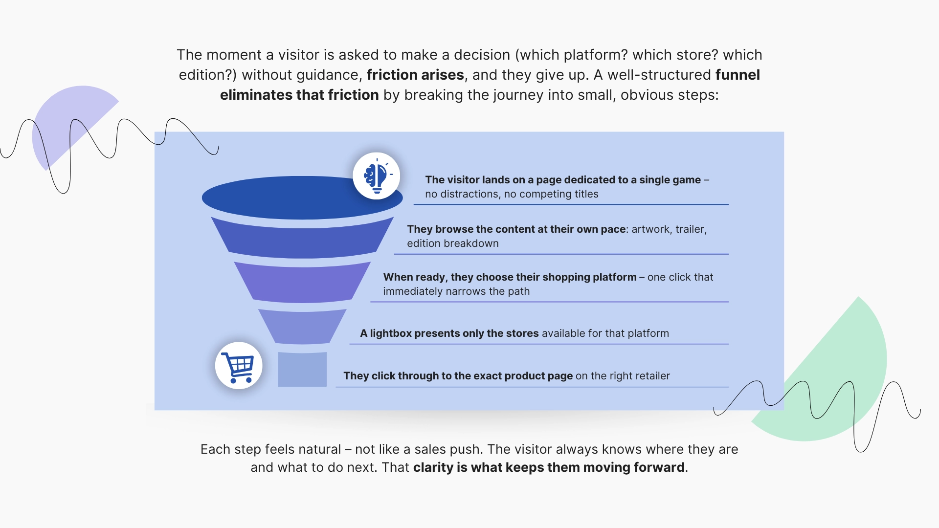
The flow looks like this:
Landing page → platform CTA → store-selection lightbox → retailer
A PS5 player clicks the PS5 button. A lightbox opens with stores selling that version. The player chooses one and lands on the exact retailer page.
That’s the detail worth stealing.
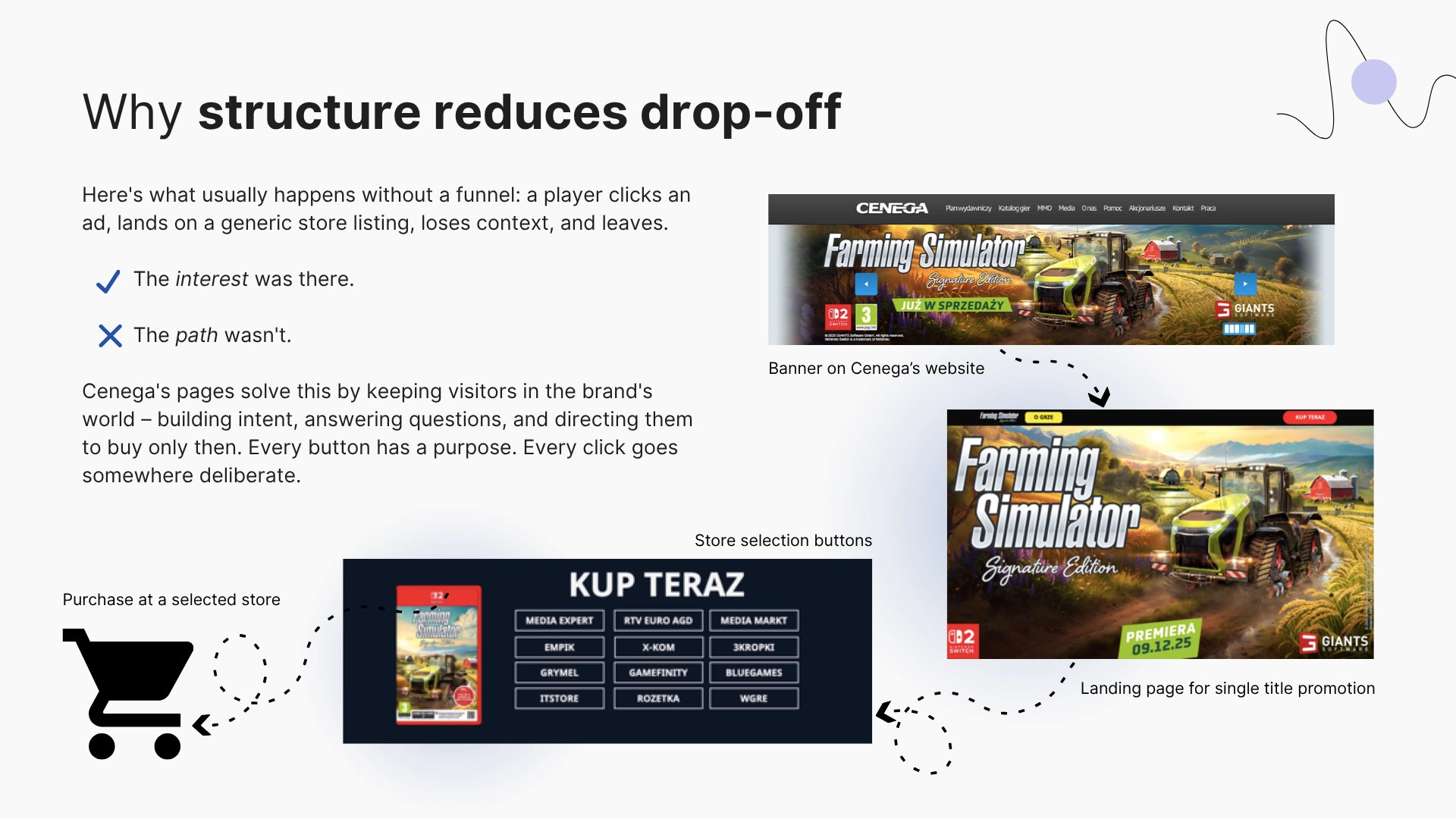
The lightbox does not add another step for the sake of it. It removes irrelevant choices from the next step.
A redirect moves the visitor. A lightbox helps them decide where they should be moved.
The two also work together. Store buttons inside the lightbox can redirect users directly to specific retailer product pages.
You can also reuse the same lightbox across several landing pages. That becomes useful when multiple campaigns share the same store-selection logic.
The Scale: One Game Launch, Multiple Markets
A campaign that works in Poland shouldn’t need rebuilding from zero for Czechia.
Cenega operates across several Central European markets. The same title can launch in Poland, Czechia, Slovakia, and Hungary at the same time. Each market still needs local copy, CTAs, and store links.
Their solution starts with one master landing page. Once the page is ready, the team duplicates it in Landingi. The structure, visuals, and layout stay the same. Then they change what needs to be local:
- page copy for the local language,
- CTA links for local retailers,
- legal or rating information where needed.
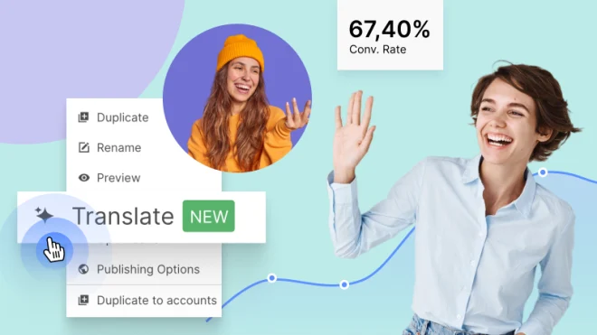
Landingi’s automatic translation can speed up the first version. The team can then review the copy before publishing.
Repeated elements can go one step further. Headers, footers, and campaign banners can be built as Smart Sections. An update to that section can then appear across all connected pages.
The payoff is bigger than faster page production.
A player in Prague can see the same campaign as a player in Warsaw. But they see it in their language, with links that actually make sense locally.
And that brings the whole strategy together.
One title gets one focused environment. Every click removes one decision. Every market gets the same campaign logic without rebuilding it.
That’s why Cenega’s approach is useful beyond one game launch. It turns landing pages into the connective layer between campaign interest and checkout.
The ad creates the interest. The store closes the sale.
The landing page makes sure the player gets from one to the other.
Cenega used the following Landingi features to reach their goals. Curious to learn more?
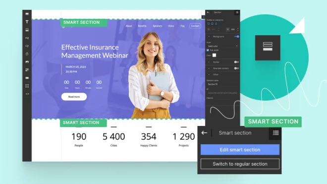
Smart Sections
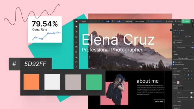
Visual Builder