
A photographer landing page should quickly show potential clients what you photograph, what your style looks like, and how they can book or get in touch. According to Google research, users can form an initial opinion about a website in as little as 50 milliseconds (0.05 seconds), so strong imagery, clear positioning, and an obvious next step need to work together from the first screen.
In Landingi, you can build a photography landing page manually or use Lunar, the AI-native landing page generator, to turn a detailed brief into a complete, editable page in minutes. From there, add your own photographs, refine the offer and booking flow, and tailor the page to weddings, portraits, events, commercial shoots, or another specific service.
Key facts:
- A photographer landing page should make the photographer’s style, specialty, and offer clear within the first screen.
- The portfolio works best when it is curated around the kind of clients and shoots you actually want to attract.
- Booking details, testimonials, pricing cues, and a visible CTA help turn visual interest into a real inquiry.
- In Landingi, the page can be created, published, tracked, tested, and optimized within one landing page operation system.
Below, we’ll look at 17 photographer landing page examples, what they do particularly well, and what you can borrow when creating your own.

17 Best Examples of Photographer Landing Pages
The 17 photographer landing page examples below show different ways to turn visual work into a page that supports real business goals. We’ll look at the specific choices that work in each example – from portfolio presentation and service positioning to trust signals and booking paths – as well as what could still be improved.
1. Tilly Rose Creative – wedding photography portfolio
Tilly Rose Creative keeps the focus exactly where it should be: on the photography. Large, high-quality images are grouped by subject and given plenty of white space, so visitors can quickly get a feel for the photographer’s style without working through long blocks of copy.

The page also provides a clear path from browsing to inquiry. A short contact form, contact details, and social links sit at the bottom, giving interested visitors an easy next step without interrupting the portfolio experience.
What they did well:
- Strong, well-curated photography
- Clean layout with generous white space
- Minimal, purposeful copy
- Simple inquiry form
- Contact and social links
What could be improved:
- Adding a few client testimonials near the inquiry section could provide useful reassurance before someone books or gets in touch.
2. Emilie Ristevski – travel photography portfolio
Emilie Ristevski’s page feels closely tied to her photography from the first screen. Soft colors, generous spacing, and large travel images create a consistent visual identity, while the portfolio quickly establishes her nature-focused, editorial style.

There’s also more substance behind the imagery. Visitors can explore her photography and videography services, journal, published book, and client testimonials, giving potential collaborators both creative context and proof of experience.
What they did well:
- Strong, consistent visual identity
- Large, carefully selected photography
- Clear presentation of creative services
- Testimonials supporting credibility
- Additional content that adds context to her work
What could be improved:
- A more prominent inquiry CTA could shorten the path for potential clients who are ready to discuss a project.
Create a photography landing page in Landingi that puts your work first and gives potential clients a clear next step.
3. Melissa Findley – travel and nature photography
Melissa Findley’s page puts her nature-focused photography at the center, using large images, generous white space, and restrained typography to create a calm visual experience. The design feels consistent with the work without getting in its way.

The page also gives visitors several ways to explore her work, including a portfolio, journal, and fine art print store. The store adds a meaningful layer to the brand, with proceeds supporting wildlife and environmental causes.
What they did well:
- Strong visual consistency
- Large, high-quality photography
- Simple, intuitive navigation
- Fine art store integrated naturally into the portfolio
- Clear connection between the work and the photographer’s values
What could be improved:
- A clearer CTA for commercial inquiries or collaborations could make it easier for potential clients to move from browsing the portfolio to getting in touch.
4. NP Visuals – photography portfolio
NP Visuals uses a simple, image-led layout that gives the photography plenty of room to stand out. The portfolio is supported by concise copy and an artist note, while generous white space keeps the page easy to browse and avoids competing with the visual work.

Navigation provides access to the contact section and social channels, but visitors ready to inquire have to take that step themselves rather than being actively guided toward it.
What they did well:
- Clean, image-focused layout
- High-quality portfolio presentation
- Concise supporting copy
- Simple navigation
- Easy access to social channels
What could be improved:
- A visible Contact or Book a Shoot CTA near the portfolio would give interested visitors a more direct path from viewing the work to making an inquiry.
5. Robin Goodlad – food photography
Robin Goodlad’s page makes his specialty clear almost immediately. Large, detailed food photography takes priority, while his recognition in the Pink Lady Food Photographer of the Year awards adds credibility without distracting from the work itself.

The gallery shows enough range to help restaurants, chefs, and food brands judge whether his style fits their project. Supporting copy also explains his collaborative approach, giving potential clients some sense of what working with him looks like.
What they did well:
- Clear food photography specialization
- Strong, high-quality portfolio
- Awards used as relevant social proof
- Clean, image-first layout
- Copy that communicates his approach to client work
What could be improved:
- A more prominent inquiry CTA near the portfolio could make it easier for potential clients to move directly from evaluating his work to discussing a shoot.
6. Marcus Hessenberg – fashion and commercial photography
Marcus Hessenberg’s page handles a broad portfolio without making it feel unfocused. Clear navigation separates fashion, commercial photography, portraits, and film work, so potential clients can quickly find the part of his portfolio that matches their project.

His South London studio also gets dedicated space on the site, which is useful information for clients considering a shoot and adds something more concrete than a standard portfolio gallery.
What they did well:
- Clear organization across different types of work
- Strong fashion and portrait photography
- Photography and filmmaking presented coherently
- Dedicated studio information
- Straightforward navigation
What could be improved:
- A stronger inquiry CTA within the portfolio and studio sections could give potential clients a quicker route to discussing a project.
7. KT Merry – luxury wedding photography
KT Merry’s page is a strong example of a photographer landing page built for the luxury market. Large editorial-style images, refined typography, and restrained copy immediately establish her visual style and positioning as a destination wedding and fine-art photographer.

The page also goes beyond a standard wedding portfolio. Visitors can explore editorial work, her Render Loyalty conservation project, and educational resources for photographers. These different areas feel connected by the same visual identity, so the broader personal brand doesn’t compete with her core photography work.
What they did well:
- Clear luxury and destination wedding positioning
- Strong editorial photography
- Consistent visual identity throughout the page
- Polished, minimal copy
- Additional projects that strengthen the photographer’s brand
What could be improved:
- Client stories or short testimonials placed closer to the wedding portfolio could add another layer of trust for couples considering a high-value booking.
8. Justin Kunimoto – wedding photography
Justin Kunimoto’s page combines a polished wedding portfolio with the practical information couples need before making an inquiry. His photojournalistic style is supported by warm, conversational copy, while pricing information, testimonials, and venue-focused blog content help answer questions that often come up during the search for a photographer.
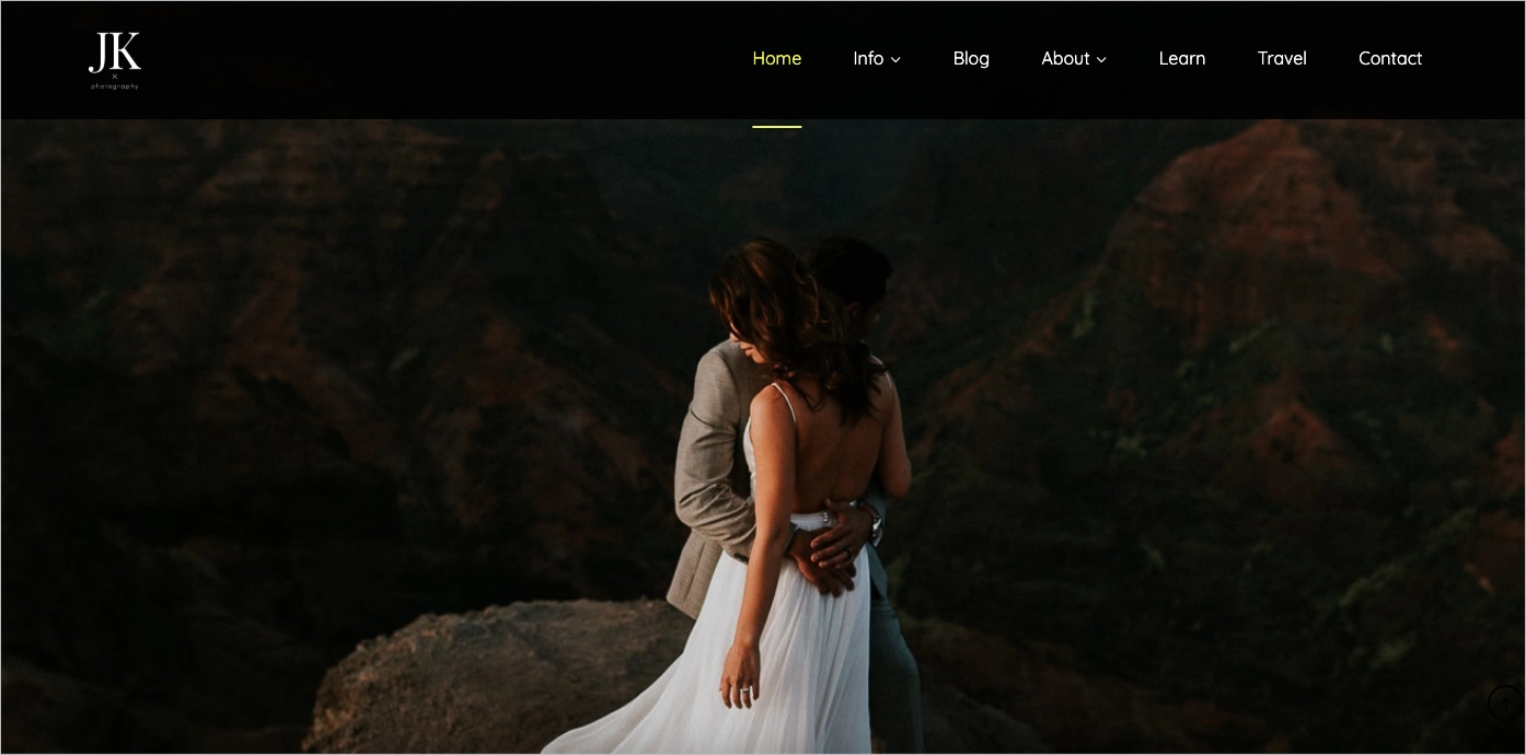
The page also makes experience part of the offer, highlighting more than a decade in the industry and hundreds of photographed weddings. That gives potential clients useful reassurance alongside the portfolio itself.
What they did well:
- Clear wedding photography positioning
- Warm, approachable copy
- Pricing information available upfront
- Testimonials and experience as strong trust signals
- Helpful venue and wedding content
What could be improved:
- Bringing a stronger selection of signature images or a featured gallery higher on the page could help first-time visitors understand his visual style even faster.
9. San Pixs Photographie – portrait and event photography
San Pixs Photographie opens with a strong hero image and a restrained monochromatic design that keeps attention on the photography. The page combines the portfolio with an introduction to the photographer and more detailed service descriptions, giving potential clients enough context to understand both the style and the offer.

The contact section provides several ways to get in touch, including a form, phone number, email, and social links. The form is relatively detailed, but optional fields help keep it from becoming an unnecessary barrier.
What they did well:
- Strong, image-led hero section
- Simple visual structure
- Clear service descriptions
- Personal introduction alongside the portfolio
- Multiple contact options
What could be improved:
- A clearer booking CTA placed earlier on the page could shorten the path from viewing the photographer’s work to making an inquiry.
10. Mango Studios – wedding photography studio
Mango Studios presents a broad photography offer without making the page difficult to navigate. Wedding galleries remain central, while engagement sessions, portraits, events, and corporate photography are clearly separated, helping visitors move directly to the service that brought them there.

The page also does a good job of supporting the portfolio with practical decision-making content. Client reviews provide social proof, while the FAQ and planning-focused blog answer questions couples may have before reaching out. Clear CTAs throughout the page make the route from browsing to inquiry easy to follow.
What they did well:
- Clear organization of multiple photography services
- Strong wedding galleries
- Visible, well-placed CTAs
- Client reviews as social proof
- Useful FAQ and planning content
- Easy navigation between services and portfolio
What could be improved:
- With so much visual and editorial content, keeping image sizes and other media carefully optimized is especially important for maintaining fast mobile performance.
11. Norte Image Studio – creative photography portfolio
Norte Image Studio takes a more experimental approach to the photographer portfolio landing page. Projects are presented in different image sizes and organized with color-coded details, while subtle animation gives the portfolio an editorial, almost magazine-like feel.

One particularly interesting feature is the option to switch between light and dark backgrounds. It changes how the photography is perceived and gives visitors some control over the viewing experience. Written content stays minimal, with an About section, contact information, and social links supporting the visual portfolio.
What they did well:
- Distinctive, editorial portfolio design
- Creative project organization
- Strong use of animation
- Light and dark viewing options
- Project details kept close to the work
What could be improved:
- The page could make the path to inquiry more obvious. A visible Contact or Work With Us CTA would help turn portfolio interest into a potential project.
Build a photography landing page in Landingi that gives your best projects the space they deserve.
12. Luke Brennan – music photography
Luke Brennan’s page is clearly built for the music industry. Concert photography, artist portraits, video, and design work sit together naturally, giving musicians and managers a good sense of both his visual style and the range of projects he can handle.

Credibility is built into the portfolio rather than added as an afterthought. Features in publications such as NME and The Guardian, along with artist testimonials, support the quality of the work, while a visible contact form gives potential clients a straightforward route to an inquiry.
What they did well:
- Clear music photography positioning
- Strong mix of live and portrait work
- Photography, video, and design presented cohesively
- Relevant media credits and testimonials
- Easy-to-find contact form
What could be improved:
- The typewriter-style typography fits the visual identity, but improving its legibility, particularly on smaller screens, would make the page easier to browse without losing its character.
13. Tiny Sparrow Photography – family and newborn photography
Tiny Sparrow Photography is clearly built around families. Vanessa’s portfolio covers maternity, newborn, family, and dance photography, with a soft visual style that carries naturally into the page design and copy.

The page also handles the practical side of booking well. Visitors can move from galleries to session details, pricing information, testimonials, and FAQs, which answers many of the questions a family may have before reaching out.
What they did well:
- Clear family photography positioning
- Consistent, warm visual identity
- Helpful session and pricing information
- Testimonials and FAQs that reduce uncertainty
- Easy navigation between galleries and services
What could be improved:
- Book a Session and Contact Me CTAs could stand out more visually. Slightly larger body text and stronger contrast would also improve readability, especially on mobile.
14. Elena Walsh – family lifestyle photography
Elena Walsh’s Little Manly Photography page has a clear sense of who it is speaking to. Soft natural-light photography, restrained colors, and warm copy create a consistent style aimed at families looking for relaxed, candid sessions rather than highly posed portraits.

The layout stays simple and gives the images plenty of space, while the copy adds just enough context around the experience of working with the photographer. This makes the page feel personal without burying the portfolio under lengthy explanations.
What they did well:
- Clear family and lifestyle photography positioning
- Consistent visual style
- Strong connection between photography and copy
- Simple, easy-to-follow layout
- Portfolio tailored to a specific client group
What could be improved:
- The later sections could use more visual variation to maintain momentum through the page. Making the inquiry and booking CTAs more prominent would also give interested visitors a clearer next step.
15. Icelandic Explorer – landscape photography and prints
Icelandic Explorer combines landscape photography with storytelling, giving visitors more context than a standard image gallery. Large photographs and video bring Iceland’s landscapes to the foreground, while individual projects let visitors explore the stories behind the work.

The page also has a clear commercial purpose: selling prints. Project-focused CTAs encourage deeper exploration, while a simple contact form and social links provide additional ways to connect with the photographer.
What they did well:
- Strong landscape photography
- Photography combined naturally with storytelling
- Clear path to individual projects
- Print sales integrated with the portfolio
- Simple contact form
What could be improved:
- With large images and video playing such an important role, careful media optimization is essential. Faster loading would help preserve the immersive experience, particularly on mobile and slower connections.
16. Flavio Roberto Fotografo – photography portfolio
Flavio Roberto’s page uses a straightforward portfolio structure built around clickable image thumbnails. Visitors can scan selected work quickly and open individual projects for a more complete gallery, while the side navigation gives the page the feel of browsing a digital photo album.

Contact is also easy to access. Along with a phone number and social links, a persistent WhatsApp button gives potential clients a direct way to ask about a session without searching for a separate contact page.
What they did well:
- Simple, easy-to-browse portfolio
- Clickable project thumbnails
- Clear side navigation
- Direct WhatsApp contact option
- Accessible contact and social links
What could be improved:
- Adding a few client testimonials or other relevant proof near the contact section could give potential clients more confidence before making an inquiry.
17. Erik Johansson – surreal photography
Erik Johansson’s page works as an entry point into his surreal visual world. A minimal layout and animated background put his artwork front and center, while a clear CTA invites visitors to move deeper into the site rather than competing with the imagery.

Beyond the opening page, visitors can explore his portfolio, buy prints, check upcoming events, and find contact information for collaborations. This gives the striking visual introduction a clear commercial and professional purpose.
What they did well:
- Distinctive, immediately recognizable visual style
- Minimal layout that keeps attention on the work
- Immersive animated background
- Clear entry CTA
- Portfolio, print store, events, and contact options
What could be improved:
- Because the experience relies heavily on large visual assets and animation, performance should be carefully optimized across mobile devices and slower connections.
How To Create a Photographer Landing Page?
To create a photographer landing page, start with a concrete offer and the material needed to support it. Choose the service you want to promote, prepare a small set of representative photographs, define your location or service area, decide what information a client needs before reaching out, and choose one primary action, such as Check Availability, Book a Session, or Request a Quote. In Landingi, you can build the page manually or use Lunar to generate a complete, editable first version from a detailed brief.
1. Define your offer and generate the first version
Start with one service and one audience. A wedding photographer might build a page specifically for couples looking for wedding coverage, while a commercial photographer may focus on brands looking for product or campaign photography.
Before building, prepare your best images, a short description of your style and services, testimonials, pricing or package information if you publish it, and the action you want visitors to take.
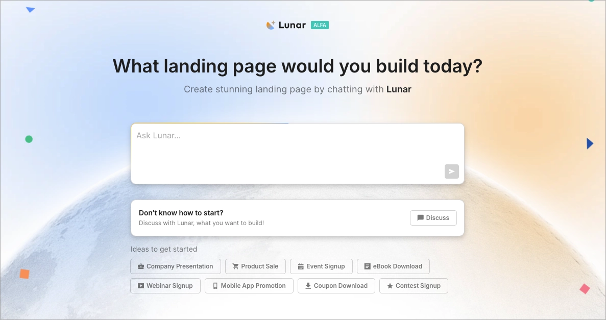
With Lunar, you can turn the information you’ve prepared into a complete first version of your page. Describe your photography business, target clients, offer, preferred style, sections, and conversion goal in a prompt. The more specific the brief, the closer the generated page will be to what you actually need.
You can use a prompt like this:
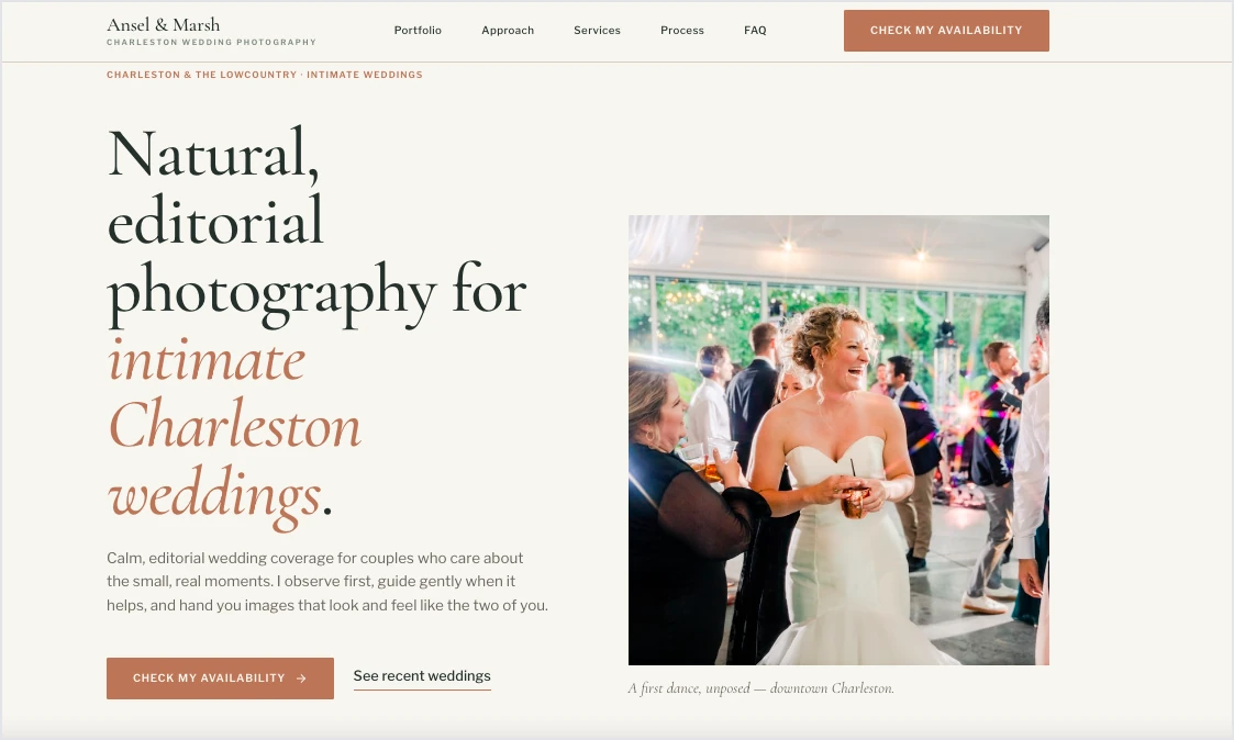
Create a landing page for a wedding photographer based in Charleston, South Carolina, targeting engaged couples planning elegant, intimate weddings.
The primary conversion goal is to generate wedding photography inquiries through a short contact form.
Position the photographer as experienced, calm, detail-oriented, and focused on natural, editorial-style wedding photography. Use a warm, refined, and personal tone without sounding overly romantic or sales-driven.

Create a hero section with a clear headline, short supporting copy, and a “Check My Availability” CTA.
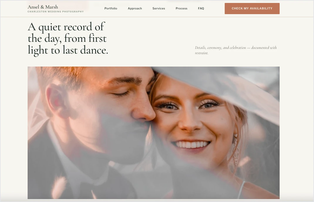
Include a curated portfolio section for 8–12 large photographs, a short About section, wedding and engagement photography services, three client testimonials, a simple booking process, an FAQ covering availability, travel, turnaround time, and packages, and a contact form asking for names, email, wedding date, venue or location, and a short message.

Repeat the primary CTA naturally after the portfolio and near the bottom of the page. Keep the design image-led, spacious, elegant, and easy to scan. Use restrained typography and neutral colors so the photography remains the strongest visual element. Optimize the structure for mobile visitors and avoid unnecessary navigation or sections that distract from the inquiry goal.
Once you submit the prompt, Lunar generates the complete landing page in a few minutes, including its layout, sections, and copy. You don’t have to build each section separately, and the generated page remains editable, so you can treat it as a working first version rather than a finished design.
Turn your photography brief into a complete, editable landing page in minutes.
2. Refine the generated page
Once Lunar generates the first version, review the page as a whole. The photography service should be clear from the opening section, the portfolio should appear early, and the path from viewing your work to making an inquiry should feel natural.
You can make changes directly through Lunar’s chat. Ask it to shorten the headline, move testimonials closer to the portfolio, simplify the About section, change the CTA, or adjust other parts of the generated page without rebuilding them manually.
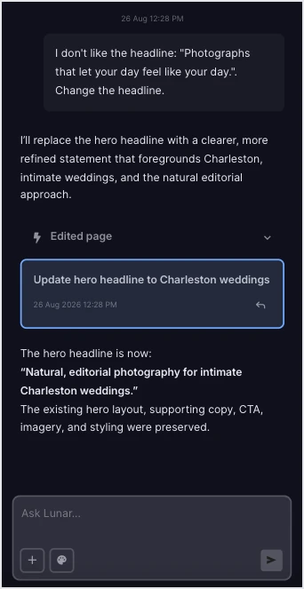
Then add the elements AI cannot provide for you: your actual photographs, accurate service details, location or travel information, brand assets, and real client feedback. You can also connect the page with tools that support the client journey – for example, Mailchimp for email marketing, Calendly for scheduling consultations, PayU for online payments, and Trustindex for displaying customer reviews and other social proof.
Keep the portfolio curated around the service you are promoting. For a wedding photography landing page, a smaller selection showing different parts of a wedding day will usually tell prospective clients more than a large gallery mixing weddings, portraits, events, and unrelated work.
3. Prepare the page for inquiries and mobile visitors
Before publishing, go through the page from a potential client’s perspective. Make the primary CTA easy to find at natural decision points and connect it to a short inquiry form or your chosen booking process. Ask only for information you need at this stage, such as contact details, type of shoot, preferred date, location, and a short message.
Pay particular attention to image performance. Photography pages naturally contain more visual assets than many other landing pages, so resize and compress photographs, use appropriate dimensions and formats such as WebP, and avoid loading full-resolution files when they are displayed at much smaller sizes.
4. Publish, track, and optimize
Once the page is live, you can start checking how prospective clients actually use it. EventTracker records interactions on the landing page, while its Event Map and Scroll Map help you see which elements attract engagement and how far visitors move through the page.

For a photography page, this can help answer practical questions:
- Are visitors reaching the full portfolio?
- Do they continue to testimonials?
- Are they clicking Check Availability?
- Do they reach the inquiry form but leave without submitting it?
Use EventTracker to see how potential clients scroll, click, and interact with your portfolio and booking path.
Use those patterns to decide what is worth testing. You might compare hero images, shorten the portfolio, move testimonials higher, simplify the inquiry form, or test different CTA wording with A/B testing.
As EventTracker collects behavioral data, Solis can analyze it together with the context of the landing page and campaign and surface alerts, discoveries, and optimization suggestions.
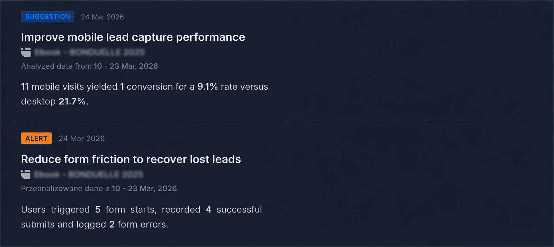
This gives you a more useful basis for improving the page than changing images, sections, or CTAs simply because you think another version might perform better.
Turn EventTracker data into AI-powered insights and recommendations for improving your photography landing page.
3 Photographer Landing Page Best Practices
A strong photographer landing page should make it easy for potential clients to judge your style, understand what you offer, and take the next step. These three practices help keep the page visually strong without losing sight of its business goal.
#1 Curate your portfolio around the service
Don’t treat the landing page as an archive of everything you’ve photographed. Select images that represent the service you are promoting and the kind of work a client can realistically expect from you.
For a wedding photography landing page, for example, show enough variety to tell the story of a wedding day – portraits, ceremony, details, candid moments, and reception – while keeping the overall visual style consistent. A commercial photographer can organize the selection around relevant campaigns, products, or industries.
A focused portfolio makes it easier for visitors to answer the question that matters most: Is this the photographer I want for my project
Build a focused photography landing page around the clients and shoots you want to attract.
#2 Keep the inquiry process simple
Your contact form should collect enough information to start a useful conversation without asking the client to complete a full booking questionnaire upfront. For many photographers, name, email, type of session, preferred date or location, and a short message will be enough for the first inquiry.

Phone numbers, budgets, venue details, or other fields can be added when they genuinely help you qualify the lead. The point isn’t to make every form as short as possible, but to remove questions that don’t need to be answered yet. Current form-design guidance continues to favor fewer necessary fields and a simple, mobile-friendly layout.
Use A/B testing to see how form length, CTA wording, or booking options affect inquiries.
#3 Optimize based on visitor behavior
A photographer landing page shouldn’t be treated as finished once it goes live. Visitor behavior, traffic sources, and the services you want to promote can change, so review the page regularly and improve the parts that may be holding back inquiries.
That might mean changing the hero image, tightening the portfolio, making the booking path clearer, moving social proof higher, simplifying the form, or improving the performance of image-heavy sections. Solis, Landingi’s AI optimization tool, helps with this process by analyzing landing page and campaign data and surfacing insights and recommendations on what may be worth improving.
Including clickable miniatures is not only about aesthetics but also about optimizing your page for fast loading and providing a seamless experience for mobile users.
FAQ About Photographer Landing Pages
These answers cover the practical questions that come up when creating, structuring, and optimizing a photographer landing page for inquiries and bookings.
What is a photographer landing page?
A photographer landing page is a focused page designed to showcase selected photography and lead visitors toward a specific action, such as checking availability, requesting a quote, or booking a consultation. It usually promotes one service or audience, such as weddings, family sessions, or commercial photography, rather than functioning as a complete photography website with every project and service.
What is the best photographer landing page builder?
Landingi is a strong choice for photographers who need more than a page editor. As an AI landing page operation system, it covers the workflow from creating and publishing a photography landing page to collecting leads, tracking performance, testing variations, and optimizing the page.
You can build manually or use Lunar, Landingi’s AI-native landing page generator, to create a complete, editable page from a prompt in minutes. Forms and integrations can support inquiries and bookings, while A/B testing helps compare page variations. Once the page starts receiving traffic, EventTracker captures visitor behavior through features including Event Map and Scroll Map, and Solis analyzes behavioral data in the context of the page and campaign to surface optimization insights and recommendations.
This makes Landingi particularly useful when a photographer portfolio landing page is expected to generate business, not simply display photographs.
Create your next landing page and manage the entire workflow in Landingi.
How can I optimize my photographer landing page for higher conversion rates?
To optimize a photographer landing page, start with the path from first impression to inquiry. Put your strongest and most relevant work early, make the photography specialty immediately clear, keep the main CTA visible, and support the decision with credible testimonials, pricing guidance, or booking details where they matter.
Once the page has traffic, Solis can help you move beyond surface-level metrics. It continuously analyzes behavioral data collected by EventTracker together with the page structure, imagery, and campaign context. It looks at signals such as scroll depth, clicks, form interactions, conversion rates, and other events, then surfaces alerts, discoveries, and practical optimization suggestions when something deserves attention.
For a photography page, that could mean flagging that visitors consistently drop before the inquiry form, that a mobile section creates friction, or that a particular part of the page is not supporting the booking path as expected. The useful part is that Solis does not look at one metric in isolation – it interprets behavior in the context of the actual landing page and campaign.
That gives you a more concrete basis for deciding what to change, such as shortening the portfolio, moving testimonials higher, simplifying the form, or adjusting the CTA, rather than redesigning the page based on instinct alone.
Find opportunities to improve your photography landing page with AI-powered recommendations.
What are the key elements of an effective photographer landing page?
An effective photography landing page needs a strong hero image, clear positioning, a curated portfolio, concise service information, social proof, and an obvious CTA. It should also provide enough practical information to make an inquiry feel worthwhile, which may include your location, availability, approach, pricing guidance, or booking process.
The portfolio itself should be selective. Every image should reinforce the type and quality of photography you’re selling rather than simply demonstrate that you can photograph many different things.
What is the best CTA for a photographer landing page?
The best CTA tells visitors exactly what the next step involves. Check Availability, Book a Session, Request a Quote, and Schedule a Consultation are generally more useful than vague buttons such as Learn More.
Match the CTA to the service and buying stage. A wedding photographer may use Check My Availability, while a commercial photographer asking clients for project details may get more value from Request a Quote. Keep the main action consistent across the page rather than competing for attention with several unrelated CTAs.
How can I make a photography landing page load faster?
To make your photography landing page load faster, start with the images, as they’re usually the heaviest part of a photography landing page. Resize photographs to their actual display dimensions, compress them appropriately, and use efficient formats such as WebP or AVIF. Avoid uploading full-resolution originals when the page displays them at a fraction of that size.
For longer portfolios, use responsive images and lazy-load below-the-fold media where appropriate, while keeping important above-the-fold content, particularly the main hero image, prioritized. Also limit unnecessary scripts, animations, and embedded media. The goal isn’t to sacrifice image quality, but to avoid making visitors download visual data they don’t need.
Boost your brand with a professionally designed landing page tailored to your needs.
Craft Stunning Photographer Landing Page in Landingi
A strong photographer landing page has two jobs: show enough of your work to make the right client interested and make the next step toward booking easy. That means carefully selected photography, clear positioning, relevant social proof, practical service information, and a booking or inquiry path that doesn’t get lost behind the portfolio.
With Landingi, you can manage that process in one AI landing page operation system. Use Lunar to generate a complete, editable page from a detailed brief, customize it with your photography and brand, connect forms and integrations to your existing workflow, and publish it without building the page from scratch.
Once traffic starts coming in, the work doesn’t stop at launch. EventTracker captures visitor behavior, A/B testing lets you compare meaningful page variations, and Solis analyzes behavioral data in the context of the page and campaign to surface alerts, discoveries, and optimization recommendations. Together, these tools let you move from creating a photography landing page to improving how effectively it turns portfolio views into inquiries. Try Landingi and make your portfolio work harder – turn attention into inquiries and inquiries into booked shoots.