
A pricing landing page appears at a key point in the customer journey. Visitors usually understand the product by then – now they’re comparing plans, checking what each option includes, and deciding if the offer is worth the price. Good pricing page design makes that decision easier by presenting meaningful differences clearly and removing uncertainty around costs, limits, and terms.
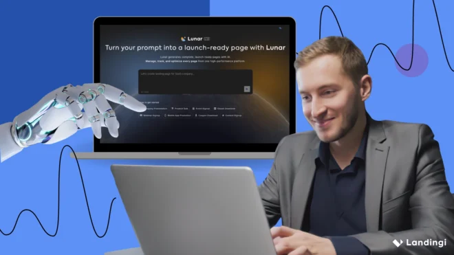
For a SaaS pricing page, this often means a readable plan comparison, monthly and annual billing options, a clearly differentiated recommended tier, and a route for customers who need an enterprise offer. In Landingi, you can build the page manually or use Lunar, the AI-native landing page generator, to generate a complete, editable pricing page from a prompt, then publish, test, and optimize it as real visitor data comes in.
Key facts:
- Pricing pages target visitors who are already close to a purchase decision.
- Plans should be easy to compare, with key differences and limits clearly shown.
- Pricing, plan hierarchy, and CTAs should be tested using real visitor behavior.
- A landing page operation system like Landingi brings creation, publishing, behavioral tracking, testing, and AI-assisted optimization into one workflow, making it easier to improve a pricing page as real data comes in.
The pricing landing page examples below show how different companies approach this decision point and which solutions are worth considering for your own page.

8 Best Examples of Pricing Landing Pages
The best pricing landing page examples make a potentially difficult decision feel surprisingly simple. The eight pages below take different approaches to presenting plans, explaining value, and guiding visitors toward the right option. We’ll look at the specific pricing page design choices that work well in each one – and where there’s still room for improvement.
1. Nebbl – cloud storage pricing landing page
Nebbl’s pricing page is built around a product that needs a little explanation: the service lets users manage files in their own cloud storage rather than moving everything into another provider’s infrastructure. The current website still positions Nebbl around storing files in your own cloud, although much of the page content is rendered dynamically, so some of the original details cannot be independently verified from the public page.

What works well in the pricing presentation is the relatively direct path from understanding the offer to comparing options. The clean layout keeps attention on the plans and their differences, while supporting information helps users make sense of a service that may not be immediately familiar.
What they did well:
- Clear presentation of a less familiar cloud-storage model
- Clean, easy-to-scan layout
- Pricing options kept central to the decision
- Supporting information that helps explain the offer
- FAQ content for questions that may come up before purchase
What could be improved:
- Stronger social proof, such as customer testimonials or recognizable client logos, could make the decision easier for visitors who understand the offer but still need reassurance before committing.
Create a clear pricing landing page in Landingi that helps customers compare options and move confidently toward the right plan.
2. TimeAlign – time management app pricing landing page
TimeAlign keeps its pricing page pleasantly simple. Visitors can compare the available options without working through a dense feature table, and the monthly and annual billing choices make the price difference easy to understand. For a relatively straightforward subscription product, that restraint works in its favor.

The page also keeps the offer close to the pricing itself, so users can see what they’re paying for without jumping between sections. Clear CTAs provide an obvious next step once they’ve made their choice. It’s a good reminder that a SaaS pricing page doesn’t need to look complicated to explain the offer properly.
What they did well:
- Simple, easy-to-scan pricing structure
- Clear monthly and annual billing options
- Benefits presented close to the price
- Strong, visible CTAs
- Little distraction around the main decision
What could be improved:
- Customer testimonials or another form of social proof near the pricing section could give hesitant visitors a little more confidence before they commit.
Build a pricing landing page in Landingi that helps visitors understand the offer and choose the right option without unnecessary friction.
3. blogstatic.io – blogging platform pricing landing page
blogstatic.io does a good job of keeping a growing SaaS offer readable. Its plans are organized around different types of users, from individual creators to teams, so visitors can quickly narrow down which option is actually meant for them. That makes the pricing feel less like a wall of features and more like a practical choice.

The visual hierarchy helps with the comparison. The recommended plan gets more attention, while the initial pricing cards surface the information most people need first. More detailed feature comparisons are available for visitors who want to dig deeper before buying. Customer logos add a useful layer of credibility without taking attention away from the plans themselves.
What they did well:
- Plans organized around clear user needs
- Strong visual hierarchy between pricing tiers
- Key features summarized before the detailed comparison
- Recommended option clearly highlighted
- Customer logos supporting credibility
- Clear CTAs tied to each plan
What could be improved:
- The detailed feature comparison can become a lot to process, particularly on smaller screens. A more compact or interactive comparison could help users focus on the differences that actually matter for their choice.
Build a pricing page in Landingi that makes even a multi-plan offer easy to understand and compare.
4. OFFLIGHT – productivity app pricing landing page
OFFLIGHT keeps its pricing page refreshingly straightforward. The offer centers on a Pro plan at $15 per month or $12 per month with annual billing, with a 14-day trial that doesn’t require a payment method upfront. Rather than making visitors decode several similar tiers, the page gives them one main paid option and clearly explains what comes with it.

The feature breakdown adds useful context to the price, covering tools such as auto-scheduling, calendar sync, AI task summaries, and integrations. Annual savings are visible at the point of comparison, while the FAQ answers pricing-specific questions that could otherwise slow down the decision.
What they did well:
- Simple pricing structure
- Clear monthly and annual billing
- Annual savings shown upfront
- Detailed feature breakdown
- 14-day trial with no payment method required
- FAQ focused on purchase-related questions
What could be improved:
- Customer testimonials or a short case study placed closer to the offer could add reassurance at the moment visitors are deciding if the product is worth paying for.
Use EventTracker to see how visitors interact with pricing options, CTAs, and key sections before they convert.
5. Essay AI – AI writing tool pricing landing page
Essay AI takes a different approach to pricing: the core product stays the same, while users choose how long they want access to it. One-, three-, and twelve-month options make the comparison easy because visitors aren’t being asked to work out which feature set they need at the same time as deciding how much they want to spend.

Longer subscriptions come with a lower effective monthly cost, giving users a clear reason to commit for more time. The pricing table itself is straightforward, with the essential information and CTA close together. That clarity does most of the work, although the surrounding pricing page design could do more to explain why the product is worth choosing in the first place.
What they did well:
- Simple subscription structure
- Clear differences between billing periods
- Better value for longer commitments
- Easy-to-scan pricing information
- Visible CTAs
What could be improved:
- The page could give the pricing more support with stronger product messaging and credible social proof. A short explanation of the value users get, paired with reviews or concrete usage data, would make the decision feel less dependent on price alone.
Use A/B testing in Landingi to compare pricing presentation, CTA copy, or offer framing and see which version converts better.
6. st33p – coffee subscription pricing landing page
st33p shows that a pricing landing page doesn’t have to be built around software plans. For its Dawn Patrol coffee, the choice comes down to pack size, with 6-, 12-, and 24-pack options presented alongside their prices. It’s a simple setup that suits the product well: visitors can compare quantities quickly without working through features that don’t matter to the purchase.

The product photography does a lot of the visual work, while concise copy keeps the focus on the coffee and the offer. Subscription flexibility is also communicated clearly, including the option to pause, which removes some of the commitment associated with recurring purchases.
What they did well:
- Easy-to-compare pack sizes and prices
- Strong product photography
- Concise product information
- Subscription flexibility communicated upfront
- Clear purchase CTA
What could be improved:
- The page could connect each option more clearly to customer value. A few specific benefits, such as who each pack size suits or how long it typically lasts, would give buyers another useful reason to choose beyond price and quantity.
Use Solis to analyze real visitor behavior and uncover opportunities to improve your pricing page.
7. Ellement – subscription pricing landing page
Ellement keeps its subscription offer easy to understand, which works especially well for a physical product. Rather than turning the purchase into a complicated comparison exercise, the page puts the subscription, price, and main benefits together so visitors can quickly see what they’ll receive and what the recurring commitment involves.

Strong product photography gives the offer a more tangible feel, while customer testimonials add reassurance close to the purchase decision. Visitors who still have questions can move on to the FAQ for additional details without making the main pricing section unnecessarily long.
What they did well:
- Straightforward subscription offer
- Price and benefits presented together
- Strong product photography
- Clear CTA
- Customer testimonials
- Easy access to additional information in the FAQ
What could be improved:
- Rather than simply adding more plans, Ellement could make the existing subscription easier to evaluate by showing the savings or practical advantage compared with buying products separately. That would give visitors a clearer reason to choose the recurring option.
8. NU:RO – analog watch pricing landing page
NU:RO keeps the buying experience as considered as the watch itself. The minimalist layout gives the product plenty of space, with large, high-quality images showing the available variations and pricing presented close to the purchase CTA. There’s very little competing for attention, so visitors can focus on the watch, compare the options, and decide if it’s right for them.

Technical specifications provide the detail buyers may want before spending, while shipping and return information addresses some of the practical concerns that often appear just before checkout. The restrained pricing page design works particularly well here because it follows the same visual language as the product.
What they did well:
- Minimalist design that fits the product
- High-quality product photography
- Clear pricing for available variations
- Prominent purchase CTA
- Accessible technical specifications
- Shipping and return information close to the buying decision
What could be improved:
- A more interactive product view, such as 360-degree imagery, could help visitors examine the watch in greater detail before buying online.
Create your pricing landing page in Landingi and give customers a clear path from comparing the offer to taking action.
How To Create a Pricing Landing Page?
To create a pricing landing page, first gather the information customers will need to compare your offer: plan names, prices, billing periods, key features, usage limits, and the CTA for each option. Decide which plan, if any, should be recommended, then arrange this information in a clear pricing table and add the sections that resolve common doubts, such as a feature comparison, FAQ, social proof, or enterprise contact option.
In Landingi, you can build the page manually or use Lunar, the AI-native landing page generator, to turn a detailed prompt into a complete, editable landing page with its structure, sections, and conversion-focused content already in place.
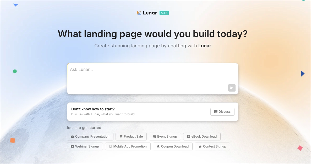
For a pricing page, the quality of the brief matters because the AI needs to understand not only what you sell, but how the plans differ and which one you want to position as the natural choice for a particular customer. For example, you could give Lunar a prompt like this:
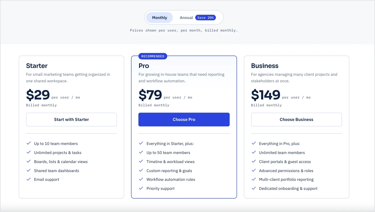
Create a pricing landing page for a B2B SaaS project management platform for marketing teams and agencies. The product has three plans: Starter at $29/month for small teams, Pro at $79/month for growing teams, and Business at $149/month for agencies managing multiple clients. Offer a 20% discount for annual billing.
Build the page around a clear three-column pricing comparison. Highlight Pro as the recommended plan, but keep all three options easy to compare. For each plan, show the price, ideal customer, 4–6 most important features or limits, and a clear CTA. Use “Start with Starter” for Starter, “Choose Pro” for Pro, and “Choose Business” for Business.
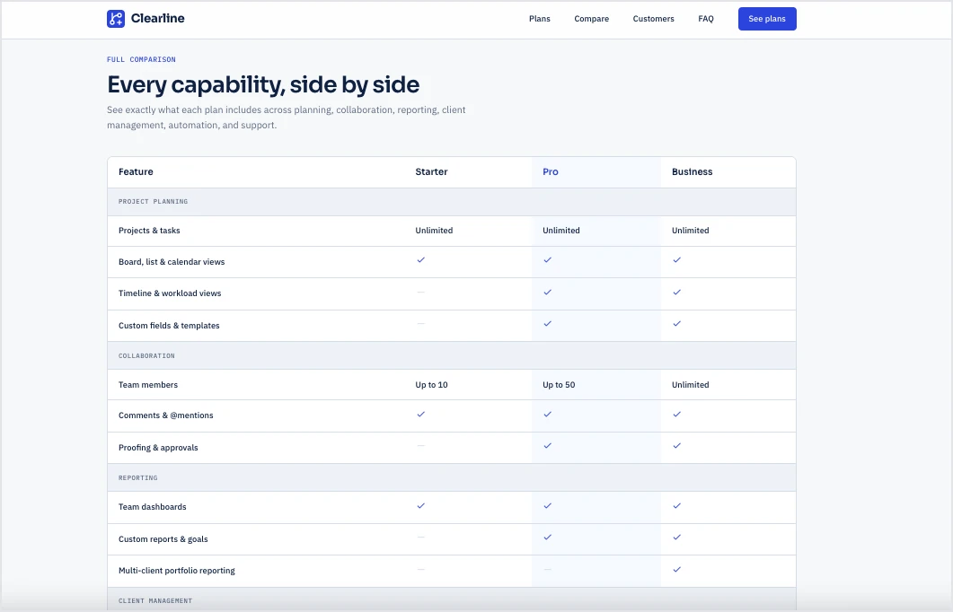
Above the pricing table, use a concise headline focused on choosing the right plan rather than explaining the product from scratch. Add a monthly/annual billing switch with annual savings clearly communicated. Below the main pricing cards, include a detailed feature comparison for visitors who need more information, followed by customer logos, two short testimonials, and an FAQ covering billing, upgrades and downgrades, cancellation, annual billing, data limits, and what happens when usage limits are exceeded.
Use a clean, professional SaaS design with strong visual hierarchy, generous spacing, and one accent color for the recommended plan and primary CTAs. Keep the copy direct and transparent. Avoid artificial urgency and vague claims. Make the layout easy to scan on mobile, with pricing and CTA visible before long feature lists.
Within minutes, you’ll get a fully editable pricing landing page:
Once you have the first version, check the pricing architecture before worrying about smaller design details. A visitor should be able to answer three questions quickly:
- Which plan is for me?
- What do I get for the extra money?
- What happens when I click the button?
If two tiers look almost identical or the important difference is buried fifteen rows down a comparison table, the pricing page still needs work.
Turn your pricing structure and offer into a complete, editable landing page from a prompt.
The same applies to price presentation. Show billing periods clearly, state what annual prices actually mean, explain usage limits, and avoid making customers calculate savings themselves. If you highlight a recommended plan, give that recommendation a reason. “Best for growing teams” is more useful than a badge that simply says “Popular.”
Then add the information people tend to look for just before committing. Depending on the product, that can include cancellation terms, upgrades and downgrades, overage rules, payment methods, guarantees, security information, or an FAQ. Enterprise offers usually need a different conversion path, such as Contact Sales, because those customers may need custom limits, procurement information, or a tailored agreement before purchasing.
After publishing, the job becomes less about design opinion and more about behavior. EventTracker can collect data such as clicks, scroll depth, form interactions, conversions, and payment-button events. Its Scroll Map and Event Map also make it easier to see which parts of a longer pricing table landing page people actually reach and interact with.

That gives you useful hypotheses to test. You might compare monthly-first versus annual-first pricing, different recommended tiers, shorter versus detailed comparisons, or CTA wording. Landingi’s A/B testing is available from the Optimize plan upward, alongside EventTracker.
Compare pricing page variations and see which presentation helps more visitors move forward.
As behavioral data builds up, Solis adds another layer to the process. The AI landing page optimization tool analyzes EventTracker data together with the page and campaign context, looking at signals including clicks, scroll depth, form interactions, conversion rates, and payment-button events. It can surface alerts, discoveries, and practical optimization suggestions when the data points to something worth investigating.
For a pricing page, that distinction matters. You don’t need AI to tell you that a green button is theoretically better than a blue one. You need to know how real visitors are behaving around the plans you actually sell, then decide what is worth changing or testing. That is what turns a pricing page from a static table into something you can keep improving as the offer and customer behavior evolve.
Turn real visitor behavior into practical recommendations for improving your pricing page.
FAQ About Pricing Landing Pages
These answers cover the questions that matter most when planning, evaluating, and improving a pricing landing page.
What is a pricing landing page?
A pricing landing page is a page designed to present the cost of a product or service and help visitors choose the right option. It typically combines prices with plan differences, key features, limits, billing terms, and CTAs that lead to purchase, signup, or sales contact.
For subscription products, a SaaS pricing page may also include monthly and annual billing, a recommended plan, a detailed feature comparison, and a separate path for enterprise customers.
How can I optimize my pricing landing page for higher conversion rates?
To optimize your pricing landing page for higher conversion rates, make the plans easier to compare and remove anything that slows down the choice. Highlight the differences that matter most, state prices, billing periods, and limits clearly, keep CTAs close to each plan, and make sure the pricing table remains readable on mobile.
Then use visitor behavior to decide what needs changing. With EventTracker, you can track clicks, scroll depth, and interactions around plans and CTAs. A/B testing lets you compare changes such as plan order, CTA copy, recommended-plan highlighting, or monthly versus annual pricing presentation, while Solis analyzes EventTracker data in the context of the page and campaign to identify patterns and suggest optimization opportunities.
What is the average pricing landing page conversion rate?
There is no widely established benchmark for pricing landing pages specifically, but broader landing page data gives a useful reference point. According to Unbounce benchmarks, B2B service landing pages average around 8.7% conversion, SaaS pages around 9.5%, and e-commerce pages around 12.9%.
Treat these figures as context rather than a target. A SaaS pricing page leading to a paid subscription is asking for a much bigger commitment than a page collecting demo requests or trial signups. The most useful benchmark is therefore your own conversion rate, tracked over time and segmented by traffic source, device, and conversion type.
Should a pricing page include an FAQ?
Yes. A pricing page should include an FAQ when there are details that could make someone hesitate before choosing a plan. This is especially useful for subscription and SaaS products, where the price alone rarely tells the whole story. Cover the questions that naturally come up during comparison:
- Can I change my plan later?
- What happens if I exceed a usage limit?
- Can I cancel anytime?
- Is annual billing paid upfront?
- Are there refunds?
- Which payment methods are accepted?
- What does the trial include?
- How does enterprise pricing work?
Clear answers remove uncertainty without making the pricing table unnecessarily dense. Keep the section close to the pricing offer and focused on purchase-related questions. Product tutorials and general support content belong elsewhere – here, the FAQ should deal with the final details a visitor may want to confirm before choosing a plan.
Create, test, and optimize your pricing landing page with Landingi.
Build A Pricing Landing Page With Landingi
A pricing page has a fairly demanding job: it needs to make a complex offer easy to compare without oversimplifying the details that matter. With Landingi, you can handle the full process in one AI landing page operation system, from creating and publishing the page to testing how different versions of the offer perform.
You can build the page manually or use Lunar to generate a complete, editable pricing landing page from a detailed prompt. Once it’s live, EventTracker helps you see how visitors interact with pricing cards, CTAs, and longer comparison sections, including through its Event Map and Scroll Map. This gives you concrete data for A/B tests, such as changing plan hierarchy, CTA wording, annual pricing presentation, or the way a recommended plan is highlighted.
As traffic builds, Solis analyzes EventTracker data in the context of the page and campaign and turns those behavioral signals into optimization recommendations. That creates a useful workflow for pricing pages in particular: build the offer, publish it, see how people actually compare it, test meaningful changes, and keep improving the page as your plans and customers evolve.
With Landingi, your pricing table landing page doesn’t have to remain a static list of plans. It can become a measurable, continuously optimized part of the buying journey, built around a simple goal: helping customers understand what they’re paying for and choose the right option with confidence. Try Landingi now!