
Nonprofit organizations increasingly rely on digital campaigns to attract donors, recruit volunteers, and raise awareness. A dedicated nonprofit landing page gives every campaign a clear goal and removes distractions, making it easier for visitors to take action – most often by donating. The best donation pages combine compelling messaging, emotional storytelling, strong visuals, and trust signals that encourage people to support a cause.
Creating and optimizing these pages is much easier with dedicated landing page platforms. Tools like Landingi help nonprofits build, publish, test, and improve donation pages without coding, allowing teams to launch fundraising campaigns faster and optimize them based on real user behavior.
Below, you’ll find 20 nonprofit landing page examples that showcase different approaches to messaging, design, and conversion strategy, along with practical takeaways you can apply to your own fundraising campaigns.

20 Examples of Best Nonprofit Landing Pages
The following section presents 20 high-performing nonprofit landing page examples created for charitable campaigns. Each example demonstrates how strategic messaging, visual hierarchy, and call-to-action placement influence donor behavior. Structured analysis of these nonprofit landing page examples highlights practical strengths and identifies opportunities for improvement. This can help you create a page that effectively communicates your message and inspires visitors to take action by making more donations.
1. International Rescue Committee
International Rescue Committee supports people affected by war, conflict, and natural disasters through emergency relief and long-term recovery programs. IRC’s nonprofit landing page emphasizes urgency through bold visuals and a direct headline that immediately communicates the crisis’s impact.
What works well on IRC’s landing page:
- Visuals are vivid, strong, and emotional.
- The opening statement, “Your donation can help families in Gaza survive,” immediately sets the tone for urgency and the need for action.
- The offer of a matching gift provides added motivation for potential donors.
- The page looks really good on mobile devices.
What could be improved on IRC’s landing page:
- The navigation menu should occupy less space.
- More trust-building elements, partner logos, or media mentions could increase credibility.
- Distracting elements – media press, news, and features – do not encourage conversion.

Generate and optimize your nonprofit landing page faster with Lunar and Landingi.
2. Charity: Water
Charity: Water focuses on providing clean drinking water to communities facing water scarcity. Its donation landing page combines strong visual storytelling with progress indicators that demonstrate measurable fundraising impact. Authentic beneficiary stories increase emotional engagement and credibility.
What works well on the Charity: Water page:
- The option to choose between one-time and recurring donations is a plus.
- Strong headline evokes positive feelings and empathy.
- A graphic representation of fundraising progress stimulates imagination and encourages people to donate.
- Lots of real-life stories are heart-stirring and build credibility.
What could be improved on the Charity: Water page:
- The donation form is visible from the beginning; however, the primary CTA is hidden under the fold.
- Copy under the headline could be slightly shorter.

Generate your next fundraising landing page with Lunar, then optimize it with Solis.
3. Szlachetna Paczka
Szlachetna Paczka, a Polish charity initiative, aims to provide targeted aid to families in need, focusing on the power of personalized support. Its nonprofit landing page is designed to evoke empathy and action, highlighting the struggles of families in need and offering various ways to help.
What works well on the Szlachetna Paczka page:
- The use of real-life stories, such as Mrs. Halina’s, creates a strong emotional connection.
- The use of impactful images and statistics, such as the number of families waiting for help, conveys the urgency and scale of the need.
- The site is easy to navigate, with clear sections and a straightforward layout.
What can be improved on the Szlachetna Paczka page:
- There are four CTAs above the fold (two of them repeated in the navigation menu) – it’s way too many.
- While the site mentions impact reports, these could be more prominently displayed to build trust and show effectiveness.
- Further sections are busy, with lots of distracting buttons and information.

Grow your supporter base with AI-powered nonprofit landing pages built in Landingi.
4. Help for Ukraine (Biedronka)
Help for Ukraine is a donation campaign supporting refugees displaced by war. This nonprofit landing page, built with Landingi, communicates purpose through a direct headline and strong national color cues. A visible fundraising bar provides social proof and reinforces collective participation.
What works well on the Help for Ukraine page:
- Headline “Wsparcie dla Ukrainy!” (Help for Ukraine!) is vivid and straightforward.
- The colors leave no doubt about what the site is about.
- The yellow bar is designed to display the amount of collected funds, serving as social proof.
What can be improved on the Help for Ukraine page:
- There is no direct CTA above the fold.
- Donation and help information are not so easy to find, as visitors have to scroll through the page.

5. CAMFED
CAMFED supports girls’ education and promotes long-term social impact through educational access. Its nonprofit landing page communicates transformation through emotional storytelling, beneficiary narratives, and supporting statistics. Donation notifications serve as real-time social proof and reinforce campaign momentum.
What works well on CAMFED’s landing page:
- The headline implies that supporting the foundation will make us feel better.
- Push notifications with information about the donation just made are fantastic social proof and incentives.
- Compelling stories from beneficiaries, like Faiza from Ghana, personalize the cause and make the impact tangible.
- The inclusion of statistics lends credibility and demonstrates the scope of work.
What can be improved on CAMFED’s landing page:
- CTA button in push notifications is hardly noticeable and disappears quickly.
- If the navigation menu were smaller, a form with a donation button could fit in the hero section.

See what works, then build and optimize your nonprofit landing page with Landingi.
6. Save the Children
Save the Children Fund works to protect children affected by conflict, poverty, and humanitarian crises. Its nonprofit landing page uses emotionally charged imagery, a visible donation form in the hero section, and flexible contribution options to support diverse donor preferences. Photo attribution strengthens credibility and transparency.
What works well on the Save the Children page:
- The content effectively uses emotional appeal, focusing on children in crisis situations.
- Providing photo attribution enhances credibility and empathy.
- The donation form visible right in the hero section sets a clear goal for this page.
- Offering various donation options caters to the different preferences of donors.
What can be improved on the Save the Children page:
- While the page mentions crises, including more individual stories could create a stronger emotional connection.
- Providing more information on the long-term impact of donations could help in building a case for sustained support.

Maximize donations with a nonprofit landing page built and optimized in Landingi.
7. Feeding America
Feeding America operates a nationwide network of food banks to combat hunger across the United States. Its donation landing page communicates tangible impact through a strong value statement. Minimalist design and straightforward navigation reduce distractions, while multiple payment options increase accessibility.
What works well on the Feeding America page:
- The form copy catches attention immediately, highlighting that $1 equals 10 meals, making the impact of donations tangible and meaningful.
- The minimalistic design and straightforward navigation focus the user’s attention on the donation process.
- Having three payment options is a great advantage.
What can be improved on the Feeding America page:
- The page could benefit from more emotional storytelling, imagery, or testimonials.
- The CTA for donations could be made more prominent and engaging to immediately capture the visitor’s attention.

Create and optimize a nonprofit landing page that inspires more people to take action.
8. GOSH (Great Ormond Street Hospital)
The Great Ormond Street Hospital (GOSH) Charity’s Christmas Appeal 2023 landing page is designed to encourage donations during the festive season, with a focus on helping seriously ill children. It combines emotional storytelling with clear calls to action, aiming to connect with potential donors on a personal level.
According to Double the Donation, 30% of annual giving happens in December, with about 10% of all annual donations coming in the last three days of the year. GOSH’s Christmas campaign is a great example of how nonprofits can take advantage of this seasonal surge in charitable giving.
What works well on GOSH’s landing page:
- The page effectively uses emotional storytelling, focusing on children like Henry, to create a strong emotional connection with visitors.
- Visitors can easily choose between one-off or monthly donations, with suggested amounts for convenience.
- The option to leave a stocking message for children at GOSH adds a personal, interactive touch.
- The page is short and focuses on the donation goal.
What can be improved on GOSH’s landing page:
- Reducing the navigation menu’s height would improve the first impression and visibility of the hero section, especially for mobile users.
- Incorporating more visuals or videos could make the page more engaging and emotionally compelling.

Get inspired by high-converting nonprofit landing pages, then build your own with Landingi.
9. Sightsavers
Sightsavers focuses on preventing avoidable blindness and promoting disability rights. Its nonprofit landing page balances emotional storytelling with detailed explanations of how donations are allocated, strengthening transparency. Impactful imagery and beneficiary stories, such as Sanjit’s narrative, create an emotional connection, while a clear layout supports accessibility.
What works well on Sightsavers’ page:
- The use of impactful images and graphics helps convey the urgency and importance of their work.
- Compelling stories, like Sanjit’s, create an emotional connection with the audience.
- User-friendly layout makes it easy for visitors to learn about the charity and how to get involved.
- The page provides detailed information on how donations are utilized.
What can be improved on Sightsavers’ page:
- The page contains numerous hyperlinks and excessive information; reducing them may help increase conversion rates.

10. UNHCR
The UNHCR’s winter appeal landing page is designed to garner support for refugees facing harsh winter conditions. It emphasizes the urgency of the situation and the critical need for donations to provide life-saving protection, shelter, and warmth.
What works well on UNHCR’s page:
- The use of impactful images and a clear layout enhances the page’s appeal.
- Descriptions of how donations help in different regions (Ukraine, Afghanistan, Syria) make the impact tangible.
- The expandable FAQ section provides more details.
What can be improved on UNHCR’s page:
- Although the hero section is great, the content below the fold is a long block of text. By simplifying the content and highlighting the CTA, visitors could stay engaged longer.
- Adding testimonials, videos, or stories from beneficiaries could further humanize the cause and encourage donations.
- Page performance for mobile devices (according to Lighthouse) needs improvement.

11. UNFPA
The United Nations Population Fund (UNFPA) has created a landing page for its Mama Kit donation campaign. This campaign focuses on providing essential aid to new mothers and their newborns, especially those affected by conflict. UNFPA’s landing page focuses on reproductive health and rights, using statistics and stories to underscore the importance of its mission.
What works well on UNFPA’s page:
- The very minimalist first section – with a short but impactful headline and an emotional photo – conveys a strong message.
- The FAQ section addresses common concerns about donation security, tax deductions, and other administrative queries, helping build trust with potential donors.
- The donation form can accept donations in currencies from around the globe.
What can be improved on UNFPA’s page:
- It would be helpful to make the CTA in the hero section more prominent, as it currently resembles a social media share button.
- The donation form pop-up triggered by the CTA button takes time to load. It may be faster to scroll to the form section.

12. Doctors Without Borders
Doctors Without Borders provides emergency medical assistance in crisis zones worldwide. Its donation landing page emphasizes the urgency of medical aid in crisis zones, using real-life scenarios to appeal for support.
What works well on the Doctors Without Borders page:
- The headline “Help save lives. Donate now.” is direct and compelling, creating a sense of urgency.
- Accepting credit cards, bank accounts, and PayPal broadens accessibility for various donors.
- The mention of a 4-star rating from Charity Navigator builds credibility and trust with potential donors.
What can be improved on the Doctors Without Borders page:
- The form occupies the entire page, which can be overwhelming. It would be helpful to create a multi-step form and move some fields to later steps. A shorter, more streamlined donation form might reduce friction.
- Incorporating more compelling visuals or stories about the impact of donations could emotionally engage visitors more effectively.

13. Rainforest Trust
Rainforest Trust’s Brazilian Amazon Fund campaign focuses on preventing deforestation. Its donation landing page presents an opportunity to create protected areas and safeguard Indigenous territories, aiming to save 20 million acres of intact forest.
What works well on Rainforest Trust’s page:
- The fundraiser’s purpose is immediately conveyed through a poignant photo that fills the initial view.
- The page effectively communicates the dire situation in the Amazon, with statistics such as “2.9 million acres of forest in Brazil destroyed in 2022 alone,” which creates a sense of urgency.
- The objective to save 20 million acres of intact forest and lock up 6 billion metric tons of CO₂ is featured, providing clarity on the impact of donations.
- There are three CTAs above the fold: one in the navigation menu, another below the headline, and a third fixed to the side of the page.
What can be improved on Rainforest Trust’s page:
- There is no clear message about how visitors can donate, but they will be prompted with a pop-up for fundraising.
- The page is quite long, and it’s unlikely that many visitors will scroll all the way down to the bottom.

14. Turning Pointe Autism Foundation
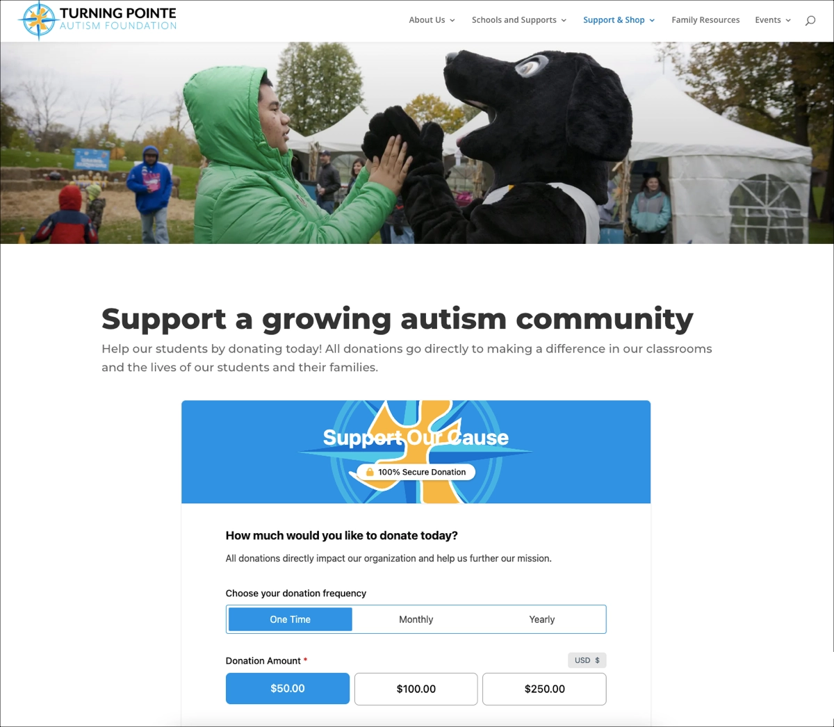
Turning Pointe Autism Foundation is a nonprofit organization that supports individuals with autism through specialized education and community programs. Its donation landing page highlights that all donations directly impact classrooms and students’ families.
What works well on the Turning Pointe Autism Foundation page:
- The headline “Support a growing autism community” is clear and mission-driven, immediately conveying the cause and defining the beneficiary group.
- The donation frequency selector (One Time, Monthly, Yearly) increases flexibility, encouraging higher lifetime donor value.
- The preset donation amounts simplify decision-making.
- The “100% Secure Donation” badge adds reassurance and reduces hesitation.
What can be improved on the Turning Pointe Autism Foundation page:
- The hero section image does not visually connect directly to the donation form. Adding a clearer emotional bridge between the image and the giving action could strengthen persuasion.
- The donation form appears in a single large block. Introducing a multi-step structure could reduce perceived effort and increase completion rates.
15. World Vision Australia
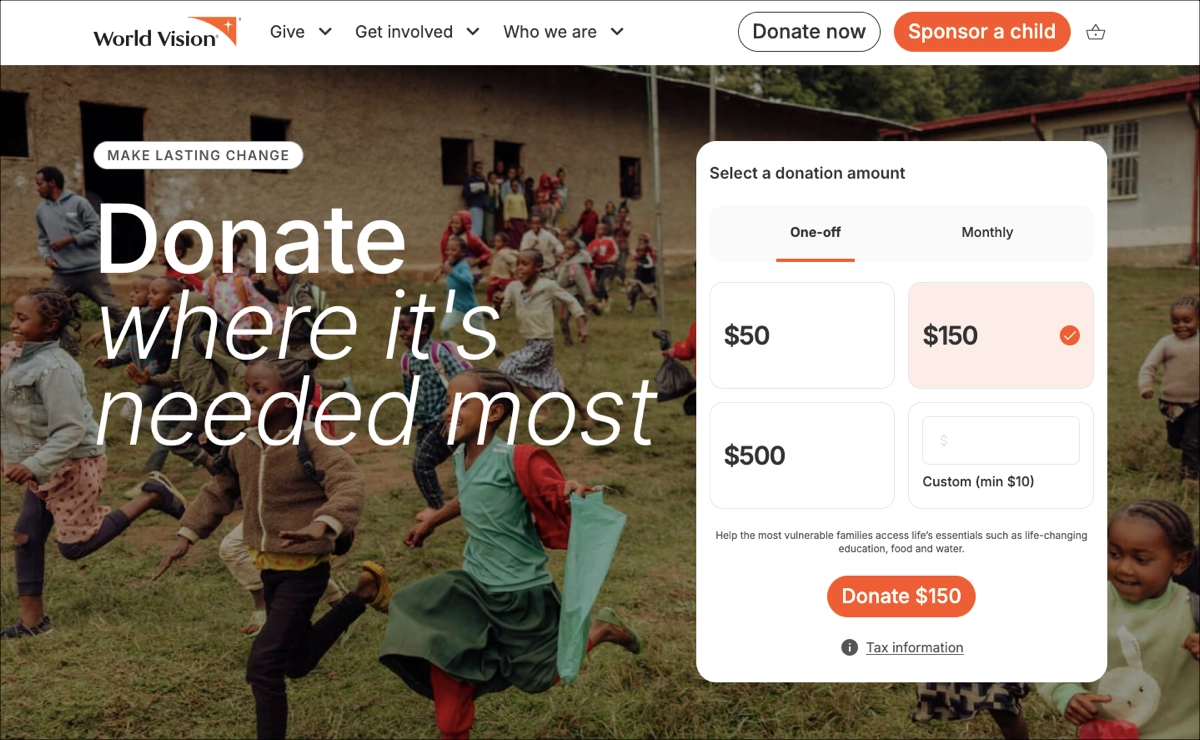
World Vision is an international humanitarian organization operating since 1966 and working across Africa, Asia, the Pacific, the Middle East, and Australia. The World Vision Australia donation page focuses on flexible giving “where it’s needed most” and combines emotional storytelling with quantified impact data.
What works well on the World Vision page:
- The hero headline is clear and benefit-focused.
- The donation module appears above the fold. Users can select one-off or monthly giving immediately, which shortens the path to conversion.
- The page connects amounts to outcomes – specific impact statements, increasing perceived value.
- Strong statistical proof that reinforces credibility.
- Financial transparency is clearly presented.
- Trust badges and affiliations increase institutional credibility.
What can be improved on the World Vision page:
- The page is content-rich. While informative, the number of sections may overwhelm first-time visitors. Collapsing secondary sections or introducing progressive disclosure could reduce cognitive load.
Generate a nonprofit landing page with Lunar, then customize it for your fundraising campaign in minutes.
16. Canadian Red Cross
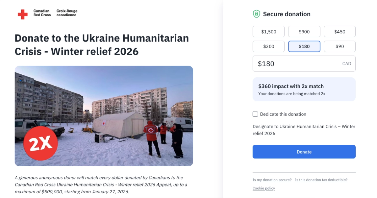
The Canadian Red Cross is a national humanitarian organization providing emergency assistance and disaster relief in Canada and internationally. This donation page focuses on the Ukraine Humanitarian Crisis – Winter Relief 2026 appeal and highlights a time-limited 2× donation match, which acts as the primary psychological lever.
What works well on the Canadian Red Cross page:
- The headline is specific – it clearly defines the cause, geography, and seasonal urgency.
- The 2× match incentive is prominently displayed, creating strong urgency and increasing perceived impact.
- The live impact multiplier reinforces value.
- The form is minimal and distraction-free.
- Security reassurance appears at the top of the form.
What can be improved on the Canadian Red Cross page:
- The emotional narrative is limited above the fold. While the winter image supports context, adding a short impact statement tied to winter-specific needs (heating kits, insulated shelters, blankets) would increase emotional engagement.
17. Oxfam Danmark
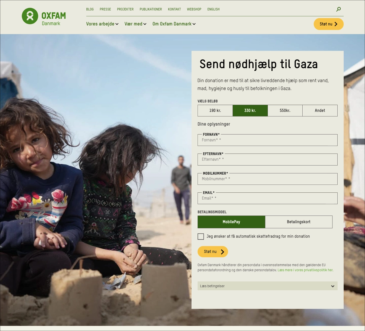
Oxfam Danmark is part of the global Oxfam confederation, an international humanitarian organization working to reduce poverty and respond to crises worldwide. Its donation page focuses on emergency relief for civilians in Gaza and emphasizes life-saving aid, including clean water, food, hygiene, and shelter.
What works well on the Oxfam Danmark page:
- The headline clearly defines both the action and the location, reducing ambiguity and increasing clarity.
- The large hero image featuring children in Gaza creates emotional engagement before the user interacts with the donation module.
- MobilePay is prominently integrated.
- Privacy and GDPR reassurance are visible below the CTA.
What can be improved on the Oxfam Danmark page:
- There is no visible urgency mechanism, such as a funding goal meter.
- The donation impact is described in general terms. Quantifying outcomes (e.g., “330 kr. provides X liters of clean water”) would increase clarity and perceived effectiveness.
18. North Texas Food Bank
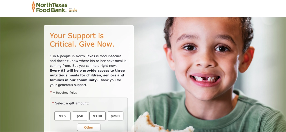
North Texas Food Bank (NTFB) is a nonprofit hunger-relief organization serving North Texas communities. This donation page focuses on immediate food insecurity and highlights that 1 in 6 people in North Texas face food insecurity, while every $1 provides access to 3 meals.
What works well on the North Texas Food Bank page:
- The headline is urgent and direct.
- The page uses a strong local statistic, making the issue concrete and geographically relevant.
- Each preset donation amount displays a calculated impact.
- The page supports both one-time and recurring donations. Monthly options are clearly labeled, which supports higher donor lifetime value.
- The design keeps the donation form above the fold. Users can select an amount immediately without scrolling.
What can be improved on the North Texas Food Bank page:
- The page emphasizes meal quantity but does not prominently display financial allocation percentages (e.g., program vs. administrative costs). Adding transparency metrics could increase institutional trust.
- There is no visible urgency trigger, such as a time-limited match or a funding goal. Introducing a multiplier campaign or goal tracker could increase short-term conversion rates.
19. Help for Heroes
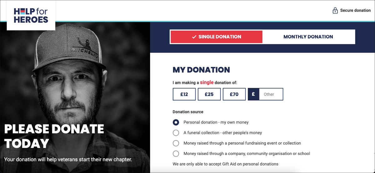
Help for Heroes is a charity that supports wounded veterans and service personnel in rebuilding their lives after injury or illness. Its donation page focuses on immediate financial support and emphasizes that contributions help veterans “start their new chapter”.
What works well on the Help for Heroes page:
- The hero image creates a strong emotional focus.
- The frequency toggle is highly visible. The clear separation between “Single Donation” and “Monthly Donation” encourages recurring giving without complicating the interface.
- The “Secure donation” indicator appears in the top-right corner. This placement reduces payment anxiety before users interact with the form.
- The donation source clarification improves compliance. By distinguishing personal donations from fundraising or company contributions, the page reduces processing ambiguity and Gift Aid errors.
What can be improved on the Help for Heroes page:
- There is no visible statistic about veteran need (e.g., number of veterans supported annually). Including quantified data would strengthen credibility.
- The custom amount option is visually secondary. Making it more prominent could encourage higher contributions.
20. RSPCA
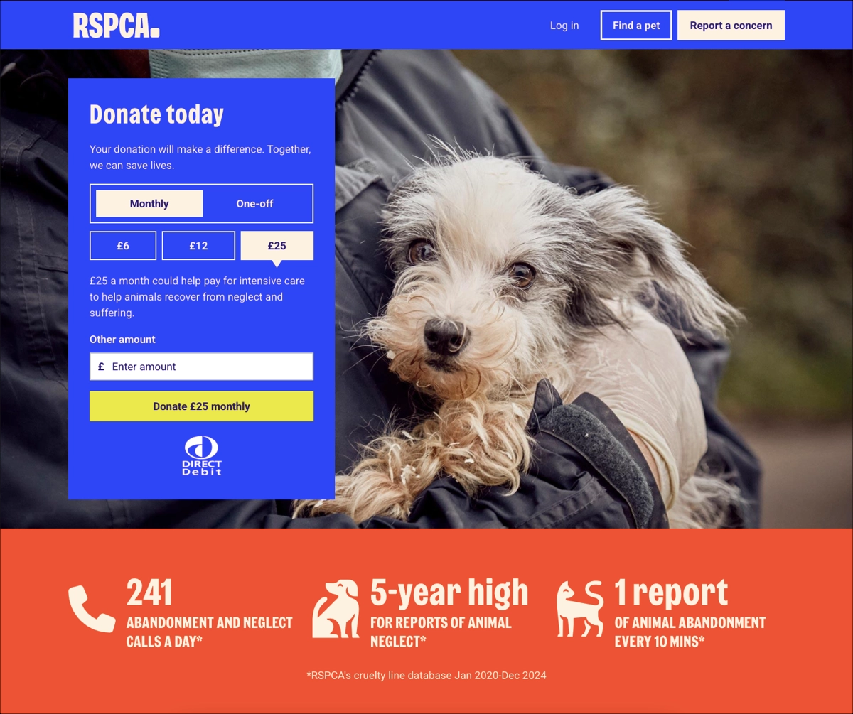
RSPCA is an animal welfare charity that prevents cruelty and rescues animals from neglect and abuse. This donation page focuses on urgent intervention and highlights rising abandonment and neglect statistics to drive immediate support.
What works well on the RSPCA page:
- The page combines emotional imagery with data. The hero image of a rescued dog increases empathy, while statistics below the fold reinforce scale and seriousness.
- The donation frequency toggle is clearly visible. Monthly giving is preselected, which strategically promotes recurring donations and higher lifetime value.
- Impact explanation is tied to the selected amount. For example, £25 per month helps fund intensive care for neglected animals, connecting money to outcomes.
- The CTA button dynamically reflects the selected amount (“Donate £25 monthly”). This reinforces commitment clarity before submission.
What can be improved on the RSPCA page:
- The impact statement uses general wording such as “could help pay.” Replacing modal phrasing with precise quantified outcomes would increase clarity and authority.
- There is no visible progress tracker or match campaign. Adding a time-bound funding goal could further increase short-term conversion rates.
Generate a nonprofit landing page in minutes with Lunar, then customize every detail in Landingi.
How Do I Create a Nonprofit Landing Page?
To create a nonprofit landing page in Landingi, start with Lunar – an AI-powered landing page generator that creates complete, campaign-ready pages from a simple prompt. Describe your fundraising campaign, the cause you support, the audience you want to reach, the action visitors should take, and any key information you’d like to include. Lunar then generates a complete landing page with tailored copy, a logical page structure, and a conversion-focused layout.
For example, you can use the following prompt:
Create a donation landing page for a nonprofit organization providing emergency food assistance to families affected by flooding. The goal is to collect one-time and monthly donations. Use a compassionate but factual tone, explain how different donation amounts help, include a short beneficiary story, financial transparency information, trust signals, an FAQ section, and a prominent “Donate Now” CTA. The page should be optimized for mobile traffic from social media campaigns.Within a few minutes, Lunar will turn the prompt into a launch-ready nonprofit donation page.
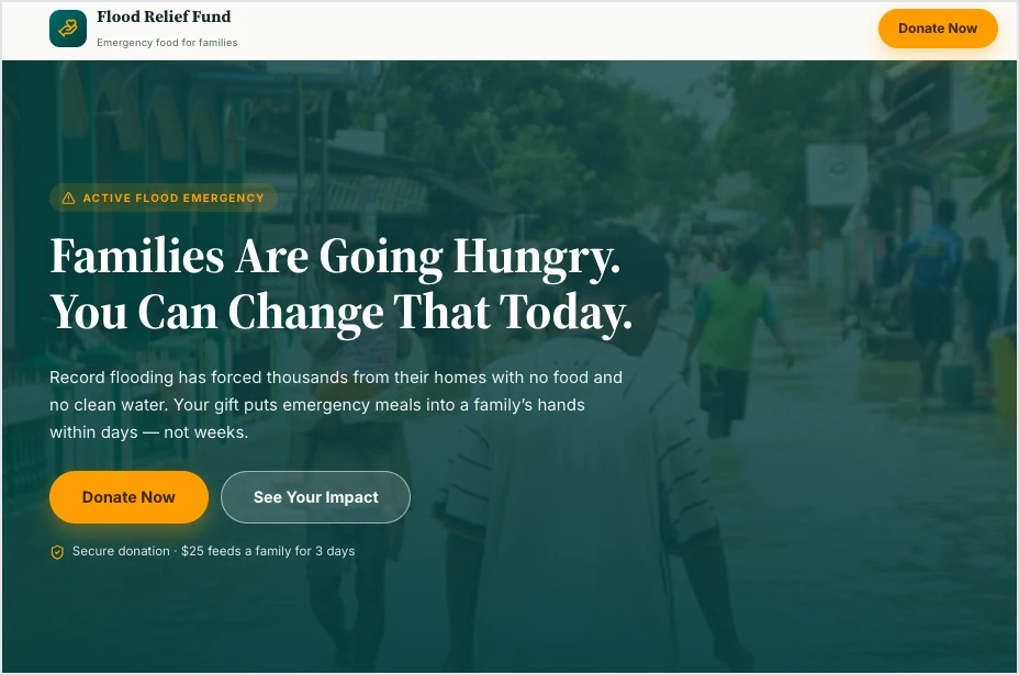
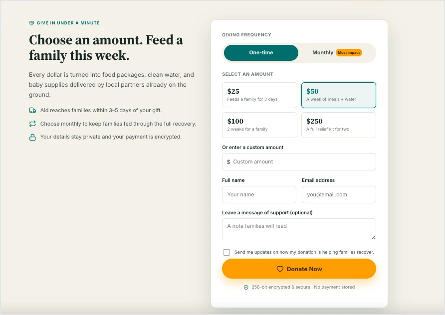
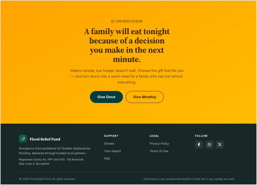
You can then refine the copy and page structure through chat, adjust individual sections, add your organization’s images and branding, connect the donation form or payment solution, and publish the page on your own domain.
Turn inspiration into action – generate your nonprofit landing page with Lunar.
The generated page becomes part of your Landingi workspace, so you can manage it alongside other campaigns, duplicate it for different causes or audiences, and publish new variants without moving content between separate tools. This is especially useful for nonprofit teams running several fundraising campaigns with limited design or development resources.
Once the page is live, optimization should be based on visitor behavior rather than assumptions. EventTracker records interactions such as scroll depth, clicks, form activity, conversion events, and payment button actions. Its Event Map and Scroll Map help reveal which sections attract attention, where visitors stop scrolling, and whether important donation elements are being overlooked.
Solis, Landingi’s AI landing page optimization tool, analyzes this behavioral data together with the page structure and campaign context. It can flag issues such as an underperforming mobile layout, a form visitors repeatedly abandon, or a CTA that receives less engagement than expected. It then provides alerts, discoveries, and practical recommendations that help you decide what to test or improve.
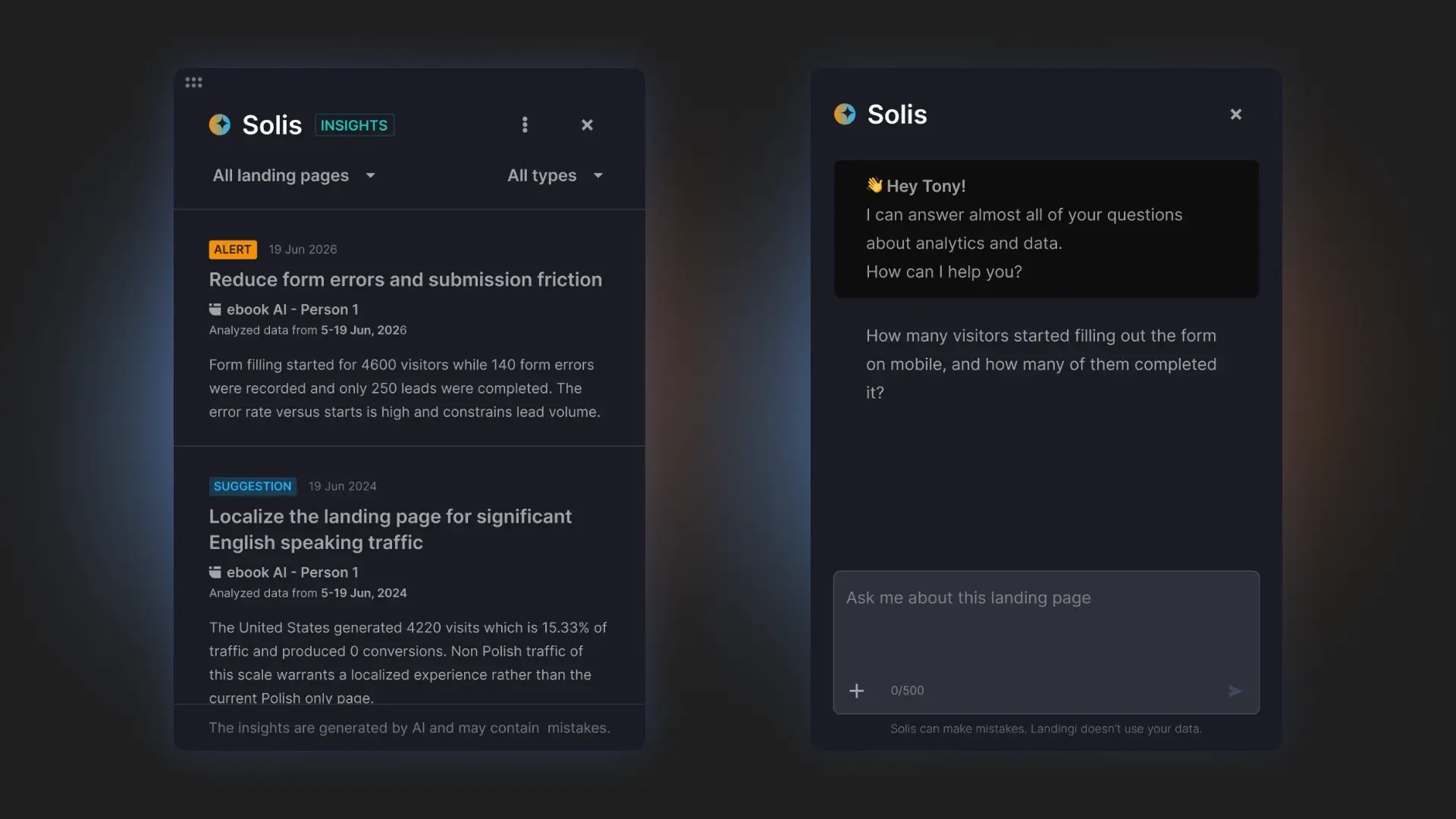
Use these findings to test focused changes, such as shortening the donation form, moving the impact statement higher on the page, adjusting suggested contribution amounts, clarifying recurring donation options, or strengthening trust information near the payment step. A/B testing each meaningful change allows you to compare results and improve the fundraising landing page without rebuilding the entire campaign.
Analyze user behavior, discover optimization opportunities, and improve your donation page with Solis.
8 Nonprofit Landing Page Best Practices
The best nonprofit landing pages make it easy for visitors to trust your organization and act on their intention to help. The practices below focus on the elements that have the greatest impact on donation page performance, from communicating the value of every contribution to optimizing campaigns based on real user behavior.
1. Focus on one goal
Every nonprofit landing page should support a single conversion goal. If your campaign is collecting donations, don’t compete for attention with newsletter sign-ups, volunteer recruitment, or multiple calls to action. A focused page reduces decision fatigue and helps more visitors complete the action you want them to take.
2. Show the impact of every donation
People are more likely to give when they understand exactly how their contribution helps. Instead of asking for a generic donation, explain what different amounts make possible. Statements such as “$25 provides emergency food for a family” or “$50 funds medical supplies” make the outcome tangible and help donors see the value of their support.
3. Build trust before asking for money
Trust is one of the biggest factors influencing donation decisions. Display security badges, charity ratings, financial reports, partner logos, and clear information about how funds are allocated. Testimonials and real beneficiary stories also reinforce credibility.
4. Make donating as simple as possible
Every extra step in the donation process increases the risk of abandonment. Keep donation forms short, offer suggested contribution amounts, support one-time and recurring giving, and provide popular payment methods whenever possible. A frictionless donation experience helps visitors act while their motivation is highest.
5. Combine emotional storytelling with evidence
Emotion captures attention, but facts build confidence. The strongest fundraising pages combine authentic stories with measurable outcomes, showing both the human side of the campaign and its real-world impact.
6. Design for mobile first
Many nonprofit campaigns receive a large share of their traffic from social media, email, and digital advertising, where mobile devices dominate. Make sure your landing page loads quickly, remains easy to navigate on smaller screens, and keeps donation forms, buttons, and key information visible without creating unnecessary friction.
7. Use behavioral data to improve performance
Instead of guessing why visitors leave without donating, analyze how they interact with your page. Track clicks, scroll depth, form interactions, and conversion events to identify where people lose interest or abandon the donation process. Insights like these make optimization far more effective than relying on assumptions alone.
8. Continuously optimize your campaigns
High-performing fundraising pages are rarely perfect after launch. Review performance regularly, test headlines, donation amounts, page layouts, and calls to action, then refine your page based on the results. AI-powered tools such as Solis can help identify optimization opportunities faster, while A/B testing validates which changes lead to more donations over time.
See what visitors actually do on your page and discover optimization opportunities with Solis.
FAQ
Find answers to the most common questions about nonprofit landing pages, donation page optimization, and fundraising best practices.
What is a nonprofit landing page?
A nonprofit landing page is a dedicated web page designed to support a single fundraising or engagement goal, such as collecting donations, recruiting volunteers, or promoting a campaign. It removes unnecessary distractions and guides visitors toward one clear action with focused messaging, compelling visuals, trust signals, and a prominent call to action.
Because every page is built for a specific audience and campaign, nonprofit landing pages typically achieve higher conversion rates than general website pages. They also make it easier to measure campaign performance, test improvements, and optimize results over time.
Why do I need a nonprofit landing page?
You need a nonprofit landing page because it gives every fundraising campaign a single, focused goal, making it easier for visitors to take action. Instead of sending people to a general website, a dedicated landing page keeps them focused on donating, registering for an event, volunteering, or supporting a specific initiative. This streamlined experience reduces distractions, increases engagement, and typically leads to higher conversion rates.
Dedicated landing pages also improve the performance of paid campaigns, social media posts, and email marketing by matching each audience with tailored messaging. Combined with analytics, A/B testing, and optimization tools, they make it easier to understand donor behavior, improve campaign performance, and build long-term supporter relationships.
Generate your nonprofit landing page with Lunar and customize it in minutes.
What to Avoid While Creating Nonprofit Landing Pages?
Avoid creating a nonprofit landing page that tries to achieve too many goals at once. Too much content, multiple competing CTAs, or complex navigation can distract visitors and reduce conversions. Instead, keep the page focused on a single action, such as making a donation or registering for an event.
It’s equally important to build trust. Missing impact information, financial transparency, testimonials, security indicators, or partner logos can make potential donors hesitate before contributing. A long or complicated donation form, poor mobile experience, and slow loading times also create unnecessary friction that may prevent visitors from completing their donation.
Finally, don’t treat your landing page as a one-time project. Monitor visitor behavior, test different headlines, CTAs, donation amounts, and page layouts, and keep optimizing your campaign based on real data rather than assumptions.
What makes a good donation CTA?
A good donation CTA clearly tells visitors what to do next and reinforces the impact of their contribution. Use concise, action-oriented phrases such as “Donate Now,” “Support the Campaign,” or “Help a Family Today,” and place the CTA where it’s easy to find, especially above the fold and near key impact statements or trust signals.
The most effective donation CTAs also reduce hesitation by adding context. Pairing the button with a short message, such as “Every $25 provides 100 meals” or “Your donation will be matched today,” helps visitors understand why they should act now. Regular A/B testing of CTA copy, placement, color, and surrounding content can further improve conversion rates over time.
Build Nonprofit Landing Page With Landingi
Creating a nonprofit landing page is only the first step. The real impact comes from continuously improving your campaigns, making it easier for people to donate, and understanding what encourages them to take action.
With Landingi, you can generate a complete donation landing page in minutes using Lunar, customize every section without coding, and publish your campaign on your own domain. Once it’s live, EventTracker shows how visitors interact with the page, while Solis analyzes user behavior and highlights opportunities to improve conversions, helping you optimize your fundraising efforts based on real data instead of assumptions.
Whether you’re launching a one-time fundraising campaign, collecting recurring donations, promoting a charity event, or recruiting volunteers, Landingi gives your team everything needed to create, manage, and optimize high-converting nonprofit landing pages from one platform. Generate your first nonprofit landing page with Lunar and start building more effective fundraising campaigns with Landingi.